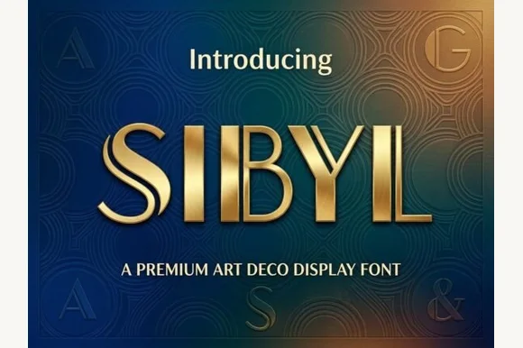
Dual-bar architectural 1920s Art Deco display sans
Sibyl
Sibyl is a sleek architectural Art Deco display font pairing bold vertical pillars with crisp parallel twin hairline stems.
Ideas for this font
Headline-first letterforms
Five hundred and sixty-four display faces built for a single line at large size: heavy contrast serifs, condensed sans, novelty cuts and poster lettering that would fall apart in a paragraph but holds a title beautifully.
694 fonts (sorted by maker demand)Page 20 of 29
Dual-bar architectural 1920s Art Deco display sans
Sibyl is a sleek architectural Art Deco display font pairing bold vertical pillars with crisp parallel twin hairline stems.
Ideas for this font
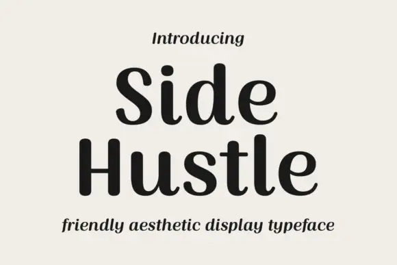
Soft contrast display with curled feet
Side Hustle is a soft contrast display in charcoal on a warm off-white sheet: mixed case with rounded stems, gently curled lower feet and a slight contrast between thick and thin, set in two lines with a small italic line above and a plain italic line beneath.
Ideas for this font
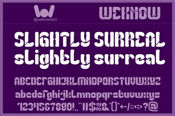
1968 Fillmore-inspired geometric psychedelic sans (Full charset)
Slightly Surreal is a complete geometric-psychedelic display font (uppercase, lowercase, 0–9 & full symbols) blending 1960s mod curves with crisp modern spacing.
Ideas for this font
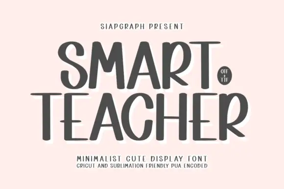
Tall narrow minimalist display lettering
Smart Teacher is a tall narrow display face in charcoal: mixed capital and lower-case forms in one line, a wide T bar, a small round counter in the o and a soft white halo behind the lettering.
Ideas for this font
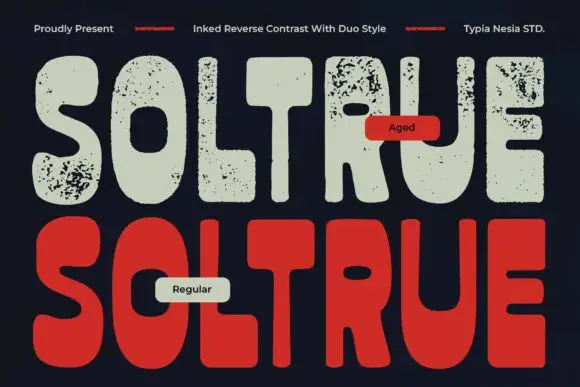
Reverse-contrast rounded display with two treatments
Soltrue is a heavy rounded reverse-contrast display on a near-black ground: fat capitals whose horizontals swell and whose uprights are slim, shown twice — once in a clean aged-cream fill and once in a solid red — with a small line at the top and two labels that name the treatments.
Ideas for this font
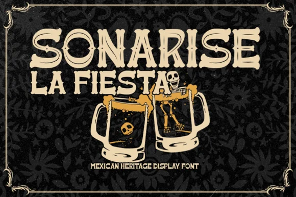
Hand-carved Mexican fiesta & cantina serif-display
Sonarisa La Fiesta is a lively Mexican-heritage display typeface with flared Tuscan-style spurs, dancing baselines, and hand-carved warmth.
Ideas for this font
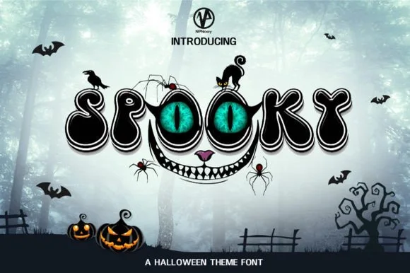
Playful Halloween display with a face
Spooky 5 is a playful Halloween display in black with a white outline and a built-in face: the two O letters become green eyes under a brow, a wide toothy smile runs beneath the word, and the whole lockup is festooned with bats, spiders, a black cat and a crow.
Ideas for this font
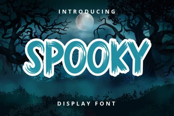
Chunky brush display with dry edges
Spooky 6 is a chunky brush display in teal with a white outline: thick uneven strokes, dry brush edges that break the contour, and letters that lean and bounce against each other, printed over a moonlit forest scene.
Ideas for this font
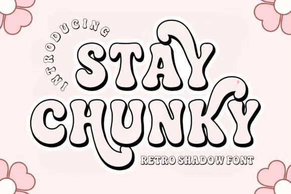
Hollow 3D-extruded 1970s groovy swash shadow display
Stay Chunky Shadow is a nostalgic 1970s groovy outline font featuring built-in 3D extruded ribbon shadows and sweeping 'Y' swashes!
Ideas for this font
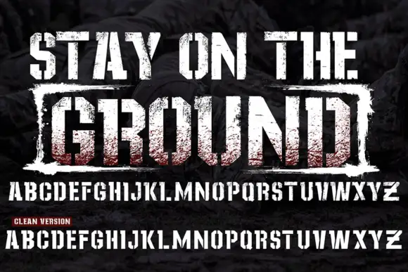
Grunge stamped display with clean cut
Stay On The Ground is a grunge display in red and white over a dark texture: heavy squared caps with a coarse stamp-like wear, a second line boxed inside a rough rectangle, and beneath it a full alphabet shown twice — once worn and once clean — with a small note marking the clean version.
Ideas for this font
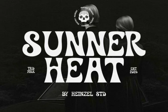
Psychedelic curl display
Sunner Heat is a psychedelic display in cream on a dark photograph: heavy letters whose stems curve into long hooks and loops, a waving baseline and exaggerated swashes on several letters, with a round skull badge above and small tracked notes at the sides, so the plate reads as a seventies rock poster.
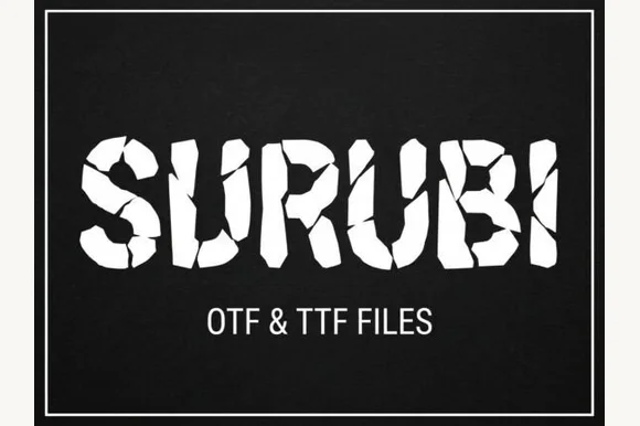
Cracked fragment display
Surubi is a cracked display in white on black: heavy caps built from separate fragments, with wide crack lines running through the bowls and stems and displaced pieces at the edges, set inside a thin rule frame with the file formats noted beneath.
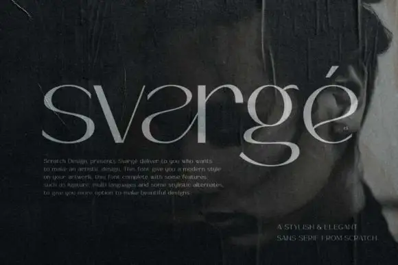
Fine contrast lowercase display
Svarge is a fine contrast lowercase shown in pale grey over a dark close portrait: reversed-looking a curves, a broad lower g loop, hairline joins and a tall ascender, with a small paragraph of description at the lower left and a right-aligned credit at the foot.
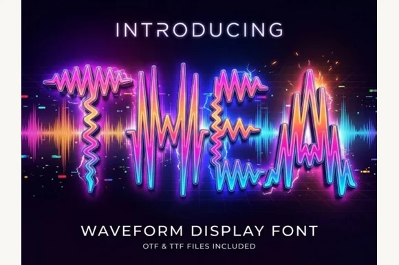
Letters drawn as oscillating audio waveforms with a bright glow along each stroke
Thea is a display alphabet in which every stroke is drawn as an oscillating audio waveform, so a word reads as a signal trace rather than as lettering, with the shape still legible from the amplitude envelope.
Ideas for this font
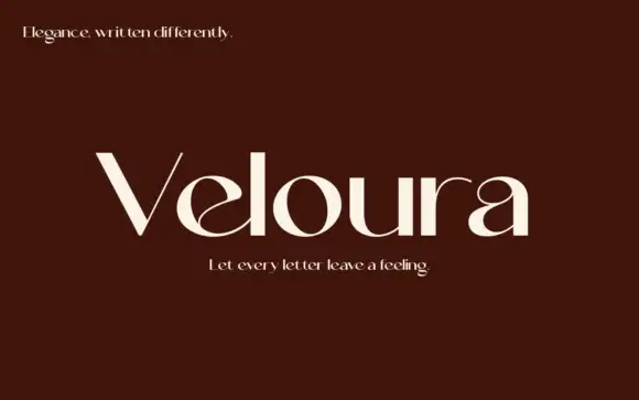
High-contrast display with curled interiors
Veloura is a high-contrast display in cream on deep maroon: mixed case with a curled e interior, a looping a upper bowl, fine joins and wide oval bowls, set as one large word between two small italic lines, one above and one below.
Ideas for this font
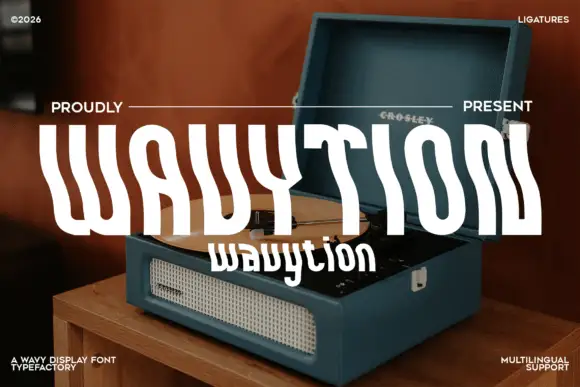
Waved condensed display
Wavytion is a waved display in white over a photograph of a portable record player: very tall narrow forms whose stems bend into broad alternating waves, so the word reads as a ribbon, with a second line in a softer wave beneath and small notes in the corners.
Ideas for this font
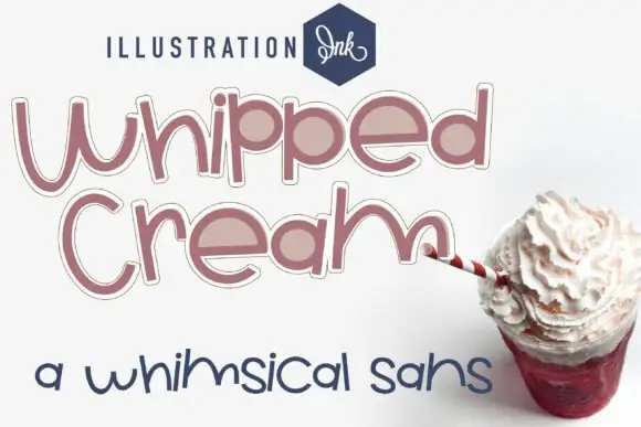
Loose rounded whimsical display
Whipped Cream Family is a loose rounded display shown in dusty rose on white: mixed case with uneven heights, broad circular bowls, an outline plus a fill variant and a loose baseline, set in two large lines with a small studio wordmark above and a second sample in a thinner cut below.
Ideas for this font
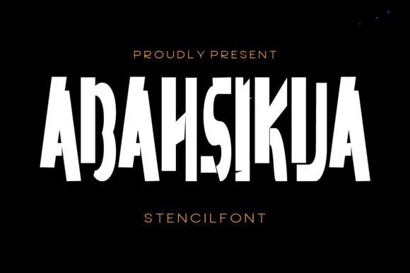
Tall condensed diagonal-sliced architectural stencil display
Abahsikua is a tall, condensed modern stencil display font sliced by bold diagonal negative-space cuts across geometric block pillars.
Ideas for this font
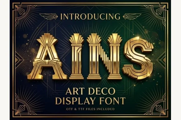
Fluted Art-Deco pillar & theater-marquee display (OTF & TTF)
Ains is a grand 1920s Art Deco display font carving vertical architectural column flutes down the center of wide geometric capitals (OTF & TTF).
Ideas for this font
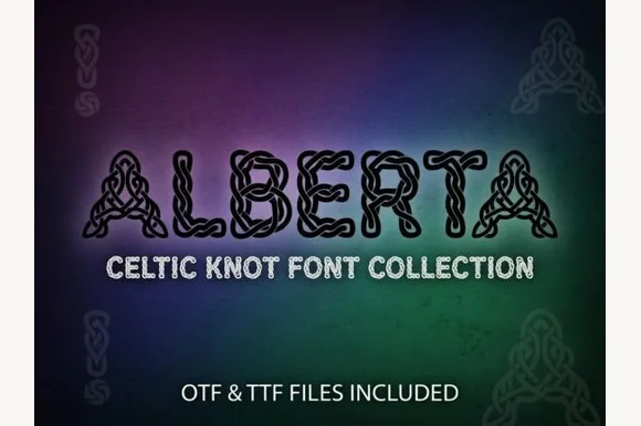
Celtic knot capitals drawn as interlaced strands with black outlines
Alberta is a Celtic knot capital alphabet in which every stroke is drawn as a braided strand, the openings close into loops and one thin outline holds the whole letter, so a word reads as knotwork rather than as type.
Ideas for this font
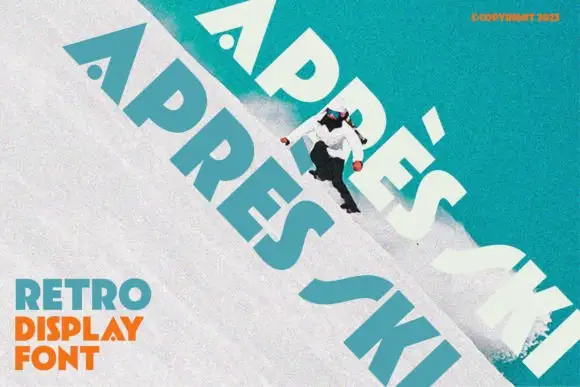
Heavy angular capitals with small round counters and a detached acute accent
Apres Ski sets a retro grotesque at a steep angle across a snowy slope, its capitals wide, its corners notched and its counters cut with shapes that look borrowed from ski graphics of the seventies.
Ideas for this font
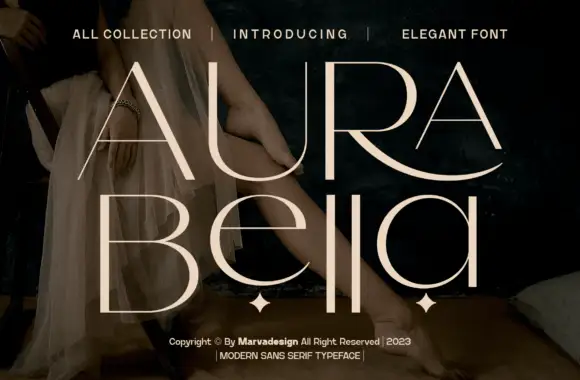
Fine contrast capitals and rounded lowercase with an extended sweeping R leg
Aura Bella draws an extremely light display sans, its strokes reduced to hairlines with a few heavy flares, its capitals tall, wide-spaced and set over a dark photograph.
Ideas for this font
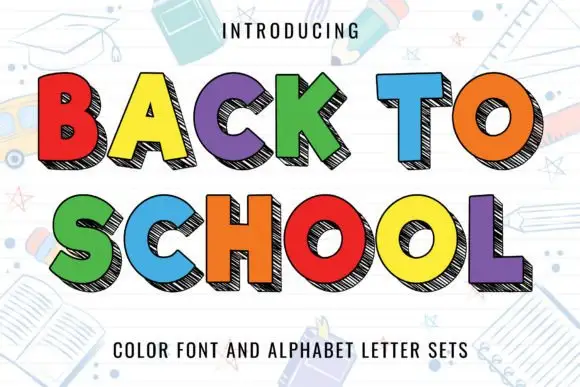
Flat bright block capitals with dark diagonally hatched offset depth
Back to School sets chunky flat-colour capitals against a white page of pale classroom doodles, each letter carrying a dark offset shadow that is filled with close diagonal hatching instead of a solid tone.
Ideas for this font
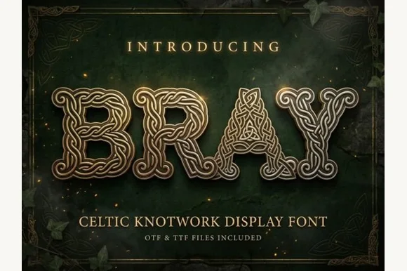
Celtic knotwork display with bevelled strands and interlaced bowls
Bray is a Celtic knotwork display alphabet in which every stroke is a braided band with a bevelled edge, the bowls close into interlaced rings and the letters share one outline, so a word reads as cast metal rather than as type.
Ideas for this font
Allow optional Google Analytics to measure visits and catalogue actions. Your search words and notes are not included. Privacy & storage