Neutral Sans Workhorse

Whipped Cream Family + Mango Dream
Lets Whipped Cream Family own the focal silhouette while handling secondary copy, sizing and subheads cleanly.
Inspect Mango Dream specimenDisclosure: MakerFileHub may earn a commission from qualifying purchases via paid links on this page. How our links work.
Loose rounded whimsical display
Whipped Cream Family is a loose rounded display shown in dusty rose on white: mixed case with uneven heights, broad circular bowls, an outline plus a fill variant and a loose baseline, set in two large lines with a small studio wordmark above and a second sample in a thinner cut below.
Paid link
Get this fontProject & layout blueprintsAt-a-glance maker compatibility
Sturdy stroke walls and open counters weed cleanly on adhesive vinyl, HTV apparel film, and cut cardstock.
Visual anatomy & craft review
The plate shows two cuts of the same idea: the large word is drawn as an outlined shape with a lighter inner fill, and the smaller line beneath is a thin monoline version of the same letterforms, so a buyer can see both the display weight and a lighter companion. The drawing is loose and rounded, with the baseline allowed to drift, which is what gives the set its whimsical character, and that looseness means a layout should not depend on a strict baseline or a precise fit. The size floor is moderate, because the outline and the inner fill merge below a certain size. The studio wordmark is product copy. It suits a bakery, a card and a label.
Display, whimsical, rounded, friendly
Two-font hierarchy recipes
Tested contrast partners — pairing Whipped Cream Family with grounded secondary typography.
Whipped Cream Family + Mango Dream
Lets Whipped Cream Family own the focal silhouette while handling secondary copy, sizing and subheads cleanly.
Inspect Mango Dream specimen
Whipped Cream Family + Cronelo
Grounds bold display lettering with classic typographic authority on posters, badges and apparel.
Inspect Cronelo specimenPractical applications
Concrete hierarchy, scale and production guidance tailored to Whipped Cream Family’s stroke geometry.
A loose rounded display sets a friendly card, and the two cuts let a greeting and a detail line share one family. The pair finishes a small card.
Hierarchy & layout recipe
A6 card: the greeting in the display cut at 28 pt, the details in the thin cut at 10 pt, and the date at 9 pt. Keep 15 mm margins and print two colours on a cream card.
Pre-production check
Check the 28 pt greeting at home-print resolution, where the outline and the fill can merge; keep the gap above 0.8 mm. Confirm the 10 pt details keep a 4.5:1 contrast and that the card folds flat.
A whimsical display reads as a small kitchen, and the thinner cut keeps a long ingredient line readable on a small die. The thin cut stays readable on a small die.
Hierarchy & layout recipe
Print a 55 by 80 mm label: the shop in the display cut at 12 pt, the product in the thin cut at 8 pt, and the weight at 7 pt. Keep 5 mm inside the die.
Pre-production check
Check the 8 pt product line on a small die, where a loose bowl can close; keep the counters open. Confirm the 7 pt weight reads at arm's length and that the label takes a fold.
A loose display makes a dessert banner, and the rounded bowls read at arm's length across a table. The rounded bowls read at a distance.
Hierarchy & layout recipe
Print a 600 by 150 mm banner: the greeting at 45 mm cap height, the name at 20 mm, and two colours on a card stock. Keep 15 mm margins and punch the holes clear of the outline.
Pre-production check
Check the banner at 45 mm, where the outline can touch the punched hole; keep 8 mm clearance. Confirm the name reads at two metres and that the banner hangs level.
Technical & licence verification
Confirm included OTF/TTF/WOFF formats, full glyph tables and licence coverage on the live store page before batch production.
Closest visual alternatives
Matched across letterform anatomy, stroke behaviour and craft applications.
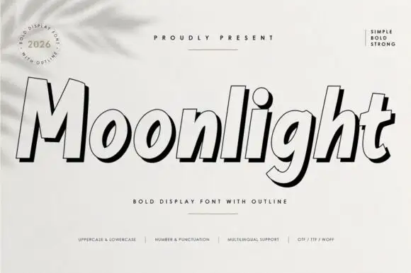
Heavy slanted display with outline
Moonlight is a forward-sloping heavy display in black on white: fat mixed-case letters drawn as a pale face with a bold contour and a black offset shadow, with a round badge at the upper left, a rule above the word and a row of tracked notes at the foot.
Ideas for this font
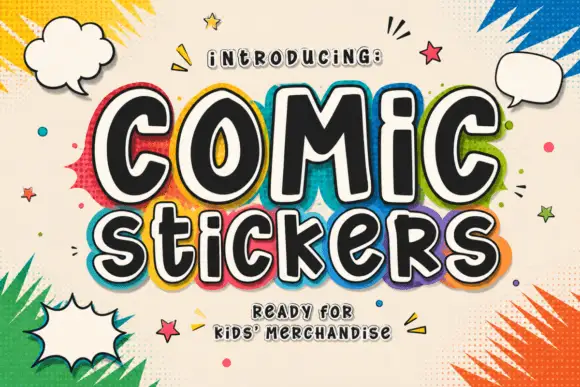
Soft irregular mixed-case lettering with thick faces and layered sticker-like edging
Comic Stickers combines tall COMiC forms with a lower mixed-case Stickers line, where rounded black faces with uneven widths and softly bent terminals are separated from bright offset borders by pale edging.
Ideas for this font
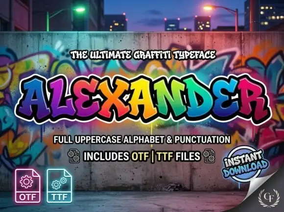
Heavy angular graffiti-like capitals with uneven baselines and layered outline styling
Alexander spreads broad coloured capitals across a graffiti-wall scene, where the letters lean in different directions with pointed corners and heavy curved sides, and multiple outlines stack behind the fills while gradients run through the wall behind.
Ideas for this font
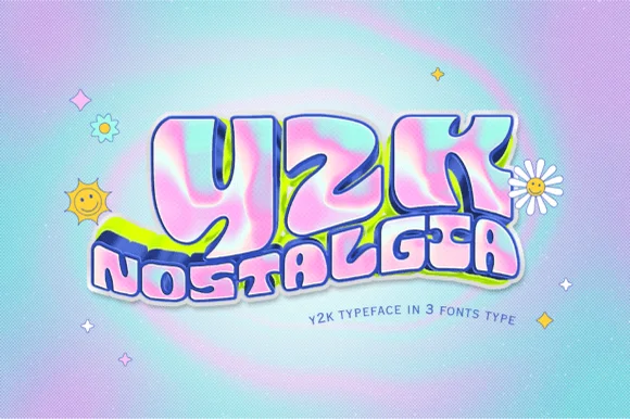
Inflated 2000s pop sticker with an outline
Y2k Nostalgia is an inflated display face in pink, blue and lilac on a gradient ground: bubble letters with a chrome sheen, a dark outline, a soft drop shadow and a white sticker border, stacked as a big lowercase word over a smaller one and sold in three styles.
Ideas for this font
Same independent foundry
Allow optional Google Analytics to measure visits and catalogue actions. Your search words and notes are not included. Privacy & storage