Neutral Sans Workhorse

Surubi + Monure
Lets Surubi own the focal silhouette while handling secondary copy, sizing and subheads cleanly.
Inspect Monure specimenDisclosure: MakerFileHub may earn a commission from qualifying purchases via paid links on this page. How our links work.
Cracked fragment display
Surubi is a cracked display in white on black: heavy caps built from separate fragments, with wide crack lines running through the bowls and stems and displaced pieces at the edges, set inside a thin rule frame with the file formats noted beneath.
Paid link
Get this fontProject & layout blueprintsAt-a-glance maker compatibility
Open counter bridges hold interior islands intact on laser-cut wood, acrylic, and mylar stencils.
Visual anatomy & craft review
The word is set once, wide, and each letter is broken into pieces: the cracks are gaps cut through the black shapes rather than lines drawn on top, so the letter reads as shattered material. The fragments stay aligned enough that the word remains legible at a distance, which is the discipline the face depends on. Because the gaps are structural, the face needs a large size and a plain background, and the specimen supplies both, with a single caption beneath in a light grotesque stating the formats. The frame is a thin rule inset from the edge, which gives the plate a poster format without competing with the lettering, and the palette is strictly two colours so the fractures read as form rather than texture.
Cracked, fragmented, brutal, modern
Two-font hierarchy recipes
Tested contrast partners — pairing Surubi with grounded secondary typography.
Surubi + Monure
Lets Surubi own the focal silhouette while handling secondary copy, sizing and subheads cleanly.
Inspect Monure specimen
Surubi + Evoire
Grounds bold display lettering with classic typographic authority on posters, badges and apparel.
Inspect Evoire specimenPractical applications
Concrete hierarchy, scale and production guidance tailored to Surubi’s stroke geometry.
A cracked display reads as broken material from across a venue, and the fragment structure holds on a screen print where a textured face would clog.
Hierarchy & layout recipe
A2 portrait: the band at 140 mm cap height, the line-up in a 14 mm sans, and the date at 28 mm. Keep 30 mm margins, print one colour on a dark ground, and keep the crack gaps above 5 mm so they survive the screen.
Pre-production check
Check the poster at five metres, where the fragments can read as print damage; keep the gaps uniform. Confirm the 14 mm line-up reads at two metres and that the date sits clear of the fractured letters.
A cracked title signals fracture before the book is opened, and the fragments hold at thumbnail size where a fine texture would turn to noise.
Hierarchy & layout recipe
Set the title at 90 mm cap height across 220 mm, the subtitle in a 12 pt sans, and the editor at 8 pt. Print white on a dark matte stock and keep the thin rule frame inset by 12 mm.
Pre-production check
Check the title at thumbnail size, where the gaps can blur the word; keep the fragments large. Confirm the 8 pt editor survives lamination and that the frame clears the trim.
A fragment display prints as one screen and looks deliberate rather than worn, which suits a workshop better than a distressed texture.
Hierarchy & layout recipe
Print a 260 mm chest graphic: the studio at 55 mm cap height, the year at 18 mm, and one ink on a light shirt. Keep the crack gaps at 4 mm so the mesh holds them and place the graphic 80 mm below the collar.
Pre-production check
Check the screen at actual mesh, where a 4 mm gap fills; widen it. Wash-test one shirt and confirm the year stays legible after five cycles.
Technical & licence verification
Confirm included OTF/TTF/WOFF formats, full glyph tables and licence coverage on the live store page before batch production.
Closest visual alternatives
Matched across letterform anatomy, stroke behaviour and craft applications.
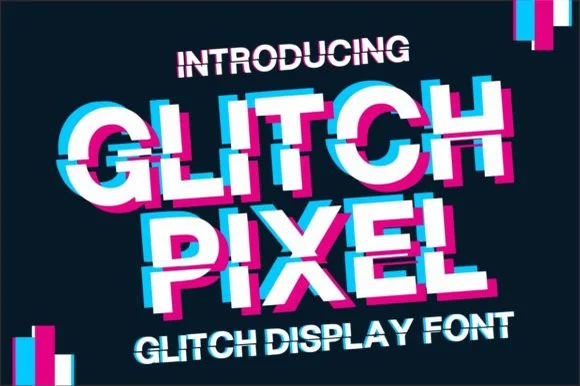
Sliced VHS scanline & RGB chromatic-aberration glitch sans
Glitch Pixel is a bold sans display font sliced horizontally by VHS tracking shifts for instant RGB cyan-and-magenta glitch titles!
Ideas for this font
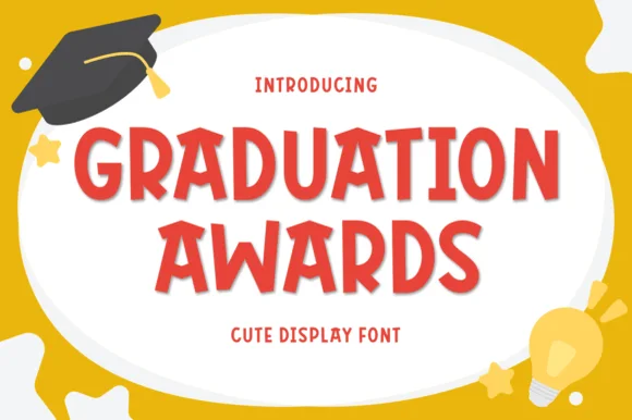
Playful bouncy cut-paper elementary display sans (Multilingual)
Graduation Awards is a sunny, bouncy cut-paper display sans (NOT a slab serif!) built for Pre-K/Kindergarten awards, stickers, and kid celebrations (Multilingual)!
Ideas for this font
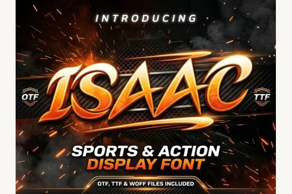
Slanted winged esports & motorsport action display
Isaac is an aggressive, forward-slanted sports display font featuring speed-sliced horizontal wings and razor-angled athletic geometry.
Ideas for this font
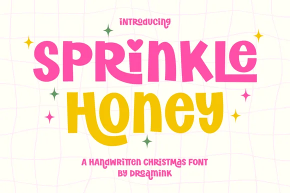
Chunky cut-paper kids' display with heart-dotted i (Year-round!)
Sprinkle Honey is a chunky, playful cut-paper display font with a sweet heart-dotted 'i'—zero Christmas icons attached so it shines all 12 months!
Ideas for this font
Same independent foundry
Allow optional Google Analytics to measure visits and catalogue actions. Your search words and notes are not included. Privacy & storage