 #1 · Best Overall
Disclosure: MakerFileHub may earn a commission from qualifying purchases via paid links on this page. How our links work.
Wavy baselines, bulbous bowls & 1970s warmth
31 Best Retro 70s & Groovy Fonts
The groovy look is a specific anatomy: bowl shapes that bulge past their vertical axis, baselines that rise and fall, and letter spacing that opens up rather than tightens. Wavy Retro and Meltypie work the liquid end, Tiki Tangle and Boho Retro bring the surf and psychedelic sides, and Moonberry Soda pushes the heart-shaped counter into cute territory. Malaka Cournt and Nash sit at the heaviest end, where the shapes read as pillows.
Quick verdict
Wavy Retro is the cleanest starting point for a branding job, Tiki Tangle suits hospitality and surf retail, and Meltypie is the pick for posters that want to look wet. Malaka Cournt carries the heaviest weight for merch.
Quick answer
Top 3 retro 70s & groovy picks right now.
Short on time? Start with our three highest-rated retro 70s & groovy standouts before scrolling the full breakdown.
#1 · Best Overall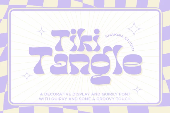 #2 · Runner-Up Pick
 #3 · Editor's Choice
How we tested & selected these 31 fonts
From 452 candidates we kept 31 that show genuine groovy construction rather than a rounded sans with a curve applied. Judged on baseline behaviour, counter integrity at small sizes, and whether the face holds up in a single-colour cut as well as in full-colour print.
Side-by-side summary
Top 5 retro 70s & groovy picks at a glance.
Compare specimens, OpenType/PUA traits and primary project roles side by side.
| Rank & Font | Style & File Specs | Best Project Fit | Store Listing |
|---|---|---|---|
| DisplayPUA encoded · Ligatures | A summer workshop poster | Get fontPaid link | |
| DisplayQuirky | Smoothie cup logo, beach tote HTV or summer market poster | Get fontPaid link | |
| DisplayLigatures · Alternates & swashes | Artisan pizza box, ice-cream pint & cookie-shop logo | Get fontPaid link | |
| DisplayPUA encoded · Ligatures | Retro festival ringer tee & iced-coffee glass wrap | Get fontPaid link | |
| DisplayAlternates & swashes · Language support · File formats | Boba cup decal, kawaii sticker shop logo or party tee | Get fontPaid link |
Display & Decorative Headlines
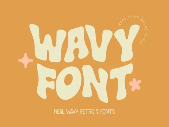
11 fonts#1 · Best OverallWavy Retro
Wavy Retro shows thick letters with curved outer edges and uneven tops, where the W spreads broadly, the O tilts and the T carries an exaggerated rightward arm, and the cream title sits on orange with almost no additional decoration.
The strokes stay thick, the sides bulge, the tops rise unevenly and the arms stretch sideways. That wave is the character: the word reads as a seventies sign rather than a straight cap row, which is why the sample keeps the type alone on orange. The cover advertises two fonts while only one direction is shown, so check the styles you hold, keep 44 pt so the bulges stay distinct and test the W against a long word. The bulges are the detail: below about 30 pt the swollen sides merge with the neighbouring letter and the row prints as a chain of bars. Keep the face at 44 pt, test the W against the longest word in the title, and check the second advertised style before you build a layout around it.
Recommended project & layout
A summer workshop poster — Use two roomy rows on a flat contrasting field with a plain date block.
Before you cut or print
Check row spacing around the tallest bulges and verify the chosen member.
Best paired with
Get fontPaid link
#2 · Runner-Up PickTiki Tangle
Tiki Tangle is a wavy retro display in which the letters bounce along a loose line, the curves flare at the terminals and the counters stay open, so a short phrase reads as a nineteen-sixties surf poster without any distress.
The T flares a wide top, the k splays two curved arms, the i dots small and round and the g drops a soft tail, all at a medium weight with smooth solid outlines and a bounce that shifts each letter a few points up or down. The clean vector edge is the character: there is no texture in the fill, which is why the sample sets a two-word phrase in one flat colour. Because the letters bounce, a long line needs deliberate leading from 30 pt, and the face cuts cleanly from three quarters of an inch of cap height. The wave illustration, the sun and the small caption are presentation; the groovy lettering is the face.
Recommended project & layout
Smoothie cup logo, beach tote HTV or summer market poster — Set in lilac, coral or seafoam green with generous breathing room.
Before you cut or print
Smooth solid contours cut cleanly on permanent vinyl and HTV.
Best paired with
Get fontPaid link
#3 · Editor's ChoiceMeltypie
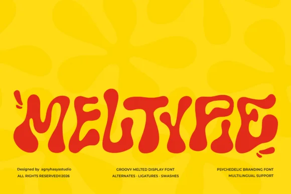
Meltypie is a bold, bottom-heavy psychedelic display typeface with liquid, syrup-like curves that swell and drip along the baseline.
Meltypie is a liquid melted psychedelic groovy display: letters drawn as soft blobs with stretched joins, drips hanging from the baseline and round terminals that sag under their own weight. It is the lettering of a seventies poster, and the drips are what make the word look poured rather than written. The drips are the finest element and they merge into neighbours as soon as the face is reduced. It needs roughly 40 mm for the drip and the blob to read, and it is best in two flat inks on coated stock where the edge stays crisp.
Recommended project & layout
Artisan pizza box, ice-cream pint & cookie-shop logo — Set a single 5-to-9-letter brand or treat name large across the center panel in high-contrast red, chocolate, or butter yellow, paired with a crisp grotesk subline.
Before you cut or print
Rounded, bulbous contours have no fragile sharp spurs, making Meltypie surprisingly easy to cut on bold sign vinyl and DTF shirt transfers.
Best paired with
Get fontPaid link
 #4 · Top Maker Utility
Boho Retro
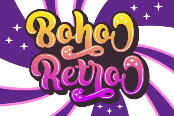
Boho Retro is a plump, heavy-looped 1970s groovy display script with curled swash caps and pillowy connected lowercase bowls.
Boho Retro is a swirled nineteen-seventies psychedelic bubble script-display: fat rounded letters that swell at the waist, joins drawn as spirals and terminals that curl back into the letter like smoke. It is a poster face, so it wants size, two flat inks and a pale ground rather than a busy photograph. The spirals are the finest element and they fill into solid blobs as soon as the face is reduced. It needs roughly 44 mm for the spiral and the swell to read, and it is best two warm flat inks on a light stock.
Recommended project & layout
Retro festival ringer tee & iced-coffee glass wrap — Stack a two-word phrase at a slight upward 6-degree angle and add a contoured offset shadow layer in Cricut or Illustrator if you want the sticker look.
Before you cut or print
Weld connected lowercase letters before cutting vinyl, and check the tight interior spiral holes inside 'B', 'o', and 'e' when weeding.
Best paired with
Get fontPaid link
 #5 · Standout Silhouette
Moonberry Soda
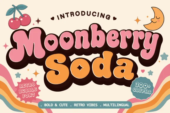
Moonberry Soda is a plump retro bubble display in which the round bowls hide heart-shaped counters, the silhouettes stay thick and soft and the alternates add playful variants, so a short word reads as a kawaii sticker.
The B closes two round bowls with a heart cut inside one, the o keeps a small heart counter, the S swells through a soft spine and the lowercase m sits low under round shoulders, all at a bubble weight with thick sticker-ready outlines. The heart counters are the character: they sit inside the letter rather than beside it, which is why the sample sets a two-word phrase with air around it. Because the hearts are small, the face wants 34 pt before they read and the alternates should be checked for the shapes a project prefers. The pastel ground and the small caption are presentation; the dark bubble letters are the face.
Recommended project & layout
Boba cup decal, kawaii sticker shop logo or party tee — Layer a deep brown drop-shadow offset behind pastel pink and orange fills.
Before you cut or print
Keep cut height above 1.2 inches on vinyl so the tiny heart counters weed cleanly.
Best paired with
Get fontPaid link
 #6
Malaka Cournt
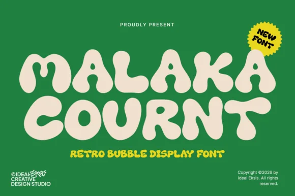
Malaka Cournt is an ultra-bold retro bubble display font sculpting wide, squishy 1970s letterforms with compressed teardrop counters.
Malaka Cournt is an ultra-heavy retro bubble display in caps with wide squishy 1970s letterforms, compressed teardrop counters and a low waistline that makes a word a mass of soft shapes. The counters are small, so the face needs roughly 35 mm to stay legible, and the weight is so heavy that it works best as a solid silhouette in one flat colour. It is a poster, packaging and apparel face, at its best in cream on a saturated ground or reversed out of a deep colour.
Recommended project & layout
Retro tennis/athletic club crewneck, tote & beer can — Stack 2 centered uppercase lines huge (68–125 pt) in cream puff HTV over forest green, navy, or brown.
Before you cut or print
Thick solid silhouettes weed in 5 seconds on Cricut HTV and vinyl down to 0.75 inches!
Best paired with
Get fontPaid link
 #7
Happy Grunge
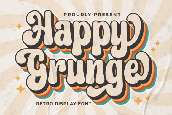
Happy Grunge is a clean, upbeat 1970s groovy bubble display font—smooth and rounded rather than distressed—with teardrop bowls and dancing stems.
Happy Grunge is a bouncy nineteen-seventies groovy soft-bubble display: fat rounded letters with a warm wobble across the baseline, a soft outline that separates the bubbles from a busy ground and a small heart or star tucked into one counter. The wobble grows the word vertically and the tucked shape closes first. It needs roughly 30 mm for the tucked shape and the outline to read, and it is best in two warm inks on cream, or one ink plus paper where the outline reads as a soft edge.
Recommended project & layout
Retro sunshine tote, festival sticker & kids' graphic tee — Duplicate 3 offset background layers in mustard, burnt orange, and teal behind cream foreground type for the classic 70s stack.
Before you cut or print
Solid vector edges weed smoothly down to 0.75 in; just pop out the small enclosed counters inside 'a', 'p', 'g', and 'e'.
Best paired with
Get fontPaid link
 #8
Nash
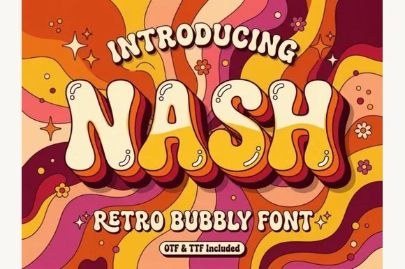
Nash is a cheerful 1970s psychedelic bubble display font swelling bottom-heavy groovy curves for retro shirts, posters, and mugs (OTF & TTF).
Nash is a 1970s psychedelic bubble display with bottom-heavy swells, groovy flower-power curves and a baked 3D extrusion in a second colour, so a word reads as a retro shirt transfer rather than a modern poster. The extrusion fixes the light direction and the swollen strokes keep it friendly at 26 mm, while the wide counters survive a single-colour print. It needs roughly 28 mm for the swell and shadow to read, and it is best in cream with mustard and burgundy on a warm ground.
Recommended project & layout
Retro roller-rink tee, groovy coffee wrap & tote bag — Center 1 uppercase word huge (84–170 pt) arched gently (+10%) with mustard + maroon 3D retro shadows.
Before you cut or print
100% smooth solid vector letters cut and weed in seconds on Cricut puff HTV, Oracal 651, and cardstock down to 0.65 in!
Best paired with
Get fontPaid link
 #9
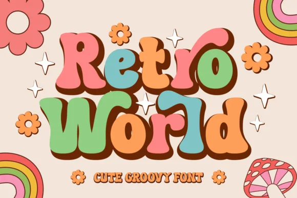
Retro World
Retro World is a curvy, bottom-heavy 1970s groovy display typeface with curled swash ears, teardrop lobes, and sunny flower-child bounce.
Retro World is a plump nineteen-seventies psychedelic bubble display: fat rounded letters built from overlapping flower petals, a wobbling baseline and a soft outline that separates the bubbles from the ground. The petals close the counters early and the outline is the finest element. It needs roughly 32 mm for the petal edge and the outline to read, and it is best in two warm inks on cream, or one burnt orange on white where the petal edges stay open.
Recommended project & layout
Groovy summer-camp tee, iced-coffee glass wrap & tote — Color individual letters in alternating muted retro tones (terracotta, sage, mustard, dusty pink) backed by a unified dark brown shadow.
Before you cut or print
Smooth, generous vector curves weed fast and cleanly on permanent cup vinyl and HTV down to 0.75 inches.
Best paired with
Get fontPaid link
 #10
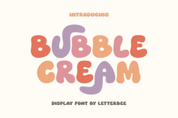
Bubble Cream
Bubble Cream is a sweet, organic rounded display font featuring playful stretched U/R tails and pillowy ice-cream-scoop curves.
Bubble Cream is a soft groovy ice-cream display: scoop-shaped letters with a rounded top, a thin outline, pastel fills and a small drip or swirl at the base of some characters. The scoops close their counters early and the swirls are the finest element, and the pastel palette means a one-ink print loses the idea. It needs roughly 30 mm for the swirl and the outline to read, and it is best in three pastels on white, or one ink plus bare paper for the swirl on coloured card.
Recommended project & layout
'Two Sweet' ice-cream party banner, sticker & kids' tee — Stack 2 centered words at 60–110 pt, coloring each letter in rotating sorbet pastels on warm cream.
Before you cut or print
100% smooth, thick, solid rounded shapes cut and weed in seconds on Cricut HTV, cardstock banners, and vinyl down to 0.65 in!
Best paired with
Get fontPaid link
 #11
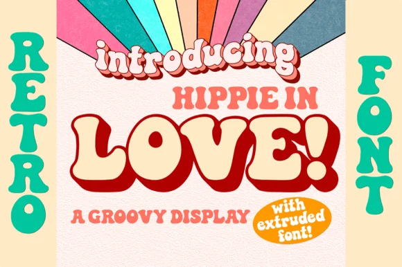
Hippie in Love
Hippie in Love is a chunky 1970s retro display family bundled with a dedicated Extruded shadow font for instant 3D poster lettering.
Hippie in Love is a nineteen-seventies bell-bottom display with a matched extruded cut: soft flared stems, a rounded shoulder, a small kick at the foot and a second shape that sits behind the letter as a solid extruded depth. The extrude is fixed to the skeleton, so the two cuts must keep the same spacing. It needs roughly 28 mm for the flare and the extrude edge to read, and it is best in two warm inks on cream, or one ink with the extrude left as bare paper on coloured card.
Recommended project & layout
Retro Valentine sweatshirt, Galentine mug & groovy card — Type your phrase in the Extruded font in deep maroon or chocolate brown, then layer the Regular font on top in warm cream.
Before you cut or print
Use the solid Regular font alone for super-clean single-layer HTV weeding, or Print-Then-Cut/DTF for two-tone 3D shirts.
Best paired with
Get fontPaid link
Serifs & Slab Serifs
4 fonts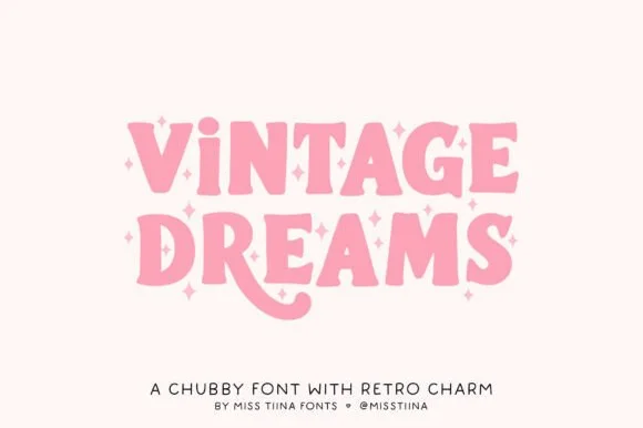 #12
Vintage Dreams
Vintage Dreams is a lovable, chubby 1970s display serif combining soft Cooper-Black curves, sparkle-star 'i' dots, and a swooping 'R' tail!
Vintage Dreams is a chubby nineteen-seventies Cooper-inspired serif with groovy swashes: fat rounded serifs, a soft bulbous weight and curled swashes that roll off the caps and the descenders, with a warm irregular baseline. The swashes widen the word considerably and the bulbs close the counters early. It needs roughly 30 mm for the bulb and the swash to read, and it is best in two warm inks on cream, or one burnt orange on white where the swash reads as a drawn line.
Recommended project & layout
Groovy iced-coffee glass wrap, retro sweatshirt & sticker — Stack 2 words at 60–110 pt, swapping uppercase 'I' for lowercase 'i' to trigger the cute star dot!
Before you cut or print
100% smooth, plump solid shapes cut and weed in seconds on Cricut Oracal 651, puff HTV, and cardstock down to 0.7 inches!
Best paired with
Get fontPaid link
 #13
Retro Kids
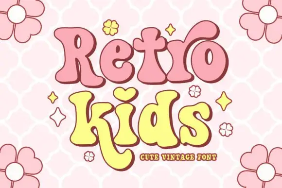
Retro Kids uses rounded heavy serif-like forms with uneven widths, where the i takes a heart for its dot, the k drops a long curved leg under the row, the two words sit in pink and yellow with a thick outline and the cover fills the field with outlined daisies.
The strokes stay heavy and soft, the feet round, the widths shift and one letter borrows a heart for a dot while another leg curves far below. That heart dot is the character, because it turns a plain vintage face into a children's mark with a single gesture. The daisies and stars are cover artwork. The source notes PUA-encoded extras and stylistic alternates, so check how the heart is reached and test the long k leg against your bottom margin before setting a two-row block.
Recommended project & layout
A playful birthday front — Leave space below the long letter leg.
Before you cut or print
Verify available alternates for the actual words.
Best paired with
Get fontPaid link
 #14
Dream to Berich Font
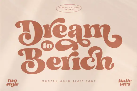
Dream to Berich shows orange mixed-case letters with thick rounded strokes and tight curved counters, where the large D and B capitals curl inward and a long loop fills the gap between the two title rows on a pale cover that advertises a two-style and an italic version in the corners.
The strokes stay thick, the counters squeeze tight, the capitals roll inward and one loop bridges the rows. That bridge is the character: the stack reads as a single ornament rather than two lines, which is why the sample keeps three words close together. The corner notes promise two styles and an italic without showing them. Keep 40 pt so the tight counters stay open, check whether the loop is a letter or an added flourish and confirm the italic file before planning a paired setting.
Recommended project & layout
A retro stationery-name study — Start with flat lettering and keep any large loop clear of descriptors.
Before you cut or print
Check name rights and exact alternate access.
Best paired with
Get fontPaid link
 #15
Kleyfo
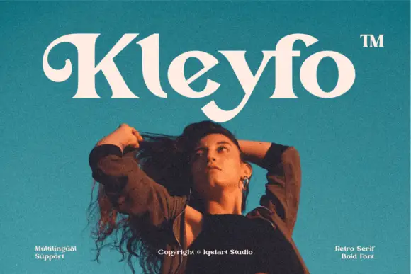
Kleyfo is a heavy retro serif in which the stems carry groovy weight, the K opens a long curled entry, the diagonals stay thick and the terminals sweep into small pointed joins, so a short name reads as a seventies boutique label.
The K lifts a curled entry stroke that travels above the cap line, the y drops a low rounded tail, the bowls stay broad against thick diagonals and the joins finish in small points rather than flat cuts. The curled entry is the character: it puts one flourish on the first letter and leaves the rest solid, which is why the sample sets a single name on a plain teal field. Because the swashes reach outside the letter, the face needs 34 pt in print and clean weeding from three quarters of an inch of cap height; the family carries accented Latin, so a name can keep its diacritics. The teal ground, the portrait and the small credit are presentation.
Recommended project & layout
A compact creative-studio name — Keep the K curl outside a plain service descriptor.
Before you cut or print
Check name rights and exact alternate access.
Best paired with
Get fontPaid link
Matched Font Duos & Packs
9 fonts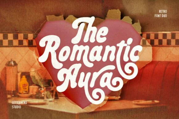 #16
Romantic Aura Duo
Romantic Aura Duo pairs a thick, velvety 1970s swash script with a clean companion voice for nostalgic love notes and merch.
Romantic Aura Duo pairs a nineteen-seventies swashed retro script with a rounded sans: the script runs a high-contrast stroke with wide swelling swashes that lift above and below the line, while the sans is a soft rounded block for details and lists. The pair is a period look, so it works best in two warm flat inks on a light ground rather than in photographic tints. The swash thins are the finest element and they break first. The script needs roughly 32 mm and the sans 20 mm for their detail to read.
Recommended project & layout
Retro Valentine sweatshirt, mug wrap & galentine card — Stack 2 to 3 centered words tightly inside a heart or arch silhouette so rising ascenders nest into the gaps of the line above.
Before you cut or print
Weld all overlapping script letters before cutting HTV, and keep total lockup width at 3.5 in+ so tight inner 'e' and 'a' counters weed cleanly.
Best paired with
Get fontPaid link
 #17
Simple Stacked
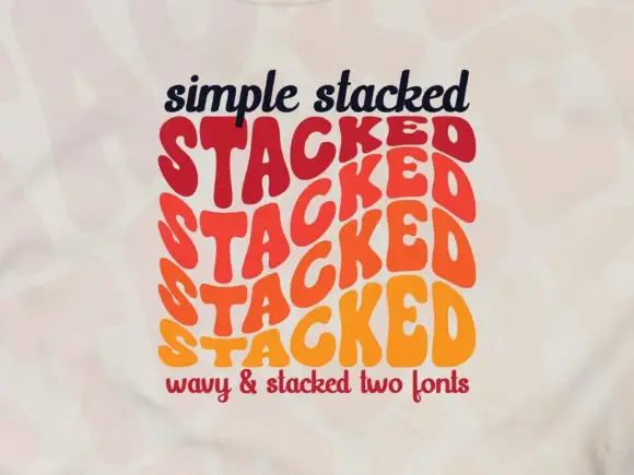
Simple Stacked is a wavy display in which rounded capitals repeat down three offset rows, each row bending and stretching the letters differently, so a short word reads as a rainbow of stacked script rather than a plain line.
The S pulls a broad curve, the A opens a narrow counter, the letters in the middle row stretch wider than the row above and the baseline of each row waves independently. The repetition is the character: it turns one word into a pattern, which is why the sample sets a single phrase three times over. Because the rows overlap, the face needs deliberate spacing between rows from 30 pt and reads best as a display block rather than as a line of text; a second word needs its own stack. The pale ground and the small caption are presentation; the wavy lettered rows are the face.
Recommended project & layout
A rhythm-themed poster — Reserve the centre for one verified stacked word and keep all event details outside the repeated rows.
Before you cut or print
Confirm how many rows one glyph or style actually generates.
Best paired with
Get fontPaid link
 #18
Vintage Postman
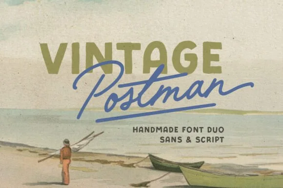
Vintage Postman pairs a sturdy retro sans with the look of a soft rubber stamp and a brisk monoline brush script: the olive sans holds a solid horizontal line while the angled script cuts across the baseline with a hand-signed slant.
The sans cut keeps even stems, softly rounded corners and a slightly uneven impression, and the script cut draws a monoline stroke at a steady width with a sharp slant and quick connectors. The pairing of a grounded row and an angled line is the character: one gives structure and the other gives motion, which is why the sample sets the olive words above the blue signature. Because the script slants, keep 18 mm between the rows and 20 mm at the right for the exit; the sans stays readable from 0.35 inches of pen height.
Recommended project & layout
Coffee bag label, travel poster or surf-shop tee — Set the geographical or brand noun in all-caps sans and overlap the descriptor in angled script.
Before you cut or print
Check light organic edge texture on the sans if cutting decals under 1.5 inches.
Best paired with
Get fontPaid link
 #19
Jaglend Font Duo
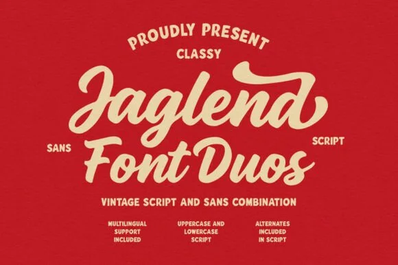
Jaglend Font Duo pairs a thick, creamy vintage sign-painter brush script with a sturdy, hand-drawn condensed uppercase sans companion.
Jaglend Font Duo pairs a retro sign-painter brush script with a rugged condensed sans: the script carries a loaded stroke with small flicks and connected letters on a firm slant and a shallow bounce, while the sans is narrow with uneven edges that read as a sanded board for lists and prices. The two voices share one palette, so a window, a price list and a card can be built from one family without a third face. The script's flicks are the finest element and they close first at small sizes, while the condensed sans stacks a long service list in a narrow panel without wrapping. The script needs roughly 24 mm and the condensed sans 18 mm for their detail to read.
Recommended project & layout
BBQ rub tin, craft soda label & barbershop window sign — Arch the sans uppercase header over a large slanted Jaglend Script centerpiece and anchor with tracked sans footers.
Before you cut or print
Broad solid brush strokes cut cleanly on HTV, sticker vinyl, and wood-sign stencils—weld script connections before cutting.
Best paired with
Get fontPaid link
 #20
Tropical Sunlight
Tropical Sunlight is a duo of a heavy retro script with broad loops and a rounded block sans, shown stacked so the script carries the name and the sans shouts the second line.
The script half is a fat connected hand whose capitals open into wide loops, whose joins carry the same weight as the stems and whose ends curl rather than taper, giving the word a painted-sign feel at any size above 30 pt. The sans half is a rounded block with no contrast, short caps and wide letterfit, and in the sample it is set larger than the script so the two lines balance as a single badge. A smaller italic line beneath shows how the pair handles a third register. The script's loops are what let it hold a wide measure without tracking, and the sans supplies the shout. The cream ground, the navy and orange inks, the small beach drawing and the credits are presentation; the duo is the lettering.
Recommended project & layout
A beach-day event heading — Place a short script line above one block title and move dates to a plain strip.
Before you cut or print
Check the top loop clears the preceding line and verify the two styles.
Best paired with
Get fontPaid link
 #21
Chicago Athlete
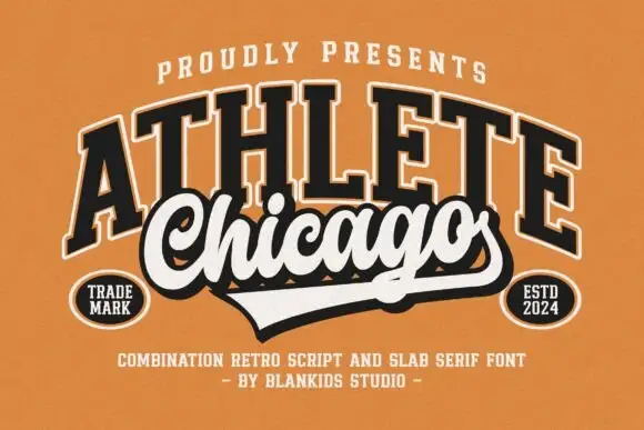
Chicago Athlete pairs a tall arched slab word with a thick flowing script below, where the script carries round loops and a long terminal that forms the lower edge of a badge.
The slabs stay tall and arched, the script thickens and flows, the loops close round and the final stroke flattens out to close the shape at the bottom. That shared edge is the character: the two members read as one badge rather than two lines, which is why the cover binds them with cream borders and shadows. The overlap is a designed lockup and not an automatic alignment, so build the arch and the edge yourself and check that any two words will actually meet that way.
Recommended project & layout
A neighbourhood club identity study — Keep the slab row above the script and allow the lower tail to define the badge edge.
Before you cut or print
Verify both supplied styles and confirm any club or location naming rights.
Best paired with
Get fontPaid link
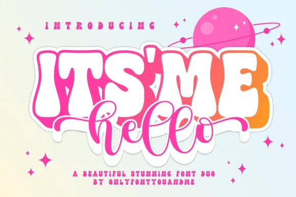 #22
Itsmehello Regular
Itsmehello Regular pairs a fat rounded seventies display face with a smooth monoline script, where the wide white caps sit as a background block with a soft outline and the connected cursive threads across their lower half in a flat pink.
The display row stays wide and inflated, the script stays one thin weight, the script crosses the caps rather than sitting below them, and the outline lifts the block off the pale ground. That crossing is the character, because the two voices occupy the same space and the eye reads one shape rather than two rows. The pink planet and the sparkles are cover artwork. Keep 46 pt for the caps, keep 22 pt for the script, and check that the script colour holds enough contrast over the pale caps.
Recommended project & layout
Small-shop thank-you card or sticker duo — Set the main punchword in chunky caps and overlap a short lowercase script accent below.
Before you cut or print
If layering HTV, slice/knockout the script shadow from the base bubble layer.
Best paired with
Get fontPaid link
 #23
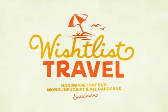
Wishlist Travel
Wishlist Travel pairs a lively, curl-tipped monoline cursive script with a sturdy, slightly bouncy uppercase rounded sans.
Wishlist Travel is a duo of a swashed retro monoline script and a bold rounded sans: the script runs an even stroke with joined letters and long swashes that curl off the first and last characters, while the sans is a heavy rounded block for badges and prices. The swashes need side clearance and are the first thing to be trimmed, and the monoline is the weaker element in print. The script needs roughly 24 mm and the bold sans 26 mm for their detail to read.
Recommended project & layout
Family vacation tee, beach-bag HTV & luggage tag — Top with a simple line-art palm or umbrella icon, set row one in curled script, and anchor row two in bold sans.
Before you cut or print
Medium-thick strokes on both fonts weed cleanly on HTV and tumbler vinyl down to 0.8 in—weld script joins first.
Best paired with
Get fontPaid link
 #24
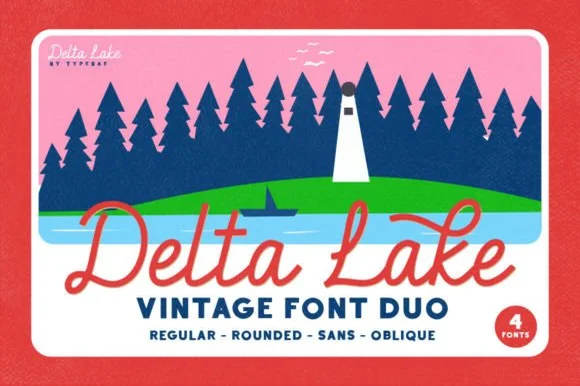
Delta Lake Font
Delta Lake Font is a 4-font vintage outdoor duo bundling matched Script (Regular & Rounded tails) and bold camp Sans (Regular & Oblique).
Delta Lake Font is a four-cut vintage national-park and lake-camp duo: a regular, a rounded, a sans and an oblique, all drawn on the same slightly inked skeleton with a small badge-friendly weight. The cuts share metrics so a line can mix a regular name with a sans caption, and the rounded cut is the softest of the four. It needs roughly 22 mm for the inked edge and the rounded terminal to read, and it is best in one deep green or brown on cream and buff stock, where the ink edge prints as a slightly worn rule.
Recommended project & layout
Lake-house boat towel, camp enamel mug & cabin sign — Set 'Lake [Name]' in coral or cream Delta Lake Script with side tails over tracked navy Delta Lake Sans below.
Before you cut or print
Both the sturdy monoline script and bold camp sans cut and weed super cleanly on HTV, boat vinyl, and wood stencils (weld script!).
Best paired with
Get fontPaid link
Scripts & Calligraphy
7 fonts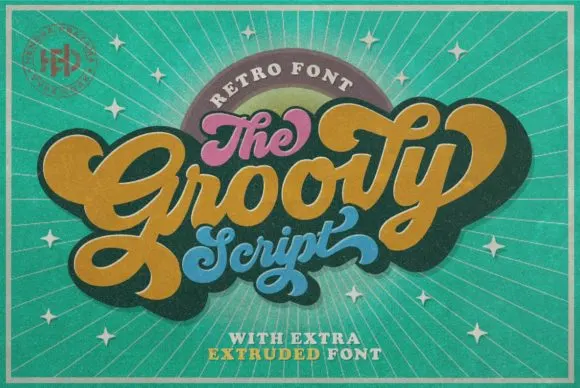 #25
Groovy
Groovy is a compact connected script drawn from late-sixties and seventies advertising, where the letters join in a rounded loop and the whole word keeps the squat, cheerful proportions of that period rather than the tall slant of a calligraphic hand.
The connectors stay visible, the x-height runs large against short ascenders and the curves close round rather than tapering into sharp exits. That squashed retro rhythm is the character: the word reads as a period advertisement rather than as a modern script, which is why the sample stays short and horizontal. Test the actual connectors in your own phrase before promising a long line, and keep 28 pt so the joins do not disappear on a small print. The connectors are the detail to test: a long phrase repeated at 28 pt turns the joins into a dotted line, so keep the sample short and check your own wording before the run.
Recommended project & layout
A seventies-themed birthday invite — Let a short retro party title rise across the upper card, with the honouree’s name below. Keep the date and address level and plain in a lower information block.
Before you cut or print
Check names, age and date together; leave essential details out of the decorative word shape.
Best paired with
Get fontPaid link
 #26
Vintage Melinda
Vintage Melinda is a creamy, thick-stroke retro brush script with dramatic curled swash capitals and sweeping baseline loops.
Vintage Melinda is a bold retro-romance brush script with curled swashes: a heavy loaded stroke, a shallow slant, connected letters and swashes that curl off the caps and descenders into a tight spiral. The spirals widen the word and are the finest element, and the loaded weight closes the loops early. It needs roughly 30 mm for the spiral and the brush edge to read, and it is best in one warm ink on cream, or a fine gold on a dark ground where the curls print as bright lines.
Recommended project & layout
Harvest market apparel, retro diner mug & fall tote — Stack a two-word vintage slogan at 4–8 inches wide, choosing one lower underline swash to anchor the bottom edge of the lockup.
Before you cut or print
Always weld connected letters before cutting, and check clearance between row one descenders ('g', 'y') and row two swash capitals.
Best paired with
Get fontPaid link
 #27
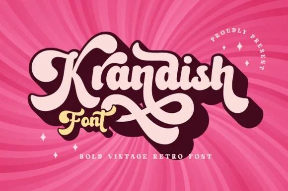
Krandish
Krandish is a heavy, cream-smooth 1970s retro script featuring dramatic looping swash capitals and thick figure-eight underline tails.
Krandish is a chunky nineteen-seventies retro brush script with swash tails: a very heavy loaded stroke, a firm slant and tails that extend straight off the first and last letters before curling up at the tip. The tails widen the word and are the first thing trimmed, and the heavy weight closes the counters early. It needs roughly 30 mm for the tail and the heavy stroke to read, and it is best in two warm inks on cream, or one burnt orange on white where the tails still read as drawn lines.
Recommended project & layout
Retro roller-skate tee, beach tote & iced-coffee wrap — Tilt a 1-to-2-word phrase upward 8 degrees and duplicate a dark offset layer behind it in Illustrator or Cricut for a 3D retro shadow.
Before you cut or print
Weld connected lowercase strokes into one path before cutting, and check the tight loops inside 'a', 'd', and 'o'.
Best paired with
Get fontPaid link
 #28
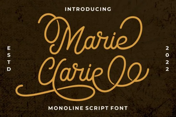
Marie Clarie
Marie Clarie is a smooth, medium-fine monoline script featuring oversized vintage ribbon loops on capitals and spiraled terminal flourishes.
Marie Clarie is a vintage neon-sign and badge monoline script: an even tubular stroke that reads as bent glass, joined letters, a shallow slant and a badge frame of concentric rules around the word with small dots at the corners. The monoline is what lets it work as a neon tube, and the badge rules are the finest element. It needs roughly 28 mm for the tube and the badge rule to read, and it is best as a one-colour neon or vinyl job, or a flat two-colour print on a dark ground.
Recommended project & layout
LED neon wall-sign mockup, salon logo & vintage jacket — Stack a two-word name tightly so the sweeping lower loop of the second capital nests beneath the first word.
Before you cut or print
Consistent monoline thickness cuts far cleaner on HTV and vinyl than high-contrast scripts—just weld all overlapping loops first.
Best paired with
Get fontPaid link
 #29
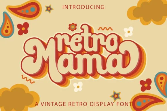
Retro Mama
Retro Mama is a plump, connected 1970s marshmallow script featuring bulbous heart-cleft M arches and sweeping wrap-around swash loops.
Retro Mama is a groovy connected marshmallow script: fat rounded letters that join in one thick ribbon, a lazy baseline that rises and dips, and swash loops that rise off the caps into a wide arc. The weight is the character, so it closes the counters early, and the swash loops grow the word vertically. It needs roughly 28 mm for the swash arc and the marshmallow join to read, and it is best in two warm inks on cream, or one saturated colour on white where the thick stroke stays solid.
Recommended project & layout
Mother's Day 'Cool Mama' sweatshirt, glass can & car decal — Nestle smaller lowercase 'retro' or 'cool' right into the top valley of the big swashed 'Mama' line below.
Before you cut or print
Fat, smooth single-piece strokes weed like a dream on puff HTV, matte vinyl, and embroidery appliqué—weld all cursive joins first!
Best paired with
Get fontPaid link
 #30
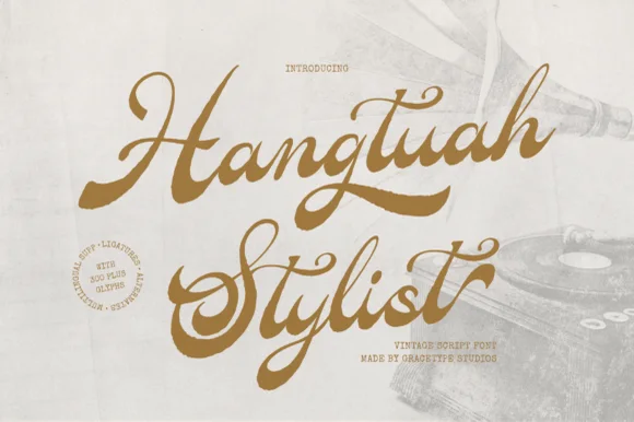
Hangtuah
Hangtuah is a thick, slanted vintage sign-painter script featuring bold brush strokes, dynamic swash capitals, and retro underline tails.
Hangtuah is a bold retro sign-painter brush script with underline swashes: a heavy loaded stroke, a firm slant, connected letters and thick underline swashes that run beneath the word and turn up at the end. The underlines are the design and they fix the block's width, and the brush edge is the finest element. It needs roughly 30 mm for the underline and the brush edge to read, and it is best in one dense ink on a sanded board, or a flat two-colour print on uncoated stock.
Recommended project & layout
Barbershop window decal, Moto apparel & coffee tin — Angle a 1-to-2-word brand name upward 7 degrees and anchor the empty lower-right space with a tapered underline tail alternate.
Before you cut or print
Weld all overlapping brush joins before cutting HTV or gold metallic sign vinyl; thick strokes weed smoothly at 1.2 in+.
Best paired with
Get fontPaid link
 #31
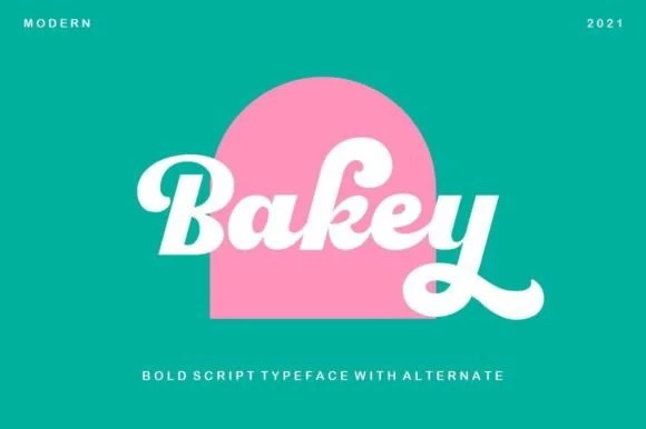
Bakey
Bakey is a bold, upright 1960s/70s packaging script with thick syrupy downstrokes, plump bowls, and upturned retro tails.
Bakey is a heavy 1960s bakery and packaging script: fat brush-drawn letters with a high x-height, joins that thicken through the middle of a word and a set of looped ascenders that keep the line from looking mechanical. It is the lettering of a bakery bag and a window board rather than a modern logo, so it works best large and in one warm ink. The loops are the finest element and they close into a solid block as soon as the face is reduced. It needs roughly 30 mm for the stroke and the loop to read, and it is best on uncoated kraft or white board.
Recommended project & layout
Artisan donut box, pastry seal & milkshake cup logo — Center a single 4-to-7-letter brand name inside an arch or circle badge at 48–72 pt above small tracked sans taglines.
Before you cut or print
Thick letter bodies and rounded ends make Bakey super reliable for adhesive window decals, mug vinyl, and garment HTV.
Best paired with
Get fontPaid link
Practical buyer checklist
Frequently asked questions.
Key cutting, printing and pairing answers before choosing a retro 70s & groovy typeface.
How do I keep 1970s lettering from looking like a costume?
Use one groovy element per layout and keep everything else modern: a plain grid, a limited palette and a neutral body face. When headline, colours, borders and imagery all reference the same decade, the design reads as a theme party.
Can groovy fonts be cut into vinyl cleanly?
Yes if the bulges are thick. The narrow points appear where two round shapes meet, so check the waist between letters such as oo or ee. Above 2 inches the cuts are reliable; below 1 inch the round forms turn into dots.
What colours work with this style in print?
Warm earth tones, mustard, rust and avocado have become shorthand, but the shapes also work in a two-colour spot job with a cream stock. Limiting to two inks keeps the reference readable without turning it into nostalgia wallpaper.
Are these fonts usable for a logo that has to last?
Only if the lettering is redrawn rather than typeset. A groovy display face dates a mark within a decade, so treat it as a starting sketch and have the final wordmark customised, or accept the period look as the brand's whole personality.
Keep exploring
Related collections & guides.
Explore adjacent maker roundups or check our practical pre-production checklists.

01 / Type Styles
Cute bubble & kawaii
30 curated fonts · Previews & pairings


02 / Cricut & Craft
T-shirts, hoodies & HTV apparel
33 curated fonts · Previews & pairings


03 / Cricut & Craft
Coffee mugs, glass cans & barware
25 curated fonts · Previews & pairings
04 / Type Styles
Boho, earthy & botanical
24 curated fonts · Previews & pairings
Guides: Invitation font checklist · Vinyl & cutting checklist · How to pair script & sans fonts