 #1 · Best Overall
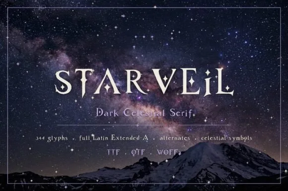
Starveil
Dark celestial serif with crescent moons & stars (344 glyphs, OTF/TTF/WOFF2)
Get fontPaid link
Read review ↓Disclosure: MakerFileHub may earn a commission from qualifying purchases via paid links on this page. How our links work.
Medieval serifs, blade spurs & celestial gothic
A romantasy cover is read as a thumbnail first, which makes silhouette and contrast more important than ornament. Starveil and Ravenmoor build a dark celestial mood, Vorgraven and Thurvane add carved and blade-spurred weight, and History of Miracles and The Quironax keep the romantic swash side of the genre. Blades of Fortunes handles the heroic sword-flare look that dominates epic fantasy.
Quick verdict
Starveil is the strongest thumbnail for a romantasy series, Vorgraven covers the carved medieval register, and Blades of Fortunes is the epic fantasy statement. The Quironax is the pick for a romantic, swash-driven cover.
Quick answer
Short on time? Start with our three highest-rated romantasy, medieval & book covers standouts before scrolling the full breakdown.
#1 · Best OverallDark celestial serif with crescent moons & stars (344 glyphs, OTF/TTF/WOFF2)
 #2 · Runner-Up Pick
 #3 · Editor's Choice
Elegant display serif with large ornamental swashes
We kept 21 of 346 candidates after testing each at 200 px width, the size of a storefront thumbnail. Weighted contrast at that scale, whether ornament survives compression, and how the face behaves across a three-book series where the silhouette must stay consistent.
Side-by-side summary
Compare specimens, OpenType/PUA traits and primary project roles side by side.
| Rank & Font | Style & File Specs | Best Project Fit | Store Listing |
|---|---|---|---|
| SerifAlternates & swashes | Romantasy book cover, astrology app/site & tarot deck | Get fontPaid link | |
| SerifAlternates & swashes | Epic fantasy trilogy cover, RPG rulebook & lore map | Get fontPaid link | |
| SerifLigatures · Alternates & swashes · Language support | Romantic novel cover, wedding menu or candle label | Get fontPaid link | |
| SerifFile formats | Imperial stout bottle label, gothic novel or apothecary box | Get fontPaid link | |
| SerifTabletop-RPG | Dragon birthday banner, tabletop RPG campaign cover or dice-bag HTV | Get fontPaid link |
#1 · Best OverallStarveil is a dark celestial display serif (344 glyphs, Latin Extended-A, TTF/OTF/WOFF2) embedding crescent moons and star sparkles into flared stems.
Starveil is a dark celestial serif with crescent moons and stars built into the glyph set: fine-bracketed serifs, a firm stem, crescents that replace the dots and tittles and small four-point stars on the diagonals, across a large multilingual glyph set supplied as OTF, TTF and WOFF2. The crescents are the finest element and the stars are what closes first. It needs roughly 30 mm for the crescent and the star to read, and it is best in one silver on black or a deep ink on cream, and it holds up on screen at 14 px where the crescents become plain dots.
Romantasy book cover, astrology app/site & tarot deck — Center all-caps titles at 54–96 pt with +20 tracking in silver foil or white over midnight nebula/mountain photography.
Fine crescent-moon notches and star dots belong in print, foil stamping, and web headers—not small blade-cut vinyl.
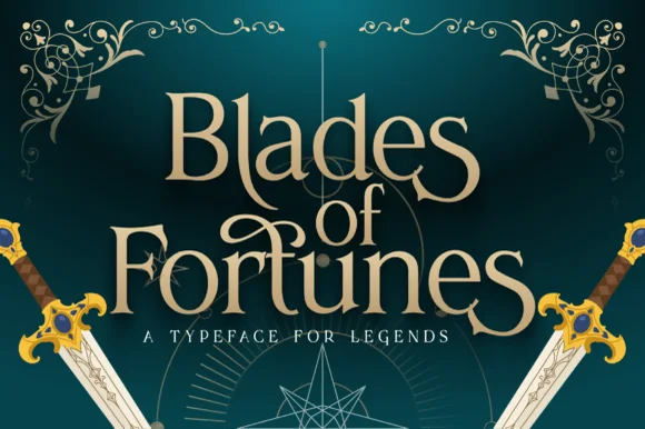
#2 · Runner-Up PickBlades of Fortunes is a sculpted epic-fantasy display serif featuring sword-hilted crossbars, sweeping swash loops, and sharp triangular terminals.
Blades of Fortunes is a heroic fantasy display serif in which the serifs flare into sword blades: heavy bracketed stems, flared blade terminals with a centre fuller, a tall cap height and a sharp bevel where the blade meets the stem. The blade flare widens the word, and the fuller is the finest element. It needs roughly 32 mm for the fuller and the flare to read, and it is best in one metallic on a dark ground, or a single dense ink on stone-grey stock where the bevel prints as a highlight.
Epic fantasy trilogy cover, RPG rulebook & lore map — Stack 3 centered lines ('Blades / of / Fortunes') with smaller tucked 'of' in the center pocket above tracked Roman caps.
Solid stroke bodies with crisp sharp serifs print and foil-stamp cleanly, and even cut on 1.5 in+ decal vinyl!
#3 · Editor's ChoiceHistory of Miracles is an elegant display serif in which the stems carry fine serifs and large drawn swashes swing out from several letters, so a two-word title reads as an engraved certificate head.
The H sets two tall stems with a fine bar, the i carries a light dot, the s holds a swash spine, the t spreads a curled arm, the o stays a wide ring and the y drops a long tail, all at a moderate contrast with fine serifs and swashes drawn from the first and last letters, plus a set of italic alternates. The swashes are the character: they take up as much space as the letters, which is why the sample sets two stacked words with a large gap above and below. Because the swashes are thin, the face needs 36 pt upward and a smooth ground, and it prints best in one flat colour. The dark teal sky, the planet, the small badge and the caption beneath are presentation; the yellow display words are the face.
Romantic novel cover, wedding menu or candle label — Set Title Case headlines at 30pt+ and use the plain italic for subtitles.
Includes Regular and Italic; best for print, foil and digital layouts.
 #4 · Top Maker Utility
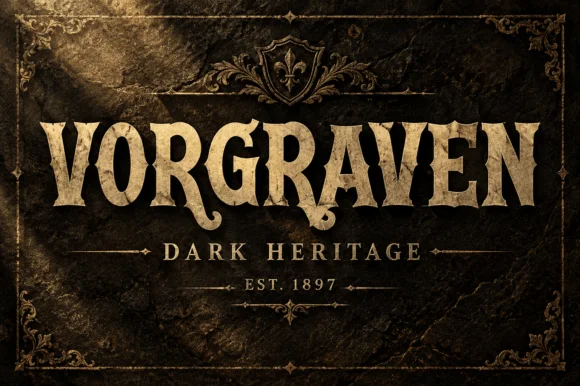
Vorgraven is a heritage serif in which the stems carry gothic spurs, the bowls are cut square and the feet flare into heavy slabs, so a word reads as lettering carved into stone.
The V opens with two spurred stems, the O closes a squared counter, the G carries a straight bar and a spur, and the R holds a heavy bowl and a straight leg, all at a heavy even weight with flat tops and unbracketed slabs. The spurs are the character: short cuts project from the stems at an angle and catch the light like chiselled edges, which is what gives the face its monument register. The fit is tight, so a single word builds a solid block at 60 pt on a label or a sign, and the counters stay open at display sizes. Because the weight is uniform and the edges are flat, the face reproduces well in foil and in deboss. The dark stone, the gold frame, the crest, the thin rules and the two caption lines are presentation; the typeface is the word.
Imperial stout bottle label, gothic novel or apothecary box — Centre above a thin ornamental divider and tracked serif date line.
Solid crisp shapes cut well at 2"+ on vinyl signs and print richly in metallic ink.
 #5 · Standout Silhouette
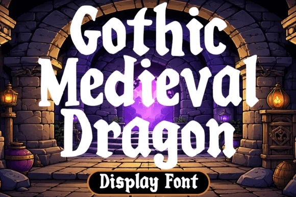
Gothic Medieval Dragon is a chunky fantasy serif in which the serifs wedge out round, the lowercase bowls stay heavy and the contrast stays low, so a game-night title reads as friendly storybook lettering rather than as black-metal type.
The G carries a rounded wedge foot, the o closes a fat bowl, the n turns two broad arches and the r keeps a short heavy arm, all at a display weight with soft serifs and barely any contrast between thick and thin. The low contrast is the character: it stays readable on a busy illustration, which is why the sample sets a two-word title over a scene. Because the strokes are fat, the face holds from 28 pt and cuts from three quarters of an inch of cap height without losing its wedges. The dragon, the parchment texture and the small caption are presentation; the heavy title words are the face.
Dragon birthday banner, tabletop RPG campaign cover or dice-bag HTV — Add a heavy black outline around parchment-white or gold letter fills.
Thick smooth serifs make this fantasy pick genuinely vinyl- and HTV-friendly!
 #6
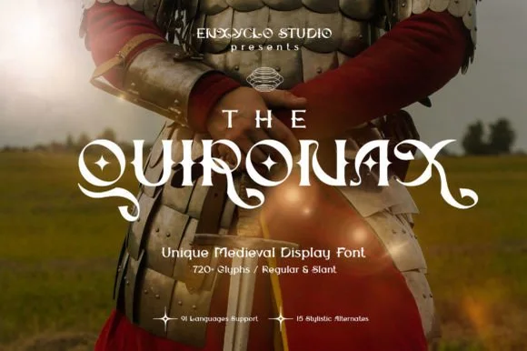
The Quironax is a richly detailed medieval display serif equipped with 720+ glyphs, Regular and Slant cuts, and 15 stylistic alternate sets.
The Quironax is a swashed medieval and romantasy display serif in a regular and a slant: heavy bracketed stems with worn edges, small spike serifs on the diagonals, swash capitals that curl over the following letter and a slight forward lean in the slant cut. The spikes and the swashes are the finest elements and both close first. It needs roughly 32 mm for the spike and the swash to read, and it is best in one fine metallic on a dark ground, or a dense ink on parchment-toned stock.
Romantasy book cover, D&D campaign map & RPG title — Center the main title at 54–84 pt with +20 tracking and set 'THE' or series numerals small and wide-tracked above.
Fine tapered swash tips shine on printed book covers, foil editions, and digital banners rather than small cut vinyl.
 #7
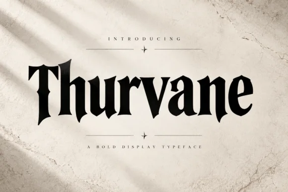
Thurvane is a bold hybrid gothic-wedge serif merging heavy Roman readability with sharp medieval diamond spurs and blade hooks (OTF).
Thurvane is a heavy gothic-wedge serif that fuses Roman readability with medieval diamond spurs, blade hooks on the terminals and a dropped T spur. The stems are massive and the strokes nearly uniform, so the face reads as carved rather than calligraphic, and the wedge serifs give it a stonemason's geometry. It holds at 14 pt in print because the counters stay open, which is unusual for this weight, and it looks correct on labels, menus and covers where authority matters more than warmth. Small caps would be a natural companion but are not implied.
Craft distillery bottle, steakhouse menu & leather-patch cap — Center 1 bold title-case word at 60–110 pt in matte black on natural textured cotton paper.
Thick, clean, solid single-layer shapes cut and weed fast on Cricut HTV, sign vinyl, and wood stencils down to 0.8 in!
 #8
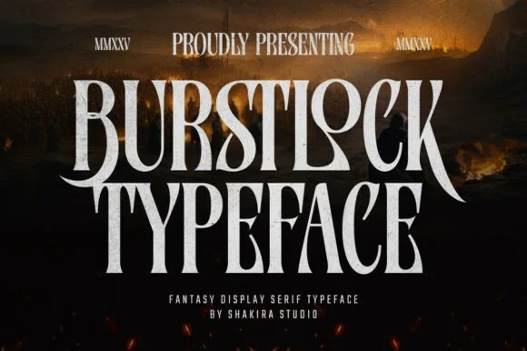
Burstlock is a dramatic, tall condensed fantasy serif whipping sweeping sword-blade legs off 'R' and 'K' for game titles and dark-fantasy covers!
Burstlock is a tall condensed fantasy serif that whips sweeping sword-blade legs off the R and K and thins into razor wing terminals, so a word reads as a game title rather than a book heading. The blades extend past the letter body in both directions, which grows the artwork box, and the condensed stance fits a long title in one column. It needs roughly 32 mm for the blades to read as deliberate, and it is best in bone white on a dark ground or in a single warm ink on a pale one.
Dark-fantasy / romantasy novel cover, RPG title & poster — Stack 2 tall uppercase lines centered at 80–165 pt flanked by Roman numerals ('MMXXVI') above.
Solid single-layer vector letters cut cleanly on 1.1 in+ Cricut HTV and vinyl—use tweezers on the sharp winged 'R/K' tips!
 #9
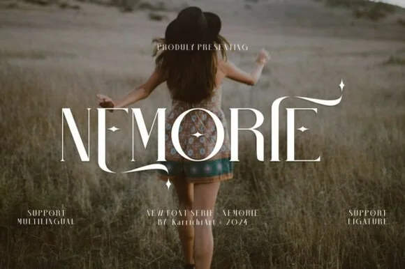
Nemorie is a refined high-contrast display serif featuring sweeping scythe-like swash bars, sculpted ligatures, and four-point star accents.
Nemorie is a high-contrast art-nouveau serif with celestial ligatures: a thin-thick stroke with hairline hairlines, tall whipped ascenders that rise into a small star or comet tail and ligature pairs that knit two letters into one drawn shape. The hairlines are the design and the first thing to break on textured stock, and the ligatures change the word's width as they engage. It needs roughly 28 mm for the hairline and the comet tail to read, and it is best in one fine ink on smooth or coated stock, or a foil impression above 40 pt where the hairlines still carry.
Fantasy novel cover, tarot guidebook & poetry anthology — Center 1-word titles at 56–90 pt with +15 tracking over moody photography, keeping author names clean below.
Ultra-fine hairlines require book printing, foil stamping, or high-res digital covers rather than small cut vinyl.
 #10
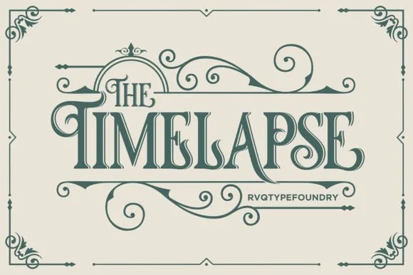
Timelapse is an ornate Victorian display serif crowned with spiraling vine swashes, teardrop terminals, and vintage apothecary charm.
Timelapse is a Victorian storybook and apothecary display serif with swashes: fine bracketed serifs against heavy stems, a small ball terminal on the diagonals, swash capitals that curl off the first letter and a slightly condensed width that keeps a long label on one line. The hairlines are the design and the swashes need side clearance. It needs roughly 30 mm for the swash and the hairline to read, and it is best in one fine ink on smooth or coated stock, or a foil impression above 40 pt where the curls still turn.
Steampunk or historical novel cover, tea tin & poster — Center 1-to-2-word uppercase titles at 48–72 pt, activating upper flourishes on left initials and lower curls on middle/right stems.
Fine spiral tendrils and thin serif crossbars belong in print, foil, or laser wood engraving rather than small cut vinyl.
 #11
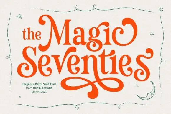
Magic Seventie shows orange serif lettering with heavy curved sides and pointed joins, where large curled initials frame the two-row title and a long figure-eight extension drops below the words, while thin green stars, a moon and a wavy border surround the name.
The sides stay heavy, the joins point, the initials curl and one tail draws a figure eight under the row. That extension is the character: a period serif gains a poster flourish, which is why the sample stacks two rows above it. The stars, moon and border are separate drawings, so plan 26 mm beneath the tail, keep 36 pt and check that the curl is a supplied character rather than cover art. The figure-eight tail is the detail that fails: it needs 26 mm of clear ground beneath the row, and the curl has to be a supplied character rather than cover art before a poster can rely on it.
A retro-party invitation title — Reserve a broad lower margin for one verified figure-eight swash.
Proof the phrase and clear separate stars.
 #12
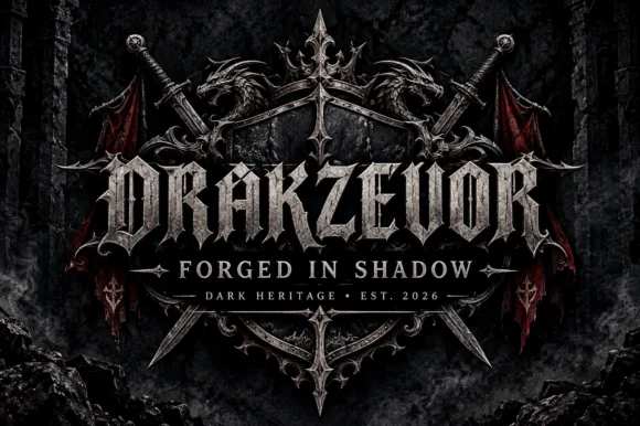
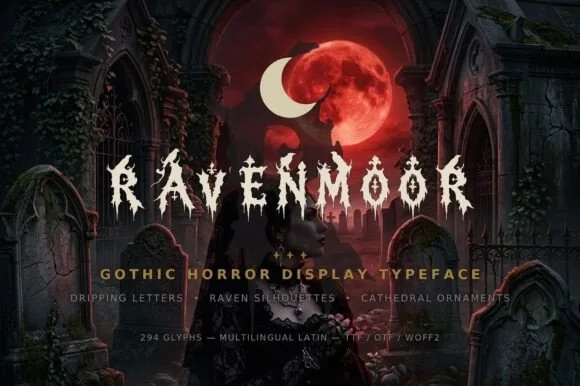
Ravenmoor is a gothic horror display in bone white on a crimson moonlit graveyard: jagged stems, drips falling from every baseline, points that extend into long spikes, with a tracked subtitle and a specification line beneath in small caps.
The word is set once, wide, and each letter is drawn with a broken silhouette: the stems carry spikes, the joins carry thorns, and the drips fall from the baseline at irregular lengths, which turns the words into an image of the scene behind them. Because the drips and spikes are structural, the face needs a large size and a dark ground, and the specimen supplies both with a graveyard scene under a red moon. The tracked subtitle and the specification line beneath sit in small caps with ornaments between them, which is how this kind of product lists its features, and the type there stays calm so the display keeps the weight. The palette is bone on crimson, and the ornament set mentioned in the copy is not shown, which is honest enough for a sheet this size.
Haunted-manor invite, gothic candle label & Poe book jacket — Center all-caps titles at 54–96 pt in bone-white or crimson over dark graveyard/moonlit art, tracked at +15.
Tiny perched ravens and fine drip tips require print, web (WOFF2 included!), or DTF—do not weed small cut vinyl.
 #13
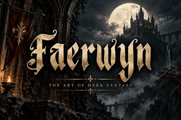
Faerwyn is a mystical dark-fantasy blackletter blending sharp medieval broad-nib calligraphy with sweeping elven ascender curls.
Faerwyn is a dark-fantasy blackletter that mixes sharp medieval broad-nib calligraphy with elven ascender curls and tapered blade descenders, so a word reads as a name from a fantasy map rather than a gothic poster. The curls extend above the x-height and the blades taper below, which means the artwork box grows vertically, and the dense stems need size. It needs roughly 32 mm for the curls and blades to read, and it is best in tarnished gold on a dark ground or in one ink on parchment cream.
Romantasy / RPG novel cover, D&D campaign guide & dice box — Set 1 title-case fantasy name huge (72–140 pt) above wide-tracked serif subheaders ('THE ART OF DARK FANTASY').
Solid broad-nib strokes laser-engrave cleanly onto wooden dice trays and print richly in metallic gold foil or DTF!
 #14
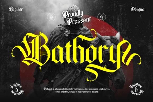
Bathory is a lush, handmade medieval blackletter family (Regular & Oblique) featuring double-barred capitals and sweeping flame-curled descenders.
Bathory is an ornate medieval blackletter family with a dense texture, sharp diamond terminals, hairline connecting strokes and a Regular plus an Oblique for emphasis. The oblique slants the whole texture, which is the only italic this family offers, and the hairlines are its weakest part in print. It needs roughly 30 mm for the diamond terminals to read, and it is best in one black on cream or a single dark red on parchment tones, never reversed at small sizes.
Epic fantasy cover, heavy-metal vinyl jacket & RPG rulebook — Set single-word titles in title case at 64–110 pt in gold or crimson over dark chiaroscuro artwork.
Fine interior double-bars inside capitals call for print, foil, or DTF transfers rather than small blade-weeded vinyl.
 #15
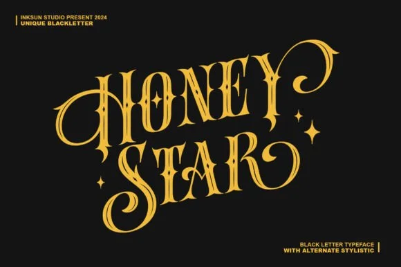
Honey Star is a whimsical, medium-bold ornamental blackletter blending diamond gothic stems with sweeping celestial spiral curls.
Honey Star is a Victorian ornamental blackletter crossed with psychedelic swashes: dense broken strokes with a heavy vertical rhythm, split serifs that curl into long spiral tails, small stars set into the counters and a warm wobble across the baseline. The spirals and the stars are the finest elements and both close first. It needs roughly 34 mm for the spiral and the star to read, and it is best in two warm inks on cream, or one dense ink on white where the spirals print as drawn lines.
Celestial tarot box, apothecary candle & spooky-season mug — Center a 2-word title in metallic gold over midnight black or deep plum, flanking outer curls with minimal star marks.
Main stems have decent body, while outer spiral tips taper fine—favor gold foil, sublimation, or 1.8 in+ vinyl decals.
 #16
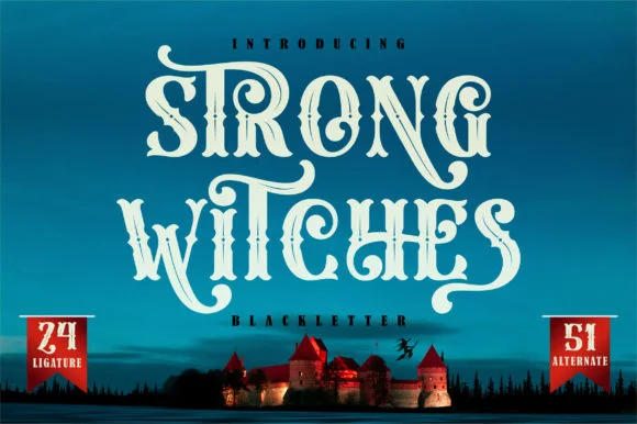
Strong Witches is a lively, fairytale-gothic blackletter softened by bouncy curled swashes, 24 ligatures, and 51 stylistic alternates.
Strong Witches is a playful curly-swashed fantasy blackletter with twenty-four ligatures and fifty-one alternates: dense broken strokes with a light rhythm, curls that sprout off the shoulders and a swash set that turns a plain word into a drawn spell. The alternates only appear through specific keystrokes, and the curls are the finest element. It needs roughly 32 mm for the curl and the ligature to read, and it is best in two flat inks on cream, or one dense ink on white where the curls print as drawn lines.
Hocus-Pocus party shirt, potion jar label & spellbook prop — Stack 2 centered words at 48–68 pt and swap in 2 or 3 of the 51 PUA alternates on outer capitals and descenders.
Sturdy main stems cut well on HTV and vinyl at 1.4 inches+ tall; take care around the narrower curled tail hooks when weeding.
 #17
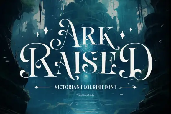
Ark Raised shows white narrow capitals in two rows over a dark blue architectural scene, where large curling A and R entries flank the title, hooked feet and rounded inward terminals interrupt the tall upright stems and star marks plus arrow-like rules sit beneath.
The stems stay narrow and tall, the entries curl far to the left, the feet hook and the terminals round inward at several points. That flanking curl is the character: the title is wider than its letters because of the entries, which is why the cover leaves dark space on both sides. The scene, the stars and the arrow rules are artwork. Keep 48 pt so the curls stay open, allow 30 mm at each flank and check the hooked feet against the trim before printing.
An original fantasy-story title — Keep large curls inside a clean title zone above plain author credits.
Proof exact letters and clear original scene artwork.
 #18
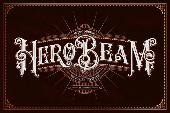
Hero Beam is an elaborate Victorian poster typeface dressed with interior inline filigree, curled spurs, and crisp drop-contour framing.
Hero Beam is a three-dimensional Victorian saloon and tattoo blackletter: a dense gothic body with a bevel that shades the left edge, a bright highlight ridge along the stem and a drop shadow that sits under the letter. The shading is the whole character, so it needs size to read as a solid beam rather than a smudge, and the highlight is the finest element. It needs roughly 36 mm for the bevel and the highlight to read, and it is best as a paper-colour build on dark stock, or one metallic ink with the highlight left as unprinted paper at 50 mm and above.
Craft root-beer bottle, barber-parlor mirror & cigar box — Arc or center a single bold brand title at large scale (56–84 pt) over dark mahogany, navy, or black label panels.
Contains intricate interior filigree lines—produce via high-res label printing, DTF, or laser engraving rather than blade-cut vinyl.
 #19
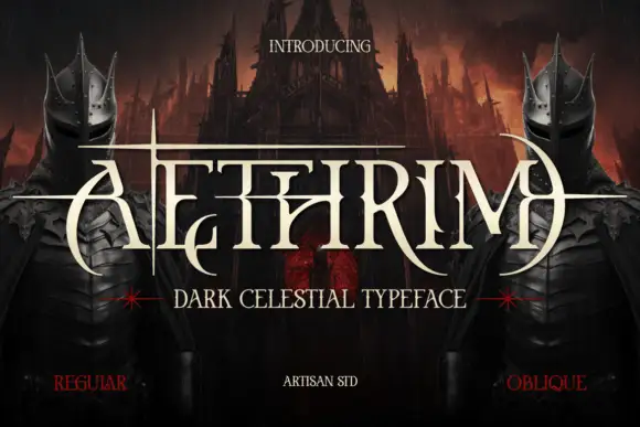
Aethrim has high-contrast upright capitals with fine pointed cross-strokes and sweeping crescent-like curves, and long horizontal extensions cut across the title near cap height while armoured figures and a dark castle frame the word.
The uprights stay tall, the cross-strokes narrow to needles, the crescent curves sweep wide and the horizontal extensions run past the word. That overrun is the character: the title crosses its own line like a blade, which is why the sample frames it with armoured figures. The scene sets the cover mood rather than the package contents, so test the plain word on flat colour, allow 22 mm at each end for the extensions and keep 40 pt before the needles break up.
An original fantasy novella cover — Keep the title large in a clear band; place the author below all descending points.
Check exact capital combinations and use only artwork you have rights to.
 #20
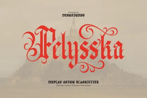
Pelysska is a dramatic gothic blackletter display typeface draped in curling calligraphy vines, looped ascenders, and regal manuscript spurs.
Pelysska is a scarlet gothic blackletter display draped in curling calligraphy vines, with looped ascenders, symmetrical S-scroll tendrils above and below the x-height and regal manuscript spurs, so a word reads as an illuminated manuscript rather than a poster. The vines extend well past the letters, which means the artwork box grows in every direction, and the stems are dense. It needs roughly 32 mm for the scrolls to read, and it is best in vermilion or gold on a deep ground or in one ink on vellum cream.
Gothic fantasy book cover, classical poster & tarot deck — Set 1 hero title word in title case at 60–96 pt in scarlet, gold, or black over muted parchment tones.
Fine tapered scroll tips reproduce cleanly in print, foil, and DTF transfers; scale vinyl decals above 2.5 inches if blade-cutting.
 #21
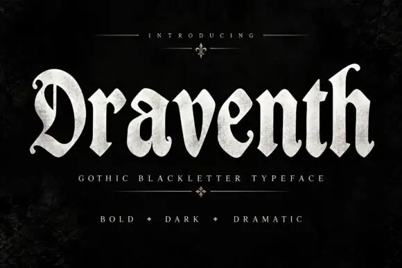
Draventh is a wide gothic blackletter display face with heavy stems, sharp hooked shoulders and a weathered silver fill that reads as rubbed metal.
Draventh spans the frame in a pale weathered silver on a dark ground, and the letters are broad with short ascenders: the D and the h carry hooks at the top, the v and the n break into sharp diagonals, and every foot ends in a diamond. The fill is textured rather than flat, so the shapes look cast and then worn, and the counters stay open enough that the word reads at a distance. Below the title a spaced caption sits between fine rules with a small fleuron, and a second line lists three qualities divided by diamonds. A fleuron also sits above the word, so the composition is symmetrical on a vertical axis. It is a cover and poster blackletter for horror, metal and dark fantasy, and it needs a large size, because the weathering that gives it character turns into dirt at small sizes.
A fantasy-miniature studio catalogue — Place Draventh at the top of a cream catalogue cover, with MODELS in plain small capitals below and a single product image in the lower half.
Check the smaller line and keep product photographs separately credited.
Practical buyer checklist
Key cutting, printing and pairing answers before choosing a romantasy, medieval & book covers typeface.
200 px wide is the standard storefront thumbnail, and 100 px catches the worst case on a phone. If the title is unreadable at those sizes, the cover will underperform regardless of how good it looks at full size.
Only for chapter headings and drop caps. Interior text needs a readable serif, and gothic or spurred display faces at 11 pt slow reading considerably, especially in long novels.
Yes, and consistency helps sales. Use the same title face on bookmarks, tote bags and enamel pins, but simplify the ornament for small items where fine detail disappears.
Fix three things: the title face, the placement of the author line and the silhouette weight. Then vary only the illustration and colour palette. Changing the typeface between books breaks shelf recognition more than any other single decision.
Keep exploring
Explore adjacent maker roundups or check our practical pre-production checklists.
37 curated fonts · Previews & pairings
26 curated fonts · Previews & pairings
26 curated fonts · Previews & pairings
34 curated fonts · Previews & pairings
Guides: Invitation font checklist · Vinyl & cutting checklist · How to pair script & sans fonts
Allow optional Google Analytics to measure visits and catalogue actions. Your search words and notes are not included. Privacy & storage