 #1 · Best Overall
Disclosure: MakerFileHub may earn a commission from qualifying purchases via paid links on this page. How our links work.
Stepped skyscrapers, inline bars & geometric caps
19 Best 1920s Art Deco & Gatsby Fonts
Art Deco is geometry with ambition: tall capitals, stepped shoulders, and repetitive parallel lines that suggest a skyscraper facade. Flamingo revives the 1929 Berthold ultra-condensed idea, Davi builds a Greek-key labyrinth inside each letter, and Monsante, Pontiac Inline and Riya work the double and triple inline bars that define the era's signage. Studio Voice keeps an Art Deco serif structure for menus and invitations.
Quick verdict
Flamingo is the most authentic condensed Deco for signage and posters, Studio Voice suits menus and invitations, and Davi is the statement letter for a single word. Rimma handles the neon-adjacent inline look.
Quick answer
Top 3 1920s Art Deco & Gatsby picks right now.
Short on time? Start with our three highest-rated 1920s Art Deco & Gatsby standouts before scrolling the full breakdown.
#1 · Best Overall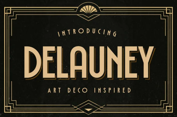 #2 · Runner-Up Pick
 #3 · Editor's Choice
How we tested & selected these 19 fonts
We reviewed 129 Deco candidates and kept 19 with genuine period construction: low crossbars, geometric circular bowls, stepped shoulders and inline bars aligned to the stem. Simple condensed sans faces styled as Deco were removed from the list rather than ranked low.
Side-by-side summary
Top 5 1920s Art Deco & Gatsby picks at a glance.
Compare specimens, OpenType/PUA traits and primary project roles side by side.
| Rank & Font | Style & File Specs | Best Project Fit | Store Listing |
|---|---|---|---|
| DisplayHistoric | 1920s gala poster, cocktail list, wine label or book cover | Get fontPaid link | |
| Sans serif1920s-cinema | Cricut acrylic Gatsby bar sign, table number & party banner | Get fontPaid link | |
| Sans serifLigatures · Alternates & swashes · Language support | Architectural studio, skincare box & minimalist identity | Get fontPaid link | |
| Sans serifPUA encoded · Ligatures · Alternates & swashes | A rounded-line skincare-name study | Get fontPaid link | |
| Sans serifPUA encoded · File formats | Home-organization pantry & closet bin decal, frame & sign | Get fontPaid link |
Clean Sans & Handwritten Print
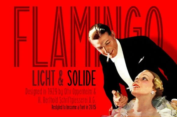
5 fonts#1 · Best OverallFlamingo
Flamingo is an ultra-condensed thin sans in which the stems run very tall, the terminals stay flat and the counters narrow to slots, so a single word reads as a 1920s film title card.
The F sets three thin arms on a narrow stem, the L turns a sharp corner, the A pinches to a point, the M squeezes four thin stems into a narrow frame and the N keeps a hairline diagonal, all at a thin even weight with flat terminals and an extremely condensed proportion. The proportion is the character: the face fits a long title into a narrow column, which is how the sample sets one word across a poster edge to edge. Because the stems are hairline, it needs 40 pt upward and a smooth ground, and it should never carry a paragraph. The red field, the photograph, the small caption grid and the credit lines are presentation; the dark condensed title is the face.
Recommended project & layout
1920s gala poster, cocktail list, wine label or book cover — Use Solide for smaller subheads and Licht at towering 72pt+ poster scale.
Before you cut or print
Use the Solide weight if cutting vinyl; save fine Licht inline lines for print.
Best paired with
Get fontPaid link
#2 · Runner-Up PickDelauney
Delauney is a bold, solid single-layer Art Deco sans serif defined by dramatic low-waisted crossbars on 'E', 'A', and 'R' and crisp geometric poise.
Delauney is a nineteen-twenties Art Deco geometric sans with a low waist: tall narrow caps, a very high crossbar, a small aperture and a strict geometric construction with no curve in the stems. The low waist stacks a long word vertically, and the small aperture closes first when the face shrinks. It needs roughly 20 mm for the aperture and the waist to read, and it is best in one deep ink on cream, or a fine gilt on deep green where the narrow stems print as light bars.
Recommended project & layout
Cricut acrylic Gatsby bar sign, table number & party banner — Set 1 uppercase header at 54–96 pt in metallic gold vinyl over black or frosted acrylic inside geometric rule frames.
Before you cut or print
100% clean solid single-layer vectors cut and weed in seconds on Cricut Oracal 651, HTV, and cardstock down to 0.65 inches!
Best paired with
Get fontPaid link
#3 · Editor's ChoiceBielchon
Bielchon is a crisp, light-to-regular modern sans-serif featuring tall x-height, circular bowls, and subtle stencil-like notched joins.
Bielchon is a slim contemporary geometric sans with architectural cuts: narrow even stems, perfectly circular bowls, sharp mitred cuts where two strokes meet instead of a curve and a level baseline that reads as gallery signage. The mitres are the design and they round off once the face is reduced or printed with a coarse screen. It needs roughly 22 mm for the mitre and the counter to read, and it is best in one fine ink on a pale ground, or a single white on a dark ground where the cuts print as sharp joints.
Recommended project & layout
Architectural studio, skincare box & minimalist identity — Set brand wordmarks in mixed-case at 36–60 pt with +15 tracking, leaving generous negative space across matte white or stone stock.
Before you cut or print
At small label sizes below 12 pt, print at 300+ DPI so the delicate notch gaps at 'h' and 'n' shoulders remain crisp rather than filling in.
Best paired with
Get fontPaid link
 #4 · Top Maker Utility
Aura
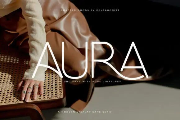
Aura shows pale thin capitals over a dark fashion photograph, where near-even rounded strokes build an open U and a broad R bowl, the first A carries a long curved cross-stroke that sweeps toward the centre and the R leg continues below the final A as a broad flowing curve.
The strokes stay uniform and thin, the curves stay circular and one cross stroke drops into a wide ligature that links two letters and runs under the word. That ligature is the character: the row reads as a drawn wordmark rather than a set line, which is why the sample keeps four letters on a photograph. The source notes PUA extras plus entry and terminal swashes, so check how the link is reached. Keep 36 pt for the thin strokes, test the ligature with your own letters and reserve 20 mm beneath.
Recommended project & layout
A rounded-line skincare-name study — Test the actual name on a flat panel and keep its descriptor beneath the entire sweep.
Before you cut or print
Verify connection access and inspect fine strokes at label size.
Best paired with
Get fontPaid link
 #5 · Standout Silhouette
Decoration
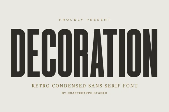
Decoration is a sleek, tall flat-sided condensed sans (narrower and taller than sister font Collection #963!) built for clean architectural posters & labels (OTF/TTF).
Decoration is a tall narrow condensed sans in caps with flat sides, PUA alternates and a compact retro skeleton that reads as architectural signage rather than a modern grotesk. The stems are straight and the counters small, so a long word fits a narrow panel, and the flat sides let the letters sit close without touching. It needs roughly 18 mm for the compact counters to stay open, and it is at its best in one dark ink on a warm neutral ground where the proportions carry the design.
Recommended project & layout
Home-organization pantry & closet bin decal, frame & sign — Set 1 uppercase category word at 56–115 pt with +4 tracking in matte black or white Oracal 651.
Before you cut or print
100% crisp, straight-line solid strokes cut and weed in seconds on Cricut vinyl and HTV down to 0.6 inches!
Best paired with
Get fontPaid link
Display & Decorative Headlines
11 fonts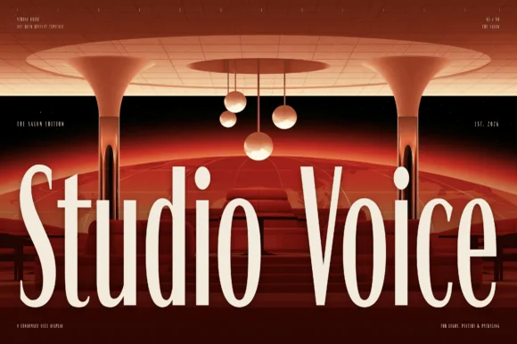 #6
Studio Voice
Studio Voice is a condensed brutalist sans in which the stems run very tall, the terminals stay flat and the counters squeeze to narrow slots, so a two-word title reads as a gallery graphic rather than as a headline.
The S holds a flat spine in a narrow frame, the t raises a short bar, the u keeps two tall stems, the d closes a slot and the o squeezes into a tall ring, all at an even monoline weight with flat terminals and a compressed proportion. The compression is the character: the face fits a long title into a narrow band, which is how the sample sets two words across a wide image without condensing them further. Because the counters stay open, the face reads at 24 pt and holds a wall at 200 pt, and it prints in one flat ink. The red interior, the lamps, the small technical labels and the faint grid are presentation; the cream condensed words are the face.
Recommended project & layout
Cocktail lounge menu, architecture firm mark or podcast cover — Set in Title Case with tight leading at large editorial sizes.
Before you cut or print
Fine terminals excel in print, web headers and packaging.
Best paired with
Get fontPaid link
 #7
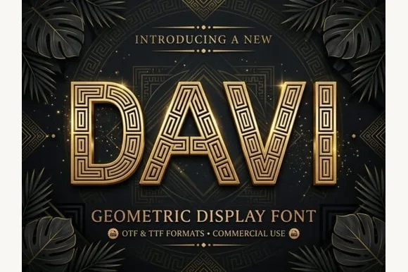
Davi
Davi is a geometric display capital alphabet in which every stroke is a wide band filled with a drawn greek-key maze, so a word reads as gilded metalwork rather than as lettering.
The D closes a rectangular bowl with a maze running through it, the A carries a stepped apex, the V narrows to a flat point and the I stands as a single banded bar, all at a display weight with square corners, an inlaid meander drawn inside each stroke and a thin outer keyline. The inlay is the character: the maze follows the stroke, which is why the sample sets one word in gold on a dark ground with a keyline around it. Because the inlay lines are fine, the face needs 60 pt before they read, and it wants two tones rather than a gradient. The dark pattern ground, the palm leaves, the corner ornaments and the small caps are presentation; the gold display word is the face.
Recommended project & layout
Gala awards header, luxury spirit box or boutique emblem — Reserve for short uppercase focal words at 48pt+ with clean sans body copy.
Before you cut or print
Intricate interior labyrinth lines are crafted for print, foil and digital media.
Best paired with
Get fontPaid link
 #8
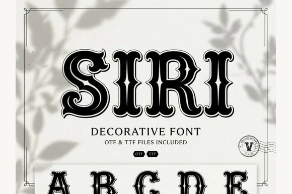
Siri
Siri is a vintage Deco serif in which every stem carries an inline bevel, the serifs curl and a heavy contour closes the shape, so a word reads as a painted shop window from the thirties.
The S opens with a curled terminal and an inner line, the I stands as a heavy stem with a double bevel, the R keeps a squared bowl with an inline and the full alphabet beneath shows the same treatment on every letter, all at a heavy weight with a high contrast and a contour that follows the outline. The inline is the character: it runs inside the stem and turns with the serif, which is what gives the face its boutique register at 60 pt and what fails first when it is reproduced small. Below 24 pt the inline fills with ink. The pale ground, the black ink, the botanical shadow and the small badges are presentation; the display face is the word shown.
Recommended project & layout
Perfume label, chocolate box or speakeasy event card — Use at 32pt+ on smooth cream or pale pastel cardstock.
Before you cut or print
Fine internal contour lines are suited to print and digital design.
Best paired with
Get fontPaid link
 #9
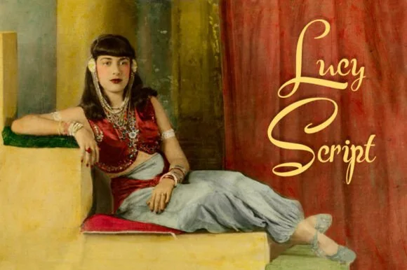
Lucy Script
Lucy Script is an ornamental script in which the capitals flare at the base, the joins stay heavy and the terminals curl, so a two-word title reads as a vintage shopfront painted by hand.
The L opens a wide flared capital, the u keeps two heavy stems, the c curls a narrow crescent, the y drops a hooked tail and the S swells a heavy spine, all at a brush contrast with flared capitals, curled terminals and a moderate slope. The flare is the character: the capitals widen where they meet the baseline, which is why the sample sets two stacked words in gold over a painted scene. Because the downstrokes are heavy, the face holds from 28 pt and prints on most stocks; the curled terminals need margin. The painted interior, the figure and the small caption are presentation; the gold script words are the face.
Recommended project & layout
Gatsby party invitation, vintage cosmetics or theatre poster — Combine Title Case script headers with tracked geometric capitals.
Before you cut or print
Medium-high stroke contrast works best in print, foil and larger decals.
Best paired with
Get fontPaid link
 #10
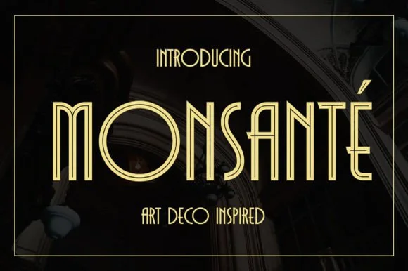
Monsante
Monsante is a tall, geometric 1920s Art Deco display typeface built from crisp parallel double-line inline strokes and low-waisted crossbars.
Monsante is a nineteen-twenties Art Deco double-line inline geometric display: wide squared letters built from two parallel strokes with a hairline gap, sharp mitred corners and a strict symmetry that reads as a hotel facade sign. The gap between the lines is the design and it closes into one stroke when the face is reduced. It needs roughly 32 mm for the double line to read, and it is best in one fine metallic on a dark ground, or one ink on a pale ground where the gap stays open.
Recommended project & layout
Roaring-Twenties gala invite, champagne menu & seating chart — Track uppercase headlines out to +40 in metallic gold on black, emerald, or midnight-navy cardstock.
Before you cut or print
Parallel twin-rail lines are delicate—ideal for gold foil stamping, laser engraving, and 300 DPI print rather than small vinyl decals.
Best paired with
Get fontPaid link
 #11
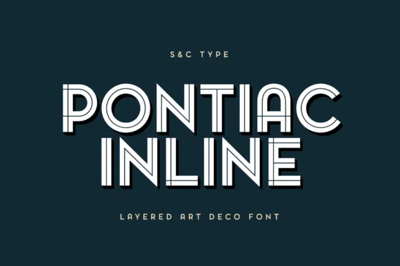
Pontiac Inline
Pontiac Inline is a balanced Parisian Art Deco inline sans featuring wide circular bowls and crisp centered parallel linework.
Pontiac Inline is a Parisian Art Deco geometric inline sans: extended squared caps, a fine inner rule that follows the contour, stepped shoulders and a strict geometric construction with no curvature in the stems. The inline is the entire design, so it closes when the face is small or overprinted, and the extended width makes words long. It needs roughly 34 mm for the inner rule to read as a line, and it is best in one deep ink on cream, or a metallic on deep green where the inline prints as a bright keyline.
Recommended project & layout
Bistro café menu, boutique hotel keycard & gin label — Stack 2 centered uppercase words at 48–88 pt with +12 tracking over deep petrol blue, emerald, or charcoal.
Before you cut or print
Clean geometric inline vectors cut cleanly on 1.5 in+ storefront window vinyl and print sharply down to 20 pt!
Best paired with
Get fontPaid link
 #12
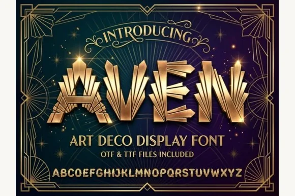
Aven
Aven is a showstopping 1920s Art Deco display font sculpting stepped Chrysler-Building triple flutes into bold geometric capitals (OTF & TTF).
Aven is a 1920s Art Deco display that sculpts stepped triple flutes into bold geometric capitals, with solid heavy faces and striped architectural side ribs, so a word reads as a Chrysler-era façade rather than a normal Deco headline. The ribs repeat across the stems, which means the face needs size for the flutes to read, and the solid faces keep it legible at 24 mm. It needs roughly 32 mm for the triple flutes to hold, and it is best in champagne gold on midnight blue or in one ink on ivory.
Recommended project & layout
Roaring-Twenties New Year's Eve / Gatsby wedding invite — Center 1 hero word at 64–120 pt in metallic gold over navy or emerald inside geometric fan-corner borders.
Before you cut or print
Fine parallel fluted stripes alongside solid stems require foil stamping, print, laser engraving, or DTF—avoid small vinyl weeding.
Best paired with
Get fontPaid link
 #13
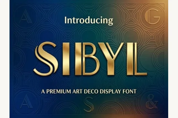
Sibyl
Sibyl is a sleek architectural Art Deco display font pairing bold vertical pillars with crisp parallel twin hairline stems.
Sibyl is an Art Deco display that pairs heavy vertical pillars with twin hairline side stems, so a word alternates between solid weight and two fine parallel rules on the same letter. The hairlines are structural and must stay separate, which means the face needs size and a print process that does not close a 0.4 mm gap. It needs roughly 32 mm for the twin stems to read as two lines, and it is best in gold or a single dark ink on teal or ivory.
Recommended project & layout
Luxury real-estate identity, hotel keycard & spirit bottle — Set 1 uppercase brand name at 56–100 pt with +12 tracking above clean geometric sans subcopy.
Before you cut or print
Parallel hairline twin rules belong in foil stamping, print, laser-engraved brass/acrylic, and web—not small cut vinyl.
Best paired with
Get fontPaid link
 #14
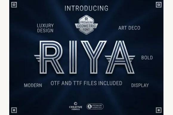
Riya
Riya is an architectural geometric Art Deco display font constructed from three parallel concentric ribbon lines with wing extensions (OTF & TTF).
Riya is a geometric Art Deco display drawn in three parallel rules, so every stem is a stack of stripes with even white gaps and a sharp corner where the rules turn. The labyrinth effect reads only when the gaps stay open, and the rules are thin enough to need generous size. It needs roughly 40 mm for the three lines to separate, and it is best in gold on deep green or black for print, or one ink on white where the gaps stay largest.
Recommended project & layout
Executive architecture firm mark, luxury spirits & event pass — Center 1 short uppercase word at 64–120 pt in silver or gold foil over midnight navy.
Before you cut or print
Fine triple concentric channels belong in print, foil stamping, laser engraving, and web—not small blade-cut vinyl.
Best paired with
Get fontPaid link
 #15
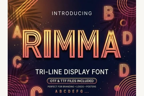
Rimma
Rimma is a clean, geometric three-line parallel display typeface merging 1920s Art Deco symmetry with glowing 1980s neon tube lines.
Rimma is a geometric three-line inline Art Deco sans with a retrowave edge: wide squared letters built from three parallel hairlines, sharp mitred corners, an even width and a symmetry that reads as a neon sign drawn on a grid. The three lines are the design and they merge into one at small sizes. It needs roughly 34 mm for the three lines to read, and it is best in one neon colour on a dark ground, or one fine ink on a pale ground where the gaps between the lines stay open.
Recommended project & layout
Cocktail lounge neon menu, synthwave cover & cinema poster — Set all-caps titles at 54–96 pt with +20 tracking in warm coral, electric cyan, or champagne gold on midnight navy.
Before you cut or print
Triple hairline channels are designed for digital graphics, print, and LED/foil artwork—avoid weeding small vinyl.
Best paired with
Get fontPaid link
 #16
Ark Raised
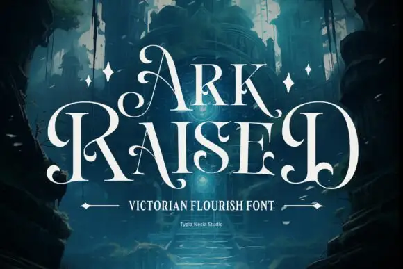
Ark Raised shows white narrow capitals in two rows over a dark blue architectural scene, where large curling A and R entries flank the title, hooked feet and rounded inward terminals interrupt the tall upright stems and star marks plus arrow-like rules sit beneath.
The stems stay narrow and tall, the entries curl far to the left, the feet hook and the terminals round inward at several points. That flanking curl is the character: the title is wider than its letters because of the entries, which is why the cover leaves dark space on both sides. The scene, the stars and the arrow rules are artwork. Keep 48 pt so the curls stay open, allow 30 mm at each flank and check the hooked feet against the trim before printing.
Recommended project & layout
An original fantasy-story title — Keep large curls inside a clean title zone above plain author credits.
Before you cut or print
Proof exact letters and clear original scene artwork.
Best paired with
Get fontPaid link
Serifs & Slab Serifs
3 fonts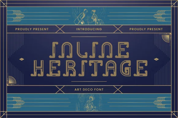 #17
Inline Heritage - Art Deco
Inline Heritage - Art Deco is a geometric 1920s Art Deco display typeface carved with continuous open inline channels and curled step terminals.
Inline Heritage is a nineteen-twenties Art Deco architectural display serif drawn as an open inline: tall narrow caps, a fine channel running down each stem, stepped shoulders and a strict geometric base with sharp unbracketed feet. The channel is the whole design and it closes first at small sizes, and the tall proportion stacks a long word vertically. It needs roughly 32 mm for the channel to stay open, and it is best in one deep ink on cream, or a metallic ink on deep green where the channel prints as a bright line.
Recommended project & layout
1920s Gatsby wedding invitation, speakeasy bar menu & table number — Set 2 centered uppercase lines at 42–72 pt with +20 tracking in champagne gold over deep peacock teal or black.
Before you cut or print
Open inline channels shine in gold foil stamping, flat print, and laser-engraved acrylic; scale vinyl above 2 inches if cutting.
Best paired with
Get fontPaid link
 #18
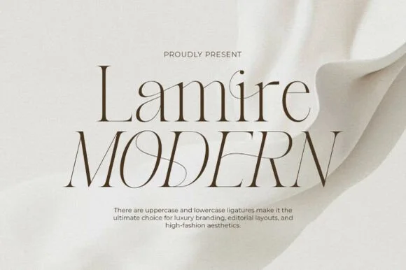
Lamire Modern
Lamire Modern is an ultra-light, tall-statured editorial serif featuring sweeping diagonal ligatures across both uppercase and lowercase.
Lamire Modern is an ultra-light editorial serif with tall stature, whisper hairlines and sweeping diagonal ligatures that cross from one letter to the next. The contrast is extreme, so the face needs roughly 30 mm before it survives in print, and the ligatures require the letters to be set as designed rather than adjusted with kerning. It reads as fashion typography rather than a book face, and it is at its best in one colour on a smooth coated stock where the hairlines stay continuous.
Recommended project & layout
Bridal gown label, luxury skincare serum & candle carton — Stack mixed-case over all-caps at 48–84 pt with +10 tracking and wide ivory negative space.
Before you cut or print
Hairline strokes are strictly engineered for print, hot foil, and high-res web headers—never blade-cut vinyl.
Best paired with
Get fontPaid link
 #19
Lumera Editorial
Lumera Editorial is a tall, glamorous display serif braiding sweeping calligraphic loops through condensed high-fashion capitals!
Lumera Editorial is a tall condensed display serif in which ribbon-like swashes run the full height of the ascenders and sweep across the caps, giving each word the look of a fashion masthead. The condensation stacks a long title vertically, and the ribbons sit above and below the line, so a tight leading collides them. It needs roughly 36 mm for the ribbon width to read, and it is best in one dense ink on matte white, or foil at 60 pt and above where the ribbon edge stays sharp.
Recommended project & layout
Fashion magazine cover, beauty-box lid & novel jacket — Stack 2 uppercase words at 68–140 pt flanked by thin oval studio stamps ('ELEGANT CURVE').
Before you cut or print
Hairline crossbars and ribbon loops belong on printed covers, foil boxes, and digital graphics rather than small blade-cut vinyl.
Best paired with
Get fontPaid link
Practical buyer checklist
Frequently asked questions.
Key cutting, printing and pairing answers before choosing a 1920s Art Deco & Gatsby typeface.
What makes a font look Art Deco rather than just condensed?
Stepped shoulders, low horizontal stress, geometric circular bowls and repetitive inline bars. Condensed width alone is a proportion, not a style, and plenty of modern narrow grotesques have no Deco construction at all.
Are Art Deco fonts suitable for a wedding invitation?
Yes, particularly for evening or city venues. Keep the names in the Deco face and set the ceremony details in a quiet serif or sans, since Deco capitals at small sizes with inline detail become hard to read.
Why do inline Deco fonts break down in vinyl?
The parallel bars are thinner than a blade kerf at typical sizes, and each bar becomes an island. Use them for print, foil and laser engraving, or choose a solid Deco cut for anything that has to be weeded.
Can I mix Art Deco with a script?
A 1920s theatrical brush script pairs well, because that combination existed in period advertising. Keep the script smaller and place it on a separate line so the Deco geometry still leads the layout.
Keep exploring
Related collections & guides.
Explore adjacent maker roundups or check our practical pre-production checklists.


01 / Type Styles
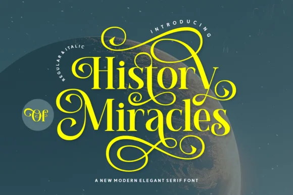
Luxury & modern serif
34 curated fonts · Previews & pairings
02 / Occasions & Milestones
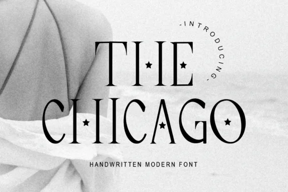
Minimalist & editorial wedding serifs
23 curated fonts · Previews & pairings
03 / Type Styles
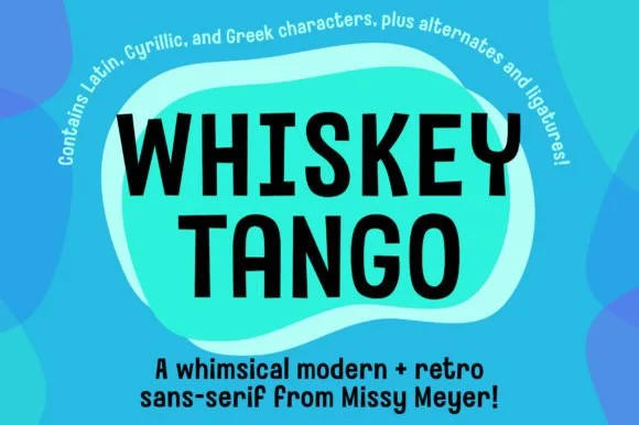
Tall condensed & narrow poster
25 curated fonts · Previews & pairings
04 / Branding & Print
Soy candles, apothecary & skincare
29 curated fonts · Previews & pairings
Guides: Invitation font checklist · Vinyl & cutting checklist · How to pair script & sans fonts