 #1 · Best Overall
Disclosure: MakerFileHub may earn a commission from qualifying purchases via paid links on this page. How our links work.
Sign-painted scripts, chalked boards & menus
28 Best Artisan Bakery & Café Fonts
Café typography is read standing up, often in poor light, at a distance of two metres. Durlane and Hangtuah carry the sign-painter weight that survives that test, Bakery and Bakey add the softer counter-script look, and Biscora and Worldstar supply the condensed sans and letterpress serif that keep a menu readable when the script has done its job. Cake and Bakery handles the piped-icing display case.
Quick verdict
Durlane is the most solid choice for signage and menus, Bakery suits packaging and paper bags, and Biscora is the best condensed sans for price columns. Cake and Bakery is the pick for a seasonal pastry display.
Quick answer
Top 3 artisan bakery, café & menus picks right now.
Short on time? Start with our three highest-rated artisan bakery, café & menus standouts before scrolling the full breakdown.
#1 · Best Overall #2 · Runner-Up Pick
 #3 · Editor's Choice
How we tested & selected these 28 fonts
We kept 28 of 701 candidates, evaluating each in a real menu layout with prices, allergens and section headers. Weighted legibility at 2 m, how the script behaves beside a price column, and whether the face looks credible on packaging as well as a board.
Side-by-side summary
Top 5 artisan bakery, café & menus picks at a glance.
Compare specimens, OpenType/PUA traits and primary project roles side by side.
| Rank & Font | Style & File Specs | Best Project Fit | Store Listing |
|---|---|---|---|
| ScriptRetro | Café window decal, pastry box or tote bag | Get fontPaid link | |
| ScriptBold | Etched whiskey glass stencil, BBQ rub label or leather patch | Get fontPaid link | |
| ScriptPUA encoded · Alternates & swashes | Cottage-bakery cake box, sourdough bag & apron HTV | Get fontPaid link | |
| ScriptLigatures · Alternates & swashes | Barbershop window decal, Moto apparel & coffee tin | Get fontPaid link | |
| ScriptLigatures · Alternates & swashes | Artisan donut box, pastry seal & milkshake cup logo | Get fontPaid link |
Scripts & Calligraphy
10 fonts#1 · Best OverallDurlane
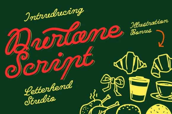
Durlane is a fat retro script in which the strokes swell, a thin inline runs along the middle of every stem and the joins stay heavy, so a name reads as a hand-painted bakery sign from the 1980s.
The D opens a heavy loop, the u keeps two thick stems, the r swells an arm, the l rises on a fat stem, the a closes a wide bowl and the e turns a heavy eye, all at a brush weight with an even slant and an inline drawn inside the thick strokes. The inline is the character: it splits each fat stroke into two bands, which is why the sample sets a single name at large size and lets it carry the whole image. It ships with a set of food illustrations, but the type stands alone. The dark green ground, the croissants, the coffee cup and the small script credits are presentation; the red display name is the face.
Recommended project & layout
Café window decal, pastry box or tote bag — Angle headlines 6–8 degrees upward in warm cream, red or mustard tones.
Before you cut or print
Weld cursive joins before cutting window or sign vinyl.
Best paired with
Get fontPaid link
#2 · Runner-Up PickWhiskey
Whiskey delivers heavy mid-century sign-painter brush script, where thick retro strokes and compact loops carry a bold sweeping underline tail built for barware, sauce labels, hats and gifts rather than a formal invitation.
The strokes stay heavy and brushy, the loops close compact, the connectors thicken and the final tail sweeps under the whole word. That underline tail is the character: the word arrives already signed off, which is why the sample sets one short spirit name on a dark ground. Because the tail travels below and beyond the letters, keep 22 mm of clearance at the outer end from 28 pt and confirm whether the swash is a separate character before promising it on a curved surface.
Recommended project & layout
Etched whiskey glass stencil, BBQ rub label or leather patch — Use sandblast resist stencil vinyl on rocks glasses or laser-engrave on leather coasters.
Before you cut or print
Weld cursive joins; thick strokes cut cleanly for glass-etching stencils and HTV.
Best paired with
Get fontPaid link
#3 · Editor's ChoiceBakery
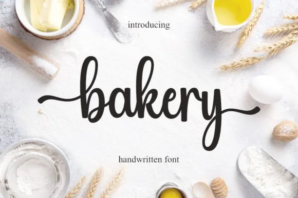
Bakery is a warm, bouncy handwritten brush script with tall looped ascenders ('b', 'k') and smooth horizontal beginning and ending tails.
Bakery is a bouncy medium-weight farmhouse brush script with side tails: a loaded stroke with visible dry edges, joined letters, a rising baseline and long tails that flick off the first and last letters. The tails need side clearance and are the first thing trimmed, and the brush edge is the finest element. It needs roughly 24 mm for the tail and the brush edge to read, and it is best in one warm ink on kraft and cream, or a single dark colour on a pale board where the brush edge prints as texture.
Recommended project & layout
Cottage-bakery cake box, sourdough bag & apron HTV — Set a lowercase focal word ('bakery', 'homemade', 'cookies') at 4–8 inches wide with the entry and exit tails turned on.
Before you cut or print
Medium brush stroke weight is one of the easiest script styles to cut and weed on Cricut HTV and adhesive vinyl—remember to weld.
Best paired with
Get fontPaid link
 #4 · Top Maker Utility
Hangtuah
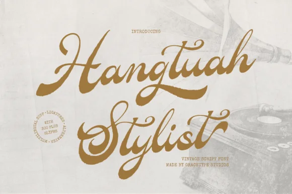
Hangtuah is a thick, slanted vintage sign-painter script featuring bold brush strokes, dynamic swash capitals, and retro underline tails.
Hangtuah is a bold retro sign-painter brush script with underline swashes: a heavy loaded stroke, a firm slant, connected letters and thick underline swashes that run beneath the word and turn up at the end. The underlines are the design and they fix the block's width, and the brush edge is the finest element. It needs roughly 30 mm for the underline and the brush edge to read, and it is best in one dense ink on a sanded board, or a flat two-colour print on uncoated stock.
Recommended project & layout
Barbershop window decal, Moto apparel & coffee tin — Angle a 1-to-2-word brand name upward 7 degrees and anchor the empty lower-right space with a tapered underline tail alternate.
Before you cut or print
Weld all overlapping brush joins before cutting HTV or gold metallic sign vinyl; thick strokes weed smoothly at 1.2 in+.
Best paired with
Get fontPaid link
 #5 · Standout Silhouette
Bakey
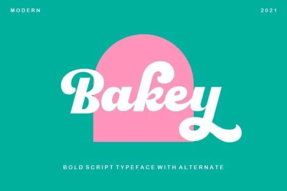
Bakey is a bold, upright 1960s/70s packaging script with thick syrupy downstrokes, plump bowls, and upturned retro tails.
Bakey is a heavy 1960s bakery and packaging script: fat brush-drawn letters with a high x-height, joins that thicken through the middle of a word and a set of looped ascenders that keep the line from looking mechanical. It is the lettering of a bakery bag and a window board rather than a modern logo, so it works best large and in one warm ink. The loops are the finest element and they close into a solid block as soon as the face is reduced. It needs roughly 30 mm for the stroke and the loop to read, and it is best on uncoated kraft or white board.
Recommended project & layout
Artisan donut box, pastry seal & milkshake cup logo — Center a single 4-to-7-letter brand name inside an arch or circle badge at 48–72 pt above small tracked sans taglines.
Before you cut or print
Thick letter bodies and rounded ends make Bakey super reliable for adhesive window decals, mug vinyl, and garment HTV.
Best paired with
Get fontPaid link
 #6
Biscora
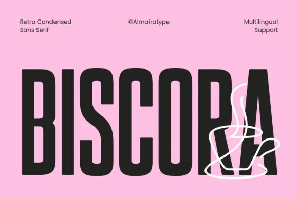
Biscora is a stylish condensed sans distinguished by crisp diagonal stencil-like angle cuts across the joints of 'S', 'R', and 'A' (Multilingual)!
Biscora is a condensed retro café sans in which the letters are cut on a diagonal: the stems carry a slanted slice through the counter, the shoulders are squared and the terminals are cut at the same angle, so a word reads as if sliced by one blade. The slice is the whole design and it closes first at small sizes, and the condensation fits long names on a fascia. It needs roughly 26 mm for the diagonal cut to read, and it is best in one warm ink on cream and kraft, or a single dark colour on a pale board.
Recommended project & layout
Specialty espresso bar cup, biscotti tin & pastry box — Set 1 uppercase brand word huge (84–165 pt) and overlay a minimalist 1-line white illustration across the lower corner.
Before you cut or print
Clean, crisp solid segments cut and weed smoothly on Cricut Oracal 651 and HTV down to 0.75 inches!
Best paired with
Get fontPaid link
 #7
Roastery Handmade
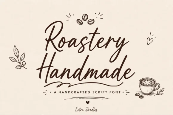
Roastery Handmade is a lively, upright café brush script accompanied by charming hand-drawn coffee-bean, latte-cup, leaf, and heart doodles.
Roastery Handmade is a warm café marker brush script with a set of coffee doodles: a wet loaded stroke with visible marker texture, joined letters, a light slant and small flicked exits, plus drawn beans, cups and steam curls cut to the same weight. The doodles let a cup or a bag be decorated from the same file, and the marker edge is the finest element. The script needs roughly 22 mm and the doodles 20 mm for their detail to read, and both work in one warm ink on kraft.
Recommended project & layout
Small-batch coffee bag, café chalkboard & espresso mug — Stack two bouncy script words centered beneath a 3-bean doodle icon, anchored by tracked sans roast specs below.
Before you cut or print
Sturdy upright marker thickness cuts and weeds cleanly on mug vinyl, apron HTV, and café window decals—weld script joins first!
Best paired with
Get fontPaid link
 #8
Mantiques
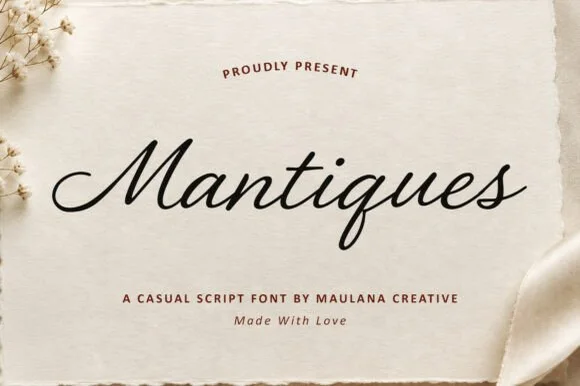
Mantiques is a smooth, slanted casual monoline script blending 1950s sign-painter grace with clean modern readability (plus swash alternates!).
Mantiques is a slanted casual monoline script that borrows 1950s sign-painter rhythm and adds swash alternates, so a name reads as painted quickly on a shop window rather than as calligraphy. The even monoline weight makes it predictable in vinyl and plotter work, and the swashes extend the word at both ends. It needs roughly 20 mm for the open lowercase to read, and it is best in ink black on warm paper or in one bright ink on a dark ground.
Recommended project & layout
Vintage antique-shop sign, coffee sleeve, apparel chest & mug — Center 1 title-case word at 64–125 pt above clean tracked sans caps ('A CASUAL SCRIPT FONT').
Before you cut or print
Weld overlapping cursive joins in Design Space—cuts and weeds smoothly on Oracal 651, HTV, and embroidery templates down to 0.9 in!
Best paired with
Get fontPaid link
 #9
Krandish
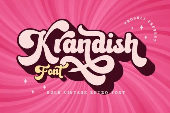
Krandish is a heavy, cream-smooth 1970s retro script featuring dramatic looping swash capitals and thick figure-eight underline tails.
Krandish is a chunky nineteen-seventies retro brush script with swash tails: a very heavy loaded stroke, a firm slant and tails that extend straight off the first and last letters before curling up at the tip. The tails widen the word and are the first thing trimmed, and the heavy weight closes the counters early. It needs roughly 30 mm for the tail and the heavy stroke to read, and it is best in two warm inks on cream, or one burnt orange on white where the tails still read as drawn lines.
Recommended project & layout
Retro roller-skate tee, beach tote & iced-coffee wrap — Tilt a 1-to-2-word phrase upward 8 degrees and duplicate a dark offset layer behind it in Illustrator or Cricut for a 3D retro shadow.
Before you cut or print
Weld connected lowercase strokes into one path before cutting, and check the tight loops inside 'a', 'd', and 'o'.
Best paired with
Get fontPaid link
 #10
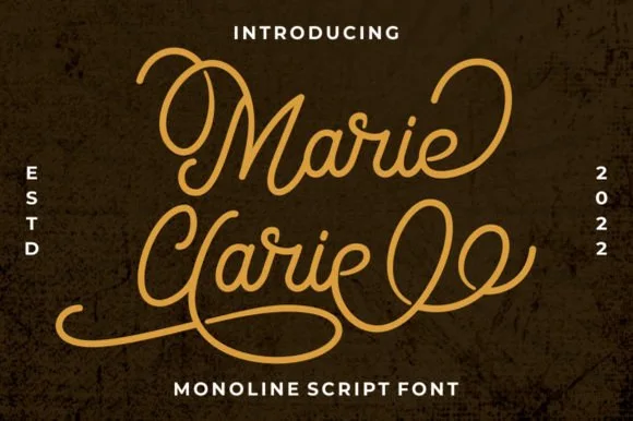
Marie Clarie
Marie Clarie is a smooth, medium-fine monoline script featuring oversized vintage ribbon loops on capitals and spiraled terminal flourishes.
Marie Clarie is a vintage neon-sign and badge monoline script: an even tubular stroke that reads as bent glass, joined letters, a shallow slant and a badge frame of concentric rules around the word with small dots at the corners. The monoline is what lets it work as a neon tube, and the badge rules are the finest element. It needs roughly 28 mm for the tube and the badge rule to read, and it is best as a one-colour neon or vinyl job, or a flat two-colour print on a dark ground.
Recommended project & layout
LED neon wall-sign mockup, salon logo & vintage jacket — Stack a two-word name tightly so the sweeping lower loop of the second capital nests beneath the first word.
Before you cut or print
Consistent monoline thickness cuts far cleaner on HTV and vinyl than high-contrast scripts—just weld all overlapping loops first.
Best paired with
Get fontPaid link
Serifs & Slab Serifs
6 fonts #11
Worldstar
Worldstar is a bold vintage editorial serif (NOT casual handwriting!) featuring warm bracketed curves and subtle antique letterpress edge ink.
Worldstar is a bold vintage editorial serif with warm bracketed curves and a light letterpress edge that sits on the contour, so a page reads as printed on a cylinder press rather than distressed in software. The weight is bold but the counters stay open, which lets the face set a 10 pt caption as comfortably as a 60 pt masthead, and the bracketing gives small sizes a soft, non-digital finish. Edge ink is subtle enough to survive a second-generation print, and the face is at its best in a single dark colour on a warm off-white stock.
Recommended project & layout
Indie zine masthead, coffee-table book, podcast & tote — Span 1 mixed-case masthead across the top (88–160 pt) above left-aligned stacked all-caps Worldstar subheaders.
Before you cut or print
Gentle organic outer edges (zero microscopic interior holes!) actually cut on 1 in+ Cricut HTV/vinyl AND screen-print gorgeously!
Best paired with
Get fontPaid link
 #12
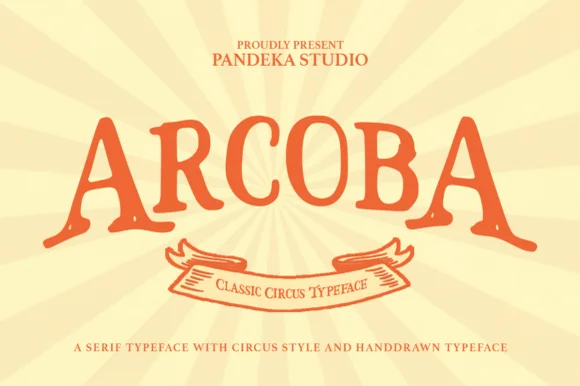
Arcoba
Arcoba is a charming, hand-crafted vintage circus serif with flared wedge terminals, playful arched rhythm, and zero fragile hairlines!
Arcoba is a hand-drawn vintage circus serif with flared wedge terminals, a playful arched rhythm and no fragile hairlines anywhere in the family, so it holds at small label sizes as well as on a poster. Capitals are tall and organic, the inked edges are slightly uneven, and the flared feet give a word a carnival bounce without a script's connections. It needs roughly 12 mm to look like sign painting, and its natural setting is an arch or a curved line, which is what the flared terminals are drawn for. It is a warm display face for events and packaging.
Recommended project & layout
'ONE-DERFUL CARNIVAL' 1st-birthday banner, popcorn box & invite — Arch 1 uppercase headline (+12%, 76–155 pt) in carnival red-orange over a cream-and-gold sunburst above a ribbon scroll.
Before you cut or print
Thick, sturdy hand-drawn serifs (no microscopic filigree!) cut and weed cleanly on Cricut cardstock, HTV, and Oracal 651 at 0.85 in+!
Best paired with
Get fontPaid link
 #13
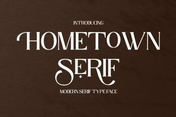
Hometown Serif
Hometown Serif is an elegant, high-contrast uppercase display serif accented by sweeping descender cradles and spiraled stem hooks.
Hometown Serif is a high-contrast modern display serif with curled swash stems: hairline hairlines against heavy stems, stems that curl out at the base into a small spur and swash capitals that finish in a drawn curl. The hairlines and the curls are the finest elements and both silt on textured stock. It needs roughly 30 mm for the curl and the hairline to read, and it is best in one fine ink on coated or smooth card, or a foil impression above 40 pt.
Recommended project & layout
Formal invitation monogram, menu header & welcome mirror — Track uppercase titles slightly open (+30) at 32–48 pt, reserving decorative tail alternates for the first or center letters.
Before you cut or print
Hairline horizontal crossbars and thin serif feet are best suited to print, foil stamping, or 2 in+ mirror decals.
Best paired with
Get fontPaid link
 #14
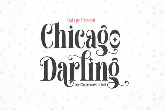
Chicago Darling
Chicago Darling is a bold, condensed modern-vintage serif distinguished by curled spiral terminals, sparkling counters, and deep descender loops.
Chicago Darling is a high-contrast vintage display serif with curled ball terminals: hairline thins against swollen stems, a small x-height, a high waist and terminals that roll into small balls on the a, c and r. It is the lettering of a nineteen-twenties poster and a department-store sign, so it wants size and air. The hairline thins are the finest element and they break first in print and in vinyl. It needs roughly 34 mm for the contrast and the ball terminal to read, and it is best one dark ink on a cream ground.
Recommended project & layout
Soy candle vessel label & apothecary box front — Stack a two-word scent or brand name tightly at 32–42 pt with tighter line-height, anchored by minimalist uppercase sans notes below.
Before you cut or print
Hairline crossbars and spiral tips shine in 300 DPI print and hot foil; avoid weeding small adhesive vinyl below 2 inches cap height.
Best paired with
Get fontPaid link
 #15
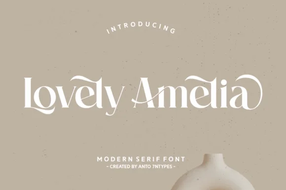
Lovely Amelia
Lovely Amelia is a soft, high-contrast modern display serif featuring sweeping canopy arches over vowels and sculpted ligatures.
Lovely Amelia is a high-contrast display serif with Art-Nouveau canopy arches that spring from the vowels and a sculpted cradle tail that runs beneath a word. The arches sit above the x-height, so the layout needs headroom, and the tail occupies its own band below the baseline. Contrast is strong, so the face wants 22 mm and up before the hairlines hold, and it is a title and invitation face rather than a text face. Its natural home is an asymmetric composition where the canopy can echo a drawn frame.
Recommended project & layout
Ceramic-studio mark, botanical skincare & boutique sign — Set 1 or 2 title-case words at 48–84 pt in warm cream or charcoal over earthy clay/sand tones.
Before you cut or print
High-contrast hairline transitions shine in print, foil, and web logos; scale vinyl above 1.75 in if cutting.
Best paired with
Get fontPaid link
 #16
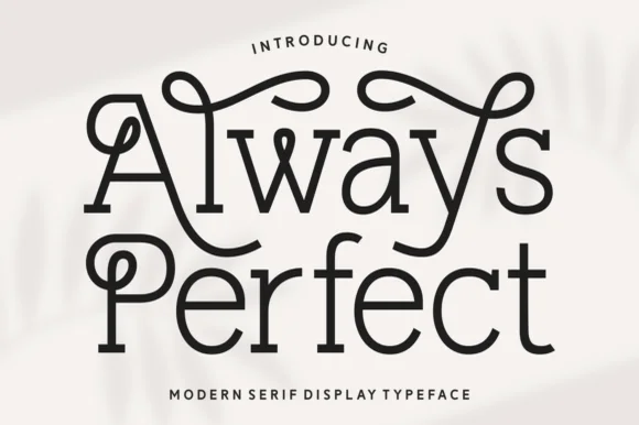
Always Perfect
Always Perfect is a playful monoline swash serif whose tall stems curl into sweeping overhead loops, ball-tipped hooks, and linked ligatures.
Always Perfect is a looped monoline Art-Nouveau serif built for storybooks: an even delicate stroke, tall whipped ascenders that loop back over the word, wide round bowls and small curled terminals that echo the loops. The monoline keeps the face honest at small sizes, and the loops grow the word in both directions. It needs roughly 26 mm for the loop and the curl to read, and it is best in one fine ink on smooth ivory, or a single dark colour on a cream ground where the loops print as a drawn line.
Recommended project & layout
Boutique patisserie box, flower-shop sign & bookplate stamp — Stack 2 mixed-case words centered at 44–72 pt, turning on curled swash alternates only on outer initials and ascenders.
Before you cut or print
Steady medium-thin monoline weight cuts cleanly on 1.4 in+ window or mug vinyl—weld any overlapping loop joins first.
Best paired with
Get fontPaid link
Display & Decorative Headlines
5 fonts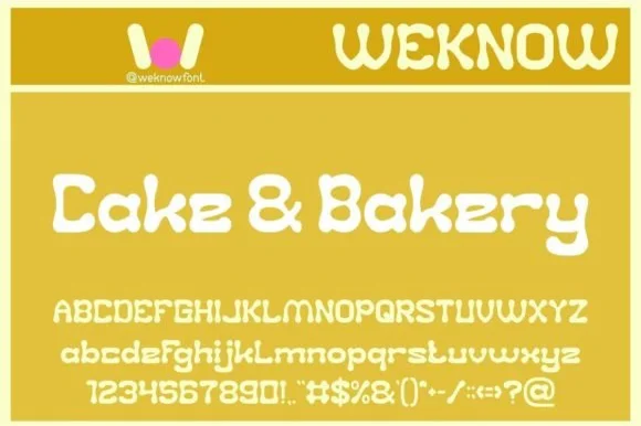 #17
Cake and Bakery
Cake and Bakery is a sweet, piped-frosting retro display font (disconnected, NOT a thin script!) with curled pastry terminals across full A–Z, a–z & 0–9!
Cake and Bakery is a piped-icing display drawn from nineteen-seventies pastry decoration: each letter is a rope of icing with a soft raised edge, a slight sag between the letters and a scalloped terminal, in full caps, lower case, figures and symbols. The rope shading suggests height, so a word needs size to look piped rather than drawn. It needs roughly 30 mm for the rope edge and the scallop to read, and it is best in one soft colour on cream, or a two-colour build where the icing highlight is bare paper.
Recommended project & layout
Custom cake-box lid, cupcake sticker, bakery van & apron — Set mixed-case titles ('Cake & Bakery', 72 pt) in frosting white or chocolate brown over pastel yellow, pink, or mint.
Before you cut or print
100% smooth, thick single-layer shapes cut and weed cleanly on Cricut HTV, Oracal 651, and cardstock down to 0.65 in!
Best paired with
Get fontPaid link
 #18
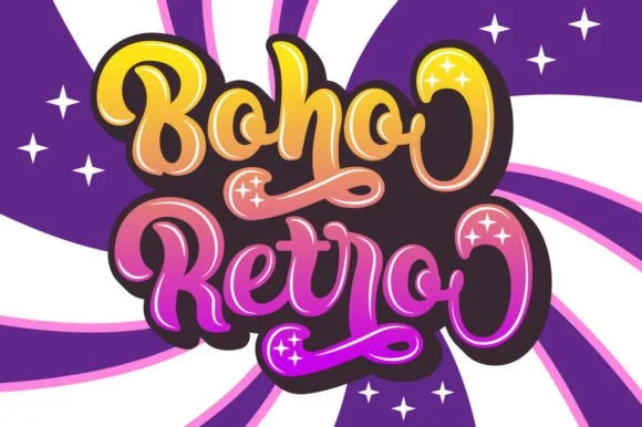
Boho Retro
Boho Retro is a plump, heavy-looped 1970s groovy display script with curled swash caps and pillowy connected lowercase bowls.
Boho Retro is a swirled nineteen-seventies psychedelic bubble script-display: fat rounded letters that swell at the waist, joins drawn as spirals and terminals that curl back into the letter like smoke. It is a poster face, so it wants size, two flat inks and a pale ground rather than a busy photograph. The spirals are the finest element and they fill into solid blobs as soon as the face is reduced. It needs roughly 44 mm for the spiral and the swell to read, and it is best two warm flat inks on a light stock.
Recommended project & layout
Retro festival ringer tee & iced-coffee glass wrap — Stack a two-word phrase at a slight upward 6-degree angle and add a contoured offset shadow layer in Cricut or Illustrator if you want the sticker look.
Before you cut or print
Weld connected lowercase letters before cutting vinyl, and check the tight interior spiral holes inside 'B', 'o', and 'e' when weeding.
Best paired with
Get fontPaid link
 #19
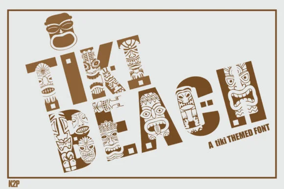
Tiki Beach
Tiki Beach is an illustrated tropical display font whose chunky block capitals are filled with carved tiki faces, palm-frond chevrons, and tribal motifs.
Tiki Beach is a Polynesian carved-totem and tiki mask display: heavy block letters carved with stacked horizontal grooves, small mask faces set into some counters and a rounded top edge that reads as a carved post. The mask faces are the design and they fill into the stroke once the face is reduced, and the grooves add a carved texture. It needs roughly 34 mm for the mask and the groove to read, and it is best in one dense ink on timber-toned stock, or a routed cut where the grooves become real channels.
Recommended project & layout
Luau party invitation, tiki-bar menu & pool-deck poster — Set 1 or 2 short words large (64–110 pt) in warm teak brown, terracotta, or teal on clean sand-cream cardstock.
Before you cut or print
Contains dozens of tiny interior pattern cutouts per letter—use Print-Then-Cut, sublimation, or flat print, NOT blade-cut vinyl weeding.
Best paired with
Get fontPaid link
 #20
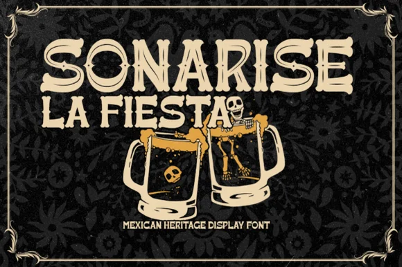
Sonarisa La Fiesta
Sonarisa La Fiesta is a lively Mexican-heritage display typeface with flared Tuscan-style spurs, dancing baselines, and hand-carved warmth.
Sonarisa La Fiesta is a hand-carved Mexican fiesta and cantina serif display: chunky bracketed letters with visible chisel facets, small star or diamond cuts set into the counters and edges that read as carved and painted timber. The facets are the design and they flatten into a solid block once the face is reduced, and the star cuts close first. It needs roughly 32 mm for the facet and the star to read, and it is best in three flat inks on cream, or one ink plus paper where the stars print as knockouts.
Recommended project & layout
Día de los Muertos banner, taco-bar menu & cantina sign — Stack 2 or 3 centered uppercase lines in warm cream, marigold gold, or fiesta coral over dark papel-picado backgrounds.
Before you cut or print
Chunky solid stems with flared ends cut cleanly on cardstock banners, HTV aprons, and painted wood stencils down to 0.75 in.
Best paired with
Get fontPaid link
 #21
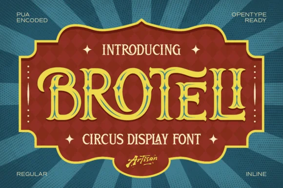
Broteli
Broteli is a theatrical vintage carnival display font featuring bifurcated Tuscan spurs, curled terminals, and both Regular and Inline cuts.
Broteli is a Tuscan-spurred circus and carnival poster display: heavy unbracketed slabs that split into a forked foot, a median spur rising from the middle of some stems, small ball terminals and a slight inward curve on the round letters that reads as a hand-painted carnival board. The forks are the design and they close first when the face shrinks. It needs roughly 32 mm for the fork and the spur to read, and it is best in two bright inks on cream, or one ink plus paper where the forks print as cuts.
Recommended project & layout
'Step Right Up' carnival birthday marquee & ticket invite — Set the child's name or 'CARNIVAL' in Broteli Inline at 56 pt inside a bordered plaque, flanked by four-point star dingbats.
Before you cut or print
Choose the solid Regular cut when cutting cardstock or vinyl banners; save the detailed Inline cut for printed invitations and posters.
Best paired with
Get fontPaid link
Matched Font Duos & Packs
7 fonts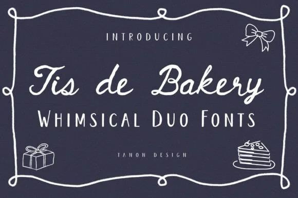 #22
Tis De Bakery
Tis De Bakery is a charming bistro font duo pairing a relaxed monoline cursive script with a tall, whimsical semi-serif uppercase font!
Tis De Bakery is a duo: a whimsical café monoline script with a light even stroke and a loose bounce, plus a quirky tall serif and a tall sans for the supporting lines. The script carries the shop name while the tall faces carry the menu, so a board uses two voices from one family. The monoline survives uncoated stock where a contrast script would break, and the tall serif needs size for its small serifs. The script needs roughly 22 mm and the tall serif 18 mm for their detail to read.
Recommended project & layout
Café chalkboard menu, cake-care instruction card & box — Set menu headers in Tis De Bakery Script (64 pt) above +8 tracked Whimsical Caps (36 pt) inside a doodled frame.
Before you cut or print
Uniform monoline weights draw wonderfully with white/gold Cricut Gel Pens on dark cardstock, and cut vinyl at 1 in+ (Weld script!).
Best paired with
Get fontPaid link
 #23
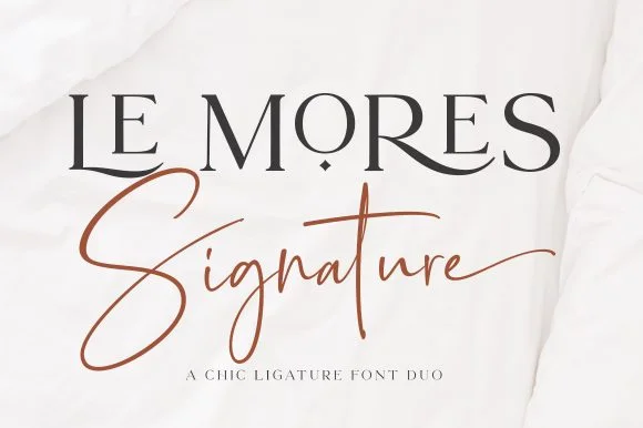
Le Mores Signature
Le Mores Signature pairs an editorial ligature serif—highlighted by cradled base loops—with a brisk copper-toned signature cursive.
Le Mores Signature pairs a ligature-rich editorial serif with a slanted signature script: the serif is a moderate-contrast face with true ligatures and oldstyle figures for running text, while the script is a fast slanted signature with a looping capital and a heavy exit stroke. The pair is how a printed magazine signs a page, so the serif carries the body and the signature carries the name. The signature's thin connectors are the finest element and they break first. The serif needs roughly 20 mm and the signature 30 mm for their detail to read.
Recommended project & layout
Boutique fashion hangtag, perfume box & atelier logo — Set the primary brand name in tracked-open serif capitals at 36 pt and overlap a single script subword across the lower-left stem.
Before you cut or print
Keep the slender signature script in print, hot foil, or larger 2.5 in+ decals rather than tiny blade-cut vinyl.
Best paired with
Get fontPaid link
 #24
Country Kitchen
Country Kitchen is a two-cut duo in which narrow upright capitals set the plain line and a darker connected script carries the warm one, so a kitchen sign can separate a heading from a phrase without a third family.
The capital cut stands narrow and unjoined with even strokes and tight counters, while the script cut connects through tall k and h loops and long low entry and exit strokes at a heavier weight. The contrast in join is the character: one member is printed, one is written, which is why the sample pairs a thin cap line with a dark script beneath it. Set the caps at 16 pt and the script at 22 pt for a balanced pair, and weld the script before cutting from 1.1 inches of x-height. The photographed interior, the boards and the props are presentation; the lettered sign is the duo.
Recommended project & layout
A farm-kitchen menu header — Place the capitals above the script with a clear gap, then start dishes and prices in plain type below both tails.
Before you cut or print
Check the actual pair and leave menu details undecorated.
Best paired with
Get fontPaid link
 #25
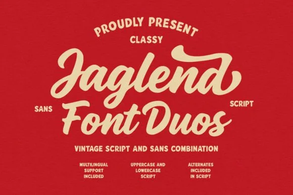
Jaglend Font Duo
Jaglend Font Duo pairs a thick, creamy vintage sign-painter brush script with a sturdy, hand-drawn condensed uppercase sans companion.
Jaglend Font Duo pairs a retro sign-painter brush script with a rugged condensed sans: the script carries a loaded stroke with small flicks and connected letters on a firm slant and a shallow bounce, while the sans is narrow with uneven edges that read as a sanded board for lists and prices. The two voices share one palette, so a window, a price list and a card can be built from one family without a third face. The script's flicks are the finest element and they close first at small sizes, while the condensed sans stacks a long service list in a narrow panel without wrapping. The script needs roughly 24 mm and the condensed sans 18 mm for their detail to read.
Recommended project & layout
BBQ rub tin, craft soda label & barbershop window sign — Arch the sans uppercase header over a large slanted Jaglend Script centerpiece and anchor with tracked sans footers.
Before you cut or print
Broad solid brush strokes cut cleanly on HTV, sticker vinyl, and wood-sign stencils—weld script connections before cutting.
Best paired with
Get fontPaid link
 #26
Tropical Sunlight
Tropical Sunlight is a duo of a heavy retro script with broad loops and a rounded block sans, shown stacked so the script carries the name and the sans shouts the second line.
The script half is a fat connected hand whose capitals open into wide loops, whose joins carry the same weight as the stems and whose ends curl rather than taper, giving the word a painted-sign feel at any size above 30 pt. The sans half is a rounded block with no contrast, short caps and wide letterfit, and in the sample it is set larger than the script so the two lines balance as a single badge. A smaller italic line beneath shows how the pair handles a third register. The script's loops are what let it hold a wide measure without tracking, and the sans supplies the shout. The cream ground, the navy and orange inks, the small beach drawing and the credits are presentation; the duo is the lettering.
Recommended project & layout
A beach-day event heading — Place a short script line above one block title and move dates to a plain strip.
Before you cut or print
Check the top loop clears the preceding line and verify the two styles.
Best paired with
Get fontPaid link
 #27
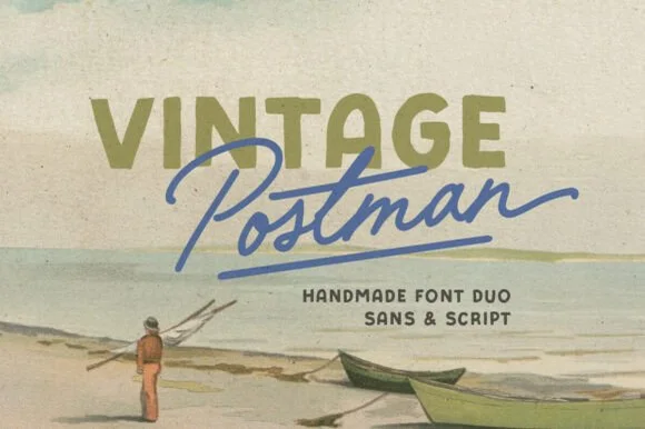
Vintage Postman
Vintage Postman pairs a sturdy retro sans with the look of a soft rubber stamp and a brisk monoline brush script: the olive sans holds a solid horizontal line while the angled script cuts across the baseline with a hand-signed slant.
The sans cut keeps even stems, softly rounded corners and a slightly uneven impression, and the script cut draws a monoline stroke at a steady width with a sharp slant and quick connectors. The pairing of a grounded row and an angled line is the character: one gives structure and the other gives motion, which is why the sample sets the olive words above the blue signature. Because the script slants, keep 18 mm between the rows and 20 mm at the right for the exit; the sans stays readable from 0.35 inches of pen height.
Recommended project & layout
Coffee bag label, travel poster or surf-shop tee — Set the geographical or brand noun in all-caps sans and overlap the descriptor in angled script.
Before you cut or print
Check light organic edge texture on the sans if cutting decals under 1.5 inches.
Best paired with
Get fontPaid link
 #28
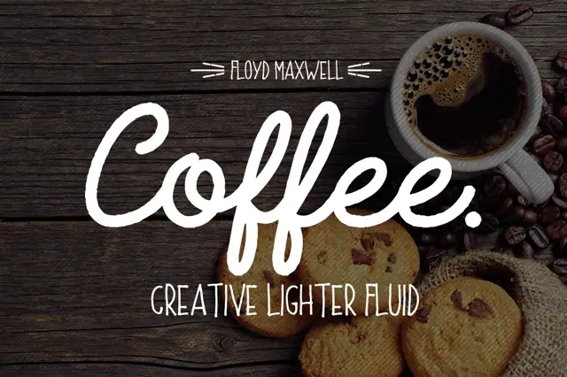
Coffee Font + Extras
Coffee Font + Extras pairs a heavy connected script with a light rounded uppercase sans, so a name can be carried loudly in script and supported quietly in caps beneath.
The script half is a fat connected hand with a rounded terminal on every stroke: the capital C opens as a broad crescent, the o and the f close tight bowls, the e loops back through its own counter and the second f repeats the shape, which is what gives the word its café-sign look. The sans half is a light rounded capital face with even strokes and wide letterfit, and in the sample it carries a supporting line at a size small enough to stay quiet under the script. The contrast between the heavy script and the light caps is the whole point of the pairing: one line announces, the other informs. The dark timber ground, the white inks, the coffee cup and the crumbed biscuits are presentation; the duo is the lettering.
Recommended project & layout
A coffee-cart menu hierarchy — Use script at the top, short caps section labels below and prices in a plain aligned column.
Before you cut or print
Keep f loops away from labels and inspect the caps at menu size.
Best paired with
Get fontPaid link
Practical buyer checklist
Frequently asked questions.
Key cutting, printing and pairing answers before choosing a artisan bakery, café & menus typeface.
Should a café menu use a script font for item names?
No. Scripts slow scanning and make prices hard to align. Reserve the script for section headers and the logo, and set item names in a plain text face at 10 to 12 pt with generous leading.
Which fonts survive chalkboard lettering?
Monoline and single-weight faces, because chalk cannot render stroke contrast. Anything with fine hairlines turns into an even line and loses the design. Keep lettering large, 1.5 inches or more, and use a chalk marker with a chisel tip.
How do I align prices cleanly on a menu?
Use right-aligned tab stops with a leader dot rather than typing dots by hand. Keep the price column the same width on every page, and check that numerals are tabular so 1 and 8 occupy the same space.
Can one font work across signage, packaging and menus?
A face with a wide weight range can, and that consistency helps recognition. Most cafés need three: a script for the brand, a text face for menus, and a condensed numeral set for prices. Three is plenty for a small shop.
Keep exploring
Related collections & guides.
Explore adjacent maker roundups or check our practical pre-production checklists.


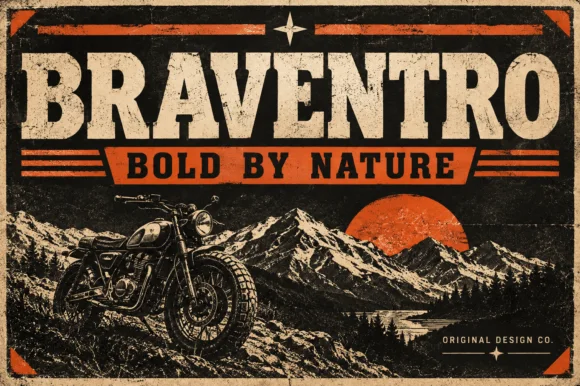
01 / Branding & Print
Brand & packaging
39 curated fonts · Previews & pairings

02 / Cricut & Craft
Coffee mugs, glass cans & barware
25 curated fonts · Previews & pairings
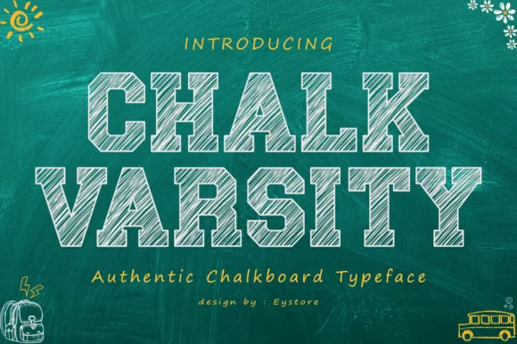
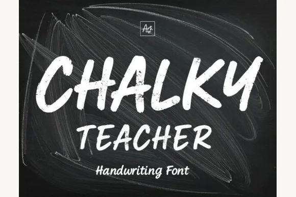
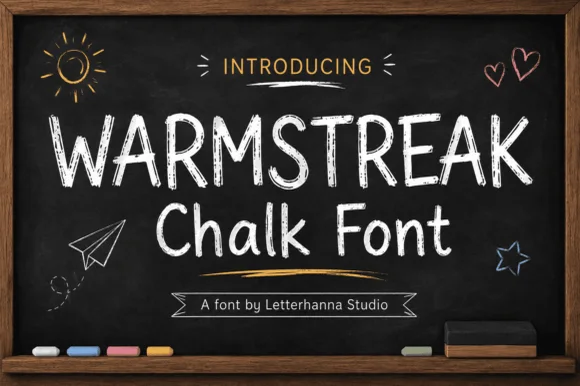
03 / Branding & Print
Chalkboard, slate & bistro
15 curated fonts · Previews & pairings

04 / Cricut & Craft
Monoline cursive & marker scripts
23 curated fonts · Previews & pairings
Guides: Invitation font checklist · Vinyl & cutting checklist · How to pair script & sans fonts