 #1 · Best Overall
Disclosure: MakerFileHub may earn a commission from qualifying purchases via paid links on this page. How our links work.
Bridges, military stencils & laser scoring
13 Best Stencil & Bridged Laser-Cut Fonts
A stencil font only works if every island is held by a bridge, and most listings never state the gap width. Army Force and Battle Army Stencil keep thick vertical breaks across the stem, Naya and Snout widen them for plywood, and Stencora carries the bridged logic into serif signage for a more polished job.
Quick verdict
Army Force is the most reliable all-purpose stencil for a first laser job, Naya and Snout suit thick plywood where bridges need to be wide, and Stencora covers the editorial serif case. Liberty Stencil wins when the project needs a heritage palette rather than a tactical one.
Quick answer
Top 3 stencil & bridged laser-cut picks right now.
Short on time? Start with our three highest-rated stencil & bridged laser-cut standouts before scrolling the full breakdown.
#1 · Best Overall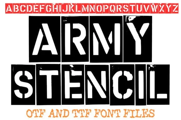 #2 · Runner-Up Pick
 #3 · Editor's Choice
Battle Army Stencil
Heavy stencil capitals with vertical breaks and fine scattered surface marks
Get fontPaid link
Read review ↓How we tested & selected these 13 fonts
We kept 16 of 70 candidates after checking that counters are genuinely bridged rather than merely broken, that gaps scale with the stem, and that the file behaves at both 1 inch and 8 inch cap heights. Fonts whose stencil look comes from a distressed texture instead of a structural bridge are excluded.
Side-by-side summary
Top 5 stencil & bridged laser-cut picks at a glance.
Compare specimens, OpenType/PUA traits and primary project roles side by side.
| Rank & Font | Style & File Specs | Best Project Fit | Store Listing |
|---|---|---|---|
| DisplayTactical | Veteran tribute shirt, tactical decal, gym banner or ammo-can stencil | Get fontPaid link | |
| DisplayFile formats | Surplus crate prop, veteran tribute tee or rugged poster | Get fontPaid link | |
| DisplayHeavy stencil capitals with vertical breaks and fine scattered surface marks | An industrial exhibition-poster heading | Get fontPaid link | |
| DisplayFile formats | Mylar spray-paint stencil, wood crate mark & tactical gear | Get fontPaid link | |
| DisplayWide rugged stencil capitals | A workshop equipment sign | Get fontPaid link |
Display & Decorative Headlines
9 fonts#1 · Best OverallArmy Force
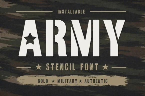
Army Force is a heavy stencil alphabet in which the stems are thick and squared, the counters cut straight through and a star replaces the counter of the A, so a word reads as equipment marking.
The A holds a five-pointed star in place of its counter, the R keeps a squared bowl and a straight leg, the M splays from a narrow vertex and the Y forks with flat cuts, all at a heavy even weight with bridges that keep the letters from closing. That construction is what makes the face practical: the bridges let the letters be cut as a mask as well as printed solid. Because the shapes are simple and the weight is uniform, a word stacks into two lines at 50 pt and reads from a distance on a case or a wall. The counters are wide enough to survive a spray. The brushed dark ground, the bone ink, the thin rules, the stars and the two caption lines are presentation; the typeface is the word.
Recommended project & layout
Veteran tribute shirt, tactical decal, gym banner or ammo-can stencil — Set in cream, olive drab or matte black all-caps.
Before you cut or print
100% cut-ready on Cricut, Silhouette and Mylar stencils.
Best paired with
Get fontPaid link
#2 · Runner-Up PickArmy Stencil
Army Stencil captures stamped metal military stencils across a full A to Z uppercase set with organic weathered edges, and the red alphabet banner along the top of the cover confirms clean stencil bridges across every enclosed letter from A through Z.
The strokes stay plain and heavy, the bridges remain clean across every enclosed letter, the edges weather organically and the wear varies from mark to mark. That stamped-metal feel is the character: the face reads as equipment marking rather than a decorative military theme, which is why the whole alphabet is shown. The wear is the fragile part, so check how it behaves at 40 mm, test the digits your crate codes need and keep the letters on a plain ground so the bridges stay legible.
Recommended project & layout
Surplus crate prop, veteran tribute tee or rugged poster — Set in bold black or olive drab all-caps on kraft, canvas or distressed backgrounds.
Before you cut or print
Subtle edge roughness prints great via DTF/screen; simplify or cut larger (2"+) if using vinyl.
Best paired with
Get fontPaid link
#3 · Editor's ChoiceBattle Army Stencil
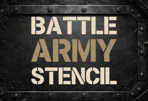
Battle Army Stencil shows three lines of pale and tan capitals on a riveted dark metal-like panel. Heavy plain strokes are interrupted by vertical breaks through bowls and crossbars, small speckled marks appear across several letter faces, the A and M use broad angled sections and the S is split near its upper and lower centres.
The stems stay heavy and plain, the breaks cut vertically, the speckles scatter unevenly and the diagonals on A and M open wide. That break pattern is the character: the letters look cut from plate steel rather than stencilled on paper, which is why the sample sits on a riveted ground. Check which letters carry breaks, keep 40 pt before the bridges close and confirm that the speckles are part of the file rather than the panel photograph. The breaks are the risk: the bridges close at about 30 pt and the letter then prints as a plain block, and the scattered speckles may come from the panel rather than the file.
Recommended project & layout
An industrial exhibition-poster heading — Use flat stencil capitals in a plain title rectangle above a separate exhibition-information strip.
Before you cut or print
Inspect every bridge and gap at print size and source background textures independently.
Best paired with
Get fontPaid link
 #4 · Top Maker Utility
Naya
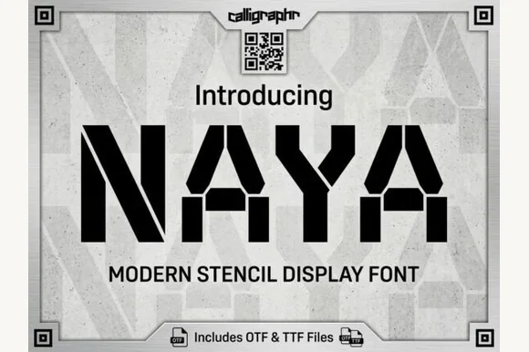
Naya is a heavy, wide-stance industrial stencil sans featuring clean angled bridge cuts and zero trapped enclosed counters.
Naya is a heavy geometric military stencil sans: thick squared stems, chamfered corners, a bridge cutting every closed counter and a strict vertical construction that reads as cargo marking. The bridge is structural, so it must stay wide enough for a blade or a stencil brush, and the geometric skeleton keeps the word level. It needs roughly 30 mm for the bridge and the chamfer to read, and it is best in one flat olive or black on raw board and white, or white on a dark cargo surface.
Recommended project & layout
Mylar spray-paint stencil, wood crate mark & tactical gear — Set uppercase cargo or brand headers at 48–120 pt with +15 tracking inside heavy corner-bracket borders.
Before you cut or print
100% stencil-safe for Mylar paint stencils, laser wood signs, plasma-cut metal plaques, and heavy vinyl down to 0.6 inches.
Best paired with
Get fontPaid link
 #5 · Standout Silhouette
Snout
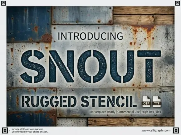
Snout is a wide industrial stencil in which heavy capitals are interrupted by narrow vertical gaps, the S and O stay round against straight-sided N, U and T shapes and a speckled fill roughens the surface, so a word reads as a sprayed crate marking.
The S turns a round spine, the O closes a wide ring, the N and U keep straight sides and every letter carries two or three narrow gaps cut from the top or bottom edge, with the speckle scattered across the fill. The gaps are the character: they let a wide letter read as a stencil without breaking the silhouette, which is why the sample sets a dark title on a metal collage. Because the gaps are narrow, the face wants 30 pt before they stay open, and it holds well in spray, print and vinyl from 0.85 inches of letter height. The metal and wood collage is artwork; the dark stencil letters are the face.
Recommended project & layout
A workshop equipment sign — Set the title on a plain high-contrast panel with safety instructions separately typeset.
Before you cut or print
Validate bridges and manufacturing constraints with the fabricator before cutting.
Best paired with
Get fontPaid link
 #6
Old Military Stencil
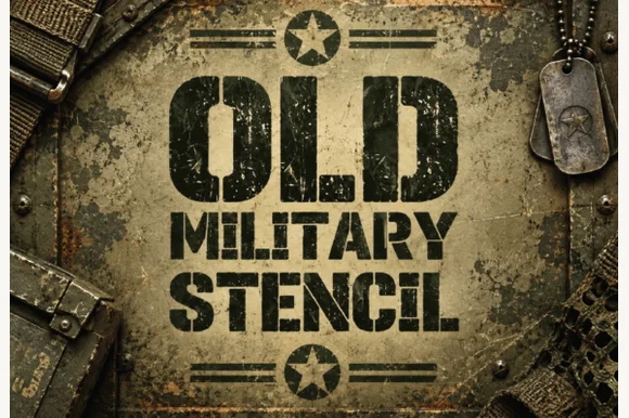
Old Military Stencil is a rugged, heavy-duty military stencil sans combining classic army bridge cuts with gritty field-worn paint texture.
Old Military Stencil is a heavy stencil sans with classic army bridge cuts, squared terminals and a gritty field-worn paint texture scattered across the strokes. The bridges are wide and deliberate, which means the letter reads as sprayed through a cut board rather than as a printed face, and the wear sits on the stroke so it survives at banner scale. It needs roughly 35 mm for the bridges and the texture to hold, and it is best in matte black on olive drab or in one ink on kraft.
Recommended project & layout
Veteran retirement shadowbox, ammo-can label & garage sign — Stack 2 or 3 centered uppercase rows framed top and bottom by circled five-point stars.
Before you cut or print
Internal paint-scuff pinholes look awesome in DTF shirts, laser wood/metal engraving, and print; Contour specks out if cutting physical Mylar stencils!
Best paired with
Get fontPaid link
 #7
Barista Stencil
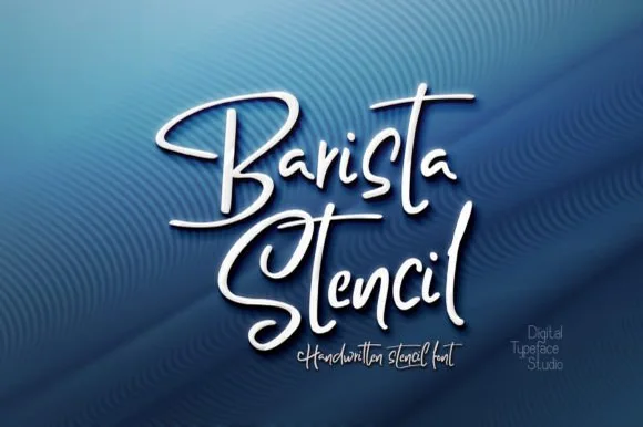
Barista Stencil is an ingeniously engineered handwritten stencil script crafted with ZERO closed loops—so inner letter islands never fall out when laser- or blade-cutting!
Barista Stencil is an open-loop bridged stencil calligraphy script made for wood and metal cutting: a loaded brush stroke with cut-through bridges across every loop, ragged edges and a firm slant that reads as a routed sign. The bridges are structural, and a bridge that is too thin disappears in a router or a plasma cutter. It needs roughly 32 mm for the bridge and the brush edge to read, and it is best as a routed or engraved one-colour job, or a stencilled ink on a flat surface.
Recommended project & layout
Laser-cut steel/wood sign, coffee cocoa-duster stencil & crate — Cut negative-space words into 3-inch round stainless/acrylic cappuccino cocoa-duster discs or 7.5 mil Mylar sheets!
Before you cut or print
Remember NOT to overlap bridge gaps—weld only the intended connecting baseline tails while keeping open loop gaps clear!
Best paired with
Get fontPaid link
 #8
Dyobar
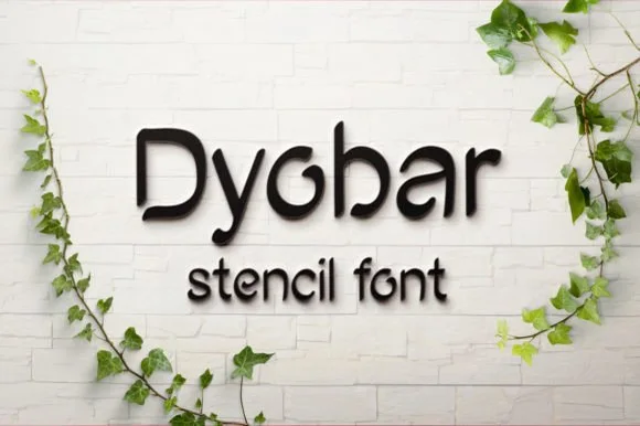
Dyobar is a tidy, modern rounded sans serif crafted without closed loops so every counter stays naturally bridged for stencil and laser cutting.
Dyobar is a clean open-loop rounded geometric stencil sans: circular bowls, thick even stems with fully rounded ends, and a bridge that opens every closed counter as a small gap in the curve. The geometry keeps a word friendly and the bridges make it usable as a cut stencil, so the gap width decides whether it paints or floods. It needs roughly 26 mm for the bridge and the rounded end to read, and it is best in one flat ink on raw board and white, or white on a dark surface where the rounded ends stay clean.
Recommended project & layout
CNC plasma-cut metal house sign, mailbox plate & doormat — Set family surnames or street names in mixed case at 2.5–5 inches tall inside a steel or birch cutout bar.
Before you cut or print
Sturdy uniform stroke thickness holds rigid in 14-gauge steel, 1/8 in acrylic, and 7.5 mil Mylar stencil sheets!
Best paired with
Get fontPaid link
 #9
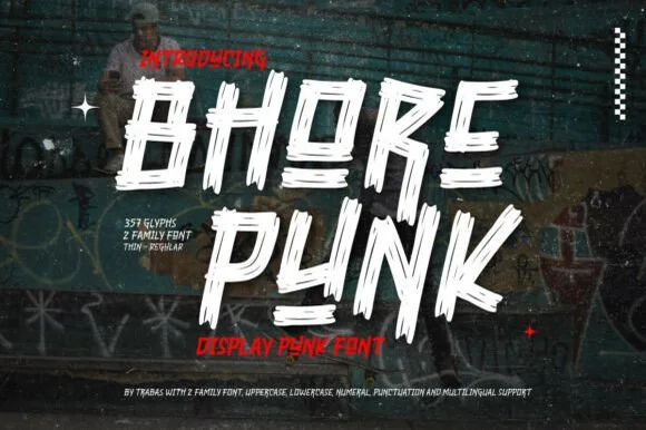
Bhore Punk
Bhore Punk is a fierce, slanted punk-rock display typeface sliced through with diagonal razor-cut stencil splits and jagged dry-brush spurs.
Bhore Punk is a slashed stencil-cut punk and streetwear display: squared letters cut through by three or four parallel slashes, with hard corners, a slightly uneven baseline and small torn bridges left holding the pieces together. The slashes are the design and they merge into solid notches as soon as the face is reduced. It needs roughly 30 mm for the slash and the bridge to read, and it is best as a one-colour vinyl cut or a flat two-colour print on uncoated stock.
Recommended project & layout
Punk gig flyer, skate zine masthead & album cover — Stack 2 short all-caps words tight in stark white and red over high-contrast monochrome photography.
Before you cut or print
For DIY spray-paint stencils or large HTV back prints, scale letters to 2 inches+ so all separated slash fragments stay easy to align.
Best paired with
Get fontPaid link
Serifs & Slab Serifs
4 fonts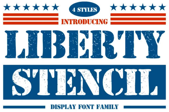 #10
Liberty Stencil
Liberty Stencil offers a four-style Americana slab-stencil family drawn from 1776 heritage crates, Independence Day banners and rugged apparel, where bracketed slab serifs meet crisp centre bridges instead of the flat shoulders of a modern military stencil.
The feet carry real brackets, the bridges cut through the middle of each letter and the weight stays even enough to hold up in a two-colour layout. The bracket is the character: the face looks cut from a wooden crate rather than sprayed through a metal mask, which is why the sample leans on a heritage palette. Four styles exist in the family, but the specimen shows one at a time, so confirm which cut your file contains and keep 40 pt before the narrow bridges close in print.
Recommended project & layout
4th of July porch plank, Memorial Day tee or brewery sign — Use the clean/solid style from the 4-font pack for vinyl stencils and textured styles for print.
Before you cut or print
Verify clean vs distressed style selection before sending to a cutting machine.
Best paired with
Get fontPaid link
 #11
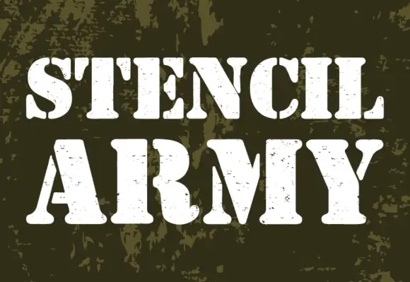
Stencil Army
Stencil Army shows white uppercase words on an olive camouflage field, where heavy stems and broad curved slab feet are interrupted by stencil breaks, and the C and S curves split vertically while E arms separate from parts of the main stem.
The weight stays heavy, the feet curve wide, the breaks cut through the middle of the letters and small worn marks roughen the rest. That broad foot is the character: the word reads as sprayed through a cut mask rather than printed from a plate, which is why the sample leans on a camouflage ground. The treatment is visible distress rather than proof of military use or a cut-ready stencil, so inspect the outlines before any mask and keep 40 pt so the breaks survive.
Recommended project & layout
A distressed industrial-history heading — Keep the flat title on a plain panel with credits and historical claims in a separate reading-face column.
Before you cut or print
Check fine worn marks at print size and do not infer historical authenticity from the visual theme.
Best paired with
Get fontPaid link
 #12
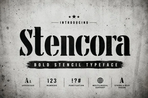
Stencora
Stencora is a bold, refined mixed-case stencil display serif pairing classic ball terminals and thick vertical stems with razor-clean stencil bridges.
Stencora is a bold stencil display serif that keeps classical ball terminals and thick vertical stems while cutting razor-clean bridges through the letters, so it reads as industrial signage rather than military stencil. The bridges are narrow and precise, which means they close below roughly 22 mm, and the mixed case keeps a line readable at 30 mm. Contrast is high enough to look editorial, and the face is best in one flat colour on concrete, board or a dark garment, where the cut bridges stay visible as light.
Recommended project & layout
Specialty coffee-roaster sack, industrial gin bottle & crate — Set 1 title-case brand name at 64–120 pt in matte black over raw concrete, kraft paper, or unbleached canvas.
Before you cut or print
100% clean, non-distressed vector bridges cut crisply on Mylar stencils, laser wood, and Oracal 651 vinyl down to 1 inch!
Best paired with
Get fontPaid link
 #13
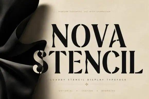
Nova Stencil
Nova Stencil is a luxury stencil serif in which every stem is interrupted by a narrow bridge, the contrast stays high and the feet flatten, so a word reads as a couture stencil rather than as a military one.
The N carries two bridges, the O opens at the top and the bottom, the V splits at the apex, the S breaks its spine twice and the E cuts both arms, all at a high contrast with flat serifs and bridges about a tenth of the stem width. The bridges are the character: they are cut where a stencil would weaken a bowl, which is why the face keeps its elegance instead of turning industrial. Because the bridges are narrow, the face needs 50 pt before they read as cuts and not as print faults, and it wants a smooth ground. The crumpled beige backdrop, the small caps line above and the category line below are presentation; the black stencil word is the face.
Recommended project & layout
A stencil-style label-name study — Begin with a flat printed lockup rather than a physical cutout.
Before you cut or print
Check name rights and gap visibility at size.
Best paired with
Get fontPaid link
Practical buyer checklist
Frequently asked questions.
Key cutting, printing and pairing answers before choosing a stencil & bridged laser-cut typeface.
What is the smallest stencil gap that still holds on a laser cutter?
Around 0.6 mm is the practical floor on 3 mm plywood with a well-tuned kerf. Below that, the bridge heats, chars and often breaks. On a diode laser working at slower speeds you can hold 0.5 mm, but run a test coupon first.
Can stencil fonts be used with a Cricut blade instead of a laser?
Yes, and bridged designs weed more easily than solid ones because each island is already attached. Cut adhesive vinyl at 1.25 inches or taller so the bridge strips do not tear while the waste piece lifts.
Why does my stencil letter look solid after spraying?
Paint bridges across narrow gaps as the stencil flexes, and overspray fills small slits. Hold the can further back, apply thin coats, and lift the stencil immediately instead of letting the paint tack while the mask is still pressing down.
Do stencil fonts include lowercase letters?
Many military and industrial stencils ship capitals only, with lowercase mapped to small caps. Check the glyph count before setting a sentence, and plan around all-caps headlines if that is what you have.
Keep exploring
Related collections & guides.
Explore adjacent maker roundups or check our practical pre-production checklists.

01 / Cricut & Craft
Vinyl & Cricut cutting
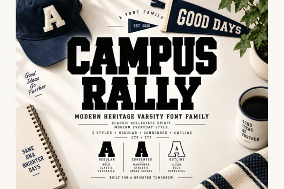
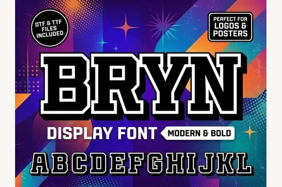
38 curated fonts · Previews & pairings
02 / Holidays & Seasons
4th of July & Americana
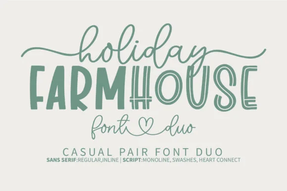
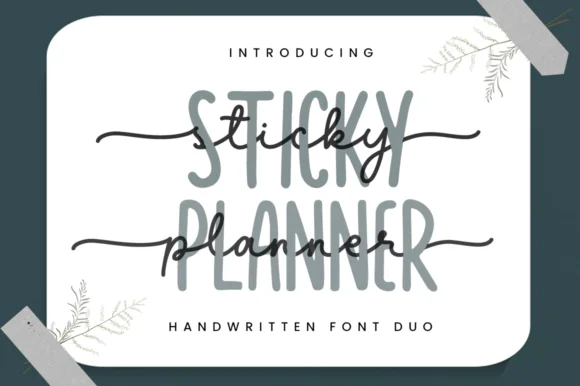
14 curated fonts · Previews & pairings

03 / Cricut & Craft
Modern farmhouse & wood signs
27 curated fonts · Previews & pairings
04 / Cricut & Craft
Monogram & split-letter
22 curated fonts · Previews & pairings
Guides: Invitation font checklist · Vinyl & cutting checklist · How to pair script & sans fonts