 #1 · Best Overall
Petunia Bounce
Quirky playful serif with a bounce and hand-drawn alternates
Get fontPaid link
Read review ↓Disclosure: MakerFileHub may earn a commission from qualifying purchases via paid links on this page. How our links work.
Picture-book serifs, fairytale curls & cover lettering
A children's book face has to be friendly on the cover and steady for a hundred pages of interior text, and those are different jobs. Petunia Bounce and Kidlit carry the mid-century picture-book warmth, Abraca and Storybook Fantasy handle the enchanted cover lettering, and River School and Timelapse add the retro and Victorian storybook options. Whimsical supplies solid, outline and dotted versions for cover systems.
Quick verdict
Petunia Bounce is the warmest usable interior serif, Storybook Fantasy is the strongest enchanted cover face, and Whimsical gives you a three-style cover system. Kidlit suits early-reader books.
Quick answer
Short on time? Start with our three highest-rated children's books & fairytale standouts before scrolling the full breakdown.
#1 · Best OverallQuirky playful serif with a bounce and hand-drawn alternates
 #2 · Runner-Up Pick
 #3 · Editor's Choice
Whimsical spiral-curled enchanted fairytale display serif (OTF & TTF)
We kept 26 of 383 storybook candidates, judging interiors and covers separately. Weighted x-height and letter spacing for beginning readers, whether the curl patterns repeat obviously, and how the face holds when printed at 14 to 18 pt on matte picture-book stock.
Side-by-side summary
Compare specimens, OpenType/PUA traits and primary project roles side by side.
| Rank & Font | Style & File Specs | Best Project Fit | Store Listing |
|---|---|---|---|
| SerifNostalgic | Children's picture-book cover, toy box logo or storybook birthday card | Get fontPaid link | |
| SerifPUA encoded · Alternates & swashes · Language support | Classroom library bin labels & reading-corner banner | Get fontPaid link | |
| SerifFile formats | Children's fantasy book cover, fairy-garden sign & potion jar | Get fontPaid link | |
| SerifFile formats | 'Once Upon a Time' princess/dragon invite & book-nook sign | Get fontPaid link | |
| SerifPUA encoded · Alternates & swashes | A class welcome card | Get fontPaid link |
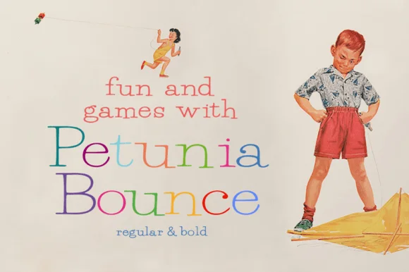
#1 · Best OverallPetunia Bounce is a quirky serif in which the letters step up and down, the serifs stay soft and the alternates swap in rounder forms, so a two-word title reads as a children's book headline rather than as a text face.
The P opens a soft bowl on a slim stem, the e turns a round eye, the t sets a light bar, the u drops a curved tail and the a closes a wide bowl, all at a moderate contrast with soft serifs, a visible bounce and a set of alternates in regular and bold. The bounce is the character: the baseline moves letter to letter, which is why the sample sets two stacked words in alternating colours and lets them rock. Because the counters stay open, the face reads from 24 pt in print and holds a cover at 80 pt, and the alternates let a repeated letter vary. The cream ground, the drawn boy, the kite and the small line beneath are presentation; the coloured title words are the face.
Children's picture-book cover, toy box logo or storybook birthday card — Use Bold for cover titles and Regular for chapter headings and read-aloud quotes.
Sturdy Bold weight also cuts cleanly on nursery wall vinyl.
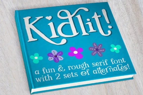
#2 · Runner-Up PickKidlit is a lively hand-drawn serif with organic, slightly wiggly stems, curled ascender tops, and multi-set alternates.
Kidlit is a hand-drawn bouncy storybook serif with curled ascenders: soft bracketed stems, a small x-height, letters that hop along the baseline and ascenders that curl over like a fern. It is a children's-book face, so it wants air and one warm ink rather than a busy illustration behind it. The curls are the finest element and they close into a hook once the face is reduced. It needs roughly 26 mm for the curl and the serif to read, and it is best one dark ink on a cream ground.
Classroom library bin labels & reading-corner banner — Set genre titles in 1.5 in mixed-case Kidlit above a smaller secondary line at 40% height, cycling alternate glyphs on repeated letters.
Sturdy stems cut cleanly on cardstock and adhesive vinyl down to 0.75 in; watch only the small detached dots on 'i' and '!' during transfer.
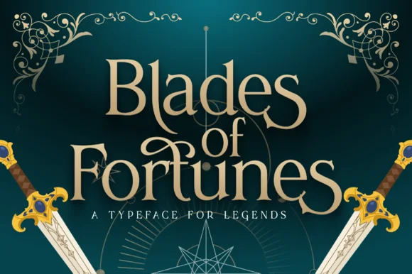
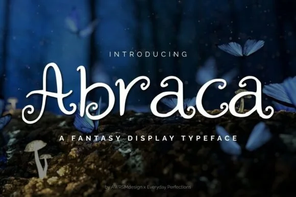
#3 · Editor's ChoiceAbraca is an enchanted storybook display serif curling delicate fairytale spirals into the bowls and terminals of 'A', 'b', 'r', 'a', and 'c' (OTF & TTF)!
Abraca is a storybook fantasy display with tall spiky ascenders, hooked terminals and a slightly uneven hand-drawn rhythm, so a word reads as a title on an old children's book rather than as a decorative spray. The hooks and spikes extend beyond the letter body, and the drawing keeps its warmth at large sizes, which is why it suits a cover better than a sign. It needs roughly 28 mm for the hooks to read as deliberate, and it is best in gold or a warm ink on deep green and plum, or dark on cream.
Children's fantasy book cover, fairy-garden sign & potion jar — Center 1 mixed-case title word huge (72–140 pt) above wide-tracked geometric sans ('A FANTASY DISPLAY TYPEFACE').
Clean, solid vector paths cut on 1.1 in+ Cricut vinyl/HTV, draw beautifully with Foil Quill, and laser-engrave crisply!
 #4 · Top Maker Utility
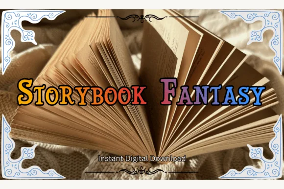
Storybook Fantasy is an ornate fairytale display serif featuring dramatic curled initial capitals alongside sturdy small-caps-style letters.
Storybook Fantasy is a swash-capped serif for enchanted and medieval storybooks: an even serif weight with a small bracketed foot, capitals that open into curled swashes and a few terminals that finish in a drawn leaf or a small fleur. The swashes lift above the line and extend the word, so a centred title needs side clearance. It needs roughly 30 mm for the swash curl and the leaf terminal to read, and it is best in one deep ink on cream, or a fine gold foil above 44 pt where the curl edge stays sharp.
'Once Upon a Time' princess/dragon invite & book-nook sign — Set phrases in Title Case at 44–72 pt so only the initial 'S', 'F', or 'O' carries the large fairytale curl.
Solid vector bodies cut cleanly on wood-sign vinyl, HTV, and cardstock cake toppers at 1.2 in+ height.
 #5 · Standout Silhouette
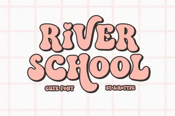
River School shows soft heavy serif-like forms with curved endings, where a heart-shaped dot and a long descending stroke interrupt an otherwise compact two-line shape.
The strokes stay heavy and round, the serifs soften into curves, the dot opens as a small heart and one stroke drops far below the baseline. That heart dot is the character: a retro face gains a single romantic mark without extra artwork, which is why the sample keeps two short rows close together. The long tail crosses the space between the lines, so keep 20 mm of clear ground beneath the descender and verify that the heart is a character rather than a cover addition.
A class welcome card — Leave space under the title for long tails.
Confirm the heart-dot option if needed.
 #6
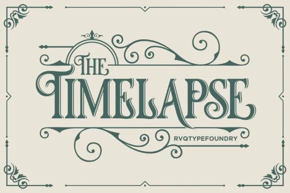
Timelapse is an ornate Victorian display serif crowned with spiraling vine swashes, teardrop terminals, and vintage apothecary charm.
Timelapse is a Victorian storybook and apothecary display serif with swashes: fine bracketed serifs against heavy stems, a small ball terminal on the diagonals, swash capitals that curl off the first letter and a slightly condensed width that keeps a long label on one line. The hairlines are the design and the swashes need side clearance. It needs roughly 30 mm for the swash and the hairline to read, and it is best in one fine ink on smooth or coated stock, or a foil impression above 40 pt where the curls still turn.
Steampunk or historical novel cover, tea tin & poster — Center 1-to-2-word uppercase titles at 48–72 pt, activating upper flourishes on left initials and lower curls on middle/right stems.
Fine spiral tendrils and thin serif crossbars belong in print, foil, or laser wood engraving rather than small cut vinyl.
 #7
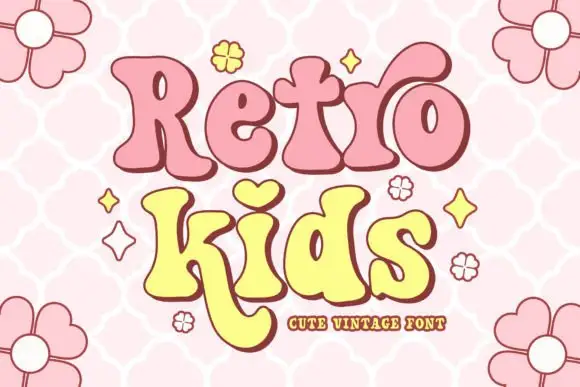
Retro Kids uses rounded heavy serif-like forms with uneven widths, where the i takes a heart for its dot, the k drops a long curved leg under the row, the two words sit in pink and yellow with a thick outline and the cover fills the field with outlined daisies.
The strokes stay heavy and soft, the feet round, the widths shift and one letter borrows a heart for a dot while another leg curves far below. That heart dot is the character, because it turns a plain vintage face into a children's mark with a single gesture. The daisies and stars are cover artwork. The source notes PUA-encoded extras and stylistic alternates, so check how the heart is reached and test the long k leg against your bottom margin before setting a two-row block.
A playful birthday front — Leave space below the long letter leg.
Verify available alternates for the actual words.
 #8
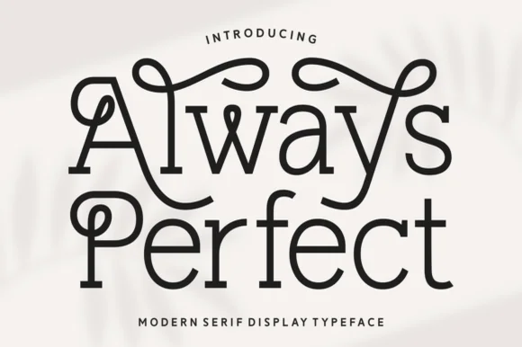
Always Perfect is a playful monoline swash serif whose tall stems curl into sweeping overhead loops, ball-tipped hooks, and linked ligatures.
Always Perfect is a looped monoline Art-Nouveau serif built for storybooks: an even delicate stroke, tall whipped ascenders that loop back over the word, wide round bowls and small curled terminals that echo the loops. The monoline keeps the face honest at small sizes, and the loops grow the word in both directions. It needs roughly 26 mm for the loop and the curl to read, and it is best in one fine ink on smooth ivory, or a single dark colour on a cream ground where the loops print as a drawn line.
Boutique patisserie box, flower-shop sign & bookplate stamp — Stack 2 mixed-case words centered at 44–72 pt, turning on curled swash alternates only on outer initials and ascenders.
Steady medium-thin monoline weight cuts cleanly on 1.4 in+ window or mug vinyl—weld any overlapping loop joins first.
 #9
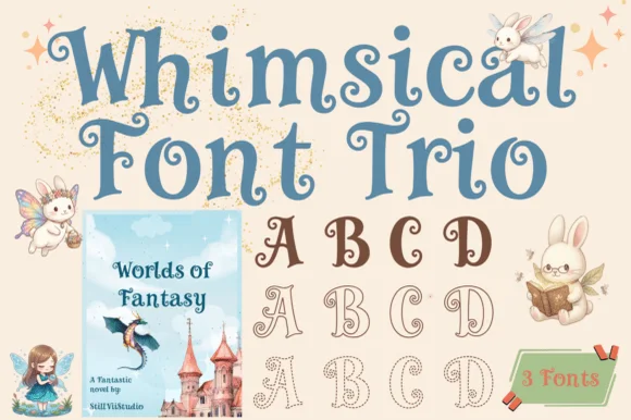
Whimsical is a coordinated 3-font fairytale serif trio offering matched Solid, Outline, and Dotted/Stitched cuts with curled spiral terminals.
Whimsical is a fairytale storybook serif in three styles, sold as a trio of solid, outline and dotted cuts: a light high-contrast serif with a small x-height, ball terminals and a slightly tilted stress, plus an outline version for layering and a dotted version for a stitching look. The family lets one cover carry a solid title and an outlined second line in the same voice. The outline and dotted cuts are the weakest elements and they close first. The solid needs roughly 26 mm and the dotted 36 mm for their detail to read.
Children's picture-book cover, fairy invite & nursery print — Use the Solid font at 48–72 pt for book titles and the Outline or Dotted cuts for activity/coloring pages inside.
Solid cut weeds cleanly on 1.1 in+ nursery wall vinyl and onesie HTV; save Outline and Dotted cuts for print and Cricut Pen.
 #10
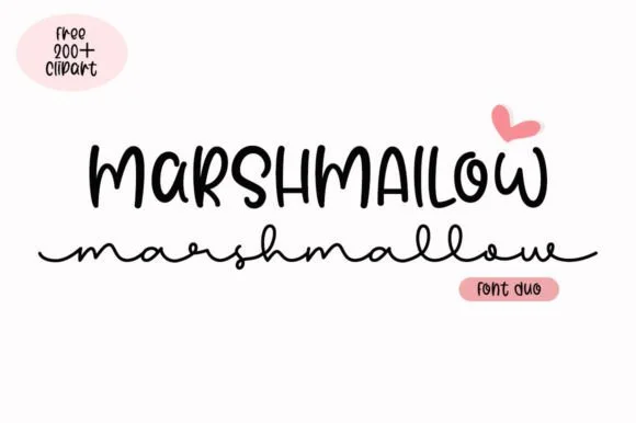
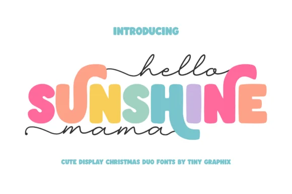
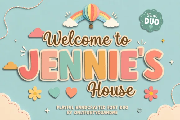
Jennie's House is a two-cut family in which chunky pastel capitals wear a heavy outline and a monoline script writes a second line, so a short phrase reads as stacked paper stickers.
The J hooks a wide foot, the E stacks three short arms, the N keeps two fat stems, the I stands as a plain bar and the S holds a soft spine, all at a chunky weight with rounded corners and a thick contour; the script cut draws a connected line with a tall loop on the W and a hooked h. The layering is the character: the outlined caps sit behind the script in the sample, which gives depth without a shadow effect. Both cuts hold from 26 pt upward and cut cleanly in card. The blue ground, the hot-air balloon, the clouds, the flowers and the small badges are presentation; the outlined caps and brown script are the family.
Nursery door plaque, baby shower welcome sign or kids' room print — Set the child's name in large coral/sage block caps framed by smaller script lines.
Both fonts use smooth vector shapes that cut cleanly on vinyl and wood/acrylic.
 #11
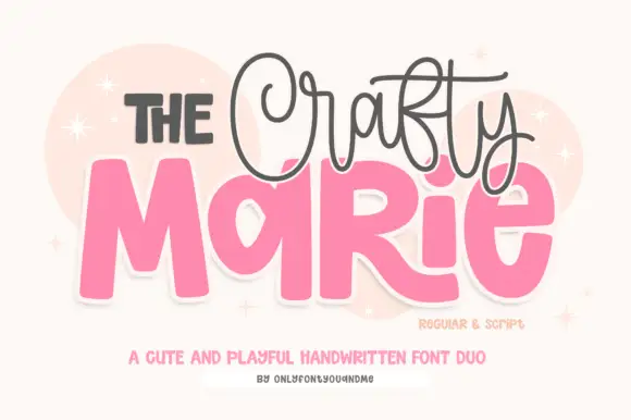
The Crafty Marie sets fat rounded blocks at poster scale and a fine looping script above them, so a maker's name reads as a bold shape with a delicate signature riding over it.
The block half is very heavy: the M holds two thick diagonals and a shallow vertex, the A closes with a low bar, the R keeps a fat bowl and a straight leg and the E carries three even arms, all with fully rounded corners and no contrast at all. The script half is the opposite: a fine monoline with tall loops, thin joins and a light slant, set smaller and tracked across the top of the blocks. That contrast is the whole point of the pair — one face carries visual weight and the other carries personality, which is how a small craft brand gets both at once. Counters in the blocks stay open at 30 pt. The blush ground, the pale circles, the sparkles and the two small caption lines are presentation; the duo is the lettering.
A craft-stall name board — Separate the script line from the block name rather than letting loops cross small counters.
Verify both styles and the actual name characters.
 #12
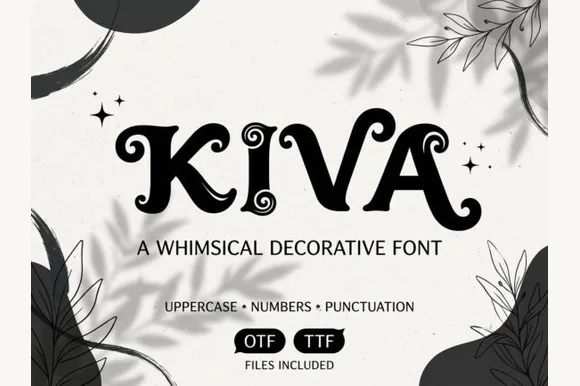
Kiva is a playful fairytale decorative font featuring chunky flared stems and exaggerated spiraled ball terminals (uppercase, numbers, punctuation).
Kiva is a curly storybook display in which the ascenders and descenders end in ball-drop hooks: a soft rounded stem, a small bracketed curve at the shoulder and a heavy bead that hangs off the terminal. The hooks grow the word vertically at both ends, and the bead is the one detail that disappears first. It needs roughly 32 mm for the hook and the ball drop to read, and it is best in one deep ink on cream, or a fine gold on a dark ground where the beads print as bright points.
Children's picture-book title, potion label & woodland print — Center short 4-to-7-letter uppercase titles at 48–76 pt framed by simple line-art leaves or stars.
Sturdy strokes and round ball tips cut cleanly on Cricut vinyl, HTV, and cardstock down to 1 inch cap height.
 #13
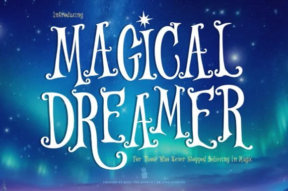
Magical Dreamer is a tall, dreamy fairytale display serif curling spiral hooks and twinkling aurora magic into storybook capitals (with alternates & swashes)!
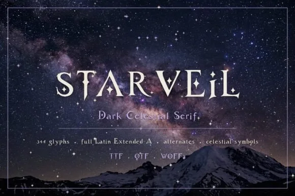
Magical Dreamer is a celestial fairytale serif in which the swashes curl into starlight: caps open into long curls tipped with small stars, the serifs finish in fine points and the alternate set adds trails that run off the last letter. The star tips are the finest element and the trails extend the word, so the box needs side clearance. It needs roughly 34 mm for the star tip and the curl to read, and it is best in one deep ink on cream, or a fine gold foil above 46 pt where the star edges stay sharp.
Celestial 'Twinkle Little Star' invite, nursery print & tee — Stack 2 tall uppercase lines centered at 76–155 pt crowned by a four-point North Star above matching lowercase subtext.
Solid, smooth hand-drawn stems cut cleanly on Cricut glitter HTV and Oracal 651 above 1.1 inches!
 #14
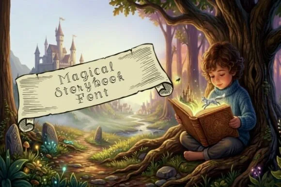
Magical Storybook is a delicate hollow-outline fairytale font curling storybook spirals onto open-centered uppercase and lowercase letters.
Magical Storybook is a hollow-outline fairytale display whose open-centred letters curl storybook spirals on the M, S, b and k, so a word reads as a title drawn with a fine pen rather than filled with ink. The outline is thin and the interior is open, which means the face needs size and a clean print to keep the double line from closing. It needs roughly 30 mm for the outline and spirals to hold, and it is best in one fine dark ink on parchment cream or as a gold line on a deep ground.
Children's fantasy scroll header, potion-craft sheet & card — Stack 2–3 mixed-case words at 56–115 pt across parchment banners or watercolor clouds.
Ultra-fine hollow outlines are strictly for flat print, digital illustrations, Foil Quill, and Cricut Pens—never blade-cut small vinyl!
 #15
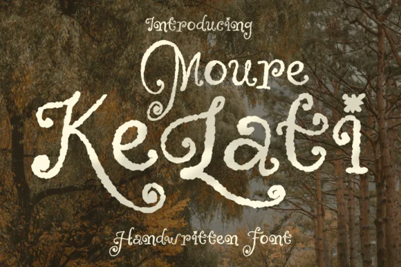
Moure Kelati is a whimsical, rough-edged fairytale display font (disconnected, NOT a smooth script!) with spiral capitals and star/flower 'i' dots!
Moure Kelati is a weathered woodland storybook display whose disconnected letters curl spirals on the M, K and L and top their i dots with star and flower shapes, so a word reads as a page from a rough-edged fairy tale rather than a smooth script. The rough edge is baked into the contour, which means the face holds at large sizes and turns to noise below about 26 mm. It needs roughly 26 mm for the edge to read as paper rather than dirt, and it is best in parchment cream on a dark forest ground or in one dark ink on cream.
Folklore fantasy book cover, mushroom foraging guide & tea — Stack 2 mixed-case words centered at 64–130 pt in antique parchment over dark forest greens and browns.
Roughened organic edges and fine spirals are crafted for book covers, DTF apparel, sublimation, and flat print—avoid small vinyl weeding!
 #16
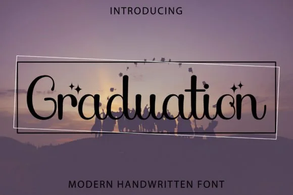
Graduation (by Kido Studio) is a whimsical PUA-encoded decorative serif (NOT a blocky slab!) curling fairytale loops and four-point stars around mixed-case letters!
Graduation is a whimsical decorative serif in mixed case, with curled ball terminals, fairytale loops on the ascenders and four-point star accents supplied as PUA glyphs so the sparkle can be placed deliberately rather than applied as a graphic overlay. The contrast is moderate and the counters stay open, which lets the face hold at 14 pt, and the ball terminals give a word a soft, celebratory edge without the bounce of a script. Because the stars are glyphs, they inherit the text colour and reflow with the line, which is useful on a card set in one ink.
'Reach for the Stars' grad cap topper, frame & invite — Center 1 mixed-case word at 68–140 pt inside tilted geometric hairline frames.
PUA-encoded alternates copy easily via Character Map; cut solid letters at 1.2 in+ on vinyl or print at any size!
 #17
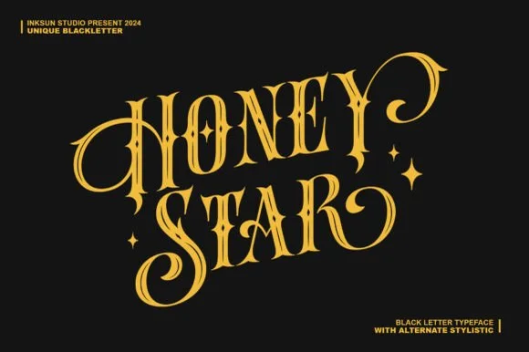
Honey Star is a whimsical, medium-bold ornamental blackletter blending diamond gothic stems with sweeping celestial spiral curls.
Honey Star is a Victorian ornamental blackletter crossed with psychedelic swashes: dense broken strokes with a heavy vertical rhythm, split serifs that curl into long spiral tails, small stars set into the counters and a warm wobble across the baseline. The spirals and the stars are the finest elements and both close first. It needs roughly 34 mm for the spiral and the star to read, and it is best in two warm inks on cream, or one dense ink on white where the spirals print as drawn lines.
Celestial tarot box, apothecary candle & spooky-season mug — Center a 2-word title in metallic gold over midnight black or deep plum, flanking outer curls with minimal star marks.
Main stems have decent body, while outer spiral tips taper fine—favor gold foil, sublimation, or 1.8 in+ vinyl decals.
 #18
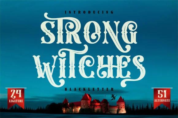
Strong Witches is a lively, fairytale-gothic blackletter softened by bouncy curled swashes, 24 ligatures, and 51 stylistic alternates.
Strong Witches is a playful curly-swashed fantasy blackletter with twenty-four ligatures and fifty-one alternates: dense broken strokes with a light rhythm, curls that sprout off the shoulders and a swash set that turns a plain word into a drawn spell. The alternates only appear through specific keystrokes, and the curls are the finest element. It needs roughly 32 mm for the curl and the ligature to read, and it is best in two flat inks on cream, or one dense ink on white where the curls print as drawn lines.
Hocus-Pocus party shirt, potion jar label & spellbook prop — Stack 2 centered words at 48–68 pt and swap in 2 or 3 of the 51 PUA alternates on outer capitals and descenders.
Sturdy main stems cut well on HTV and vinyl at 1.4 inches+ tall; take care around the narrower curled tail hooks when weeding.
 #19
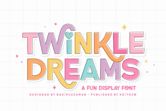
Twinkle Dreams combines firm block capitals with a heart-shaped dot above the i and curling extensions on selected letters, where the R and K tails swing below the main rows, each letter takes a pastel fill with a fine dark edge and the whole block sits on a faint grid.
The bodies stay blocky and even, the edges stay fine, the fills change per letter and two letters drop long tails under the baseline. That heart dot is the character: a plain display face gains one playful substitution, which is why the sample keeps a short title. The grid and the sparkles are cover treatment. Keep 40 pt so the fine edges stay separate from the fills, verify the heart form in your file and check the swinging tails against the line beneath.
A wish-themed party invitation — Keep the phrase large with clear room below any R tail; place details in plain text.
Check the actual letters and do not assume a heart appears in words without i.
 #20
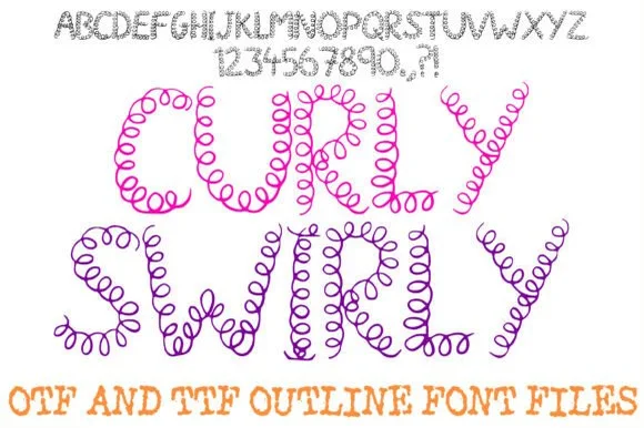
Curly Swirly Handwriting Abc is a whimsical novelty display font drawn entirely from continuous, bouncy spring-coil pen loops.
Curly Swirly Handwriting Abc is a continuous coiled-loop doodle alphabet in which every letter is drawn as a telephone cord: an even line spiralling through the whole character, loops that touch the neighbours and no detached stroke. The cord grows the word in both directions, and the loop spacing is the readable detail. It needs roughly 30 mm for the loop pitch to read, and it is best in one fine ink on white, or a single bright colour on kraft where the coils stay open.
Elementary art-board header, Cricut Pen card & binder cover — Set short 1-to-2-word headers big (60–110 pt) in magenta, purple, or turquoise on bright white cardstock.
Dozens of tiny closed coil loops per letter mean you MUST use print, sublimation, or Cricut Pen drawing—never weed blade-cut vinyl!
 #21
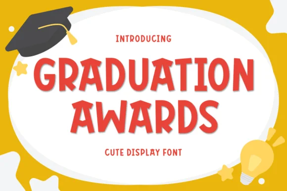
Graduation Awards is a sunny, bouncy cut-paper display sans (NOT a slab serif!) built for Pre-K/Kindergarten awards, stickers, and kid celebrations (Multilingual)!
Graduation Awards is a bouncy rounded display sans with chunky capitals, a clipped cut-paper rhythm and slightly varied cap heights, drawn in a bright weight whose joins are simple enough for a cutting machine. Because each letter is a closed shape with generous counters, it reads at sticker scale and at banner scale without changing character, and the multilingual support lets the same award design serve bilingual classrooms. It is emphatically a celebration face: warm, loud and short-phrase only, and it needs roughly 14 mm before the bounce starts to look cramped.
Kindergarten 'SUPER READER' award, moving-up banner & tee — Stack 2 centered uppercase lines at 64–125 pt in cherry red, royal blue, or gold on white certificates.
Thick, smooth rounded shapes cut and weed in 4 seconds on Cricut cardstock, HTV, and Oracal 651 down to 0.55 inches!
 #22
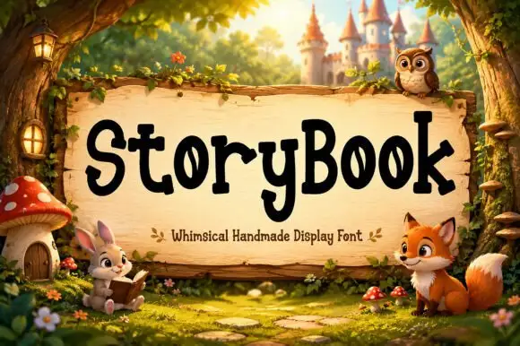
Storybook is a mixed-case display in which the letters stand upright with gently pointed serif ends, the heights shift slightly and the o counters narrow into leaf shapes, so a title reads as hand-carved lettering for a children's tale.
The S turns a soft spine with pointed terminals, the o pinches its counter into a leaf, the y drops a short rounded descent and the capitals sit only a little above the lowercase, so a word stays even in tone. The pointed soft serif is the character: it suggests a carved edge without any distress, which is why the sample sets one title on a wooden sign. Because the points are soft, the face holds from 26 pt and cuts from three quarters of an inch of cap height; the uneven heights mean a long line reads best at 30 pt and above. The woodland characters and the castle behind the sign are artwork; the cream lettered title is the face.
An original children’s story cover — Set two title rows in a calm panel above original artwork.
Check unusual o counters and avoid implying supplied character art.
 #23
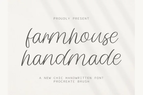
Farmhouse Handmade is a breezy, light-stroke handwritten cursive with tall open ascender loops and relaxed baseline bounce.
Farmhouse Handmade is an airy tall-looped monoline handwritten script: a fine even stroke, very high ascenders that loop twice, wide spacing and long tapered descenders that drop below the baseline. The airy spacing needs a wide measure and the descenders close the line below, so stacked text needs extra leading. It needs roughly 26 mm for the double loop and the fine stroke to read, and it is best in one warm ink on smooth or uncoated stock, or a single dark colour where the thin stroke still carries.
Handmade linen care tag & craft-booth price card — Pair lowercase two-word product titles at 22 pt on unbleached cotton paper with tiny all-caps sans weight and scent notes underneath.
Because every stroke is fine monoline, favor flat printing, rubber stamps, or Cricut fine-point pen drawing over small adhesive vinyl cuts.
 #24
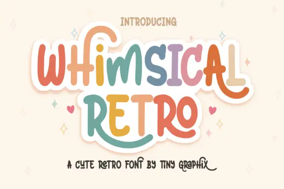
Whimsical Retro mixes soft upright letterforms with unusually long curled terminals, set over a pastel layered fill inside a thin outline on a warm paper ground.
The lower-case keeps a tall x-height and generous round bowls, so the word reads as friendly rather than thin, while the l, r and y endings leave the baseline and curl back up in wide arcs. Each letter is built from stacked layers: a pale inner fill, a soft outline and a hint of shadow sitting slightly down and left, which is what produces the paper-cut depth on the cover. Spacing is open, so the curls sit in the gaps instead of overlapping their neighbours, and the capitals are only slightly taller than the lower-case. Small hearts and sparkles between words are artwork, not glyphs, and the tracked caps caption below is a separate label face.
A cheerful name card — Leave breathing room at both line ends.
Check that the real letters offer the desired terminals.
 #25
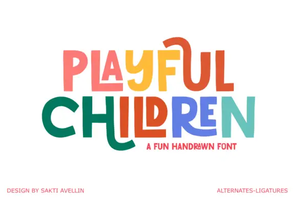
Playful Children is a hand-drawn capital alphabet in which the letters are angular, the arms run long and some strokes extend past the letter body, so a word reads as something drawn with a ruler-free marker.
The P holds a squared bowl on a straight stem, the L keeps one long arm, the A carries a low crossbar and a hooked leg, and the Y forks with one arm reaching further than the other, all at a heavy even weight with flat ends. The extensions are the character: crossbars on the A and the H overshoot, and the legs of the R and the Y drop below the baseline, which is what gives the face its movement at 40 pt. Because the shapes are simple and evenly weighted, the letters can take a different colour each without breaking the rhythm, which is how the sample uses them. The fit is loose, so a short word fills a wide format. The white ground, the coloured fills, the two credits and the small caption are presentation; the lettering is the two words.
A pupil activity-book title — Keep the title in two spacious lines and reserve a clear lower margin for extended feet.
Verify the actual H and U alternates before choosing line spacing.
 #26
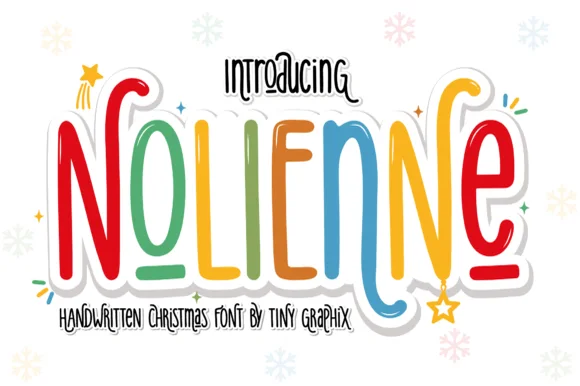
Nolienne is a tall, whimsical handwritten display font mixing slender rainbow-marker stems with playful spiral terminals (and zero locked-in holiday clipart!).
Nolienne is a tall whimsical handwritten display that mixes slender marker stems with playful spiral terminals and an alternating rainbow palette, and it ships with no locked-in holiday clip art, so the same face works in December and in June. The spirals sit at the ends of stems, which grows the artwork box above and below the word, and the slender strokes need size before they hold in print. It needs roughly 24 mm for the spirals to read as deliberate curls, and it is best in one colour on white or in alternating brights on cream.
Kids' Santa-letter header, elf pajama shirt & gift sticker — Color letters in alternating cherry red, pine green, gold, and icy blue inside a 0.14 in white sticker offset.
Uniform, smooth monoline marker strokes cut and weed cleanly on Cricut HTV, Oracal 651, and Print-Then-Cut stickers down to 0.7 in!
Practical buyer checklist
Key cutting, printing and pairing answers before choosing a children's books & fairytale typeface.
Between 16 and 20 pt for ages three to seven, depending on line length, with leading at 1.4 to 1.5 times the size. Early readers need larger type and shorter lines than the standard adult picture book.
Rarely. Curls, swashes and tight spacing slow word recognition. Use them for chapter titles, drop caps and covers, and set the running text in a warm, neutral serif with an open x-height.
Matte paper absorbs ink and softens fine detail, while screens emit light and exaggerate contrast. Proof the interior at final size on the actual stock, and expect curls to look slightly softer and hairlines to fill in.
Coverage varies and is usually Latin-focused. If the book will be translated, check for the specific diacritics before signing off the layout, since a missing glyph forces a typeface change across the whole interior.
Keep exploring
Explore adjacent maker roundups or check our practical pre-production checklists.
24 curated fonts · Previews & pairings
21 curated fonts · Previews & pairings
30 curated fonts · Previews & pairings
16 curated fonts · Previews & pairings
Guides: Invitation font checklist · Vinyl & cutting checklist · How to pair script & sans fonts
Allow optional Google Analytics to measure visits and catalogue actions. Your search words and notes are not included. Privacy & storage