 #1 · Best Overall
Disclosure: MakerFileHub may earn a commission from qualifying purchases via paid links on this page. How our links work.
Logotypes, packaging systems & retail identity
39 Best Brand & Packaging Fonts
A branding face has to work at three scales: a favicon, a shipping box and a storefront. De Rozzo and Stanza carry enough contrast for a considered mark, Braventro and Orvelia hold weight at large sizes, and Vanielst and Lonika add the swash detail that suits a premium packaging line. Auretha and Lovely Amelia show what a real weight range or a distinctive ligature can do for a family.
Quick verdict
De Rozzo is the most adaptable mark for a retail brand, Auretha gives you a full weight range for a packaging system, and Stanza is the statement serif for a premium launch. Braventro covers the heritage and label role.
Quick answer
Top 3 brand & packaging picks right now.
Short on time? Start with our three highest-rated brand & packaging standouts before scrolling the full breakdown.
#1 · Best Overall #2 · Runner-Up Pick
Stanza
Swashed modern couture serif with hairline stress and curling terminals
Get fontPaid link
Read review ↓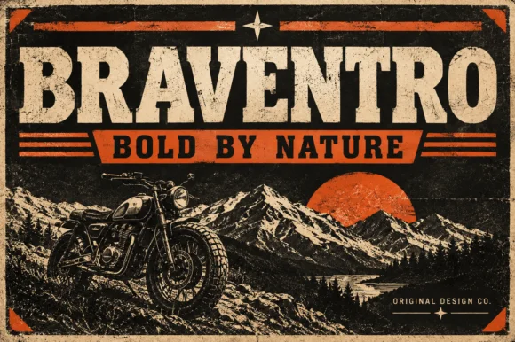 #3 · Editor's Choice
How we tested & selected these 39 fonts
We screened 2,625 paid fonts, the largest pool in the catalogue, and kept 39 with a coherent family structure. Weighted licence clarity for logo use, how the face holds at 16 px, availability of weights and italics, and whether the letterforms survive reversal on packaging.
Side-by-side summary
Top 5 brand & packaging picks at a glance.
Compare specimens, OpenType/PUA traits and primary project roles side by side.
| Rank & Font | Style & File Specs | Best Project Fit | Store Listing |
|---|---|---|---|
| SerifPoised | Wine label, resort identity, fashion lookbook or masthead | Get fontPaid link | |
| SerifLigatures · Alternates & swashes | Fashion boutique logo, perfume box or magazine title | Get fontPaid link | |
| Slab SerifFile formats | Garage metal sign, craft beer label or leather hat patch | Get fontPaid link | |
| SerifAlternates & swashes · File formats | Formal wedding suite monogram & header | Get fontPaid link | |
| SerifLigatures · Alternates & swashes · Language support | Perfume carton, candle vessel & boutique wordmark | Get fontPaid link |
Serifs & Slab Serifs
14 fonts#1 · Best OverallDe Rozzo
De Rozzo balances wide classical roman bowls with crisp modern wedge serifs and alternates, built for luxury fashion, magazines and wine labels, where the expansive round O and C counters contrast with slender horizontal hairlines for a confident Mediterranean feel.
The bowls stay wide and round, the serifs cut as wedges, the hairlines thin out and the alternates sit outside the default set. That wedge is the character: a classical roman gains a modern edge, which is why the sample suits fashion and wine. Alternates need checking in your own file, so test the letters you need, keep 32 pt for the hairlines and print on coated stock where the thin strokes survive. The hairline thins are the risk: they silt below about 32 pt and they fill on an uncoated sheet, and the alternates sit outside the default set so they have to be switched on per letter.
Recommended project & layout
Wine label, resort identity, fashion lookbook or masthead — Track all-caps wordmarks +15 and pair with minimalist grotesk body copy.
Before you cut or print
Best for print packaging, foil and web headers.
Best paired with
Get fontPaid link
#2 · Runner-Up PickStanza
Stanza is a modern serif in which the strokes carry extreme contrast, the terminals curl and the crossbars of the A and the T extend into swashes, so a short word reads as a fashion masthead rather than a title.
The S closes both ends in curls, the T throws its bar wide and finishes in a fine swash, the A carries a halved crossbar that runs beyond the letter and the N keeps two hairlines with a heavy diagonal, all with high contrast and unbracketed joins. The swashes are the character: they extend beyond the letter body at the top and the base, which is what lets four letters fill a wide plate and what makes the face a poor choice for anything below 30 pt. Hairlines are genuinely thin, so the face wants coated stock and a printer who can hold the line. The green ground, the white ink, the tracked label and the small caption are presentation; the serif is the word shown.
Recommended project & layout
Fashion boutique logo, perfume box or magazine title — Limit dramatic swash alternates to 1–2 letters per wordmark.
Before you cut or print
Fine serif hairlines are built for print, foil and digital branding.
Best paired with
Get fontPaid link
#3 · Editor's ChoiceBraventro
Braventro is a heavy heritage slab in which the brackets run broad, the counters stay compact and the stems carry sign-letter weight, so a two-word heading reads as a stencilled tin sign for an outdoor brand.
The B stacks two dense bowls, the R keeps a compact bowl over a heavy leg, the A carries a wide apex with a low crossbar and the V drops two thick diagonals into a narrow point, all at a sign weight with bracketed serifs and small counters. The density is the character: the letters sit close and the ink covers most of the box, which is why the sample sets a short phrase on a plain tin ground. Because the counters are small, the face wants 30 pt before they stay open, and it holds from three quarters of an inch of cap height on wood, acrylic or vinyl. The rivets, the rust texture and the small subline are presentation; the heavy slab words are the face.
Recommended project & layout
Garage metal sign, craft beer label or leather hat patch — Pair with a ribbon banner subline in bold sans capitals.
Before you cut or print
OTF display font; solid bold edges cut cleanly on stencils and vinyl.
Best paired with
Get fontPaid link
 #4 · Top Maker Utility
Orvelia
Orvelia is a high-contrast display serif in which the stems alternate thick and hairline weights, the R, V and A end in curved swash legs and the bowls stay sculpted, so a name reads as a crest for a perfume box or a masthead.
The R tucks its leg into a curve, the V splits into two swashed strokes, the A carries a curling leg and the bowls close against fine joins that thin to a hairline at every junction. The swash leg is the character: three capitals carry the ornament while the rest of the alphabet stays quiet, which is why the sample frames one word for formal stationery. Because the hairlines are fine, the face wants coated stock from 16 pt and gains from hot foil on signage; the display cut ships with swashes as separate glyphs. The pale ground and the small frame rules are presentation; the dark display word is the face.
Recommended project & layout
Formal wedding suite monogram & header — Track supporting lines (FOREVER BEGINS HERE) wide in a simple roman serif beneath the main display name.
Before you cut or print
Delivered as OTF; best suited to print, foil stamping and digital branding due to fine serif hairlines.
Best paired with
Get fontPaid link
 #5 · Standout Silhouette
Vanielst Elegant Serif Display Stylistic
Vanielst is a substantial, medium-high-contrast display serif highlighted by graceful overhead swash loops and crisp bracketed feet.
Vanielst Elegant Serif Display Stylistic is a bold transitional display serif with an overhead canopy swash: sturdy bracketed stems, a moderate contrast, crisp horizontal serifs and a capital set that carries a wide arc of swash above the word like an awning. The canopy is the design and it needs vertical room, so the face cannot be tucked under a fold. The canopy and the hairlines are the finest elements and they break first. It needs roughly 36 mm for the canopy and the serif to read, and it is best one dark ink on a bright stock.
Recommended project & layout
Perfume carton, candle vessel & boutique wordmark — Set a single 5-to-8-letter brand name at 36–54 pt, activating only one canopy swash alternate so the silhouette stays clean and memorable.
Before you cut or print
Substantial main stems cut cleanly on sign vinyl down to 1 inch, though tapering overhead swash tips perform best in print, foil, or larger 2 in+ decals.
Best paired with
Get fontPaid link
 #6
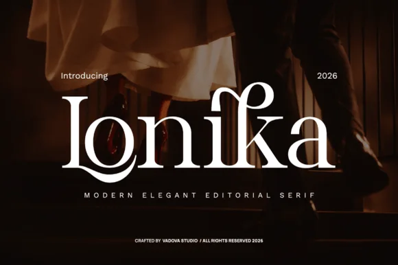
Lonika
Lonika is a refined, high-contrast modern editorial serif distinguished by cradle-looped capitals and curved calligraphy-style ascenders.
Lonika is a high-contrast romantic editorial serif with floral dots and swashes: fine hairline hairlines against heavy stems, ball terminals that finish in a small flower, swept swash capitals that curl off the first letter and a tall cap height that fills a heading. The hairlines and the floral dots are the finest elements and both silt on textured stock. It needs roughly 30 mm for the flower dot and the swash to read, and it is best in one fine ink on coated or smooth card, or a foil impression above 40 pt.
Recommended project & layout
Evening wedding invitation suite, vow book & menu title — Spotlight a single surname or venue word at 48–68 pt centered over dark photography or thick cotton stock.
Before you cut or print
Delicate hairline serifs and horizontal bars belong in high-DPI print, letterpress, or foil stamping rather than tiny cut vinyl.
Best paired with
Get fontPaid link
 #7
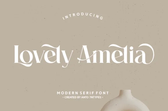
Lovely Amelia
Lovely Amelia is a soft, high-contrast modern display serif featuring sweeping canopy arches over vowels and sculpted ligatures.
Lovely Amelia is a high-contrast display serif with Art-Nouveau canopy arches that spring from the vowels and a sculpted cradle tail that runs beneath a word. The arches sit above the x-height, so the layout needs headroom, and the tail occupies its own band below the baseline. Contrast is strong, so the face wants 22 mm and up before the hairlines hold, and it is a title and invitation face rather than a text face. Its natural home is an asymmetric composition where the canopy can echo a drawn frame.
Recommended project & layout
Ceramic-studio mark, botanical skincare & boutique sign — Set 1 or 2 title-case words at 48–84 pt in warm cream or charcoal over earthy clay/sand tones.
Before you cut or print
High-contrast hairline transitions shine in print, foil, and web logos; scale vinyl above 1.75 in if cutting.
Best paired with
Get fontPaid link
 #8
Auretha
Auretha is a complete 8-weight + Variable luxury serif typeface (Thin to Extrabold, 374 glyphs, 6 alternates) built for full brand systems.
Auretha is a modern luxury serif family in eight weights plus a variable axis, with a 374-glyph set: high-contrast display cuts that thin to hairlines at the top weights, sturdier text cuts underneath, fine bracketed serifs and a tall cap height. The family lets a fashion house set a cover and a caption in one voice, and the hairlines require coated stock or large sizes. The display needs roughly 30 mm and the text cuts hold at 9 pt, all in one fine ink.
Recommended project & layout
Complete skincare/hospitality brand identity & web system — Use Bold/Semibold at -15 tracking for packaging wordmarks and Light/Regular at 11 pt for ingredient and story panels.
Before you cut or print
Variable font file allows fine-tuning exact optical stroke weight for dark-mode web headers; Bold cuts also work on 1 in+ sign vinyl.
Best paired with
Get fontPaid link
 #9
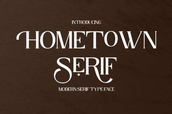
Hometown Serif
Hometown Serif is an elegant, high-contrast uppercase display serif accented by sweeping descender cradles and spiraled stem hooks.
Hometown Serif is a high-contrast modern display serif with curled swash stems: hairline hairlines against heavy stems, stems that curl out at the base into a small spur and swash capitals that finish in a drawn curl. The hairlines and the curls are the finest elements and both silt on textured stock. It needs roughly 30 mm for the curl and the hairline to read, and it is best in one fine ink on coated or smooth card, or a foil impression above 40 pt.
Recommended project & layout
Formal invitation monogram, menu header & welcome mirror — Track uppercase titles slightly open (+30) at 32–48 pt, reserving decorative tail alternates for the first or center letters.
Before you cut or print
Hairline horizontal crossbars and thin serif feet are best suited to print, foil stamping, or 2 in+ mirror decals.
Best paired with
Get fontPaid link
 #10
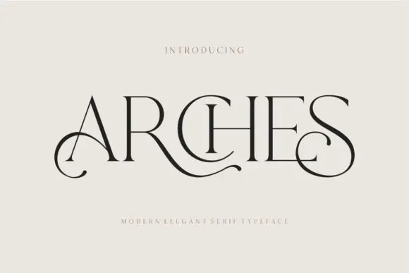
Arches
Arches sets one word in dark ink on a warm neutral field, where wide flat serifs sit on hairline cross strokes, the A climbs to a sharp apex, the R leg sweeps into a long horizontal tail that runs beneath the following letters and the S closes with an extended curl.
The uprights stay thin, the serifs stay flat and wide, the contrast is extreme and two letters throw strokes sideways instead of down. Those sideways strokes are the character: the word reads as a piece of engraved editorial typography rather than a headline, which is why the sample leaves a wide cream margin around it. The small introduction line above and the caption below are separate cover text. Keep 44 pt before the hairlines vanish, allow 30 mm at each end for the sweep and check the R tail against any text you put underneath.
Recommended project & layout
A beauty studio identity — Use a short studio name with a broad clear margin around its lower curls. Put the service descriptor and booking details beneath in plain type rather than threading them through the swashes.
Before you cut or print
Test the actual studio name; the preview’s “Arches” composition may not transfer to other letters.
Best paired with
Get fontPaid link
 #11
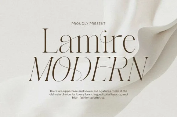
Lamire Modern
Lamire Modern is an ultra-light, tall-statured editorial serif featuring sweeping diagonal ligatures across both uppercase and lowercase.
Lamire Modern is an ultra-light editorial serif with tall stature, whisper hairlines and sweeping diagonal ligatures that cross from one letter to the next. The contrast is extreme, so the face needs roughly 30 mm before it survives in print, and the ligatures require the letters to be set as designed rather than adjusted with kerning. It reads as fashion typography rather than a book face, and it is at its best in one colour on a smooth coated stock where the hairlines stay continuous.
Recommended project & layout
Bridal gown label, luxury skincare serum & candle carton — Stack mixed-case over all-caps at 48–84 pt with +10 tracking and wide ivory negative space.
Before you cut or print
Hairline strokes are strictly engineered for print, hot foil, and high-res web headers—never blade-cut vinyl.
Best paired with
Get fontPaid link
 #12
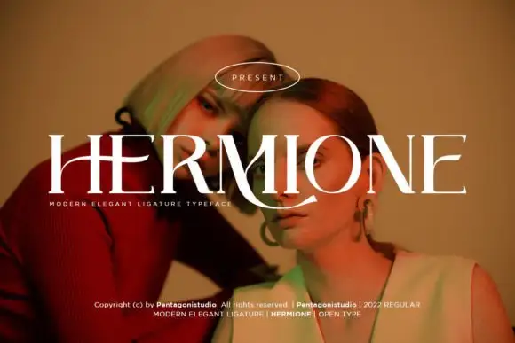
Hermione Modern Serif
Hermione is a modern elegant serif in caps with very fine hairlines, tall proportions and a set of display ligatures, shown over an editorial portrait and set with a slight arch.
HERMIONE spans the card in white over a close portrait in warm light, and the letters are tall and narrow with hairlines at the joins and sharp wedge serifs; the I and the O are drawn to touch, and the custom ligatures give the word a rhythm that a standard setting would not have. The baseline lifts slightly across the centre, which is a display treatment rather than a feature of the font, and a caption at the foot names the family and credits the foundry. The sample is a fashion layout: type over a photograph, wide spacing in small caps, one ornament. What it tells a buyer is that the face is for titles and mastheads at a large size, and that the hairlines need a good press or a screen, never a cheap photocopy.
Recommended project & layout
A portrait-series opener — Place the capitals across a pale full-width panel with the subject's name and byline in plain small text below the left edge.
Before you cut or print
Verify the actual phrase, ligatures and rights; the specimen does not prove automatic decorative joins.
Best paired with
Get fontPaid link
 #13
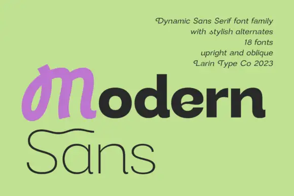
Modern Sans
Modern Sans is a wide sans family of eighteen fonts, shown with a heavy display cut, a hairline weight and a script alternate that replaces the first letter of a word.
modern fills the middle of the card in a heavy sans with squared outer corners, and the first letter is a purple script m drawn at the same optical size, which shows the family's alternate set in one glance. Sans follows underneath in a hairline weight at four times the width, so the card demonstrates the range from heavy to thin without a second specimen. The palette is a soft lime ground with the lettering in dark grey and one accent, and a block of small type at the upper right lists the count of fonts, the upright and oblique sets and the studio. The face itself is a dynamic sans with slightly flared stems, which keeps the display weight from looking mechanical, and the wide spacing at the thin weights keeps the hairline readable at moderate sizes.
Recommended project & layout
A two-weight design-studio identity trial — Place Modern in one verified heavy member above Studio in one verified light member on a plain white square card.
Before you cut or print
Confirm both members and the selected M form; do not infer controls from the cover.
Best paired with
Get fontPaid link
 #14
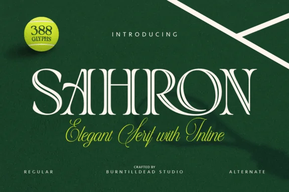
Sahron
Sahron is an aristocratic high-contrast serif accented by fine interior inline grooves down its primary vertical and diagonal stems.
Sahron is an engraved inline luxury display serif in a regular and an alternate cut: high-contrast stems with a fine white inline running down the middle of every thick stroke, sharp bracketed serifs and an alternate set that shifts the inlay to a double line. It is a banknote and a perfume-box face, so it wants size and precise registration rather than a soft ground. The inline is the finest element and it fills or breaks first in print and in foil. It needs roughly 40 mm for the inline to read, and it is best one dark ink on a bright coated stock.
Recommended project & layout
Emerald spirits label, bespoke tailoring seal & candle box — Set a single uppercase brand name at 42–64 pt with +35 tracking over rich hunter green, navy, or matte black stock.
Before you cut or print
Fine interior inline slots shine in 300+ DPI offset/digital print and hot foil; avoid small blade-cut vinyl where narrow inline strips could lift.
Best paired with
Get fontPaid link
Scripts & Calligraphy
10 fonts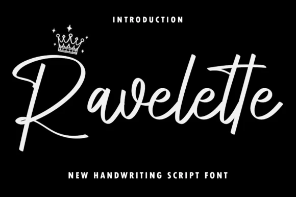 #15
Ravelette
Ravelette is a sleek, upright monoline-brush signature script featuring a sweeping 'R' leg and custom double-'tt' crossbar ligature.
Ravelette is a smooth monoline-brush signature script with a double t crossbar, tall loops and an even slant, so a name reads as written quickly with a good pen rather than as a formal calligraphy. The monoline weight is what makes it plot, foil and embroider predictably, and the double crossbar gives a repeated letter a deliberate flourish. It needs roughly 16 mm for the loops to read and about 10 mm on a card, and it is best in one dark ink on cream or as a fine foil on matte board.
Recommended project & layout
Lash/nail studio logo, satin pajama pocket & perfume label — Center 1 title-case brand name at 64–125 pt above bold spaced condensed sans ('NEW HANDWRITING SCRIPT FONT').
Before you cut or print
Weld overlapping cursive joins in Cricut Design Space—weeds smoothly on Oracal 651 and HTV down to 0.9 inches!
Best paired with
Get fontPaid link
 #16
Bunglon
Bunglon is a modern copperplate script in which the downstrokes carry weight, the hairlines stay fine and generous swashes arch above the x-height and below the baseline, so a single name reads as formal calligraphy.
The B opens a wide upper loop, the bowls swell on the downstroke and thin on the join, the ascenders carry tall loops and the swash set adds long arcs that clear the word above and below. The overhead swashes are the character: they frame a name without a border, which is why the sample sets one couple's name on a plain card. Because the swashes are long, a line needs 20 mm of clearance at both ends, and the joins must be welded before cutting from 1.1 inches of x-height. The pale ground, the fine rules and the small caps line are presentation; the dark calligraphic name is the face.
Recommended project & layout
Save-the-date or thank-you card headline — Use swashed forms sparingly on first and last letters and keep event logistics in a clean serif.
Before you cut or print
Fine hairlines suit print and foil; thicken with a small offset path if adapting for large vinyl signs.
Best paired with
Get fontPaid link
 #17
William Jameson
William Jameson is a lively monoline signature script with broad looping capitals and a bold underline swash tail.
William Jameson is a slanted signature cursive with a sweeping underline swash: a fast forward-leaning stroke, letters joined at the baseline, and a long flat swash that draws under the whole name and lifts at the end. The swash is the design, so the face needs a wide measure rather than a square panel. The swash thins are the finest element and they break first in print and in foil. It needs roughly 30 mm for the swash and the slant to read, and it is best one dark ink on a smooth stock.
Recommended project & layout
Apparel neck label, hangtag & founder sign-off — Stack the first name slightly left of the surname so the descending 'J' or capital loop balances the underline swash across a 3-inch width.
Before you cut or print
For HTV hoodies or t-shirts, size the lockup at least 3.5 inches wide so compact 'e' and 's' loops weed without lifting.
Best paired with
Get fontPaid link
 #18
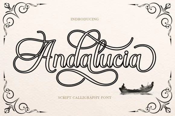
Andalucia Outline
Andalucia Outline is an elaborate, hollow-contoured calligraphic script wrapped in multi-looped copperplate canopy and underline flourishes.
Andalucia Outline is a hollow-outlined copperplate flourish calligraphy script: a steep slope, hairline-thin strokes drawn only as an open outline, capitals that loop twice and flourishes that curl off both ends of a line. The hollow stroke needs a light ground, and the hairline outline silts into a grey edge once the face is reduced. It needs roughly 32 mm for the outline and the flourish to read, and it is best as a one-colour vinyl or foil job on a light ground, or a single ink print on smooth stock.
Recommended project & layout
Tattoo flash sheet, lowrider club tee & music poster — Center a single focal name or city title at large poster scale (60–110 pt) with wide breathing room above and below the loops.
Before you cut or print
Because every stroke is a fine double-line outline, print via screen print, DTF, or high-res paper rather than weeding small vinyl.
Best paired with
Get fontPaid link
 #19
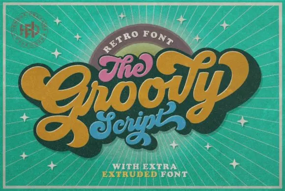
Groovy
Groovy is a compact connected script drawn from late-sixties and seventies advertising, where the letters join in a rounded loop and the whole word keeps the squat, cheerful proportions of that period rather than the tall slant of a calligraphic hand.
The connectors stay visible, the x-height runs large against short ascenders and the curves close round rather than tapering into sharp exits. That squashed retro rhythm is the character: the word reads as a period advertisement rather than as a modern script, which is why the sample stays short and horizontal. Test the actual connectors in your own phrase before promising a long line, and keep 28 pt so the joins do not disappear on a small print. The connectors are the detail to test: a long phrase repeated at 28 pt turns the joins into a dotted line, so keep the sample short and check your own wording before the run.
Recommended project & layout
A seventies-themed birthday invite — Let a short retro party title rise across the upper card, with the honouree’s name below. Keep the date and address level and plain in a lower information block.
Before you cut or print
Check names, age and date together; leave essential details out of the decorative word shape.
Best paired with
Get fontPaid link
 #20
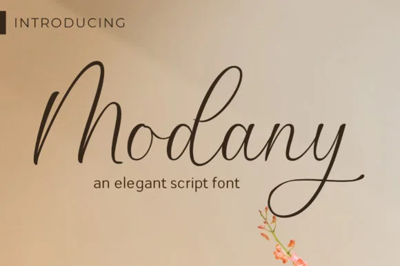
Modany
Modany is a graceful, thin-to-medium handwritten cursive script with tall peaked arches on capitals and long, airy ascenders.
Modany is a slender upright fountain-pen cursive script: a fine even stroke on a nearly vertical axis, small loops, joined letters and a light ink swell where the pen pauses, with very little contrast between thin and thick. The monoline character makes it legible at small sizes, and the fine stroke is what fails first on textured stock. It needs roughly 24 mm for the pen swell and the join to read, and it is best in one dark ink on smooth card, or a single warm ink on cream where the swell prints as a soft edge.
Recommended project & layout
Minimalist save-the-date, envelope calligraphy & menu — Set single or paired names at 38–54 pt on warm cotton cardstock with generous breathing room above the tall 'M/d' peaks.
Before you cut or print
Fine pen weight excels in flat print, letterpress, and Foil Quill pen drawing; keep adhesive vinyl cuts above 1.8 in tall.
Best paired with
Get fontPaid link
 #21
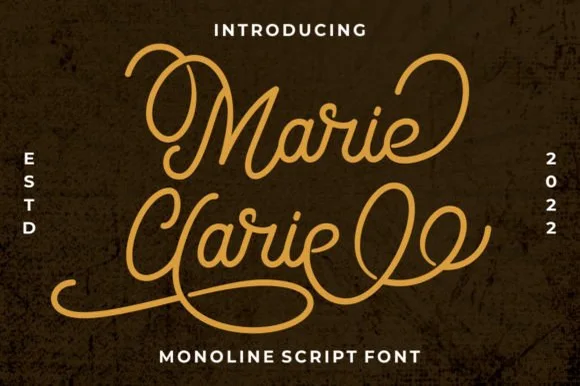
Marie Clarie
Marie Clarie is a smooth, medium-fine monoline script featuring oversized vintage ribbon loops on capitals and spiraled terminal flourishes.
Marie Clarie is a vintage neon-sign and badge monoline script: an even tubular stroke that reads as bent glass, joined letters, a shallow slant and a badge frame of concentric rules around the word with small dots at the corners. The monoline is what lets it work as a neon tube, and the badge rules are the finest element. It needs roughly 28 mm for the tube and the badge rule to read, and it is best as a one-colour neon or vinyl job, or a flat two-colour print on a dark ground.
Recommended project & layout
LED neon wall-sign mockup, salon logo & vintage jacket — Stack a two-word name tightly so the sweeping lower loop of the second capital nests beneath the first word.
Before you cut or print
Consistent monoline thickness cuts far cleaner on HTV and vinyl than high-contrast scripts—just weld all overlapping loops first.
Best paired with
Get fontPaid link
 #22
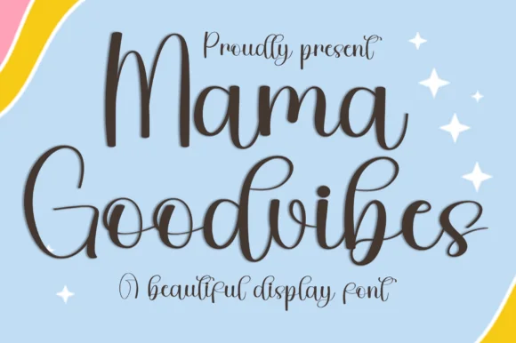
Mama Goodvibes
Mama Goodvibes is a cheerful, upright modern brush script (PUA encoded with ligatures) built for everyday mama tumblers and shirts—zero holiday lock-in!
A bouncy upright modern calligraphy shown in espresso charcoal over a pastel rainbow and sky backdrop with white sparkles: tall open loops on the M, G, d and b with a light bounce and PUA alternates, so the word reads as friendly modern hand lettering rather than as a formal script. The bounce is consistent rather than random, which is what keeps a two-word line from looking drunk, and the open loops give the lettering air at small sizes. The scene behind is staging and carries no seasonal device of its own. Uses are lifestyle brands, drinks, apparel and party stationery where a warm, current voice is wanted.
Recommended project & layout
16 oz iced-coffee glass wrap, car decal & boutique tee — Stack 2 title-case words centered at 52–90 pt accented with 4-point star sparkles.
Before you cut or print
Weld all touching cursive connectors before cutting Oracal 651 or HTV; weeds reliably at 0.9 inches+!
Best paired with
Get fontPaid link
 #23
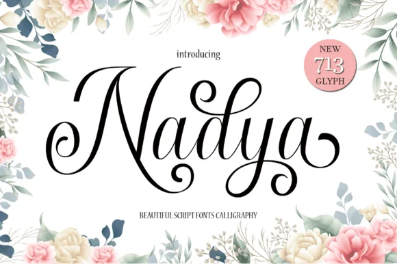
Nadya
Nadya is an expressive upright calligraphy script packed with 713 glyphs, spiraled terminal droplets, and soaring looped ascenders.
Nadya is a romantic upright calligraphy script with more than seven hundred glyphs and curls: a moderate contrast stroke on a nearly vertical axis, wide oval bowls, joined letters and curled entries that turn back over the word. The glyph count means a phrase can be tuned with alternates so no two joins repeat, and the curls need side clearance. It needs roughly 26 mm for the curl and the join to read, and it is best in one fine ink on smooth card, or a foil impression above 38 pt where the curls still turn.
Recommended project & layout
Floral bridal shower sign, invitation suite & menu title — Spotlight first names at 48–68 pt centered inside botanical borders, paired with 9 pt tracked serif dates underneath.
Before you cut or print
Hairline upstrokes and delicate spiral droplets reproduce best via flat printing, foil, or large 2.5 in+ acrylic sign decals.
Best paired with
Get fontPaid link
 #24
Welcome
Welcome features relaxed lowercase cursive with long level beginning and ending swash tails, tailored for round wood signs and entryways, where the smooth monoline-leaning strokes and open letter spacing keep words calm while the extended w and e tails span a circular blank.
The stroke stays one width, the spacing opens, the tails run level and the word sits calm. That level tail is the character: the greeting stretches to the width of a round board without a bigger point size, which is why the sample targets door signs. Plan the tails against the blank's curve, keep the stroke at 3 mm for cutting, and check the exits in your own word before committing the sign. The wide tail is also the weak point on a shaped blank: it has to end inside the panel, so a 12 mm tail on a 300 mm round board is safe and anything longer gets trimmed at the edge.
Recommended project & layout
Round wood welcome sign or nursery plaque — Centre the tailed lowercase word across the middle third and tuck family names below in small caps.
Before you cut or print
PUA-encoded tails weld cleanly in Cricut/Silhouette; verify thin tail tips before weeding small decals.
Best paired with
Get fontPaid link
Clean Sans & Handwritten Print
6 fonts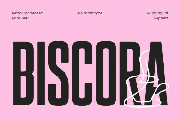 #25
Biscora
Biscora is a stylish condensed sans distinguished by crisp diagonal stencil-like angle cuts across the joints of 'S', 'R', and 'A' (Multilingual)!
Biscora is a condensed retro café sans in which the letters are cut on a diagonal: the stems carry a slanted slice through the counter, the shoulders are squared and the terminals are cut at the same angle, so a word reads as if sliced by one blade. The slice is the whole design and it closes first at small sizes, and the condensation fits long names on a fascia. It needs roughly 26 mm for the diagonal cut to read, and it is best in one warm ink on cream and kraft, or a single dark colour on a pale board.
Recommended project & layout
Specialty espresso bar cup, biscotti tin & pastry box — Set 1 uppercase brand word huge (84–165 pt) and overlay a minimalist 1-line white illustration across the lower corner.
Before you cut or print
Clean, crisp solid segments cut and weed smoothly on Cricut Oracal 651 and HTV down to 0.75 inches!
Best paired with
Get fontPaid link
 #26
Whiskey Tango
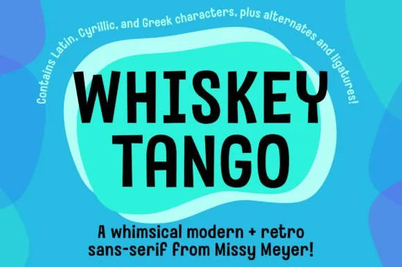
Whiskey Tango is a lively, tall-and-narrow rounded sans-serif packed with Latin, Cyrillic, and Greek support plus over 110 PUA alternates.
Whiskey Tango is a tall condensed rounded retro sans with more than a hundred and ten private-use extras: squeezed caps with soft corners and a high waist, plus swash letters, ligatures, tails and ornaments reached through alternate keystrokes. It is a packaging face, so it wants a tall panel and a single flat ink rather than a soft ground. The soft corners are the finest element and they plug first at small sizes. It needs roughly 26 mm for the corner and the condensed stem to read, and it is best one flat ink on kraft or white board.
Recommended project & layout
Retro travel poster, podcast cover & cocktail menu — Stack two-word drink or episode titles in 48 pt uppercase at tight 0.95 line-height, using mixed-case Whiskey Tango or a light sans for descriptions.
Before you cut or print
Rounded stroke ends and generous counters make this one of the cleanest tall sans faces to cut on Oracal 651 or HTV even at 0.65 in.
Best paired with
Get fontPaid link
 #27
Sovel
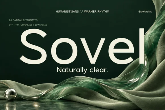
Sovel is a poised humanist sans-serif combining clean open lowercase forms with subtly flared stroke terminals and 26 capital alternates.
Sovel is a warm humanist sans with twenty-six expressive capital alternates: open apertures, a soft stroke modulation, a tall x-height and a set of capitals whose terminals curl or flare so a headline can be tuned without changing the family. The alternates only appear through specific keystrokes, and the soft modulation disappears under a coarse screen. It needs roughly 20 mm for the aperture and the alternate to read, and it is best in one dark ink on uncoated stock.
Recommended project & layout
Wellness skincare tube, candle jar & studio wordmark — Set a 4-to-7-letter brand wordmark in mixed-case at 42 pt, swapping in an alternate initial cap, and use standard Sovel at 10 pt for sublines.
Before you cut or print
Clean, open bowls cut crisply on matte label vinyl, frosted glass etch stencils, and precision cardstock.
Best paired with
Get fontPaid link
 #28
Golden Rooster
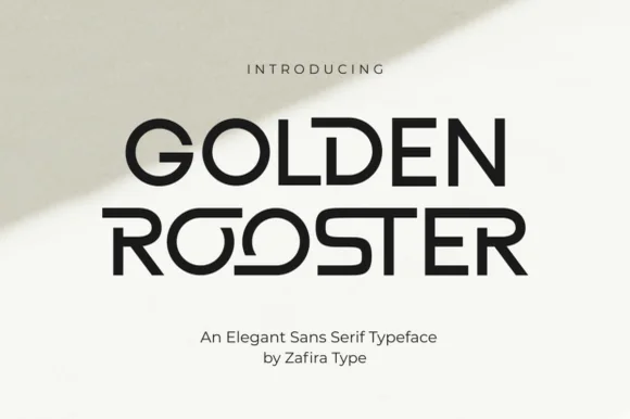
Golden Rooster is a crisp, medium-bold geometric sans-serif distinguished by circular interlocking 'OO' ligatures and sculpted leg curves.
Golden Rooster is a geometric art-gallery sans with interlocking ligature bowls: perfectly circular bowls, straight-sided stems, and a set of ligatures where two round letters share one overlapping arc so the pair reads as a single drawn form. The interlock is the design and it breaks if the pair is tracked apart, and the circular bowls close when the face shrinks. It needs roughly 26 mm for the interlock and the bowl to read, and it is best in one fine ink on a pale ground, or a single dark tone on coated stock.
Recommended project & layout
Modern architecture studio, roastery & lifestyle wordmark — Set brand names in uppercase at 36–60 pt with +20 tracking on raw white cotton stock, letting one ligature pair act as the centerpiece.
Before you cut or print
Even stroke weight and wide geometric counters weed cleanly on storefront glass vinyl, acrylic signs, and matte packaging labels.
Best paired with
Get fontPaid link
 #29
Bielchon
Bielchon is a crisp, light-to-regular modern sans-serif featuring tall x-height, circular bowls, and subtle stencil-like notched joins.
Bielchon is a slim contemporary geometric sans with architectural cuts: narrow even stems, perfectly circular bowls, sharp mitred cuts where two strokes meet instead of a curve and a level baseline that reads as gallery signage. The mitres are the design and they round off once the face is reduced or printed with a coarse screen. It needs roughly 22 mm for the mitre and the counter to read, and it is best in one fine ink on a pale ground, or a single white on a dark ground where the cuts print as sharp joints.
Recommended project & layout
Architectural studio, skincare box & minimalist identity — Set brand wordmarks in mixed-case at 36–60 pt with +15 tracking, leaving generous negative space across matte white or stone stock.
Before you cut or print
At small label sizes below 12 pt, print at 300+ DPI so the delicate notch gaps at 'h' and 'n' shoulders remain crisp rather than filling in.
Best paired with
Get fontPaid link
 #30
Memoir Slang
Memoir Slang is a heavy, tight-set modern sans-serif distinguished by crisp neo-grotesk geometry and sharp, horned ear details.
Memoir Slang is a bold neo-grotesk display sans with a hooked double-storey g: even squared stems, tight apertures, a straight-sided g with a hooked ear and a slightly narrow width that keeps a long masthead on one line. The hook is the only detail and it closes when the face is reduced. It needs roughly 22 mm for the hook and the aperture to read, and it is best in one dense ink on uncoated stock, or a single white on a dark ground where the tight apertures still open.
Recommended project & layout
Streetwear lookbook, exhibition poster & album title — Left-align 2-line mixed-case titles at 64–96 pt with tight -15 tracking and 0.94 line-height.
Before you cut or print
Heavy solid stems cut cleanly on large window vinyl and bold DTF/HTV streetwear prints down to 0.75 in.
Best paired with
Get fontPaid link
Matched Font Duos & Packs
9 fonts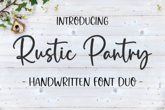 #31
Rustic Pantry
Rustic Pantry is a coordinated farmhouse font duo pairing a lively bouncy cursive script with a tall, narrow hand-drawn uppercase sans.
Rustic Pantry is a duo of a bouncy farmhouse brush script and a tall skinny marker sans: the script runs a loaded stroke with small flicks, a rising baseline and joined letters, while the sans is narrow with blunt marker ends for prices and lists. The two voices share one palette, so a jar label can carry a name and a list in the same hand. The script's bounce grows the word vertically and the marker sans stacks a long line in a narrow label. The script needs roughly 22 mm and the sans 18 mm for their detail to read.
Recommended project & layout
Glass pantry canister decal, spice-jar set & kitchen sign — Center the script word at 2–3.5 inches wide above a 0.5-inch tracked skinny sans descriptor line.
Before you cut or print
Weld all touching cursive connectors before cutting Oracal 651 permanent jar vinyl; medium stroke weight weeds cleanly.
Best paired with
Get fontPaid link
 #32
Brown Carolina Duo
Brown Carolina Duo contrasts broad high-contrast capitals with a much finer narrow slanted script, set dark on a plain cream field, where the capital R legs sweep below the neighbouring letters and the script carries long tails that run past the ends of both words.
The caps keep thin cross strokes and heavy uprights, the script keeps one fine weight, and the two voices sit in a strict stack: script, two cap rows, script. That alternating order is the character, because the fine lines frame the heavy block like a rule above and below. Both treatments appear on a plain light field, so the cover gives no clue about texture or shadow. Keep 34 pt for the caps before the thin strokes break up, keep 20 pt as the floor for the script and check the R leg before setting a line of capitals.
Recommended project & layout
A boutique stationery front — Use the capital name centrally and a small script descriptor below, leaving the R sweep clear of contact information in a plain footer.
Before you cut or print
Confirm both styles and the actual capital alternates.
Best paired with
Get fontPaid link
 #33
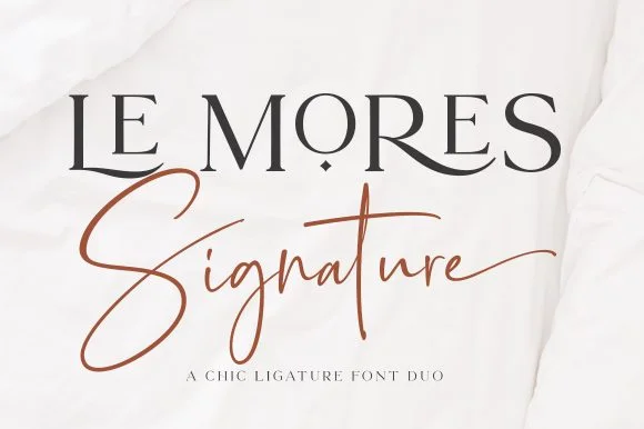
Le Mores Signature
Le Mores Signature pairs an editorial ligature serif—highlighted by cradled base loops—with a brisk copper-toned signature cursive.
Le Mores Signature pairs a ligature-rich editorial serif with a slanted signature script: the serif is a moderate-contrast face with true ligatures and oldstyle figures for running text, while the script is a fast slanted signature with a looping capital and a heavy exit stroke. The pair is how a printed magazine signs a page, so the serif carries the body and the signature carries the name. The signature's thin connectors are the finest element and they break first. The serif needs roughly 20 mm and the signature 30 mm for their detail to read.
Recommended project & layout
Boutique fashion hangtag, perfume box & atelier logo — Set the primary brand name in tracked-open serif capitals at 36 pt and overlap a single script subword across the lower-left stem.
Before you cut or print
Keep the slender signature script in print, hot foil, or larger 2.5 in+ decals rather than tiny blade-cut vinyl.
Best paired with
Get fontPaid link
 #34
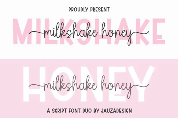
Milkshakehoney
Milkshakehoney pairs a crisp, wide-stance uppercase sans-serif with a tall, narrow-looped monoline cursive accented by straight side tails.
Milkshakehoney pairs a clean geometric uppercase sans with a tall-looped monoline script: the sans is a wide, even-width capital set for signage and labels, while the script is a thin monoline with high loops that rise well above the x-height and joins that stay open. The pair gives one card a printed voice and a hand-written line and works from a single ink. The monoline hairline is the finest element and it breaks first. The sans needs roughly 20 mm and the script 30 mm for their detail to read.
Recommended project & layout
Bridesmaid proposal box lid & satin robe chest print — Track the uppercase sans role title ('BRIDESMAID') wide in pale pink or gold behind the recipient's cursive first name.
Before you cut or print
Size HTV chest names at 4 inches wide or larger so the tall narrow 'k' and 'h' loops weed cleanly without stretching.
Best paired with
Get fontPaid link
 #35
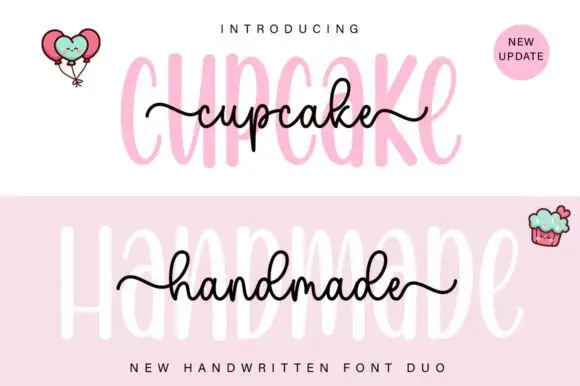
Cupcake Handmade Duo
Cupcake Handmade Duo places tall narrow rounded letters in pale pink behind a smaller connected script line in black, twice on one cover, where the script carries long outer tails and looped k and h forms while a balloon pair, a cupcake drawing and an update badge sit in the corners.
The caps stay tall and narrow, the script stays compact and continuous, the loops open large and the tails run wide past the caps on both sides. That size gap is the character, because the script sits inside the cap row rather than under it. The balloons, the cupcake and the badge are separate sample elements, so do not count them as part of the type. Keep 34 pt for the caps and 16 pt for the script, and check the k and h loops against your margins before locking the lockup.
Recommended project & layout
A cupcake-table heading — Place the capital title above, not behind, the script; put flavours and dietary information in a plain panel below.
Before you cut or print
Check both supplied styles and essential food information separately.
Best paired with
Get fontPaid link
 #36
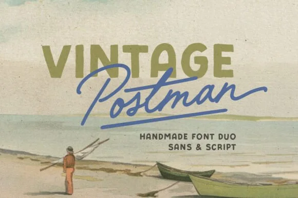
Vintage Postman
Vintage Postman pairs a sturdy retro sans with the look of a soft rubber stamp and a brisk monoline brush script: the olive sans holds a solid horizontal line while the angled script cuts across the baseline with a hand-signed slant.
The sans cut keeps even stems, softly rounded corners and a slightly uneven impression, and the script cut draws a monoline stroke at a steady width with a sharp slant and quick connectors. The pairing of a grounded row and an angled line is the character: one gives structure and the other gives motion, which is why the sample sets the olive words above the blue signature. Because the script slants, keep 18 mm between the rows and 20 mm at the right for the exit; the sans stays readable from 0.35 inches of pen height.
Recommended project & layout
Coffee bag label, travel poster or surf-shop tee — Set the geographical or brand noun in all-caps sans and overlap the descriptor in angled script.
Before you cut or print
Check light organic edge texture on the sans if cutting decals under 1.5 inches.
Best paired with
Get fontPaid link
 #37
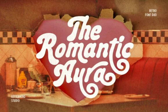
Romantic Aura Duo
Romantic Aura Duo pairs a thick, velvety 1970s swash script with a clean companion voice for nostalgic love notes and merch.
Romantic Aura Duo pairs a nineteen-seventies swashed retro script with a rounded sans: the script runs a high-contrast stroke with wide swelling swashes that lift above and below the line, while the sans is a soft rounded block for details and lists. The pair is a period look, so it works best in two warm flat inks on a light ground rather than in photographic tints. The swash thins are the finest element and they break first. The script needs roughly 32 mm and the sans 20 mm for their detail to read.
Recommended project & layout
Retro Valentine sweatshirt, mug wrap & galentine card — Stack 2 to 3 centered words tightly inside a heart or arch silhouette so rising ascenders nest into the gaps of the line above.
Before you cut or print
Weld all overlapping script letters before cutting HTV, and keep total lockup width at 3.5 in+ so tight inner 'e' and 'a' counters weed cleanly.
Best paired with
Get fontPaid link
 #38
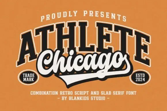
Chicago Athlete
Chicago Athlete pairs a tall arched slab word with a thick flowing script below, where the script carries round loops and a long terminal that forms the lower edge of a badge.
The slabs stay tall and arched, the script thickens and flows, the loops close round and the final stroke flattens out to close the shape at the bottom. That shared edge is the character: the two members read as one badge rather than two lines, which is why the cover binds them with cream borders and shadows. The overlap is a designed lockup and not an automatic alignment, so build the arch and the edge yourself and check that any two words will actually meet that way.
Recommended project & layout
A neighbourhood club identity study — Keep the slab row above the script and allow the lower tail to define the badge edge.
Before you cut or print
Verify both supplied styles and confirm any club or location naming rights.
Best paired with
Get fontPaid link
 #39
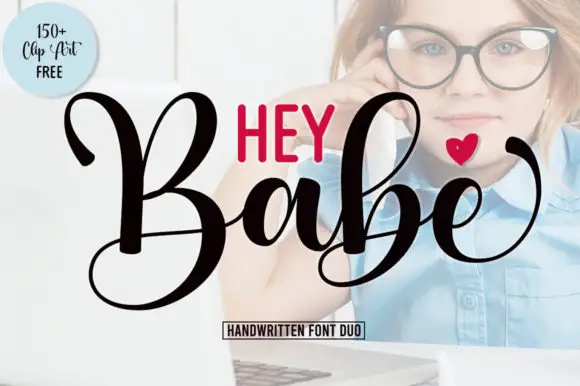
Hey Babe
Hey Babe is a duo of a heavy looping script with tall capitals and a smaller rounded sans, arranged so a bold script line carries the design and the sans supplies the second voice.
The script half opens with a large B whose loop rises above the cap line and crosses its own stem, and the letters after it keep that weight: the a closes a round bowl, the b repeats the tall loop, the e curls its exit and the final e lifts away with a flourish. Weight is heavy and constant, joins stay as thick as the stems and the ends curl rather than taper, which gives the phrase its confident tone. The second half is a compact rounded sans in capitals with even strokes, and in the sample it sits above the script as a short label, which is how the pair is usually layered. The photograph behind, the black and red inks, the small heart and the boxed caption are presentation; the duo is the two lines.
Recommended project & layout
A short affectionate cover — Place small print above the script and sender below its lowest loop.
Before you cut or print
Verify heart availability and included extras separately.
Best paired with
Get fontPaid link
Practical buyer checklist
Frequently asked questions.
Key cutting, printing and pairing answers before choosing a brand & packaging typeface.
Can I use a purchased font in a logo I register as a trademark?
Most commercial licences permit logo use, sometimes with an extended tier. Redrawing the lettering as outlines and keeping records of your modifications is both common practice and the cleanest way to make the mark genuinely yours.
How many weights do I need for a packaging system?
Four is the usual minimum: regular, medium, bold and one light or italic. Below that you end up faking weight with outlines, which distorts the letterforms and shows badly at large print sizes.
Why does my logo look weak on a small screen?
High-contrast serifs and fine swashes fall apart under 24 px. Design a simplified lockup, drop the swashes and increase weight, then use it for favicons, app icons and social avatars while the full mark stays for print.
Should the logo font and the body font be different?
Usually yes. The mark needs character and the body needs neutrality at small sizes. If you want one family, choose a face with a very wide weight range so the mark can be bold and the text light within the same structure.
Keep exploring
Related collections & guides.
Explore adjacent maker roundups or check our practical pre-production checklists.
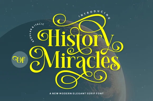
01 / Type Styles
Luxury & modern serif
34 curated fonts · Previews & pairings
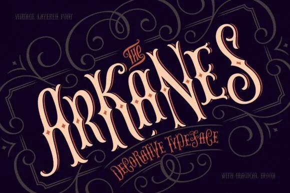
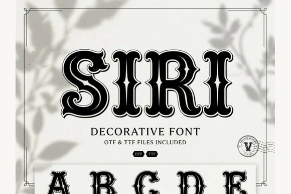
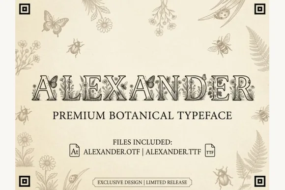
02 / Branding & Print
Soy candles, apothecary & skincare
29 curated fonts · Previews & pairings

03 / Branding & Print
Artisan bakery, café & menus
28 curated fonts · Previews & pairings
04 / Type Styles
Signature & logo script
28 curated fonts · Previews & pairings
Guides: Invitation font checklist · Vinyl & cutting checklist · How to pair script & sans fonts