Modern Grotesque Body

Sunner Heat + Mansory
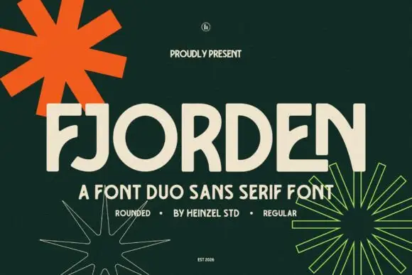
Creates crisp high-hierarchy contrast beneath Sunner Heat headlines across menus, websites and labels.
Inspect Mansory specimenDisclosure: MakerFileHub may earn a commission from qualifying purchases via paid links on this page. How our links work.
Psychedelic curl display
Sunner Heat is a psychedelic display in cream on a dark photograph: heavy letters whose stems curve into long hooks and loops, a waving baseline and exaggerated swashes on several letters, with a round skull badge above and small tracked notes at the sides, so the plate reads as a seventies rock poster.
Paid link
Get this fontProject & layout blueprintsAt-a-glance maker compatibility
Sturdy stroke walls and open counters weed cleanly on adhesive vinyl, HTV apparel film, and cut cardstock.
Visual anatomy & craft review
The two words are stacked and each letter is drawn with a curl: the stems end in hooks, the S loops back on itself, and the baseline rises and falls, which gives the block its movement. The weight stays heavy throughout, so the curls read as structure rather than decoration, and the counters remain open enough that the words are legible at a distance. Spacing is tight and the two lines lock together, which is what makes the plate read as one image. The ground is a dark photograph of a road and two figures, and the small tracked notes at the corners plus the round badge above belong to the period language rather than to the letterforms themselves.
Psychedelic, curled, display, retro
Two-font hierarchy recipes
Tested contrast partners — pairing Sunner Heat with grounded secondary typography.
Sunner Heat + Mansory
Creates crisp high-hierarchy contrast beneath Sunner Heat headlines across menus, websites and labels.
Inspect Mansory specimen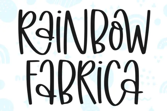
Sunner Heat + Rainbow Fabrica
Adds a warm human signature touch for 1-to-3-word callouts without competing against structured serif capitals.
Inspect Rainbow Fabrica specimenPractical applications
Concrete hierarchy, scale and production guidance tailored to Sunner Heat’s stroke geometry.
A psychedelic display sets a period tone in one word, and the heavy curls read from across a venue where a thin retro script would be lost in the crowd.
Hierarchy & layout recipe
A2 portrait: the band at 120 mm cap height, the line-up in a 12 mm sans, and the date at 26 mm. Keep 30 mm margins, print cream on a dark ground, and keep the curls away from the small type block.
Pre-production check
Check the poster at five metres, where a curl can read as damage; keep the hooks above 6 mm. Confirm the 12 mm line-up reads at two metres and that the date sits clear of the lowest curl.
A curled display prints as one screen and looks like a vintage band shirt, which suits a retro party better than a clean modern mark.
Hierarchy & layout recipe
Print a 260 mm chest graphic: the phrase at 55 mm cap height, the date at 18 mm, and one ink on a light shirt. Keep the thinnest hook at 3 mm so the screen holds and place the graphic 80 mm below the collar.
Pre-production check
Check the screen at actual mesh, where a 3 mm hook fills; thicken it. Wash-test one shirt and confirm the date stays legible after five cycles.
A curled display frames a music history as a period poster, and the flat single ink keeps a cover cheap while the letterforms carry the era.
Hierarchy & layout recipe
Set the title at 90 mm cap height across 230 mm, the subtitle in a 12 pt sans, and the author at 9 pt caps. Print cream on a dark matte stock and keep the badge as the only ornament.
Pre-production check
Check the title at thumbnail size, where the curls can blur into the ground; keep the contrast high. Confirm the 9 pt author survives lamination and that the title clears the trim by 12 mm.
Technical & licence verification
Confirm included OTF/TTF/WOFF formats, full glyph tables and licence coverage on the live store page before batch production.
Closest visual alternatives
Matched across letterform anatomy, stroke behaviour and craft applications.
Chubby 1970s Cooper-inspired groovy swash serif
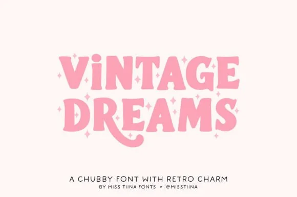
Vintage Dreams is a lovable, chubby 1970s display serif combining soft Cooper-Black curves, sparkle-star 'i' dots, and a swooping 'R' tail!
Ideas for this font
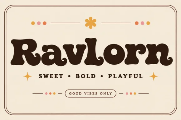
Fat retro serif with psychedelic curls
Ravlorn is a fat retro serif in brown on cream: heavy rounded strokes, ball terminals that curl into the counters, a swash tail on the final n, and an even weight that reads as a 1970s soft serif rather than a sharp display.
Ideas for this font
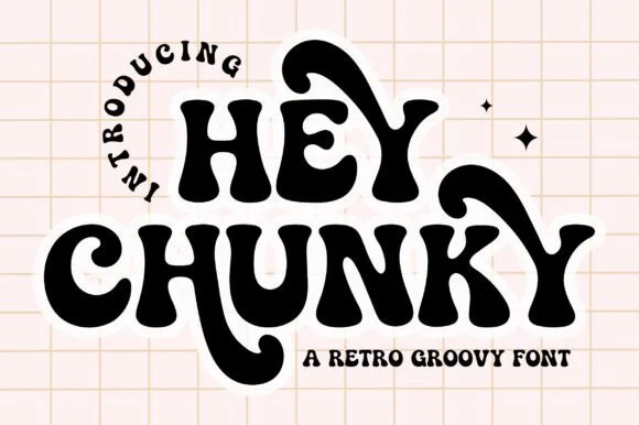
Swash-tailed 1970s psychedelic & groovy serif display
Hey Chunky is an expressive 1970s groovy display font kicking long, flamboyant retro swash tails off 'H', 'Y', 'C', and 'K'!
Ideas for this font
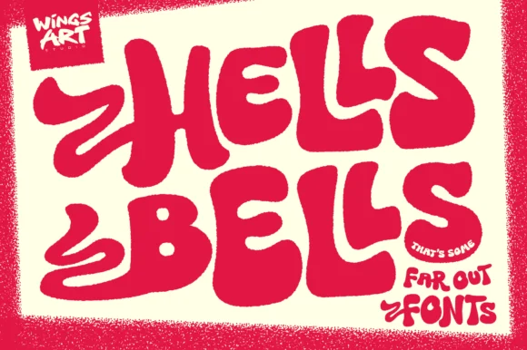
Exuberant 1970s bell-bottom & swash-flame poster display
Hells Bells is a flamboyant 1970s poster display typeface with sweeping bell-bottom curves, flame-like left swashes, and heavy disco swagger.
Ideas for this font
Same independent foundry
Allow optional Google Analytics to measure visits and catalogue actions. Your search words and notes are not included. Privacy & storage