Neutral Sans Workhorse

Back to School + Saltriver Grotesk
Lets Back to School own the focal silhouette while handling secondary copy, sizing and subheads cleanly.
Inspect Saltriver Grotesk specimenDisclosure: MakerFileHub may earn a commission from qualifying purchases via paid links on this page. How our links work.
Flat bright block capitals with dark diagonally hatched offset depth
Back to School sets chunky flat-colour capitals against a white page of pale classroom doodles, each letter carrying a dark offset shadow that is filled with close diagonal hatching instead of a solid tone.
Paid link
Get this fontProject & layout blueprintsAt-a-glance maker compatibility
Sturdy stroke walls and open counters weed cleanly on adhesive vinyl, HTV apparel film, and cut cardstock.
Visual anatomy & craft review
The two rows of BACK TO SCHOOL alternate red, yellow, purple, green, blue and orange, with a white edge following every counter and a black shadow dropped down and to the right, hatched by hand so it reads as pencil rather than a blur. Letterforms are wide, squat and square-shouldered with flat tops and small square counters, and the whole line sits on a light sketch of pencils, a school bus, a ruler, paper clips and stars. The caption under the second row is plain black capitals with wide tracking, which gives the colour a rest. It is a colour font with letter sets, so the bright fill and the hatched shadow travel together unless the layers are separated.
Flat bright block capitals with dark diagonally hatched offset depth
Two-font hierarchy recipes
Tested contrast partners — pairing Back to School with grounded secondary typography.
Back to School + Saltriver Grotesk
Lets Back to School own the focal silhouette while handling secondary copy, sizing and subheads cleanly.
Inspect Saltriver Grotesk specimen
Back to School + Rosemode
Grounds bold display lettering with classic typographic authority on posters, badges and apparel.
Inspect Rosemode specimenPractical applications
Concrete hierarchy, scale and production guidance tailored to Back to School’s stroke geometry.
The bright blocks and the pencil-hatched shadow say classroom without a single illustration, and two stacked rows fill a portrait poster with one short phrase.
Hierarchy & layout recipe
Print an A3 poster: set the two rows at 96 pt with 34 mm between baselines, keep 26 mm of clear ground beneath before the date at 18 pt, and keep 22 mm of border so the shadows stay in the trim.
Pre-production check
Hatching clogs below 30 pt; check the print proof and hold the heading at 60 pt or above on paper.
A school-age birthday can borrow the classroom palette, and the flat colour blocks keep the number and the name legible on a folded card.
Hierarchy & layout recipe
Print a 120 by 170 mm card: set the greeting at 40 pt across two rows, keep 16 mm of clear ground beneath before the party details at 10 pt, and keep 12 mm of margin on each side of the fold.
Pre-production check
The shadow layer sits behind the fill; check the exported file before sending a single-colour print to a card printer.
The heavy blocks hold a magazine cover line at newsstand distance, and the hand-drawn shadow keeps a serious issue sounding approachable.
Hierarchy & layout recipe
Print a 210 by 275 mm cover: set the cover line at 84 pt across two rows, keep 20 mm of clear ground beneath before the standfirst at 11 pt, and keep 18 mm of margin from the trim edge.
Pre-production check
Six colours in one line; check the press proof before confirming the cover with a four-colour printer.
Technical & licence verification
Confirm included OTF/TTF/WOFF formats, full glyph tables and licence coverage on the live store page before batch production.
Closest visual alternatives
Matched across letterform anatomy, stroke behaviour and craft applications.
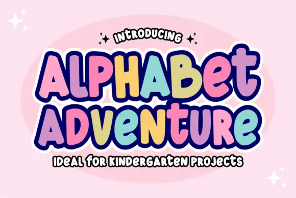
Irregular rounded blocks with a heavy outline and a rainbow of fills
Alphabet Adventure is an irregular rounded block alphabet in which the letters bounce at different heights, a heavy outline surrounds the whole phrase and each letter can take its own colour.
Ideas for this font
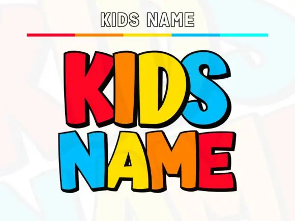
Broad playful capitals with flat bright fills and black lower edges
Kids Name is a fat cartoon display face: rounded colour caps with a heavy black contour and a hard offset shadow, built to be set large on a wall, a door or a shirt.
Ideas for this font
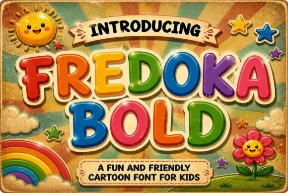
Rounded cartoon capitals in glossy colour with heavy shading
Fredoka Bold is a rounded cartoon capital alphabet in which every letter carries a glossy highlight, a darker shade along the lower edge and a thick cream outline, so a word reads as inflated toy lettering.
Ideas for this font
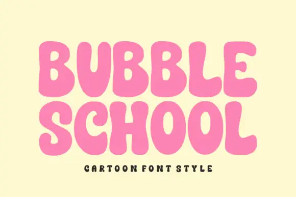
Solid bubble capitals with soft uneven contours and a heavy fill
Bubble School is a solid bubble capital alphabet in which the strokes swell, the contours wobble slightly and the fill is flat, so a word reads as thick foam letters rather than as a sticker.
Ideas for this font
Same independent foundry
Allow optional Google Analytics to measure visits and catalogue actions. Your search words and notes are not included. Privacy & storage