Neutral Sans Workhorse

Smart Teacher + Homies
Lets Smart Teacher own the focal silhouette while handling secondary copy, sizing and subheads cleanly.
Inspect Homies specimenDisclosure: MakerFileHub may earn a commission from qualifying purchases via paid links on this page. How our links work.
Tall narrow minimalist display lettering
Smart Teacher is a tall narrow display face in charcoal: mixed capital and lower-case forms in one line, a wide T bar, a small round counter in the o and a soft white halo behind the lettering.
Paid link
Get this fontProject & layout blueprintsAt-a-glance maker compatibility
Sturdy stroke walls and open counters weed cleanly on adhesive vinyl, HTV apparel film, and cut cardstock.
Visual anatomy & craft review
The words are stacked and set large, and the face mixes forms on purpose: the S of Smart is a tall narrow capital, the m and the a are lower case with small round counters, the a of Teacher closes into a loop and the r carries a short arm, so a single word reads as hand-picked letters rather than a set. The stems are thick, the letters are tightly spaced and the heights are uneven, which gives a minimalist face a hand-cut edge, and a tiny circular badge in the upper right breaks the block deliberately. The caption at the foot states the practical facts: a minimalist display face, encoded for cutting machines and sublimation work, which tells a crafter exactly what it can do. The face is a display face for teacher material, merchandise and social graphics, and it works best in two or three short words at a large size.
A tall display face with mixed letter shapes
Two-font hierarchy recipes
Tested contrast partners — pairing Smart Teacher with grounded secondary typography.
Smart Teacher + Homies
Lets Smart Teacher own the focal silhouette while handling secondary copy, sizing and subheads cleanly.
Inspect Homies specimen
Smart Teacher + Auretha
Grounds bold display lettering with classic typographic authority on posters, badges and apparel.
Inspect Auretha specimenPractical applications
Concrete hierarchy, scale and production guidance tailored to Smart Teacher’s stroke geometry.
A tall display face reads down a corridor, and the mixed letter shapes give a plain classroom sign the handmade look a printed label cannot.
Hierarchy & layout recipe
Print a 300 by 200 mm sign: set the teacher name at 64 pt over two lines, keep 18 mm of clear ground beneath before the room number at 20 pt, and hold 16 mm of border on all four sides.
Pre-production check
A narrow face at sixty-four points can look squeezed; print one sign at the final size and check the line breaks before the set.
The face is built for cutting and sublimation, and the thick stems hold when the lettering is weeded from vinyl on a shirt.
Hierarchy & layout recipe
Print a 250 by 300 mm shirt graphic: set the slogan at 70 pt over three lines, keep 10 mm of bridge between letters, and leave 6 mm around the outline for the cutting path.
Pre-production check
Thin joins between the m and the a will tear when weeded; print one test cut and check the counters before the batch.
A tall display face gives an education feature a title that reads as a stamp rather than a headline, and the mixed forms match the subject.
Hierarchy & layout recipe
Print a 230 by 300 mm opener: set the title at 90 pt over two lines, keep 26 mm of clear ground beneath before the standfirst at 11 pt, and hold 22 mm of margin on both sides.
Pre-production check
A tight face at ninety points closes its counters; print one opener at the final size and check the o and the e before the issue.
Technical & licence verification
Confirm included OTF/TTF/WOFF formats, full glyph tables and licence coverage on the live store page before batch production.
Closest visual alternatives
Matched across letterform anatomy, stroke behaviour and craft applications.
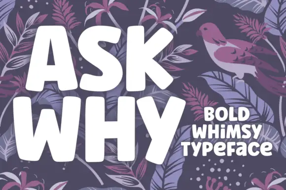
Bold whimsical blocks with uneven proportions and soft squared corners
Ask Why is a bold whimsical display in which the letters sit softly squared, the stance shifts from letter to letter and the widths vary, so a two-word phrase reads as lettering drawn by hand with a broad marker.
Ideas for this font
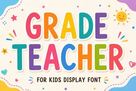
Tall rounded classroom capitals with simple counters and per-letter colour
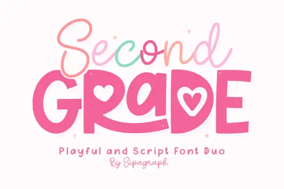
Grade Teacher is a tall rounded capital alphabet with simple counters, drawn so a heading reads as classroom lettering that a teacher could have cut out of coloured card.
Ideas for this font
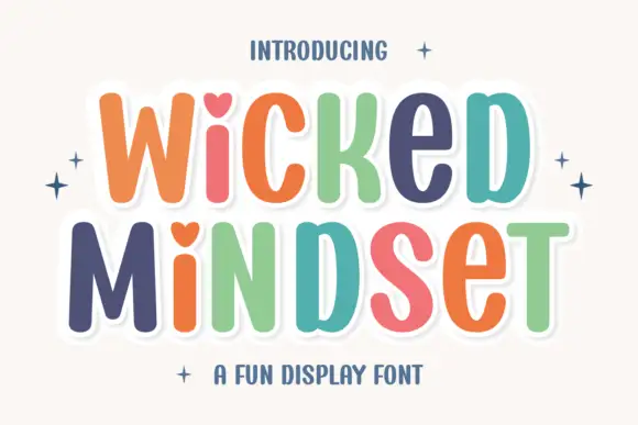
Playful multicolour caps with heart counters
Wicked Mindset is a playful rounded caps display in multicolour with a white contour and offset shadow: fat letters with soft corners, hearts cut into three counters, a bounce across both lines, and four-point sparkles at the sides of a plain cream ground.
Ideas for this font
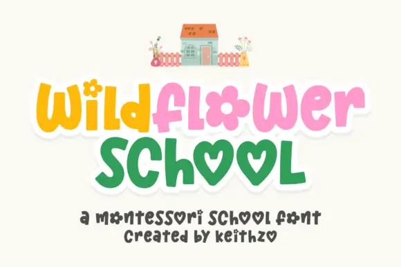
Playful rounded letters with flower and heart forms
Wildflower School is a cheerful hand-drawn display in which the round letters become shapes: the o of flower is a flower head, both o's of school are hearts, and the pastel caps sit inside a white sticker outline.
Ideas for this font
Same independent foundry
Allow optional Google Analytics to measure visits and catalogue actions. Your search words and notes are not included. Privacy & storage