Neutral Sans Workhorse

Veloura + Memoir Slang
Lets Veloura own the focal silhouette while handling secondary copy, sizing and subheads cleanly.
Inspect Memoir Slang specimenDisclosure: MakerFileHub may earn a commission from qualifying purchases via paid links on this page. How our links work.
High-contrast display with curled interiors
Veloura is a high-contrast display in cream on deep maroon: mixed case with a curled e interior, a looping a upper bowl, fine joins and wide oval bowls, set as one large word between two small italic lines, one above and one below.
Paid link
Get this fontProject & layout blueprintsAt-a-glance maker compatibility
Sturdy stroke walls and open counters weed cleanly on adhesive vinyl, HTV apparel film, and cut cardstock.
Visual anatomy & craft review
The plate is two colours and three lines, and the restraint lets the letterforms speak: the e is built from a curling interior stroke and the a loops at the top, so the lowercase carries the character while the capitals stay quiet. That construction sets a size floor, because the fine joins and the curls close first, and the deep maroon ground makes the cream read as ink. The two italic lines are product copy set in a companion face, which shows that the family implies an italic. Because the letters are wide and contrasting, the face suits a label, a masthead and a cover at display sizes, and it is not intended for a paragraph.
Display, contrast, elegant, editorial
Two-font hierarchy recipes
Tested contrast partners — pairing Veloura with grounded secondary typography.
Veloura + Memoir Slang
Lets Veloura own the focal silhouette while handling secondary copy, sizing and subheads cleanly.
Inspect Memoir Slang specimen
Veloura + The Simple Editorial
Grounds bold display lettering with classic typographic authority on posters, badges and apparel.
Inspect The Simple Editorial specimenPractical applications
Concrete hierarchy, scale and production guidance tailored to Veloura’s stroke geometry.
A high-contrast label reads as a considered bottle, and the curled e gives a short name a detail on a small die. The curled e sells the label.
Hierarchy & layout recipe
Print a 50 by 90 mm label: the house at 13 pt, the vintage at 8 pt, and the volume at 7 pt. Keep 5 mm inside the die and keep the finest join above 0.25 mm on the curve.
Pre-production check
Check the 13 pt house on a curved bottle, where a join can fill; keep it above 0.25 mm. Confirm the 7 pt volume reads on the shelf and that the label holds in a cellar.
A contrast masthead gives a fashion title a voice, and the wide bowls hold a short name across a portrait cover. The wide bowls hold the width.
Hierarchy & layout recipe
Set the masthead at 100 mm cap height across 195 mm, the cover lines in an 8 pt sans, and the issue at 7 pt. Print one ink on a coated stock and keep 22 mm margins at the head.
Pre-production check
Check the masthead at 100 mm, where a join can break on coated stock; keep it above 0.25 mm. Confirm the 7 pt issue survives lamination and that the masthead clears the trim.
A contrast display reads as quiet luxury, and the curled interiors give the names a finish without a script. The curls read as luxury.
Hierarchy & layout recipe
A5 invitation: the names at 26 pt, the request in a 9.5 pt serif, and the date at 8.5 pt caps. Keep 26 mm margins and letterpress one ink on a heavy cotton card.
Pre-production check
Check the 26 pt names in letterpress, where a join can sink into the cotton; proof the plate first. Confirm the request reads at arm's length and that the names clear the trim.
Technical & licence verification
Confirm included OTF/TTF/WOFF formats, full glyph tables and licence coverage on the live store page before batch production.
Closest visual alternatives
Matched across letterform anatomy, stroke behaviour and craft applications.
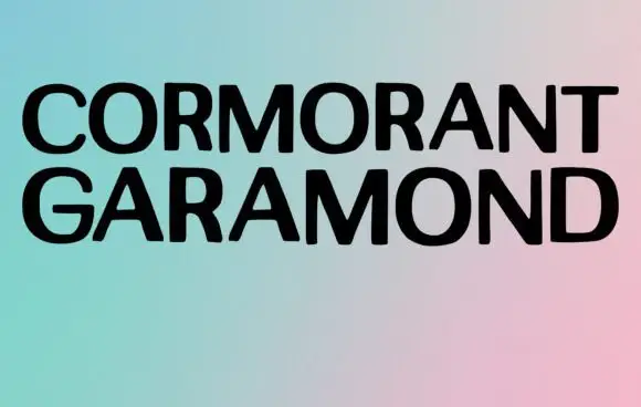
Broad plain capitals in a minimal specimen
Cormorant Garamond shows two long rows of broad black capitals over a soft gradient, where the strokes stay largely even, the joins close tightly and only faint thickenings hint at a serif at this display size rather than the fine detail the family name suggests.
Ideas for this font
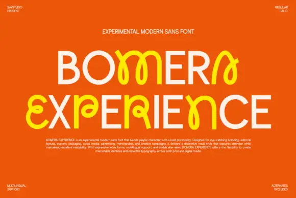
Plain capitals interspersed with looped characters and crossing strokes
Bomera Experience shows two pale capital lines on orange, where selected characters turn yellow and bloom into loose looping structures with bulbous ends, while circular O and plain straight E forms sit beside curling shapes that cross themselves near the body line.
Ideas for this font
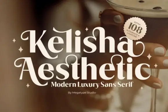
Heavy contrast mixed case with looped entry strokes and long curling capital legs
Kelisha Aesthetic is a modern luxury sans with high stroke contrast, tall narrow letters and a set of alternates in which an arm or an ascender curls into a loop.
Ideas for this font
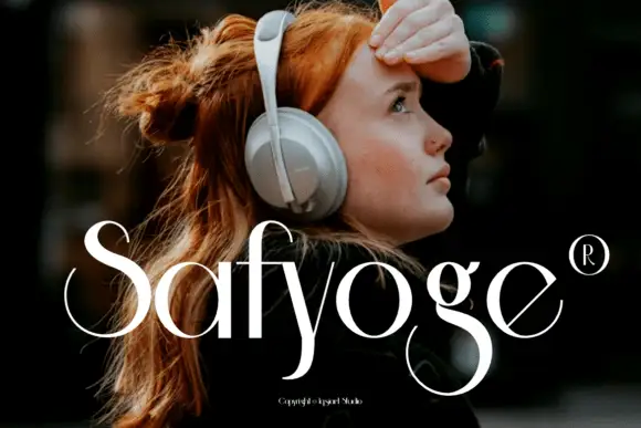
Fine contrast display with sweeping S
Safyoge is a fine contrast display in white over a street portrait: mixed case with a sweeping S, a long y descender that curls below the baseline and a broad lower g loop, with a registered mark at the right and a small credit at the foot.
Ideas for this font
Allow optional Google Analytics to measure visits and catalogue actions. Your search words and notes are not included. Privacy & storage