 #1 · Best Overall
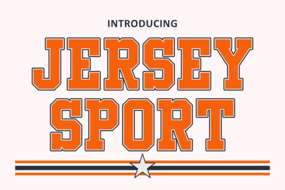
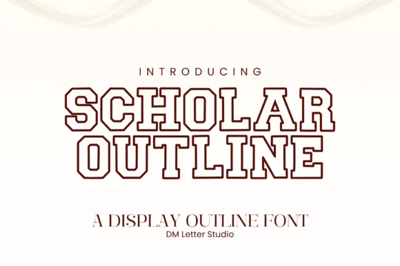
Scholar Block Outline
Double-lined collegiate varsity outline slab serif
Get fontPaid link
Read review ↓Disclosure: MakerFileHub may earn a commission from qualifying purchases via paid links on this page. How our links work.
Open contours, varsity outlines & engraved channels
Outline lettering is a contour decision: how thick the wall is, how open the interior stays, and whether the shape can hold a second colour. Scholar Block Outline and Hollow Varsity keep the collegiate double and triple contour, Quirky Outline and Summer Sketch work the hand-drawn tubular look, and Sahron and Deluxe Jersey add the serif and inline variants that suit signage.
Quick verdict
Scholar Block Outline is the sturdiest hollow for a two-tone shirt, Hollow Varsity covers the triple-contour case, and Quirky Outline is the pick for hand-drawn craft signage. Deluxe Jersey handles inline collegiate detail.
Quick answer
Short on time? Start with our three highest-rated outline, hollow & inline display standouts before scrolling the full breakdown.
#1 · Best OverallDouble-lined collegiate varsity outline slab serif
 #2 · Runner-Up Pick
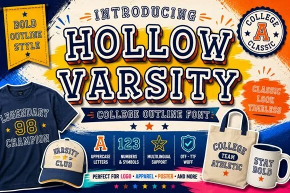
Triple-contoured hollow collegiate varsity slab (OTF, TTF & WOFF)
 #3 · Editor's Choice
We kept 22 of 435 candidates after measuring the wall thickness at 1 inch. Judged on whether the contour closes into a sliver, how the interior behaves as a second colour layer, and whether the inline channel aligns with the stem.
Side-by-side summary
Compare specimens, OpenType/PUA traits and primary project roles side by side.
| Rank & Font | Style & File Specs | Best Project Fit | Store Listing |
|---|---|---|---|
| Slab SerifLanguage support | Senior hoodie chest arch, grad banner & notebook cover | Get fontPaid link | |
| Slab SerifCollegiate-classic | College-alumni crewneck, cap patch, tote & mug wrap | Get fontPaid link | |
| Slab SerifChampionship | Varsity letterman hoodie, championship banner & trophy plate | Get fontPaid link | |
| SerifLigatures · Alternates & swashes | Emerald spirits label, bespoke tailoring seal & candle box | Get fontPaid link | |
| Slab SerifAthletic | Senior-night jersey chest, spirit hoodie & megaphone decal | Get fontPaid link |
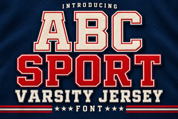
#1 · Best OverallScholar Block Outline is a clean, double-contoured collegiate varsity slab serif with octagonal corners and multilingual support.
Scholar Block Outline is a collegiate varsity slab drawn as a double line: the letter is an outline with a second outline running inside it, so every stem reads as two parallel tracks with a narrow channel between them. The channel is the whole design and it closes first at small sizes, and the double line makes a heavy face look light on a light ground. It needs roughly 32 mm for both lines and the channel to read, and it is best in one dark ink on white or heather grey, or a two-colour build where the outer line takes the second colour.
Senior hoodie chest arch, grad banner & notebook cover — Stack 2 centered uppercase lines at 60–110 pt in varsity maroon, navy, or forest green on heather-gray or cream garments.
Because it cuts two thin parallel outline rings, scale HTV/vinyl above 1.75 inches tall, or use DTF/sublimation for smaller badges.
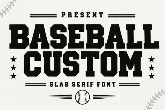
#2 · Runner-Up PickHollow Varsity is a classic triple-lined hollow college slab font covering uppercase, numbers, symbols, and multilingual glyphs (OTF/TTF/WOFF).
Hollow Varsity is a triple-contoured hollow collegiate slab, with octagonal capitals, concentric outline rings and matching jersey numerals, supplied as OTF, TTF and WOFF for print and web. The hollow construction means the letter is defined by its three lines rather than a fill, so it reads as an applied patch at 30 mm and as a clean graphic at 200 mm, and the rings must stay separated or the word closes into a solid block. It is a sports and school face for jerseys, posters and merch.
College-alumni crewneck, cap patch, tote & mug wrap — Arch the college/city name above big 2-digit graduation year numerals and a 'CHAMPION' footer.
Concentric thin border lines shine in DTF transfers, sublimation totes/mugs, and screen print rather than small blade-cut vinyl.
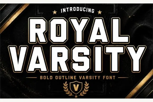
#3 · Editor's ChoiceRoyal Varsity is a bold collegiate athletic slab serif wrapping solid white block cores inside a crisp parallel outer varsity border.
Royal Varsity is a collegiate varsity slab serif in a filled cut plus a matching outline cut: extended block letters with thick unbracketed slabs, a small notch on the terminals and a second version where only the outer keyline prints. The pair lets a shirt carry a heavy name and a light second line in one voice, and the outline cut is the weaker element in print. The filled cut needs roughly 30 mm and the outline 34 mm for their detail to read.
Varsity letterman hoodie, championship banner & trophy plate — Stack 2 centered uppercase lines above a starred crest shield ('V') and gold rule lines.
Cut HTV at 1.5 inches+ tall so the thin outer perimeter border weeds cleanly without snapping, or use DTF at any size.
 #4 · Top Maker Utility
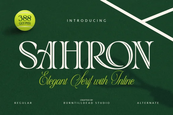
Sahron is an aristocratic high-contrast serif accented by fine interior inline grooves down its primary vertical and diagonal stems.
Sahron is an engraved inline luxury display serif in a regular and an alternate cut: high-contrast stems with a fine white inline running down the middle of every thick stroke, sharp bracketed serifs and an alternate set that shifts the inlay to a double line. It is a banknote and a perfume-box face, so it wants size and precise registration rather than a soft ground. The inline is the finest element and it fills or breaks first in print and in foil. It needs roughly 40 mm for the inline to read, and it is best one dark ink on a bright coated stock.
Emerald spirits label, bespoke tailoring seal & candle box — Set a single uppercase brand name at 42–64 pt with +35 tracking over rich hunter green, navy, or matte black stock.
Fine interior inline slots shine in 300+ DPI offset/digital print and hot foil; avoid small blade-cut vinyl where narrow inline strips could lift.
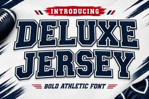 #5 · Standout Silhouette
Deluxe Jersey is a classic double-outlined collegiate varsity slab serif built for athletic chests, senior jerseys, and team banners.
Deluxe Jersey is a collegiate varsity block slab with an inline border: extended block letters with thick unbracketed slabs, a thin keyline running just inside the outer edge and a small notch on the terminals that reads as a stitched jersey patch. The inline border doubles the footprint and closes first when the face is reduced. It needs roughly 32 mm for the border and the notch to read, and it is best in two flat inks on jersey, or one thread colour on a patch where the border becomes an inner stitch line.
Senior-night jersey chest, spirit hoodie & megaphone decal — Arch the school or team name slightly across a 10.5-inch chest width above large centered player numerals.
Because the built-in outer outline creates a thin channel around every letter, scale HTV cuts to at least 1.5 inches tall or use DTF/sublimation for tiny badges.
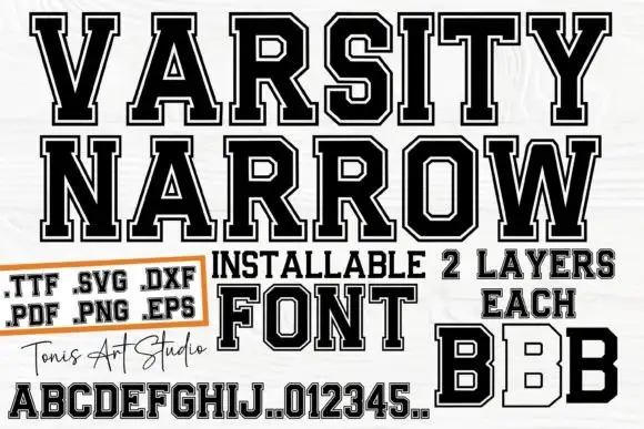 #6
Varsity Narrow is a narrow athletic slab in which the capitals compress, the corners clip, the O turns an octagonal counter and a fine inner border runs inside the letter, so a long team name fits a narrow board.
The R drops an angular leg, the O closes an octagonal counter, the B stacks two squared bowls and the fine border follows every contour at a constant distance, with separate filled and outlined examples on the cover. The inner border is the character: it thins the letter without reducing the outside size, which is why the sample pairs a filled word with an outlined one. Because the border is fine, the face wants 34 pt before it stays open, and the narrow proportions let a long name sit on one row. The pale ground and the small caption are presentation; the dark outlined slabs are the face.
A club-name pennant — Use the name on a straight central line with a plain year panel beneath it.
Verify layer alignment and the required letters in the actual supplied files.
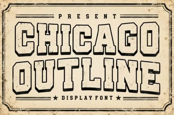 #7
Chicago Outline is a weathered vintage collegiate outline font tracing classic octagonal varsity blocks in scuffed charcoal ink.
Chicago Outline is a collegiate varsity slab drawn as a hollow inline: a thick block letter with a fine rule running inside the contour, plus a weathered edge that chips the outer line. The inline needs clear space on both sides, and because the whole letter is an outline it disappears when reversed at small sizes. It needs roughly 34 mm for the inline rule to read as a line, and it is best in one dark ink on light stock, or a two-colour build where the inline is bare paper.
Throwback city sweatshirt, alumni mug & sports pennant — Stack 2 wide uppercase lines at 60–110 pt framed top and bottom by horizontal stadium stripes and stars.
Distressed rough outline walls shine in DTF transfers, screen print, and sublimation mugs rather than small vinyl weeding.
 #8
Varsity Spirit is a layered varsity capital alphabet in which each letter carries an inline stroke, a keyline and a set of matching numerals, so a team name reads as the appliqué on a college jacket.
The V cuts two thick diagonals with an inline running between them, the S holds a stepped spine, the A pinches a flat apex, the R turns a notched leg and the numerals carry the same inline and keyline, all at a heavy slab weight with square serifs. The inline is the character: it divides each stroke into two bands, which is why the sample sets a stacked word above a full numeral line. Because the inline is narrow, the face needs 40 pt before it stays open, and each layer has to be a clean vector for a vinyl or embroidery cut. The white timber ground, the format strip and the small badge are presentation; the black and white layered words are the face.
A school-spirit event poster — Put a broad title over a separate plain schedule and keep the inner lines away from background patterns.
Check every required numeral and letter rather than assuming the sample alphabet is complete.
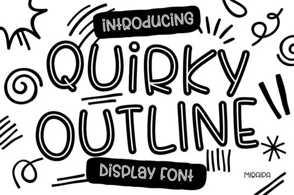 #9
Quirky Outline Font is a tall, lively hand-drawn outline display font with double-walled tubular strokes and playful dancing rhythm.
Quirky Outline Font is a tall funky tubular outline display: each letter is a single rounded tube drawn as a hollow contour, the shapes bend and lean slightly and the ends finish in a blunt cap rather than a taper. Because the letter is a tube, the interior stays open and the line weight is uniform, so the face prints honestly in one ink at any size. It needs roughly 28 mm for the tube weight and the bend to read, and it is best in one bright ink on white, or a single pastel on cream where the hollow interior lets the paper show.
Art-room coloring poster, sketchbook cover & bulletin board — Stack 2 tall words big (64–120 pt) framed by solid black pill banners ('INTRODUCING' / 'DISPLAY FONT') at top and bottom.
Great for print coloring sheets, iPad Procreate lettering bases, and 1.75 in+ vinyl decals.
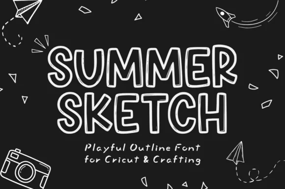 #10
Summer Sketch is a playful, hand-drawn rounded outline display font built for Cricut pen drawing, coloring sheets, and breezy summer crafts.
Summer Sketch is a hand-drawn rounded outline display in tall friendly capitals, drawn as a single open contour rather than a filled shape, which makes it the natural choice for a plotter pen, a colouring sheet or a traced craft project. The outline is even, the counters are wide, and the slight wobble in the contour is what keeps it looking drawn rather than generated. It needs roughly 12 mm for the double line to stay separated, and it prints best as a single colour on a light ground, so the interior stays open for colouring or for the substrate to show through.
Kids' camp coloring banner, Cricut Pen card & scrapbook — Print or pen-plot at 54–100 pt on white cardstock surrounded by travel/camp line doodles.
Cuts on HTV/vinyl at 1.4 in+ tall (lift the center hollow cleanly!), and shines with Cricut Pens and Print-Then-Cut.
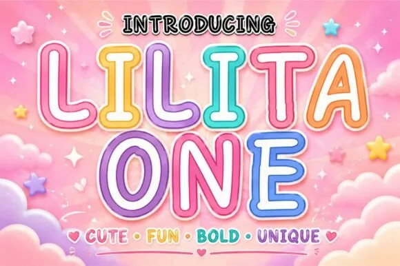 #11
Lilita One (by creativelabstd) is a plump, rounded display typeface shown with playful double candy-cane border styling and soft tubular terminals.
Lilita One is a rounded retro-candy display with both an outline and an inline cut: fat lozenge-shaped letters, a soft drop shadow, a thin white inner line and a glossy top highlight drawn into the stroke. The three layers share metrics, so they stack into one candy word, and the inner line closes first at small sizes. It needs roughly 30 mm for the inner line and the gloss to read, and it is best in two bright inks on white, or one ink plus bare-paper highlights on coloured card.
Cotton-candy party banner, sweet-shop jar & kids' tumbler — Add a crisp white inner offset and pastel outer contour in Canva or Cricut Print-Then-Cut over cloud backgrounds.
Solid rounded letter cores cut fast and cleanly on HTV, permanent vinyl, and cardstock at 0.65 in+.
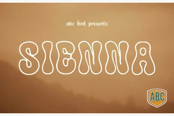 #12
Sienna is a breezy 1970s psychedelic outline font tracing pear-shaped, bottom-heavy groovy letters in a clean monoline contour.
Sienna is a nineteen-seventies bell-bottom outline display: each letter is drawn as a contour that flares at the foot, the outline weight is even and the bottoms sweep outward into a small kick. Because the letter is hollow, the interior stays open, and the flare is what breaks the word box at the base. It needs roughly 30 mm for the outline weight and the kick to read, and it is best in one saturated ink on white, or a single pastel on cream where the hollow interior lets the paper show.
Desert music-fest poster, boho tote & Cricut Pen print — Center 1 uppercase word huge (72–140 pt) with +4 tracking over warm ochre, terracotta, or sunset photography.
Ideal for Cricut Pens, Foil Quill, DTF tees, and flat print; if blade-cutting HTV, size above 1.6 in so the thin outline ring weeds intact.
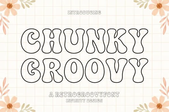 #13
Chunky Groovy is a crisp, flat monoline 1970s outline display font (shadow-free!) tracing bell-bottom retro curves in an even black contour.
Chunky Groovy is a clean flat monoline display from the nineteen-seventies: fat outline letters of even weight with no shading, rounded corners that overrun the stem joints and a slight italic slant that leans the whole word. Because the letter is a monoline outline, the interior stays empty and the line weight is the same everywhere, so the face prints honestly at any size in one ink. It needs roughly 30 mm for the outline weight and the rounded corner to read, and it is best in one bright ink on white, or a single pastel on cream where the empty interior lets the paper show.
Minimalist clear glass-can wrap, Cricut Pen card & tote — Stack 2 centered uppercase lines at 64–125 pt over grid, checker, or floral backdrops.
Draws crisply with Cricut Pens/markers and prints great on clear glass cans; size above 1.6 in if blade-cutting vinyl outlines!
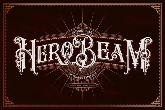 #14
Hero Beam is an elaborate Victorian poster typeface dressed with interior inline filigree, curled spurs, and crisp drop-contour framing.
Hero Beam is a three-dimensional Victorian saloon and tattoo blackletter: a dense gothic body with a bevel that shades the left edge, a bright highlight ridge along the stem and a drop shadow that sits under the letter. The shading is the whole character, so it needs size to read as a solid beam rather than a smudge, and the highlight is the finest element. It needs roughly 36 mm for the bevel and the highlight to read, and it is best as a paper-colour build on dark stock, or one metallic ink with the highlight left as unprinted paper at 50 mm and above.
Craft root-beer bottle, barber-parlor mirror & cigar box — Arc or center a single bold brand title at large scale (56–84 pt) over dark mahogany, navy, or black label panels.
Contains intricate interior filigree lines—produce via high-res label printing, DTF, or laser engraving rather than blade-cut vinyl.
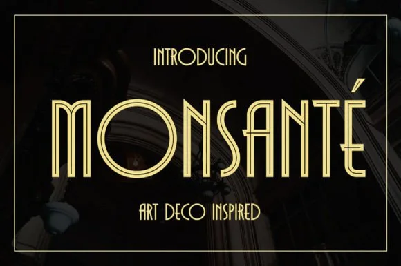 #15
Monsante is a tall, geometric 1920s Art Deco display typeface built from crisp parallel double-line inline strokes and low-waisted crossbars.
Monsante is a nineteen-twenties Art Deco double-line inline geometric display: wide squared letters built from two parallel strokes with a hairline gap, sharp mitred corners and a strict symmetry that reads as a hotel facade sign. The gap between the lines is the design and it closes into one stroke when the face is reduced. It needs roughly 32 mm for the double line to read, and it is best in one fine metallic on a dark ground, or one ink on a pale ground where the gap stays open.
Roaring-Twenties gala invite, champagne menu & seating chart — Track uppercase headlines out to +40 in metallic gold on black, emerald, or midnight-navy cardstock.
Parallel twin-rail lines are delicate—ideal for gold foil stamping, laser engraving, and 300 DPI print rather than small vinyl decals.
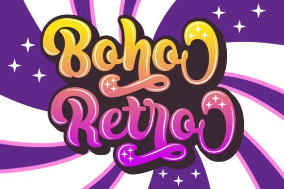 #16
Boho Retro is a plump, heavy-looped 1970s groovy display script with curled swash caps and pillowy connected lowercase bowls.
Boho Retro is a swirled nineteen-seventies psychedelic bubble script-display: fat rounded letters that swell at the waist, joins drawn as spirals and terminals that curl back into the letter like smoke. It is a poster face, so it wants size, two flat inks and a pale ground rather than a busy photograph. The spirals are the finest element and they fill into solid blobs as soon as the face is reduced. It needs roughly 44 mm for the spiral and the swell to read, and it is best two warm flat inks on a light stock.
Retro festival ringer tee & iced-coffee glass wrap — Stack a two-word phrase at a slight upward 6-degree angle and add a contoured offset shadow layer in Cricut or Illustrator if you want the sticker look.
Weld connected lowercase letters before cutting vinyl, and check the tight interior spiral holes inside 'B', 'o', and 'e' when weeding.
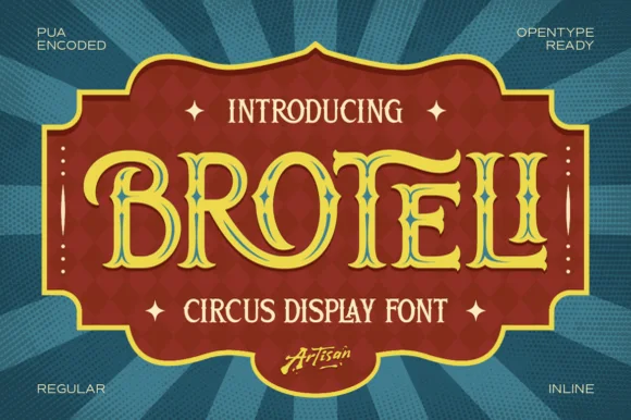 #17
Broteli is a theatrical vintage carnival display font featuring bifurcated Tuscan spurs, curled terminals, and both Regular and Inline cuts.
Broteli is a Tuscan-spurred circus and carnival poster display: heavy unbracketed slabs that split into a forked foot, a median spur rising from the middle of some stems, small ball terminals and a slight inward curve on the round letters that reads as a hand-painted carnival board. The forks are the design and they close first when the face shrinks. It needs roughly 32 mm for the fork and the spur to read, and it is best in two bright inks on cream, or one ink plus paper where the forks print as cuts.
'Step Right Up' carnival birthday marquee & ticket invite — Set the child's name or 'CARNIVAL' in Broteli Inline at 56 pt inside a bordered plaque, flanked by four-point star dingbats.
Choose the solid Regular cut when cutting cardstock or vinyl banners; save the detailed Inline cut for printed invitations and posters.
 #18
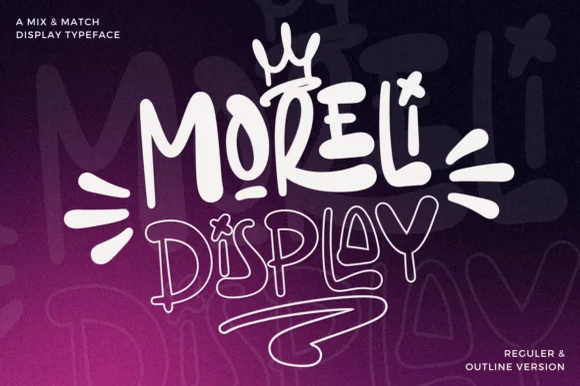
Moreli is a playful mix-and-match street-bubble display typeface shipped in both solid Regular and matching hollow Outline versions.
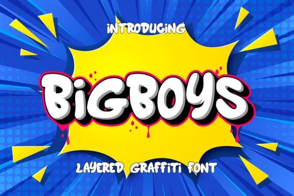
Moreli is a street-art bubble and outline graffiti display duo: the fill cut is a fat rounded bubble with a wide flare and a slight lean, while the outline cut traces the same shapes as a hollow keyline for a second colour behind or in front. The pair is designed to be layered, so the outline only makes sense when it is registered against the fill. The keyline is the finest element and it closes first when the face is reduced. The fill needs roughly 36 mm and the outline 44 mm for their detail to read.
Streetwear drop tee, skate sticker & podcast cover — Stack the solid Regular style on line one at 110% scale above the Outline style on line two, tilting the whole lockup 5 degrees.
Use the solid Regular cut for vinyl decals; reserve the fine double-wall Outline version for screen printing, DTF, or large posters.
 #19
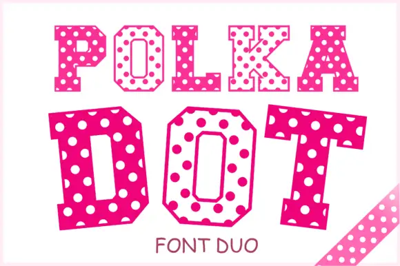
Polka Dot draws its capitals as octagons with the corners cut straight off, then punches a scatter of round holes through the fill so every letter looks like a punched paper tag.
POLKA runs in smaller octagons and DOT in very large ones, both in magenta pink with white dots of two sizes arranged without a strict grid, which is what stops the pattern from reading as a machine mesh. The cuts at the corners make the letters feel cut from card, and the counters stay square. The pair is sold as a duo, so one weight is for a headline and the other for a smaller line, and the caption at the foot names it that way. Because the holes are part of the glyph, the face has to print large enough for each dot to survive, and a two-colour print inverts the whole idea.
A dotted party title comparison — Set DOT PARTY twice on matching white cards, once in each verified treatment, above identical plain date blocks.
Confirm both treatments exist and compare dot clarity at the same scale.
 #20
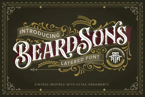
Beardsons rises diagonally across an ornate olive cover, where white capitals carry thin internal lines, narrow waists and extended curled terminals around the opening B and the central S, a dark red offset behind the letters adds depth and fine gold foliage frames the name.
The stems stay narrow at the waist and wide at the terminals, the internal hairlines cut through the bodies and the offset duplicates the contour behind. That layered offset is the character: the word reads as a carved Victorian sign rather than a flat lettering job, which is why the sample runs on a diagonal across a bordered field. The gold foliage, the border and the banners are artwork. Keep 44 pt so the thin inner lines survive, allow 12 mm for the offset and check the diagonal at the trim.
A barbershop appointment-card front — Angle BEARDSONS slightly across a dark olive card front; place BARBER in small plain capitals beneath, and booking details on the reverse.
Verify available letter variants and any layer registration in the intended application.
 #21
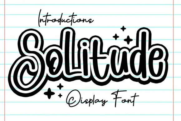
Solitude shows connected upright script forms traced by a thick dark outer contour with a second pale inline inside it, where the S curls into a large lower loop, the tall l and d rise over a compact rounded body and four spark marks sit at the right.
The script stays connected, the bodies stay compact, two contours wrap every stroke and one initial loops low. That double contour is the character: the word reads as a sticker with an inline, which is why the sample sits alone on a ruled notebook page. The notebook lines and the small caption above are presentation. Check whether the outline is a separate layer or baked into the glyph, keep 40 pt so the inline stays open and avoid setting it over busy backgrounds where the contour disappears.
A personal journal cover — Keep the title centred on a plain field with the author line well below the lower loop.
Confirm whether the hollow outline is a supplied style.
 #22
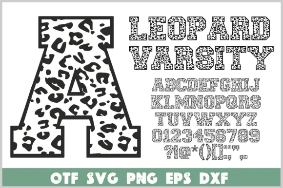
Leopard Varsity wraps heavy varsity slabs in a dark border and fills the interior with irregular leopard spots, so a block letter looks like animal print cut out and outlined in ink.
The cover shows a single enormous A carrying the spot field, then the words LEOPARD VARSITY in the same build, then the full alphabet, digits and punctuation at a smaller size so the coverage is visible. Serifs stay square and wide, the corners angular, and the counters open enough that the spots do not swallow them. The spot pattern is irregular by design, so neighbouring letters never repeat the same arrangement, and the border keeps its thickness across sizes. A coloured strip at the foot lists the file formats. The layered build, border plus fill plus spots, is what a cutting-file user needs to check, because a spot touching the border merges the two shapes.
A spotted initial birthday card — Centre A on a white square birthday card with a plain name line in a tan footer.
Proof the spots and border at final size and verify the supplied A.
Practical buyer checklist
Key cutting, printing and pairing answers before choosing a outline, hollow & inline display typeface.
An outline leaves the whole interior empty inside a perimeter stroke, while an inline carves a thin channel down the centre of a solid stem. Outlines are for hollow lettering, inlines are for engraved or metallic effects.
They are easier than fine scripts because the shape is one closed ring. Use bold athletic or bubble outlines at 1.25 inches or more, and keep the wall above 0.6 mm so the ring lifts without stretching.
Yes, that is one of their best uses. Print the outline at 300 dpi on cartridge paper so the walls stay crisp, and check that the interior is wide enough for a marker rather than only a pencil.
The channel closes when the stem narrows, so the letter appears to have a crack. Keep inline faces above 24 pt in print and above 2 inches for cutting, and avoid them in reversed-out small text.
Keep exploring
Explore adjacent maker roundups or check our practical pre-production checklists.
23 curated fonts · Previews & pairings
25 curated fonts · Previews & pairings
19 curated fonts · Previews & pairings
33 curated fonts · Previews & pairings
Guides: Invitation font checklist · Vinyl & cutting checklist · How to pair script & sans fonts
Allow optional Google Analytics to measure visits and catalogue actions. Your search words and notes are not included. Privacy & storage