 #1 · Best Overall
Disclosure: MakerFileHub may earn a commission from qualifying purchases via paid links on this page. How our links work.
Signatures, quiet serifs & luxury property marks
22 Best Real Estate, Photography & Studio Logos
Property and studio branding needs to look established without shouting, which is why this edit leans on signatures and restrained serifs rather than display faces. Regalyn and Signora carry a confident brush-pen signature, Allura Signature and Gasthony Signature keep the fine-nib register, and Vanielst and Le Mores Signature add the editorial serif that suits a boutique agency.
Quick verdict
Regalyn is the strongest signature for a principal agent, Allura Signature is the pick for a fine-pen luxury mark, and Vanielst is the best serif for a boutique agency. Le Mores Signature pairs both in one download.
Quick answer
Top 3 real estate, photography & studio logos picks right now.
Short on time? Start with our three highest-rated real estate, photography & studio logos standouts before scrolling the full breakdown.
#1 · Best Overall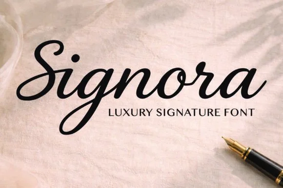 #2 · Runner-Up Pick
 #3 · Editor's Choice
How we tested & selected these 22 fonts
We kept 22 of 672 candidates after removing heart-accented and wedding-adjacent scripts that suit romance rather than property. Weighted legibility on a for-sale board, how the mark scales to a 16 px favicon, and licence clarity for logo use.
Side-by-side summary
Top 5 real estate, photography & studio logos picks at a glance.
Compare specimens, OpenType/PUA traits and primary project roles side by side.
| Rank & Font | Style & File Specs | Best Project Fit | Store Listing |
|---|---|---|---|
| ScriptAlternates & swashes | Apparel chest logo, baseball-cap embroidery & tumbler decal | Get fontPaid link | |
| ScriptPoised | Real-estate agent sign, boutique hangtag & cosmetic tube | Get fontPaid link | |
| ScriptGraceful | Champagne-foil invitation, seating-chart header & menu | Get fontPaid link | |
| ScriptPUA encoded · Alternates & swashes | Real-estate sign-off, cosmetics seal & jewelry card | Get fontPaid link | |
| ScriptPUA encoded · Alternates & swashes | A quiet wedding invitation heading | Get fontPaid link |
Scripts & Calligraphy
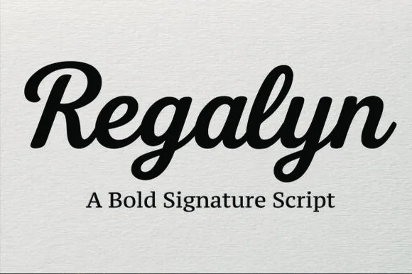
11 fonts#1 · Best OverallRegalyn
Regalyn is a bold, heavy-bodied signature script with velvety rounded brush downstrokes and sturdy, cutter-friendly lowercase loops.
Regalyn is a heavy retro brush-pen signature script: a thick loaded stroke that ends in tapered flicks, connected letters, a firm rightward slant and a low bounce that keeps the word close to the baseline. The weight closes the loops early, and the tapered flicks are the finest element. It needs roughly 26 mm for the tapered flick and the loaded stroke to read, and it is best in one deep ink on cream and kraft, or a single dark colour on a pale board where the stroke prints as a ridge.
Recommended project & layout
Apparel chest logo, baseball-cap embroidery & tumbler decal — Set single-word brand names at 4–9 inches wide across hoodies, hats, or tumblers above a clean serif subline.
Before you cut or print
Weld all overlapping cursive connectors before cutting HTV or permanent vinyl; weeds cleanly down to 0.7 inches.
Best paired with
Get fontPaid link
#2 · Runner-Up PickSignora
Signora is a smooth, medium-bold slanted signature script combining crisp ribbon-like downstrokes with clean, legible cursive counters.
Signora is a medium-bold slanted signature script with a fountain-pen weight: an even stroke that swells slightly under pressure, a consistent rightward lean and joins that sit close to the baseline rather than looping high. The moderate weight is what makes it survive small sizes, where a hairline signature would break. It needs roughly 20 mm for the pen weight and the join to read, and it is best in one warm black or deep brown on ivory, or a foil impression above 36 pt where the swelling can carry.
Recommended project & layout
Real-estate agent sign, boutique hangtag & cosmetic tube — Center the signature name at 48–76 pt directly over wide-tracked uppercase sans ('LUXURY SIGNATURE' style).
Before you cut or print
Sturdy enough for 1.25 in+ window vinyl, acrylic signs, and tote HTV once overlapping script joints are welded.
Best paired with
Get fontPaid link
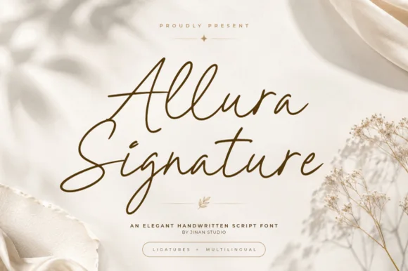
#3 · Editor's ChoiceAllura Signature
Allura Signature is a slender, slanted handwritten signature script with tall twin-looped capitals/ascenders and fluid ligature flow.
Allura Signature is a fine-pen signature script with tall stacked loops, a steep slant and a light monoline stroke that keeps an even weight through the joins. The loops rise well above the ascenders, so a line grows tall before it grows wide, and the monoline keeps the face honest on uncoated stock. It needs roughly 22 mm for the loop stack to read, and it is best in one ink on ivory, or foil only above 40 pt where the fine stroke can carry it.
Recommended project & layout
Champagne-foil invitation, seating-chart header & menu — Set focal titles at 44–68 pt in warm bronze or gold foil above a tiny boxed sans descriptor.
Before you cut or print
Slender monoline-calligraphy weight excels in foil, print, and Foil Quill; scale vinyl above 2 inches if cutting.
Best paired with
Get fontPaid link
 #4 · Top Maker Utility
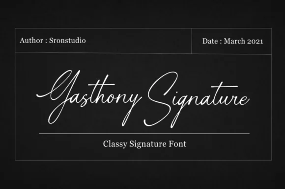
Gasthony Signature
Gasthony Signature is a slender, briskly slanted fountain-pen signature script with tall figure-eight capitals and airy lowercase rhythm.
Gasthony Signature is a slanted fine-nib fountain-pen signature script: a hairline stroke with a light swell on the downstrokes, a steep slant, joined letters and long tapered entries that start well before the first letter. The hairlines are the design and the first thing to break on textured stock, and the long entries need left-side clearance. It needs roughly 26 mm for the hairline and the entry to read, and it is best in one dark ink on smooth card, or a raised foil impression above 36 pt.
Recommended project & layout
Real-estate sign-off, cosmetics seal & jewelry card — Place the signature at 22–28 pt in metallic silver, gold foil, or deep charcoal above a tracked uppercase title line.
Before you cut or print
Thin pen lines are built for 300 DPI print, digital watermarks, embossing, or Foil Quill—not small blade-cut vinyl weeding.
Best paired with
Get fontPaid link
 #5 · Standout Silhouette
Lovely
Lovely sets a fine signature script in a single dark weight over a pale city photograph, where a wide entry curve opens low at the left, the letters rise into tall slender loops through the middle and a large descending y plus an extended closing sweep make the lower right part of the footprint.
The stroke stays thin and even, the loops stay tall, the entry runs wide and the exit sweeps out. That asymmetry is the character: the word is wider at the right than the left, which is why the sample sits on a generous square field rather than a strip. The building behind it is scenery, not part of the type. Keep 26 pt as the floor, allow 25 mm of clear space at the right for the exit sweep and check the y loop against any line placed beneath.
Recommended project & layout
A quiet wedding invitation heading — Use a single script heading above the names. Keep a clear band beneath its lowest strokes, then set the venue and time in plain text.
Before you cut or print
Print at invitation size and check contrast on the chosen paper. Do not use the fine script for the address or RSVP instructions.
Best paired with
Get fontPaid link
 #6
William Jameson
William Jameson is a lively monoline signature script with broad looping capitals and a bold underline swash tail.
William Jameson is a slanted signature cursive with a sweeping underline swash: a fast forward-leaning stroke, letters joined at the baseline, and a long flat swash that draws under the whole name and lifts at the end. The swash is the design, so the face needs a wide measure rather than a square panel. The swash thins are the finest element and they break first in print and in foil. It needs roughly 30 mm for the swash and the slant to read, and it is best one dark ink on a smooth stock.
Recommended project & layout
Apparel neck label, hangtag & founder sign-off — Stack the first name slightly left of the surname so the descending 'J' or capital loop balances the underline swash across a 3-inch width.
Before you cut or print
For HTV hoodies or t-shirts, size the lockup at least 3.5 inches wide so compact 'e' and 's' loops weed without lifting.
Best paired with
Get fontPaid link
 #7
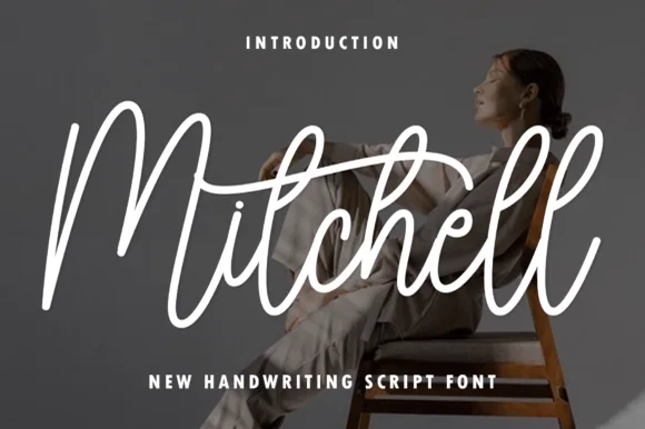
Mitchell
Mitchell is a stylish, tall-looped brush-signature script pairing high editorial ascenders ('M', 't', 'h', 'l') with smooth, vinyl-friendly stroke weight.
Mitchell is a tall upright brush-signature script with high editorial ascenders on the M, t, h and l, medium-thick monoline-brush connectors and a smooth, even rhythm that stays readable in a column. Because it is upright rather than slanted, a long name fits a narrow format, and the even weight means it transfers and plots without the joins breaking. It needs roughly 18 mm for the tall loops to read as deliberate, and it is a stationery and label face, best in one dark ink on a warm ground.
Recommended project & layout
Photographer watermark, fashion boutique tag & candle jar — Center 1 title-case signature word huge (76–150 pt) above clean wide-spaced sans-serif subheaders.
Before you cut or print
Weld overlapping cursive joins + crossbar intersections in Design Space—cuts and weeds cleanly on Oracal 651 and HTV down to 1 inch!
Best paired with
Get fontPaid link
 #8
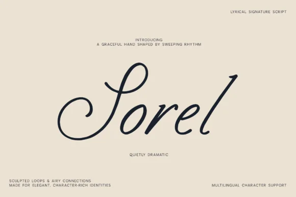
Sorel
Sorel is a poised, slanted lyrical signature script defined by an expansive double-curled S-loop and crisp high-rising ascenders.
Sorel is a slanted lyrical signature script with an expansive double-curled S loop, high-rising ascenders and clean monoline-shaded cursive that glides between letters. The loops extend above and below the word, so the layout needs head and foot room, and the even weight lets it foil and plot predictably. It needs roughly 20 mm for the S loop to read as a spiral rather than a blob, and it is a stationery and label face, best in one midnight ink on a warm gallery cream.
Recommended project & layout
Atelier fashion wordmark, wine-estate signature & art book — Float a single title-case word at 56–90 pt in the center of generous cream cardstock with micro corner credits.
Before you cut or print
Medium-slender strokes reproduce best via print, embossing, foil, or 1.75 in+ retail window vinyl (weld overlaps).
Best paired with
Get fontPaid link
 #9
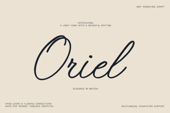
Oriel
Oriel is an airy, minimalist monoline signature script featuring wide open oval 'O' loops, unhurried rhythm, and full multilingual support.
Oriel is an airy monoline signature script with wide open oval O loops, an unhurried even rhythm and a very light optical weight, drawn to sit quietly on editorial stock rather than to shout. Because the stroke never thickens, it plots, foils and prints predictably, and because the loops stay open, the face reads at 14 mm even when printed in a pale ink. It carries multilingual character support, so a name in another script keeps the same airy construction. It suits quiet branding, place cards and watermarks, and it looks wrong at poster scale where its lightness becomes timid.
Recommended project & layout
Minimalist linen clothing tag, ceramic studio & watermark — Center 1 title-case word huge (76–155 pt) surrounded by generous warm-sand negative space and micro-sans corner notes.
Before you cut or print
Draws in crisp single-weight lines with Cricut Pens/Foil Quill and cuts cleanly on 1.25 in+ Oracal 651 (Weld joins!).
Best paired with
Get fontPaid link
 #10
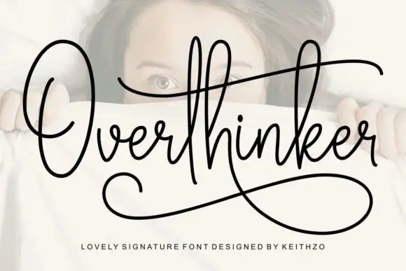
Overthinker
Overthinker shows a large oval O, high narrow loops and a long t crossbar, with a broad lower sweep that returns under the word from the descending k-like join.
The stroke holds one even weight, the loops stay narrow and tall, the crossbar runs long and the final join sweeps back beneath the whole word as an underline. The monoline signature is the character: the underline turns a plain name into a mark without any extra artwork, which is why the sample sets one word alone with space around it. Because the sweep travels under the letters, keep 20 mm of clear ground below from 24 pt, and check that the joining stroke is supplied as a character rather than drawn in the layout.
Recommended project & layout
A reflective journal title — Reserve a wide title band and begin plain text below the lower sweep.
Before you cut or print
Check actual alternate strokes instead of assuming the cover sweep.
Best paired with
Get fontPaid link
 #11
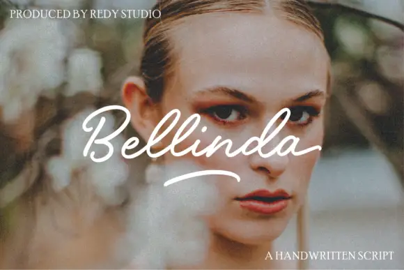
Bellinda – Modern Calligraphy Fonts
Bellinda flows from an open capital B through paired tall l loops, and a separate curved underline sits beneath the word so the sample reads as a signed line over a portrait.
The capital opens wide, the loops rise in pairs above the body, the joins stay light and the underline is drawn as its own stroke rather than attached to a letter. The paired loops are the character: two matching ascenders give the word a rhythm, which is why the sample sets one name. Because the loops and the underline both travel, keep 20 mm above and 18 mm beneath from 26 pt, and treat the underline as a drawn element.
Recommended project & layout
A portrait-session enclosure — Use a quiet heading band above a plain session summary, not across a face.
Before you cut or print
Confirm whether the underline is an available glyph.
Best paired with
Get fontPaid link
Matched Font Duos & Packs
9 fonts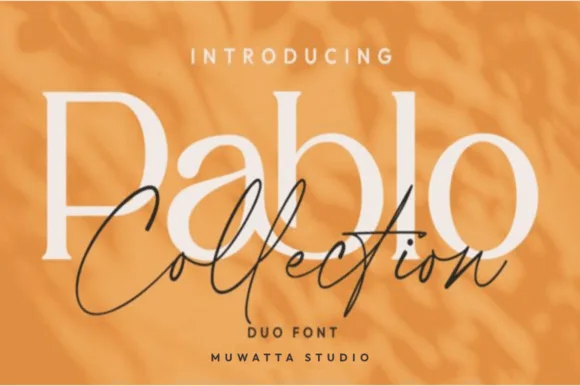 #12
Pablo Duo
Pablo Duo pairs a clean, open-counter modern serif with an airy fine-line signature script built for layered editorial knockout logos!
Pablo Duo pairs an open-counter modern flared serif with an airy fine-line signature script, designed so the serif can sit large behind an overlapping script in a layered knockout. The serif carries size, the script carries personality, and the two are meant to intersect, which means the layout must leave room for the overlay. The serif needs roughly 24 pt for the flare to read, and the pair is best in cream and charcoal on amber or one ink on ivory.
Recommended project & layout
Fashion capsule hangtag, jewelry box, candle & Instagram kit — Set 1 large mixed-case Serif word (110 pt) at 40% tint or cream and drape the dark Signature Script (64 pt) across its lower bowls.
Before you cut or print
Serif cuts cleanly on 0.8 in+ vinyl; fine monoline Script shines in print, foil, Cricut Pens, or 1.4 in+ welded decals.
Best paired with
Get fontPaid link
 #13
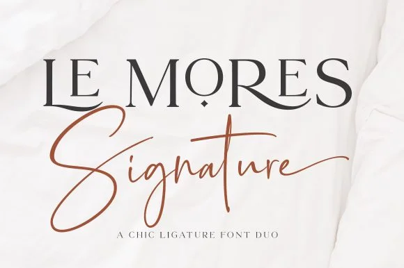
Le Mores Signature
Le Mores Signature pairs an editorial ligature serif—highlighted by cradled base loops—with a brisk copper-toned signature cursive.
Le Mores Signature pairs a ligature-rich editorial serif with a slanted signature script: the serif is a moderate-contrast face with true ligatures and oldstyle figures for running text, while the script is a fast slanted signature with a looping capital and a heavy exit stroke. The pair is how a printed magazine signs a page, so the serif carries the body and the signature carries the name. The signature's thin connectors are the finest element and they break first. The serif needs roughly 20 mm and the signature 30 mm for their detail to read.
Recommended project & layout
Boutique fashion hangtag, perfume box & atelier logo — Set the primary brand name in tracked-open serif capitals at 36 pt and overlap a single script subword across the lower-left stem.
Before you cut or print
Keep the slender signature script in print, hot foil, or larger 2.5 in+ decals rather than tiny blade-cut vinyl.
Best paired with
Get fontPaid link
 #14
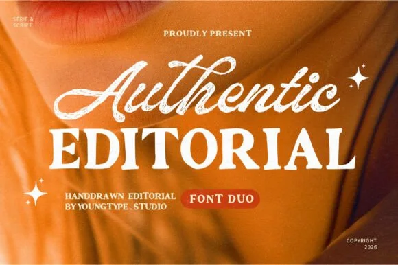
Authentic Editorial
Authentic Editorial pairs an expressive, textured brush script with a sturdy, softly organic all-caps editorial serif partner.
Authentic Editorial pairs a textured slanted brush signature script with a sturdy bracketed all-caps editorial serif, so one line is signed by hand and the next is set as a magazine heading. The script's flying crossbar and dry edge give it warmth, while the serif carries small text at 9 pt; the two share a warm cream palette. The script needs roughly 22 mm for the texture to read, and the pair is best in cream on amber or ink on cream.
Recommended project & layout
Lifestyle podcast cover, coaching brand & boutique lookbook — Overlap the script descenders/tails slightly across the top edge of the tracked (+20) uppercase serif line.
Before you cut or print
Both the bold serif and medium-thick script have enough body for 1.25 in+ tote HTV, mug wraps, and crisp print.
Best paired with
Get fontPaid link
 #15
Brown Carolina Duo
Brown Carolina Duo contrasts broad high-contrast capitals with a much finer narrow slanted script, set dark on a plain cream field, where the capital R legs sweep below the neighbouring letters and the script carries long tails that run past the ends of both words.
The caps keep thin cross strokes and heavy uprights, the script keeps one fine weight, and the two voices sit in a strict stack: script, two cap rows, script. That alternating order is the character, because the fine lines frame the heavy block like a rule above and below. Both treatments appear on a plain light field, so the cover gives no clue about texture or shadow. Keep 34 pt for the caps before the thin strokes break up, keep 20 pt as the floor for the script and check the R leg before setting a line of capitals.
Recommended project & layout
A boutique stationery front — Use the capital name centrally and a small script descriptor below, leaving the R sweep clear of contact information in a plain footer.
Before you cut or print
Confirm both styles and the actual capital alternates.
Best paired with
Get fontPaid link
 #16
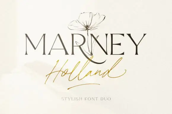
Marney Holland
Marney Holland pairs a tall high-contrast serif capital cut with a loose thin script: the R curls its leg below the serif line, the script runs light through its joins and a long low exit stroke closes the written line.
The serif cut keeps slender stems with fine joins and a leg that drops below the baseline, while the script cut joins a thin lowercase body and finishes with a low exit stroke that trails away from the word. The contrast between the two is the character: an engraved name over a signed phrase, which is why the sample stacks the pair. Because the script exit travels, keep 20 mm at the right and 16 mm between the rows from 26 pt, and the serif hairlines want a coated stock. Both cuts list PUA access, so any extra swash is a deliberate choice.
Recommended project & layout
A ceremony title hierarchy — Put a short serif title above the couple names in script, then a plain date below both tails.
Before you cut or print
Verify both members and actual name spacing.
Best paired with
Get fontPaid link
 #17
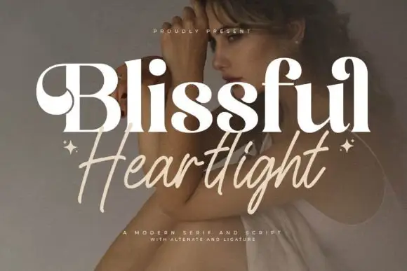
Blissful Heartlight
Blissful Heartlight shows a pale heavy Blissful line with round bowls and curled upper entries over a portrait, where the serifs swell into bulges at the joins and a thinner right-leaning Heartlight script sits beneath with long loose strokes and extended ascenders and descenders plus two small stars at the outer edges.
The serif stays heavy and soft, the script stays thin and leaning, the ascenders rise high and the descenders drop low while the two rows overlap slightly at the centre. That swelling serif is the character: the caps look inflated at the joins rather than cut, which is why the sample relies on a photographic ground for contrast. The stars are styling, and the cover notes alternates and ligatures without showing them. Keep 44 pt for the serif and 26 pt for the script, and check the overlap for contrast before printing.
Recommended project & layout
A serif-and-handwritten invitation pairing — Keep the handwritten line clear of the practical invitation text.
Before you cut or print
Verify both members and exact joins.
Best paired with
Get fontPaid link
 #18
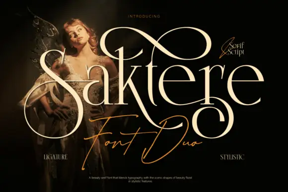
Saktere
Saktere shows pale high-contrast serif forms with huge looping extensions that rise over the middle of the word and fall below the final letters, while a much finer slanted script line crosses the lower part of the composition.
The serif cut carries thick-heavy contrast with enormous loops leaving several letters, and the script cut draws a fine slanted line that sits beneath and across the serif row. The oversized loop is the character: one extension can double the height of the word, which is why the sample layers a fine script underneath. Because the loops travel both up and down, keep 24 mm above and 22 mm below from 28 pt, and hold the script 16 mm clear of the serif row.
Recommended project & layout
A single-name invitation centrepiece — Leave generous top and bottom clearance with plain details below.
Before you cut or print
Check the exact name and alternate mappings.
Best paired with
Get fontPaid link
 #19
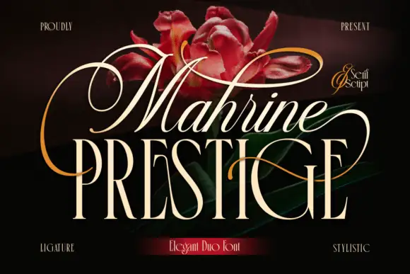
Mahrine Prestige
Mahrine Prestige shows a pale slanted upper word with thin connected-looking strokes and large loops, while tall narrow PRESTIGE capitals form a more upright base crossed by a fine sweeping extension, and red flowers with gold flourishes fill the dark background.
The upper line leans, the loops grow large, the lower caps stand upright and a single extension crosses both. That vertical pairing is the character: a light script floats above a narrow serif and one stroke ties them, which is why the sample stacks the two members tightly. The flower and flourish assets are cover decoration, so confirm both member files and their metrics, keep 20 mm between the rows and check that the crossing extension clears the caps. The crossing extension is the failure point: it has to clear the caps below, so 20 mm between the rows keeps it off their tops, and the loop thins out under 30 pt and needs a coated sheet.
Recommended project & layout
A formal invitation-title pairing — Reserve a clear gap between loops and keep event details plain.
Before you cut or print
Verify both selected members and exact alternate mapping.
Best paired with
Get fontPaid link
 #20
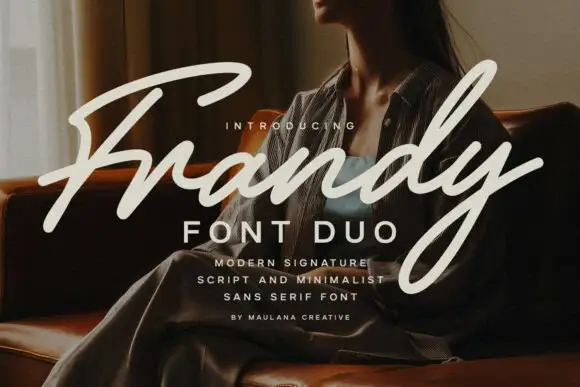
Frandy
Frandy pairs a modern signature script with a minimal sans in wide-tracked capitals, so one lockup carries a personal mark and a quiet structural label beneath it.
The script half is a connected signature with a heavy first stroke that lightens as it travels: the capital F opens as a broad sweeping stem, the r and the a stay open and the y drops a long curved descender that runs below the second line of the sample. Weight is uneven by design, heavier at the start and finer toward the exit, which is what gives the face its signed quality. The sans half is a plain capital face with even strokes and wide tracking, and it carries the supporting lines at small sizes without competing. Together the pair reads as a signature over a printed label, which is how most personal-brand stationery is built. The photograph behind, the cream inks and the four small lines of caption are presentation; the duo is the lettering.
Recommended project & layout
A fashion-studio folder title — Use separate script and sans baselines on a solid panel, with contact details below the y loop.
Before you cut or print
Check member coverage and thin joins at tag size.
Best paired with
Get fontPaid link
Serifs & Slab Serifs
2 fonts #21
Vanielst Elegant Serif Display Stylistic
Vanielst is a substantial, medium-high-contrast display serif highlighted by graceful overhead swash loops and crisp bracketed feet.
Vanielst Elegant Serif Display Stylistic is a bold transitional display serif with an overhead canopy swash: sturdy bracketed stems, a moderate contrast, crisp horizontal serifs and a capital set that carries a wide arc of swash above the word like an awning. The canopy is the design and it needs vertical room, so the face cannot be tucked under a fold. The canopy and the hairlines are the finest elements and they break first. It needs roughly 36 mm for the canopy and the serif to read, and it is best one dark ink on a bright stock.
Recommended project & layout
Perfume carton, candle vessel & boutique wordmark — Set a single 5-to-8-letter brand name at 36–54 pt, activating only one canopy swash alternate so the silhouette stays clean and memorable.
Before you cut or print
Substantial main stems cut cleanly on sign vinyl down to 1 inch, though tapering overhead swash tips perform best in print, foil, or larger 2 in+ decals.
Best paired with
Get fontPaid link
 #22
Orvelia
Orvelia is a high-contrast display serif in which the stems alternate thick and hairline weights, the R, V and A end in curved swash legs and the bowls stay sculpted, so a name reads as a crest for a perfume box or a masthead.
The R tucks its leg into a curve, the V splits into two swashed strokes, the A carries a curling leg and the bowls close against fine joins that thin to a hairline at every junction. The swash leg is the character: three capitals carry the ornament while the rest of the alphabet stays quiet, which is why the sample frames one word for formal stationery. Because the hairlines are fine, the face wants coated stock from 16 pt and gains from hot foil on signage; the display cut ships with swashes as separate glyphs. The pale ground and the small frame rules are presentation; the dark display word is the face.
Recommended project & layout
Formal wedding suite monogram & header — Track supporting lines (FOREVER BEGINS HERE) wide in a simple roman serif beneath the main display name.
Before you cut or print
Delivered as OTF; best suited to print, foil stamping and digital branding due to fine serif hairlines.
Best paired with
Get fontPaid link
Practical buyer checklist
Frequently asked questions.
Key cutting, printing and pairing answers before choosing a real estate, photography & studio logos typeface.
Can I use a signature font for a real estate logo?
Yes, provided the mark is redrawn and simplified. Type the name, convert to outlines, adjust the entry and exit strokes, and create a small version for signage and favicons, since the raw script will not hold at 16 px.
What size should lettering be on a for-sale board?
The agent name at 4 to 6 inches, the phone number at 3 to 4 inches, and the website at 2 to 3 inches. Boards are read from a moving car, so larger and fewer is always better.
Do these fonts include the numbers a phone number needs?
Most include 0 to 9, but signatures often have poor numerals. If a phone number sits in the mark, test the digits first, and consider setting numbers in a plain sans rather than forcing a script.
How do I stop a property brand looking generic?
Choose one distinctive element, such as a single ligature or an unusual ampersand, and keep everything else restrained. Most property brands fail because they use a thin serif and a wide tracking with nothing else to remember.
Keep exploring
Related collections & guides.
Explore adjacent maker roundups or check our practical pre-production checklists.
01 / Type Styles
Signature & logo script
28 curated fonts · Previews & pairings



02 / Type Styles
Luxury & modern serif
34 curated fonts · Previews & pairings
03 / Branding & Print
Font duos & pairings
32 curated fonts · Previews & pairings
04 / Branding & Print
Minimalist & geometric sans
31 curated fonts · Previews & pairings
Guides: Invitation font checklist · Vinyl & cutting checklist · How to pair script & sans fonts