MakerFileHub · Fonts4,091 curated & craft fonts · 93 curated collections · Original previews
MakerFileHubSaved 0

Geometric, grotesque & workhorse sans

Sans serif Fonts (305 Profiles)

Three hundred and nine sans-serif faces covering geometric circles, neo-grotesque neutrality and cutting-friendly bold display. These are the fonts that make the rest of a layout readable.

Letterform anatomy

How to read sans serif letterforms.

Three checks worth running on any specimen before you compare prices.

Sans serifs separate by their terminals and their skeleton. Geometric faces build letters from near-perfect circles and straight stems with horizontal terminals, grotesques keep a slight stroke modulation and angled cuts, and humanist sans faces borrow the proportions of handwriting. That difference shows up most clearly in the lowercase a, the g and the t.

93 CollectionsA–Z Index

305 fonts (sorted by maker demand)Page 1 of 13

Font profiles

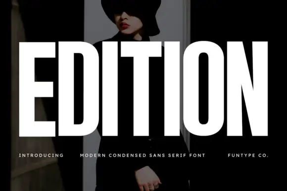
Original Edition preview by Funtype Co.

Very heavy condensed capitals with squared stems and narrow oval counters

Edition

Edition shows white capital lettering spanning most of a dark portrait cover: thick vertical strokes and broad flat arms build a rectangular title, the O keeps rounded outer sides around a small vertically elongated counter and the I stands as a plain bar.

Explore
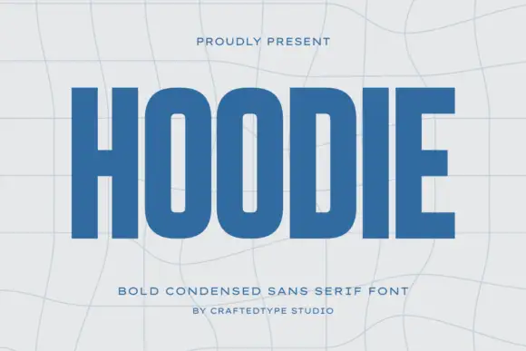
Original Hoodie preview by CraftedType Studio

Condensed block capitals with rounded rectangular O counters

Hoodie

Hoodie shows a large blue uppercase word on a pale warped-grid field, where heavy straight uprights and flat horizontal endings form a dense block, the O and D hold rounded rectangular counters, the H crossbar sits near the middle and the E keeps three squared arms.

Explore
Original Kohilo preview by product.rasiostudio

Heavy round lowercase forms with a long K leg and deep j hook

Kohilo

Kohilo shows pale yellow heavy lettering against vivid red, where the dotted descending letter appears in a brighter yellow, the opening K sends a broad curved leg beneath the first round bowl and the central descender turns into a deep rounded hook.

Explore
Original Modern Heritage preview by vladfedotovv

Light geometric capitals with circular O and broad angular diagonals

Modern Heritage

Modern Heritage shows black capitals in two closely stacked lines on white, where thin nearly even strokes form a circular O, a broad M and N and a large triangular A, while the G keeps an open right side with a short inner bar.

Explore
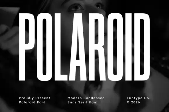
Original Polaroid preview by Funtype Co.

Tall condensed grotesque

Polaroid

Polaroid is a tall condensed grotesque in white over a monochrome portrait: very narrow capitals with flat terminals, a closed counter in the O, a short bar on the R, and a height that runs almost the full frame, so the word reads as a stretched sign rather than a standard alphabet.

Explore
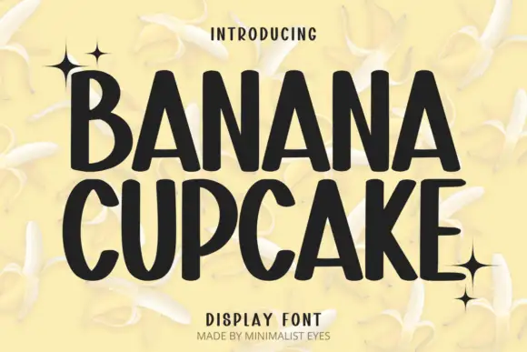
Original Banana Cupcake preview by Minimalist Eyes

Tall playful display sans

Banana Cupcake

Banana Cupcake stacks two large words in dark letters on a pale banana photograph, where tall narrow capitals fill the width, the counters squeeze into thin slots, the corners soften slightly and the letter widths shift row by row so the second word runs wider than the first.

Explore
Original Mango Dream preview by Cotton White Studio

Light geometric lowercase with circular bowls and single-storey a and g

Mango Dream

Mango Dream sets a black lowercase name on a pale paper-like ground, where thin nearly even strokes form wide circular bowls, the a stays single storey, the m arches stay low and the g opens its lower curve into a short rounded descender while the d rises above the word.

Explore
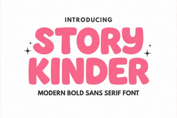
Original Story Kinder preview by Minimalist Eyes

Soft heavy rounded sans

Story Kinder

Story Kinder is a soft heavy sans in pink on white: caps with thick rounded strokes, uneven widths, a curved y that drops below the line like a lowercase letter and generous bowls, set in two lines with sparkles at the sides and a plain line beneath naming the style.

Explore
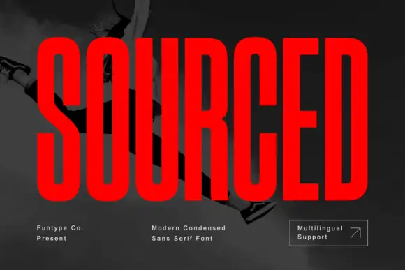
Original Sourced preview by Funtype Co.

Very condensed heavy capitals with narrow rounded rectangular counters

Sourced

Sourced shows vivid red capitals across a dark monochrome photograph, where tall heavy uprights and flat-ended arms leave thin rounded rectangular counters inside the O and D, the R carries a straight angled leg and the C opens only a small gap on its right side.

Explore
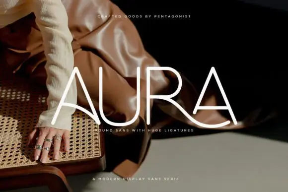
Original Aura preview by Pentagonistudio

Light rounded capitals with long curved A bars and an extended R leg

Aura

Aura shows pale thin capitals over a dark fashion photograph, where near-even rounded strokes build an open U and a broad R bowl, the first A carries a long curved cross-stroke that sweeps toward the centre and the R leg continues below the final A as a broad flowing curve.

Explore
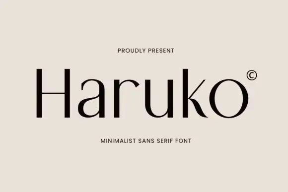
Original Haruko preview by Letterayu

Light contrasting mixed case with a low H bar and curved k leg

Haruko

Haruko shows black title-case lettering on a flat pale beige field, where thin cross-strokes meet more substantial upright and curved sides, the H crossbar sits low, the a stays a simple round and the u opens broad, while the k moves into a curved tapering leg and the r ends in a small pointed shoulder.

Explore
Original Olline preview by product.rasiostudio

Bold modern geometric sans

Olline

Olline is a bold geometric sans in red on black: circular counters, a heavy even stroke, a lowercase with a straight-sided o and a dot that floats away from the i, presented at extreme size with small tracked captions in the corners, so the plate reads as a contemporary identity study.

Explore
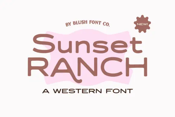
Original Sunset Ranch preview by blushfontco

Wide rounded western sans

Sunset Ranch

Sunset Ranch is a wide rounded sans in clay brown on white: mixed case with heavy rounded strokes, an unusually long curved leg on the capital A and open bowls, set in two lines over a torn pink shape, with a small arced line above, a sun badge at the corner and a tracked line beneath.

Explore

Production reality

Where these faces fail.

The light weights are the trap. A hairline sans looks modern on screen and fails immediately as a vinyl cut, while the bold weights of the same family cut cleanly at a quarter of the size. Buy for the weight you will actually plot, not the one in the preview.

Which sans weight should I buy for a cutting project?

Bold or black for anything cut below two inches, medium for larger signage, and light only for print or engraving. Weight decides survival far more than style does, and most families are sold as a full set so you can test both.

Why do geometric sans faces look odd in long text?

Because circles of equal width make letters like o and e occupy the same space as narrow letters, so spacing looks uneven over a paragraph. Geometric sans works best for headlines, labels and short interface text.

Help improve the font catalogue?

Allow optional Google Analytics to measure visits and catalogue actions. Your search words and notes are not included. Privacy & storage

Original preview

Clear review data?