 #1 · Best Overall
Disclosure: MakerFileHub may earn a commission from qualifying purchases via paid links on this page. How our links work.
Multi-file families with outline & extrude
23 Best 3D Layered & Shadow Fonts
A layered font is really a family: one solid weight, one outline, one extrude, drawn so the three register at the same point size. Bigboys and Boogie Blast build the street-art version, Scriledge and Dacota carry it into woodcut and Western territory, and Romantic Angela and Groter Retro do the groovy seventies treatment. Pink Power and Betha cover the wide urban and Y2K cases.
Quick verdict
Scriledge is the most reliable three-layer woodcut family, Bigboys is the strongest street-art stack, and Romantic Angela covers the groovy swash look. Pink Power handles wide Y2K block stacks.
Quick answer
Top 3 3D layered & shadow picks right now.
Short on time? Start with our three highest-rated 3D layered & shadow standouts before scrolling the full breakdown.
#1 · Best Overall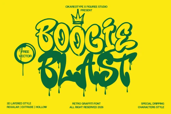 #2 · Runner-Up Pick
Boogie Blast
3-style dripping street-graffiti family (Regular, Extrude & Hollow + drips)
Get fontPaid link
Read review ↓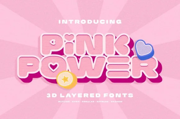 #3 · Editor's Choice
Pink Power
5-style 3D retro Y2K bubble sans + cute icons (Outline, Strip, Regular, Extrude, Shadow)
Get fontPaid link
Read review ↓How we tested & selected these 23 fonts
We kept 23 of 114 candidates, checking that the layers align at the same point size rather than needing manual nudging. Weighted layer count, whether the outline is a true contour, and how the extrude reads on a 3 inch stack.
Side-by-side summary
Top 5 3D layered & shadow picks at a glance.
Compare specimens, OpenType/PUA traits and primary project roles side by side.
| Rank & Font | Style & File Specs | Best Project Fit | Store Listing |
|---|---|---|---|
| DisplayStreet-pop | Skate/street-art birthday banner, hoodie graphic & sticker | Get fontPaid link | |
| DisplayStreet-funk | 90s hip-hop party flyer, skate-deck graphic & street tee | Get fontPaid link | |
| DisplayY2K-cute | Y2K doll/slumber-party banner, notebook sticker & tee | Get fontPaid link | |
| DisplayHeavy-urban | Streetwear puff-print chest logo, beanie patch & sticker | Get fontPaid link | |
| DisplayHollow-3D-shadow | Color-in groovy tote, DTF retro crewneck & Libbey glass wrap | Get fontPaid link |
Display & Decorative Headlines
8 fonts#1 · Best OverallBigboys
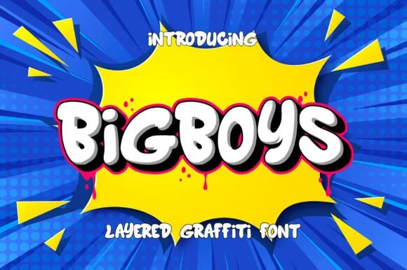
Bigboys is a chunky, layered 3D bubble-graffiti display font built for bold street-art titles, stickers, and youth apparel.
Bigboys is a layered three-dimensional street-art bubble graffiti display: fat interlocking letters with a deep offset block, a bright inner highlight, a hard keyline and small drips running off the baseline. The layers stack the word visually, and the drips are the finest element and close first. It needs roughly 34 mm for the drip and the layer stack to read, and it is best as a flat three-colour print on coated stock, or two inks where the deepest layer takes the darkest tone.
Recommended project & layout
Skate/street-art birthday banner, hoodie graphic & sticker — Duplicate identical text boxes in place—black 3D shadow in back, neon pink rim middle, crisp white fill on top.
Before you cut or print
Use the solid base layer alone for super-easy single-color HTV weeding, or Print-Then-Cut/DTF for full 3-color graffiti stacks!
Best paired with
Get fontPaid link
#2 · Runner-Up PickBoogie Blast
Boogie Blast is an energetic 3-style retro graffiti font family (Regular, Extrude, Hollow) equipped with special paint-dripping character alternates.
Boogie Blast is a three-style street-graffiti family with a regular cut, an extrude and a hollow outline, all carrying drip details: rounded bubble strokes, a soft top highlight and paint runs that extend below the baseline. The drips add height under the word, so a centred block needs clearance underneath. It needs roughly 30 mm for the drip length and the highlight to read, and it is best in two spray colours on a primed wall or one ink on paper with the drips left as bare paper highlights.
Recommended project & layout
90s hip-hop party flyer, skate-deck graphic & street tee — Use clean Regular/Extrude on row one and turn on the dripping character variants along the bottom row so drips hang freely.
Before you cut or print
Great for screen print, DTF hoodies, and Print-Then-Cut slaps; use single-layer Regular or Hollow at 1.5 in+ for HTV.
Best paired with
Get fontPaid link
#3 · Editor's ChoicePink Power
Pink Power is a 5-style layered 3D retro sans system (Regular, Outline, Strip, Extrude, Shadow) bundled with cute heart/star 3D icons.
Pink Power is a five-style Y2K bubble family: a regular rounded cut plus outline, strip, extrude and shadow versions on one inflated skeleton, with small star and heart icons supplied alongside. The inflated stems nearly touch, so tracking cannot be closed without merging letters, and the extrude and shadow layers need fixed spacing. It needs roughly 28 mm for the highlight strip and the extrude edge to read, and it is best in two bright inks on white, or one ink plus a knocked-out strip on coloured card.
Recommended project & layout
Y2K doll/slumber-party banner, notebook sticker & tee — Layer Shadow + Extrude in hot pink, Regular in blush pink, and Outline/Strip in crisp white.
Before you cut or print
Use Regular alone for super-clean 1-layer Cricut HTV weeding, or Print-Then-Cut/sublimation for the full 5-layer 3D stack.
Best paired with
Get fontPaid link
 #4 · Top Maker Utility
Betha
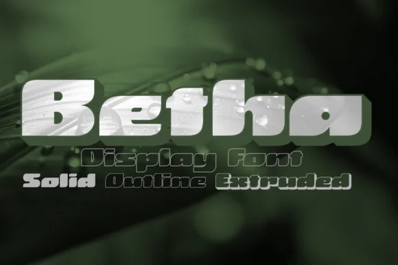
Betha is a squat, ultra-wide urban block display family bundled in Solid, Outline, and Extruded 3D styles.
Betha is a squat, ultra-wide urban block family supplied in Solid, Outline and Extruded styles drawn to layer, with pill-slit counters, heavy geometric bowls and squared shoulders. Because the three styles share exact metrics, a designer can stack outline over solid or extrude behind it and get a predictable registration, which is the point of the family. Width is extreme, so a word needs a wide container and a short letter count; the extruded style also adds depth downward, requiring extra vertical space. It reads at 30 mm and up and is a poster and apparel face.
Recommended project & layout
Streetwear puff-print chest logo, beanie patch & sticker — Set 1 short 4-to-6-letter brand word in Solid or Extruded across a 10-inch hoodie chest.
Before you cut or print
Solid cut has massive surface area for 3D puff HTV and vinyl—just watch the ultra-narrow horizontal counter slits in 'e' and 'a'.
Best paired with
Get fontPaid link
 #5 · Standout Silhouette
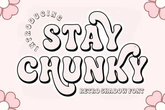
Stay Chunky Shadow
Stay Chunky Shadow is a nostalgic 1970s groovy outline font featuring built-in 3D extruded ribbon shadows and sweeping 'Y' swashes!
Stay Chunky Shadow is a hollow three-dimensional display with a groovy extruded shadow: an outlined face with wide open counters, a hard offset extrusion running down and to the right and a small swash curl on the round letters. The hollow face means the ground shows through the letters, and the extrusion is the only weight. It needs roughly 34 mm for the outline and the extrusion to read, and it is best in two flat inks on white, or one ink on a bright ground where the hollow letters read as knockouts.
Recommended project & layout
Color-in groovy tote, DTF retro crewneck & Libbey glass wrap — Stack 2 uppercase words at 68–135 pt, curving a small arched eyebrow ('INTRODUCING') along the upper-left shoulder.
Before you cut or print
Fine black outline + shadow channels are made for sublimation glass cans (clear glass shows through!), DTF, and Print-Then-Cut!
Best paired with
Get fontPaid link
 #6
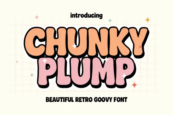
Chunky Plump
Chunky Plump is a bubbly retro-groovy display font wrapped in bold black comic outlines and extruded 3D drop shadows!
Chunky Plump is an inflated retro-groovy display with a groovy waist pinch, heavy black comic outlines and an extruded 3D drop shadow baked into the glyph, so a word reads as a screen-printed poster sticker rather than a flat letter. The extrusion always falls to one side, which fixes the light direction and means the word cannot be flipped without looking wrong. It needs roughly 32 mm for the extrusion to read as depth, and it is best in peach or pink with a black shadow on a pale grid ground.
Recommended project & layout
Retro sticker-shop logo, iced-coffee wrap & graphic tee — Stack 2 tight uppercase words at 68–130 pt so black 3D shadows lock into one cohesive retro badge.
Before you cut or print
Shines on Print-Then-Cut vinyl stickers, DTF tees, and sublimation wraps—or cut solid single-layer shapes on 0.8 in+ HTV!
Best paired with
Get fontPaid link
 #7
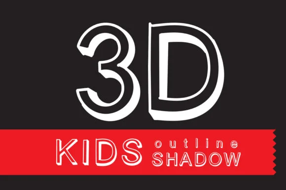
Kids 3D Outline Shadow
Kids 3D Outline Shadow is a cheerful hollow-outlined cartoon display font built with crisp 3D right-hand block extrusions.
Kids 3D Outline Shadow is a hollow-extruded cartoon block: open letters with a thick outline, an empty face where the ground shows through and a hard offset extrusion that reads as a cut cardboard shadow. The hollow face needs a light ground, and the extrusion doubles the footprint. It needs roughly 32 mm for the outline and the extrusion to read, and it is best as a one-colour cut file on a light ground, or two flat inks where the extrusion takes a darker tone.
Recommended project & layout
Big birthday-age numeral ('7', '10') poster & activity sheet — Set giant age numerals at 140–220 pt above uppercase kid names on high-contrast black, red, or cobalt.
Before you cut or print
Best for posters, worksheets, sublimation, and DTF; if cutting vinyl, scale above 2.2 inches so thin 3D wall lines weed cleanly.
Best paired with
Get fontPaid link
 #8
Bouncy Block Deluxe
Bouncy Block Deluxe is a thick, solid-filled bubble display font with pillowy rounded terminals, playful tilt, and tiny counter pinholes.
Bouncy Block Deluxe is a heavy rounded chunky bubble display: fat even-width letters with fully rounded corners, tight counters that almost close and a baseline that lifts a few letters so the word looks stacked and bouncing. It is a signage face, so it wants size and a single flat colour rather than fine detail. The counters are the finest element and they plug as soon as the face is reduced or cut in vinyl. It needs roughly 30 mm for the counter and the corner radius to read, and it is best as one flat ink on a light ground.
Recommended project & layout
Back-to-school tote, water-bottle sticker & kids' tee — Stack 2 or 3 short punchy words ('STAY COOL', 'DREAM BIG') at tight 0.88 line-height inside a contoured die-cut sticker shape.
Before you cut or print
When weeding small decals under 1 inch, use a fine pin pen solely to pop out the tiny teardrop counters inside 'B', 'o', 'a', and 'e'.
Best paired with
Get fontPaid link
Serifs & Slab Serifs
3 fonts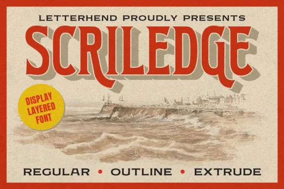 #9
Scriledge
Scriledge is a 3-layer vintage display serif system (Regular, Outline, Extrude) with dropped swash hooks and classic coastal-poster stature.
Scriledge is a three-layer woodcut poster serif with a regular cut, an outline cut and an extrude cut on one skeleton, drawn with the rough contours and notched counters of carved wood. The extrude sits behind the letter, so the layers must keep fixed spacing, and the outline is the layer that closes first. It needs roughly 30 mm for the outline rule and the extrude edge to read, and it is best in two inks on a warm uncoated sheet, or one dense ink with the extrude left as bare paper.
Recommended project & layout
Seafood shack sign, craft-rum bottle & coastal coffee tin — Layer tan Extrude in back, vermilion Regular in front, and dark Outline for crisp antique poster definition.
Before you cut or print
Regular cut alone cuts cleanly on 1 in+ wood-sign stencils and vinyl; use all 3 layers for printed tins and posters.
Best paired with
Get fontPaid link
 #10
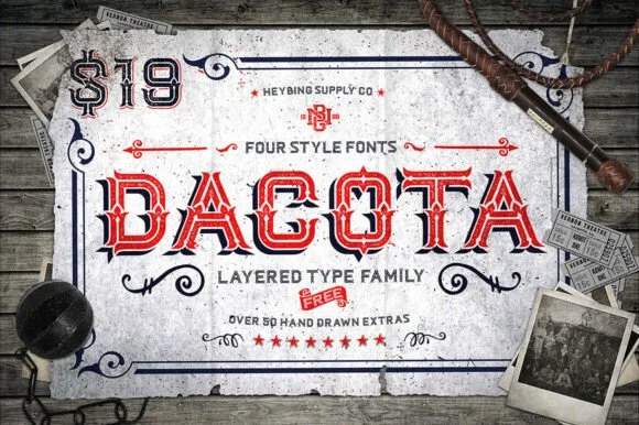
Dacota
Dacota is a 4-style layered American West Tuscan serif family bundled with 50+ hand-drawn Western banners, ropes, and flourishes.
Dacota is a four-style layered Western Tuscan family with stacked bevel, inline and shadow builds, plus a bundle of hand-drawn banners, ropes and flourishes, so a headline is assembled as a sandwich rather than set as one line. The layers must register on top of each other, and the inline style only reads when the base colour sits behind it. It needs roughly 40 mm for the bevel and inline to stay open, and it is best in crimson and black on aged paper, or in two athletic colours on timber.
Recommended project & layout
Craft-whiskey label, steakhouse menu & rodeo poster — Stack base, inline, and shadow layers in barn red, cream, and charcoal inside the bundled ornamental frame borders.
Before you cut or print
Use the solid base cut alone when cutting 1.25 in+ wood-sign vinyl, and stack all 4 layers for printed labels and DTF shirts.
Best paired with
Get fontPaid link
 #11
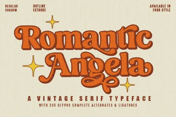
Romantic Angela
Romantic Angela is a curvy 4-style vintage display serif (Regular, Shadow, Outline, Extrude) packing 335 glyphs, alternates, and ligatures.
Romantic Angela is a groovy nineteen-seventies swash serif shipped in four related styles - regular, shadow, outline and extrude - all built on the same soft rounded skeleton with long curling swashes on the caps. The four styles share metrics, so they stack into one layered word, and the extrude adds depth behind the letter. It needs roughly 30 mm for the swash and the shadow offset to read, and it is best in two warm inks on cream, or one ink plus the outline style on white.
Recommended project & layout
Retro Valentine crewneck, booktok tote & greeting card — Layer Extrude + Regular + Outline in chocolate brown, terracotta, and cream at 56–96 pt with four-point star accents.
Before you cut or print
Solid Regular cut weeds cleanly on single-layer HTV and cup vinyl at 0.9 in+; stack all 4 cuts for DTF and print!
Best paired with
Get fontPaid link
Scripts & Calligraphy
6 fonts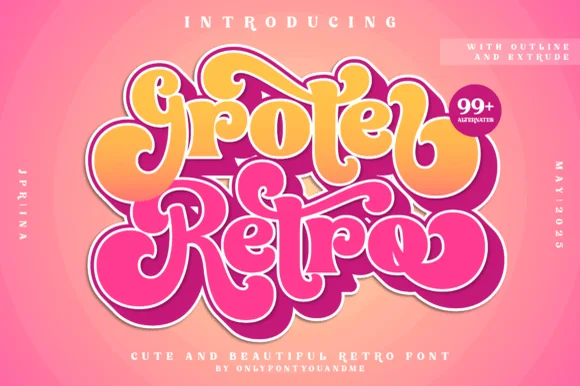 #12
Groter Retro
Groter Retro is a plump, 1970s marshmallow script family bundled with matched Outline and Extrude font layers plus 99+ stylistic alternates.
Groter Retro is a layered nineteen-seventies bubble script family: a rounded connected script cut, an outline and an extrude on one skeleton, with more than ninety alternates that change the entry and exit sweeps. The layers must keep fixed spacing, and the alternates mean two words set in the same face may not match, which is the point. It needs roughly 28 mm for the extruded edge and the bubble join to read, and it is best in two warm inks on cream, or one ink plus a knocked-out outline on coloured card.
Recommended project & layout
70s roller-skate hoodie, iced-coffee glass wrap & sticker — Stack 2 title-case script words tight (0.88 leading) and swap in 2 or 3 of the 99+ alternates on initial and final letters.
Before you cut or print
Use the solid base script layer (welded!) for fast single-color HTV weeding, or Print-Then-Cut/DTF for full 3-layer retro color.
Best paired with
Get fontPaid link
 #13
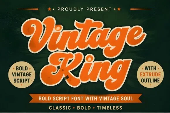
Vintage King
Vintage King is a thick, creamy retro script family bundled with matched Extrude and Outline cuts plus stylistic swash alternates.
Vintage King is a nineteen-fifties to seventies sign-painter script shipped in three cuts: a regular brush script, an extrude and an outline, all on one skeleton with a wet stroke, a low slant and long sweeping caps. The layers must keep fixed spacing, and the outline closes first. It needs roughly 28 mm for the extrude edge and the sweep to read, and it is best in two warm inks on cream, or one ink plus a knocked-out outline on coloured card.
Recommended project & layout
Craft root-beer can, retro diner tee & barbershop sign — Stack 2 title-case words at tight 0.90 leading, layering cream Extrude behind burnt-orange Regular over dark green or navy.
Before you cut or print
Solid Regular cut weeds cleanly on single-color HTV and decal vinyl down to 0.8 in (weld joins first!); stack layers for DTF/print.
Best paired with
Get fontPaid link
 #14
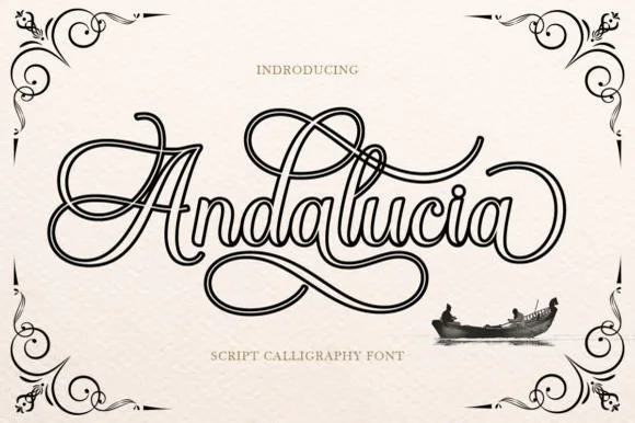
Andalucia Outline
Andalucia Outline is an elaborate, hollow-contoured calligraphic script wrapped in multi-looped copperplate canopy and underline flourishes.
Andalucia Outline is a hollow-outlined copperplate flourish calligraphy script: a steep slope, hairline-thin strokes drawn only as an open outline, capitals that loop twice and flourishes that curl off both ends of a line. The hollow stroke needs a light ground, and the hairline outline silts into a grey edge once the face is reduced. It needs roughly 32 mm for the outline and the flourish to read, and it is best as a one-colour vinyl or foil job on a light ground, or a single ink print on smooth stock.
Recommended project & layout
Tattoo flash sheet, lowrider club tee & music poster — Center a single focal name or city title at large poster scale (60–110 pt) with wide breathing room above and below the loops.
Before you cut or print
Because every stroke is a fine double-line outline, print via screen print, DTF, or high-res paper rather than weeding small vinyl.
Best paired with
Get fontPaid link
 #15
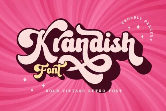
Krandish
Krandish is a heavy, cream-smooth 1970s retro script featuring dramatic looping swash capitals and thick figure-eight underline tails.
Krandish is a chunky nineteen-seventies retro brush script with swash tails: a very heavy loaded stroke, a firm slant and tails that extend straight off the first and last letters before curling up at the tip. The tails widen the word and are the first thing trimmed, and the heavy weight closes the counters early. It needs roughly 30 mm for the tail and the heavy stroke to read, and it is best in two warm inks on cream, or one burnt orange on white where the tails still read as drawn lines.
Recommended project & layout
Retro roller-skate tee, beach tote & iced-coffee wrap — Tilt a 1-to-2-word phrase upward 8 degrees and duplicate a dark offset layer behind it in Illustrator or Cricut for a 3D retro shadow.
Before you cut or print
Weld connected lowercase strokes into one path before cutting, and check the tight loops inside 'a', 'd', and 'o'.
Best paired with
Get fontPaid link
 #16
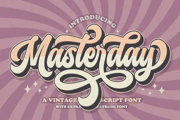
Masterday
Masterday builds a dense connected title above large intertwined lower loops, where upper curls and crossing strokes demand more space than the small internal letters alone suggest and a black offset extrusion deepens the silhouette.
The body stays compact, the loops grow large, the lower strokes cross one another and the offset shadow repeats the whole word behind it. That interlacing is the character: the phrase reads as a finished badge rather than a line of type, which is why the sample keeps one title with heavy loops beneath. The extrusion belongs to the artwork, so test the plain face first, keep 26 mm between baselines and check that the crossing strokes actually exist as characters.
Recommended project & layout
A retro birthday dance poster — Place the name in a generous central band. Keep a broad clear area under the loops before the date, venue and RSVP.
Before you cut or print
Verify available swashes and any extruded style in the current listing; do not copy the artwork effect as a promised feature.
Best paired with
Get fontPaid link
 #17
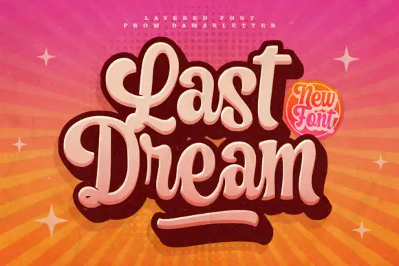
Last Dream
Last Dream is a fat seventies script with a pale inner fill, a dark contour and a hard offset shadow that reads as a printed sticker, with letters that touch without closing the word.
Letterforms are wide and looping, with thick joining strokes that never fully close the word, so the line stays legible even though the letters touch. The shadow is a solid duplicate pushed down and right rather than a blur, which is what produces the sticker effect and makes the face usable in one flat colour when the layer is dropped. Upstrokes carry most of the weight and the downstrokes pinch thin at the joins, giving a hand-lettered bounce instead of a true italic slant. The gradient sky, sun rays and small sparkles in the preview belong to the artwork; the typeface itself is a single two-layer construction that survives being separated.
Recommended project & layout
A music-night poster — Stack the title above a plain performer and time panel.
Before you cut or print
Check that the shadow does not fill small counters.
Best paired with
Get fontPaid link
Matched Font Duos & Packs
6 fonts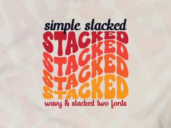 #18
Simple Stacked
Simple Stacked is a wavy display in which rounded capitals repeat down three offset rows, each row bending and stretching the letters differently, so a short word reads as a rainbow of stacked script rather than a plain line.
The S pulls a broad curve, the A opens a narrow counter, the letters in the middle row stretch wider than the row above and the baseline of each row waves independently. The repetition is the character: it turns one word into a pattern, which is why the sample sets a single phrase three times over. Because the rows overlap, the face needs deliberate spacing between rows from 30 pt and reads best as a display block rather than as a line of text; a second word needs its own stack. The pale ground and the small caption are presentation; the wavy lettered rows are the face.
Recommended project & layout
A rhythm-themed poster — Reserve the centre for one verified stacked word and keep all event details outside the repeated rows.
Before you cut or print
Confirm how many rows one glyph or style actually generates.
Best paired with
Get fontPaid link
 #19
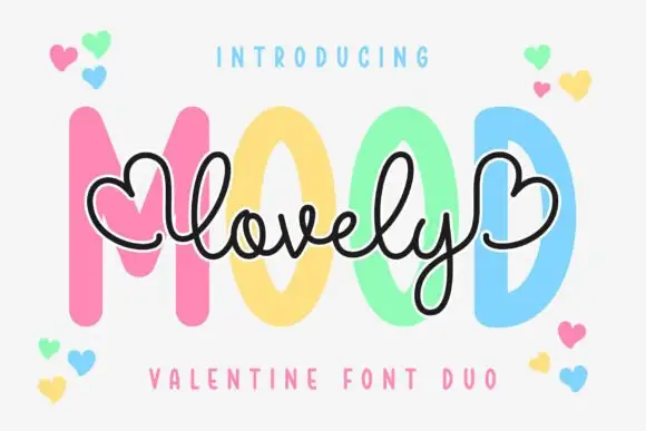
Lovely Mood Duo
Lovely Mood Duo is a two-cut pair in which a fine monoline script with heart-shaped ends crosses a heavy upright capital word, so a card can carry a written line and a printed one in the same soft tone.
The script cut keeps a thin even weight, loops its ascenders and finishes both outer strokes in small hearts, while the capital cut stands heavy and upright with tight counters and squared stems. The layering is the character: the script is meant to cross the capitals rather than sit beside them, which is why the sample overlaps the two words. Because the script is fine, it wants 24 pt before its joins stay continuous, and both members weld before cutting from 1.1 inches of x-height. The white edging and the pastel colours in the sample are treatments rather than separate layers; the two lettered words are the duo.
Recommended project & layout
A two-voice Valentine cover — Place the heavy word centrally and a short script accent just beneath it. Keep the outer hearts clear of the trim and the personal note inside.
Before you cut or print
Check both styles in the listing; outline and colour treatments may require separate design work.
Best paired with
Get fontPaid link
 #20
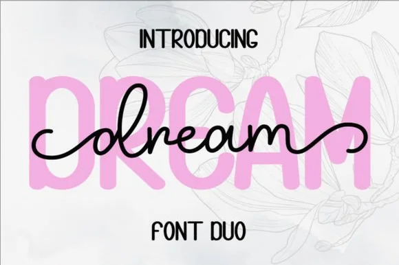
Dream Duo
Dream Duo combines a plump, soft-cornered uppercase sans-serif with a fluid monoline script that threads cleanly across wide titles.
Dream Duo pairs a chunky pastel rounded sans with a smooth monoline cursive: the sans is a fat even-width block with fully rounded corners and tight spacing for headlines, while the cursive is a soft even stroke with open loops and a gentle slant. The pair is built for a soft palette, so it loses its character when printed in a single harsh black. The monoline hairline is the finest element and it breaks first. The sans needs roughly 26 mm and the cursive 28 mm for their detail to read.
Recommended project & layout
Nursery wall name sign & sweet-sixteen acrylic backdrop — Scale the background sans to 3.5 inches tall in soft pastel and center the dark monoline script across the middle 60% height.
Before you cut or print
Weld all cursive joins before cutting vinyl, and use Cricut's Slice or a 0.07 in offset knockout if avoiding two-layer vinyl overlap.
Best paired with
Get fontPaid link
 #21
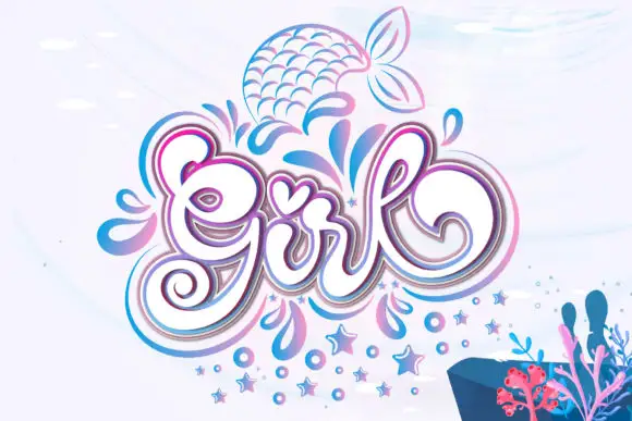
Girl
Girl builds a large curled capital G, a tall looped l and a heart-shaped accent over the central letters, with layered pink and blue outlines around the word and droplets, stars and a mermaid tail drawn beside it.
The script bodies stay round and full, the outlines stack in two colours around every stroke and the small motifs sit outside the lettering. The layered outline is the character: the word reads as a decorated sticker rather than a written line, which is why the sample surrounds it with droplets and stars. Because the outline doubles each stroke, keep 30 pt before the inner and outer lines merge, and treat the motifs as artwork rather than encoded glyphs. The doubled outline is the fragile part: below 30 pt the inner and outer lines merge into one thick edge, and a vinyl cut of two colours traps air between them.
Recommended project & layout
A party-name centrepiece — Keep the lettering on a clear central panel and limit surrounding motifs to the corners.
Before you cut or print
Confirm the desired dingbats and inspect counters after outlining.
Best paired with
Get fontPaid link
 #22
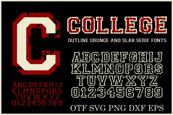
College Grunge
College Grunge is a powerhouse 2-font + cut-file varsity pack pairing a rough distressed slab WITH a crisp double-outline collegiate slab in OTF, SVG, PNG, DXF & EPS!
College Grunge is a two-font collegiate pack of a distressed varsity slab and a clean double-outline cut, with vector and raster files for cutting: the distressed cut carries chipped edges and uneven ink, while the clean cut has a second keyline inside the first. The pair lets one shirt show a worn name and a crisp second line, and the clean cut is the weaker element at small sizes. The distressed slab needs roughly 30 mm and the double outline 34 mm for their detail to read.
Recommended project & layout
Cricut varsity hoodie, senior banner & letterman decal — Layer the clean Outline font in white HTV around solid athletic crimson or navy—or print the Grunge fill on vintage tees!
Before you cut or print
Use the CLEAN Outline style + included SVG/DXF files for fast Cricut/Silhouette vinyl cutting; use the Grunge style for DTF & print!
Best paired with
Get fontPaid link
 #23
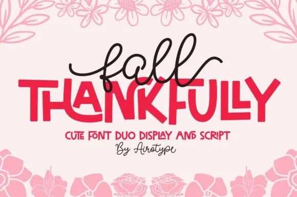
Fall Thankfully
Fall Thankfully pairs a looping monoline cursive script with a heavy, interlocking all-caps sans display face.
Fall Thankfully is a duo of a monoline tail script and a bouncy all-caps sans: the script runs an even stroke that finishes every word with a long lifted tail, while the sans is a chunky capital set whose baseline hops so a short line looks hand-set. The pair is built for autumn market goods, where one line is written and one is printed. The script tail is the finest element and it closes into a dot when reduced. The script needs roughly 28 mm and the sans 24 mm for their detail to read.
Recommended project & layout
Thanksgiving host apron & kitchen tea towel — Set the main family or harvest word in the heavy sans at 2.5 in cap height, then tuck a 1-word script lead-in slightly overlapping the upper-left letters.
Before you cut or print
Weld the overlapping script loops before cutting HTV, and peel away from the narrow 'f' and 'l' ascender counters slowly.
Best paired with
Get fontPaid link
Practical buyer checklist
Frequently asked questions.
Key cutting, printing and pairing answers before choosing a 3D layered & shadow typeface.
Why do my 3D font layers not line up in Cricut Design Space?
Usually because the layers were typed at different sizes or letter spacing. Retype the same string, set the same point size for each layer, and use align centre. If the family is properly built, no manual nudging is needed.
How many layers can a vinyl design support?
Three is comfortable on flat surfaces; four or more starts to lose registration on a curved blank. On cardstock shadow boxes, five or six layers work because each layer is registered against a frame rather than by eye.
Do layered fonts work for HTV on shirts?
Yes, and they look best in two colours. Press the base layer, cool completely, then press the top layer. On fleece, add a cover sheet so the loops do not shift the second layer out of register.
What paper weight suits a layered cardstock design?
Between 160 and 250 gsm. Anything lighter curls under the adhesive, anything heavier will not cut cleanly on a standard blade. Foam tape between layers adds depth but changes the frame depth of a shadow box.
Keep exploring
Related collections & guides.
Explore adjacent maker roundups or check our practical pre-production checklists.
01 / Cricut & Craft
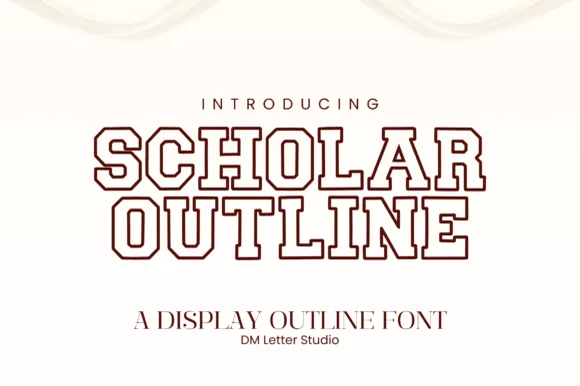
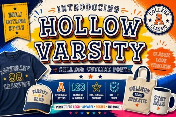
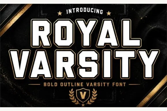
Outline, hollow & inline display
22 curated fonts · Previews & pairings

02 / Cricut & Craft
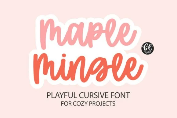
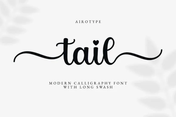
Vinyl & Cricut cutting
38 curated fonts · Previews & pairings
03 / Cricut & Craft
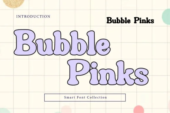
Sublimation, sticker & Print-Then-Cut
29 curated fonts · Previews & pairings
04 / Type Styles
Retro 70s & groovy
31 curated fonts · Previews & pairings
Guides: Invitation font checklist · Vinyl & cutting checklist · How to pair script & sans fonts