 #1 · Best Overall
Bray
Celtic knotwork display with bevelled strands and interlaced bowls
Get fontPaid link
Read review ↓Disclosure: MakerFileHub may earn a commission from qualifying purchases via paid links on this page. How our links work.
Knotwork, uncial caps & shamrock detail
Celtic lettering comes from two traditions: the uncial hand of Irish manuscripts, and the knotwork that fills and frames it. Bray and Alberta build ropework and open loops into the letters, Celtic Finery and Hortens keep the uncial structure clean, and Lucky No. 4 and Eva Celtic apply shamrock detail for the March season. Celtic Dragon adds a weathered, carved variant.
Quick verdict
Bray is the strongest knotwork display for a pub or heritage sign, Celtic Finery is the cleanest uncial for signage that must be read, and Hortens suits ornamental headings. Eva Celtic covers the St. Patrick's seasonal work.
Quick answer
Short on time? Start with our three highest-rated Celtic, Gaelic & St. Patrick's standouts before scrolling the full breakdown.
#1 · Best OverallCeltic knotwork display with bevelled strands and interlaced bowls
 #2 · Runner-Up Pick
Celtic knot capitals drawn as interlaced strands with black outlines
 #3 · Editor's Choice
We kept 12 of 72 candidates, a deliberately tight pool. Judged on whether the knotwork is interwoven rather than drawn on top, uncial letter accuracy, and how the detail resolves at 2 inch sign scale and on a 1 inch decal.
Side-by-side summary
Compare specimens, OpenType/PUA traits and primary project roles side by side.
| Rank & Font | Style & File Specs | Best Project Fit | Store Listing |
|---|---|---|---|
| DisplayAlternates & swashes | Irish pub sign, craft stout label, St. Patrick's poster or kilt-shop mark | Get fontPaid link | |
| DisplayGaelic | Celtic festival banner, fantasy novel map header or engraved glassware | Get fontPaid link | |
| DecorativeLigatures | St. Patrick's family shirt, classroom door sign & pub coaster | Get fontPaid link | |
| DecorativeFile formats | Irish pub menu, mead bottle label & Highland games poster | Get fontPaid link | |
| DecorativeFile formats | St. Patrick's Day pub shirt, parade banner & lucky mug | Get fontPaid link |
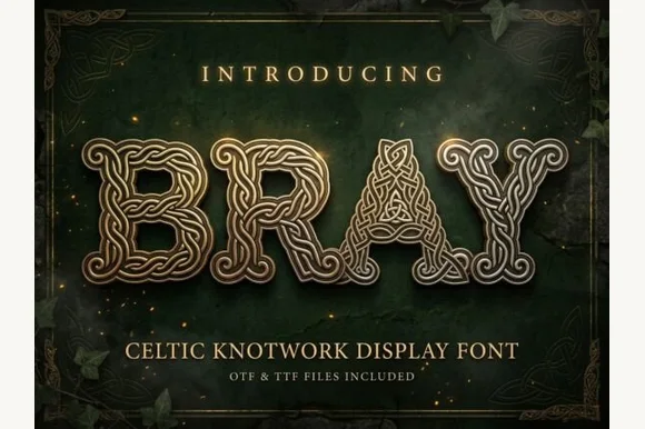
#1 · Best OverallBray is a Celtic knotwork display alphabet in which every stroke is a braided band with a bevelled edge, the bowls close into interlaced rings and the letters share one outline, so a word reads as cast metal rather than as type.
The B builds two rings from interlaced bands, the R turns a knotted leg, the A closes an interlaced apex, the Y splays two braided arms and the head of each letter meets the next in a shared ring, all at a display weight with a bevel drawn along every band and a regular over-and-under pattern. The bevel is the character: it makes the knotwork look cast rather than drawn, which is why the sample sets one word in gold against a dark ground. Because the bands are narrow, the face needs 50 pt before the interlacing reads, and it wants one colour plus a highlight rather than a full gradient. The dark green ground, the ivy, the corner knots and the small caps are presentation; the gold display word is the face.
Irish pub sign, craft stout label, St. Patrick's poster or kilt-shop mark — Use for 1–2 short uppercase words at large display sizes (48pt+).
Intricate interwoven lines suit print, laser engraving and DTF rather than small vinyl cuts.
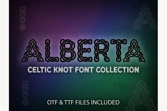
#2 · Runner-Up PickAlberta is a Celtic knot capital alphabet in which every stroke is drawn as a braided strand, the openings close into loops and one thin outline holds the whole letter, so a word reads as knotwork rather than as type.
The A builds its apex from two interlaced strands, the L curls into a terminal spiral, the B closes two braided bowls, the E splits into three woven arms and the R turns a knotted leg, all at a display weight with a single contour and a regular over-and-under pattern. The interlacing is the character: each letter is drawn as a continuous path, which is why the sample sets one word and lets the pattern carry the image. Because the strands are thin, the face needs 50 pt before the weave reads and it prints best in one colour with the counters open. The green and purple ground, the corner knots and the line beneath are presentation; the outlined knot word is the face.
Celtic festival banner, fantasy novel map header or engraved glassware — Set in all-caps with +20 letter-spacing so adjacent knotwork breathes.
Ideal for laser engraving, print and DTF; too intricate for small blade vinyl.
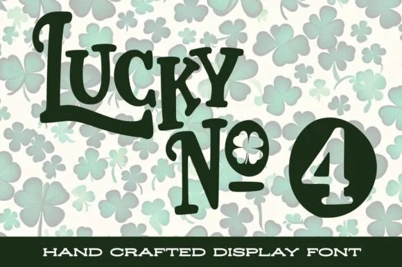
#3 · Editor's ChoiceLucky No. 4 is a lively, hand-crafted St. Patrick's display typeface featuring bouncy tall capitals, shamrock-filled counters, and badge numerals.
Lucky No. 4 is a handcrafted St Patrick's display in which the counters open as shamrock leaves: a firm hand-drawn stem, three-lobed counters on the o and the b, a small stem line at the foot and a slightly uneven contour. The shamrock counters are the design and close first when the face shrinks, and the hand-drawn edge is what gives it warmth. It needs roughly 30 mm for the shamrock counter and the hand edge to read, and it is best in one emerald ink on cream, or a single dark green on white where the leaves stay open.
St. Patrick's family shirt, classroom door sign & pub coaster — Let the capital 'L' underline swash cradle 'UCKY' above shamrock-accented 'No.' or family names.
Sturdy solid green stems cut cleanly on HTV and vinyl at 1.25 in+; take care weeding the tiny shamrock counter inside 'o'.
 #4 · Top Maker Utility
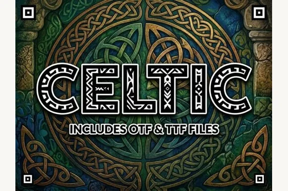
Celtic is an ornamental uppercase display font filling wide geometric block letters with authentic interlaced Celtic ribbon knotwork.
Celtic is an intricate interwoven knotwork block display: heavy squared letters whose counters and stems are filled with braided bands that pass over and under each other, with small circular knots at the joins. The braid is the design and it silts into a mush as soon as the face is reduced or printed with a coarse screen. It needs roughly 40 mm for the over-under braid to read, and it is best in one fine ink on smooth stock, or a single etched or foiled colour where the braid prints as a bright line.
Irish pub menu, mead bottle label & Highland games poster — Set 1 focal uppercase word at 54–96 pt in bone-cream, gold, or forest green over dark slate.
Dozens of tiny knotwork cutouts inside every letter mean you should output via print, laser wood/slate engraving, or DTF—never weed vinyl.
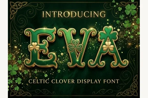 #5 · Standout Silhouette
Eva Celtic is a festive St. Patrick's display serif decorating flared Celtic-style capitals with built-in three-leaf shamrock cutouts and sprigs.
Eva Celtic is a Celtic display serif embellished with shamrock forms: heavy curved stems, uncial-style bowls, a shamrock cut into some counters and a thin interlaced knotwork band along the baseline. The knotwork is the finest element and closes first, and the shamrock counters fill before the stroke thins. It needs roughly 34 mm for the knotwork and the shamrock to read, and it is best in one green ink on cream, or a single dark ink on a pale ground where the interlacing prints as a cut line.
St. Patrick's Day pub shirt, parade banner & lucky mug — Set 1 focal word at 4–9 inches wide in kelly green or metallic gold HTV above clean tracked serif subtext.
Scale vinyl and HTV cuts to at least 1.5 inches tall so the small shamrock leaf details weed cleanly without tearing.
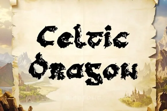 #6
Celtic Dragon is a rugged medieval uncial display font combining rounded Gaelic manuscript skeletons with jagged dragon-wing / torn-parchment edges.
Celtic Dragon takes the rounded uncial skeleton of an Irish manuscript hand and cuts its outline into jagged, dragon-wing shapes, so the letters read as torn parchment rather than as a clean medieval revival. Bowls on the e, d and g keep the half-uncial rhythm, which means a word still scans like a manuscript even with the serration. The best weight of detail sits between 18 and 60 mm; below that the serrations fill into a rough blob, and above it they look like a deliberate fantasy texture. It is a display face for atmosphere, not for long copy.
D&D world-map region label, dragon quest book & tavern menu — Set realm and tavern names in title case at 48–92 pt in espresso or black over aged parchment.
Ragged serrated contours are built for map printing, laser wood burning, DTF, and book covers rather than small vinyl weeding.
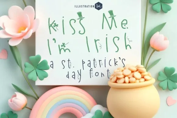 #7
Kiss Me I'm Irish is a light, playful hand-drawn St. Patrick's print font adorning slender stems with tiny shamrocks and tilted leprechaun top hats!
Kiss Me I'm Irish is a whimsical fine-pen print with a light monoline skeleton, wide round bowls, and small shamrock and top-hat glyphs that replace the dot on the i and the ascender on the l. The ornaments attach to the letters rather than sitting as clip art, so the word box grows a little at both ends. It needs roughly 28 mm for the ornaments to read, and it is best in emerald green on cream, or one ink on white where the fine pen stays open.
St. Patrick's classroom treat card, Cricut Pen note & tag — Set 3 or 4 playful mixed-case lines at 36–68 pt in Kelly-green ink on crisp white cardstock.
Hair-thin sketchy pen stems + tiny clover details are strictly for flat print, Print-Then-Cut, and Cricut Pens—never blade-weed vinyl!
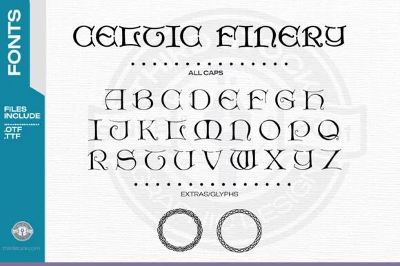 #8
Celtic Finery is an uncial capital alphabet in which the stems turn on rounded shoulders, the serifs flare into triangles and the letters sit wide, so a title reads as an illuminated manuscript head rather than as a modern sans.
The C curls a wide crescent, the E sets three short arms on a rounded stem, the M builds four rounded valleys, the R turns a hooked leg and the O stays a wide ring, all at a monoline weight with triangular serifs and uncial proportions. The uncial shape is the character: the letters are built from rounded strokes, which is why the sample sets a two-word title above an alphabet line and a pair of knot borders. Because the strokes are even and open, the face holds from 22 pt and prints in one ink; the triangular serifs need a smooth stock at caption sizes. The white ground, the knot roundels, the dotted rules and the sidebar labels are presentation; the black uncial letters are the face.
St. Patrick's shirt HTV, Irish pub window vinyl or family plaque — Pair all-caps headings with the included circular knotwork rings as side accents.
Solid clean vector paths cut and weed well on Cricut and Silhouette at 1"+ height.
 #9
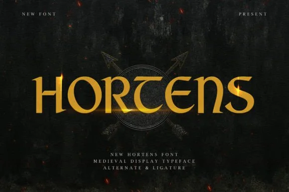
Hortens is a noble medieval display typeface blending curved uncial 'T' and 'E' forms with custom ligatures for historical & fantasy titles.
Hortens is a medieval display serif with uncial T and E forms, knightly proportions and custom ligatures that link RT into a single curved crossbar, so a word reads as an inscription from a chronicle rather than as a blackletter. The ligature is the signature, which means the face needs size for the join to read as deliberate, and the wide capitals fill a panel with one word. It needs roughly 28 mm for the uncial curves to read, and it is best in burnished gold on charcoal or in one dark ink on parchment cream.
Arthurian / Viking historical novel, tabletop wargame & map — Set 1 uppercase title horizontally at 72–150 pt in burnished gold over dark slate, leather, or parchment.
Sturdy, medium-bold single-layer curves cut and weed cleanly on Cricut gold HTV, Oracal 651, and shield stencils down to 0.8 in!
 #10
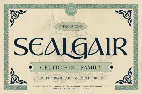
Sealgair is a four-weight Celtic display serif blending chiseled wedge terminals with sinuous interlocking crossbars and descender hooks.
Sealgair is an ornamental Celtic and Norse display serif family: sturdy stems with woven knotwork filling the counters, angular shoulder ornaments and a second cut whose interlacing runs thinner for a smaller line. The family is a carved-inscription look, so it belongs on a sign, a plaque and a cover rather than a paragraph. The knotwork is the finest element and it fills into a solid plate when the face is reduced. It needs roughly 44 mm for the weave to read, and it is best one dark ink on a stone-toned ground or carved in relief.
Craft whiskey, meadery, or Highland pub bottle label — Set the spirit or pub name in Sealgair Bold all-caps across the label chest, using Regular or Light for batch numbers and tasting notes.
For laser-engraved oak barrels, leather coasters, or Slate plaques, choose Medium or Bold so fine wedge serifs engrave crisply.
 #11
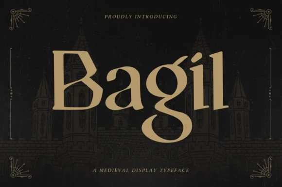
Bagil is a stately medieval display serif blending flared wedge terminals with an uncial-inspired double-story 'g' for fantasy books, games, and meaderies.
Bagil is an ornate medieval blackletter family with a dense vertical texture, sharp diamond terminals on the ascenders, hairline connecting strokes and a Regular plus an Oblique for emphasis. The dense texture means a word prints as a near-solid black mass, which is the effect the face is drawn for, and the oblique slants that whole texture rather than offering a true italic. The hairline connectors are the first thing to fail on uncoated stock or in reverse, and the diamond terminals are what survive at display sizes. It needs roughly 30 mm for the diamond terminals to read, and it is best in one black on cream or a single dark red on parchment tones, never reversed at small sizes.
Epic fantasy novel jacket, D&D campaign book & RPG menu — Center 1 title-case hero name huge (84–170 pt) in warm gold or parchment-tan over dark charcoal castle art.
100% solid, thick-stemmed serif shapes cut and weed cleanly on Cricut Oracal 651, HTV, and D&D dice-box wood stencils down to 0.7 in!
 #12
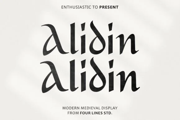
Alidin is a sleek modern medieval serif blending broad-nib calligraphic curves and an arched 'A' swash with crisp contemporary polish.
Alidin is a modern medieval display serif that keeps the broad-nib calligraphic curves of an uncial, including an arched A swash, but polishes the contours so a word reads as contemporary rather than as a manuscript reproduction. Mixed case works because the lowercase keeps the same nib logic, and the arch on the A extends above the cap line. It needs roughly 26 mm for the arched swash to read as deliberate, and it is best in deep forest or charcoal on warm ivory, or as a single spot on a dark ground.
Artisan olive-oil / spice bottle, boutique hotel & candle — Center 1 title-case brand name at 76–155 pt on textured white cotton labels above clean sans micro-caps.
100% smooth, solid broad-nib shapes cut and weed in seconds on Cricut Oracal 651 and HTV down to 0.75 inches!
Practical buyer checklist
Key cutting, printing and pairing answers before choosing a Celtic, Gaelic & St. Patrick's typeface.
A style derived from early Irish and Anglo-Saxon manuscripts, with rounded capitals, a short x-height and a slanted pen angle. Uncial letters are a separate historical alphabet, not small capitals of a Roman serif face.
Rarely below 1 inch. The interlace strands are thin and become detached islands on a cutting mat. Use them for signage and engraving at 2 inches or more, or print them for cards and labels.
Choose one reference. A single uncial wordmark in green and cream reads as heritage, while shamrocks, leprechauns, rainbow gradients and comic lettering together read as a party-supply aisle.
Uncial faces usually map lowercase to smaller uncial forms rather than true lowercase. That affects how sentences look, so plan all-caps or capitalised layouts before designing.
Keep exploring
Explore adjacent maker roundups or check our practical pre-production checklists.
21 curated fonts · Previews & pairings
14 curated fonts · Previews & pairings
25 curated fonts · Previews & pairings
39 curated fonts · Previews & pairings
Guides: Invitation font checklist · Vinyl & cutting checklist · How to pair script & sans fonts
Allow optional Google Analytics to measure visits and catalogue actions. Your search words and notes are not included. Privacy & storage