 #1 · Best Overall
Disclosure: MakerFileHub may earn a commission from qualifying purchases via paid links on this page. How our links work.
Scanlines, chrome inline & neon-tube lettering
14 Best 80s Synthwave & Neon Fonts
Synthwave typography is built from screen artefacts: scanlines, chromatic slices, chrome bevelling and a horizon-line perspective that came from 1980s arcade cabinets and VHS covers. Rimma and Ruzana work the multi-line inline, Dora and Glory carry the scanline block, and Hustle Times and Shadenia supply the neon-tube monoline script that actually maps onto real LED signage.
Quick verdict
Rimma is the strongest inline for a poster, Dora covers the scanline block, and Hustle Times is the pick for neon-tube signage that has to be bent in the real world. Glory works for thumbnails and album art.
Quick answer
Top 3 80s synthwave, outrun & neon picks right now.
Short on time? Start with our three highest-rated 80s synthwave, outrun & neon standouts before scrolling the full breakdown.
#1 · Best Overall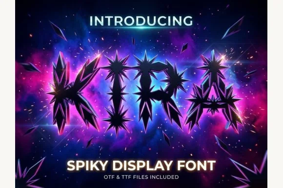 #2 · Runner-Up Pick
 #3 · Editor's Choice
How we tested & selected these 14 fonts
We kept 17 of 42 candidates, a genuinely tight pool. Judged on whether the scanline or inline is drawn into the glyph, how the face holds at 1440 px and in print, and whether a solid companion weight exists for small text.
Side-by-side summary
Top 5 80s synthwave, outrun & neon picks at a glance.
Compare specimens, OpenType/PUA traits and primary project roles side by side.
| Rank & Font | Style & File Specs | Best Project Fit | Store Listing |
|---|---|---|---|
| DisplayNeon-Deco | Cocktail lounge neon menu, synthwave cover & cinema poster | Get fontPaid link | |
| DisplayExplosive | EDM single cover, anime battle thumbnail & sci-fi poster | Get fontPaid link | |
| DisplaySynthwave | Synthwave playlist cover, retro-arcade flyer & stream header | Get fontPaid link | |
| DisplayGlitched | Cybersecurity conference slide, tech podcast & gaming intro | Get fontPaid link | |
| DisplayArcade | Roller-rink birthday invite, retro bowling shirt & poster | Get fontPaid link |
Display & Decorative Headlines
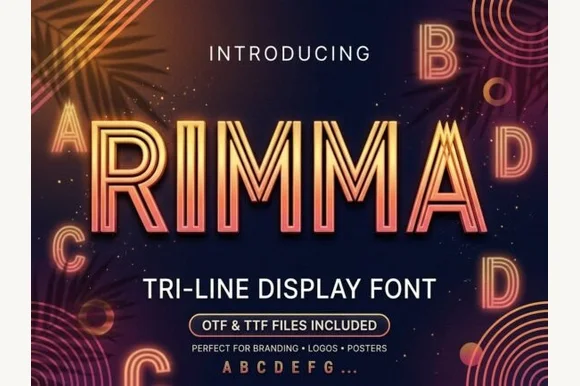
12 fonts#1 · Best OverallRimma
Rimma is a clean, geometric three-line parallel display typeface merging 1920s Art Deco symmetry with glowing 1980s neon tube lines.
Rimma is a geometric three-line inline Art Deco sans with a retrowave edge: wide squared letters built from three parallel hairlines, sharp mitred corners, an even width and a symmetry that reads as a neon sign drawn on a grid. The three lines are the design and they merge into one at small sizes. It needs roughly 34 mm for the three lines to read, and it is best in one neon colour on a dark ground, or one fine ink on a pale ground where the gaps between the lines stay open.
Recommended project & layout
Cocktail lounge neon menu, synthwave cover & cinema poster — Set all-caps titles at 54–96 pt with +20 tracking in warm coral, electric cyan, or champagne gold on midnight navy.
Before you cut or print
Triple hairline channels are designed for digital graphics, print, and LED/foil artwork—avoid weeding small vinyl.
Best paired with
Get fontPaid link
#2 · Runner-Up PickKira
Kira is an aggressive futuristic display font bursting with jagged starburst shards and crystalline spikes erupting from bold letter cores.
Kira is a wide futuristic display built from starburst and sci-fi geometry: extended caps, chamfered corners, a small ray or spike on some terminals and a heavy even stroke that reads as signage from a distance. The extensions make every word long, so a centred block needs side room, and the spikes are the detail that closes at small sizes. It needs roughly 30 mm for the spike and the chamfer to read, and it is best in one bright ink on a dark ground, or black on a pale technical tone.
Recommended project & layout
EDM single cover, anime battle thumbnail & sci-fi poster — Set single-word titles huge (80–130 pt) with +25 tracking so neighboring crystal shards do not collide.
Before you cut or print
Sharp micro-spikes and internal shard lines are strictly for digital graphics, print, and DTF—not blade-cut vinyl.
Best paired with
Get fontPaid link
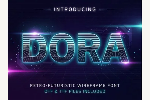
#3 · Editor's ChoiceDora
Dora is a retro-futuristic 1980s display font combining horizontal CRT scanline faces with built-in 3D wireframe perspective grids.
Dora is a nineteen-eighties synthwave display built from scanlines and wireframe depth: each letter is drawn as a stack of fine horizontal lines, with a second offset stack behind it that reads as a three-dimensional wireframe, and the top edge carries a small highlight. The scanlines are the entire design, and they close first when the face is small or printed on absorbent stock. It needs roughly 38 mm for the scanlines and the offset stack to read, and it is best in two neon inks on black, where the lines read as light bars, and never on coated stock that glares.
Recommended project & layout
Synthwave playlist cover, retro-arcade flyer & stream header — Center short uppercase titles at 64–110 pt in electric cyan or magenta over deep indigo grid backgrounds.
Before you cut or print
Ultra-fine wireframe mesh lines require high-resolution digital screens or 300+ DPI print—never cut vinyl.
Best paired with
Get fontPaid link
 #4 · Top Maker Utility
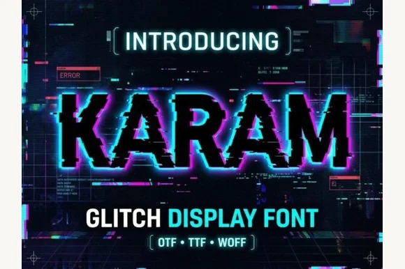
Karam
Karam is a cybernetic glitch display font that slices bold serif/slab capitals with horizontal scan-tear offsets and pixel blocks.
Karam is a horizontal pixel-sliced digital glitch slab display: a squared slab skeleton cut into thin horizontal bands that shift sideways by a few pixels, with small chromatic offsets at the slice boundaries that read as a broken video frame. The slice offset is the design, and any scaling that is not a whole-pixel multiple turns the slices into uneven bars. It needs roughly 32 mm at whole-pixel multiples for the slice to read, and it is best as a flat three-colour print on coated stock, or one ink where the offsets print as knockouts.
Recommended project & layout
Cybersecurity conference slide, tech podcast & gaming intro — Duplicate the text layer 2 px left in cyan and 2 px right in magenta behind white foreground text for instant RGB chromatic glitch.
Before you cut or print
Fine horizontal pixel steps belong in digital video, web banners, print, or DTF rather than blade-cut vinyl.
Best paired with
Get fontPaid link
 #5 · Standout Silhouette
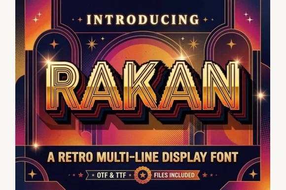
Rakan
Rakan is an energetic 1980s multi-line display font constructed from five parallel concentric tracks wrapping bold geometric capitals.
Rakan is a nineteen-eighties arcade display of stacked concentric ribbons: every stem is three or four parallel bands that curve into arcs at the corners, and the bands wrap around the whole word so the letters share one continuous ribbon. The band gaps are the design, and they close when the face is small or the ink spreads. It needs roughly 40 mm for the bands to stay separate, and it is best in two bright inks on black, or one metallic on a dark ground where the arcs read as light strips.
Recommended project & layout
Roller-rink birthday invite, retro bowling shirt & poster — Set short uppercase words at 56–96 pt in mustard gold, tangerine, or cream over deep plum or navy.
Before you cut or print
Multiple narrow concentric channels are designed for print, sublimation, and digital graphics—not small cut vinyl.
Best paired with
Get fontPaid link
 #6
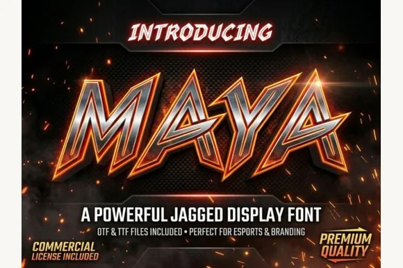
Maya
Maya is a fierce, forward-slanted esports display typeface armed with swept-back blade spurs and wide, angular athletic stances.
Maya is a razor-spurred esports display: slanted squared caps, a heavy even stroke, and sharp blade spurs that flash off the corners of the A, M, K and X. The lean drives each word forward and the spurs break the silhouette, so a word box widens at the ends. It needs roughly 30 mm for the spur and the slant to read, and it is best in one acid or cool ink on black, or black on a pale technical ground where the spur tips stay sharp.
Recommended project & layout
Esports clan logo, Twitch stream banner & fight-night card — Tighten kerning around 'A-Y-A' diagonals and wrap the whole wordmark in a thick dark outer shield contour.
Before you cut or print
Broad solid vector stems cut cleanly on gaming PC case vinyl, car decals, and jersey HTV at 1 in+ height.
Best paired with
Get fontPaid link
 #7
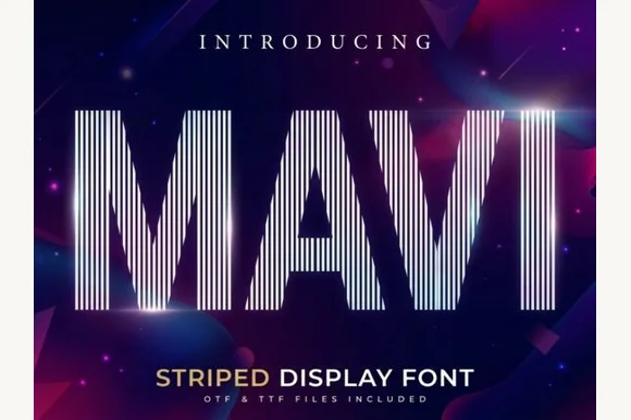
Mavi
Mavi is a towering condensed display font built entirely from crisp vertical parallel pinstripes sliced into bold geometric silhouettes.
Mavi is a tall condensed display built from vertical pinstripes: each stem is a set of parallel fine lines running the full height, the counters stay open and the outline is a thin rule at the silhouette. The pinstripes make the face read as an optical texture at distance and as thin lines close up, so the spray count matters. It needs roughly 44 mm for the stripes to stay separate, and it is best in one deep ink on white, or white on a dark ground where the stripes read as light threads.
Recommended project & layout
Tech keynote title slide, architecture poster & techno flyer — Span 1 short uppercase word tall across the center of a dark gradient frame above wide-tracked sans subcopy.
Before you cut or print
Fine vertical line arrays are built for high-res screens and 48 pt+ print posters—avoid blade-cutting thin vinyl strips.
Best paired with
Get fontPaid link
 #8
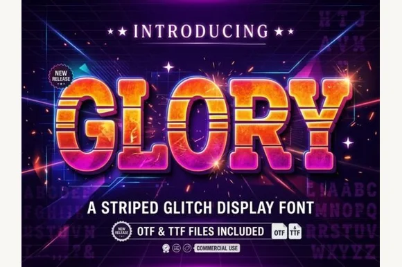
Glory
Glory is a chunky arcade block in which every letter carries horizontal scanline gaps, so a word reads as a stretched slice of a 1980s title screen rather than as flat lettering.
The G closes with a square bar, the L keeps one heavy arm, the O holds a rectangular counter and the Y forks with flat cuts, all at a very heavy weight with squared corners and a bevel across the top and left edges. The scanlines are the defining feature: three or four horizontal gaps cut through each stroke at regular intervals and stay aligned across the word, which is what makes the face read as a screen artifact. That alignment is also the risk — set at different sizes, the stripes drift out of register between letters. Because the shapes are simple, the face holds at 60 pt on a poster and fails below 20 pt where the gaps read as damage. The dark ground, the gradient fills, the sparks and the two caption lines are presentation; the typeface is the word.
Recommended project & layout
80s arcade night poster, synthwave album or retro tee — Fill with vertical warm-sunset gradients over dark navy/violet backdrops.
Before you cut or print
Multiple horizontal stripes per letter suit DTF, screen printing and digital graphics.
Best paired with
Get fontPaid link
 #9
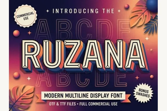
Ruzana
Ruzana is a sleek multi-line inline display font channeling 1930s Art-Deco neon marquees and 1980s Miami retrowave (+ Bonus Swashes in OTF & TTF)!
Ruzana is a multi-line inline display in caps, with parallel neon-like lines running through each stem, chamfered geometric corners and bonus swashes, drawn in the language of Art-Deco marquees and retrowave signage. The parallel lines are the face's only detail, so it needs roughly 28 mm before they stay separate, and the letter reads as a lit panel at poster size. It is a title and signage face, best in two tones on a dark ground or as white lines on a saturated one.
Recommended project & layout
Synthwave / disco flyer, cocktail-lounge menu & album cover — Center 1 uppercase word huge (80–165 pt) with +4 tracking over dark sunset-violet gradients.
Before you cut or print
Fine parallel inline grooves shine in print, DTF shirts, Foil Quill, and large 2.2 in+ window vinyl (do NOT cut tiny vinyl!).
Best paired with
Get fontPaid link
 #10
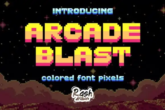
Arcade Blast
Arcade Blast builds block capitals from visible square steps, where bright yellow upper portions shift to orange middles and deep pink lower bands, the O and A keep square counters, diagonals become staircases and a dark offset edge adds depth.
The steps stay one unit wide, the colour changes on a horizontal line through the letters, the corners never round and the counters close as rectangles. That stacked band is the character: the word looks lit from above by a shaded screen rather than filled with a gradient, which is why the cover adds stars and a rocky pixel landscape. The scene and the depth treatment belong to the artwork, so smooth nothing and scale in whole multiples of the step.
Recommended project & layout
A retro arcade-party heading — Set PRESS above PLAY on black, with the date in a plain white lower strip and no borrowed landscape.
Before you cut or print
Check the new glyphs and export scaling; do not imply licensed game affiliation.
Best paired with
Get fontPaid link
 #11
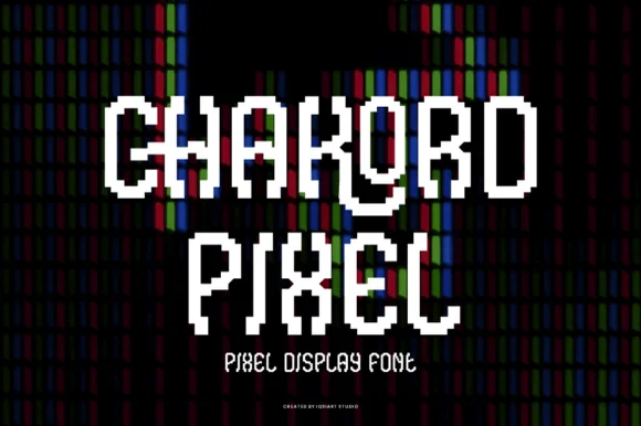
Chakord Pixel
Chakord Pixel builds chunky 8-bit arcade capitals from crisp square pixel blocks with playful notched corners and ligature-like joins.
Chakord Pixel is a stair-stepped eight-bit arcade pixel display: every stroke is built from square cells on a fixed grid, with hard diagonal steps, chunky caps and no anti-aliased curves at all. The grid is the design, so the face must be set on an even multiple of the cell size or the steps break into uneven runs. The corners are the finest element and they crumble when the face is scaled off-grid. It needs roughly 32 mm for the cell to read as a pixel, and it is best one bright ink on a dark ground.
Recommended project & layout
'Level Up' gamer birthday topper & party shirt — Stack 'LEVEL 10' or the birthday kid's gamer tag in two centered lines, backing white letters with a black offset pixel shadow.
Before you cut or print
Because stepped corners create many tiny 90-degree turns, use a fresh 45-degree blade at medium speed so vinyl corners lift sharply.
Best paired with
Get fontPaid link
 #12
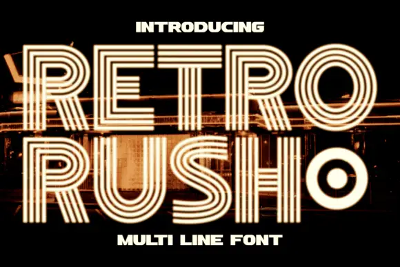
Retro Rush
Retro Rush is a geometric capital alphabet in which every stroke is drawn as several parallel lines, so a word reads as a neon tube sign or a striped poster from the late seventies.
The R keeps a squared bowl and a straight leg, the E carries three arms, the T holds a wide bar and the O closes a round counter with a filled dot at its centre, all at a heavy overall footprint with the weight distributed across four or five parallel strokes. That construction is the character: the letters read as outlines, which means they can be printed hollow, filled between the lines, or used as a mask. Alignment across letters matters — the line count has to stay constant or the word looks broken. Because the strokes are thin individually, the face needs 40 pt minimum and a smooth stock, and it fails at 16 pt where the lines merge. The dark ground, the city lights behind, the warm glow and the two caption lines are presentation; the typeface is the two words.
Recommended project & layout
A retro evening poster — Use a dark uncluttered panel around the title.
Before you cut or print
Inspect line separation at the final size.
Best paired with
Get fontPaid link
Scripts & Calligraphy
2 fonts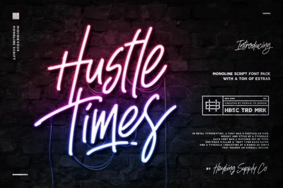 #13
Hustle Times
Hustle Times is a tall, upbeat slanted monoline script pack (bundled with extras) engineered to mimic glowing bent-glass neon signs.
Hustle Times is a tall slanted monoline script with narrow loops and an upward, energetic baseline, drawn to imitate bent-glass neon tubing. The monoline stroke is what makes the neon conversion work, and the slant plus the tight loops make a long word run up a wall. It needs roughly 30 mm for the loops to stay open on a wall sign and about 8 mm for a printed card, and it is best as a bright colour on dark brick, or a single ink on a pale ground.
Recommended project & layout
Cocktail-bar neon sign graphic, podcast cover & club flyer — Tilt upward 7 degrees in white core + hot-pink/cyan outer glow over dark brick or charcoal.
Before you cut or print
Solid single-cord vectors also cut cleanly on 1.1 in+ HTV, bar-mirror vinyl, and acrylic LED backboards (weld joins!).
Best paired with
Get fontPaid link
 #14
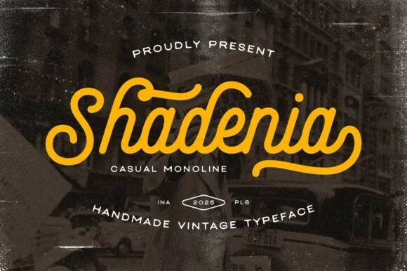
Shadenia
Shadenia is a thick, sturdy vintage monoline script inspired by mid-century neon diner signs, classic car badges, and retro athletic jerseys.
Shadenia is a bold vintage monoline script with heavy tubular strokes, a retro S and a smooth curled exit hook, drawn from mid-century neon diner signs and athletic jerseys, so a name reads as a painted sign rather than a modern script. The monoline weight is what makes it safe for cutting, plotting and neon conversion, and the exit hook adds width at the end of a word. It needs roughly 24 mm for the tubular stroke to read, and it is best in mustard or warm white on a dark ground, or one ink on cream.
Recommended project & layout
Classic garage jacket embroidery, diner mug & brewery tee — Center 1 title-case word at 5–10 inches wide in mustard gold, cream, or cherry red above arched vintage sans.
Before you cut or print
One of the sturdiest vintage scripts for Cricut HTV, puff vinyl, laser-cut acrylic signs, and satin-stitch embroidery—weld joins first!
Best paired with
Get fontPaid link
Practical buyer checklist
Frequently asked questions.
Key cutting, printing and pairing answers before choosing a 80s synthwave, outrun & neon typeface.
Can synthwave fonts be used for real neon signs?
Only the monoline neon-tube scripts, because physical tubing has one fixed width. Multi-line and scanline faces cannot be bent as tube, so they are limited to printed or digital use.
Why do scanline fonts look grey when printed?
The gaps between the lines are thinner than ink spread, so they fill in from both sides. Print them large, on coated stock, and increase the gap width or choose a solid weight for smaller sizes.
What colours define the synthwave look?
Magenta, cyan and deep purple with a dark ground, usually with a gradient and a glow. Keep the type itself in a single bright colour so the gradient stays in the background, otherwise legibility drops sharply.
Is the 80s revival still usable for a brand?
As a campaign layer, yes. It dates quickly as a primary identity, so pair a restrained primary typeface with a synthwave display cut used for launches, events and merchandise.
Keep exploring
Related collections & guides.
Explore adjacent maker roundups or check our practical pre-production checklists.
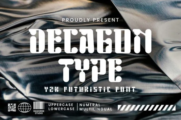
01 / Type Styles
Cyberpunk, sci-fi & mecha tech
16 curated fonts · Previews & pairings
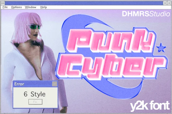
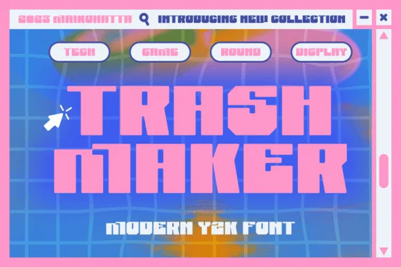
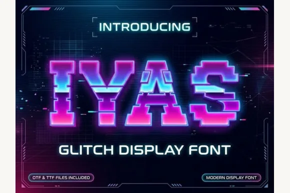
02 / Type Styles
Y2K & futuristic tech
16 curated fonts · Previews & pairings
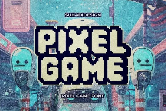
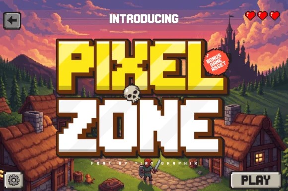
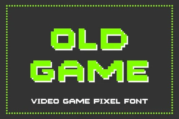
03 / Type Styles
8-bit pixel, VHS & gaming
14 curated fonts · Previews & pairings
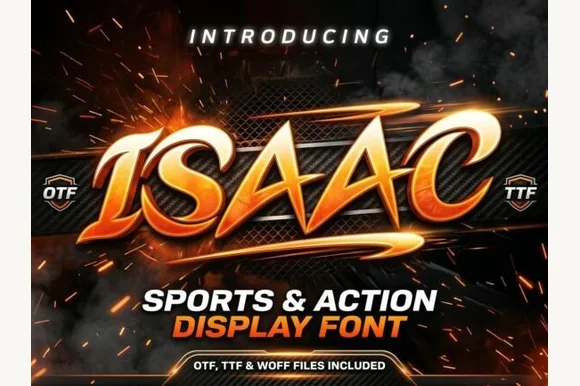
04 / Branding & Print
YouTube thumbnails, podcasts & gaming
24 curated fonts · Previews & pairings
Guides: Invitation font checklist · Vinyl & cutting checklist · How to pair script & sans fonts