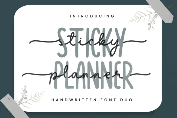
 #1 · Best Overall
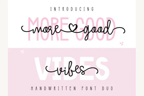
More Good Vibes Duo
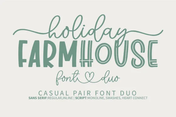
Heart-connected monoline script & tall rounded sans duo
Get fontPaid link
Read review ↓Disclosure: MakerFileHub may earn a commission from qualifying purchases via paid links on this page. How our links work.
Two-font quote layouts & printable hierarchy
A quote print is a hierarchy in a frame: one line that carries the phrase and a smaller line that carries the attribution or the date. More Good Vibes Duo and Authentic Editorial supply script-plus-sans pairs, Vintage Serenade and Dreamy Romance use serif-plus-script, and Brown Carolina Duo and Pablo Duo keep the pairing clean and modern. Blissful Heartlight adds a heavy curled serif for a statement piece.
Quick verdict
More Good Vibes Duo is the most versatile printable pair, Vintage Serenade suits a warm vintage print, and Pablo Duo covers the modern minimal look. Blissful Heartlight is the pick for a single large statement.
Quick answer
Short on time? Start with our three highest-rated quote prints, wall art & affirmations standouts before scrolling the full breakdown.
#1 · Best OverallHeart-connected monoline script & tall rounded sans duo
 #2 · Runner-Up Pick
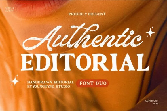
Textured brush signature script & warm hand-crafted serif duo
 #3 · Editor's Choice
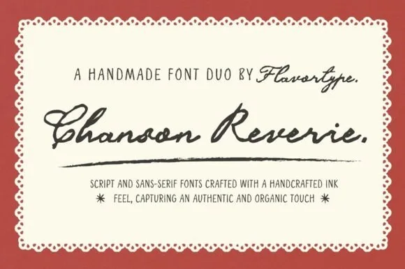
Nostalgic ink-textured brush script & tall skinny sans duo
We kept 26 of 1,113 candidates after testing each in an 8 by 10 inch print layout with three lines of different lengths. Weighted line-length handling, how the pairing reads at 18 by 24 inches, and whether the face prints cleanly at 300 dpi.
Side-by-side summary
Compare specimens, OpenType/PUA traits and primary project roles side by side.
| Rank & Font | Style & File Specs | Best Project Fit | Store Listing |
|---|---|---|---|
| DuoAlternates & swashes | Layered tumbler wrap, boutique sweatshirt & thank-you card | Get fontPaid link | |
| DuoWarm-editorial | Lifestyle podcast cover, coaching brand & boutique lookbook | Get fontPaid link | |
| DuoNostalgic | French bistro menu, artisanal jam label & chocolaterie box | Get fontPaid link | |
| DuoCozy | Coffee-shop loyalty card, mug wrap & sticker sheet | Get fontPaid link | |
| DuoPUA encoded · Ligatures · Alternates & swashes | A boutique stationery front | Get fontPaid link |
#1 · Best OverallMore Good Vibes Duo pairs a bouncy heart-swashed monoline cursive script with a tall, soft-cornered uppercase sans backdrop partner.
More Good Vibes Duo pairs a heart-connected monoline script with a tall rounded sans: the script runs an even stroke with joined letters where two words meet in a small drawn heart, while the sans is a narrow rounded block for lists, prices and badges. The pair lets one card carry a hand-linked line and a quiet, legible second voice from the same palette, which is how a small maker's whole print set usually comes together. The heart join is the finest element and it closes into a comma once the face is reduced, while the rounded sans keeps a long line on one row without wrapping. The script needs roughly 26 mm and the rounded sans 20 mm for their detail to read.
Layered tumbler wrap, boutique sweatshirt & thank-you card — Type the uppercase sans at 64 pt in soft blush or sage (25% visual weight) and center the black script directly over its middle.
For layered HTV, use Knockout/Slice or press smooth matte vinyl first and dark script HTV on top; weld all script joins.
#2 · Runner-Up PickAuthentic Editorial pairs an expressive, textured brush script with a sturdy, softly organic all-caps editorial serif partner.
Authentic Editorial pairs a textured slanted brush signature script with a sturdy bracketed all-caps editorial serif, so one line is signed by hand and the next is set as a magazine heading. The script's flying crossbar and dry edge give it warmth, while the serif carries small text at 9 pt; the two share a warm cream palette. The script needs roughly 22 mm for the texture to read, and the pair is best in cream on amber or ink on cream.
Lifestyle podcast cover, coaching brand & boutique lookbook — Overlap the script descenders/tails slightly across the top edge of the tracked (+20) uppercase serif line.
Both the bold serif and medium-thick script have enough body for 1.25 in+ tote HTV, mug wraps, and crisp print.
#3 · Editor's ChoiceChanson Reverie combines a thick, vintage ink-bled fountain script with a tall, narrow hand-drawn uppercase sans companion.
Chanson Reverie is a duo of a nostalgic ink-textured brush script and a tall skinny sans: the script carries a dry-brush edge with small skips, a shallow slant and joined letters, while the sans is narrow with blunt ends for the supporting lines. The ink texture is the design and fills in when the face is reversed or printed small on coated stock. The script needs roughly 24 mm and the sans 18 mm for their detail to read, and both are best in one dense ink on uncoated paper.
French bistro menu, artisanal jam label & chocolaterie box — Set dish or product names in 42 pt script and ingredients/origins in 12 pt tracked skinny sans inside a scalloped frame.
Thick script cuts cleanly on 1.1 in+ vinyl once welded; keep the skinny sans at 12 pt+ in print or 0.85 in+ on vinyl.
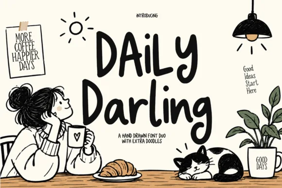 #4 · Top Maker Utility
Daily Darling is a warm hand-sketched font duo (tall marker sans + casual bouncy script) bundled with cozy coffee-shop doodles.
Daily Darling is a warm hand-sketched duo: a tall marker sans in caps paired with a casual bouncy script, bundled with coffee-shop doodles, so a café sign reads as a page from a notebook rather than a designed logo. The marker caps are even and legible at 12 mm, and the script carries the name; the doodles can be placed as separate art. It needs roughly 20 mm for the marker cap and 16 mm for the script, and it is best in black on a paper white or in one warm ink on kraft.
Coffee-shop loyalty card, mug wrap & sticker sheet — Stack uppercase sans ('MORE COFFEE') over bouncy script ('Darling') and scatter 2 or 3 bundled doodles around.
Uniform medium-bold marker weight makes both fonts + larger doodles super easy to cut on permanent cup vinyl!
 #5 · Standout Silhouette
Brown Carolina Duo contrasts broad high-contrast capitals with a much finer narrow slanted script, set dark on a plain cream field, where the capital R legs sweep below the neighbouring letters and the script carries long tails that run past the ends of both words.
The caps keep thin cross strokes and heavy uprights, the script keeps one fine weight, and the two voices sit in a strict stack: script, two cap rows, script. That alternating order is the character, because the fine lines frame the heavy block like a rule above and below. Both treatments appear on a plain light field, so the cover gives no clue about texture or shadow. Keep 34 pt for the caps before the thin strokes break up, keep 20 pt as the floor for the script and check the R leg before setting a line of capitals.
A boutique stationery front — Use the capital name centrally and a small script descriptor below, leaving the R sweep clear of contact information in a plain footer.
Confirm both styles and the actual capital alternates.
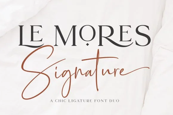 #6
Le Mores Signature pairs an editorial ligature serif—highlighted by cradled base loops—with a brisk copper-toned signature cursive.
Le Mores Signature pairs a ligature-rich editorial serif with a slanted signature script: the serif is a moderate-contrast face with true ligatures and oldstyle figures for running text, while the script is a fast slanted signature with a looping capital and a heavy exit stroke. The pair is how a printed magazine signs a page, so the serif carries the body and the signature carries the name. The signature's thin connectors are the finest element and they break first. The serif needs roughly 20 mm and the signature 30 mm for their detail to read.
Boutique fashion hangtag, perfume box & atelier logo — Set the primary brand name in tracked-open serif capitals at 36 pt and overlap a single script subword across the lower-left stem.
Keep the slender signature script in print, hot foil, or larger 2.5 in+ decals rather than tiny blade-cut vinyl.
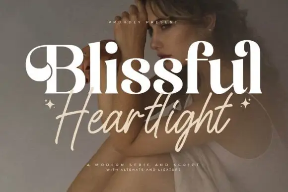 #7
Blissful Heartlight shows a pale heavy Blissful line with round bowls and curled upper entries over a portrait, where the serifs swell into bulges at the joins and a thinner right-leaning Heartlight script sits beneath with long loose strokes and extended ascenders and descenders plus two small stars at the outer edges.
The serif stays heavy and soft, the script stays thin and leaning, the ascenders rise high and the descenders drop low while the two rows overlap slightly at the centre. That swelling serif is the character: the caps look inflated at the joins rather than cut, which is why the sample relies on a photographic ground for contrast. The stars are styling, and the cover notes alternates and ligatures without showing them. Keep 44 pt for the serif and 26 pt for the script, and check the overlap for contrast before printing.
A serif-and-handwritten invitation pairing — Keep the handwritten line clear of the practical invitation text.
Verify both members and exact joins.
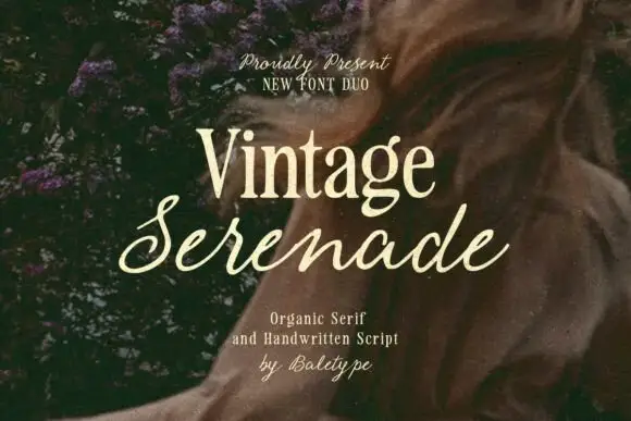 #8
Vintage Serenade pairs a compact organic serif with a long slanted script, so a card carries a firm printed name and a flowing second line that runs well beyond it on both sides.
The serif half is a soft roman with slightly uneven serifs, a moderate contrast and tight spacing: the V holds two narrow stems, the g drops a rounded tail and the a keeps a small bowl, which makes a single word read as warm print rather than as editorial. The script half is a light connected hand with a steady slant, tall loops on the l and the d and a long entry and exit stroke that stretch the line past the serif above it. That proportion is the point of the pairing: the serif anchors and the script sails. Both halves hold at 20 pt on an uncoated card, and the script never thins so far that it drops out. The foliage and torn paper photograph, the cream ink and the three caption lines are presentation; the duo is the two lines.
A garden invitation title pairing — Keep practical details in a plain third voice below the script.
Verify members, joins and names.
 #9
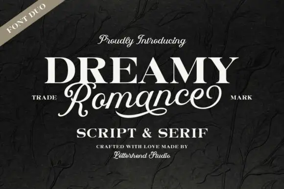
Dreamy Romance shows bold white serif capitals above a slanted connected script word: the script capital R closes a loop while a long curved underline sweeps beneath the middle of the word, so one card holds a solid statement and a written line.
The serif cut keeps wide heavy capitals with even counters, the script cut joins a slanted lowercase body and its R loops at the entry, and the underline curve sits beneath the script as a separate drawn stroke. The pairing of a heavy cap row with a flowing line is the character, which is why the sample sets the two at different sizes on a dark textured cover. Because the script slants and the underline sweeps, keep 18 mm between the rows and 20 mm at each end from 28 pt.
A serif-and-script invitation pairing — Keep names and dates clear of the long script underline.
Verify both members and exact letter joins.
 #10
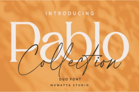
Pablo Duo pairs a clean, open-counter modern serif with an airy fine-line signature script built for layered editorial knockout logos!
Pablo Duo pairs an open-counter modern flared serif with an airy fine-line signature script, designed so the serif can sit large behind an overlapping script in a layered knockout. The serif carries size, the script carries personality, and the two are meant to intersect, which means the layout must leave room for the overlay. The serif needs roughly 24 pt for the flare to read, and the pair is best in cream and charcoal on amber or one ink on ivory.
Fashion capsule hangtag, jewelry box, candle & Instagram kit — Set 1 large mixed-case Serif word (110 pt) at 40% tint or cream and drape the dark Signature Script (64 pt) across its lower bowls.
Serif cuts cleanly on 0.8 in+ vinyl; fine monoline Script shines in print, foil, Cricut Pens, or 1.4 in+ welded decals.
 #11
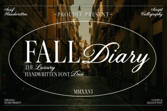
Fall Diary is an atmospheric editorial font duo pairing tall, crisp hand-crafted Roman serif capitals with a lush slanted calligraphy script.
Fall Diary is a duo: a classical editorial Roman serif with moderate contrast, sharp wedge serifs and a calm open fit, paired with a sweeping calligraphy script that carries the signature lines. The serif holds the information and the script holds the name, so a suite uses two voices from one family rather than two typefaces. The serif is built for long reading and holds at 9 pt in a narrow measure, while the script's sweeping exits need side clearance so the tail does not run into the margin. The serif needs roughly 20 mm and the script 24 mm for their detail to read.
Travel journal cover, autumn lookbook, novel & Substack — Place uppercase Serif + title-case Script side-by-side on the same baseline inside a thin oval hairline frame.
Serif cuts cleanly at 1 in+; Weld the Calligraphy Script joins and size above 1.25 in if cutting sign vinyl.
 #12
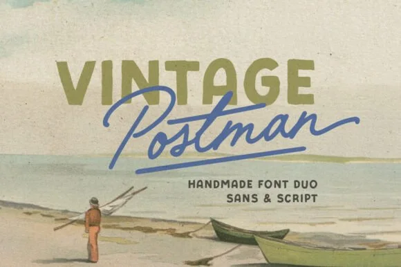
Vintage Postman pairs a sturdy retro sans with the look of a soft rubber stamp and a brisk monoline brush script: the olive sans holds a solid horizontal line while the angled script cuts across the baseline with a hand-signed slant.
The sans cut keeps even stems, softly rounded corners and a slightly uneven impression, and the script cut draws a monoline stroke at a steady width with a sharp slant and quick connectors. The pairing of a grounded row and an angled line is the character: one gives structure and the other gives motion, which is why the sample sets the olive words above the blue signature. Because the script slants, keep 18 mm between the rows and 20 mm at the right for the exit; the sans stays readable from 0.35 inches of pen height.
Coffee bag label, travel poster or surf-shop tee — Set the geographical or brand noun in all-caps sans and overlap the descriptor in angled script.
Check light organic edge texture on the sans if cutting decals under 1.5 inches.
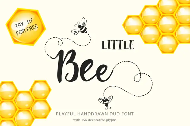 #13
Little Bee Duo pairs a compact serif in wide capitals with a rounded connected script, so a jar label can carry a printed heading and a friendly written line in the same ink.
The serif half is a tight roman with small serifs and wide tracking: the L keeps one arm, the t crosses with a short bar and the whole word sits as a label rather than as a headline. The script half is a rounded connected hand with a swollen middle stroke, a looped capital B and a tail that curls away from the word, set larger than the serif in the sample. That contrast in size is the useful part: the caps label the product and the script gives it a voice, which is how most small-batch packaging is built. Both halves hold at 12 pt on a label, and the script's round counters survive a print on kraft. The cream ground, the honeycomb, the bees, the dashed flight path and the two caption lines are presentation; the duo is the two lines.
A honey-label name study — Place a small serif category above the script name, factual product text below and no copied free badge.
Verify thematic elements and food-labelling requirements separately.
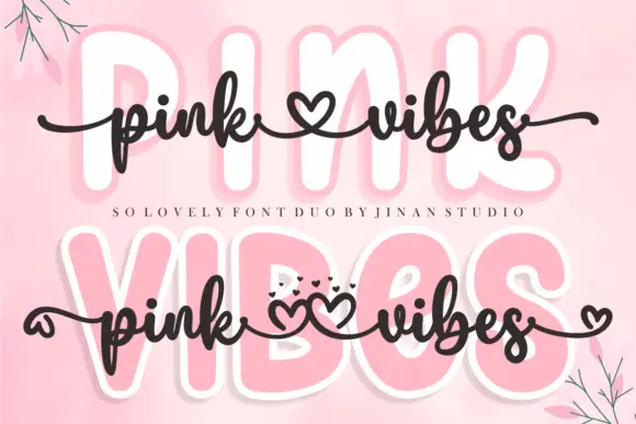 #14
Pink Vibes Duo pairs two fat rounded capital rows, drawn in white with a soft pink glow, with a small dark connected script that runs across them, and in the lower sample the script joins the words with heart shapes instead of a plain connector stroke.
The caps stay broad and inflated, the script stays thin and dark, the contrast between the two weights carries the pair and the hearts sit where a ligature would normally go. The upper sample sets the script over the caps without hearts, the lower inserts one heart between the words and a second heart cluster on the final s, so the decorative join is an option rather than the default. Branches in the corners are cover artwork. Check which connector glyphs your file carries before planning the heart link, keep 30 pt for the script strokes and set the caps in one colour so the pink glow does not come from the type.
A two-level greeting — Keep capitals above script rather than overlapping; leave heart tails in open space.
Check connector variants and actual duo contents.
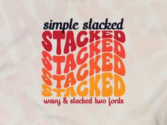 #15
Simple Stacked is a wavy display in which rounded capitals repeat down three offset rows, each row bending and stretching the letters differently, so a short word reads as a rainbow of stacked script rather than a plain line.
The S pulls a broad curve, the A opens a narrow counter, the letters in the middle row stretch wider than the row above and the baseline of each row waves independently. The repetition is the character: it turns one word into a pattern, which is why the sample sets a single phrase three times over. Because the rows overlap, the face needs deliberate spacing between rows from 30 pt and reads best as a display block rather than as a line of text; a second word needs its own stack. The pale ground and the small caption are presentation; the wavy lettered rows are the face.
A rhythm-themed poster — Reserve the centre for one verified stacked word and keep all event details outside the repeated rows.
Confirm how many rows one glyph or style actually generates.
 #16
Brenco is a grounded, medium-bold contemporary serif with sturdy bracketed feet and warm, approachable lowercase curves.
Brenco is a wide squared sans display with heavy even strokes, flat terminals and a slightly extended stance, so a word reads as a stencilled crate marking rather than a modern grotesk. The flat terminals and squared corners print cleanly at low resolution, which makes it a signage and packaging face, and the extended width fills a panel with a short word. It needs roughly 30 mm for the squared corners to read, and it is best in a dark ink on kraft or in white on a deep colour.
Specialty coffee-roaster bag, bakery window & ceramic mug — Set 1 bold mixed-case brand word huge (76–150 pt) with tight -2 tracking across rich espresso photography.
Sturdy medium-bold stroke contrast cuts and weeds cleanly on Cricut Oracal 651 and HTV down to 0.75 inches!
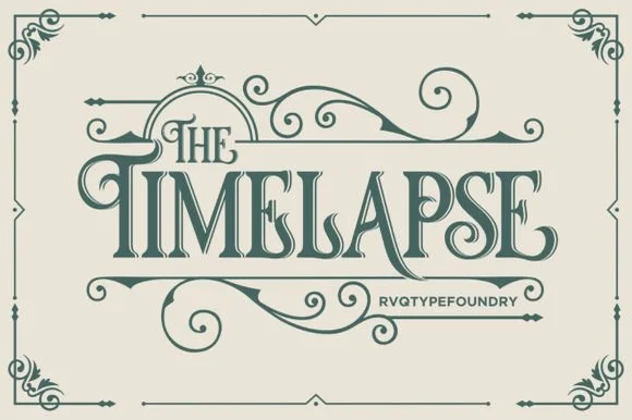 #17
Timelapse is an ornate Victorian display serif crowned with spiraling vine swashes, teardrop terminals, and vintage apothecary charm.
Timelapse is a Victorian storybook and apothecary display serif with swashes: fine bracketed serifs against heavy stems, a small ball terminal on the diagonals, swash capitals that curl off the first letter and a slightly condensed width that keeps a long label on one line. The hairlines are the design and the swashes need side clearance. It needs roughly 30 mm for the swash and the hairline to read, and it is best in one fine ink on smooth or coated stock, or a foil impression above 40 pt where the curls still turn.
Steampunk or historical novel cover, tea tin & poster — Center 1-to-2-word uppercase titles at 48–72 pt, activating upper flourishes on left initials and lower curls on middle/right stems.
Fine spiral tendrils and thin serif crossbars belong in print, foil, or laser wood engraving rather than small cut vinyl.
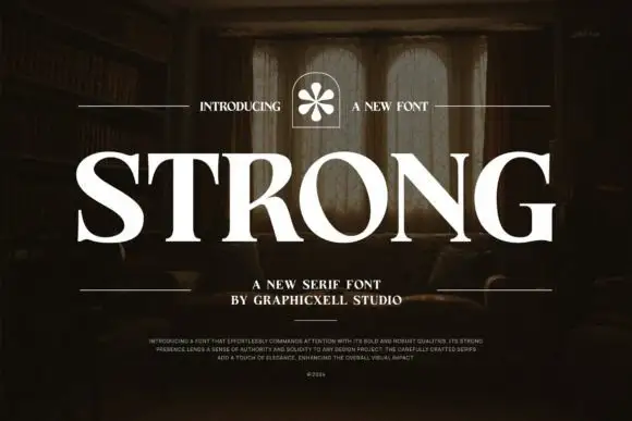 #18
Strong shows white serif capitals with substantial curved stems and fine pointed serifs over a shadowed room, where the O is broad and round, the R carries a thick low diagonal leg and the G finishes in a firm horizontal bar with a small flower badge above the row.
The stems stay thick, the serifs taper to points, the bowls open round and the terminals close flat. That closing bar is the character: the word reads as a bold editorial serif rather than a slab, which is why the sample sits large over an interior photograph. The room and the badge belong to the cover, and the caption claims weight and durability that type cannot promise. Keep 44 pt for a display row and 14 pt for text, and check whether your file carries more than one weight.
A substantial studio-name sign study — Start with flat one-colour lettering above plain service text.
Check name rights and fine serif visibility at distance.
 #19
Bunglon is a modern copperplate script in which the downstrokes carry weight, the hairlines stay fine and generous swashes arch above the x-height and below the baseline, so a single name reads as formal calligraphy.
The B opens a wide upper loop, the bowls swell on the downstroke and thin on the join, the ascenders carry tall loops and the swash set adds long arcs that clear the word above and below. The overhead swashes are the character: they frame a name without a border, which is why the sample sets one couple's name on a plain card. Because the swashes are long, a line needs 20 mm of clearance at both ends, and the joins must be welded before cutting from 1.1 inches of x-height. The pale ground, the fine rules and the small caps line are presentation; the dark calligraphic name is the face.
Save-the-date or thank-you card headline — Use swashed forms sparingly on first and last letters and keep event logistics in a clean serif.
Fine hairlines suit print and foil; thicken with a small offset path if adapting for large vinyl signs.
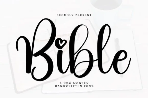 #20
Bible is a smooth, medium-bold modern handwritten script featuring tall looped ascenders ('b', 'l') and an open heart-shaped dot over 'i'.
Bible is a bouncy modern calligraphy script with heart-shaped dots over the i and j: a light-to-medium contrast stroke, a wide oval axis, a soft bounce and a small heart where the tittle would be. The heart is the design and it fills first at small sizes, and the bounce grows the word vertically. It needs roughly 24 mm for the heart dot and the join to read, and it is best in one warm ink on smooth ivory, or a foil impression above 36 pt where the heart still holds its lobes.
Bible-cover HTV name, baptism keepsake & prayer journal — Center a first name or short faith phrase at 3.5–5 inches wide in gold foil HTV on cream or cognac covers.
Weld overlapping lowercase connectors before cutting HTV, and scale above 1.2 in so the tiny open heart counter weeds cleanly.
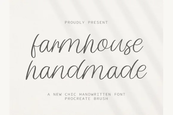 #21
Farmhouse Handmade is a breezy, light-stroke handwritten cursive with tall open ascender loops and relaxed baseline bounce.
Farmhouse Handmade is an airy tall-looped monoline handwritten script: a fine even stroke, very high ascenders that loop twice, wide spacing and long tapered descenders that drop below the baseline. The airy spacing needs a wide measure and the descenders close the line below, so stacked text needs extra leading. It needs roughly 26 mm for the double loop and the fine stroke to read, and it is best in one warm ink on smooth or uncoated stock, or a single dark colour where the thin stroke still carries.
Handmade linen care tag & craft-booth price card — Pair lowercase two-word product titles at 22 pt on unbleached cotton paper with tiny all-caps sans weight and scent notes underneath.
Because every stroke is fine monoline, favor flat printing, rubber stamps, or Cricut fine-point pen drawing over small adhesive vinyl cuts.
 #22
Taught is a heavy, flat-sided condensed sans-serif with tight interior counters and commanding vertical headline presence.
Taught is a bold flat-sided condensed poster grotesk: narrow stems with completely flat sides, tight square counters, a bold weight that holds across a large format and a set of slightly odd terminals that give it a printed poster feel. The flat sides keep a word from looking hand-made, and the counters close when the face is scaled down. It needs roughly 22 mm for the counter and the flat side to read, and it is best in one dense ink on uncoated stock, or a single white on a dark ground.
YouTube thumbnail headline, fitness poster & magazine cover — Set 1-to-4-word uppercase punchlines at 72+ pt with +15 tracking and tight 0.92 line-height over high-contrast backgrounds.
Broad flat stems weed fast on sign vinyl and HTV down to 0.6 inches—zero fragile serifs or hairlines to tear.
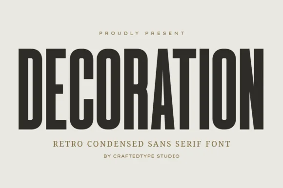 #23
Decoration is a sleek, tall flat-sided condensed sans (narrower and taller than sister font Collection #963!) built for clean architectural posters & labels (OTF/TTF).
Decoration is a tall narrow condensed sans in caps with flat sides, PUA alternates and a compact retro skeleton that reads as architectural signage rather than a modern grotesk. The stems are straight and the counters small, so a long word fits a narrow panel, and the flat sides let the letters sit close without touching. It needs roughly 18 mm for the compact counters to stay open, and it is at its best in one dark ink on a warm neutral ground where the proportions carry the design.
Home-organization pantry & closet bin decal, frame & sign — Set 1 uppercase category word at 56–115 pt with +4 tracking in matte black or white Oracal 651.
100% crisp, straight-line solid strokes cut and weed in seconds on Cricut vinyl and HTV down to 0.6 inches!
 #24
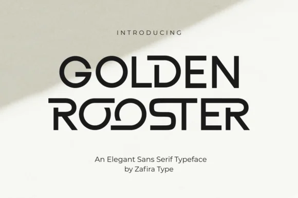
Golden Rooster is a crisp, medium-bold geometric sans-serif distinguished by circular interlocking 'OO' ligatures and sculpted leg curves.
Golden Rooster is a geometric art-gallery sans with interlocking ligature bowls: perfectly circular bowls, straight-sided stems, and a set of ligatures where two round letters share one overlapping arc so the pair reads as a single drawn form. The interlock is the design and it breaks if the pair is tracked apart, and the circular bowls close when the face shrinks. It needs roughly 26 mm for the interlock and the bowl to read, and it is best in one fine ink on a pale ground, or a single dark tone on coated stock.
Modern architecture studio, roastery & lifestyle wordmark — Set brand names in uppercase at 36–60 pt with +20 tracking on raw white cotton stock, letting one ligature pair act as the centerpiece.
Even stroke weight and wide geometric counters weed cleanly on storefront glass vinyl, acrylic signs, and matte packaging labels.
 #25
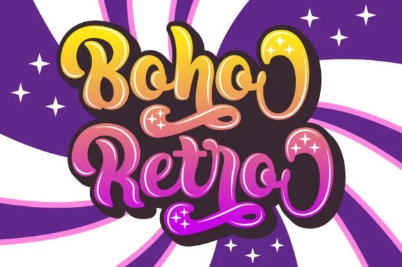
Boho Retro is a plump, heavy-looped 1970s groovy display script with curled swash caps and pillowy connected lowercase bowls.
Boho Retro is a swirled nineteen-seventies psychedelic bubble script-display: fat rounded letters that swell at the waist, joins drawn as spirals and terminals that curl back into the letter like smoke. It is a poster face, so it wants size, two flat inks and a pale ground rather than a busy photograph. The spirals are the finest element and they fill into solid blobs as soon as the face is reduced. It needs roughly 44 mm for the spiral and the swell to read, and it is best two warm flat inks on a light stock.
Retro festival ringer tee & iced-coffee glass wrap — Stack a two-word phrase at a slight upward 6-degree angle and add a contoured offset shadow layer in Cricut or Illustrator if you want the sticker look.
Weld connected lowercase letters before cutting vinyl, and check the tight interior spiral holes inside 'B', 'o', and 'e' when weeding.
 #26
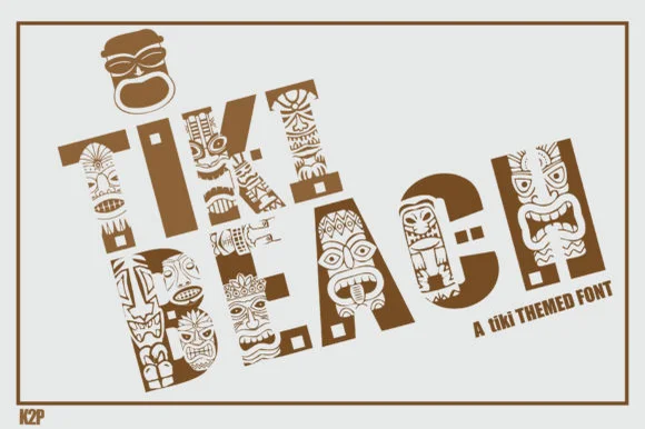
Tiki Beach is an illustrated tropical display font whose chunky block capitals are filled with carved tiki faces, palm-frond chevrons, and tribal motifs.
Tiki Beach is a Polynesian carved-totem and tiki mask display: heavy block letters carved with stacked horizontal grooves, small mask faces set into some counters and a rounded top edge that reads as a carved post. The mask faces are the design and they fill into the stroke once the face is reduced, and the grooves add a carved texture. It needs roughly 34 mm for the mask and the groove to read, and it is best in one dense ink on timber-toned stock, or a routed cut where the grooves become real channels.
Luau party invitation, tiki-bar menu & pool-deck poster — Set 1 or 2 short words large (64–110 pt) in warm teak brown, terracotta, or teal on clean sand-cream cardstock.
Contains dozens of tiny interior pattern cutouts per letter—use Print-Then-Cut, sublimation, or flat print, NOT blade-cut vinyl weeding.
Practical buyer checklist
Key cutting, printing and pairing answers before choosing a quote prints, wall art & affirmations typeface.
300 dpi at the final size, so 2400 by 3000 px for 8 by 10 inches and 5400 by 7200 px for 18 by 24. Anything lower shows visibly soft edges on the lettering when printed.
Two, occasionally three with a small ornament. One script for the phrase and one sans for the attribution is enough, and a third face usually signals that the layout has not been decided.
Optical centring. Scripts and faces with descenders appear low when mathematically centred, so raise the block by about 2 percent of the frame height and check it from a metre away rather than at zoom.
Only the solid script and block faces, at 2 inches or more. Fine connectors and swashes tear during weeding, and large wall quotes are usually easier to apply as transfer-taped sections than as single long lines.
Keep exploring
Explore adjacent maker roundups or check our practical pre-production checklists.
32 curated fonts · Previews & pairings
37 curated fonts · Previews & pairings
24 curated fonts · Previews & pairings
27 curated fonts · Previews & pairings
Guides: Invitation font checklist · Vinyl & cutting checklist · How to pair script & sans fonts
Allow optional Google Analytics to measure visits and catalogue actions. Your search words and notes are not included. Privacy & storage