Neutral Sans Workhorse

Thea + Modern Heritage
Lets Thea own the focal silhouette while handling secondary copy, sizing and subheads cleanly.
Inspect Modern Heritage specimenDisclosure: MakerFileHub may earn a commission from qualifying purchases via paid links on this page. How our links work.
Letters drawn as oscillating audio waveforms with a bright glow along each stroke
Thea is a display alphabet in which every stroke is drawn as an oscillating audio waveform, so a word reads as a signal trace rather than as lettering, with the shape still legible from the amplitude envelope.
Paid link
Get this fontProject & layout blueprintsAt-a-glance maker compatibility
Sturdy stroke walls and open counters weed cleanly on adhesive vinyl, HTV apparel film, and cut cardstock.
Visual anatomy & craft review
Each letter is built from a vertical waveform: the T holds a stiff peak and a wide crossbar, the h rises into a rounded amplitude, the e closes a looped oscillation and the a keeps a small bowl, all traced as thin lines that spike above and below the letter body at a regular frequency. Legibility comes from the envelope rather than the outline, which is why the face needs a generous size — at 40 pt the waveform reads, at 14 pt it turns into noise. The glow in the sample is applied colour, not part of the letterforms, and the underlying alphabet is a single-line trace. Use is narrow by design: titles, panels and event artwork rather than body copy. The dark ground, the spectrum gradient, the bokeh and the two caption lines are presentation; the typeface is the word.
Waveform · Electric · Neon
Two-font hierarchy recipes
Tested contrast partners — pairing Thea with grounded secondary typography.
Thea + Modern Heritage
Lets Thea own the focal silhouette while handling secondary copy, sizing and subheads cleanly.
Inspect Modern Heritage specimen
Thea + Mewah
Grounds bold display lettering with classic typographic authority on posters, badges and apparel.
Inspect Mewah specimenPractical applications
Concrete hierarchy, scale and production guidance tailored to Thea’s stroke geometry.
The waveform reads as a signal and fits the subject, and the trace holds at 60 pt on a sleeve where a normal display face would look borrowed.
Hierarchy & layout recipe
Print a 120 mm square sleeve: set the title at 60 pt across the centre, set the artist in a 10 pt sans at the foot, and keep 12 mm of margin so the tallest spikes stay inside the trim of the sleeve.
Pre-production check
A waveform printed on a matte laminate loses its glow and turns grey; check a proof and reserve the effect for screen or for a fluorescent ink.
The electric trace carries an event poster at 90 pt and reads across a wall, which is what a night's artwork has to do at arm's length.
Hierarchy & layout recipe
Print an A2 poster: set the event name at 90 pt across the upper half, set the line-up in a 14 pt sans below, and keep 25 mm of margin so the spikes never reach the trim on any edge.
Pre-production check
A thin single-line trace over a photograph disappears; check the poster with the image in place and lay a solid panel behind the title.
The trace gives a ticket a distinctive mark at 16 pt, and the single-line construction reads at that size on a small security print.
Hierarchy & layout recipe
Print a 100 by 50 mm ticket: set the event name at 16 pt, set the date in a 6 pt caps sans beneath, and keep 6 mm clear of the perforation so the spikes do not run into the tear line.
Pre-production check
A waveform crossing a perforation tears badly; check the artwork against the tear position and keep the trace fully on one side.
Technical & licence verification
Confirm included OTF/TTF/WOFF formats, full glyph tables and licence coverage on the live store page before batch production.
Closest visual alternatives
Matched across letterform anatomy, stroke behaviour and craft applications.
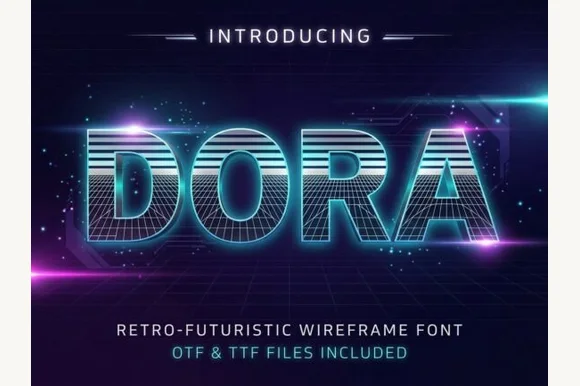
1980s synthwave scanline & 3D wireframe display
Dora is a retro-futuristic 1980s display font combining horizontal CRT scanline faces with built-in 3D wireframe perspective grids.
Ideas for this font
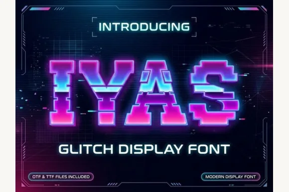
Sliced horizontal glitch pixel caps with displaced rows
Iyas is a pixel capital alphabet in which each letter is sliced into horizontal bands and some bands are displaced sideways, so a word reads as a signal breaking up on a screen.
Ideas for this font
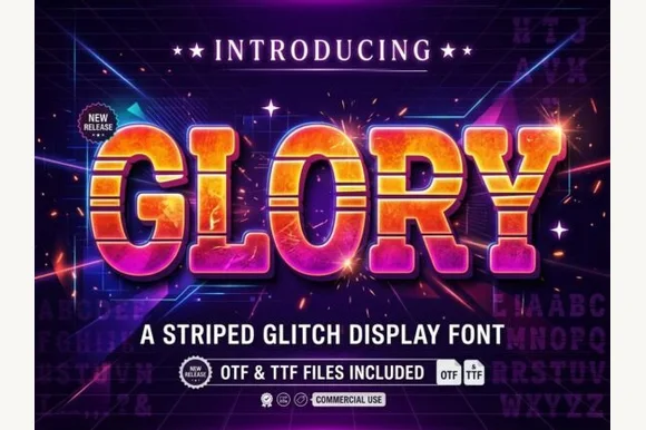
Scanline-striped retrowave block with chunky bevels
Glory is a chunky arcade block in which every letter carries horizontal scanline gaps, so a word reads as a stretched slice of a 1980s title screen rather than as flat lettering.
Ideas for this font
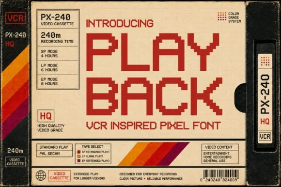
Blocky pixel sans modelled on VHS cassette labelling
Playback is a blocky pixel alphabet modelled on the lettering printed on VHS cassettes, with square pixels, wide spacing and no diagonal or curved detail at all.
Ideas for this font
Same independent foundry
Allow optional Google Analytics to measure visits and catalogue actions. Your search words and notes are not included. Privacy & storage