 #1 · Best Overall
Blackchapel
Spiked black-metal sigil lettering with ragged edges and dripping points
Get fontPaid link
Read review ↓Disclosure: MakerFileHub may earn a commission from qualifying purchases via paid links on this page. How our links work.
Death metal thorns, splintered black metal & drips
Extreme metal lettering is a silhouette problem: the word has to be recognisable while every stem sprouts spikes, roots or flames. Rustic splinters into thorn roots, Blackchapel adds a spiked sigil geometry, and Mortir and Atherna twist blackletter into something closer to a logo than a typeface. Thornveil and Demise keep more of the textura structure for bands that still want words to be read.
Quick verdict
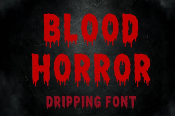
Blackchapel has the cleanest spiked silhouette for merch, Mortir is the pick for a death metal logo, and Thornveil keeps enough textura structure for a readable album title. Blood Horror covers the dripping horror side.
Quick answer
Short on time? Start with our three highest-rated heavy metal, spiked & horror display standouts before scrolling the full breakdown.
#1 · Best OverallSpiked black-metal sigil lettering with ragged edges and dripping points
 #2 · Runner-Up Pick
Twisted thorny death-metal blackletter with hooked spurs and long tails
 #3 · Editor's Choice
Tribal-horned extreme metal face with dripping points and a horned crest
We kept 17 of 171 candidates that build their silhouette from the letterform rather than from a photo texture. Judged on the outer contour's clarity at 4 inches, whether spikes resolve in one colour, and how much of the word remains legible in a thumbnail-sized digital release.
Side-by-side summary
Compare specimens, OpenType/PUA traits and primary project roles side by side.
| Rank & Font | Style & File Specs | Best Project Fit | Store Listing |
|---|---|---|---|
| DecorativeChaotic | Extreme metal band shirt, horror fest poster or haunted flyer | Get fontPaid link | |
| DecorativeBrutal | Dark gaming boss title, metal album cover or skate graphic | Get fontPaid link | |
| DecorativeAlternates & swashes · Language support · File formats | Custom band crest, dark fantasy merch or battle-jacket patch | Get fontPaid link | |
| DecorativeFierce | Underground metal gig flyer or horror zine cover | Get fontPaid link | |
| DisplayAlternates & swashes | Horror movie title card, metal tee or punk zine | Get fontPaid link |
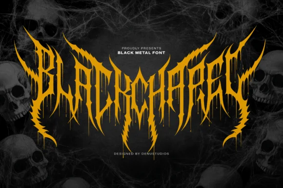
#1 · Best OverallBlackchapel is an extreme-metal sigil face in which the letters merge into a spiked mass, the stems split into thorns and the bottoms run into drips, so a word reads as a band logo rather than as readable type.
The B dissolves into a fan of spikes, the l and the a share stems, the c is a hooked blade and the final flourish reaches past the last letter, all at a heavy weight with edges cut into points. Legibility is deliberately compromised: the face works as a mark at 80 pt and above, where the silhouette reads as a mass with a hint of letters, and it collapses below 30 pt. The drips at the bottom are part of the drawing rather than a treatment, which is why they cannot be removed without redrawing. The dark ground, the yellow ink, the skulls and cobwebs, the small label are presentation; the sigil face is the word shown.
Extreme metal band shirt, horror fest poster or haunted flyer — Keep to 1 short word centred large on black fabric or poster stock.
Strictly for DTF, screen printing and digital art — impossible to weed in vinyl.
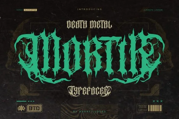
#2 · Runner-Up PickMortir is a death-metal blackletter in which the gothic skeleton is twisted, the stems sprout thorns and the descenders run long, so a word reads as a brutal logotype with blackletter bones still visible.
The M draws as three heavy verticals joined by hooked breaks, the o closes a narrow counter with a thorn on its shoulder, the r keeps a hooked arm and the t carries a spur, all at a heavy weight with pointed terminals and twisted joins. Unlike a fully abstract sigil, the skeleton stays readable: the blackletter structure survives the distortion, which is what lets the face work at 40 mm on a shirt as well as at 100 pt on a cover. The thorns multiply below 30 pt and the face turns into noise. The dark green ground, the teal ink, the mist, the small type blocks are presentation; the display face is the word shown and its caption.
Dark gaming boss title, metal album cover or skate graphic — Set in acid green, blood red or chrome over dark textured backdrops.
Built for print, DTF and digital headers rather than blade cutting.
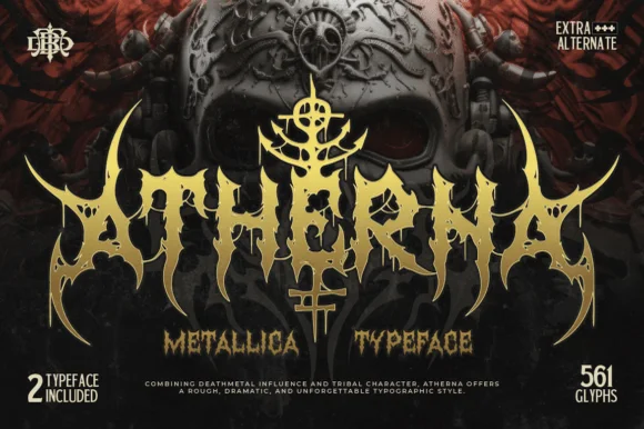
#3 · Editor's ChoiceAtherna is an extreme-metal face in which the letters grow horns and thorns, the joins drip downward and a crest sits above the word, so the mark reads as a tribal sigil rather than as type.
The A rises into two horned peaks, the T loses its bar to a crest, the h dissolves into a fan of thorns and the rest of the word interlocks through shared stems, all at a heavy weight with every edge cut to a point and drips below the baseline. The tribal geometry is the character: the horns curve rather than spike, which is what separates the face from a purely jagged black-metal style while keeping the same mass at 80 pt. Legibility is limited to recognition at large sizes, and the drips belong to the drawing rather than to a treatment. The dark ground, the gold ink, the skull behind, the small badges are presentation; the display face is the word shown and its caption.
Custom band crest, dark fantasy merch or battle-jacket patch — Swap first and last letters with wide horned alternates for crest symmetry.
Designed for screen print, DTF and digital artwork.
 #4 · Top Maker Utility
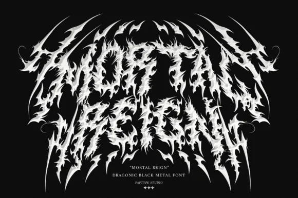
Mortal Reign is a black-metal display face in which the letters are built from flame-like spikes, the word arches upward at both ends and the thorns interlock between letters, so the mark reads as a winged sigil.
The M is drawn as a crown of spikes, the o closes a hollow with a flame on its shoulder, the r carries a hooked blade and the t loses its bar to the surrounding thorns, all at a heavy weight with every edge cut into a point. The arch is the composition: the outer letters rise higher than the middle, which is why the sample reads as a winged emblem rather than a line of type. Legibility is limited to named recognition at 60 pt and above. The black ground, the white ink, the small caps credit beneath are presentation; the display face is the word shown.
Underground metal gig flyer or horror zine cover — Stack two short words tightly in stark white over pure black.
Print, DTF and digital use only.
 #5 · Standout Silhouette
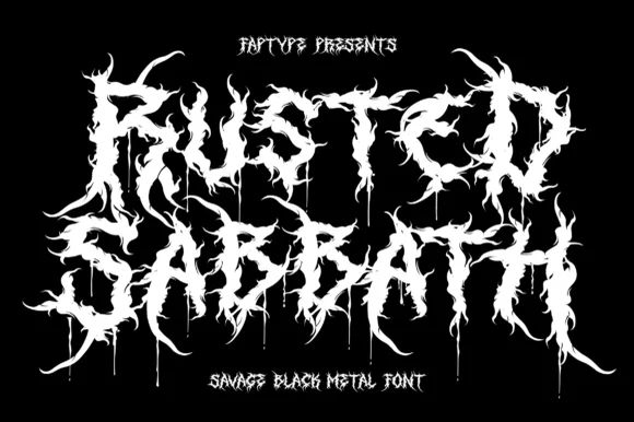
Rusted Sabbath is a black metal display alphabet in which the stems split into spikes, the counters disappear and the tops of the letters run into flame-like hooks, so a band name reads as a sigil before it reads as words.
The R breaks its bowl into three clawed points, the U turns into a fork, the S carries two rows of spikes, the T raises a crown of thorns and the D ends in a dripping tail, all at a skeletal weight with sharp, irregular terminations and no optical spacing at all. The deliberate illegibility is the character: the face is built to be read as an emblem on a patch or a cassette cover, not as text. Because the points are thin, the face needs 60 pt before the spikes print, and it belongs on one colour over black. The framed black field, the small typewriter caps above and the subtitle below are presentation; the spiked band name is the face.
Horror movie title card, metal tee or punk zine — Pair with tiny clean grotesque credits at the bottom margin.
For screen print, DTF and digital graphics.
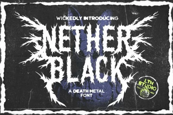 #6
Nether Black is a ferocious death-metal display typeface erupting with symmetrical thorn spikes and splintered outer wings.
Nether Black is a jagged symmetrical death-metal thorn display: dense blackletter-derived stems with spikes thrown from every arm, mirrored ornaments along the vertical axis and a solid inner field that makes each word read as a barbed plate. It is a scene face, so it belongs on a record sleeve and a club flyer rather than on a product label. The spikes are the finest element and they fill into a solid edge when the face is reduced or screened. It needs roughly 40 mm for the spikes and the stems to read, and it is best one white ink on a black ground or the reverse.
Haunted-attraction merch hoodie & horror gig poster — Stack two short 4-to-6-letter words centered on a black garment back, using the winged outer alternates only on the first and last letters.
Skip cut-and-weed vinyl on the razor-fine thorn tips—use DTF transfers, screen printing, or high-resolution poster print instead.
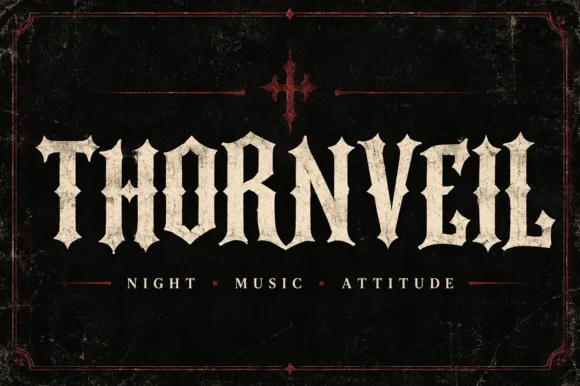 #7
Thornveil is an ornamental gothic blackletter display font combining sturdy Roman-width capitals with sharp side thorns and split fishtail serifs.
Thornveil is an all-caps blackletter built for dark metal and cathedral signage: the stems are dense and vertical, the ascenders split into barbed thorns, the connectors are hairline and the counters are tight enough that a word reads as a black mass with pale slits. The thorns sit on the silhouette and the hairline connectors fail first in print. It needs roughly 36 mm for the thorns and the counters to stay separate, and it is best in one dense black on bone or a single silver on matte black, never reversed at small sizes.
Gothic rock tour poster, dark-ambient cover & club flyer — Center all-caps titles at 54–84 pt above wide-tracked ('NIGHT · MUSIC · ATTITUDE') serif subcaptions.
Tiny inline stem slits and sharp side thorns reproduce best via print, screen print, or DTF rather than small vinyl weeding.
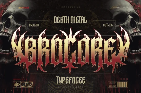 #8
Brocore is an extreme death-metal blackletter family (Regular & Outline) bristling with jagged root spikes, horn canopies, and symmetrical emblem balance.
Brocore is a spiky underground death-metal blackletter in a regular and an outline cut: dense broken strokes with hairline spikes shooting off the shoulders and terminals, a heavy vertical rhythm and counters reduced to thin slits. The spikes are the design and they vanish as soon as the face is printed small or reversed, and they extend the word in all directions. It needs roughly 34 mm for the spike and the slit to read, and it is best in one dense ink on white, or a single white on a black ground where only the spikes survive.
Extreme-metal band logo, festival merch tee & vinyl sleeve — Center a 5-to-8-letter band or brand name at 9–12 inches wide across black heavyweight tees using Regular or Outline.
Razor-thin spike tips require screen printing, DTF transfers, or digital artwork rather than blade-weeded HTV.
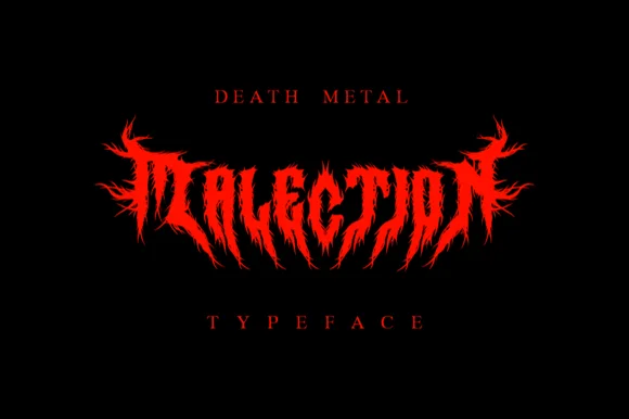 #9
Malection is a ferocious underground death-metal display font sculpting jagged flame-like thorns into symmetrical band-logo arches.
Malection is a symmetrical death-metal display in which the band-name arches flare outward into flame-shaped thorns while keeping a readable central letter core, and the family includes alternate configurations so the silhouette can be tuned. The thorns grow from the outer contour rather than being scattered behind the word, which means the letters remain the anchor and the ornament can be reduced. Heavy cores hold at poster scale; the thorn tips vanish below roughly 20 mm. It is a logo device first and a typeface second, and it should not carry anything but a name.
Extreme-metal band logo, tour hoodie & concert flyer — Arch the bottom baseline slightly upward so outer 'M' and 'N' thorn wings flare like bat wings.
Razor-fine jagged thorns mean you MUST use DTF transfers, screen print, or digital print—never try to weed cut vinyl!
 #10
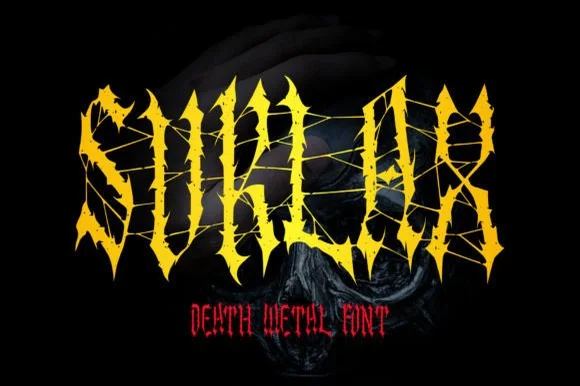
Suklax is a jagged death-metal blackletter stretching cobweb-thin tension threads between heavy, thorn-spiked gothic capitals.
Suklax is a death-metal blackletter variant whose capitals are drawn heavy and thorned, with a broken vertical rhythm and thin tension threads strung between letters like cobweb filaments. The blackletter skeleton is authentic enough to read as gothic, but the spikes and hanging threads push it into horror territory, so it works as decoration as much as text. Thick stems hold at poster scale; the threads vanish below roughly 20 mm and should be treated as ornament, not as part of the word. The face is all but unreadable in long copy, which is appropriate for a title.
Haunted-house merch tee, horror movie poster & cassette — Set short 5-to-8-letter titles in sulfur yellow, slime green, or blood red over pitch black.
Hair-thin web filaments crossing between letters mean print, DTF, or screen print ONLY—never blade-cut vinyl!
 #11
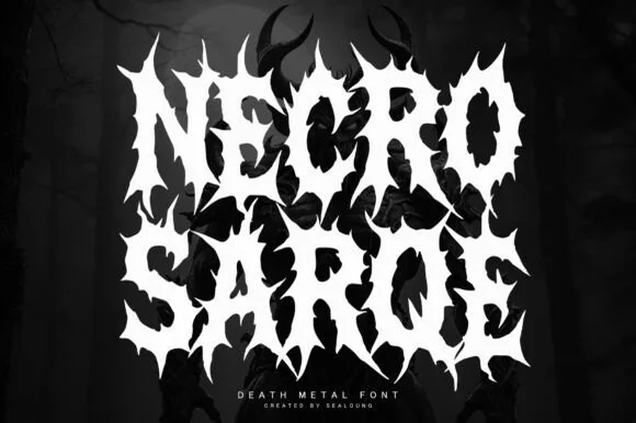
Necrosarqe Regular is a chunky, bone-spiked death-metal blackletter combining thick readable letter cores with aggressive barbed edges.
Necrosarqe is a thick death-metal blackletter in which heavy readable letter cores carry barbed bone spikes along their outer edges, so the word stays legible while the silhouette turns aggressive. The cores are wide and the spikes grow outward, which means the letter is the anchor and the barb can be reduced without destroying the name. Because the fill is heavy, the face reproduces in screen print and vinyl, though the spike tips vanish below roughly 25 mm. It is a logo device for merch, posters and labels rather than a text face.
Oversized vintage-wash metal tee, gym pump-cover & sticker — Stack 2 short 5-letter uppercase words tightly (0.85 leading) across a 12-inch oversized tee front.
Best in white plastisol screen print or DTF transfers on washed charcoal cotton—do not blade-weed.
 #12
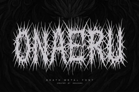
Onaeru is a fierce extreme-metal display font erupting hundreds of needle-fine centipede spikes out of tall condensed capitals.
Onaeru is an extreme-metal display face whose condensed capitals form a readable skeleton inside a dense outward halo of needle-thin centipede spikes. The spikes grow from the stroke edges rather than sitting behind them, so the letter remains the anchor and the bristles are ornament, which means the word survives if the spikes drop out in reproduction. Stylistic alternates change the density of the bristles, letting a designer tune how loud a logo becomes. Below roughly 25 mm the spikes merge into a grey aura, and at that point the face is decoration rather than text.
Grindcore / black-metal LP sleeve, tour poster & patch — Center 1 short 5-to-7-letter title huge in stark white on matte black across balanced outer margins.
Hundreds of needle-fine bristles require high-mesh screen print, DTF, or print—never blade-cut vinyl!
 #13
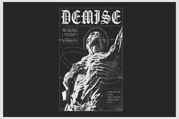
Demise is a razor-chiseled underground gothic blackletter featuring crisp vertical facets and grimdark poster presence.
Demise is a razor-chiselled blackletter with crisp vertical facets and split highlights running down each stem, so the letters read as carved bone rather than ink. The structure is a true gothic skeleton, narrow and tightly spaced, and the facet line is the only decoration, which keeps a word legible at 30 mm. The highlights are thin, so they close below roughly 22 mm and should be treated as size-dependent; the face is a logo and poster device, not a text face, and it wants a dark ground with a cold light ink.
Underground streetwear back-print, metal patch & skate deck — Anchor 1 short all-caps word (4–7 letters) across the top of a ruled brutalist poster grid in bone-white on matte black.
Fine interior facet splits print razor-sharp via screen print, DTF transfers, and zine risograph!
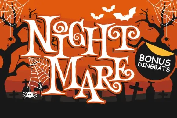 #14
Night Mare is an angular decorative serif in which the letters stay uneven, the feet come to points and the terminals coil inward in tight spirals, so a stacked title reads as gothic horror lettering rather than a clean historical blackletter.
The G and E curl their terminals inward, the T stretches a long bar over neighbouring letters, the feet sharpen to points and the letter heights shift by design. The coiled terminal is the character: it puts the fright in the letterform instead of in added artwork, which is why the sample stacks a tall uneven title. Because the spirals are small, the face wants 36 pt before they resolve, and the points thin out in vinyl under three quarters of an inch of cap height. The extra characters are PUA-encoded, so any swash must be accessed deliberately.
A haunted-story evening poster — Stack two short words above a clean time-and-location block, leaving the long top bars clear.
Confirm required characters and any bonus ornaments before layout approval.
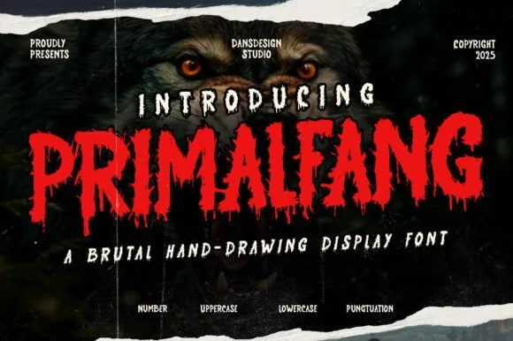 #15
Primalfang is a ragged, hand-brushed horror display typeface with torn upper fangs, uneven baselines, and dripping beast-claw terminals.
Primalfang is a gnarled claw-slashed horror brush display: heavy strokes drawn with a split brush so the edges fray into claws, three parallel slash cuts through some counters and a rough spatter that reads as an animal strike. The slashes are the design and they fill into solid notches when the face is reduced. It needs roughly 32 mm for the slash and the claw edge to read, and it is best in one dark ink on white, or a single blood red on a matte dark ground.
Werewolf party invite, haunted-trail sign & horror tee — Set single-word titles in oversized crimson capitals across pitch-black backgrounds, flanked by stark white subcopy.
Main letter bodies are thick enough for 1.5 in+ sign vinyl or HTV, though DTF and print preserve the sharpest jagged tips.
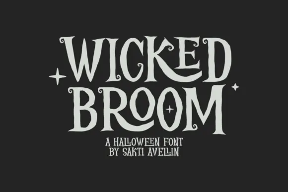 #16
Wicked Broom shows tall narrow serif capitals with irregular pointed ends and tiny spiral terminals, where the R leg curls broadly beneath its neighbour and the O stays a long oval rather than rounding out.
The caps compress tall, the ends taper to points, small spirals finish several strokes and one leg sweeps under the following letter. The spiral terminal is the character: it gives a narrow cap row a gothic flourish without a picture, which is why the sample keeps to a short seasonal name. Because the spirals are the thinnest part, keep 30 pt as the floor, and keep 20 mm of clearance below where a leg curls past the baseline. The spirals are the thinnest strokes: they snap in foil and close below about 30 pt, and a leg that sweeps under the next letter needs 20 mm of clearance below the baseline.
A story-night poster — Stack two title lines on a plain dark panel above clear event details.
Check the R and K curls against adjacent letters.
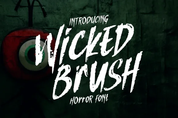 #17
Wicked Brush is a rough brush script in which the strokes tear at the edges, the letters lean forward and the joins break, so a two-word title reads as something scrawled on a wall in a hurry.
The W drags two dry strokes into a point, the i keeps a light dash, the c opens a ragged crescent, the k breaks two diagonals and the d drops a torn bowl, all at a brush weight with inconsistent edges and a hard forward slant. The dryness is the character: the brush runs out of paint mid-stroke, which is why the sample sets two words at large size over a dark ground. Because the edges are ragged, the face needs 40 pt before the texture reads as a brush and not as a bad print, and it prints best in one light colour on a dark ground. The green wall, the painted eye, the dripping mark and the small caps above and below are presentation; the white brush words are the face.
Haunted trail poster, thriller cover or Halloween party flyer — Angle headlines 8–10 degrees upward in stark white or blood red over black.
Ragged dry-brush edges are built for print, DTF and digital posters — not blade vinyl.
Practical buyer checklist
Key cutting, printing and pairing answers before choosing a heavy metal, spiked & horror display typeface.
The spikes eat the counters. Once the gaps between stems close, word shape collapses and the reader has to identify each letter separately. Above 2 inches, or on a poster, the geometry works; at 40 px on a phone it does not.
Only the structural variants with thick spikes. Textured faces carry hundreds of small detached specks that cannot survive weeding. Choose a clean silhouette and cut at 3 inches or more for band merch.
Many ship capitals only, because the genre uses logo-style all-caps. Where lowercase exists it is often a smaller capital. Plan artwork for all-caps wordmarks so the set never runs out of glyphs.
Black metal styles tend to be thin, symmetrical, spiked and close to a sigil, while death metal lettering is heavier, asymmetric and often based on twisted blackletter. Horror adds drips, slime and organic shapes instead of thorns.
Keep exploring
Explore adjacent maker roundups or check our practical pre-production checklists.
26 curated fonts · Previews & pairings
31 curated fonts · Previews & pairings
18 curated fonts · Previews & pairings
21 curated fonts · Previews & pairings
Guides: Invitation font checklist · Vinyl & cutting checklist · How to pair script & sans fonts
Allow optional Google Analytics to measure visits and catalogue actions. Your search words and notes are not included. Privacy & storage