Neutral Sans Workhorse

Side Hustle + Bareum
Lets Side Hustle own the focal silhouette while handling secondary copy, sizing and subheads cleanly.
Inspect Bareum specimenDisclosure: MakerFileHub may earn a commission from qualifying purchases via paid links on this page. How our links work.
Soft contrast display with curled feet
Side Hustle is a soft contrast display in charcoal on a warm off-white sheet: mixed case with rounded stems, gently curled lower feet and a slight contrast between thick and thin, set in two lines with a small italic line above and a plain italic line beneath.
Paid link
Get this fontProject & layout blueprintsAt-a-glance maker compatibility
Sturdy stroke walls and open counters weed cleanly on adhesive vinyl, HTV apparel film, and cut cardstock.
Visual anatomy & craft review
The plate is deliberately plain: two words at a size where the curled feet read, a small line above and a line beneath, all in the same ink. The drawing is a soft display with a slight contrast and rounded stems, and the curl on the lower feet is the detail that keeps it from looking like a rounded grotesque, so the face reads as friendly rather than as neutral. That construction sets a moderate size floor, because the curls close first. The two small lines are product copy set in a companion italic, which is a useful hint that the family has more than one cut. It suits a label, a card and a sign for a small business, and it holds at a range of sizes rather than only at display scale.
Display, soft, contrast, friendly
Two-font hierarchy recipes
Tested contrast partners — pairing Side Hustle with grounded secondary typography.
Side Hustle + Bareum
Lets Side Hustle own the focal silhouette while handling secondary copy, sizing and subheads cleanly.
Inspect Bareum specimen
Side Hustle + Auretha
Grounds bold display lettering with classic typographic authority on posters, badges and apparel.
Inspect Auretha specimenPractical applications
Concrete hierarchy, scale and production guidance tailored to Side Hustle’s stroke geometry.
A soft display label reads as a small business, and the curled feet give a short name some character on a small die. The curls give a short name character.
Hierarchy & layout recipe
Print a 55 by 80 mm label: the cart at 13 pt, the drink at 8 pt, and the price at 7 pt. Keep 5 mm inside the die, keep the curls above 0.4 mm and leave 4 mm at the foot for the address.
Pre-production check
Check the 13 pt cart name on a small die, where a curl can fill; keep it above 0.4 mm. Confirm the 7 pt price reads at arm's length and that the label wipes clean.
A friendly display sets a warm card, and the two lines can carry a greeting and a detail without a second face. The two lines carry a card.
Hierarchy & layout recipe
A6 card: the greeting at 26 pt, the details in a 9.5 pt sans, and the date at 8.5 pt. Keep 15 mm margins, print one ink on a cream card and leave 12 mm at the foot for the sender line.
Pre-production check
Check the 26 pt greeting at home-print resolution, where a curl can close; keep it above 0.8 mm. Confirm the 9.5 pt details keep a 4.5:1 contrast and that the card folds flat.
A soft display sign reads as a maker rather than a chain, and the rounded stems hold across a lane of tables. It reads as a maker's sign.
Hierarchy & layout recipe
A3 board: the stall at 70 mm cap height, the prices in a 24 mm sans, and one ink on a white board. Keep 25 mm margins and finish with a matte lacquer.
Pre-production check
Check the board at three metres, where a curled foot can read as a smudge; keep the contrast inside the letter. Confirm the prices read at two metres and that the lacquer dries clear.
Technical & licence verification
Confirm included OTF/TTF/WOFF formats, full glyph tables and licence coverage on the live store page before batch production.
Closest visual alternatives
Matched across letterform anatomy, stroke behaviour and craft applications.
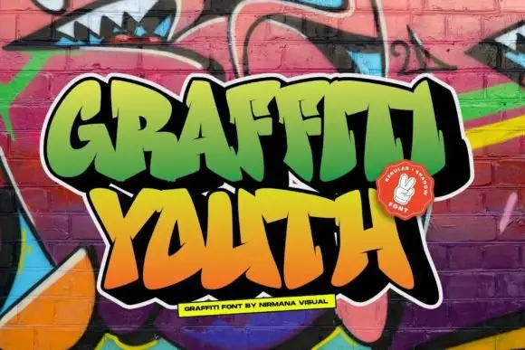
Broad graffiti capitals with sharp projecting joins
Graffiti Youth shows dense irregular capitals with angular tips, slanted crossbars and closely fitted side strokes, and the lower word leans and spreads differently from the upper row.
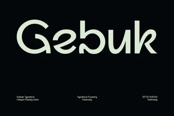
Rounded open forms with a curling G interior and a turned-in b terminal
Gebuk centres pale green lettering on black, where the G carries a large circular outer curve and a hooked interior, the b ends in an inward curl near the baseline, the e opens diagonally and the k uses a curved upper arm beside a straighter leg.
Ideas for this font
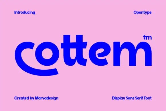
Heavy rounded lowercase with a sweeping c foot and closely joined double-t crossbars
Cottem sets a bold grotesque in lowercase, then lets the c break out of the line and sweep under the whole word as a flat curved tail, which turns a plain sans into a mark.
Ideas for this font
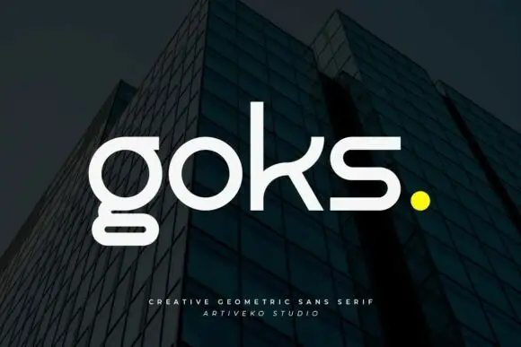
Geometric lowercase with circular o, rectangular lower g loop and curved k arm
Goks is a geometric sans with lowercase forms drawn from circles and straight lines, flat-cut terminals, and a g whose descender drops as a straight stem and stops on a horizontal bar.
Ideas for this font
Same independent foundry
Allow optional Google Analytics to measure visits and catalogue actions. Your search words and notes are not included. Privacy & storage