
Very heavy rounded sport slab capitals
Chicago Titans
Chicago Titans pushes slab weight to its limit: thick stems, counters narrowed to slots, wide flat feet and almost no space left between the letters of a word.
Ideas for this font
Athletic, woodblock & bracketed slabs
Three hundred and sixty-two slab serifs, weighted heavily towards varsity and team lettering. This is the archive for jerseys, pennants, campus posters and anything that needs a blunt, confident rectangle.
Letterform anatomy
Three checks worth running on any specimen before you compare prices.
A slab serif is defined by the junction between stem and serif. Bracketed slabs soften the join and read traditional or typewriter-adjacent, while unbracketed slabs sit on the baseline as a hard rectangle and read athletic or industrial. Inline and shadow variants repeat the same rectangle at a smaller offset, which is why varsity faces can be layered into two-colour cuts.
324 fonts (sorted by maker demand)Page 1 of 14
Very heavy rounded sport slab capitals
Chicago Titans pushes slab weight to its limit: thick stems, counters narrowed to slots, wide flat feet and almost no space left between the letters of a word.
Ideas for this font
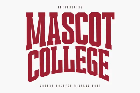
Very condensed collegiate slabs with tall stems and flat feet
Mascot College is a very condensed collegiate slab in which the stems run tall, the slabs are flat and thin and the counters close to slits, so a long name fits one line on a narrow format.
Ideas for this font
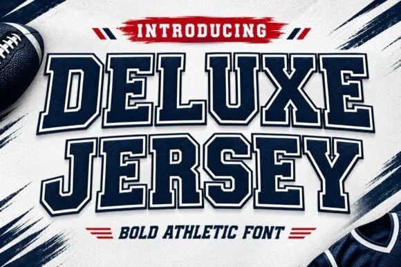
Inline-bordered collegiate varsity block slab
Deluxe Jersey is a classic double-outlined collegiate varsity slab serif built for athletic chests, senior jerseys, and team banners.
Ideas for this font

Broad angular baseball slabs with wedge serifs and a tight fit
Baseball Athlete Jersey is a broad slab capital alphabet with wedge serifs, angular bowls and a tight fit, drawn so a word reads as a sewn athletic letter rather than as a sports headline.
Ideas for this font
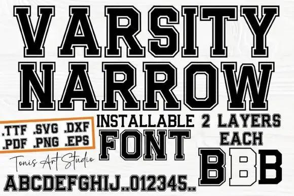
Narrow outlined varsity slabs with clipped corners and an inner border
Varsity Narrow is a narrow athletic slab in which the capitals compress, the corners clip, the O turns an octagonal counter and a fine inner border runs inside the letter, so a long team name fits a narrow board.
Ideas for this font
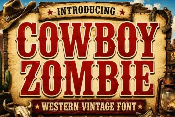
Tall Western slab capitals with inward midline notches and heavy angled strokes
Cowboy Zombie is a tall Western slab in which the serifs block wide, the midlines notch inward and the O closes to a narrow vertical slot, so a two-word title reads as a painted frontier board.
Ideas for this font
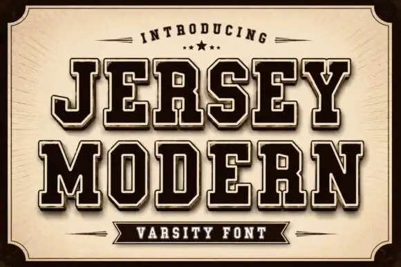
Broad angular outlined jersey capitals with heavy inner fills
Jersey Modern is a broad angular jersey alphabet drawn as an outline with a heavy inner fill, built for stacked two-line athletic lockups and large garment prints.
Ideas for this font
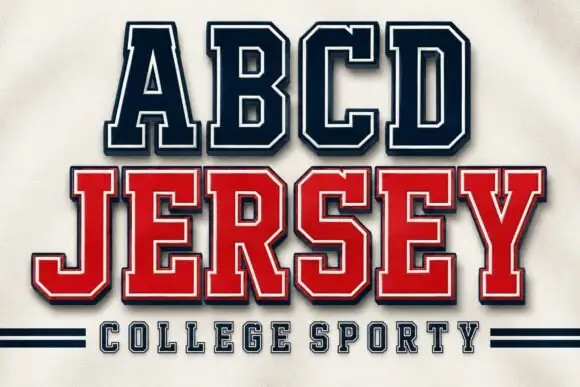
Squared collegiate capitals with an inner border and a shadowed second line
Abcd Jersey is a squared collegiate capital alphabet with an inner border, drawn so a two-line design can carry a light top line and a heavy bottom line in one family.
Ideas for this font
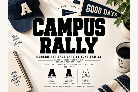
3-style collegiate varsity slab family (Regular, Condensed & Outline)
Campus Rally is a crisp, clean 3-style collegiate varsity slab family bundling matched Regular, Condensed, and Outline cuts.
Ideas for this font
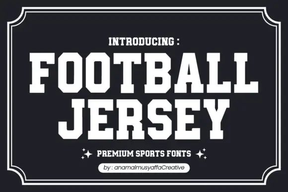
Solid athletic capitals with clipped corners and square slab ends
Football Jersey presents solid white athletic capitals on charcoal inside a double frame, where the O bowls have cut-off corners, the T and J carry broad rectangular terminals and the two rows keep an even dense rhythm with almost no space between the letters.
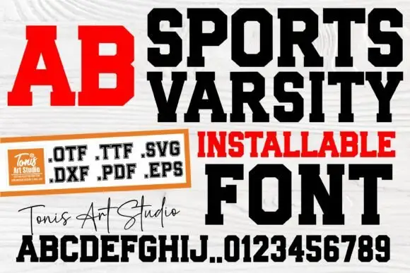
Condensed varsity slab with heavy blocks
Sports Varsity is a varsity slab in black and red on white wood: heavy condensed capitals with flat serifs, shown as a headline, a red two-letter block, a full alphabet with digits, and a handwritten studio signature.
Ideas for this font
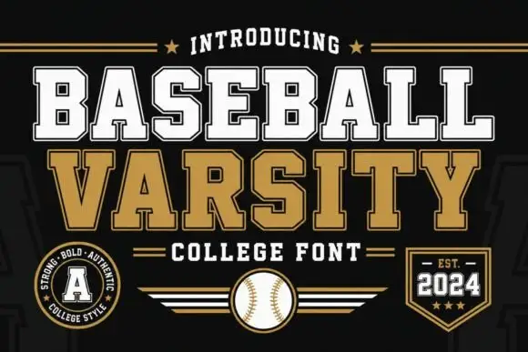
Layered varsity slab capitals with an arc
Baseball Varsity builds its two words out of heavy slab capitals with a dark offset shadow and a white inline, stacking them on a shallow arc above a ruled band and a round badge.
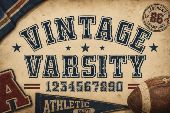
Weathered outlined college capitals
Vintage Varsity is a weathered collegiate display in navy outline on aged tan paper: arched capitals, double-line letterforms and a printed wear that leaves speckles across the strokes.
Ideas for this font
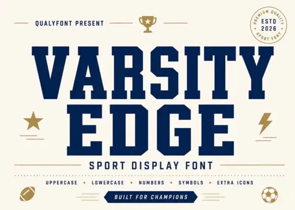
Solid angular varsity blocks
Varsity Edge is a heavyweight collegiate display: wide slab-serifed capitals with flat tops and feet, tight spacing and squared counters, set navy on cream with a set of sport icons around it.
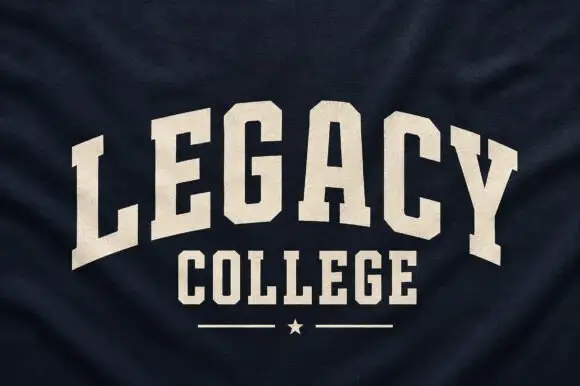
Narrow solid college capitals
Legacy College is a narrow solid college block in cream on navy heather fabric: the word is arched over a straight second line, with a rule and a star closing the composition.
Ideas for this font
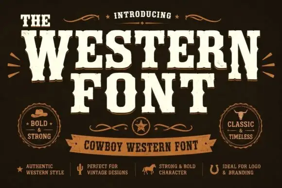
Heavy western capitals with pinched sides
The Western is a heavy western display in cream on dark brown: tall capitals with pinched waists, wedge serifs and a rough printed edge, laid out with a ribbon banner and two round badges.
Ideas for this font
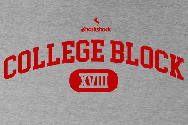
Clean narrow collegiate slab capitals with angled cuts and no lowercase
College Block is a condensed collegiate slab in capitals only, with heavy rectangular serifs, angled cuts and tight counters, built to be set on an arc across a garment.
Ideas for this font
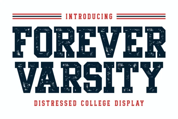
Distressed collegiate block capitals with heavy slabs and worn edges
Forever Varsity is a collegiate block alphabet with heavy slabs, tight fitting and a speckled wear texture, so a word reads as a print pulled off a worn athletic screen.
Ideas for this font
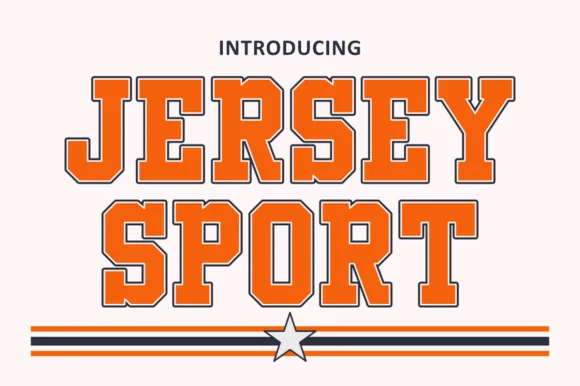
Outlined collegiate sports slab with a flat fill and a thin keyline
Jersey Sport is a collegiate slab alphabet drawn as an outline with a flat fill inside it, so a word reads as a printed athletic front where the keyline does the work and the fill carries the colour.
Ideas for this font
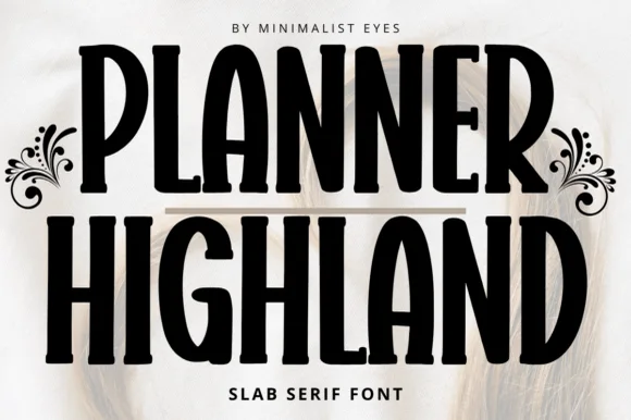
Tall friendly rounded planner slab
Planner Highland blends tall, space-saving condensed proportions with warm, softly rounded slab serifs, built for KDP covers, journals and labels where the high vertical efficiency lets longer section titles fit neatly into narrow planner columns and pantry labels.
Ideas for this font
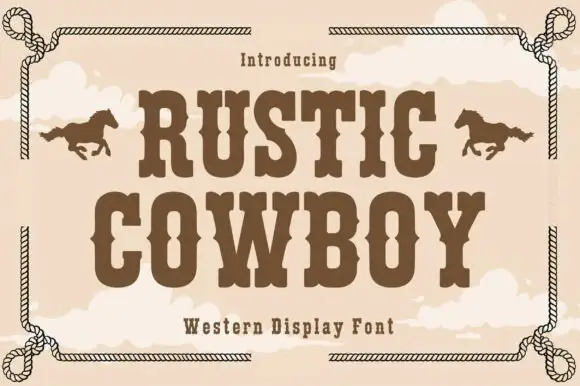
Condensed western display with a rope frame
Rustic Cowboy is a condensed western display in brown on tan: spurred slab letters with small wedge serifs inside a drawn rope border, with a galloping horse on either side.
Ideas for this font
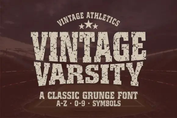
Condensed athletic capitals with cracked wear and heavy flat slabs
Vintage Varsity is a condensed athletic capital alphabet with heavy flat slabs and a cracked wear texture, so a short word reads as a printed team jersey from decades ago.
Ideas for this font
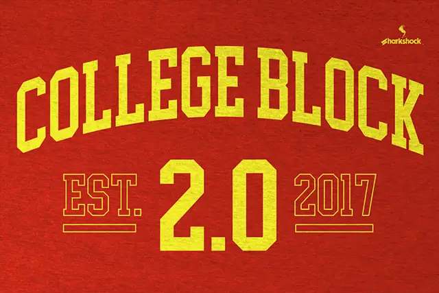
Athletic block capitals with clipped corners and solid or hollow cover treatments
College Block 2.0 displays yellow block lettering on textured red, where the main title curves upward across a shallow arc and EST. and 2017 appear as thin hollow outlines beside a much larger solid 2.0 with clipped corners.
Ideas for this font
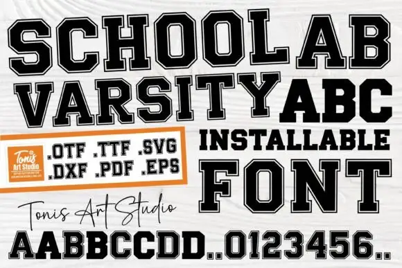
Solid and inset-bordered college blocks
School Varsity is a college block face built as two layers, an outer black letter and a white inset, supplied as font and cut files: OTF, TTF, SVG, DXF, PDF and EPS.
Ideas for this font
Production reality
Team lettering is usually cut at shirt scale, so check the joins. Where an inline or shadow variant runs close to the outer contour, a blade has almost no material to hold, and the fine line lifts during weeding. In that case cut the shadow layer separately and align it by eye.
Because the standard athletic look is built from a fill, an outline and a shadow rather than from one drawn shape. Each layer is cut in a different colour and stacked, which is why a jersey number needs the layers aligned precisely or the depth looks uneven.
Around one inch of cap height for a moderate slab, and closer to two inches for an inline or shadow variant. Below that, the flat serifs blur together and the counters fill in once the vinyl is weeded and transferred.
Allow optional Google Analytics to measure visits and catalogue actions. Your search words and notes are not included. Privacy & storage