Neutral Sans Workhorse

Spooky + Base Edge
Lets Spooky own the focal silhouette while handling secondary copy, sizing and subheads cleanly.
Inspect Base Edge specimenDisclosure: MakerFileHub may earn a commission from qualifying purchases via paid links on this page. How our links work.
Playful Halloween display with a face
Spooky 5 is a playful Halloween display in black with a white outline and a built-in face: the two O letters become green eyes under a brow, a wide toothy smile runs beneath the word, and the whole lockup is festooned with bats, spiders, a black cat and a crow.
Paid link
Get this fontProject & layout blueprintsAt-a-glance maker compatibility
Cut solid base, outline, and shadow layers in separate vinyl colors and align on registration marks.
Visual anatomy & craft review
The word is set as a character rather than as a line of type: the letters are fat and rounded with thick stems and generous counters, and the two O's are drawn as eyes with green irises and highlights, while a curved smile with square teeth is attached below the baseline. White outlines separate the black letterforms from the misty forest behind, and a series of small illustrated creatures perch on the letters, so the specimen reads as a finished Halloween graphic. The letterforms themselves are a rounded display with a slight bounce and irregular heights, which keeps the face usable for other words even without the face illustration, though the sample is honest that its strength is the character. The ground is a foggy wood with pumpkins and a fence, and the caption at the foot is a small tracked sans.
Playful, seasonal, illustrated, characterful
Two-font hierarchy recipes
Tested contrast partners — pairing Spooky with grounded secondary typography.
Spooky + Base Edge
Lets Spooky own the focal silhouette while handling secondary copy, sizing and subheads cleanly.
Inspect Base Edge specimen
Spooky + Resquel
Grounds bold display lettering with classic typographic authority on posters, badges and apparel.
Inspect Resquel specimenPractical applications
Concrete hierarchy, scale and production guidance tailored to Spooky’s stroke geometry.
A playful character face appeals to children without being frightening, and the illustration is built into the word so the poster needs no other artwork.
Hierarchy & layout recipe
A3 portrait: the word at 120 mm cap height with the white outline kept at 4 mm, the details in an 18 mm sans, and the pumpkins left in the lower corners. Keep the eye letters on the darkest part of the ground so the green reads.
Pre-production check
Check the white outline at 4 mm on the printed poster, where it must stay even around the smile; inspect at full size. Confirm the 18 mm details read at three metres and that the illustrations do not cover any of the letterforms.
A character display turns a birthday card into a small illustration, and because the joke is in the letterforms the card needs no separate drawing.
Hierarchy & layout recipe
A6 card: the word at 36 pt with a 1.5 mm white outline, the name and age in a 9 pt rounded sans beneath, and two small bats at the corners. Keep 10 mm margins and print on a dark card so the outline does the contrast work.
Pre-production check
Check the 36 pt word on a dark card stock, where a 1.5 mm outline can disappear at the thin joins; keep the outline at 2 mm for print. Confirm the 9 pt name reads and that the smile does not sit below the card's trim.
A playful face display attracts attention in a corridor while staying appropriate for a school audience, which a horror-styled gothic would not.
Hierarchy & layout recipe
A4 print: the word at 60 mm, the date and time in a 14 mm sans, and the ticket price at 8 mm. Keep the card to two colours plus the green eyes so a school photocopier can reproduce it.
Pre-production check
Check the reproduction on a school copier, where the green eyes can print as grey and the face loses its point; test one copy first. Confirm the 8 mm price reads at arm's length and that the outline survives the copier's contrast.
Technical & licence verification
Confirm included OTF/TTF/WOFF formats, full glyph tables and licence coverage on the live store page before batch production.
Closest visual alternatives
Matched across letterform anatomy, stroke behaviour and craft applications.
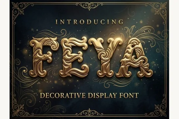
3D embossed Baroque gold acanthus-filigree ornamental font (OTF & TTF)
Feya is actually an ornate 3D-shaded Baroque acanthus-scrollwork display font—NOT a rough woodblock print or casual handwriting despite seller copy!
Ideas for this font
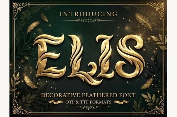
3D sculpted golden swan-feather & angel-plume ornamental font (OTF & TTF)
Elis sculpts majestic capitals entirely out of layered, curved golden swan feathers and avian plumes (OTF & TTF)!
Ideas for this font
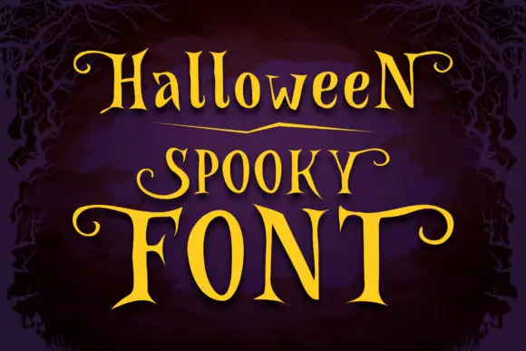
Narrow spooky serifs with curled ends
Halloween Spooky shows tall high-contrast letters with pointed serif tips and long curling terminals, and the enlarged F and T extend horizontally across the lowest word of the composition.
Ideas for this font
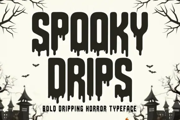
Bold dripping horror display
Spooky Drips is a bold dripping display in near-black on a bone ground: very heavy condensed letters with long viscous drips running from the baseline and the counters, flat terminals and a squared top, framed by bare branches and a row of haunted houses along the foot.
Ideas for this font
Same independent foundry
Allow optional Google Analytics to measure visits and catalogue actions. Your search words and notes are not included. Privacy & storage