 #1 · Best Overall
Disclosure: MakerFileHub may earn a commission from qualifying purchases via paid links on this page. How our links work.
Celestial ornament, marquee bulbs & champagne serifs
18 Best New Year's Eve, Countdown & Gala Fonts
New Year's Eve design has one job: look like an occasion at night. Velvet Midnight and Lunar Countdown bring opulent celestial ornament, New Year and Christmas Nightfall keep the formal high-contrast serif register, and Festive Lights reproduces the Broadway marquee bulb look. Midnight Sparkle Duo and Happy New Year Duo supply the script-plus-sans pairs that invitations usually need.
Quick verdict
Velvet Midnight is the strongest opulent display for a gala invitation, Festive Lights is the pick for a marquee-style sign, and Midnight Sparkle Duo covers the invitation suite. New Year is the most readable formal serif in the set.
Quick answer
Top 3 New Year's Eve, countdown & gala picks right now.
Short on time? Start with our three highest-rated New Year's Eve, countdown & gala standouts before scrolling the full breakdown.
#1 · Best Overall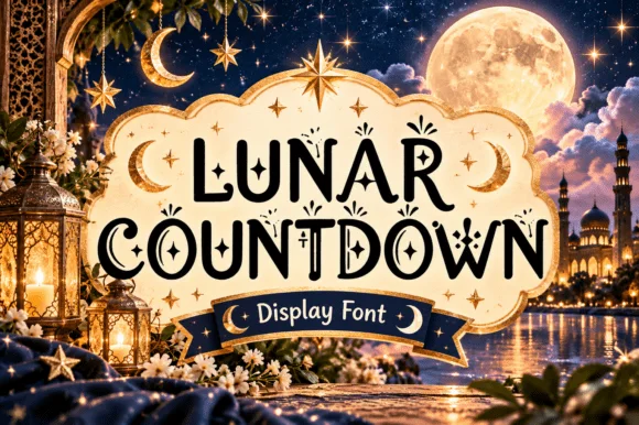 #2 · Runner-Up Pick
Lunar Countdown
Celestial crescent-moon & star ornamental display serif
Get fontPaid link
Read review ↓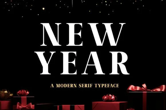 #3 · Editor's Choice
How we tested & selected these 18 fonts
We kept 18 of 114 candidates after checking each against a dark ground, since that is where every New Year design lives. Weighted ornament legibility at 18 pt, how the serif reads in reversed white, and whether a duo provides both invitation faces.
Side-by-side summary
Top 5 New Year's Eve, countdown & gala picks at a glance.
Compare specimens, OpenType/PUA traits and primary project roles side by side.
| Rank & Font | Style & File Specs | Best Project Fit | Store Listing |
|---|---|---|---|
| SerifNocturnal-luxury | New Year's Eve gala invitation, tarot box & velvet menu | Get fontPaid link | |
| SerifAlternates & swashes | New Year's Eve invite, Ramadan lantern box & Eid card | Get fontPaid link | |
| SerifDignified | Corporate holiday card, winter sale banner & wine label | Get fontPaid link | |
| Slab SerifFriendly | New Year resolution board, champagne tag & family tee | Get fontPaid link | |
| SerifPUA encoded · Alternates & swashes | Foil holiday gala invite, Christmas Eve menu & velvet box | Get fontPaid link |
Serifs & Slab Serifs
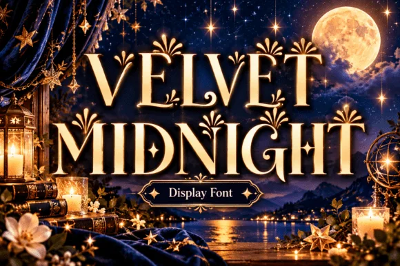
6 fonts#1 · Best OverallVelvet Midnight
Velvet Midnight is a high-contrast ornamental display serif embellished with curled teardrop hooks, diamond sparkles, and moonlit palace drama.
Velvet Midnight is an opulent celestial baroque display serif: heavy stems with fine curled serifs, a moon-phase ornament set into the crossbars, small stars scattered along the diagonals and a swash that trails from the first letter. The ornaments sit on the silhouette, so the word grows in both directions, and the stars are the finest element. It needs roughly 36 mm for the moon and the stars to read, and it is best in one gold ink on deep navy or black, or a fine foil above 50 pt where the curls stay sharp.
Recommended project & layout
New Year's Eve gala invitation, tarot box & velvet menu — Stack 2 centered uppercase lines at 54–88 pt in gold foil over midnight navy, plum, or black cardstock.
Before you cut or print
Delicate hairline crossbars and tucked star accents are crafted for print, foil stamping, and digital covers—not small cut vinyl.
Best paired with
Get fontPaid link
#2 · Runner-Up PickLunar Countdown
Lunar Countdown is a storybook ornamental display serif embellished with tucked crescent moons, dangling stars, and curled spiral terminals.
Lunar Countdown is a celestial display serif with crescent moons and stars worked into the caps: bracketed heavy stems, a crescent cut into the bowl of the round letters and a small star cluster replacing the dot and some terminals. The ornaments are integral to the letter, so they vanish rather than thin out at small sizes. It needs roughly 32 mm for the crescent and the star to read, and it is best in one midnight ink on cream, or a fine gold on a deep navy where the crescents print in reverse.
Recommended project & layout
New Year's Eve invite, Ramadan lantern box & Eid card — Stack 2 centered uppercase words inside an arched frame in midnight navy or gold foil over cream cardstock.
Before you cut or print
Main serif bodies are substantial, while tiny hanging star accents reproduce cleanest in print, foil, or 2 in+ decals.
Best paired with
Get fontPaid link
#3 · Editor's ChoiceNew Year
New Year (by Umitype) is a clean, dignified high-contrast modern Roman serif with flared wedge brackets and crisp holiday authority.
New Year by Umitype is a high-contrast formal Roman serif with flared wedge brackets, strong vertical pillars and crisp small serifs, so a word reads as an engraved invitation or a newspaper masthead rather than a festive display. The hairlines are delicate against the pillars, which means the face needs size and a smooth stock, and the wide caps fill a panel with a short word. It needs roughly 28 mm for the wedge brackets to read, and it is best in snow white on a dark ground or as a fine foil on ivory.
Recommended project & layout
Corporate holiday card, winter sale banner & wine label — Stack 2 centered uppercase words at +20 tracking in white or gold foil above smaller tracked serif sublines.
Before you cut or print
Clean solid strokes print razor-sharp at 14 pt+ and cut cleanly on 1 in+ storefront window vinyl.
Best paired with
Get fontPaid link
 #4 · Top Maker Utility
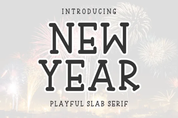
New Year
New Year (by Letterayu) is a clean, hand-drawn uppercase slab serif with softly rounded terminal balls and cheerful, easy-cutting proportions.
New Year is a hand-drawn uppercase slab serif with softly rounded terminal balls, tall narrow capitals and easy-cutting proportions that read as a cheerful poster rather than a stern headline. The drawing shows in the inked curves, so the face keeps warmth at large sizes, and the narrow forms fit a long word in a single column. It needs roughly 28 mm for the rounded terminal balls to read, and it is best in charcoal on a pale ground or in one colour on kraft.
Recommended project & layout
New Year resolution board, champagne tag & family tee — Stack 2 centered uppercase lines at 54–96 pt with +12 tracking above wide-spaced sans subtext.
Before you cut or print
Zero thin hairlines or distress holes—cuts cleanly on HTV, permanent vinyl, and cardstock down to 0.6 inches.
Best paired with
Get fontPaid link
 #5 · Standout Silhouette
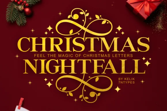
Christmas Nightfall
Christmas Nightfall is a classic, high-contrast ornamental holiday serif crowned with elaborate top-and-bottom gold scrollwork flourishes.
Christmas Nightfall is an opulent holiday display serif with symmetrical filigree swashes: heavy bracketed stems, high thin-thick contrast and a pair of mirrored flourishes that curl off both sides of the word like an engraved frame. The filigree is the design and it closes into a blot as soon as the face is reduced, and the symmetry fixes the block's width. It needs roughly 34 mm for the filigree and the hairline to read, and it is best in one fine gold on a deep ground, or a dense ink on cream with a spot varnish.
Recommended project & layout
Foil holiday gala invite, Christmas Eve menu & velvet box — Insert a narrow tracked sans subline ('FEEL THE MAGIC' or family year) cleanly between the two stacked serif rows.
Before you cut or print
Delicate spiral tendrils and tiny star accents shine in gold foil stamping, print, and sublimation rather than small cut vinyl.
Best paired with
Get fontPaid link
 #6
Resquel
Resquel is an expressive high-contrast editorial serif featuring sweeping ribbon under-tails, interlocked ligatures, and star-sparkle counters.
Resquel is a high-contrast editorial serif in caps with sweeping ribbon under-tails beneath the R and Q, interlocked ligatures and star-sparkle detail cut into the Q counter. The tails extend far past the word, so a layout needs base and side room, and the hairlines need roughly 28 mm before they hold. It is a cover and label face with a celestial register, best in one bone or metallic ink on a deep slate ground, and it is deliberately impractical for long copy.
Recommended project & layout
Luxury cosmetics carton, jewelry pouch & tarot deck box — Center 1 uppercase brand word at 54–88 pt with tight 0 tracking so the 'R' and 'Q' under-ribbons cradle adjacent letters.
Before you cut or print
Needle-thin crosshairs inside counters call for foil stamping, offset/digital print, or web headers—not blade-cut vinyl.
Best paired with
Get fontPaid link
Display & Decorative Headlines
4 fonts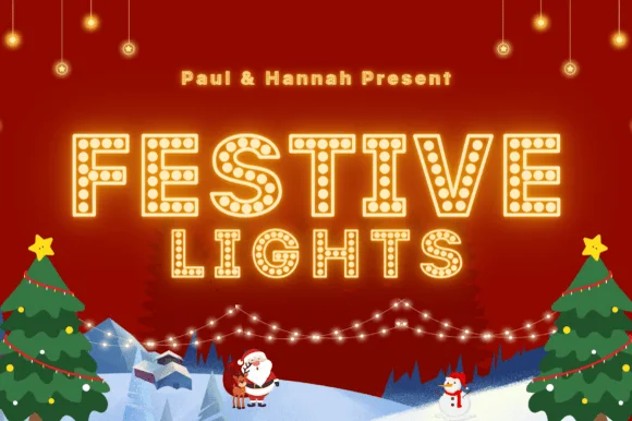 #7
Festive Lights
Festive Lights is a theatrical marquee display font studding bold outlined slab-serif capitals with evenly spaced circular light-bulb dots.
Festive Lights is a classic Broadway marquee slab display with bulb-lit letters: open slab letters drawn only as an outline, with a ring of evenly spaced round bulbs sitting on the outline and a small chase pattern suggested by alternating bulb sizes. The bulbs are the design and they merge into a solid edge once the face is reduced. It needs roughly 34 mm for the bulb pitch to read as separate bulbs, and it is best as a one-colour vinyl cut for a light box, or a flat two-colour print where the bulbs take the lighter ink.
Recommended project & layout
Holiday movie-night ticket, cocoa-bar marquee & party invite — Set 2 centered uppercase lines at 54–100 pt in warm butter-yellow with a subtle outer glow on deep crimson or midnight blue.
Before you cut or print
Dozens of tiny bulb cutouts inside every glyph make this strictly for print, digital screens, and sublimation—never weed small vinyl!
Best paired with
Get fontPaid link
 #8
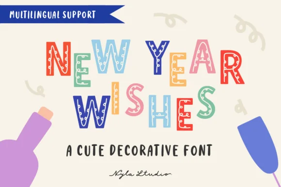
New Year Wishes
New Year Wishes is a playful decorative block font (not a traditional serif) filling bouncy uppercase letters with confetti dots, stars, and stripes.
New Year Wishes is a decorative party block in bouncy uppercase, with confetti dots, stars, zigzags and stripes filling the interior of each letter rather than sitting behind the word. The blocks are slightly irregular, which gives the face a hand-cut rhythm, and the interiors are coarse enough to survive print at 20 mm but fill below about 12 mm. It is a banner and card face: loud, festive and short-phrase only, best in two or three bright colours against a pale ground where the patterns stay separate.
Recommended project & layout
Kids' countdown-to-noon banner, party invite & cup — Color alternating letters in coral, sky blue, mint, mustard, and plum at 48–88 pt over warm cream.
Before you cut or print
Tiny interior confetti cutouts mean Print-Then-Cut, sublimation, and DTF work much cleaner than blade-weeding vinyl.
Best paired with
Get fontPaid link
 #9
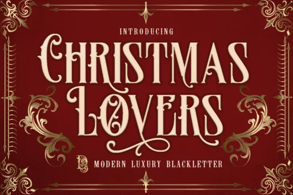
Christmas Lovers
Christmas Lovers is a stately PUA-encoded Victorian blackletter blending readable flared Roman capitals with sweeping calligraphic swashes.
Christmas Lovers is a Victorian blackletter and Roman hybrid with tall notched capitals, flared stems and sweeping calligraphic swashes, PUA encoded, so a word reads as an engraved bookplate rather than a gothic poster. The readability comes from keeping the Roman bones under the blackletter treatment, which is why it works at 14 pt in a card. It needs roughly 26 mm for the swash to read as a flourish and 12 pt for the notched stems, and it is best in gold on deep burgundy or one ink on cream.
Recommended project & layout
Dickensian holiday card, spiced-wine bottle & velvet ribbon — Stack 2 centered words at 60–115 pt in cream or gold foil on deep oxblood, forest green, or navy.
Before you cut or print
PUA encoding lets you copy-paste swash alternates from Character Map/Font Book—cuts cleanly on 1.3 in+ HTV and Foil Quill!
Best paired with
Get fontPaid link
 #10
Monsante
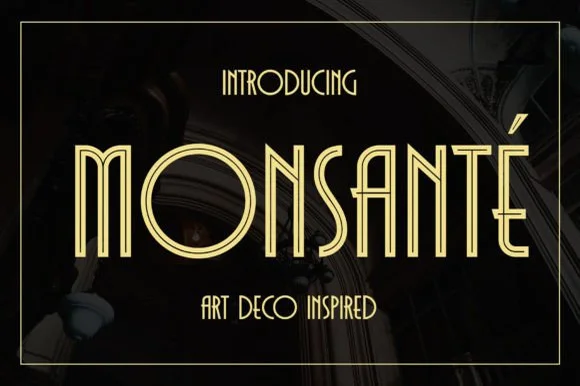
Monsante is a tall, geometric 1920s Art Deco display typeface built from crisp parallel double-line inline strokes and low-waisted crossbars.
Monsante is a nineteen-twenties Art Deco double-line inline geometric display: wide squared letters built from two parallel strokes with a hairline gap, sharp mitred corners and a strict symmetry that reads as a hotel facade sign. The gap between the lines is the design and it closes into one stroke when the face is reduced. It needs roughly 32 mm for the double line to read, and it is best in one fine metallic on a dark ground, or one ink on a pale ground where the gap stays open.
Recommended project & layout
Roaring-Twenties gala invite, champagne menu & seating chart — Track uppercase headlines out to +40 in metallic gold on black, emerald, or midnight-navy cardstock.
Before you cut or print
Parallel twin-rail lines are delicate—ideal for gold foil stamping, laser engraving, and 300 DPI print rather than small vinyl decals.
Best paired with
Get fontPaid link
Matched Font Duos & Packs
4 fonts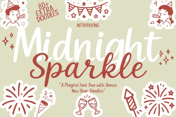 #11
Midnight Sparkle Duo
Midnight Sparkle Duo pairs a bouncy handwritten brush script and casual sans with 80+ hand-drawn New Year party doodles.
Midnight Sparkle Duo is a three-part holiday set: a playful New Year brush script with a loaded stroke and a light bounce, a tall supporting sans for the timings and addresses, and more than eighty party doodles of stars, glasses and fireworks. The script carries the greeting, the sans carries the information and the doodles let a page be built without any illustration, and all three parts share one palette so a card stays coherent. The script's bounce grows the word vertically while the tall sans stacks a long line in a narrow measure, so the two halves of a card need separate setting. The script needs roughly 24 mm and the doodles 22 mm for their detail to read.
Recommended project & layout
New Year's Eve party cup, photo-booth prop & countdown sign — Stack two bouncy script/sans words in champagne gold and berry red, framing all four corners with bundled firework doodles.
Before you cut or print
Medium-thick smooth brush strokes cut and weed cleanly on champagne-glitter HTV and wine-glass vinyl (weld script joins!).
Best paired with
Get fontPaid link
 #12
Happy New Year Duo
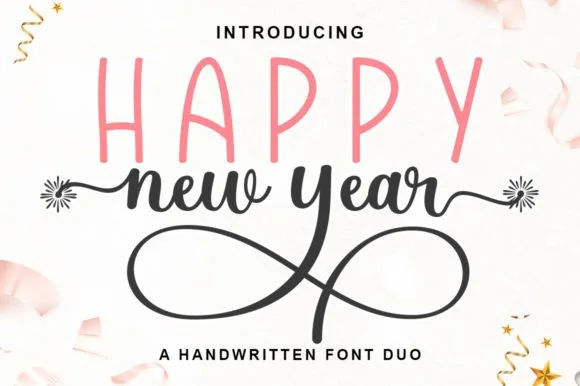
Happy New Year Duo pairs a tall, airy hand-drawn uppercase sans with a looping monoline cursive script tipped by firework-burst swashes.
Happy New Year Duo is a duo of a tall skinny marker sans and a firework-swashed monoline script: the sans is narrow with blunt ends for timings and lists, while the script runs an even stroke with joined letters and swashes that burst into firework strokes at the first and last letters. The bursts need side clearance and are the first thing trimmed, and the monoline is the weaker element in print. The script needs roughly 24 mm and the sans 18 mm for their detail to read.
Recommended project & layout
NYE wine-bottle bag, party napkin & countdown clock face — Set row one in tall pastel/gold uppercase sans (72 pt) and overlap the firework-tailed script across its lower baseline.
Before you cut or print
Weld all touching cursive overlaps on the script before cutting vinyl; scale above 1.4 in so the tiny firework rays weed cleanly.
Best paired with
Get fontPaid link
 #13
Brown Carolina Duo
Brown Carolina Duo contrasts broad high-contrast capitals with a much finer narrow slanted script, set dark on a plain cream field, where the capital R legs sweep below the neighbouring letters and the script carries long tails that run past the ends of both words.
The caps keep thin cross strokes and heavy uprights, the script keeps one fine weight, and the two voices sit in a strict stack: script, two cap rows, script. That alternating order is the character, because the fine lines frame the heavy block like a rule above and below. Both treatments appear on a plain light field, so the cover gives no clue about texture or shadow. Keep 34 pt for the caps before the thin strokes break up, keep 20 pt as the floor for the script and check the R leg before setting a line of capitals.
Recommended project & layout
A boutique stationery front — Use the capital name centrally and a small script descriptor below, leaving the R sweep clear of contact information in a plain footer.
Before you cut or print
Confirm both styles and the actual capital alternates.
Best paired with
Get fontPaid link
 #14
Royal Fortune
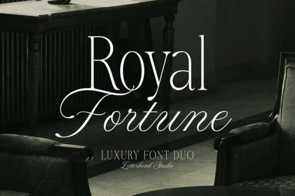
Royal Fortune is a refined luxury font duo pairing a tall, razor-thin high-contrast editorial serif with a poised copperplate calligraphy script.
Royal Fortune is a luxury duo: a tall razor-thin high-contrast editorial serif with fine bracketed feet, paired with a poised copperplate script that slants on a steady axis. The serif's hairlines are the design, so it needs size and a smooth stock, while the script carries the flourish; together they set a brand line and a signature in one voice. The serif needs roughly 30 mm for the hairlines to hold, and the pair is best in ivory on a dark manor ground or a fine foil on matte board.
Recommended project & layout
Estate wedding invitation suite, monogram crest & dinner menu — Set line one in Royal Fortune Serif (upright, 56 pt) and overlap line two in Royal Fortune Script (slanted, 52 pt) right below.
Before you cut or print
Delicate hairlines on both fonts require flat printing, letterpress, or hot-foil stamping rather than cut vinyl.
Best paired with
Get fontPaid link
Scripts & Calligraphy
4 fonts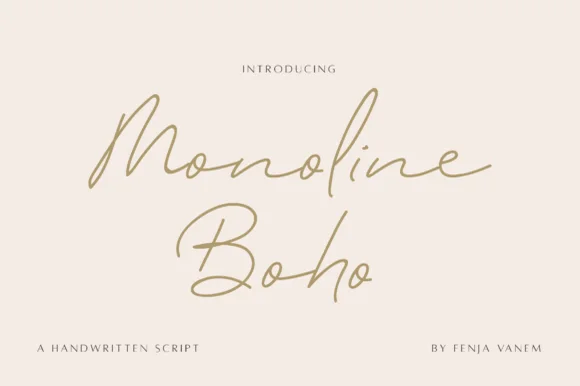 #15
Monoline Boho
Monoline Boho is a fine, forward-slanted handwritten script featuring sweeping multi-peak capitals and airy looped ascenders.
Monoline Boho is a fine slanted monoline signature script with knotted loops: an even hairline stroke on a strong slant, letters joined low, and ascenders that tie themselves into small open knots before they release. It reads as a hand-signed name rather than a set line, which is why it belongs on a card, a tag or a decal. The knots are the finest element and they close into a smudge once the face is reduced or cut small. It needs roughly 30 mm for the knot and the hairline to read, and it is best one dark ink on a smooth stock.
Recommended project & layout
Botanical skincare bottle & ceramic studio logo — Give a two-word studio name generous whitespace at 24–30 pt, paired with widely tracked 7.5 pt uppercase sans ingredient lines.
Before you cut or print
Fine monoline strokes belong in print, foil stamping, or Foil Quill drawing rather than small cut-and-weed adhesive decals.
Best paired with
Get fontPaid link
 #16
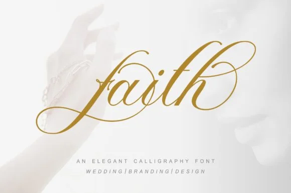
Faith
Faith (by pujalettering) is a formal slanted copperplate calligraphy script wrapped in multi-oval entry loops and figure-eight ascender flourishes.
Faith is a flourished copperplate bridal calligraphy in a gold-leaf treatment: a steep slope, strong thin-thick contrast, hairline exits that end in a flourish and long entry strokes that reach back over the word. The hairlines are the design and the first thing to lose on textured stock, and the flourishes need side and vertical clearance. It needs roughly 28 mm for the hairline and the flourish to read, and it is best in one fine gold on a deep ground or a dense ink on smooth ivory, and it must never be set small.
Recommended project & layout
Gold-foil wedding invitation, vow booklet & ceremony fan — Center 1 hero word or name at 54–88 pt in gold foil on white cotton paper above pipe-separated ('WEDDING | BRANDING') sans.
Before you cut or print
Hairline copperplate ovals require hot foil, letterpress, or flat printing rather than small vinyl weeding.
Best paired with
Get fontPaid link
 #17
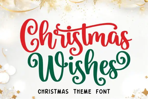
Christmas Wishes
Christmas Wishes is a festive script in which the capital curls forward, the W spreads wide, the cross strokes run long and the s forms loop low, so a two-word greeting reads as ribbon lettering on a card.
The C curls its terminal inward, the W opens two broad sweeps, the t bars reach across neighbouring letters and the s closes a low loop before it rises to the next stroke. The long cross strokes are the character: they tie pairs of letters together, which is why the sample sets two words in two colours. Because the strokes overlap, the face needs 20 mm between lines from 28 pt and the joins weld into one path before cutting from 1.1 inches of x-height; the extra glyphs are encoded. Gold stars and ribbons in the sample are artwork; the red and green script words are the face.
Recommended project & layout
A Christmas family-card cover — Keep Christmas above Wishes and place the family name in a plain line below the lowest curl, with any stars confined to the corners.
Before you cut or print
Check the chosen variants and small curls at card size.
Best paired with
Get fontPaid link
 #18
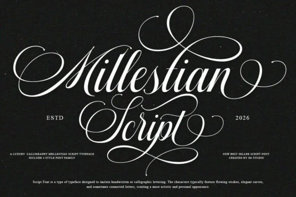
Mallestian Script
Mallestian Script ('Millestian Script') is a PUA-encoded 2-style luxury Copperplate calligraphy family crowned with regal looping flourishes!
Mallestian Script is a two-style Copperplate calligraphy family with PUA-encoded alternates, tall oval flourishes above the capitals and deep looped descenders, drawn at a formal slant with high contrast. The flourishes extend well beyond the word, so a layout must reserve space on all four sides, and the hairlines need roughly 24 mm before they hold in print. It is a luxury stationery face for invitations, certificates and labels, and it is at its best in one metallic or dark ink on a smooth coated stock.
Recommended project & layout
Black-tie hot-foil wedding invitation, crest & menu — Stack 2 title-case words at 68–140 pt in gold or silver foil over matte black, navy, or cotton rag stock.
Before you cut or print
Ultra-fine Copperplate hairlines and multi-loop swashes are tailored for hot-foil stamping, letterpress, flat print, and laser engraving (avoid small vinyl!).
Best paired with
Get fontPaid link
Practical buyer checklist
Frequently asked questions.
Key cutting, printing and pairing answers before choosing a New Year's Eve, countdown & gala typeface.
What fonts suit a New Year's Eve invitation?
An opulent high-contrast serif or a celestial ornament face for the headline, with a plain serif for the details. Keep the palette to two colours, since dark grounds with metallic accents carry the mood on their own.
Can marquee bulb fonts be cut for a party sign?
The bulb shapes are separate circles, so cutting is impractical. Print them, or cut the letter body and add small foil dots by hand if the sign has to be physical.
How do I make a year number look celebratory?
Set it large in a high-contrast serif, in one colour, and let the ornament sit above or below rather than inside the digits. Numbers with internal decoration lose legibility fast at poster scale.
Do these fonts include numerals for the year?
Yes, and most were drawn with the year in mind. Check that the digits share a width and that 0 and 2 look intentional, since a mismatched numeral set is the most visible flaw on a countdown design.
Keep exploring
Related collections & guides.
Explore adjacent maker roundups or check our practical pre-production checklists.

01 / Type Styles
1920s Art Deco & Gatsby
19 curated fonts · Previews & pairings


02 / Type Styles
Luxury & modern serif
34 curated fonts · Previews & pairings
03 / Holidays & Seasons
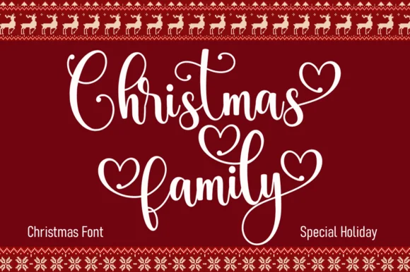
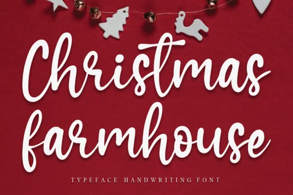
Christmas
38 curated fonts · Previews & pairings
04 / Holidays & Seasons
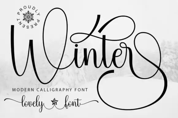
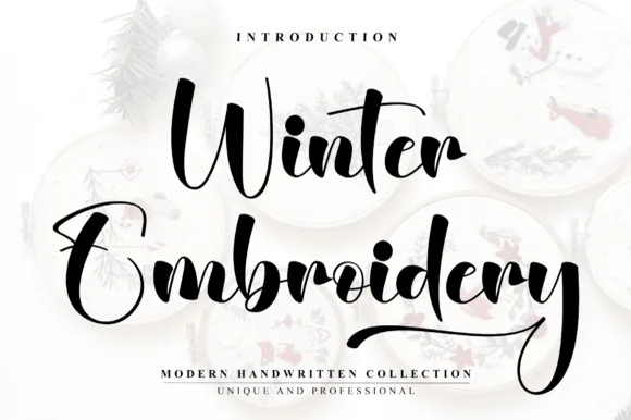
Winter
18 curated fonts · Previews & pairings
Guides: Invitation font checklist · Vinyl & cutting checklist · How to pair script & sans fonts