Neutral Sans Workhorse

Soltrue + Homies
Lets Soltrue own the focal silhouette while handling secondary copy, sizing and subheads cleanly.
Inspect Homies specimenDisclosure: MakerFileHub may earn a commission from qualifying purchases via paid links on this page. How our links work.
Reverse-contrast rounded display with two treatments
Soltrue is a heavy rounded reverse-contrast display on a near-black ground: fat capitals whose horizontals swell and whose uprights are slim, shown twice — once in a clean aged-cream fill and once in a solid red — with a small line at the top and two labels that name the treatments.
Paid link
Get this fontProject & layout blueprintsAt-a-glance maker compatibility
Fine grain and micro-texture excel in 300 DPI print, sublimation, and screen print rather than small vinyl weeding.
Visual anatomy & craft review
The plate compares two cuts of the same construction, and the comparison is the point: the upper line is speckled and the lower is solid, so a buyer sees the clean version and the textured one side by side without opening a file. The drawing is a rounded reverse-contrast capital, so the form reads as a mid-century poster face, and the swelling horizontals set a moderate size floor because the slim uprights go first. The two labels naming the treatments are genuine product copy, and the small top line lists the styles. Because the letters are heavy and rounded, the face suits a poster, a shirt and a package, and the textured cut is best kept at a size where the speckle reads.
Display, reverse-contrast, rounded, textured
Two-font hierarchy recipes
Tested contrast partners — pairing Soltrue with grounded secondary typography.
Soltrue + Homies
Lets Soltrue own the focal silhouette while handling secondary copy, sizing and subheads cleanly.
Inspect Homies specimen
Soltrue + The Simple Editorial
Grounds bold display lettering with classic typographic authority on posters, badges and apparel.
Inspect The Simple Editorial specimenPractical applications
Concrete hierarchy, scale and production guidance tailored to Soltrue’s stroke geometry.
A reverse-contrast face reads as a printed bill, and the two treatments let a poster mix a clean headline with a textured second line.
Hierarchy & layout recipe
A2 poster: the name at 120 mm cap height, the details in a 22 mm sans, and the date at 11 mm. Keep 28 mm margins and print two colours on a light stock.
Pre-production check
Check the A2 at five metres, where a slim upright can vanish; keep it above 3 mm. Confirm the 11 mm date reads at two metres and that the textured line stays legible.
A heavy display prints as merch, and the textured cut gives a worn look without a print effect on the shirt. The textured cut adds a worn look.
Hierarchy & layout recipe
Print a 260 mm chest graphic: the band at 60 mm cap height, the tour year at 26 mm, and two inks on a dark shirt. Keep the slim uprights at 4 mm and place the graphic 80 mm below the collar.
Pre-production check
Check the screen at actual mesh, where a 4 mm upright can fill; open it to 5 mm. Wash-test one shirt and confirm the speckle stays even after five cycles.
A reverse-contrast label reads as a printed deck sticker, and the rounded weight survives a small die where a fine face would not.
Hierarchy & layout recipe
Print a 50 by 50 mm label: the brand at 12 pt, the model at 7.5 pt, and two colours on a coated stock. Keep 4 mm inside the die and keep the uprights above 0.6 mm.
Pre-production check
Check the 12 pt brand on a small die, where an upright can fill; keep it above 0.6 mm. Confirm the 7.5 pt model reads at arm's length and that the label survives a scrape.
Technical & licence verification
Confirm included OTF/TTF/WOFF formats, full glyph tables and licence coverage on the live store page before batch production.
Closest visual alternatives
Matched across letterform anatomy, stroke behaviour and craft applications.
Multicolour playful caps
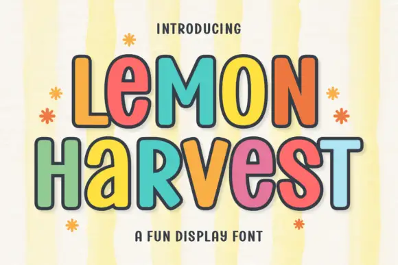
Lemon Harvest is a multicolour playful display in five warm colours with a dark outline on a pale striped ground: rounded caps with even strokes, a slight bounce, small flower and sparkle ornaments around the block, and a tracked caption beneath in a rounded sans.
Ideas for this font
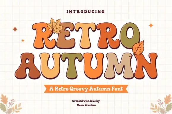
Groovy multi-colour display with autumn leaves
Retro Autumn is a groovy display in tan, orange, olive and cream on a cream grid: fat blobby letters with rounded ends, each one a different autumn colour with a dark outline, with two drawn leaves tucked against the block.
Ideas for this font
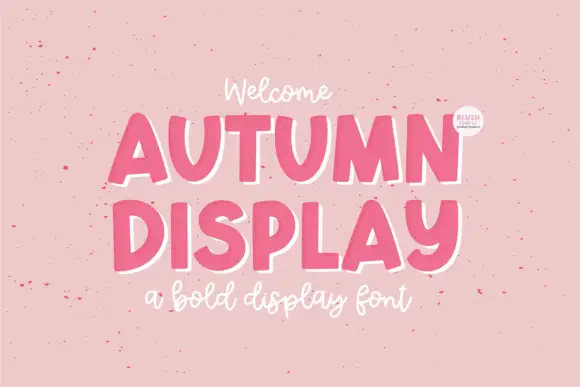
Bold display caps with a white keyline and a script companion
Autumn Display is a bold capital alphabet in which the letters sit heavy, a white keyline runs just outside each stroke and a light script writes the second line, so a two-line design reads as a printed sticker set.
Ideas for this font
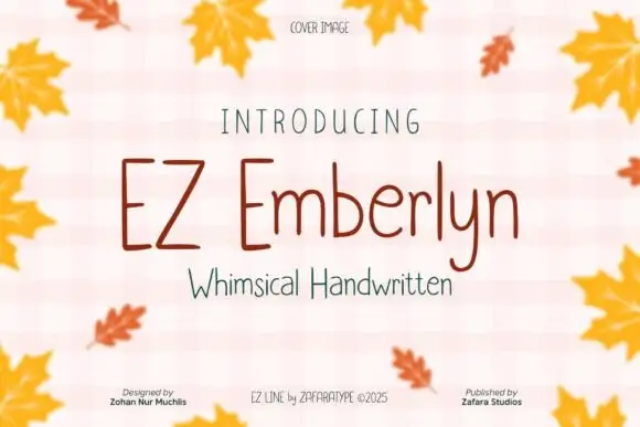
Fine tall separate print
Ez Emberlyn is a fine handwritten print face in which the letters stand separately, the stems run tall, the m and n keep rounded tops and the y descends in a narrow line, so a short phrase reads as careful pen writing without any joins.
Ideas for this font
Same independent foundry
Allow optional Google Analytics to measure visits and catalogue actions. Your search words and notes are not included. Privacy & storage