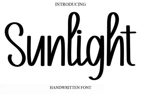
Tall condensed bouncy upright marker font
Sunlight
Sunlight is a tall, clean upright marker handwritten font with rounded loops and semi-connected farmhouse bounce.
Ideas for this font
Notes, planners & unconnected writing
Three hundred and thirty-three handwritten faces that imitate a note rather than a calligraphic hand: quick planner script, chalk scrawl, teacher printing and brush journaling. Most are print and digital-first.
Letterform anatomy
Three checks worth running on any specimen before you compare prices.
Handwritten faces fake irregularity in three ways: a bouncing baseline, varying slant, and inconsistent weight per stroke. Compare two words set side by side, because a convincing hand keeps the same kind of irregularity across both while a cheap imitation produces one repeated wobble. Letter spacing matters too, since real handwriting clusters some letters and separates others.
318 fonts (sorted by maker demand)Page 1 of 14
Tall condensed bouncy upright marker font
Sunlight is a tall, clean upright marker handwritten font with rounded loops and semi-connected farmhouse bounce.
Ideas for this font
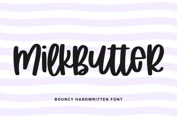
Bouncy fat handwriting with a tall waist
Milkbutter is a bouncy handwritten face in black on white: fat rounded letters with a tall waist, stems that lean and lift, and a baseline that rises and falls across the word, shown over soft lilac wavy bands.
Ideas for this font
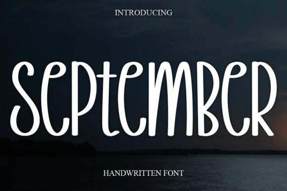
Tall narrow disconnected rounded marker capitals
September is a tall, narrow disconnected marker print font (not a connected cursive script) built with smooth, uniform rounded strokes.
Ideas for this font
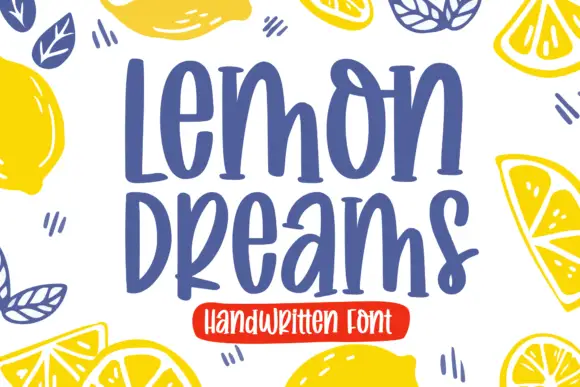
Quirky handwritten display
Lemon Dreams is a quirky handwritten display in navy on cream, surrounded by drawn lemons: a tall irregular hand with a straight-legged a, an open e and a hooked y, set in two lines with a small caps line above and a red banner beneath naming the category.
Ideas for this font
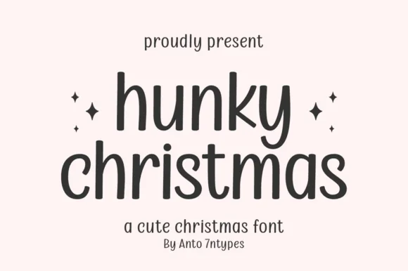
Tall monoline rounded print
Hunky Christmas is a neat upright monoline print face in which the h and k climb tall, the k closes a curled loop inside its arm, the bowls stay open and round, and no letters join, so a short holiday phrase reads as tidy hand printing.
Ideas for this font
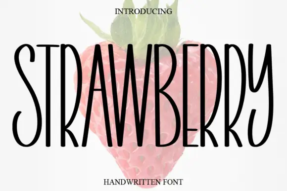
Tall narrow handwritten caps
Strawberry is a tall narrow handwritten face in black over a faded illustration of a strawberry: very condensed capitals with uneven strokes, high ascenders and a light bounce, set as one word with a small serif line above and beneath.
Ideas for this font
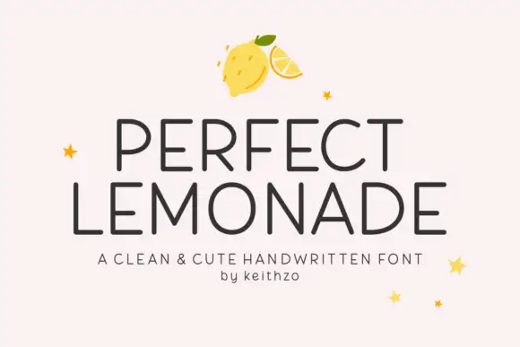
Clean cute handwritten caps
Perfect Lemonade is a clean handwritten display in charcoal on pink: light even strokes, tall open caps with rounded corners, a slightly irregular rhythm and a small star or lemon ornament, set in two lines with a tracked caption beneath, so the plate reads as a cheerful label rather than a script.
Ideas for this font
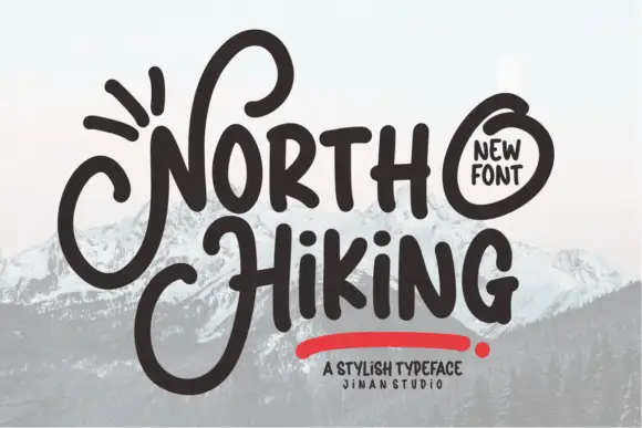
Heavy informal lettering with oversized looping N and H initials
North Hiking paints its words with one heavy rounded brush line, then lets the first letters break out into wide loops that travel above and below the rest of the word.
Ideas for this font
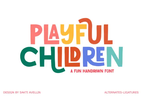
Angular playful capitals with long horizontal extensions
Playful Children is a hand-drawn capital alphabet in which the letters are angular, the arms run long and some strokes extend past the letter body, so a word reads as something drawn with a ruler-free marker.
Ideas for this font
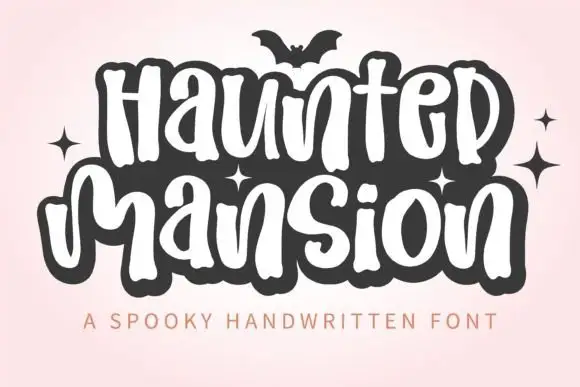
Tall rounded Halloween lettering
Haunted Mansion shows tall softly irregular letters built as narrow white strokes inside a heavy dark surrounding shape, with rounded humps, looped descenders and a bat and small sparkles sitting outside the lettering.
Ideas for this font
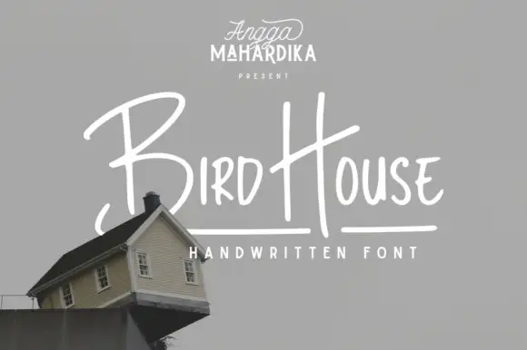
Thin informal marker mixed case with towering capitals and long cross-strokes
Bird House is a thin informal marker hand in which the first capital towers over a narrow lowercase body, the H rises especially high and a long cross-stroke travels across the second word, so a name reads as a quick marker sketch.
Ideas for this font
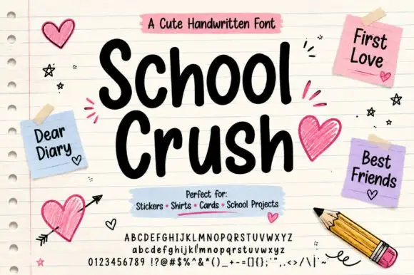
Heavy rounded marker print on a notebook page
School Crush is a heavy rounded marker print in black on a lined notebook page, with drawn hearts, sticky notes and a pencil turning the specimen into a school desk.
Ideas for this font
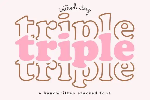
Display
Triple is a handwritten display face built for stacking: the same soft capital is drawn three times, once filled and twice as outline, offset above and below, so a word looks like a hand-drawn sign layered on itself.
Ideas for this font
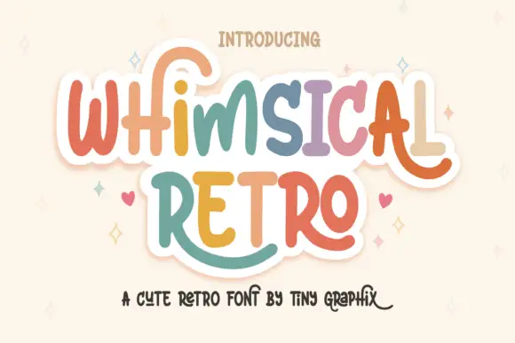
Rounded upright letters with long curled terminals
Whimsical Retro mixes soft upright letterforms with unusually long curled terminals, set over a pastel layered fill inside a thin outline on a warm paper ground.
Ideas for this font
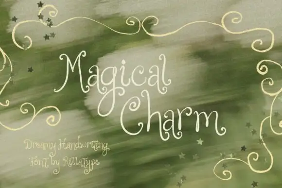
Dreamy thin curled handwriting
Magical Charm is a dreamy handwriting in cream on sage green: very thin monoline strokes, tall curled ascenders, decorative curls on the capitals and small drawn stars scattered through the background.
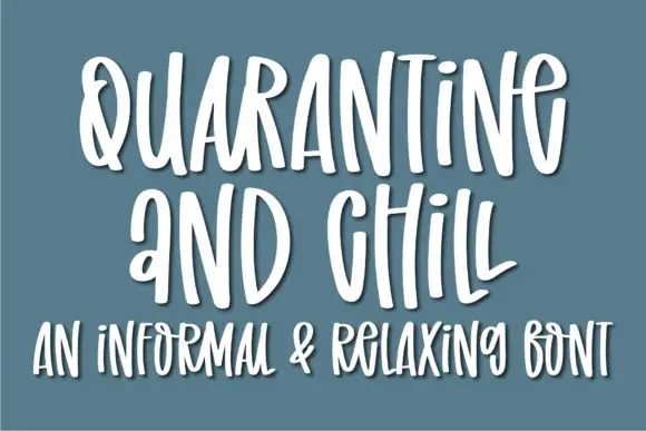
Informal tall hand with soft shadow
Quarantine and Chill is an informal handwritten display in white on slate blue: tall narrow letters, uneven spacing and a soft shadow that lifts the strokes off the ground, with a second line in the same hand.
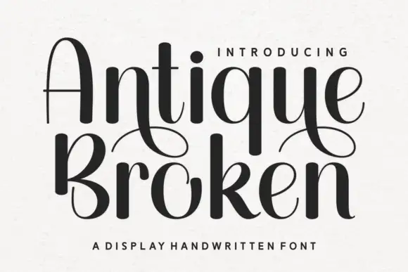
Handwritten display with high contrast and broken strokes
Antique Broken is a handwritten display alphabet in which the strokes swell to heavy dark shapes and then break into thin lines, so a word reads as drawn with a broad nib that lifted between strokes.
Ideas for this font
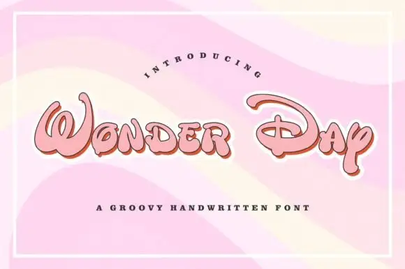
Groovy rounded hand lettering
Wonder Day is a groovy hand-lettered display in pink with a copper shadow and a thick white outline, set on a pastel wave ground: fat rounded letters with a strong forward lean and a roller-coaster bounce.
Ideas for this font
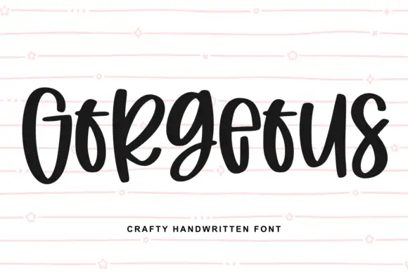
Heavy narrow handwriting with tight counters
Gorgeous is a heavy narrow handwriting that keeps a tall x-height and nearly closed counters, so a single word reads as a dense band with a lively, uneven baseline running under it.
Ideas for this font
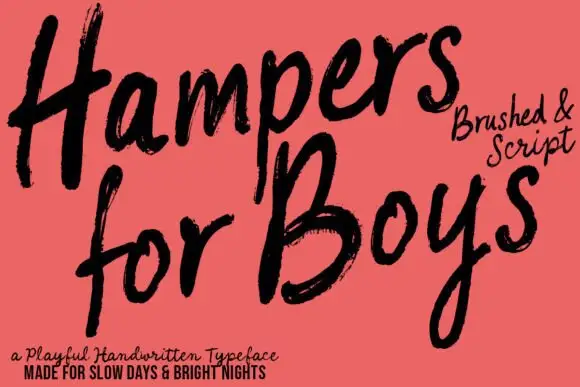
Loose brushed handwriting with slanted bodies and dry swept ends
Hampers for Boys is loose brushed handwriting in which the letters lean forward, the strokes sweep through each letter and the ends lift dry off the page.
Ideas for this font
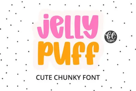
Chunky upright letters with curved lower ends and open counters
Jelly Puff is chunky upright lettering in which the strokes stay thick and even, the lower ends curl to one side and the counters stay open, so a word reads as something drawn with a fat marker.
Ideas for this font
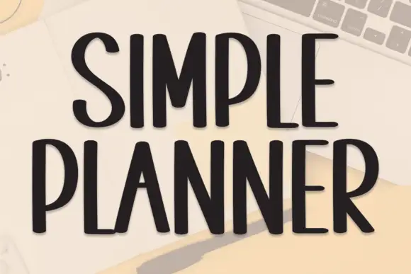
Tall condensed handwriting with light shadow
Simple Planner is a tall condensed hand-drawn display in near-black on a pale desk: narrow letters with blunt ends, a small light shadow and a level rhythm, drawn as two uppercase rows.
Ideas for this font
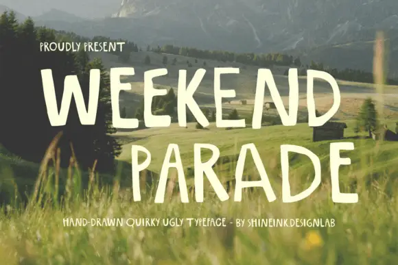
Narrow hand-drawn upright capitals
Weekend Parade is a set of tall narrow hand-drawn capitals with uneven stems, open counters and a baseline that drifts across the length of the line.
Ideas for this font
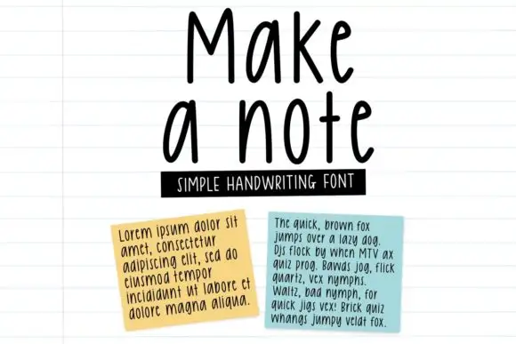
Tall neat monoline handwriting
Make a Note is a tall neat monoline handwriting in black on lined paper: high narrow letters, a small x-height, rounded terminals and an even spacing that keeps a paragraph legible at text size.
Ideas for this font
Production reality
These are the least cuttable faces in the catalogue. Textured edges, thin joins and deliberately broken strokes are the point of the style, and all three are lost or torn when cut from vinyl. Use them for planner stickers, print-then-cut sheets and sublimation.
They are one of the better uses. Handwritten faces stay legible at note size in GoodNotes and similar apps, and their irregularity keeps long journal entries from looking mechanical. Check that the family includes numerals if you write dates.
Because the same glyph is repeated identically. Most faces ship at least one alternate alphabet or a set of ligatures; turning on contextual alternates in a design app, or manually swapping repeated letters, restores the unevenness that reads as human.
Allow optional Google Analytics to measure visits and catalogue actions. Your search words and notes are not included. Privacy & storage