#1 · Best Overall
Stanza
Swashed modern couture serif with hairline stress and curling terminals
Get fontPaid link
Read review ↓Disclosure: MakerFileHub may earn a commission from qualifying purchases via paid links on this page. How our links work.
Cover lines, mastheads & display typography
Editorial type is a hierarchy tool: a masthead that reads at a metre, a deck that holds at arm's length, and captions that still work at 8 pt. Stanza and Orvelia lead with high-contrast display cuts, Amilea and Praise bring a distinctive single letter to the cover, and Candeur and Brenco cover the bold reverse-stress and warm book-serif ends of the range. Headline and Helina add the tall poster option.
Quick verdict
Stanza is the strongest cover display, Brenco is the most usable text serif in the set, and Candeur delivers the bold reverse-stress statement. Headline covers the tall poster headline slot.
Quick answer
Short on time? Start with our three highest-rated editorial & posters standouts before scrolling the full breakdown.
#1 · Best OverallSwashed modern couture serif with hairline stress and curling terminals
 #2 · Runner-Up Pick
High-contrast display serif with sculpted curves and tucked swash legs
 #3 · Editor's Choice
We kept 37 of 3,049 candidates, judging each as a system rather than a single display cut. Scored on contrast behaviour at three sizes, masthead fit, whether italics and small caps exist, and how numerals sit in a table or a price panel.
Side-by-side summary
Compare specimens, OpenType/PUA traits and primary project roles side by side.
| Rank & Font | Style & File Specs | Best Project Fit | Store Listing |
|---|---|---|---|
| SerifLigatures · Alternates & swashes | Fashion boutique logo, perfume box or magazine title | Get fontPaid link | |
| SerifAlternates & swashes · File formats | Formal wedding suite monogram & header | Get fontPaid link | |
| SerifPUA encoded · Alternates & swashes | A names-led invitation accent | Get fontPaid link | |
| SerifLigatures · Language support · File formats | A formal studio-name study | Get fontPaid link | |
| SerifSculptural | Artisanal chocolate bar, specialty coffee box & record sleeve | Get fontPaid link |
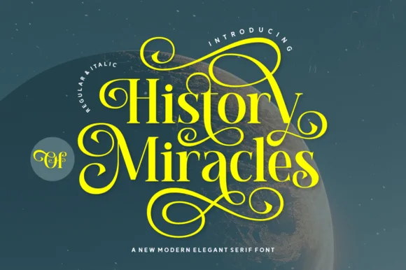
#1 · Best OverallStanza is a modern serif in which the strokes carry extreme contrast, the terminals curl and the crossbars of the A and the T extend into swashes, so a short word reads as a fashion masthead rather than a title.
The S closes both ends in curls, the T throws its bar wide and finishes in a fine swash, the A carries a halved crossbar that runs beyond the letter and the N keeps two hairlines with a heavy diagonal, all with high contrast and unbracketed joins. The swashes are the character: they extend beyond the letter body at the top and the base, which is what lets four letters fill a wide plate and what makes the face a poor choice for anything below 30 pt. Hairlines are genuinely thin, so the face wants coated stock and a printer who can hold the line. The green ground, the white ink, the tracked label and the small caption are presentation; the serif is the word shown.
Fashion boutique logo, perfume box or magazine title — Limit dramatic swash alternates to 1–2 letters per wordmark.
Fine serif hairlines are built for print, foil and digital branding.
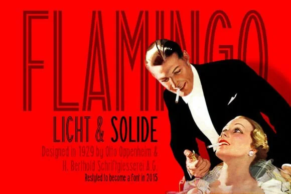
#2 · Runner-Up PickOrvelia is a high-contrast display serif in which the stems alternate thick and hairline weights, the R, V and A end in curved swash legs and the bowls stay sculpted, so a name reads as a crest for a perfume box or a masthead.
The R tucks its leg into a curve, the V splits into two swashed strokes, the A carries a curling leg and the bowls close against fine joins that thin to a hairline at every junction. The swash leg is the character: three capitals carry the ornament while the rest of the alphabet stays quiet, which is why the sample frames one word for formal stationery. Because the hairlines are fine, the face wants coated stock from 16 pt and gains from hot foil on signage; the display cut ships with swashes as separate glyphs. The pale ground and the small frame rules are presentation; the dark display word is the face.
Formal wedding suite monogram & header — Track supporting lines (FOREVER BEGINS HERE) wide in a simple roman serif beneath the main display name.
Delivered as OTF; best suited to print, foil stamping and digital branding due to fine serif hairlines.
#3 · Editor's ChoiceAmilea shows pale yellow high-contrast letters with fine tapered serifs and broad rounded lowercase over a dark portrait, where a thin loop curves below the capital A and a tall upper flourish crosses the central ascender before sweeping right.
The uprights stay heavy, the joins thin to hairlines, the serifs taper to points and two drawn flourishes cross the word above and below. Those crossing flourishes are the character: the sample is a lockup rather than a plain setting, which is why the names sit on a photograph with a raised hand. The source notes PUA extras, ligatures and alternates, so check how the flourishes are reached. Keep 40 pt for the hairlines, reserve 25 mm above and below and do not set a paragraph.
A names-led invitation accent — Leave clear space above and below the title with plain details beneath.
Verify exact letters and alternate access.
 #4 · Top Maker Utility
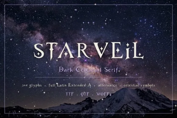
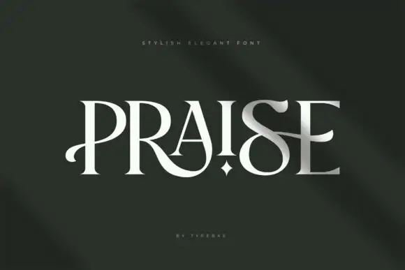
Praise is an elegant display serif in which the stems narrow to blades, the feet flatten into hairline serifs and one counter opens as a small star, so a single word reads as a fashion masthead with one deliberate interruption.
The P opens a blade-like bowl on a thin stem, the R turns a hairline leg, the A pinches to a pointed apex, the I carries a star in place of a dot, the S holds a fine spine and the E sets three thin arms, all at a high contrast with flat unbracketed serifs. The star counter is the character: it is the only ornament in the set, which is why the face carries one word and nothing else. Because the stems are thin, the face needs 40 pt upward and a coated stock, and it reads best as white on a dark ground. The dark green field, the small letter-spaced line above and the credit beneath are presentation; the light display word is the face.
A formal studio-name study — Preserve a clear band below the looping leg.
Check name rights and exact alternate access.
 #5 · Standout Silhouette
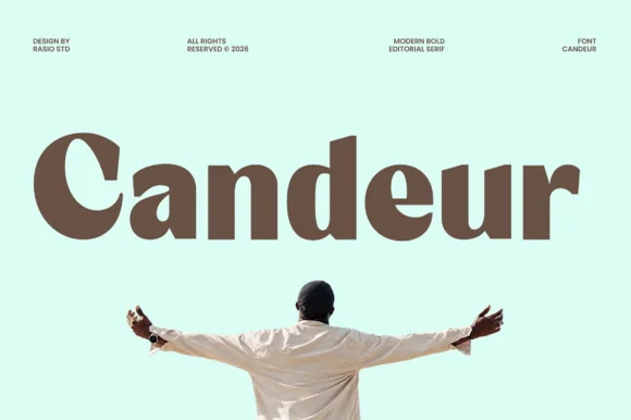
Candeur is an ultra-bold modern editorial serif pairing massive teardrop bowls and thick stems with razor-thin horizontal connectors.
Candeur is an ultra-bold modern display serif with reverse stress and high contrast: the horizontal strokes carry the weight while the verticals thin, stems are almost solid and the axis runs the opposite way to a classic serif, with small sharp serifs at the top and bottom. The inverted stress is the design and it reads as a solid block at a distance. It needs roughly 30 mm for the reverse stress to read, and it is best in one dense ink on coated stock, or a single white on a dark ground.
Artisanal chocolate bar, specialty coffee box & record sleeve — Set 1 title-case brand word huge (64–120 pt) at tight -15 tracking across pastel mint, butter, or terracotta cartons.
Outer bowls cut cleanly on large 1.5 in+ window vinyl and tote HTV; watch the hairline joins inside 'a' and 'e' at small sizes.
 #6
Brenco is a grounded, medium-bold contemporary serif with sturdy bracketed feet and warm, approachable lowercase curves.
Brenco is a wide squared sans display with heavy even strokes, flat terminals and a slightly extended stance, so a word reads as a stencilled crate marking rather than a modern grotesk. The flat terminals and squared corners print cleanly at low resolution, which makes it a signage and packaging face, and the extended width fills a panel with a short word. It needs roughly 30 mm for the squared corners to read, and it is best in a dark ink on kraft or in white on a deep colour.
Specialty coffee-roaster bag, bakery window & ceramic mug — Set 1 bold mixed-case brand word huge (76–150 pt) with tight -2 tracking across rich espresso photography.
Sturdy medium-bold stroke contrast cuts and weeds cleanly on Cricut Oracal 651 and HTV down to 0.75 inches!
 #7
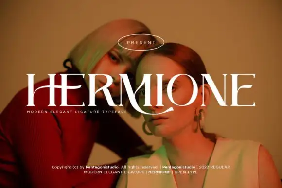
Hermione is a modern elegant serif in caps with very fine hairlines, tall proportions and a set of display ligatures, shown over an editorial portrait and set with a slight arch.
HERMIONE spans the card in white over a close portrait in warm light, and the letters are tall and narrow with hairlines at the joins and sharp wedge serifs; the I and the O are drawn to touch, and the custom ligatures give the word a rhythm that a standard setting would not have. The baseline lifts slightly across the centre, which is a display treatment rather than a feature of the font, and a caption at the foot names the family and credits the foundry. The sample is a fashion layout: type over a photograph, wide spacing in small caps, one ornament. What it tells a buyer is that the face is for titles and mastheads at a large size, and that the hairlines need a good press or a screen, never a cheap photocopy.
A portrait-series opener — Place the capitals across a pale full-width panel with the subject's name and byline in plain small text below the left edge.
Verify the actual phrase, ligatures and rights; the specimen does not prove automatic decorative joins.
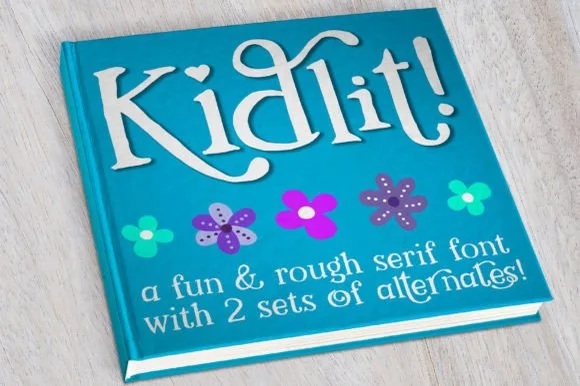 #8
Kidlit is a lively hand-drawn serif with organic, slightly wiggly stems, curled ascender tops, and multi-set alternates.
Kidlit is a hand-drawn bouncy storybook serif with curled ascenders: soft bracketed stems, a small x-height, letters that hop along the baseline and ascenders that curl over like a fern. It is a children's-book face, so it wants air and one warm ink rather than a busy illustration behind it. The curls are the finest element and they close into a hook once the face is reduced. It needs roughly 26 mm for the curl and the serif to read, and it is best one dark ink on a cream ground.
Classroom library bin labels & reading-corner banner — Set genre titles in 1.5 in mixed-case Kidlit above a smaller secondary line at 40% height, cycling alternate glyphs on repeated letters.
Sturdy stems cut cleanly on cardstock and adhesive vinyl down to 0.75 in; watch only the small detached dots on 'i' and '!' during transfer.
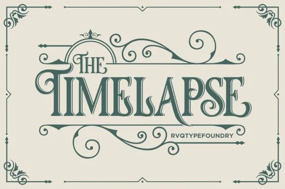 #9
Timelapse is an ornate Victorian display serif crowned with spiraling vine swashes, teardrop terminals, and vintage apothecary charm.
Timelapse is a Victorian storybook and apothecary display serif with swashes: fine bracketed serifs against heavy stems, a small ball terminal on the diagonals, swash capitals that curl off the first letter and a slightly condensed width that keeps a long label on one line. The hairlines are the design and the swashes need side clearance. It needs roughly 30 mm for the swash and the hairline to read, and it is best in one fine ink on smooth or coated stock, or a foil impression above 40 pt where the curls still turn.
Steampunk or historical novel cover, tea tin & poster — Center 1-to-2-word uppercase titles at 48–72 pt, activating upper flourishes on left initials and lower curls on middle/right stems.
Fine spiral tendrils and thin serif crossbars belong in print, foil, or laser wood engraving rather than small cut vinyl.
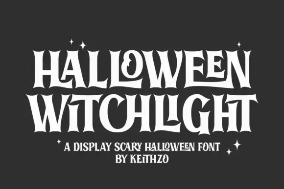 #10
Halloween Witchlight shows tall narrow letters with sharply flared ends, where a curled counter and stretched horizontal strokes vary a dense two-line title and the flares open at the feet and crowns of the stems.
The stems stand tall and narrow, the ends flare wide, one counter curls and the horizontals stretch. That flare is the character: a gothic-leaning serif gains a seasonal silhouette without any broken strokes, which is why the sample keeps a dense two-row title. Check the letters absent from the sample, keep 40 pt so the curls stay open and test the flares against your own background before promising the theme. The inward curls are the risk: they close at about 30 pt and the letter becomes a solid flare, so keep 40 pt on a dense two-row title and check the wide W and M before the run.
A night-event invitation — Leave generous space above and below the heading.
Check the curled forms for the actual text.
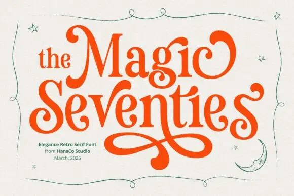 #11
Magic Seventie shows orange serif lettering with heavy curved sides and pointed joins, where large curled initials frame the two-row title and a long figure-eight extension drops below the words, while thin green stars, a moon and a wavy border surround the name.
The sides stay heavy, the joins point, the initials curl and one tail draws a figure eight under the row. That extension is the character: a period serif gains a poster flourish, which is why the sample stacks two rows above it. The stars, moon and border are separate drawings, so plan 26 mm beneath the tail, keep 36 pt and check that the curl is a supplied character rather than cover art. The figure-eight tail is the detail that fails: it needs 26 mm of clear ground beneath the row, and the curl has to be a supplied character rather than cover art before a poster can rely on it.
A retro-party invitation title — Reserve a broad lower margin for one verified figure-eight swash.
Proof the phrase and clear separate stars.
 #12
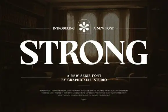
Strong shows white serif capitals with substantial curved stems and fine pointed serifs over a shadowed room, where the O is broad and round, the R carries a thick low diagonal leg and the G finishes in a firm horizontal bar with a small flower badge above the row.
The stems stay thick, the serifs taper to points, the bowls open round and the terminals close flat. That closing bar is the character: the word reads as a bold editorial serif rather than a slab, which is why the sample sits large over an interior photograph. The room and the badge belong to the cover, and the caption claims weight and durability that type cannot promise. Keep 44 pt for a display row and 14 pt for text, and check whether your file carries more than one weight.
A substantial studio-name sign study — Start with flat one-colour lettering above plain service text.
Check name rights and fine serif visibility at distance.
 #13
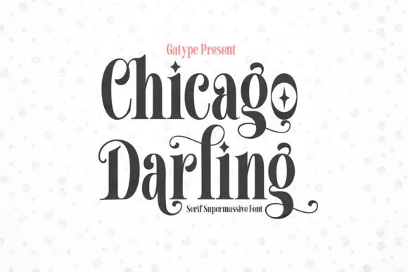
Chicago Darling is a bold, condensed modern-vintage serif distinguished by curled spiral terminals, sparkling counters, and deep descender loops.
Chicago Darling is a high-contrast vintage display serif with curled ball terminals: hairline thins against swollen stems, a small x-height, a high waist and terminals that roll into small balls on the a, c and r. It is the lettering of a nineteen-twenties poster and a department-store sign, so it wants size and air. The hairline thins are the finest element and they break first in print and in vinyl. It needs roughly 34 mm for the contrast and the ball terminal to read, and it is best one dark ink on a cream ground.
Soy candle vessel label & apothecary box front — Stack a two-word scent or brand name tightly at 32–42 pt with tighter line-height, anchored by minimalist uppercase sans notes below.
Hairline crossbars and spiral tips shine in 300 DPI print and hot foil; avoid weeding small adhesive vinyl below 2 inches cap height.
 #14
Headline is a crisp, heavy condensed sans serif engineered with flat horizontal terminals, narrow counters, and clean newspaper-poster punch.
Headline is a heavy condensed poster sans with flat horizontal terminals, narrow flat-sided counters and uniform vertical pillars, so a word reads as a newspaper poster rather than a modern display. The condensation packs a long line into a narrow measure, and the flat terminals survive a cheap single-colour print. It needs roughly 30 mm for the narrow counters to stay open, and it is best in cobalt or black on off-white gallery stock, or white on a saturated ground.
Magazine feature opener, sports poster & social carousel — Set primary titles in all-caps at 72–140 pt with -10 tracking, paired with tracked lighter condensed captions above and below.
Razor-straight edges weed in seconds on large window decals, gym wall vinyl, and apparel HTV.
 #15
Helina is a clean, heavy-weight condensed sans serif with flat-cut terminals, tight vertical rhythm, and bold magazine-masthead authority.
Helina is a heavy geometric condensed grotesk: very narrow stems with a uniform weight, squared shoulders, tight apertures and a level baseline that makes a column of type look like a printed rule. The condensation fits long words on a fascia, and the tight aperture is what closes first when the face is small. It needs roughly 24 mm for the aperture and the squared shoulder to read, and it is best in one dark ink on white and cream, or white on a dark ground where the narrow stems read as vertical lights.
Fashion lookbook masthead, fitness poster & reel cover — Set all-caps headlines at 72–140 pt with tight -15 tracking above wide-spaced (+250) micro subcaptions.
Straight, sharp-cornered vertical bars are super fast to weed on vinyl decals, gym wall graphics, and HTV.
 #16
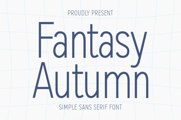
Fantasy Autumn is a tall, feather-light minimalist sans serif with slender vertical stems, high waistlines, and airy modern calm (zero autumn clipart!).
Fantasy Autumn is a hairline-light minimalist sans with tall slender stems, a high waistline, a single-storey a and generous air around the letters, drawn for calm architectural layout rather than display impact. Because the stroke is very light, the face needs roughly 20 mm before it survives print, and it is at its best on smooth uncoated stocks where the line stays continuous. It is a titling and caption face for galleries, studios and editorial work, and it should never be set small on absorbent paper.
Minimalist poetry cover, wall-calendar header & Cricut Pen card — Stack 2 mixed-case lines centered at 64–130 pt in slate navy, sage, or charcoal on white linen stock.
Ideal for Cricut Pens, Foil Quill, printables, and web/editorial headers; if blade-cutting vinyl, size above 1.4 in for slender stems!
 #17
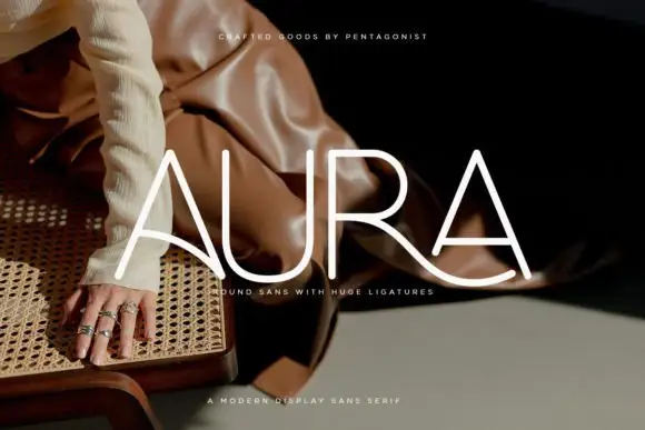
Aura shows pale thin capitals over a dark fashion photograph, where near-even rounded strokes build an open U and a broad R bowl, the first A carries a long curved cross-stroke that sweeps toward the centre and the R leg continues below the final A as a broad flowing curve.
The strokes stay uniform and thin, the curves stay circular and one cross stroke drops into a wide ligature that links two letters and runs under the word. That ligature is the character: the row reads as a drawn wordmark rather than a set line, which is why the sample keeps four letters on a photograph. The source notes PUA extras plus entry and terminal swashes, so check how the link is reached. Keep 36 pt for the thin strokes, test the ligature with your own letters and reserve 20 mm beneath.
A rounded-line skincare-name study — Test the actual name on a flat panel and keep its descriptor beneath the entire sweep.
Verify connection access and inspect fine strokes at label size.
 #18
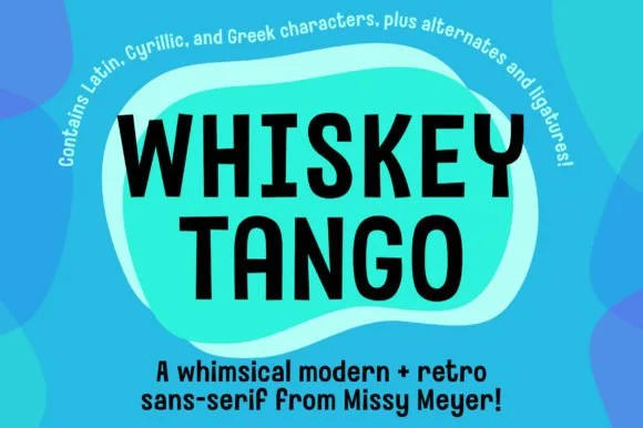
Whiskey Tango is a lively, tall-and-narrow rounded sans-serif packed with Latin, Cyrillic, and Greek support plus over 110 PUA alternates.
Whiskey Tango is a tall condensed rounded retro sans with more than a hundred and ten private-use extras: squeezed caps with soft corners and a high waist, plus swash letters, ligatures, tails and ornaments reached through alternate keystrokes. It is a packaging face, so it wants a tall panel and a single flat ink rather than a soft ground. The soft corners are the finest element and they plug first at small sizes. It needs roughly 26 mm for the corner and the condensed stem to read, and it is best one flat ink on kraft or white board.
Retro travel poster, podcast cover & cocktail menu — Stack two-word drink or episode titles in 48 pt uppercase at tight 0.95 line-height, using mixed-case Whiskey Tango or a light sans for descriptions.
Rounded stroke ends and generous counters make this one of the cleanest tall sans faces to cut on Oracal 651 or HTV even at 0.65 in.
 #19
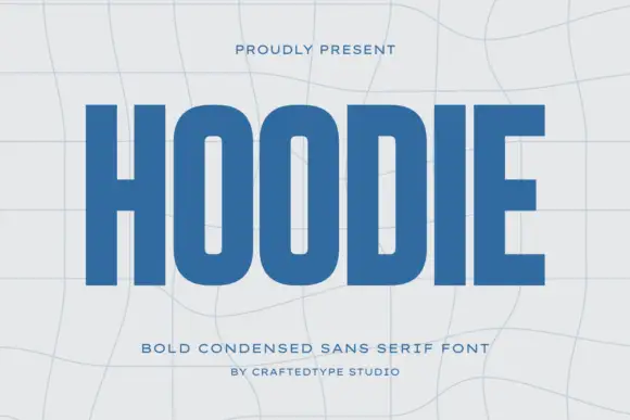
Hoodie shows a large blue uppercase word on a pale warped-grid field, where heavy straight uprights and flat horizontal endings form a dense block, the O and D hold rounded rectangular counters, the H crossbar sits near the middle and the E keeps three squared arms.
The stems stay straight and heavy, the counters turn into rounded rectangles, the endings flatten and the row compresses. That compression is the character: a short word becomes a dense block, which is why the sample fills the width on a warped grid. The grid bends independently of the type, so check the counters at your final size, keep 40 pt before they close and confirm the condensed caps are what your file actually holds. The rounded rectangular counters are the failure point: they close at about 30 pt and the word reads as a dense ribbon, so keep 40 pt and do not let a curved grid carry the type.
A compact athletic-club name study — Set one flat name line above a plain independent-club descriptor.
Check counter openness at badge size and test any garment process separately.
 #20
Taught is a heavy, flat-sided condensed sans-serif with tight interior counters and commanding vertical headline presence.
Taught is a bold flat-sided condensed poster grotesk: narrow stems with completely flat sides, tight square counters, a bold weight that holds across a large format and a set of slightly odd terminals that give it a printed poster feel. The flat sides keep a word from looking hand-made, and the counters close when the face is scaled down. It needs roughly 22 mm for the counter and the flat side to read, and it is best in one dense ink on uncoated stock, or a single white on a dark ground.
YouTube thumbnail headline, fitness poster & magazine cover — Set 1-to-4-word uppercase punchlines at 72+ pt with +15 tracking and tight 0.92 line-height over high-contrast backgrounds.
Broad flat stems weed fast on sign vinyl and HTV down to 0.6 inches—zero fragile serifs or hairlines to tear.
 #21
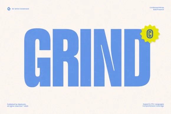
Gc Grind is a bold condensed sans-serif engineered with subtle corner inktraps and flat industrial curves across 170+ languages.
Gc Grind is a heavy condensed inktrap display sans: very narrow squared stems, small triangular traps cut into the joins where two strokes meet, a tall cap height and tight counters that read as a stencil-cut industrial headline. The traps are the design and they fill into solid corners as soon as the face is printed small. It needs roughly 24 mm for the trap and the condensed stem to read, and it is best in one dense ink on uncoated stock, or a single white on a dark ground where the traps print as cut notches.
Coffee roastery bag, energy-drink can & streetwear tag — Run bold uppercase product names vertically or across narrow 2.5-inch can panels, pairing specs in a tiny technical grotesk.
Solid vertical bars cut cleanly on matte vinyl and stencil mylar; keep height above 0.8 in so the intentional inktrap notches stay visible.
 #22
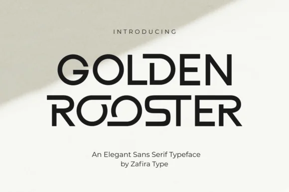
Golden Rooster is a crisp, medium-bold geometric sans-serif distinguished by circular interlocking 'OO' ligatures and sculpted leg curves.
Golden Rooster is a geometric art-gallery sans with interlocking ligature bowls: perfectly circular bowls, straight-sided stems, and a set of ligatures where two round letters share one overlapping arc so the pair reads as a single drawn form. The interlock is the design and it breaks if the pair is tracked apart, and the circular bowls close when the face shrinks. It needs roughly 26 mm for the interlock and the bowl to read, and it is best in one fine ink on a pale ground, or a single dark tone on coated stock.
Modern architecture studio, roastery & lifestyle wordmark — Set brand names in uppercase at 36–60 pt with +20 tracking on raw white cotton stock, letting one ligature pair act as the centerpiece.
Even stroke weight and wide geometric counters weed cleanly on storefront glass vinyl, acrylic signs, and matte packaging labels.
 #23
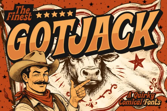
Gotjack is a punchy 1970s/80s vintage comic-book cover font built for slanted 3D block extrusions, pulp westerns, and retro pop-art tees!
Gotjack is a vintage comic-cover masthead display with warm cream-orange caps, a thick black ink outline and a deep slanted 3D block extrusion, so a word reads as the title of a pulp issue rather than a modern display. The extrusion is baked in and always falls to one side, which fixes the light direction, and the outline means the letters hold over a busy cover illustration. It needs roughly 34 mm for the block shadow to read as depth, and it is best in cream and orange on a printed comic cover or as one flat ink on kraft.
Indie comic-book masthead, retro podcast & YouTube cover — Tilt 1 uppercase title upward +8° (84–165 pt), fill with warm orange-gold, and add a heavy black 3D drop extrusion.
Clean, bold underlying polygons cut fast on Cricut HTV, Oracal 651, and Print-Then-Cut stickers down to 0.65 inches!
 #24
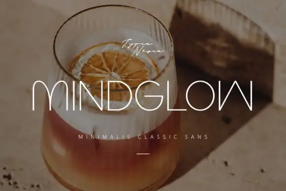
Mindglow sets wide light capitals with hairline strokes and generous tracking, and lays them over a warm photograph of a drink so the word reads as a line of light rather than a block.
The name spreads across the frame, the M and the W drawn with thin even strokes, the D and the G keeping almost rectangular bowls, and the spacing wide enough that each letter stands alone. A small script signature sits above the word and a tracked caption below, plus a short rule. Nothing is bold, so contrast comes from the photograph behind rather than from the letterforms, and the thin strokes need a calm area of the image to survive. It is a face for covers, menus and hotel signage, where a light line reads as expensive and where size is not in short supply.
An evening-drinks menu title — Place SLOW GLOW on a solid dark menu cover with a small plain venue name below, avoiding reflective glass areas.
Verify the W form and all menu characters; use a separate high-contrast face for prices.
 #25
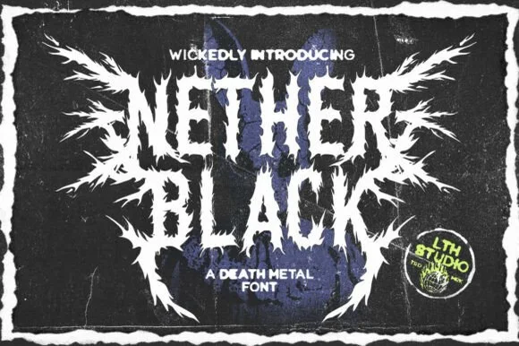
Nether Black is a ferocious death-metal display typeface erupting with symmetrical thorn spikes and splintered outer wings.
Nether Black is a jagged symmetrical death-metal thorn display: dense blackletter-derived stems with spikes thrown from every arm, mirrored ornaments along the vertical axis and a solid inner field that makes each word read as a barbed plate. It is a scene face, so it belongs on a record sleeve and a club flyer rather than on a product label. The spikes are the finest element and they fill into a solid edge when the face is reduced or screened. It needs roughly 40 mm for the spikes and the stems to read, and it is best one white ink on a black ground or the reverse.
Haunted-attraction merch hoodie & horror gig poster — Stack two short 4-to-6-letter words centered on a black garment back, using the winged outer alternates only on the first and last letters.
Skip cut-and-weed vinyl on the razor-fine thorn tips—use DTF transfers, screen printing, or high-resolution poster print instead.
 #26
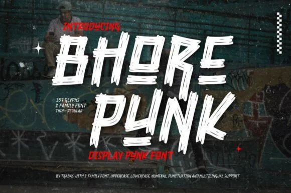
Bhore Punk is a fierce, slanted punk-rock display typeface sliced through with diagonal razor-cut stencil splits and jagged dry-brush spurs.
Bhore Punk is a slashed stencil-cut punk and streetwear display: squared letters cut through by three or four parallel slashes, with hard corners, a slightly uneven baseline and small torn bridges left holding the pieces together. The slashes are the design and they merge into solid notches as soon as the face is reduced. It needs roughly 30 mm for the slash and the bridge to read, and it is best as a one-colour vinyl cut or a flat two-colour print on uncoated stock.
Punk gig flyer, skate zine masthead & album cover — Stack 2 short all-caps words tight in stark white and red over high-contrast monochrome photography.
For DIY spray-paint stencils or large HTV back prints, scale letters to 2 inches+ so all separated slash fragments stay easy to align.
 #27
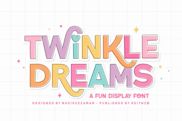
Twinkle Dreams combines firm block capitals with a heart-shaped dot above the i and curling extensions on selected letters, where the R and K tails swing below the main rows, each letter takes a pastel fill with a fine dark edge and the whole block sits on a faint grid.
The bodies stay blocky and even, the edges stay fine, the fills change per letter and two letters drop long tails under the baseline. That heart dot is the character: a plain display face gains one playful substitution, which is why the sample keeps a short title. The grid and the sparkles are cover treatment. Keep 40 pt so the fine edges stay separate from the fills, verify the heart form in your file and check the swinging tails against the line beneath.
A wish-themed party invitation — Keep the phrase large with clear room below any R tail; place details in plain text.
Check the actual letters and do not assume a heart appears in words without i.
 #28
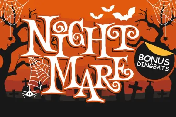
Night Mare is an angular decorative serif in which the letters stay uneven, the feet come to points and the terminals coil inward in tight spirals, so a stacked title reads as gothic horror lettering rather than a clean historical blackletter.
The G and E curl their terminals inward, the T stretches a long bar over neighbouring letters, the feet sharpen to points and the letter heights shift by design. The coiled terminal is the character: it puts the fright in the letterform instead of in added artwork, which is why the sample stacks a tall uneven title. Because the spirals are small, the face wants 36 pt before they resolve, and the points thin out in vinyl under three quarters of an inch of cap height. The extra characters are PUA-encoded, so any swash must be accessed deliberately.
A haunted-story evening poster — Stack two short words above a clean time-and-location block, leaving the long top bars clear.
Confirm required characters and any bonus ornaments before layout approval.
 #29
Bunglon is a modern copperplate script in which the downstrokes carry weight, the hairlines stay fine and generous swashes arch above the x-height and below the baseline, so a single name reads as formal calligraphy.
The B opens a wide upper loop, the bowls swell on the downstroke and thin on the join, the ascenders carry tall loops and the swash set adds long arcs that clear the word above and below. The overhead swashes are the character: they frame a name without a border, which is why the sample sets one couple's name on a plain card. Because the swashes are long, a line needs 20 mm of clearance at both ends, and the joins must be welded before cutting from 1.1 inches of x-height. The pale ground, the fine rules and the small caps line are presentation; the dark calligraphic name is the face.
Save-the-date or thank-you card headline — Use swashed forms sparingly on first and last letters and keep event logistics in a clean serif.
Fine hairlines suit print and foil; thicken with a small offset path if adapting for large vinyl signs.
 #30
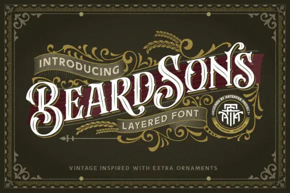
Beardsons rises diagonally across an ornate olive cover, where white capitals carry thin internal lines, narrow waists and extended curled terminals around the opening B and the central S, a dark red offset behind the letters adds depth and fine gold foliage frames the name.
The stems stay narrow at the waist and wide at the terminals, the internal hairlines cut through the bodies and the offset duplicates the contour behind. That layered offset is the character: the word reads as a carved Victorian sign rather than a flat lettering job, which is why the sample runs on a diagonal across a bordered field. The gold foliage, the border and the banners are artwork. Keep 44 pt so the thin inner lines survive, allow 12 mm for the offset and check the diagonal at the trim.
A barbershop appointment-card front — Angle BEARDSONS slightly across a dark olive card front; place BARBER in small plain capitals beneath, and booking details on the reverse.
Verify available letter variants and any layer registration in the intended application.
 #31
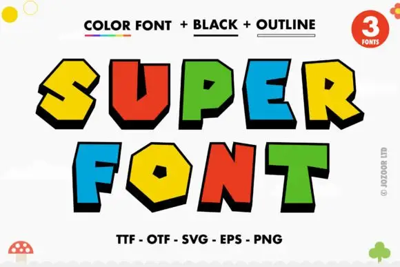
Super is a comic display face of fat angular caps, supplied three ways: a colour version with hard offset shadows, a solid black version and an outline version, all with sharp bevels and pointed corners.
SUPER over FONT fills the card, and each letter is a chunky angular shape with a bevel cut on one corner and a hard black shadow stepped to the lower left. The colours rotate through yellow, red, green and blue, and the shadow is identical on every letter, which is what holds a multi-coloured word together. A caption at the top names the three versions and a line at the foot lists the formats, while small doodles sit at the corners. The three-version construction is the practical part: the colour version is for posters and covers, the black version for one-colour print and cutting, and the outline version for colouring pages and overlays, so one purchase covers a poster, a shirt and a children's activity sheet.
A block-colour party heading — Set BIG above DAY on white, keeping the name and date in a plain black strip underneath.
Check colour and shadow rendering in the intended software, without implying licensed game branding.
 #32
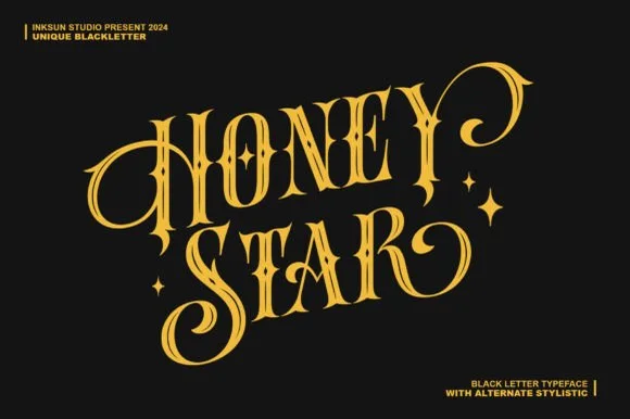
Honey Star is a whimsical, medium-bold ornamental blackletter blending diamond gothic stems with sweeping celestial spiral curls.
Honey Star is a Victorian ornamental blackletter crossed with psychedelic swashes: dense broken strokes with a heavy vertical rhythm, split serifs that curl into long spiral tails, small stars set into the counters and a warm wobble across the baseline. The spirals and the stars are the finest elements and both close first. It needs roughly 34 mm for the spiral and the star to read, and it is best in two warm inks on cream, or one dense ink on white where the spirals print as drawn lines.
Celestial tarot box, apothecary candle & spooky-season mug — Center a 2-word title in metallic gold over midnight black or deep plum, flanking outer curls with minimal star marks.
Main stems have decent body, while outer spiral tips taper fine—favor gold foil, sublimation, or 1.8 in+ vinyl decals.
 #33
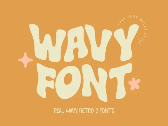
Wavy Retro shows thick letters with curved outer edges and uneven tops, where the W spreads broadly, the O tilts and the T carries an exaggerated rightward arm, and the cream title sits on orange with almost no additional decoration.
The strokes stay thick, the sides bulge, the tops rise unevenly and the arms stretch sideways. That wave is the character: the word reads as a seventies sign rather than a straight cap row, which is why the sample keeps the type alone on orange. The cover advertises two fonts while only one direction is shown, so check the styles you hold, keep 44 pt so the bulges stay distinct and test the W against a long word. The bulges are the detail: below about 30 pt the swollen sides merge with the neighbouring letter and the row prints as a chain of bars. Keep the face at 44 pt, test the W against the longest word in the title, and check the second advertised style before you build a layout around it.
A summer workshop poster — Use two roomy rows on a flat contrasting field with a plain date block.
Check row spacing around the tallest bulges and verify the chosen member.
 #34
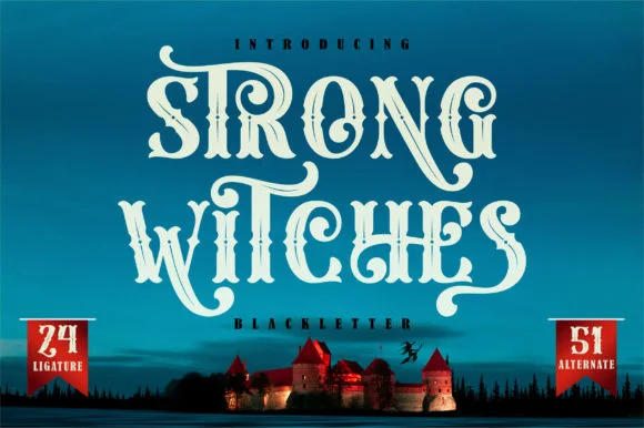
Strong Witches is a lively, fairytale-gothic blackletter softened by bouncy curled swashes, 24 ligatures, and 51 stylistic alternates.
Strong Witches is a playful curly-swashed fantasy blackletter with twenty-four ligatures and fifty-one alternates: dense broken strokes with a light rhythm, curls that sprout off the shoulders and a swash set that turns a plain word into a drawn spell. The alternates only appear through specific keystrokes, and the curls are the finest element. It needs roughly 32 mm for the curl and the ligature to read, and it is best in two flat inks on cream, or one dense ink on white where the curls print as drawn lines.
Hocus-Pocus party shirt, potion jar label & spellbook prop — Stack 2 centered words at 48–68 pt and swap in 2 or 3 of the 51 PUA alternates on outer capitals and descenders.
Sturdy main stems cut well on HTV and vinyl at 1.4 inches+ tall; take care around the narrower curled tail hooks when weeding.
 #35
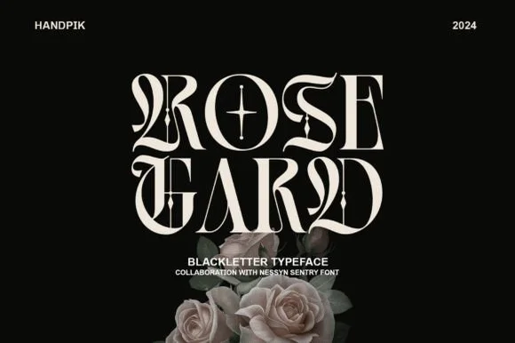
Rose Gard is a sleek, high-contrast modern blackletter featuring calligraphic hairline loops, razor-sliced stems, and a star-crossed O.
Rose Gard is a sharp high-contrast blackletter drawn for editorial use: fine hairlines against dense black stems, pointed diamond terminals, tight vertical rhythm and a clean baseline that lets it sit inside a column. The hairlines are the weakest element in print and the terminals are what survive at display size. It needs roughly 30 mm for the diamond terminal and the hairline to read, and it is best in one dense black on a smooth text stock, or a single dark red on cream, and it should never be reversed at small sizes.
Gothic romance cover, dark-academia zine & album sleeve — Stack two short 4-to-5-letter words flush-center at 64–96 pt with generous black negative space around them.
Needle-thin hairline loops and interior star crosshairs require print, foil, or digital output—do not weed small vinyl.
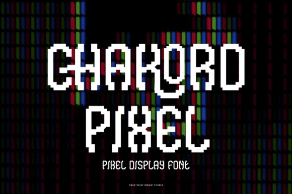 #36
Chakord Pixel builds chunky 8-bit arcade capitals from crisp square pixel blocks with playful notched corners and ligature-like joins.
Chakord Pixel is a stair-stepped eight-bit arcade pixel display: every stroke is built from square cells on a fixed grid, with hard diagonal steps, chunky caps and no anti-aliased curves at all. The grid is the design, so the face must be set on an even multiple of the cell size or the steps break into uneven runs. The corners are the finest element and they crumble when the face is scaled off-grid. It needs roughly 32 mm for the cell to read as a pixel, and it is best one bright ink on a dark ground.
'Level Up' gamer birthday topper & party shirt — Stack 'LEVEL 10' or the birthday kid's gamer tag in two centered lines, backing white letters with a black offset pixel shadow.
Because stepped corners create many tiny 90-degree turns, use a fresh 45-degree blade at medium speed so vinyl corners lift sharply.
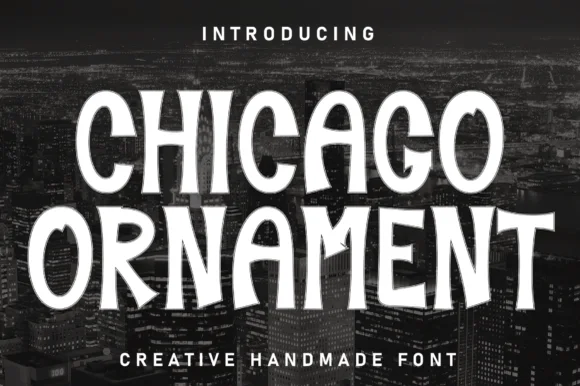 #37
Chicago Ornament is a tall, hand-inked condensed display typeface with softly flared terminals, high-waisted bars, and subtle sign-painter grit.
Chicago Ornament is a handcrafted ornamental condensed display serif in which the stems are dense with carved detail: small diamonds, hatching and scroll fins run up the vertical, the serifs split into curls and the caps carry a drawing rather than a letter shape. The ornament fills the stem, so the counters stay narrow and the smallest fin is what closes first. It needs roughly 36 mm for the hatching and the scroll fin to read, and it is best in one dense ink on cream and sand tones, or a single deep colour on a pale poster stock.
City travel poster, jazz-night bill & documentary title — Stack 2 all-caps lines wide across dark black-and-white photography with tight 0.95 leading.
Solid upright stems with soft flares cut cleanly on matte wall vinyl, wood stencils, and tote HTV down to 0.8 in.
Practical buyer checklist
Key cutting, printing and pairing answers before choosing a editorial & posters typeface.
Only in short measures of 40 characters or fewer. Longer columns need a text-optimised face with steadier weight and more open spacing, otherwise the reading rhythm stutters and the page feels tiring.
Height, not width. A masthead needs a tall cap height and simple counters so it reads across a room or a thumbnail. Swashes and ligatures belong in the cover lines, where the reader is closer.
Change one structural thing per page: a different alignment, one deliberately oversized word, or a column broken by a pull quote. Editorial design reads as considered when the grid is visible and one element breaks it on purpose.
Check for old-style figures, small caps, a proper em dash and an ampersand with character. Prices and dates expose a weak numeral set immediately, and a missing true italic forces a slanted roman that never matches the text.
Keep exploring
Explore adjacent maker roundups or check our practical pre-production checklists.
34 curated fonts · Previews & pairings
25 curated fonts · Previews & pairings
21 curated fonts · Previews & pairings
19 curated fonts · Previews & pairings
Guides: Invitation font checklist · Vinyl & cutting checklist · How to pair script & sans fonts
Allow optional Google Analytics to measure visits and catalogue actions. Your search words and notes are not included. Privacy & storage