 #1 · Best Overall
Disclosure: MakerFileHub may earn a commission from qualifying purchases via paid links on this page. How our links work.
Folk-pattern tiles, Otomi detail & carved stone
15 Best Cinco de Mayo & Mexican Fiesta Fonts
Mexican folk lettering draws on papel picado, Otomi embroidery, Talavera tile and carved stone, and the best digital faces treat those as construction rather than sticker art. Del Carna and Cinco De Mayo build folk-floral and scalloped patterns into the glyphs, Sonarisa La Fiesta and Nacho Fiesta keep a carved serif structure, and Mexico Culture and Noctis reference geometric and Mesoamerican carving.
Quick verdict
Sonarisa La Fiesta is the most useful carved display for a cantina sign, Del Carna is the strongest patterned face for party goods, and Nacho Fiesta covers the inline Tuscan register. Noctis is the pick for a Mesoamerican reference.
Quick answer
Top 3 Cinco de Mayo & Mexican fiesta picks right now.
Short on time? Start with our three highest-rated Cinco de Mayo & Mexican fiesta standouts before scrolling the full breakdown.
#1 · Best Overall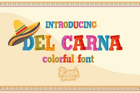 #2 · Runner-Up Pick
 #3 · Editor's Choice
How we tested & selected these 15 fonts
We kept 13 of 21 candidates, the tightest pool in the catalogue. Judged on whether the folk pattern is drawn into the letter, how the detail reads at 3 inch banner scale, and whether the design references Mexican folk art rather than generic party decoration.
Side-by-side summary
Top 5 Cinco de Mayo & Mexican fiesta picks at a glance.
Compare specimens, OpenType/PUA traits and primary project roles side by side.
| Rank & Font | Style & File Specs | Best Project Fit | Store Listing |
|---|---|---|---|
| DisplayAlternates & swashes · Language support | Día de los Muertos banner, taco-bar menu & cantina sign | Get fontPaid link | |
| DecorativeCarnival | Taco-night party invite, carnival banner & salsa-jar label | Get fontPaid link | |
| SerifCantina | Food-truck menu board, tortilla-chip bag & cantina coaster | Get fontPaid link | |
| DecorativeArtisanal-folk | Artisanal mezcal/tequila label, mole jar & restaurant sign | Get fontPaid link | |
| DecorativeBold festive capitals with dotted folk-style patterns | A community fiesta event heading | Get fontPaid link |
Display & Decorative Headlines
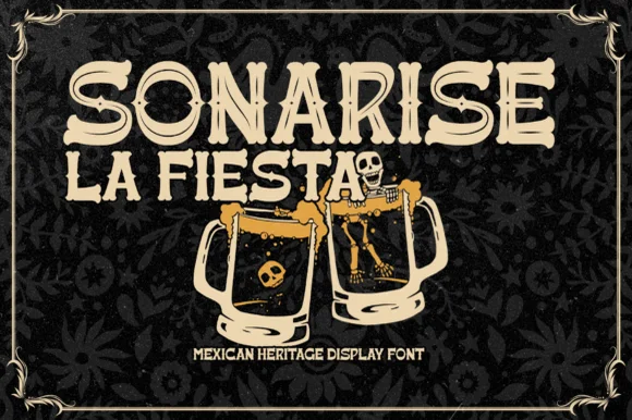
15 fonts#1 · Best OverallSonarisa La Fiesta
Sonarisa La Fiesta is a lively Mexican-heritage display typeface with flared Tuscan-style spurs, dancing baselines, and hand-carved warmth.
Sonarisa La Fiesta is a hand-carved Mexican fiesta and cantina serif display: chunky bracketed letters with visible chisel facets, small star or diamond cuts set into the counters and edges that read as carved and painted timber. The facets are the design and they flatten into a solid block once the face is reduced, and the star cuts close first. It needs roughly 32 mm for the facet and the star to read, and it is best in three flat inks on cream, or one ink plus paper where the stars print as knockouts.
Recommended project & layout
Día de los Muertos banner, taco-bar menu & cantina sign — Stack 2 or 3 centered uppercase lines in warm cream, marigold gold, or fiesta coral over dark papel-picado backgrounds.
Before you cut or print
Chunky solid stems with flared ends cut cleanly on cardstock banners, HTV aprons, and painted wood stencils down to 0.75 in.
Best paired with
Get fontPaid link
#2 · Runner-Up PickDel Carna
Del Carna is a festive multi-color fiesta display font combining bouncy flared serif capitals with painted folk-stripe textures.
Del Carna is a multi-colour fiesta display with bouncy flared wedge serifs and painted folk-stripe texture inside the strokes, so a word looks lettered onto a woven blanket rather than printed flat. The letters are wide and slightly dancing, the wedges are sharp, and the palette is per glyph, which makes the face a graphic object rather than a recolourable typeface. It needs roughly 25 mm for the stripes to read as painted texture, and it is at its best on a warm sand ground with two or three saturated inks.
Recommended project & layout
Taco-night party invite, carnival banner & salsa-jar label — Center 1 or 2 uppercase words at 54–96 pt framed top and bottom by geometric papel-picado or woven borders.
Before you cut or print
Multi-color painted fills require color printing, Print-Then-Cut stickers, or sublimation rather than single-color cut vinyl.
Best paired with
Get fontPaid link
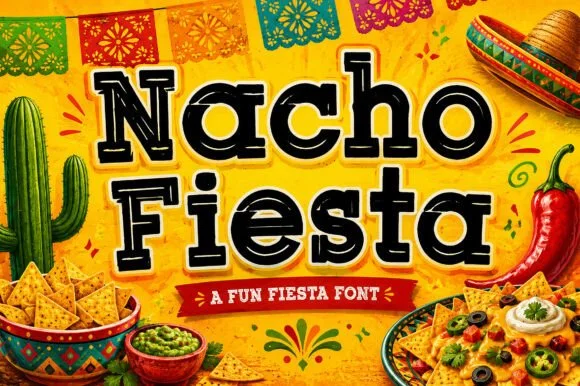
#3 · Editor's ChoiceNacho Fiesta
Nacho Fiesta is a bold, single-color cantina slab-serif accented with Western median spurs and crisp inline dots/dashes inside every stroke.
Nacho Fiesta is an inline-dotted Western and Mexican cantina Tuscan slab serif: heavy unbracketed slabs that split into a fork, a line of round dots running down the middle of each stem instead of a solid inline and a small spur rising from some shoulders. The dotted inline is the design and it merges into a line as soon as the face is reduced. It needs roughly 32 mm for the dot pitch and the fork to read, and it is best in two warm inks on cream, or one ink plus paper where the dots print as round knockouts.
Recommended project & layout
Food-truck menu board, tortilla-chip bag & cantina coaster — Set mixed-case titles at 48–90 pt in black or chili red wrapped in a 0.1 in cream sticker offset over warm yellow.
Before you cut or print
Shines in print, DTF, and menus; if cutting HTV/vinyl, scale to 1.75 in+ or Contour out the small interior inline dots.
Best paired with
Get fontPaid link
 #4 · Top Maker Utility
Mexico Culture
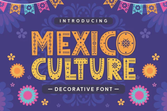
Mexico Culture is an ornamented display in yellow and orange on purple: bold caps with hand-drawn patterns cut inside each stroke, sun and flower motifs in the bowls, dot and dash ornaments around the letters, with paper bunting above and layered flowers below.
The two words are stacked and each letter carries its own pattern: dashes, stitches, dots and small suns are cut inside the strokes, which turns the words into a decorated object rather than a text line. The patterns sit inside the letters rather than around them, so the silhouette stays simple and the word remains legible at a distance, and the ornaments between letters keep the spacing even. Because the detail is fine, the face needs a large size, and the specimen sets it big on a flat purple ground with bunting and flowers that belong to the seasonal setting. The palette is three colours, and the small tracked label above and the ruled caption below are the only neutral elements, which keeps the plate in one voice.
Recommended project & layout
Artisanal mezcal/tequila label, mole jar & restaurant sign — Stack 2 centered uppercase words at 54–96 pt in ochre gold over deep indigo, terracotta, or charcoal.
Before you cut or print
Intricate interior folk carvings laser-engrave magnificently on wood/slate and print sharply; avoid weeding small vinyl.
Best paired with
Get fontPaid link
 #5 · Standout Silhouette
Cinco Fiesta
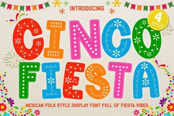
Cinco Fiesta uses broad capitals filled with floral, dotted and zigzag motifs, where each coloured letter carries a different internal pattern while keeping a strong outer silhouette.
The outer shapes stay bold and simple, the interiors change from letter to letter, the patterns fill the whole stroke and the colours vary across the row. That per-letter pattern is the character: the word becomes a folk banner without extra art, which is why the sample sets one line and advertises four styles. The cover names a regional direction as identity rather than proof of origin, so confirm which patterns ship as glyphs, test at print size and keep 40 pt.
Recommended project & layout
A community fiesta event heading — Place two large rows on a plain pale panel and put the programme below in unpatterned type.
Before you cut or print
Verify accents and required characters; have event-specific cultural wording reviewed.
Best paired with
Get fontPaid link
 #6
Mexican
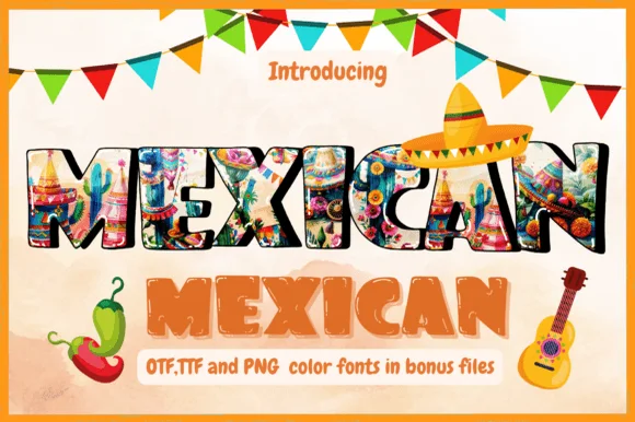
Mexican is a festive color-font pack pairing richly illustrated folk-art capitals with warm textured terracotta letters (OTF, TTF & bonus PNGs).
Mexican is a folk-collage font duo in which the letters are filled with textile and papel-picado patterns, paired with a plain textured companion for long lines, and supplied as fonts plus PNG pattern sheets. The pattern fill is the design, so the letters need size to read as cloth, and the plain companion carries the text that the patterned cut would make illegible. It needs roughly 34 mm for the inner pattern to resolve, and it is best in two flat inks on white and cream, with the pattern layer as a spot colour rather than a four-colour build.
Recommended project & layout
Taqueria menu header, fiesta sublimation tee & flyer — Arc the patterned color letters across white shirts or Kraft menu tops beneath colorful triangle bunting.
Before you cut or print
Use the PNG/color files for sublimation, DTF, and Print-Then-Cut stickers.
Best paired with
Get fontPaid link
 #7
Cinco De Mayo
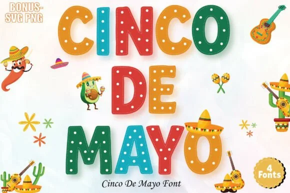
Cinco De Mayo (by ProFonts) is a bright 4-font fiesta alphabet family (+ bonus SVG/PNGs) decorating chunky rounded capitals with dots and zigzags.
Cinco De Mayo is a four-font fiesta family of chunky rounded capitals decorated with dots, zigzags and folk stripes, supplied with bonus SVG and PNG artwork. The blocks are heavy and wide with small counters, so a word reads as bunting or papel picado at 20 mm, and the four cuts let a designer alternate colours per letter without redrawing. The interior patterns are coarse enough to survive a vinyl cut, and the face is a celebration alphabet rather than a text face.
Recommended project & layout
Kids' fiesta birthday shirt, taco-bar sign & cupcake pick — Alternate the 4 included font styles/colors letter-by-letter across white party banners.
Before you cut or print
Simple geometric dots and chevrons mean you can even cut larger 2.5 in+ layered cardstock or HTV letters from the SVGs!
Best paired with
Get fontPaid link
 #8
Noctis
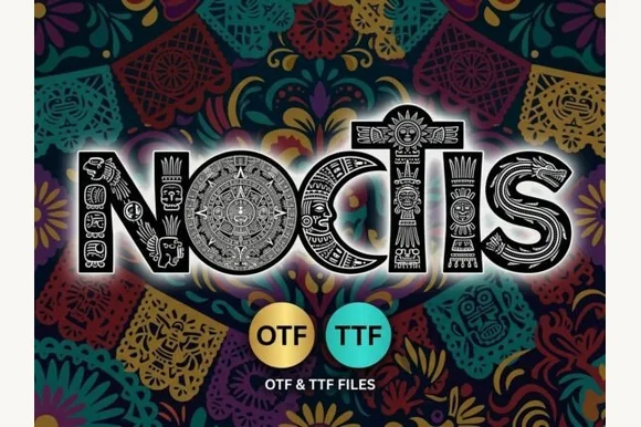
Noctis carves monumental capitals out of intricate Mesoamerican sun-stone discs, feathered-serpent frets, and totem reliefs (OTF & TTF)!
Noctis is a Mesoamerican-inspired stone-carved display: blocky stepped letters with glyph-like bars and dots in the counters, sharp incised cuts along the stems and a heavy even weight that reads as carved relief. The glyph detail is the design and closes first at small sizes, and the stepped silhouette makes a word wide. It needs roughly 34 mm for the incised cut and the glyph to read, and it is best in one dense ink on stone-toned stock, or a single terracotta on cream where the carving prints as a shadow.
Recommended project & layout
Mythology novel cover, Dia de los Muertos poster & tabletop RPG — Center 1 short 4-to-7-letter uppercase title huge (90–185 pt) so every sacred geometric carving inside the stems is legible!
Before you cut or print
Hundreds of microscopic stone-carving paths per glyph—strictly for print, posters, book jackets, laser engraving & DTF (NEVER weed vinyl!).
Best paired with
Get fontPaid link
 #9
Mexican Vibes
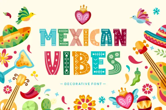
Mexican Vibes fills wide block capitals with pale folk patterns, so MEXICAN and VIBES read as two rows of woven textile rather than as lettering painted with a brush.
Each letter is a broad slab with a hairline inner outline, and inside that outline sits a different motif: zigzag tracks, stepped diamonds, rows of dots, small birds, crosses and flower heads picked out in cream against teal, green, orange, pink and red. The two rows alternate colours letter by letter, so the word becomes a stripe of the same textile repeated. Around the type, a border of sombreros, maracas, a guitar, chillies, crowned hearts and a cactus carries the folk style without touching the letterforms. The pattern is fine, so the capitals need size to keep the motifs from merging into a blur.
Recommended project & layout
A geometric-fill lettering study — Place VIBES above enlarged I and S crops on cream with plain annotation text at the left.
Before you cut or print
Verify patterns and avoid unsupported cultural attribution.
Best paired with
Get fontPaid link
 #10
Mexican Moon
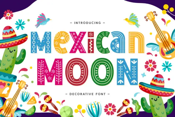
Mexican Moon shows multicoloured lettering inside a busy illustrated border, where narrow pale patterns follow the broad strokes, dots and chains sit inside the M, small star-like flowers appear in the e and parallel curves travel along the counters.
The bodies stay heavy, each letter carries its own pattern, the marks follow the stroke direction and the colour changes from letter to letter. That internal patterning is the character: the word arrives decorated without a separate illustration, which is why the sample sets one title inside a border of cacti and birds. The cultural label is a source identity rather than evidence of authenticity, so confirm which patterns are glyphs, source any surrounding art yourself and keep 40 pt before the fine marks close.
Recommended project & layout
A decorative-pattern specimen cover — Set MOON above enlarged O and N crops on white with plain pattern notes in a narrow side column.
Before you cut or print
Verify patterns and avoid unsupported cultural claims.
Best paired with
Get fontPaid link
 #11
Fiesta Circuit
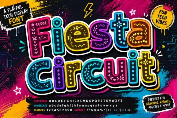
Fiesta Circuit draws fat rounded capitals, fills every one with a different bright colour and then doodles circuit tracks, node dots, stars and coiled loops across the interior in white.
Fiesta over circuit runs on a black ground spattered with paint, the letters crowding each other and tilting a few degrees so the words bounce. Each glyph carries its own set of doodle marks, some with crosses and zigzags, some with a running node line, one holding a coiled spring shape, and the white marks sit inside a thick white outline. A panel at the top calls it a playful tech display font and a round badge adds a second mood label, while the foot of the cover lists uppercase, lowercase, numbers and symbols with the actual characters. It is a colour font with a busy interior, so the word reads as a bright shape at a distance and as doodles up close.
Recommended project & layout
A creative technology club poster — Stack Fiesta over Circuit in a large white poster panel, keeping meeting details in a dark plain footer.
Before you cut or print
Verify component colouring and do not claim the marks are functional circuit diagrams.
Best paired with
Get fontPaid link
 #12
Cinco De Mayo
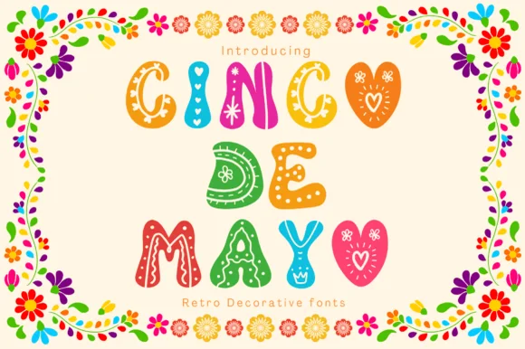
Cinco De Mayo (by Pui Art) is a sweet, scalloped folk-bubble color font decorated inside each colorful chubby letter with hearts, dots, and zigzags.
Cinco De Mayo by Pui Art is a colour folk-bubble display in which each plump scalloped letter is filled with hearts, dots and zigzag doodles and finished with a white folk border, so a word reads as a decorated paper banner rather than as type. The pattern lives inside the stroke, which means the face needs size for the doodles to read as pattern, and the scalloped edge gives every letter its own silhouette. It needs roughly 32 mm for the interior pattern to hold, and it is best in gold, turquoise and magenta on white.
Recommended project & layout
Toddler 'Uno!' / 'Dos!' fiesta shirt, banner & invite — Center 2 or 3 short words on bright white Print-Then-Cut cardstock framed by floral folk borders.
Before you cut or print
Multi-color folk details are made for sublimation, Print-Then-Cut stickers, and color printing rather than cut vinyl.
Best paired with
Get fontPaid link
 #13
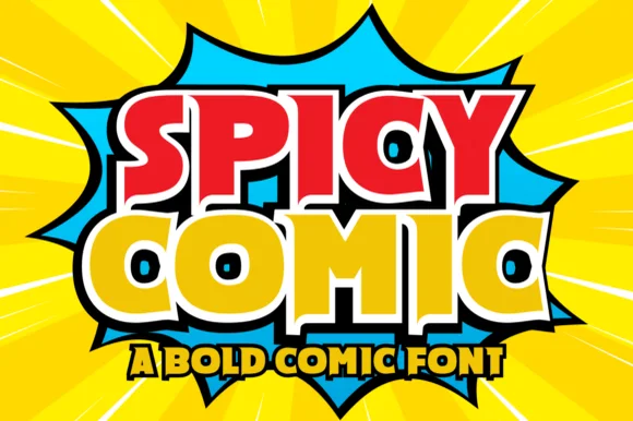
Spicy Comic
Spicy Comic is a high-energy superhero display font featuring thick angled block letters and compact triangular/keyhole counters.
Spicy Comic is a superhero display with thick angled block capitals, compact triangular and keyhole counters and hard diagonal cuts, so a word reads as a comic cover title rather than a cartoon bubble. The wedge counters are the design, which means the face needs size for them to stay open, and the sharp angles give it a printed-on-newsprint aggression. It needs roughly 30 mm for the keyhole counter to read, and it is best in red and gold on yellow, or one flat ink on newsprint grey.
Recommended project & layout
Hot-sauce bottle, taco-truck menu & spicy-snack pouch — Color row one fiery red and row two bright habanero yellow wrapped in a unified black comic border.
Before you cut or print
Solid single-layer base glyphs cut cleanly on HTV, food-truck vinyl, and sticker stock down to 0.7 inches.
Best paired with
Get fontPaid link
 #14
Cinco De Mayo
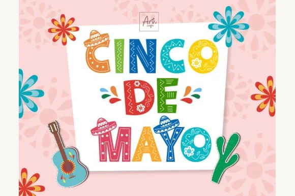
Cinco De Mayo (by Art cafe) is a full-color folk-art display font filling bold block capitals with painted Mexican flowers, sombreros, and stripes.
Cinco De Mayo is a colour font built from folk-floral Otomi patterns: each letter is filled with small embroidered blooms, leaves and birds inside a bold silhouette, and the layers separate so the pattern can print in a second colour. The silhouette holds the shape while the inner pattern needs size to read as pattern rather than noise. It needs roughly 34 mm for the inner motifs to resolve, and it is best as a two-colour print on white or cream, with the pattern layer in one bright ink.
Recommended project & layout
Cinco de Mayo party invite, margarita bar sign & menu — Stack 3 short centered words ('CINCO / DE / MAYO' or 'FIESTA / NIGHT') at 64–110 pt on bright white cardstock.
Before you cut or print
Detailed multi-color floral interiors require color printing, sublimation, or Print-Then-Cut—not single-color blade-cut vinyl.
Best paired with
Get fontPaid link
 #15
Cinco De Mayo
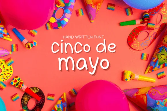
Cinco De Mayo (by Juggabee) is a slender, airy rounded monoline handwritten print font suited to everyday greeting cards, notes, and planners.
Cinco De Mayo is a slender rounded fine-pen print in which each letter is drawn as a light monoline with soft bullet terminals, wide round bowls and a generous x-height, with no connection between letters. The fine pen keeps it airy at display sizes and honest at small ones, and the rounded terminals are what stop it reading as a typewriter. It needs roughly 22 mm for the pen weight and the terminal to read, and it is best in one bright ink on white, or a single deep colour on cream where the fine line stays clean.
Recommended project & layout
Cricut Pen party invitation, envelope address & note card — Set lowercase party headers at 32–54 pt centered beneath tiny tracked uppercase sans labels ('HANDWRITTEN FONT').
Before you cut or print
Slender monoline weight is best for print, digital planners, and pen drawing; scale vinyl decals above 1.25 inches.
Best paired with
Get fontPaid link
Practical buyer checklist
Frequently asked questions.
Key cutting, printing and pairing answers before choosing a Cinco de Mayo & Mexican fiesta typeface.
Can patterned Mexican folk fonts be cut from vinyl?
Not usefully. The internal patterns are made of small detached shapes that cannot be weeded. Print these faces for banners and party goods, and use the solid carved variants when a cut design is required.
Which fonts suit a papel picado banner?
Solid, heavy faces with wide bridges and simple counters. Tissue paper tears around fine detail, so keep the lettering chunky and the cut panels at least 1 inch wide.
How do I design a fiesta theme respectfully?
Reference specific Mexican folk traditions accurately, choose one motif rather than a collage of stereotypes, and avoid mixing unrelated props. Naming the tradition the lettering comes from is a simple and effective sign of respect.
Do these fonts include numbers for dates and prices?
Most include 0 to 9, often in a plainer style than the letters. Check the numerals before setting a menu board, since patterned alphabets frequently leave numbers unpatterned.
Keep exploring
Related collections & guides.
Explore adjacent maker roundups or check our practical pre-production checklists.
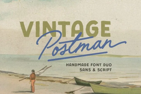
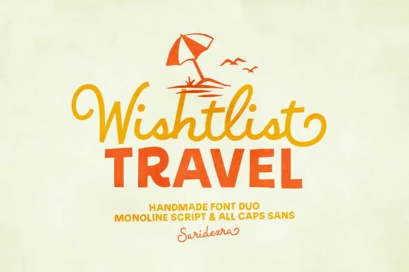
01 / Branding & Print
Tropical tiki, bamboo & surf
18 curated fonts · Previews & pairings
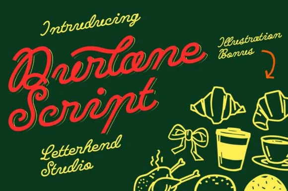

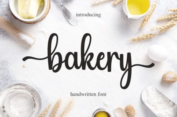
02 / Branding & Print
Artisan bakery, café & menus
28 curated fonts · Previews & pairings

03 / Holidays & Seasons
Summer
27 curated fonts · Previews & pairings

04 / Occasions & Milestones
Birthday
35 curated fonts · Previews & pairings
Guides: Invitation font checklist · Vinyl & cutting checklist · How to pair script & sans fonts