 #1 · Best Overall
Maple Mingle
Casual cursive marker lettering with a heavy sticker outline
Get fontPaid link
Read review ↓Disclosure: MakerFileHub may earn a commission from qualifying purchases via paid links on this page. How our links work.
Cricut Joy, Maker, Silhouette & adhesive vinyl
Every font here was judged on one question: does the outline survive a weeding hook. Maple Mingle and Sweet Boho carry chunky ribbon strokes that lift cleanly at three-quarter inch, Tail and Welcome add horizontal wing tails that read as one shape once welded, and Baseball Custom covers the collegiate slab side of a vinyl shop. The list stays away from dry-brush textures, spatter edges and hairline upstrokes that snap in the waste piece.
Quick verdict
Start with Maple Mingle for bouncy sticker cursive, Tail for a single long tail under a name, and Sweet Boho when you need a thick script that still looks soft. Baseball Custom is the pick for jersey and team decals where a script would look wrong.
Quick answer
Short on time? Start with our three highest-rated vinyl & Cricut cutting standouts before scrolling the full breakdown.
#1 · Best OverallCasual cursive marker lettering with a heavy sticker outline
 #2 · Runner-Up Pick
 #3 · Editor's Choice
Thick rounded brush script with plump loops and wide transitions
We screened 1,322 paid candidates through the visual library, then cut the field to 38 that show uniform stroke weight, counters wider than the blade kerf and no stray specks inside the letter body. Weighted demand, letterform reliability on a mat, file metadata such as PUA alternates, and studio variety, capping each designer at two entries so the list is not one shop repeating itself.
Side-by-side summary
Compare specimens, OpenType/PUA traits and primary project roles side by side.
| Rank & Font | Style & File Specs | Best Project Fit | Store Listing |
|---|---|---|---|
| ScriptBouncy | Friendsgiving tumbler, fall doormat or sticker pack | Get fontPaid link | |
| ScriptAlternates & swashes | Personalized tumbler name, hat patch or wood round | Get fontPaid link | |
| ScriptCozy | Tea mug decal, bridesmaid gift box or cozy home sign | Get fontPaid link | |
| ScriptChunky | Mother's Day crewneck sweatshirt, tote bag or tumbler | Get fontPaid link | |
| ScriptPUA encoded · Alternates & swashes | Round wood welcome sign or nursery plaque | Get fontPaid link |
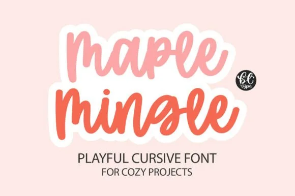
#1 · Best OverallMaple Mingle is a playful cursive face in which the letters run together in a marker hand and a heavy white outline wraps each word, so a short phrase reads as a cut sticker rather than as handwriting.
The m keeps three uneven arches, the a closes a round bowl, the p drops a wide bowl, the l rises on a slanted stem, the e turns a light eye and the n repeats the arch, all at a marker weight with rounded ends, a bouncy baseline and a contour drawn around the whole word. The contour is the character: it treats the phrase as one object, which is why the sample sets two stacked words in two colours with a cut edge. Because the shapes are solid, the face holds from 26 pt and cuts cleanly in card. The pink ground, the small monogram badge and the two caption lines are presentation; the two coloured phrases are the face.
Friendsgiving tumbler, fall doormat or sticker pack — Add an offset white sticker contour for print-then-cut planner and laptop decals.
Weld cursive joins before cutting — one of the easiest scripts to weed.
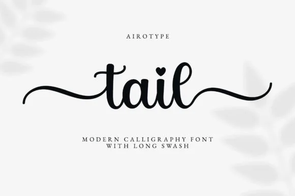
#2 · Runner-Up PickTail is a clean medium-weight calligraphy script with built-in beginning and ending wavy swashes and heart-dotted i glyphs, so a short personalised line reads as smooth writing with a flourish at each end.
The downstrokes stay sturdy, the counters open round, the entry and exit tails run in long waves and the i dots arrive as small hearts in the alternates. The wavy tail is the character: the line starts and finishes with a gesture, which is why the sample suits tumblers and round signs. Because the tails travel, keep 20 mm at each end from 26 pt, and where the surface is narrow set the word without the decorative tails rather than cropping them.
Personalized tumbler name, hat patch or wood round — Type lowercase with start and end tail alternates enabled, then Weld.
Medium-thick stroke weeds cleanly on permanent and heat-transfer vinyl.
#3 · Editor's ChoiceSweet Boho is a thick rounded brush script in which the strokes stay plump, the joins widen into soft transitions and the loops of S, B and h open wide, so a short phrase holds a large amount of ink on a craft blank.
The S swells through two wide curves, the B closes a broad upper loop, the h lifts a rounded arch and the connectors keep almost the same weight as the stems, which leaves very little thin passage anywhere in a word. The plumpness is the character: wide strokes give adhesive surface on a mug or a wooden sign, which is why the sample sets a warm phrase on a plain ground. Because the letters are fat, a title needs generous leading from 28 pt and the joins weld into a single path before cutting from 1.1 inches of x-height. The cream ground, the small daisies and the caption are presentation; the dark brush phrase is the face.
Tea mug decal, bridesmaid gift box or cozy home sign — Stack two short words tightly and Weld overlapping connections before cutting.
Top-tier vinyl & HTV friendliness thanks to thick, smooth strokes.
 #4 · Top Maker Utility
Mama is a heavy smooth brush-calligraphy script drawn for bold single-word apparel transfers, where broad cushioned downstrokes and smooth rounded joins give chest graphics rich coverage on sweatshirts and totes.
The downstrokes carry the weight, the joins stay round and smooth, the counters close tight and the word holds its shape at just one or two terms. That cushion is the character: the lettering reads warm and hand-brushed while staying solid enough to weed cleanly from a vinyl sheet, which is why the sample keeps a single short word. The 'vinyl-ready' claim comes from the source rather than a test here, so proof your own word, keep 30 pt for print and check the weeding on a scrap before the run.
Mother's Day crewneck sweatshirt, tote bag or tumbler — Centre lowercase across the chest at 8–10 inches wide and Weld before cutting.
Top choice for puff HTV, flock HTV and permanent mug vinyl.
 #5 · Standout Silhouette
Welcome features relaxed lowercase cursive with long level beginning and ending swash tails, tailored for round wood signs and entryways, where the smooth monoline-leaning strokes and open letter spacing keep words calm while the extended w and e tails span a circular blank.
The stroke stays one width, the spacing opens, the tails run level and the word sits calm. That level tail is the character: the greeting stretches to the width of a round board without a bigger point size, which is why the sample targets door signs. Plan the tails against the blank's curve, keep the stroke at 3 mm for cutting, and check the exits in your own word before committing the sign. The wide tail is also the weak point on a shaped blank: it has to end inside the panel, so a 12 mm tail on a 300 mm round board is safe and anything longer gets trimmed at the edge.
Round wood welcome sign or nursery plaque — Centre the tailed lowercase word across the middle third and tuck family names below in small caps.
PUA-encoded tails weld cleanly in Cricut/Silhouette; verify thin tail tips before weeding small decals.
 #6
Thick Black combines heavy rounded stems with large looping T, B and k forms, where two stacked words sit with tight middle counters and sweeping outer terminals, and a faint landscape runs behind the lettering as separate artwork.
The stems stay heavy, the loops grow large, the counters close tight and the terminals sweep out. That heavy loop is the character: the word reads as brush calligraphy rather than a delicate script, which is why the sample keeps two words stacked. The landscape is not part of the letters, so test the script on flat colour, keep 34 pt before the counters close and allow 22 mm at each end for the terminals. The tight counters are the risk: they plug at about 30 pt and the word greys into a black mass, so keep 34 pt and give each end 22 mm for the swept terminals.
A coffee-blend name panel — Give the name a wide front panel and move weight, ingredients and roast notes to plain type below the lowest curl.
Proof tight counters at package size.
 #7
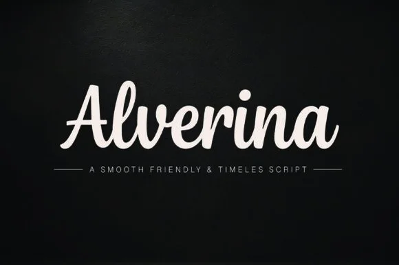
Alverina is a warm, bold-stroke handwritten script with upright rhythm and sturdy connectors that cut and weed cleanly on vinyl, HTV, and wood!
Alverina is a warm thick-ribbon script with an upright rhythm, tented A and plump connected lowercase, drawn with sturdy connectors so it cuts and weeds cleanly on vinyl, HTV and wood. The weight is bold and even, which keeps it legible at 14 mm and readable at 100 mm on a sign, and the upright stance stops a long word from drifting across a panel. It is a craft and sign-making face rather than a formal calligraphy, and it looks best in one solid colour on a matte ground.
Sweatshirt chest script, coffee mug decal & boutique bag — Center 1 title-case word at 64–125 pt in cream or gold above ruled spaced sans caps.
Weld overlapping cursive joins in Cricut Design Space—weeds in seconds on Oracal 651 and HTV down to 0.75 inches!
 #8
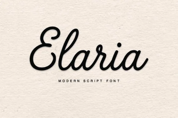
Elaria is a thick, smooth monoline-cord script with rounded pen ends and open loops—engineered to weed like a dream on Cricut vinyl and HTV!
Elaria is a plump rounded monoline-cord retro script built for vinyl: a fat even stroke with fully rounded ends, letters linked by thick cords and a small bounce that keeps the line from looking mechanical. The cords are the design and they close into one pillow when the face is reduced, and the monoline cut weeds cleanly from vinyl. It needs roughly 26 mm for the cord and the rounded end to read, and it is best as a one-colour vinyl cut, or one bright ink on white where the cord reads as a soft edge.
Small cosmetic-jar vinyl decal, embroidered crewneck & mug — Center 1 title-case name at 60–120 pt above wide-tracked geometric sans ('M O D E R N S C R I P T F O N T').
Click Weld in Cricut Design Space and weed in 5 seconds on Oracal 651, glossy HTV, or 3D puff vinyl!
 #9
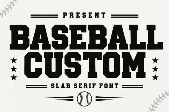
Baseball Custom is a heavy condensed slab alphabet in which the stems stay wide, the serifs turn square and the fit runs tight, so a two-word title reads as the lettering on a team jacket.
The B stacks two square bowls, the A carries a wide bar, the S steps a heavy spine, the E sets three thick arms and the M keeps four stout stems, all at a baseball weight with square serifs and almost no contrast. The condensation with full weight is the character: the face fills a narrow band without looking squeezed, which is why the sample sets two stacked words with stars either side. Because the counters stay open, the face reads from 26 pt and cuts cleanly in vinyl or felt. The cream ground, the stars, the ball and the ball-stitch corners are presentation; the black display words are the face.
Little League uniform back, bat-bag tag or team tee — Arch slightly for chest logos or run straight across jersey shoulders.
Top pick for Cricut/Silhouette HTV and laser-cut hat patches.
 #10
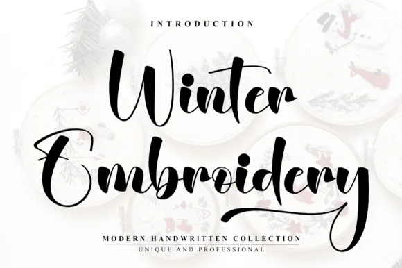
Winter Embroidery is a bouncy modern calligraphy brush script—despite its name, it features smooth solid ink strokes rather than stitch textures.
Winter Embroidery is a thick-thin bouncy modern brush script: a high-contrast stroke with a swollen thick and a hairline-thin, letters that rise and fall along the baseline and joins that loop back into the word. It is the look of a machine-embroidered name, so it suits a patch or a knit more than a leaflet. The hairlines are the finest element and they break first, on thread and in print. It needs roughly 34 mm for the thick-thin contrast to read, and it is best one colour on a soft ground where the hairline holds.
Holiday mug decal, gift sack & ornament lettering — Stack a two-word winter phrase with tight leading so the upper capital sits neatly above the wider lowercase second word.
Weld all cursive joins before vinyl cutting and keep x-height above 0.65 in so the thin upward connectors do not lift during weeding.
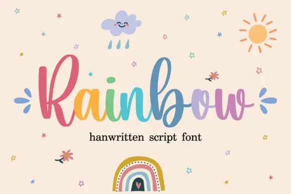 #11
Rainbow is a rounded connected script in which a narrow looped capital opens the word, the lowercase joins broadly and the b and l rise well above the body, so a single line reads as cheerful handwriting with a lift at the start.
The R closes a narrow loop, the b climbs above the ascender line, the joins stay round and open, and the lowercase bowls keep an even stroke through the connectors. The tall loop is the character: it gives one letter the vertical accent while the rest stays calm, which is why the sample sets one word alone. Because the joins are round, words need a clear gap between them, and the face cuts from about 1.1 inches of x-height before the connectors weld on vinyl. The rainbow fill and small illustrations are preview artwork; the lettering is the face.
A craft collection heading — Place the name on a clear horizontal band with product details below.
Verify alternate access and avoid assuming multicolour glyphs.
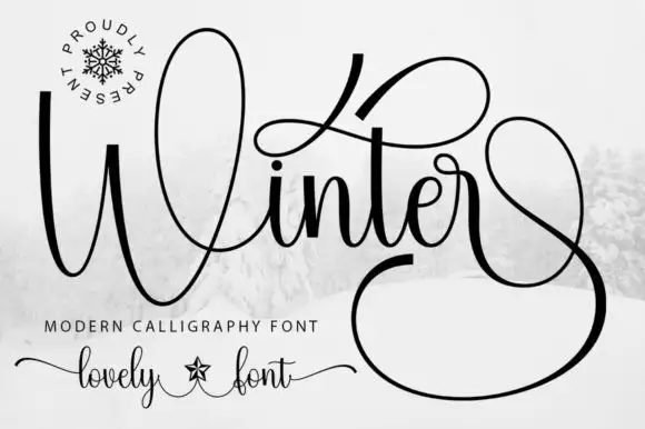 #12
Winter surrounds its small joined middle with a tall W loop, a high t sweep and a very large lower terminal, where the final stroke returns in a wide loop beneath and beside the word and fills almost half of the square field around it.
The letters stay connected and medium weight, the initial loop rises high, the t sweeps wide and the closing stroke falls into a vast loop that wraps under the word. That terminal is the character: the silhouette is nearly square rather than a narrow strip, which is why the sample cannot be cropped into a banner. Snow imagery around the field is context. Keep 30 pt for the hairlines, plan a square or very wide area for the word and check the loop against your trim before committing.
A winter concert programme cover — Give the title most of a square cover and set performers and venue on a plain inside page. Leave the lower terminal clear of the cover edge.
Try the real words before reserving a loop; the preview’s terminal may depend on a specific alternate.
 #13
Vintage Melinda is a creamy, thick-stroke retro brush script with dramatic curled swash capitals and sweeping baseline loops.
Vintage Melinda is a bold retro-romance brush script with curled swashes: a heavy loaded stroke, a shallow slant, connected letters and swashes that curl off the caps and descenders into a tight spiral. The spirals widen the word and are the finest element, and the loaded weight closes the loops early. It needs roughly 30 mm for the spiral and the brush edge to read, and it is best in one warm ink on cream, or a fine gold on a dark ground where the curls print as bright lines.
Harvest market apparel, retro diner mug & fall tote — Stack a two-word vintage slogan at 4–8 inches wide, choosing one lower underline swash to anchor the bottom edge of the lockup.
Always weld connected letters before cutting, and check clearance between row one descenders ('g', 'y') and row two swash capitals.
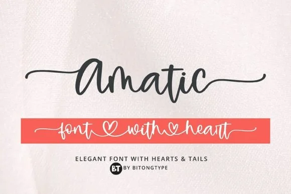 #14
Amatic is a lively handwritten monoline script equipped with sweeping horizontal side tails and playful open-heart word connectors.
Amatic is a bouncy monoline cursive with long tails and connecting hearts: an even light stroke, joined letters, a soft bounce and tails that run under the word and link to the next with a small heart at the join. The hearts and the tails are the design and both close first at small sizes, and the long tails fix a block's width. It needs roughly 26 mm for the heart and the tail to read, and it is best in one warm ink on smooth card, or a pastel plus paper where the hearts print as knockouts.
Personalized tumbler name decal & bridesmaid tote — Run a single first name with left and right tails at 4.5 inches long, or link two names through the heart swash.
Weld all cursive connectors in Design Space before cutting permanent vinyl, and keep x-height at 0.55 in or taller.
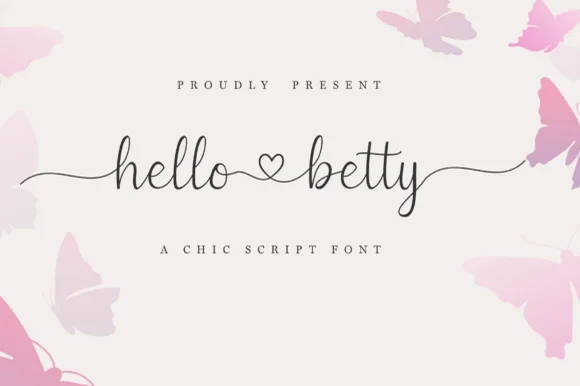 #15
Hello Betty is a fine-line bouncy script featuring symmetric beginning/ending tails and a centered heart connector swash.
Displayed on blush cream with soft butterfly corners, lowercase 'hello ♡ betty' starts with a long wave lead-in stroke on 'h', links the two words through a standalone open heart loop, and exits 'y' with an undulating tail alongside tall narrow 'l' and 'b' ascenders. PUA encoding unlocks the heart swashes and terminal tails in craft apps. The heart connector is the weakest point on a cutting mat: it is drawn as an open loop rather than a filled shape, so it weeding-fails before the tails do and it disappears entirely once the x-height drops under about 12 mm. Keep the phrase at three inches wide or above, and proof one cut before the batch.
Bridal shower champagne flute or glass can wrap — Keep the full two-word phrase within 3.25 inches wide so the left and right tails wrap gently without disappearing around the glass sides.
Because the stroke is slender, cut on premium permanent cast vinyl at slow blade speed and burnish firmly onto transfer tape before lifting.
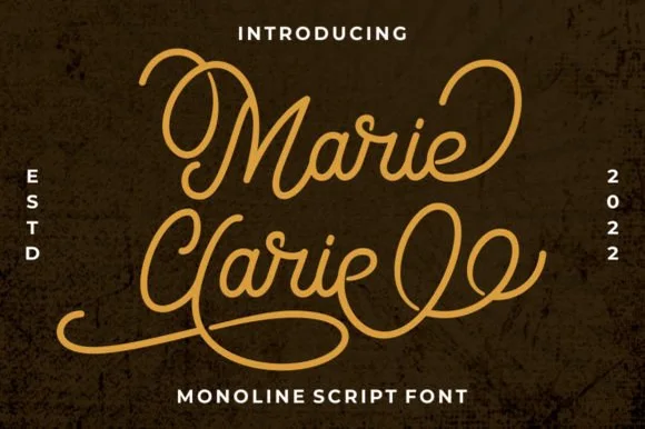 #16
Marie Clarie is a smooth, medium-fine monoline script featuring oversized vintage ribbon loops on capitals and spiraled terminal flourishes.
Marie Clarie is a vintage neon-sign and badge monoline script: an even tubular stroke that reads as bent glass, joined letters, a shallow slant and a badge frame of concentric rules around the word with small dots at the corners. The monoline is what lets it work as a neon tube, and the badge rules are the finest element. It needs roughly 28 mm for the tube and the badge rule to read, and it is best as a one-colour neon or vinyl job, or a flat two-colour print on a dark ground.
LED neon wall-sign mockup, salon logo & vintage jacket — Stack a two-word name tightly so the sweeping lower loop of the second capital nests beneath the first word.
Consistent monoline thickness cuts far cleaner on HTV and vinyl than high-contrast scripts—just weld all overlapping loops first.
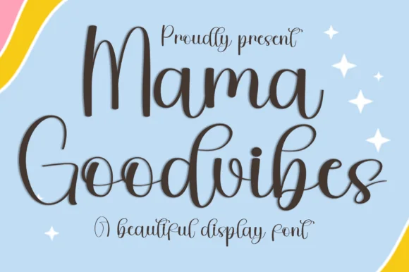 #17
Mama Goodvibes is a cheerful, upright modern brush script (PUA encoded with ligatures) built for everyday mama tumblers and shirts—zero holiday lock-in!
A bouncy upright modern calligraphy shown in espresso charcoal over a pastel rainbow and sky backdrop with white sparkles: tall open loops on the M, G, d and b with a light bounce and PUA alternates, so the word reads as friendly modern hand lettering rather than as a formal script. The bounce is consistent rather than random, which is what keeps a two-word line from looking drunk, and the open loops give the lettering air at small sizes. The scene behind is staging and carries no seasonal device of its own. Uses are lifestyle brands, drinks, apparel and party stationery where a warm, current voice is wanted.
16 oz iced-coffee glass wrap, car decal & boutique tee — Stack 2 title-case words centered at 52–90 pt accented with 4-point star sparkles.
Weld all touching cursive connectors before cutting Oracal 651 or HTV; weeds reliably at 0.9 inches+!
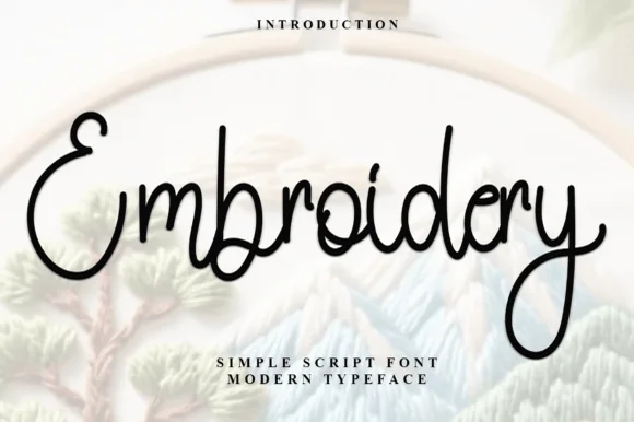 #18
Embroidery (by Inermedia Studio) is a clean, medium-weight monoline cursive script—smooth solid ink rather than faux stitch dashes.
Embroidery is a smooth rounded monoline marker cursive: an even medium stroke with fully rounded ends, joined letters, a light slant and almost no thick-thin contrast, drawn so the line reads like a single running stitch. The monoline is what makes it survive machine embroidery, where a contrast stroke merges into a solid block. It needs roughly 26 mm for the rounded join and the monoline to read, and it is best as a single thread colour on a light ground, or one ink print on smooth stock.
Craft-room organizer bin decal, tote bag & maker mug — Center single-word craft labels ('Ribbon', 'Fabric', 'Thread') at 1.25–2 in height across clear acrylic storage bins.
Weld overlapping lowercase connectors before cutting vinyl; note that for real machine embroidery you will digitize it as a satin/run path.
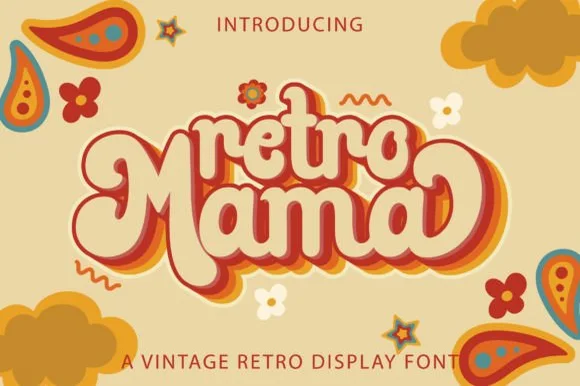 #19
Retro Mama is a plump, connected 1970s marshmallow script featuring bulbous heart-cleft M arches and sweeping wrap-around swash loops.
Retro Mama is a groovy connected marshmallow script: fat rounded letters that join in one thick ribbon, a lazy baseline that rises and dips, and swash loops that rise off the caps into a wide arc. The weight is the character, so it closes the counters early, and the swash loops grow the word vertically. It needs roughly 28 mm for the swash arc and the marshmallow join to read, and it is best in two warm inks on cream, or one saturated colour on white where the thick stroke stays solid.
Mother's Day 'Cool Mama' sweatshirt, glass can & car decal — Nestle smaller lowercase 'retro' or 'cool' right into the top valley of the big swashed 'Mama' line below.
Fat, smooth single-piece strokes weed like a dream on puff HTV, matte vinyl, and embroidery appliqué—weld all cursive joins first!
 #20
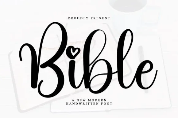
Bible is a smooth, medium-bold modern handwritten script featuring tall looped ascenders ('b', 'l') and an open heart-shaped dot over 'i'.
Bible is a bouncy modern calligraphy script with heart-shaped dots over the i and j: a light-to-medium contrast stroke, a wide oval axis, a soft bounce and a small heart where the tittle would be. The heart is the design and it fills first at small sizes, and the bounce grows the word vertically. It needs roughly 24 mm for the heart dot and the join to read, and it is best in one warm ink on smooth ivory, or a foil impression above 36 pt where the heart still holds its lobes.
Bible-cover HTV name, baptism keepsake & prayer journal — Center a first name or short faith phrase at 3.5–5 inches wide in gold foil HTV on cream or cognac covers.
Weld overlapping lowercase connectors before cutting HTV, and scale above 1.2 in so the tiny open heart counter weeds cleanly.
 #21
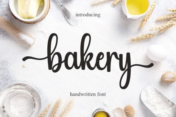
Bakery is a warm, bouncy handwritten brush script with tall looped ascenders ('b', 'k') and smooth horizontal beginning and ending tails.
Bakery is a bouncy medium-weight farmhouse brush script with side tails: a loaded stroke with visible dry edges, joined letters, a rising baseline and long tails that flick off the first and last letters. The tails need side clearance and are the first thing trimmed, and the brush edge is the finest element. It needs roughly 24 mm for the tail and the brush edge to read, and it is best in one warm ink on kraft and cream, or a single dark colour on a pale board where the brush edge prints as texture.
Cottage-bakery cake box, sourdough bag & apron HTV — Set a lowercase focal word ('bakery', 'homemade', 'cookies') at 4–8 inches wide with the entry and exit tails turned on.
Medium brush stroke weight is one of the easiest script styles to cut and weed on Cricut HTV and adhesive vinyl—remember to weld.
 #22
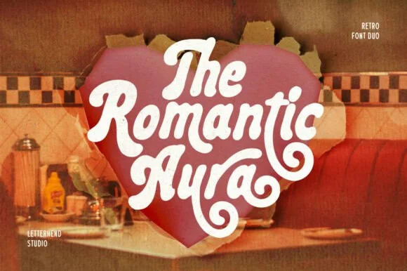
Romantic Aura Duo pairs a thick, velvety 1970s swash script with a clean companion voice for nostalgic love notes and merch.
Romantic Aura Duo pairs a nineteen-seventies swashed retro script with a rounded sans: the script runs a high-contrast stroke with wide swelling swashes that lift above and below the line, while the sans is a soft rounded block for details and lists. The pair is a period look, so it works best in two warm flat inks on a light ground rather than in photographic tints. The swash thins are the finest element and they break first. The script needs roughly 32 mm and the sans 20 mm for their detail to read.
Retro Valentine sweatshirt, mug wrap & galentine card — Stack 2 to 3 centered words tightly inside a heart or arch silhouette so rising ascenders nest into the gaps of the line above.
Weld all overlapping script letters before cutting HTV, and keep total lockup width at 3.5 in+ so tight inner 'e' and 'a' counters weed cleanly.
 #23
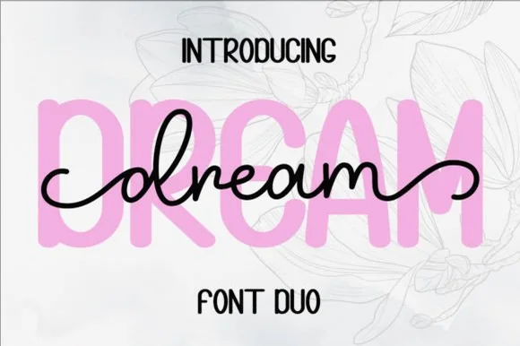
Dream Duo combines a plump, soft-cornered uppercase sans-serif with a fluid monoline script that threads cleanly across wide titles.
Dream Duo pairs a chunky pastel rounded sans with a smooth monoline cursive: the sans is a fat even-width block with fully rounded corners and tight spacing for headlines, while the cursive is a soft even stroke with open loops and a gentle slant. The pair is built for a soft palette, so it loses its character when printed in a single harsh black. The monoline hairline is the finest element and it breaks first. The sans needs roughly 26 mm and the cursive 28 mm for their detail to read.
Nursery wall name sign & sweet-sixteen acrylic backdrop — Scale the background sans to 3.5 inches tall in soft pastel and center the dark monoline script across the middle 60% height.
Weld all cursive joins before cutting vinyl, and use Cricut's Slice or a 0.07 in offset knockout if avoiding two-layer vinyl overlap.
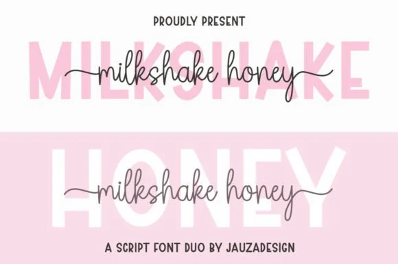 #24
Milkshakehoney pairs a crisp, wide-stance uppercase sans-serif with a tall, narrow-looped monoline cursive accented by straight side tails.
Milkshakehoney pairs a clean geometric uppercase sans with a tall-looped monoline script: the sans is a wide, even-width capital set for signage and labels, while the script is a thin monoline with high loops that rise well above the x-height and joins that stay open. The pair gives one card a printed voice and a hand-written line and works from a single ink. The monoline hairline is the finest element and it breaks first. The sans needs roughly 20 mm and the script 30 mm for their detail to read.
Bridesmaid proposal box lid & satin robe chest print — Track the uppercase sans role title ('BRIDESMAID') wide in pale pink or gold behind the recipient's cursive first name.
Size HTV chest names at 4 inches wide or larger so the tall narrow 'k' and 'h' loops weed cleanly without stretching.
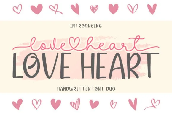 #25
Love Heart Duo matches a tall, slightly textured uppercase brush-sans with a fine monoline cursive featuring a built-in center heart swash.
Love Heart Duo pairs a hand-brushed tall sans with a heart-connected monoline script: the sans is narrow with a dry brush edge and open counters for headlines and lists, while the script runs an even thin stroke where the joins between two words swell into a small drawn heart. The pair gives one card a hand-linked line and a legible second voice from a single family and a single palette, so an invitation, a tag and a seal can be built together. The hearts are the finest element and they close into dots as soon as the face shrinks, and the dry brush edge fills when the sans is reversed or printed small. The sans needs roughly 24 mm and the script 26 mm for their detail to read.
Couple anniversary mug, pillow sham & Valentine card — Match the outer tip-to-tip width of the tailed script to the full width of the uppercase sans row underneath.
The fine monoline script cuts best above 1.75 in tall on vinyl; for smaller mugs, use sublimation or Print-Then-Cut.
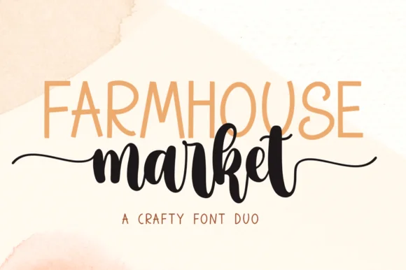 #26
Farmhouse Market teams a tall, organic uppercase sans with a bold, bouncy brush script finished by sweeping side tails.
Farmhouse Market pairs a condensed hand-drawn sans with a thick brush-pen script: the sans is a narrow uneven block with a wobbling stem for signs and price cards, while the script is a heavy brush stroke with dry ends and a visible pen turn at each join. The pair is built for a market stall, so it wants kraft paper and one dark ink rather than a coated ground. The dry brush ends are the finest element and they silt first. The sans needs roughly 22 mm and the script 30 mm for their detail to read.
Farmers-market canvas tote & produce crate stencil — Span the uppercase sans across the top width of the script's core letters, letting the script's left and right tails extend 1 inch wider on each side.
Weld all brush script letters into a single compound path before cutting HTV, and double-check the small upper loop inside 'e' and 'k'.
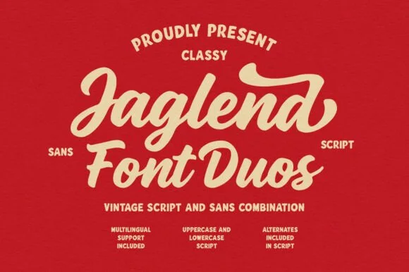 #27
Jaglend Font Duo pairs a thick, creamy vintage sign-painter brush script with a sturdy, hand-drawn condensed uppercase sans companion.
Jaglend Font Duo pairs a retro sign-painter brush script with a rugged condensed sans: the script carries a loaded stroke with small flicks and connected letters on a firm slant and a shallow bounce, while the sans is narrow with uneven edges that read as a sanded board for lists and prices. The two voices share one palette, so a window, a price list and a card can be built from one family without a third face. The script's flicks are the finest element and they close first at small sizes, while the condensed sans stacks a long service list in a narrow panel without wrapping. The script needs roughly 24 mm and the condensed sans 18 mm for their detail to read.
BBQ rub tin, craft soda label & barbershop window sign — Arch the sans uppercase header over a large slanted Jaglend Script centerpiece and anchor with tracked sans footers.
Broad solid brush strokes cut cleanly on HTV, sticker vinyl, and wood-sign stencils—weld script connections before cutting.
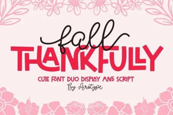 #28
Fall Thankfully pairs a looping monoline cursive script with a heavy, interlocking all-caps sans display face.
Fall Thankfully is a duo of a monoline tail script and a bouncy all-caps sans: the script runs an even stroke that finishes every word with a long lifted tail, while the sans is a chunky capital set whose baseline hops so a short line looks hand-set. The pair is built for autumn market goods, where one line is written and one is printed. The script tail is the finest element and it closes into a dot when reduced. The script needs roughly 28 mm and the sans 24 mm for their detail to read.
Thanksgiving host apron & kitchen tea towel — Set the main family or harvest word in the heavy sans at 2.5 in cap height, then tuck a 1-word script lead-in slightly overlapping the upper-left letters.
Weld the overlapping script loops before cutting HTV, and peel away from the narrow 'f' and 'l' ascender counters slowly.
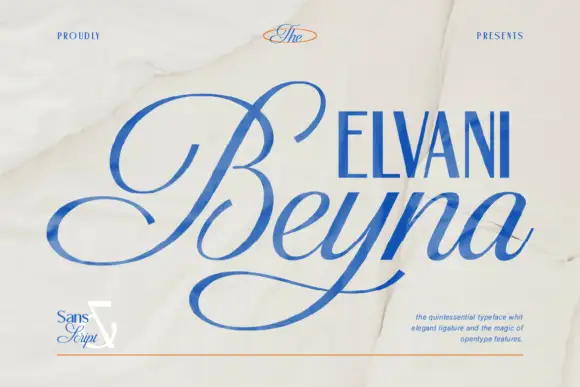 #29
Beyna Elvani is a high-contrast calligraphic script in which the capital sweeps below the baseline, the joins stay thin and the ligatures tie the letters, so a name reads as an engraved signature with a single long gesture.
The B opens a wide swash that dips under the baseline, the e turns a fine eye, the y drops a looped tail, the n keeps a soft shoulder, the a closes a small bowl and the v finishes a thin hook, all at a calligraphic contrast with hairline joins and generous ligature alternates. The wide capital is the character: it takes the width of three letters and gives the sample its horizontal sweep. The face needs 30 pt upward for the hairlines to survive a print run, and it should be set with the discretionary ligatures switched on. The crumpled paper ground, the small serif caps and the note about OpenType features are presentation; the blue script name is the face.
A two-voice wedding title — Keep the names large in script and use the confirmed sans for a small ceremony line above, with the date below the y sweep.
Check both styles and the actual ampersand.
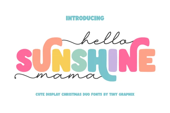 #30
Hello Sunshine Mama pairs chunky rounded caps that can each take a different colour with a fine monoline script that runs above and below the caps in long flat strokes.
The cap half is heavy and soft: the S swells through two fat curves, the U holds a deep bowl, the N keeps one thick diagonal and the E carries three even arms, all rounded and even in weight. Because each letter is a separate shape of equal weight, the sample fills them in different colours, which is how the pair is meant to be used on children's pieces. The script half is a light monoline with flat entry and exit strokes that extend well past the caps on both sides, and that sweep is what holds the composition together. Contrast comes from weight, not from style, so the two layers never fight. The white ground, the pink script, the pastel fills and the two caption lines are presentation; the duo is the lettering.
Mother's Day sweatshirt, tote or tumbler — Set the middle keyword in rainbow/earth-tone caps and sandwich with lowercase tailed script.
Thicken the thin monoline script slightly (0.02" offset) if cutting small adhesive vinyl decals.
 #31
Brown Carolina Duo contrasts broad high-contrast capitals with a much finer narrow slanted script, set dark on a plain cream field, where the capital R legs sweep below the neighbouring letters and the script carries long tails that run past the ends of both words.
The caps keep thin cross strokes and heavy uprights, the script keeps one fine weight, and the two voices sit in a strict stack: script, two cap rows, script. That alternating order is the character, because the fine lines frame the heavy block like a rule above and below. Both treatments appear on a plain light field, so the cover gives no clue about texture or shadow. Keep 34 pt for the caps before the thin strokes break up, keep 20 pt as the floor for the script and check the R leg before setting a line of capitals.
A boutique stationery front — Use the capital name centrally and a small script descriptor below, leaving the R sweep clear of contact information in a plain footer.
Confirm both styles and the actual capital alternates.
 #32
Bouncy Block Deluxe is a thick, solid-filled bubble display font with pillowy rounded terminals, playful tilt, and tiny counter pinholes.
Bouncy Block Deluxe is a heavy rounded chunky bubble display: fat even-width letters with fully rounded corners, tight counters that almost close and a baseline that lifts a few letters so the word looks stacked and bouncing. It is a signage face, so it wants size and a single flat colour rather than fine detail. The counters are the finest element and they plug as soon as the face is reduced or cut in vinyl. It needs roughly 30 mm for the counter and the corner radius to read, and it is best as one flat ink on a light ground.
Back-to-school tote, water-bottle sticker & kids' tee — Stack 2 or 3 short punchy words ('STAY COOL', 'DREAM BIG') at tight 0.88 line-height inside a contoured die-cut sticker shape.
When weeding small decals under 1 inch, use a fine pin pen solely to pop out the tiny teardrop counters inside 'B', 'o', 'a', and 'e'.
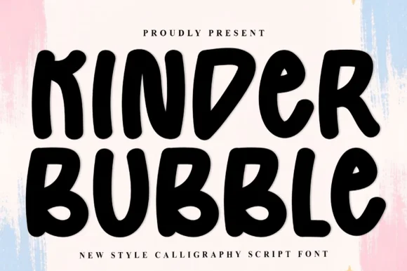 #33
Kinder Bubble is a bold, solid-black hand-drawn block display font with soft organic edges and playful mixed-case letterforms.
Kinder Bubble is a heavy hand-cut playroom block display: fat squared letters with visible scissor-cut edges, slightly mismatched heights and blunt corners, drawn to look as if cut from coloured card and pinned to a playroom wall. The cut edges are the design and they silt when the face is reduced. It needs roughly 26 mm for the cut edge and the height mismatch to read, and it is best as a one-colour vinyl or paper cut on a light ground, or one ink print where the cut edge reads as a shadow.
Daycare cubby nameplates, teacher shirts & backpack tags — Center a child's name or grade level in 1.5–2.5 in solid letters, pairing classroom room numbers in the same bold face.
Weeds cleanly on both permanent vinyl and puff HTV; just watch the compact double counters inside 'B' below 0.8 inches.
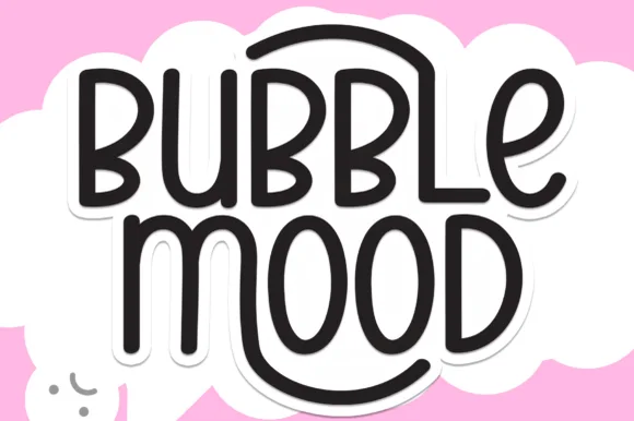 #34
Bubble Mood is a tall, medium-weight rounded marker display font where curved outer stems wrap playfully around neighboring vowels.
Bubble Mood is a tall rounded monoline marker display with nesting arches: narrow upright letters drawn with an even round-tipped stroke, where each word sits under a shallow arch that nests inside the next line's arch. The arch grows the word vertically and the monoline keeps it honest at small sizes. It needs roughly 22 mm for the arch and the rounded end to read, and it is best in one bright ink on white, or a single dark colour on a pale board.
Die-cut laptop sticker, planner cover & iced-latte cup — Stack two short words centered and add a 0.12 in white offset contour in Cricut Design Space for an instant die-cut sticker silhouette.
Clean medium-weight strokes and wide open 'O' and 'D' counters make adhesive vinyl weeding quick even at 0.75 in height.
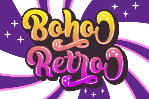 #35
Boho Retro is a plump, heavy-looped 1970s groovy display script with curled swash caps and pillowy connected lowercase bowls.
Boho Retro is a swirled nineteen-seventies psychedelic bubble script-display: fat rounded letters that swell at the waist, joins drawn as spirals and terminals that curl back into the letter like smoke. It is a poster face, so it wants size, two flat inks and a pale ground rather than a busy photograph. The spirals are the finest element and they fill into solid blobs as soon as the face is reduced. It needs roughly 44 mm for the spiral and the swell to read, and it is best two warm flat inks on a light stock.
Retro festival ringer tee & iced-coffee glass wrap — Stack a two-word phrase at a slight upward 6-degree angle and add a contoured offset shadow layer in Cricut or Illustrator if you want the sticker look.
Weld connected lowercase letters before cutting vinyl, and check the tight interior spiral holes inside 'B', 'o', and 'e' when weeding.
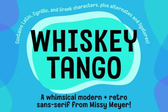 #36
Whiskey Tango is a lively, tall-and-narrow rounded sans-serif packed with Latin, Cyrillic, and Greek support plus over 110 PUA alternates.
Whiskey Tango is a tall condensed rounded retro sans with more than a hundred and ten private-use extras: squeezed caps with soft corners and a high waist, plus swash letters, ligatures, tails and ornaments reached through alternate keystrokes. It is a packaging face, so it wants a tall panel and a single flat ink rather than a soft ground. The soft corners are the finest element and they plug first at small sizes. It needs roughly 26 mm for the corner and the condensed stem to read, and it is best one flat ink on kraft or white board.
Retro travel poster, podcast cover & cocktail menu — Stack two-word drink or episode titles in 48 pt uppercase at tight 0.95 line-height, using mixed-case Whiskey Tango or a light sans for descriptions.
Rounded stroke ends and generous counters make this one of the cleanest tall sans faces to cut on Oracal 651 or HTV even at 0.65 in.
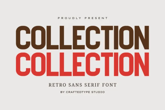 #37
Collection is a crisp, medium-condensed retro grotesk (PUA, OTF & TTF) with clean flat terminals and balanced open counters.
Collection is a condensed grotesk drawn from nineteen-seventies athletic and editorial lettering: narrow stems, flat shoulders, a tall x-height, a slightly squared bowl and a small flare where a stem meets the curve. It ships with PUA alternates as OTF and TTF, and the alternates mostly change the flare rather than the skeleton. It needs roughly 20 mm for the flare and the squared bowl to read, and it is best in one dark ink on white or on a warm sand stock, where the narrow stems stay crisp.
Apparel capsule tag ('AUTUMN COLLECTION'), tote & lookbook — Stack the same word 2 or 3 times in espresso brown, terracotta red, and warm gold at 72–135 pt.
100% smooth, zero-grunge geometric paths cut and weed in seconds on Cricut HTV and Oracal 651 down to 0.55 inches!
 #38
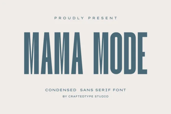
Mama Mode is a crisp, architectural tall condensed sans serif (PUA encoded, OTF & TTF) designed for elevated minimalist apparel and mugs.
Mama Mode is a tall condensed sans in caps with flat-sided stems, uniform stroke weight and very tight sidebearings, so a word stacks into a narrow architectural column. The proportions are the design: the letters are much taller than they are wide, which means the face holds a long word in a narrow panel but needs generous tracking when set in a long line. It needs roughly 18 mm for the flat sides to stay separated, and it is best in slate or ink on warm ivory, or as a single foil on a tote.
Minimalist embroidered/HTV 'MAMA MODE' cap, sweatshirt & mug — Set 2 words on a single horizontal line at 48–88 pt with +12 tracking in slate blue, forest green, or tonal cream-on-oatmeal.
100% straight, clean geometric bars cut and weed in seconds on Cricut HTV, permanent vinyl, and satin embroidery down to 0.5 in!
Practical buyer checklist
Key cutting, printing and pairing answers before choosing a vinyl & Cricut cutting typeface.
Script letters overlap visually but stay separate shapes in the file. Select the word, apply Weld or Unite, then confirm the preview shows one continuous outline with no double lines running through the joins.
Thick monoline and ribbon-brush scripts usually weed cleanly down to 0.6 to 0.75 inch cap height. High-contrast calligraphy with thin entry strokes needs 1.5 inches or more before the upstrokes survive the hook.
Yes. Iron-on film cuts face down and glossy side down, so mirror the design before sending it to the mat. Adhesive vinyl cuts face up and needs no mirroring, which is why the same file behaves differently between the two materials.
Use low-tack transfer tape on any design with unattached counters such as the middle of an o or a. Strong tape lifts the small pieces first and leaves you re-placing them by hand on the blank.
Keep exploring
Explore adjacent maker roundups or check our practical pre-production checklists.
15 curated fonts · Previews & pairings
21 curated fonts · Previews & pairings
26 curated fonts · Previews & pairings
13 curated fonts · Previews & pairings
Guides: Invitation font checklist · Vinyl & cutting checklist · How to pair script & sans fonts
Allow optional Google Analytics to measure visits and catalogue actions. Your search words and notes are not included. Privacy & storage