 #1 · Best Overall
Christmas Snow
Rounded festive caps with snow-dot counters and a heavy outline
Get fontPaid link
Read review ↓Disclosure: MakerFileHub may earn a commission from qualifying purchases via paid links on this page. How our links work.
Snow-capped blocks & holiday monograms
Holiday display lettering has to read from the street, and monograms have to hold a family name on a stocking. Christmas Snow and Christmas Snowy build the snow cap into the glyph, Frosty Christmas and Dancing Christmas add the groovy and curled registers, and Christmas Continues and Snowalora supply the ornament serif for cards and tags. Quinn Monogram handles the botanical winter initial.
Quick verdict
Christmas Snow is the strongest porch-sign display, Christmas Continues is the best ornament serif for cards, and Quinn Monogram covers the stocking initial. Frosty Christmas adds a warmer groovy alternative.
Quick answer
Short on time? Start with our three highest-rated Christmas display, snow & monograms standouts before scrolling the full breakdown.
#1 · Best OverallRounded festive caps with snow-dot counters and a heavy outline
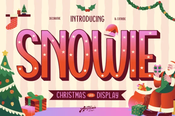 #2 · Runner-Up Pick
3-style tall quirky Christmas display (Regular, Decorative star-inlay & Extrude!)
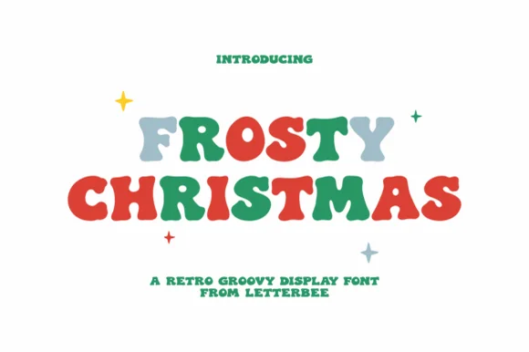 #3 · Editor's Choice
Chunky 1970s retro groovy holiday bubble display (NOT a script!)
We kept 19 of 246 candidates after testing each as a single-colour silhouette at 4 inch sign scale. Weighted whether snow and ornament detail is attached, how the monogram frames a three-letter name, and legibility at 16 pt for cards.
Side-by-side summary
Compare specimens, OpenType/PUA traits and primary project roles side by side.
| Rank & Font | Style & File Specs | Best Project Fit | Store Listing |
|---|---|---|---|
| DisplaySnow-capped | Winter cocoa mug, holiday pajama print or classroom door sign | Get fontPaid link | |
| Decorative3-style-holiday | Vintage Santa wood sign, holiday cookie box & sweatshirt | Get fontPaid link | |
| DisplayGroovy-70s-chunky | Retro 3D-puff HTV holiday crewneck, tote & coaster | Get fontPaid link | |
| DecorativePUA encoded | A Christmas dance programme | Get fontPaid link | |
| DecorativePUA encoded · Alternates & swashes | Dickensian holiday card, spiced-wine bottle & velvet ribbon | Get fontPaid link |
#1 · Best OverallChristmas Snow is a rounded capital alphabet in which the counters are punched with small snow dots, the strokes stay fat and a heavy outline wraps the word, so a greeting reads as lettering cut into a wooden sign and lit from behind.
The C curls a fat crescent, the H sets two stems with a snow dot in the bar, the R opens a wide bowl, the I drops a small dot and the S holds a soft spine, all at a festive weight with rounded corners, a contour drawn around the outside and dots cut inside the counters. The punched dots are the character: they replace plain counters, which is why the sample sets two stacked words in white on a dark board. Because the dots are small, the face needs 34 pt before they stay open, and it prints best in one light colour. The snowy forest, the wooden sign, the lantern, the snowman and the fairy lights are presentation; the white dotted words are the face.
Winter cocoa mug, holiday pajama print or classroom door sign — Print/press on light or mid-tone backgrounds or add a white offset border on dark blanks.
Tiny snowfall dots and interior flakes favour sublimation, DTF and Print-Then-Cut over small vinyl.
#2 · Runner-Up PickSnowie is a cheerful 3-style tall Christmas display family ('Regular, Decorative & Extrude') letting you layer 3D shadows and twinkle-star inlays!
Snowie is a three-style Christmas display family: a tall quirky regular with cream twinkle stars set inside the stems, a decorative star-inlay build and a separate extrude layer, so a word can be layered as a flat mark, a starred panel or a 3D block. The tall narrow caps carry the star inlay only where the stem is wide enough, which means the family needs size for the stars to read. It needs roughly 30 mm for the inlay to hold, and it is best in berry red with cream stars on a warm ground.
Vintage Santa wood sign, holiday cookie box & sweatshirt — Align Snowie Decorative + Snowie Extrude at identical X/Y coordinates (84–165 pt) in berry red + chocolate/gold.
Use Regular + Extrude for fast multi-layer Cricut HTV & cardstock cutting; use star-inlaid Decorative for DTF, sublimation & print!
#3 · Editor's ChoiceFrosty Christmas (by Letterbee) is actually a chunky, solid 1970s retro-groovy bubble display font—zero cursive script despite auto-tagging!
Frosty Christmas is a chunky nineteen-seventies groovy holiday bubble display, deliberately not a script: fat rounded letters with a warm wobble, small snowflake cuts in some counters and a soft outline that separates the bubbles from a busy ground. The wobble grows the word and the snowflake cuts close first. It needs roughly 30 mm for the snowflake and the outline to read, and it is best in two cool inks on white, or one ink plus paper where the snowflake cuts read as knockouts on a tinted panel.
Retro 3D-puff HTV holiday crewneck, tote & coaster — Color row 1 in alternating sage/slate/taupe and row 2 in holly red & pine green at 64–125 pt.
100% smooth, solid single-layer blobs cut and weed in 4 seconds on Cricut HTV, 3D puff vinyl, and Oracal 651 down to 0.65 in!
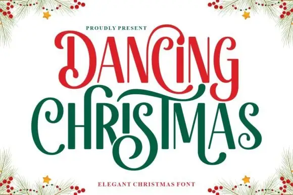 #4 · Top Maker Utility
Dancing Christmas shows narrow high-contrast letters with oversized spiral terminals, red on the upper word and green on the lower, where the D curls inward at both ends and the C, s and final extensions sweep across the vertical stems next to them.
The stems stay tall and narrow, the contrast swings wide, the hairlines thin out and the terminals spiral large. That overlap is the character: the sweeping terminals cross neighbouring letters, so the sample only works with the letters tightly set. Pine branches and berries in the corners are separate artwork. Keep 40 pt for the hairlines, leave 18 mm above and 20 mm below for the crossings, and check the s and C against your own wording before committing to a tight set.
A Christmas dance programme — Give the title two spacious lines and put the dance schedule below the lowest spiral.
Confirm the decorative D and C variants and their actual widths.
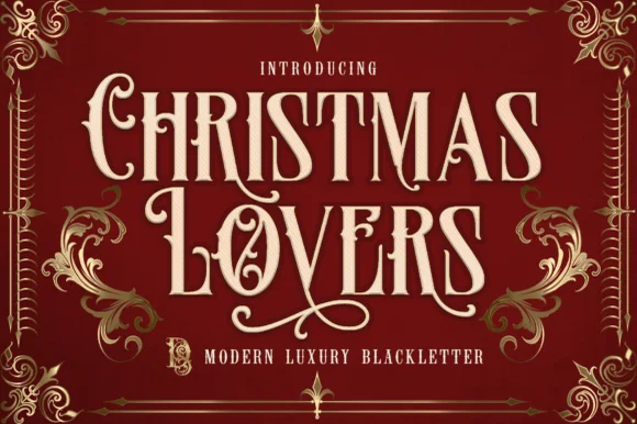 #5 · Standout Silhouette
Christmas Lovers is a stately PUA-encoded Victorian blackletter blending readable flared Roman capitals with sweeping calligraphic swashes.
Christmas Lovers is a Victorian blackletter and Roman hybrid with tall notched capitals, flared stems and sweeping calligraphic swashes, PUA encoded, so a word reads as an engraved bookplate rather than a gothic poster. The readability comes from keeping the Roman bones under the blackletter treatment, which is why it works at 14 pt in a card. It needs roughly 26 mm for the swash to read as a flourish and 12 pt for the notched stems, and it is best in gold on deep burgundy or one ink on cream.
Dickensian holiday card, spiced-wine bottle & velvet ribbon — Stack 2 centered words at 60–115 pt in cream or gold foil on deep oxblood, forest green, or navy.
PUA encoding lets you copy-paste swash alternates from Character Map/Font Book—cuts cleanly on 1.3 in+ HTV and Foil Quill!
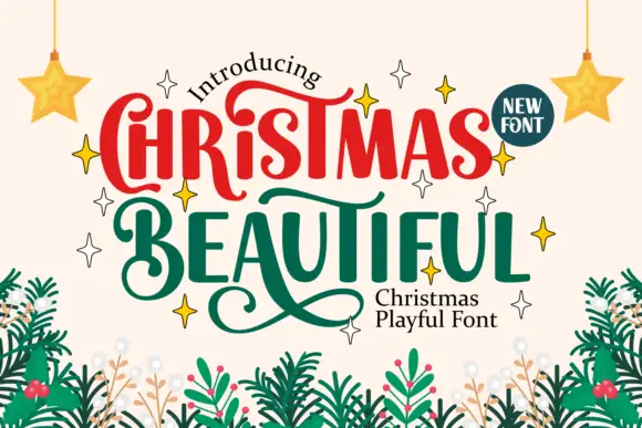 #6
Christmas Beautiful mixes rounded upright lettering with curling terminals, where large C and B initials turn into spirals, long strokes sweep beneath neighbouring letters and the most elaborate flourish reaches below the lower row on a pale ground framed by fir branches and stars.
The bodies stay rounded and heavy, the initials curl large, the connecting strokes sweep sideways and one flourish drops well under the second row. That drop is the character: the sample reads as hand-arranged rather than set, which is why the two rows feel stacked and slightly staggered. The fir branches, the stars and the corner badge are separate decoration. Keep 40 pt so the curls stay open, plan 25 mm beneath the lower row for the flourish and keep supporting copy well outside the sweep.
A Christmas market invitation — Keep the main title high and leave an empty band below for swashes before the date.
Test the actual wording and alternate selection; do not copy unsupported letter combinations.
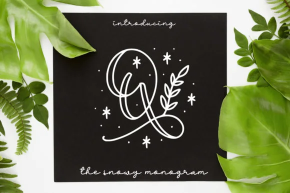 #7
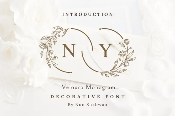
Quinn Monogram wraps looped monoline script initials with hand-drawn botanical sprigs, berries, and twinkling winter stars.
Quinn Monogram is a decorative mark rather than a text face: continuous looped monoline script initials are wrapped in hand-drawn botanical sprigs, berries and small winter stars, so the result reads as a snowy monogram card rather than lettering with decoration. The sprigs surround the initial, which means the mark needs size for the leaves to read as leaves. It needs roughly 34 mm across for the botanicals to hold, and it is best in white on a dark card or in one ink on kraft.
Foil-Quill holiday card, engraved slate coaster & gift tag — Center 1 botanical initial at 2.5–4 inches tall above a relaxed monoline script family name.
Delicate hairline loops + floating star dots are built for Foil Quill, pen plotting, laser engraving, and print—not blade-cut vinyl.
 #8
Christmas Snowy tops chunky, rounded candy-red and pine-green bubble letters with smooth white snowdrifts along every upper edge!
Christmas Snowy is a plump rounded bubble display in which each cap carries a sculpted white snowdrift along its upper edge, so the letter reads as a candy form under snow rather than a typeface with a decoration. The letters are chunky with small counters, which keeps a word solid at banner scale, and the snow caps add height above the cap line that the layout must reserve. It needs roughly 25 mm for the drift to read as snow, and it is at its best in red or green with a white cap on a pale ground.
Sublimated cocoa mug, Christmas cookie tin & kids' hoodie — Color row one candy-cane red and row two evergreen at 64–120 pt so the white snow caps gleam.
2-tone snow-cap construction shines in sublimation, DTF transfers, and Print-Then-Cut stickers (note: 3D gloss is a mockup bevel!).
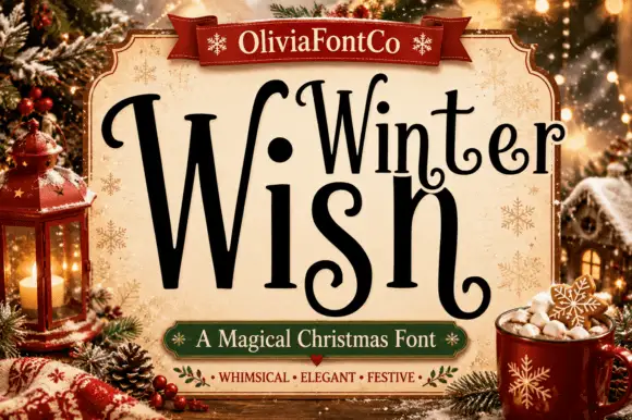 #9
Winter Wish shows a very large narrow W beside lighter rounded forms, where the s coils inward at its foot and the final h closes on a low curled extension rather than a straight stem.
The first letter grows beyond the rest, the bodies stay narrow, the coils turn inward and the last stroke reaches below the line. That single oversized initial is the character: the lockup interlocks a short seasonal phrase without a second typeface, which is why the sample sits inside a pale title panel among Christmas objects. The panel and props are artwork, and the arrangement demonstrates one fitted lockup rather than automatic shaping, so set your own phrase and keep 30 pt before the curls close.
A quiet Christmas card title — Reserve an open lower margin for curls and put the note inside.
Verify the plural ending and required alternates.
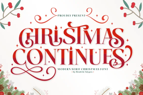 #10
Christmas Continues is a whimsical holiday display serif (not a cursive script) featuring curled spiral hooks, ligatures, and a candle-flame 'I'.
Christmas Continues is an ornamental holiday display serif with candle-flame details: high-contrast stems, split bracketed serifs, a candle flame replacing the i dot and spiral curls that turn off the descenders. The flame and the spirals are the finest elements and both close first when the face shrinks. It needs roughly 32 mm for the flame and the spiral to read, and it is best in one deep ink on cream, or a fine gold on a dark ground where the spiral prints as a bright line.
Christmas Eve candle label, carol program & holiday card — Stack 2 centered uppercase words at 48–76 pt in berry red or forest green surrounded by tiny four-point stars.
Thin serif hairlines and spiral curls shine in holiday card printing, sublimation, and foil rather than small cut vinyl.
 #11
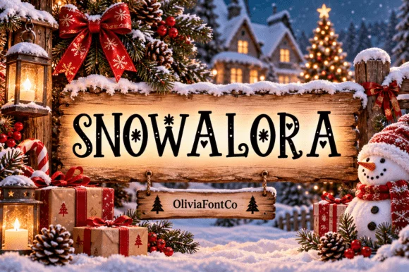
Snowalora is a classic high-contrast holiday display serif embellished with delicate hanging snowflakes and curled swash terminals.
Snowalora is a festive display serif in which the serifs and terminals open into small snowflake stars: the stems are clean and high-contrast, the flakes sit on the crossbars and the ascenders finish with a six-point star. The flakes are the finest element, so they vanish before the letters do, and the high contrast needs a smooth stock. It needs roughly 30 mm for the flake points to read, and it is best in one deep ink on white or pale blue, or a fine silver foil above 40 pt where the flake edges stay crisp.
Wooden Christmas porch sign, cocoa-bar plaque & card — Center 1 uppercase word across rustic horizontal wood planks above a smaller script/serif family name.
Main serif letters cut cleanly on 1.5 in+ sign vinyl, though tiny snowflake details favor print, sublimation, or laser engraving.
 #12
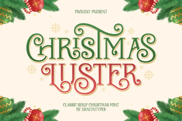
Christmas Luster is actually a lush, swash-curled classic display serif (NOT a connected script!) weaving storybook loops through red-and-green capitals!
Christmas Luster is an ornamental display serif in which the Roman capitals unfurl interlocking spiral curls on the C, H, R and S, giving a word a ribbon-like silhouette while keeping the interior letterforms classical. The curls sit inside and outside the stem, so the setting needs space around each capital, and the contrast is high enough that the hairlines want 20 mm before they hold. Small caps or lowercase would be a natural support but are not implied. It is a card, tin and cover face, best in one metallic or deep crimson ink on cream.
Heirloom cookie tin, Nutcracker print & family card — Color row 1 evergreen and row 2 holly red at 68–135 pt on warm butter-cream cardstock.
Solid flared stems + smooth curls foil-stamp and print gorgeously, and cut on 1.3 in+ Cricut sign vinyl!
 #13
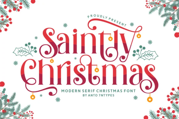
Saintly Christmas is a festive display serif in which the capitals throw long swashes, the serifs are fine and small ornaments hang from the ends, so a greeting reads as a decorated holiday plate.
The capital S opens into a wide swash that travels above the following letters, the C on the second word repeats a similar gesture downward, and the small letters keep a moderate contrast with fine bracketed serifs. Weight sits in the stems, and the swashes are drawn as fine ribbons rather than heavy strokes, which is what keeps the composition light at 40 pt. The dangling ornaments in the sample are separate glyphs, and they are the practical detail: they need to be placed rather than typed, or they land on the wrong letter. Because the swashes cross the line, the face wants generous leading when stacked. The pale ground, the red ink, the fir and berries, the small snowflakes and the two caption lines are presentation; the serif is the two words.
Christmas dinner menu or party invitation — Reserve swash alternates for outer letters only and set menu dishes in an unswashed serif.
Thin serif hairlines and spiral terminals suit print and foil best; thicken slightly with a subtle offset if cutting small vinyl.
 #14
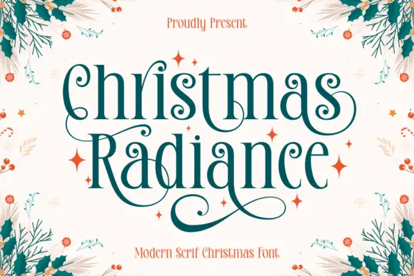
Christmas Radiance is a tall festive serif in which the capitals finish in spiral terminals, the serifs are fine and bracketed and the proportions run narrow, so a greeting reads as an engraved seasonal plate.
The capital C opens into a spiral at its upper terminal, the h and the r keep tall stems with fine serifs and the second capital R repeats the spiral gesture on its leg, which is what ties the two words together. Weight sits in the stems with a high contrast, and the spirals are drawn as open curls rather than filled shapes, so they stay legible at 24 pt and only fail below 16 pt. The fit is generous, so a two-word greeting spans a wide format at 30 pt. Because the serifs are fine, the face wants a coated stock or a smooth uncoated one with a minimum line the printer can hold. The cream ground, the deep green ink, the foliage in the corners, the orange sparks and the two caption lines are presentation; the typeface is the two words.
A candlelight concert heading — Give the heading two spacious lines above a plain programme block with no foliage behind the thin strokes.
Check lower curls against the next line baseline.
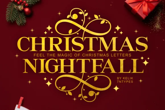 #15
Christmas Nightfall is a classic, high-contrast ornamental holiday serif crowned with elaborate top-and-bottom gold scrollwork flourishes.
Christmas Nightfall is an opulent holiday display serif with symmetrical filigree swashes: heavy bracketed stems, high thin-thick contrast and a pair of mirrored flourishes that curl off both sides of the word like an engraved frame. The filigree is the design and it closes into a blot as soon as the face is reduced, and the symmetry fixes the block's width. It needs roughly 34 mm for the filigree and the hairline to read, and it is best in one fine gold on a deep ground, or a dense ink on cream with a spot varnish.
Foil holiday gala invite, Christmas Eve menu & velvet box — Insert a narrow tracked sans subline ('FEEL THE MAGIC' or family year) cleanly between the two stacked serif rows.
Delicate spiral tendrils and tiny star accents shine in gold foil stamping, print, and sublimation rather than small cut vinyl.
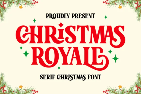 #16
Christmas Royale is an ornate serif display in which the stems curl at the foot, a few letters carry a dropped swash and the bars hold drawn diamonds, so a two-word greeting reads as engraved seasonal stationery.
The C rolls both terminals into curls, the H sets two stems with a diamond on the bar, the R turns a swash leg, the S holds a curled spine, the M carries two curved stems and the final S finishes a hooked tail, all at a moderate contrast with fine serifs and ornaments set inside the letters. The curls are the character: they hang below the baseline, which is why the sample sets two stacked words with wide leading and small sparkles around them. Because the strokes are moderate, the face holds from 24 pt and prints in one ink per word, and the ornaments need a smooth sheet. The cream ground, the pine sprigs, the stars and the small line beneath are presentation; the red and black display words are the face.
Holiday cookie tin lid or gift box label — Stack two centered all-caps lines and keep secondary text in a plain sans below.
Check tight kerning around swashed capitals R and Y before cutting vinyl decals.
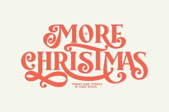 #17
More Christmas is a showstopping modern-retro display serif weaving lavish, ribbon-smooth swash curls and custom ligatures across stacked titles!
More Christmas is a lavish retro display serif in which the swashes of adjacent letters interlock, so the exit stroke of one glyph passes through the entry of the next and the word reads as one ornamented band. The interlocking means the letters cannot be respaced or tracked apart without breaking the joins, and the swashes extend above and below the line. It needs roughly 36 mm for the interlock to read, and it is best in one metallic or deep ink on cream, with foil only at large sizes.
Editorial holiday card, Nutcracker poster & cookie tin — Stack 2 uppercase words tight at 68–135 pt in vermilion red, forest green, or gold foil on warm cotton cream.
Smooth, ribbon-thick swash loops (much sturdier than spidery calligraphy!) actually cut on 1.3 in+ Cricut vinyl/HTV and foil-stamp gorgeously!
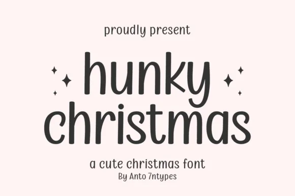 #18
Hunky Christmas is a neat upright monoline print face in which the h and k climb tall, the k closes a curled loop inside its arm, the bowls stay open and round, and no letters join, so a short holiday phrase reads as tidy hand printing.
The strokes hold one even monoline width, the ascenders rise well above the bowls, the k carries a curled internal loop and the letters stand separately with clear spacing. The monoline print is the character: it reads as careful handwriting rather than a script, which is why the sample sets a phrase in one tidy row. Because the stroke is even and light, keep 20 pt as the floor on smooth card, and give the tall ascenders 14 mm of clearance in a heading block. The sample lists swashes among the extras, so any flourish is a separate access step.
Minimalist holiday card front — Set the greeting in lowercase with generous line spacing and place a small year line underneath.
Even stroke weight weeds smoothly on adhesive vinyl; four-point stars on the cover are separate accents.
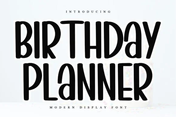 #19
Birthday Planner is a tidy, tall hand-lettered marker display font with softly rounded stem tips and friendly vertical rhythm.
Birthday Planner is a tall rounded marker all-caps planner face: narrow upright caps with fully rounded ends, an even medium stroke, wide even spacing and a height that fits a single line inside a planner box. The rounded ends are the only warmth and the caps keep a label shouty but readable. It needs roughly 20 mm for the rounded end and the counter to read, and it is best in one bright ink on white paper, or a single dark colour on pastel card.
Kids' party itinerary sign, milestone chalkboard & invite — Stack centered uppercase headers at 36–54 pt and use smaller 18 pt lines for time-slot bullet items.
Smooth, even marker strokes with zero thin serifs weed quickly and cleanly on Cricut vinyl, HTV, and acrylic signs down to 0.6 in.
Practical buyer checklist
Key cutting, printing and pairing answers before choosing a Christmas display, snow & monograms typeface.
Between 4 and 6 inches tall on a board of 18 to 24 inches. Anything under 3 inches is invisible from the pavement, which is why handmade porch signs so often look faint in photographs.
Only above roughly 2 inches where the cap detail clears 1 mm. Below that the snow becomes detached specks that lift during weeding. For smaller pieces, print the design on a decal or use a clean block.
Type the surname initial larger with two first initials flanking it, then place the frame around the actual glyph bounds. Frames shipped inside a font assume the shipped sizing, so scaling one letter drags the ornament out of proportion.
Most ship capitals and a frame, sometimes with numbers for an established date. Check the glyph set before planning an address or a date inside the mark, and keep numerals in a plain serif if they are missing.
Keep exploring
Explore adjacent maker roundups or check our practical pre-production checklists.
38 curated fonts · Previews & pairings
21 curated fonts · Previews & pairings
22 curated fonts · Previews & pairings
29 curated fonts · Previews & pairings
Guides: Invitation font checklist · Vinyl & cutting checklist · How to pair script & sans fonts
Allow optional Google Analytics to measure visits and catalogue actions. Your search words and notes are not included. Privacy & storage