Neutral Sans Workhorse

Abahsikua + Helina
Lets Abahsikua own the focal silhouette while handling secondary copy, sizing and subheads cleanly.
Inspect Helina specimenDisclosure: MakerFileHub may earn a commission from qualifying purchases via paid links on this page. How our links work.
Tall condensed diagonal-sliced architectural stencil display
Abahsikua is a tall, condensed modern stencil display font sliced by bold diagonal negative-space cuts across geometric block pillars.
Paid link
Get this fontProject & layout blueprintsAt-a-glance maker compatibility
Open counter bridges hold interior islands intact on laser-cut wood, acrylic, and mylar stencils.
Visual anatomy & craft review
Abahsikua is a tall condensed display sliced by bold diagonal negative-space cuts across geometric block pillars, so a word reads as an architectural stencil panel rather than a normal headline. The diagonal cuts break each letter into two or three pieces, which means the face needs size for the segments to stay readable, and the condensation fits a long name in a narrow column. It needs roughly 34 mm for the cuts to read as deliberate, and it is best in white on black or a single flat ink on a pale ground.
Architectural · Sliced · Avant-garde
Two-font hierarchy recipes
Tested contrast partners — pairing Abahsikua with grounded secondary typography.
Abahsikua + Helina
Lets Abahsikua own the focal silhouette while handling secondary copy, sizing and subheads cleanly.
Inspect Helina specimen
Abahsikua + Orvelia
Grounds bold display lettering with classic typographic authority on posters, badges and apparel.
Inspect Orvelia specimenPractical applications
Concrete hierarchy, scale and production guidance tailored to Abahsikua’s stroke geometry.
Diagonal stencil cuts read as a plan drawing, which is what an architecture title prints on a cover. The condensing fits a long building name in a narrow column, and the segments give the cover its subject without an illustration.
Hierarchy & layout recipe
Cover 210 x 297 mm, title 96 pt, subtitle 12/16 pt, 18 mm margins and 10 mm trim. Panel 1200 x 800 mm, title 200 mm, notes 18/24 pt. Opener 420 x 297 mm, headline 120 mm, body 9/13 pt.
Pre-production check
At 96 pt the diagonal cuts leave 1.2 mm bridges, and a digital press gaining ink closes them at 200 mm. Keep bridges at 2 mm, and check one large panel at 1:1 before mounting.
Sliced stencil pillars read as a design studio that builds things, which is what a small practice prints on a carton. The heavy blocks hold at 44 mm on a lid in one ink, and the cuts give the mark its structure without a graphic.
Hierarchy & layout recipe
Carton 200 x 150 x 80 mm, word 44 mm on the lid, 25 mm margins. Sign 900 x 300 mm, word 140 mm, 50 mm margins and 25 mm frame clearance. Card 85 x 55 mm, name 9 mm, 5 mm margins.
Pre-production check
A vinyl-cut sign loses a 1.2 mm bridge during weeding and the letter arrives in two loose pieces. Keep bridges at 2 mm on cut artwork, and weed one panel before the run.
Architectural stencil pillars read as a technical conference, which is what a winter summit prints on a banner. The segments hold on a dark LED screen, and the condensation keeps a long event name on one line at 380 mm.
Hierarchy & layout recipe
Banner 3000 x 800 mm, word 420 mm, 200 mm margins with eyelets every 600 mm. Screen 1920 x 1080, word 400 px, safe area 80 percent. Badge 100 x 140 mm, name 9 mm, role 5.5 pt, 8 mm margins.
Pre-production check
A badge at 9 mm loses the diagonal cut entirely and the name reads as a plain condensed sans. Use a companion face for badges, and check one printed badge at final size.
Technical & licence verification
Confirm included OTF/TTF/WOFF formats, full glyph tables and licence coverage on the live store page before batch production.
Closest visual alternatives
Matched across letterform anatomy, stroke behaviour and craft applications.
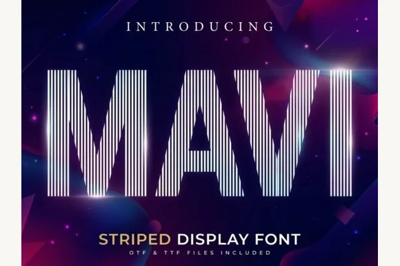
Tall condensed vertical-pinstripe optical display
Mavi is a towering condensed display font built entirely from crisp vertical parallel pinstripes sliced into bold geometric silhouettes.
Ideas for this font
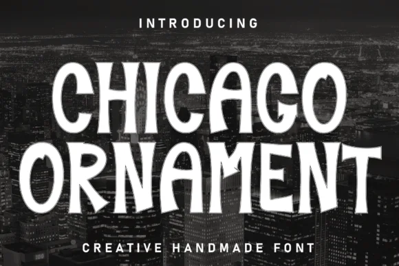
Handcrafted vintage-ornamental condensed poster serif-display
Chicago Ornament is a tall, hand-inked condensed display typeface with softly flared terminals, high-waisted bars, and subtle sign-painter grit.
Ideas for this font
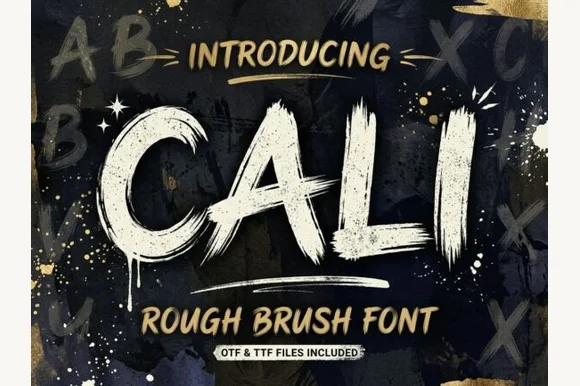
Heavy streaky hog-bristle wall-paint brush font (OTF & TTF)
Cali is a bold, wide-bristle rough brush display font streaked with authentic paint-roller and dry-brush fibers (OTF & TTF).
Ideas for this font
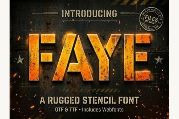
Heavy tactical steel-plate stencil sans (OTF, TTF & Webfonts)
Faye is a wide, ultra-heavy industrial stencil sans featuring diagonal tactical bridge cuts across massive block capitals (OTF, TTF & Webfonts).
Ideas for this font
Allow optional Google Analytics to measure visits and catalogue actions. Your search words and notes are not included. Privacy & storage