 #1 · Best Overall
Disclosure: MakerFileHub may earn a commission from qualifying purchases via paid links on this page. How our links work.
Dusty chalk texture, hatching & marker boards
15 Best Chalkboard, Slate & Bistro Fonts
A chalk font has to suggest dust without becoming illegible from a table away. Chalk Varsity hatches the diagonal strokes of a varsity slab, Chalky Teacher and Warmstreak reproduce a marker on dust, and Whitechalk and the two Chalkboard faces build the texture into hollow and hatched variants. Active Marker supplies the plain chisel-tip board sans that most cafés actually need.
Quick verdict
Chalk Varsity is the strongest for a sports bar board, Warmstreak is the most natural handwriting-on-slate look, and Active Marker is the practical choice for daily menus. Whitechalk covers the hatched classroom style.
Quick answer
Top 3 chalkboard, slate & bistro picks right now.
Short on time? Start with our three highest-rated chalkboard, slate & bistro standouts before scrolling the full breakdown.
#1 · Best Overall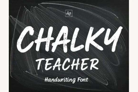 #2 · Runner-Up Pick
 #3 · Editor's Choice
How we tested & selected these 15 fonts
We kept 15 of 280 candidates with texture that follows the stroke rather than sitting over it. Judged on readability at 2 m, whether the hatch resolves at print size if the board is printed, and how the face behaves at the 1.5 inch minimum a chalk marker can hold.
Side-by-side summary
Top 5 chalkboard, slate & bistro picks at a glance.
Compare specimens, OpenType/PUA traits and primary project roles side by side.
| Rank & Font | Style & File Specs | Best Project Fit | Store Listing |
|---|---|---|---|
| Slab SerifChalk-shaded | First-day-of-school photo board, teacher DTF shirt or café menu | Get fontPaid link | |
| HandwrittenReal-chalk | 'First Day of Kindergarten' photo-prop board & classroom poster | Get fontPaid link | |
| HandwrittenDusty-chalk | 'FIRST DAY OF...' photo-prop printable & classroom poster | Get fontPaid link | |
| HandwrittenPUA encoded · Ligatures · Alternates & swashes | Coffee-shop daily specials board & deli menu header | Get fontPaid link | |
| HandwrittenChalkboard-marker | Framed classroom welcome sign, teacher tote & tumbler | Get fontPaid link |
Clean Sans & Handwritten Print
10 fonts#1 · Best OverallChalk Varsity
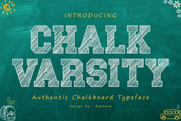
Chalk Varsity is a varsity slab alphabet in which the letters are hatched diagonally as if drawn with chalk, the slabs stay flat and the fill is rough, so a word reads as a school board sign.
The C opens a wide crescent with a flat slab, the H keeps two even stems, the A carries a low crossbar and the Y forks with chalk lines running through every stroke, all at a heavy even weight with unbracketed slabs. The hatching is the character: the lines run in one direction at a consistent angle and stop short of the contour, which is what keeps the face reading as drawn rather than as textured print. Because the hatch is fine, the face needs 30 pt minimum and belongs on classroom and gym applications. The green chalkboard ground, the white chalk, the small doodles and the two caption lines are presentation; the slab face is the two words.
Recommended project & layout
First-day-of-school photo board, teacher DTF shirt or café menu — Use white or pastel chalk hues exclusively over dark backgrounds.
Before you cut or print
Fine internal chalk hatch lines are designed for print, DTF and digital boards — not blade vinyl cutting.
Best paired with
Get fontPaid link
#2 · Runner-Up PickChalky Teacher
Chalky Teacher is an authentic blackboard handwritten font streaked internally with realistic dry-chalk grain across bold slanted strokes.
Chalky Teacher is a slanted brush alphabet with dry-chalk grain baked into the strokes, so the interior of each letter breaks into fibrous streaks instead of presenting a flat colour. The letters are bold and a little irregular in height, which reproduces the way a board is written quickly during a lesson, and the slant gives the line momentum. Because the texture is internal, the face needs a reasonable size to read as chalk rather than noise, and it is the wrong choice for a small label where the grain fills the counters; it belongs on boards, posters and large photo props.
Recommended project & layout
'First Day of Kindergarten' photo-prop board & classroom poster — Stack bold uppercase headers (72 pt) over smaller mixed-case teacher/grade lines (36 pt) on dark slate textures.
Before you cut or print
Internal chalk-dust streaks require Print-Then-Cut, posters, sublimation, or DTF—never attempt to blade-weed vinyl!
Best paired with
Get fontPaid link
#3 · Editor's ChoiceWarmstreak
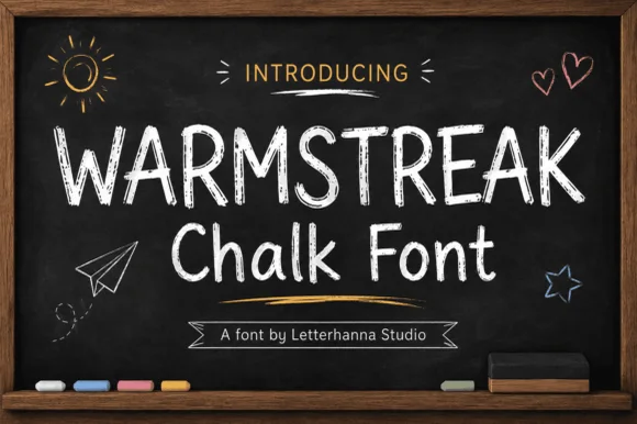
Warmstreak is an authentic, chalk-textured upright print font capturing real dusty calcium-chalk grain on café menus and school boards!
Warmstreak is a dusty chalkboard print sans: a slightly uneven even stroke, soft rounded terminals, a small grain of chalk dust along the edges and a baseline that stays level so a board reads as written in one pass. The dust is the texture and it disappears when the face is reversed or printed small. It needs roughly 24 mm for the dust and the terminal to read, and it is best as white or a single bright ink on a dark board, or the reverse printed as white ink on black card.
Recommended project & layout
'FIRST DAY OF...' photo-prop printable & classroom poster — Pair all-caps headers ('WARMSTREAK', 72 pt) with mixed-case subheaders ('Chalk Font', 54 pt) on matte chalkboard black.
Before you cut or print
Porous interior chalk dust texture is purpose-built for flat print, posters, menus, and DTF—NEVER send chalk-grain fonts to a vinyl blade!
Best paired with
Get fontPaid link
 #4 · Top Maker Utility
Active Marker
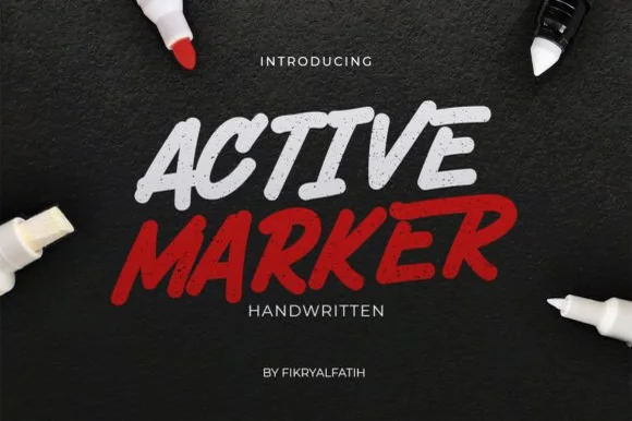
Active Marker captures brisk, slanted broad-tip marker lettering with organic stroke tapers and natural double-letter ligatures.
Active Marker is a slanted chisel-tip whiteboard and chalkboard marker sans: even strokes with a visible chisel angle, blunt ends that read as a marker turned in the hand, a firm slant and open counters that stay clean on a board. The chisel angle is the design and it flattens when the face is reduced. It needs roughly 20 mm for the chisel angle and the blunt end to read, and it is best in one dry-erase or chalk ink on a board, or a single dense ink on uncoated stock where the chisel edge prints as a step.
Recommended project & layout
Coffee-shop daily specials board & deli menu header — Highlight section headers ('ESPRESSO', 'FRESH BAKED') in bold white or red at 36–54 pt above clean tabular price columns.
Before you cut or print
Sturdy solid strokes cut smoothly on chalk-style matte vinyl at 0.8 in and taller with minimal weeding fuss.
Best paired with
Get fontPaid link
 #5 · Standout Silhouette
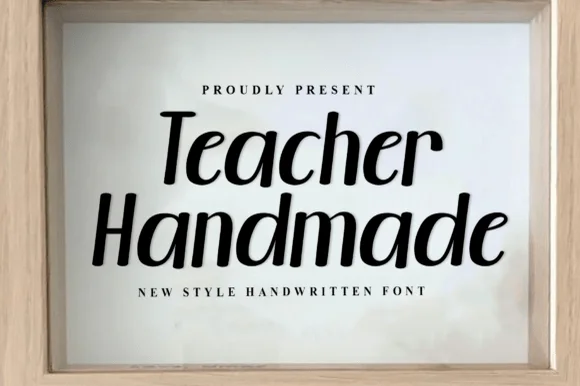
Teacher Handmade
Teacher Handmade is an upright handwritten face in black on white: thick monoline-brush strokes with rounded ends, tall ascenders, an open e and a lower-case g with a straight tail, so the two words read as marker lettering written quickly and confidently.
The two words are stacked and the drawing is handwriting rather than a script: nothing is connected, the stroke weight is nearly constant, and the ends are rounded, which is what a round-tip marker produces. The x-height is large and the ascenders are tall, so the pair fills its lines without needing a heavy weight, and the letters lean very slightly to the right, which keeps the writing from looking mechanical. The counters are generous and the spacing is even, so the face stays readable at paragraph sizes, which is unusual for a handwritten display. The specimen sets the phrase inside a pale wooden frame with tracked caps above and below, and the light grey ground keeps the black strokes crisp, so the page reads as a framed print rather than a type sheet.
Recommended project & layout
Framed classroom welcome sign, teacher tote & tumbler — Stack 2 mixed-case lines centered at 68–135 pt inside a natural wood frame above wide-tracked serif micro-caps.
Before you cut or print
100% smooth, disconnected solid strokes cut and weed in seconds on Cricut Oracal 651 and HTV down to 0.6 inches!
Best paired with
Get fontPaid link
 #6
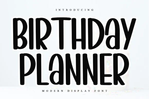
Birthday Planner
Birthday Planner is a tidy, tall hand-lettered marker display font with softly rounded stem tips and friendly vertical rhythm.
Birthday Planner is a tall rounded marker all-caps planner face: narrow upright caps with fully rounded ends, an even medium stroke, wide even spacing and a height that fits a single line inside a planner box. The rounded ends are the only warmth and the caps keep a label shouty but readable. It needs roughly 20 mm for the rounded end and the counter to read, and it is best in one bright ink on white paper, or a single dark colour on pastel card.
Recommended project & layout
Kids' party itinerary sign, milestone chalkboard & invite — Stack centered uppercase headers at 36–54 pt and use smaller 18 pt lines for time-slot bullet items.
Before you cut or print
Smooth, even marker strokes with zero thin serifs weed quickly and cleanly on Cricut vinyl, HTV, and acrylic signs down to 0.6 in.
Best paired with
Get fontPaid link
 #7
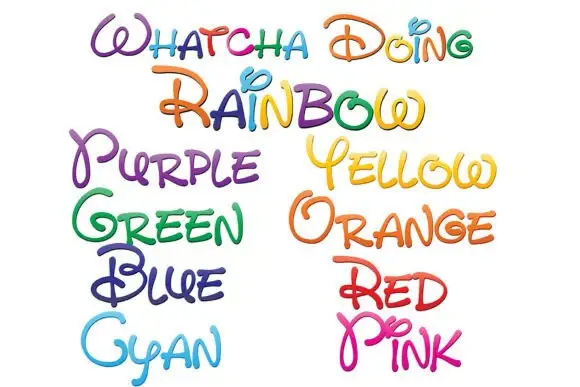
Whatcha Doing
Whatcha Doing is a playful curled script in which each letter carries a decorative loop or tail, and the sample sets the set's name plus a colour word in each of eight colour variants.
WHATCHA DOING runs across the top in mixed colours, and each letter is a single-stroke script with exaggerated loops — an O that spirals into a ball, a D with a curl on its tail, a G with a hooked descender — drawn with a slight thickness variation and no fill. Below, the colour names are set in the same construction one per colour: Purple, Yellow, Green, Orange, Blue, Red, Cyan, Pink. The point of the sample is the palette: the same face appears in eight inks, which is how a hand-lettered alphabet is actually sold, and each colour keeps the lightness needed for a script to stay legible. The face is for names, quotes and labels, and it needs generous spacing because the loops of neighbouring letters will otherwise tangle.
Recommended project & layout
An art-room welcome header — Put the phrase in a single broad row on white above a plain materials checklist in black.
Before you cut or print
Verify the colour workflow and readability of the new capitals in the intended application.
Best paired with
Get fontPaid link
 #8
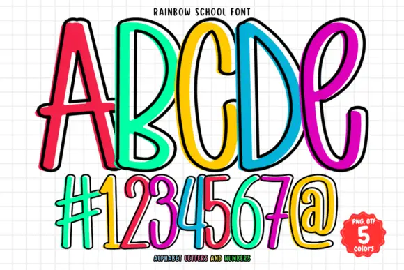
Rainbow School
Rainbow School draws tall thin caps as coloured outlines rather than solid shapes: a bright stroke with a white keyline inside it, set in five colours across a gridded notebook ground.
ABCDE fills the upper half of the card in red, green, yellow, blue and magenta, and each letter is drawn as a single thick outline with a white line running just inside it, so the shapes look like coloured gel pens. The strokes are narrow and tall with a slight slant, and the five letters lean against each other as though written along a ruled line. Underneath, a row of numerals and symbols repeats the treatment at the same size, which shows that the set covers more than the alphabet. The ground is squared exercise paper in pale grey, and a badge at the lower right states the count of colours and the formats. Because the letters are outlines, the face prints in one colour per letter, and it can be used on a colour printer with the white keyline kept as paper.
Recommended project & layout
A classroom questions wall — Set the heading in one high row over a white pinboard; put pupil questions on separate plain cards underneath.
Before you cut or print
Check the complete phrase and colour selection in the intended editor.
Best paired with
Get fontPaid link
 #9
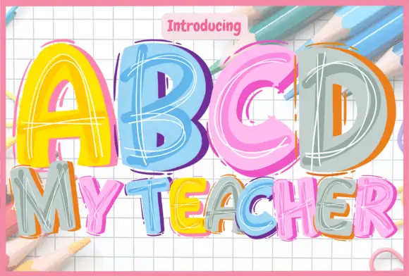
Abcd My Teacher
ABCD My Teacher draws fat capitals in bright colour and fills each one with loose white scribbles, so a word looks written with a marker on squared paper during a lesson.
ABCD fills the top of the card in yellow, blue, pink and grey, and MY TEACHER follows underneath in a mix of the same colours at two thirds of the size. Every letter is a solid colour block with an uneven edge and a scribble of white lines running through it, as though a marker had been dragged back and forth inside the shape, and a few letters carry a second outline in a different colour offset by a couple of millimetres. The ground is squared exercise paper, and pencils are scattered along the top edge of the card. A small pill at the top introduces the face. The letters lean slightly and vary in width, which is what keeps the set looking hand-drawn rather than manufactured. It is a classroom and craft face: good for worksheets, teacher gifts, school fair posters and anything that wants the look of a lesson written on the board.
Recommended project & layout
A classroom ideas board — Set three short words down the left of a white board and leave a large blank right-hand area for current questions.
Before you cut or print
Check the required word shapes and whether offset colours can be selected.
Best paired with
Get fontPaid link
 #10
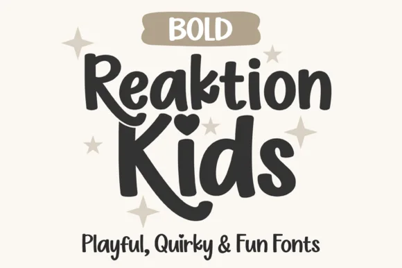
Reaktion Kids Bold
Reaktion Kids Bold is an upbeat, chunky hand-drawn marker font featuring bouncy mixed-case shapes, big round i-dots, and stylistic alternates.
Reaktion Kids Bold is a chunky quirky kids' marker font with mixed heights: some letters are drawn tall and some squat, the baseline wobbles and the stems carry a small ink blob where the marker paused. The mixed heights grow the word box vertically, and the blobs are the finest detail. It needs roughly 24 mm for the mixed height and the blob to read, and it is best in one bright ink on white, or a single dark colour on pastel card where the blobs stay open.
Recommended project & layout
Science-fair poster, classroom station sign & teacher shirt — Stack 2 mixed-case words tight (0.92 line spacing) and tuck smaller category pills ('BOLD', 'LAB') above.
Before you cut or print
Zero thin lines or distress speckles—cuts and weeds super cleanly on Cricut HTV, cardstock, and bin vinyl down to 0.6 in.
Best paired with
Get fontPaid link
Display & Decorative Headlines
5 fonts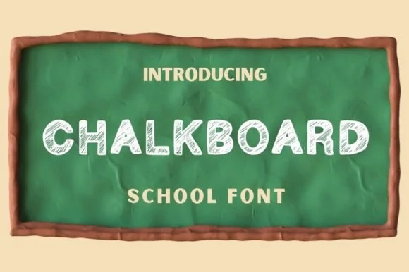 #11
Chalkboard
Chalkboard is a classroom display alphabet in capitals, drawn with a hatched interior so each stroke reads as chalk dragged across a board rather than a solid fill.
Every letter is built from clean geometric shapes and then textured with diagonal hatching inside the stroke: the C is a wide open crescent, the H is two stems and a bar, the A closes to a rounded apex and the K splays two arms from a single stem. Weight is uniform across the word, and the corners are slightly rounded, as if drawn with the flat end of a chalk stick. Because the texture sits inside the letters rather than on their edges, a word still resolves as solid at a distance and becomes grainy only up close, which is what makes the face work for a sign and for a label. Counters are wide and open. The green board, the timber frame and the small caption lines in the sample are presentation; the lettering is the words.
Recommended project & layout
Classroom welcome poster, bulletin printable or bistro chalkboard — Set in white or pastel yellow over dark slate backgrounds.
Before you cut or print
Best for printables, Canva graphics and sublimation due to internal sketch lines.
Best paired with
Get fontPaid link
 #12
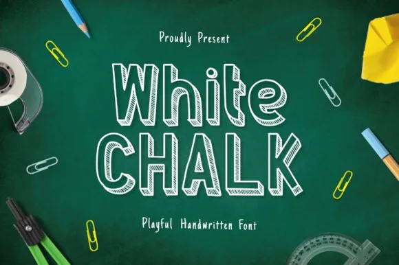
Whitechalk
Whitechalk is a tall, structured chalkboard display font pairing crisp slab-serifed outlines with diagonal white-chalk interior shading.
Whitechalk is a tall display alphabet that pairs slab-serifed outlines with diagonal chalk hatching inside the strokes, so a word looks drawn on a board with a squared chalk stub rather than printed with a chalk texture. The serifs give the letters structure, which keeps a long heading legible at a distance, and the hatch density is even enough that it survives being seen from across a room. It needs roughly 25 mm before the hatch reads as chalk rather than as grey fill, and it works best in white on a slate or green ground.
Recommended project & layout
Teacher open-house slide deck, syllabus header & printable — Mix tall mixed-case on row one with all-caps on row two at 56–100 pt on dark green or charcoal backgrounds.
Before you cut or print
Fine diagonal hatch lines inside every stem are strictly for digital slides, posters, and print—never blade-cut vinyl!
Best paired with
Get fontPaid link
 #13
Chalkboard
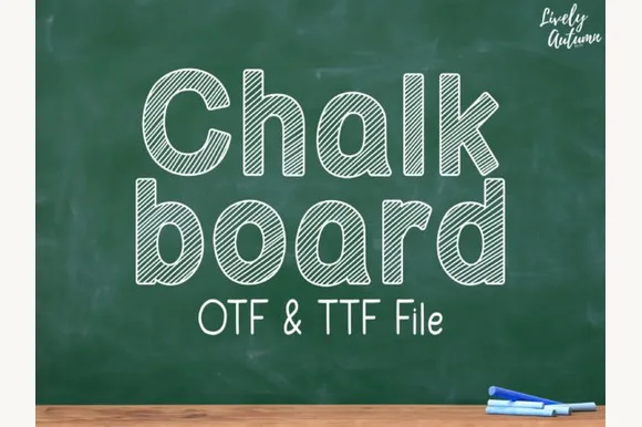
Chalkboard (by LivelyAutumn 11.11) is a tidy, rounded mixed-case classroom font filled inside clean outlines with even diagonal sketch stripes (OTF & TTF).
Chalkboard is a rounded mixed-case classroom face whose letters stay inside clean outlines filled with even diagonal sketch stripes, so a word looks chalked onto a board rather than printed. The stripes run at one angle across every letter, which means the fill reads as texture only when the letters are large enough for several stripes to cross a stroke, and the outlines keep the counter shapes open at small sizes. It needs roughly 20 mm for the stripes to read, and it is best in white on green board or in a single colour on kraft.
Recommended project & layout
Primary-grade phonics poster, worksheet header & slide deck — Stack mixed-case words at 56–100 pt above clean monoline print subtext ('OTF & TTF File' style).
Before you cut or print
Designed for classroom printables, SmartBoard slides, and Cricut Pen drawing (at larger scale)—not blade-cut vinyl.
Best paired with
Get fontPaid link
 #14
Chalkboard
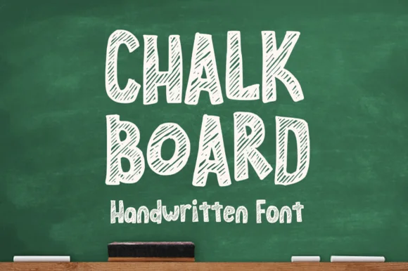
Chalkboard (by MVMET) is a cheerful classroom display font outlining bouncy uppercase/lowercase blocks filled with diagonal chalk-sketch stripes.
Chalkboard is a hand-drawn chalk family: a rough grainy stroke, slightly uneven letters, a small double-line or shadow variant and a doodle companion for arrows, stars and underlines. The grain is stippled into the stroke, so it prints as texture only above a certain size, and the doodles are drawn to the same weight. It needs roughly 26 mm for the chalk grain to read, and it is best as white or a single bright colour on a dark board, or the reverse printed as white ink on black card.
Recommended project & layout
Back-to-school bulletin header, digital slide & lunch menu — Stack 2 uppercase words huge (68–125 pt) over 1 mixed-case subheader on chalkboard green or charcoal.
Before you cut or print
Dozens of fine diagonal hatch lines inside every letter mean print, digital slides, or DTF ONLY—never blade-cut vinyl!
Best paired with
Get fontPaid link
 #15
Back to School
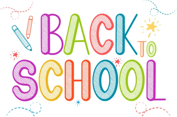
Back to School is a tall, lively classroom display font outlining narrow hand-drawn capitals filled with multi-angle colored-pencil/chalk hatching.
Back to School is a tall display in narrow hand-drawn capitals, each filled with multi-angle pencil or chalk hatching in a different colour, so a word reads as a row of shaded blocks rather than a set of letterforms. The hatching runs at varying angles, which keeps the pattern lively, and the narrow proportions let a long heading stand in a column. Detail is fine, so the face needs roughly 25 mm before the hatch reads as pencil work, and it is at its best on white with a dark outline holding each letter together.
Recommended project & layout
'Back to School' newsletter, teacher shirt (DTF) & binder cover — Color each letter in alternating rainbow shades at 60–115 pt on crisp white cardstock with pencil doodles.
Before you cut or print
Fine interior hatch lines shine in color printing, sublimation, Print-Then-Cut stickers, and DTF shirts—avoid vinyl weeding!
Best paired with
Get fontPaid link
Practical buyer checklist
Frequently asked questions.
Key cutting, printing and pairing answers before choosing a chalkboard, slate & bistro typeface.
Which fonts work with a real chalk marker on a slate board?
Plain monoline and marker faces. Any face with hairlines or fine texture cannot be reproduced by hand at board scale, and the attempt looks like a wobbly copy. Pick one solid sans and letter at 1.5 inches or larger.
Can a chalk-textured font be printed for a café board?
Yes, and it often looks better than real chalk, because the texture is consistent. Print on a matte vinyl wrap or a rigid panel at 150 dpi or more, and keep the lettering large enough that the dust detail does not disappear.
What is the difference between a chalkboard font and a marker font?
Chalk texture shows dust and broken edges, while a marker face shows a flat chisel end and even ink. Cafés often mix the two, using the chalk face for the header and the marker face for prices so the board stays readable.
How do I keep a chalkboard menu readable from across a room?
Fewer words, larger type, and one accent per section. Lettering below 1 inch is invisible from three metres, so cut the menu to the six items that matter and let the board breathe.
Keep exploring
Related collections & guides.
Explore adjacent maker roundups or check our practical pre-production checklists.
01 / Occasions & Milestones
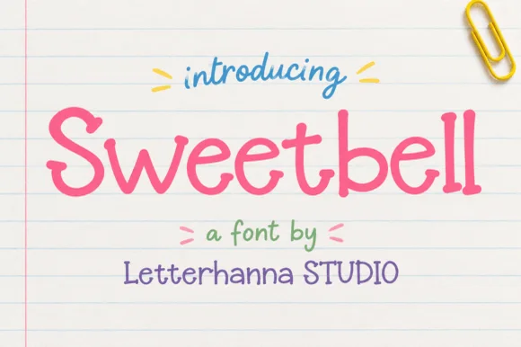
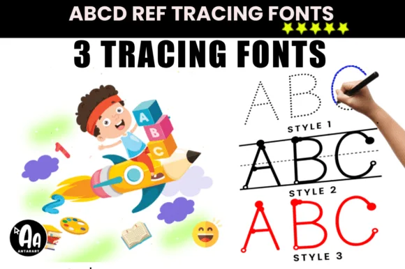
Classroom & school
32 curated fonts · Previews & pairings
02 / Cricut & Craft
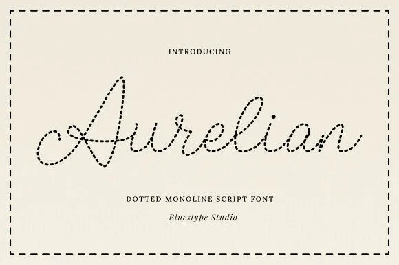
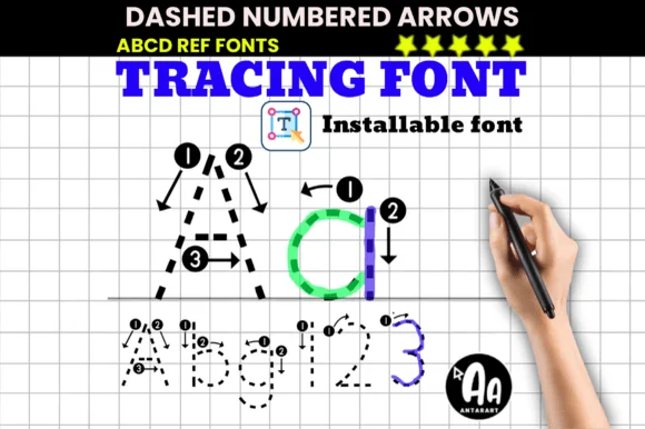
Dotted tracing & worksheet fonts
16 curated fonts · Previews & pairings

03 / Branding & Print
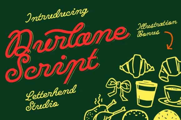
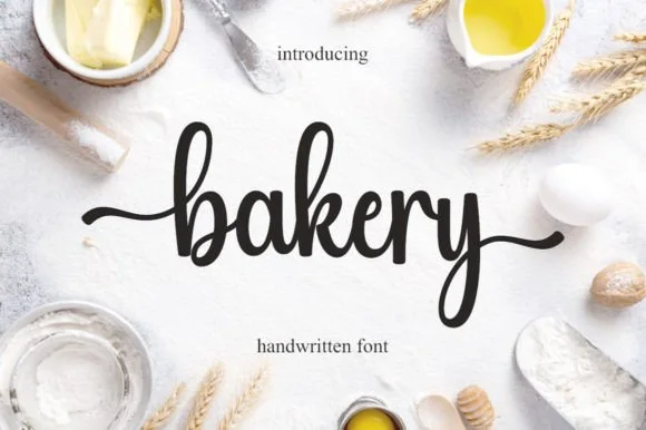
Artisan bakery, café & menus
28 curated fonts · Previews & pairings
04 / Branding & Print
Varsity & athletic
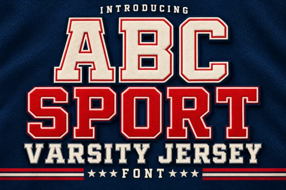
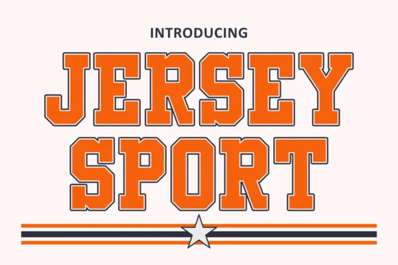
25 curated fonts · Previews & pairings
Guides: Invitation font checklist · Vinyl & cutting checklist · How to pair script & sans fonts