 #1 · Best Overall
Disclosure: MakerFileHub may earn a commission from qualifying purchases via paid links on this page. How our links work.
Skyscraper widths, flat-sided grots & poster caps
25 Best Tall Condensed & Narrow Poster Fonts
Extreme condensation is a problem of counters, not heights: once the width drops past about 1:4, the bowl of an O has nowhere to go. Flamingo keeps the 1929 Berthold geometry intact, Sourced and Homies push toward 5:1 and 6:1 ratios that fill a vertical panel, and Whiskey Tango and Hoodie stay readable at moderate condensation. Taught and Gc Grind handle the flat-sided grotesque middle.
Quick verdict
Sourced is the best extreme condensed for a tall poster, Flamingo covers the period Deco case, and Whiskey Tango works where readability matters more than drama. Homies is the pick for a single stacked word.
Quick answer
Top 3 tall condensed & narrow poster picks right now.
Short on time? Start with our three highest-rated tall condensed & narrow poster standouts before scrolling the full breakdown.
#1 · Best Overall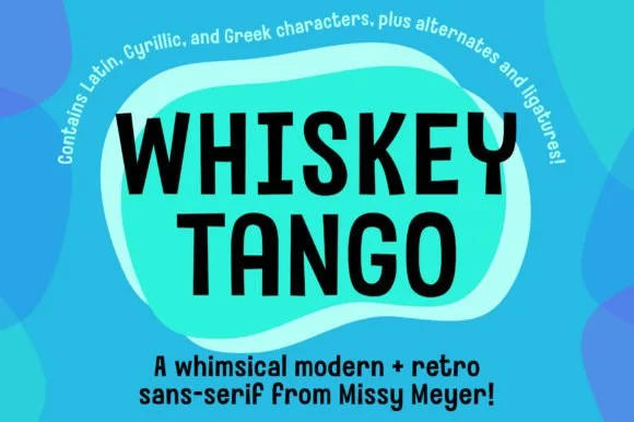 #2 · Runner-Up Pick
Whiskey Tango
Tall condensed rounded retro sans-serif with 110+ PUA extras
Get fontPaid link
Read review ↓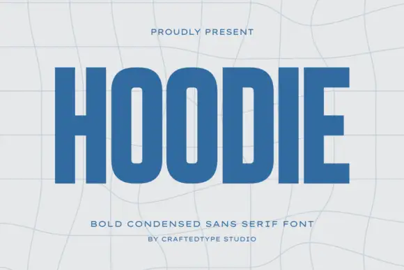 #3 · Editor's Choice
How we tested & selected these 25 fonts
We reviewed 1,406 paid fonts, the largest pool in the catalogue, and kept 25 that hold genuine condensed construction with open counters. Deliberately removed tall handwriting and looped scripts that share the narrow footprint but not the poster logic.
Side-by-side summary
Top 5 tall condensed & narrow poster picks at a glance.
Compare specimens, OpenType/PUA traits and primary project roles side by side.
| Rank & Font | Style & File Specs | Best Project Fit | Store Listing |
|---|---|---|---|
| DisplayHistoric | 1920s gala poster, cocktail list, wine label or book cover | Get fontPaid link | |
| Sans serifPUA encoded · Ligatures · Alternates & swashes | Retro travel poster, podcast cover & cocktail menu | Get fontPaid link | |
| Sans serifFile formats | A compact athletic-club name study | Get fontPaid link | |
| Sans serifLanguage support · File formats | A bold documentary-feature heading | Get fontPaid link | |
| Sans serifPUA encoded · File formats | YouTube thumbnail headline, fitness poster & magazine cover | Get fontPaid link |
Clean Sans & Handwritten Print
13 fonts#1 · Best OverallFlamingo
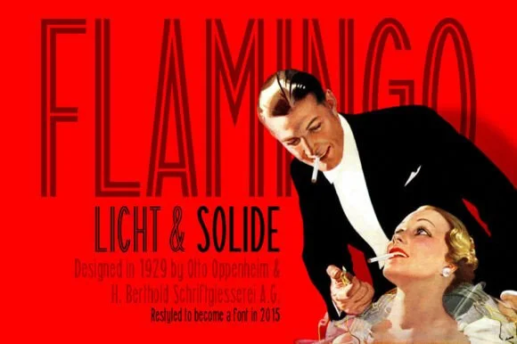
Flamingo is an ultra-condensed thin sans in which the stems run very tall, the terminals stay flat and the counters narrow to slots, so a single word reads as a 1920s film title card.
The F sets three thin arms on a narrow stem, the L turns a sharp corner, the A pinches to a point, the M squeezes four thin stems into a narrow frame and the N keeps a hairline diagonal, all at a thin even weight with flat terminals and an extremely condensed proportion. The proportion is the character: the face fits a long title into a narrow column, which is how the sample sets one word across a poster edge to edge. Because the stems are hairline, it needs 40 pt upward and a smooth ground, and it should never carry a paragraph. The red field, the photograph, the small caption grid and the credit lines are presentation; the dark condensed title is the face.
Recommended project & layout
1920s gala poster, cocktail list, wine label or book cover — Use Solide for smaller subheads and Licht at towering 72pt+ poster scale.
Before you cut or print
Use the Solide weight if cutting vinyl; save fine Licht inline lines for print.
Best paired with
Get fontPaid link
#2 · Runner-Up PickWhiskey Tango
Whiskey Tango is a lively, tall-and-narrow rounded sans-serif packed with Latin, Cyrillic, and Greek support plus over 110 PUA alternates.
Whiskey Tango is a tall condensed rounded retro sans with more than a hundred and ten private-use extras: squeezed caps with soft corners and a high waist, plus swash letters, ligatures, tails and ornaments reached through alternate keystrokes. It is a packaging face, so it wants a tall panel and a single flat ink rather than a soft ground. The soft corners are the finest element and they plug first at small sizes. It needs roughly 26 mm for the corner and the condensed stem to read, and it is best one flat ink on kraft or white board.
Recommended project & layout
Retro travel poster, podcast cover & cocktail menu — Stack two-word drink or episode titles in 48 pt uppercase at tight 0.95 line-height, using mixed-case Whiskey Tango or a light sans for descriptions.
Before you cut or print
Rounded stroke ends and generous counters make this one of the cleanest tall sans faces to cut on Oracal 651 or HTV even at 0.65 in.
Best paired with
Get fontPaid link
#3 · Editor's ChoiceHoodie
Hoodie shows a large blue uppercase word on a pale warped-grid field, where heavy straight uprights and flat horizontal endings form a dense block, the O and D hold rounded rectangular counters, the H crossbar sits near the middle and the E keeps three squared arms.
The stems stay straight and heavy, the counters turn into rounded rectangles, the endings flatten and the row compresses. That compression is the character: a short word becomes a dense block, which is why the sample fills the width on a warped grid. The grid bends independently of the type, so check the counters at your final size, keep 40 pt before they close and confirm the condensed caps are what your file actually holds. The rounded rectangular counters are the failure point: they close at about 30 pt and the word reads as a dense ribbon, so keep 40 pt and do not let a curved grid carry the type.
Recommended project & layout
A compact athletic-club name study — Set one flat name line above a plain independent-club descriptor.
Before you cut or print
Check counter openness at badge size and test any garment process separately.
Best paired with
Get fontPaid link
 #4 · Top Maker Utility
Sourced
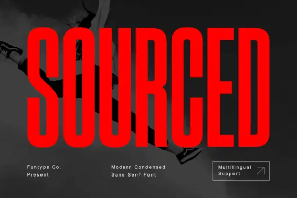
Sourced shows vivid red capitals across a dark monochrome photograph, where tall heavy uprights and flat-ended arms leave thin rounded rectangular counters inside the O and D, the R carries a straight angled leg and the C opens only a small gap on its right side.
The stems stay tall and thick, the counters squeeze into vertical rectangles, the arms end flat and the side openings close. That compression is the character: a long word fits a narrow field without losing height, which is why the sample sets a single name alone on a photograph. Language support is mentioned on the cover but only the name and small captions appear, so check the accented characters you need, keep 40 pt before the counters close and give the rows extra leading.
Recommended project & layout
A bold documentary-feature heading — Use a clear flat panel for the main words and keep credits outside the block.
Before you cut or print
Check small apertures and title contrast in a print-size proof.
Best paired with
Get fontPaid link
 #5 · Standout Silhouette
Taught
Taught is a heavy, flat-sided condensed sans-serif with tight interior counters and commanding vertical headline presence.
Taught is a bold flat-sided condensed poster grotesk: narrow stems with completely flat sides, tight square counters, a bold weight that holds across a large format and a set of slightly odd terminals that give it a printed poster feel. The flat sides keep a word from looking hand-made, and the counters close when the face is scaled down. It needs roughly 22 mm for the counter and the flat side to read, and it is best in one dense ink on uncoated stock, or a single white on a dark ground.
Recommended project & layout
YouTube thumbnail headline, fitness poster & magazine cover — Set 1-to-4-word uppercase punchlines at 72+ pt with +15 tracking and tight 0.92 line-height over high-contrast backgrounds.
Before you cut or print
Broad flat stems weed fast on sign vinyl and HTV down to 0.6 inches—zero fragile serifs or hairlines to tear.
Best paired with
Get fontPaid link
 #6
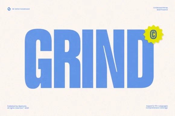
Gc Grind
Gc Grind is a bold condensed sans-serif engineered with subtle corner inktraps and flat industrial curves across 170+ languages.
Gc Grind is a heavy condensed inktrap display sans: very narrow squared stems, small triangular traps cut into the joins where two strokes meet, a tall cap height and tight counters that read as a stencil-cut industrial headline. The traps are the design and they fill into solid corners as soon as the face is printed small. It needs roughly 24 mm for the trap and the condensed stem to read, and it is best in one dense ink on uncoated stock, or a single white on a dark ground where the traps print as cut notches.
Recommended project & layout
Coffee roastery bag, energy-drink can & streetwear tag — Run bold uppercase product names vertically or across narrow 2.5-inch can panels, pairing specs in a tiny technical grotesk.
Before you cut or print
Solid vertical bars cut cleanly on matte vinyl and stencil mylar; keep height above 0.8 in so the intentional inktrap notches stay visible.
Best paired with
Get fontPaid link
 #7
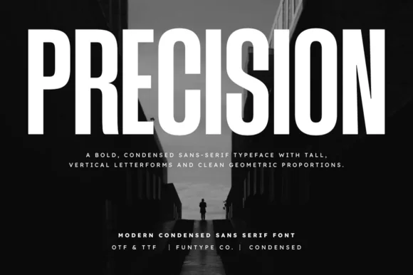
Precision
Precision is a bold, ultra-condensed sans serif typeface with tall vertical pillars, tight flat-sided counters, and clean modernist snap.
Precision is a tall ultra-condensed grotesk in caps with flat-sided counters, squared corners and very tight sidebearings, so a word reads as a compressed panel of vertical pillars rather than a normal headline. The extreme condensation packs long names into narrow columns, which is its purpose, and the tight fit means lines need tracking to avoid a solid band. It needs roughly 30 mm for the flat counters to stay open, and it is best in white on a dark ground or a single flat ink on a pale one.
Recommended project & layout
Documentary poster title, fitness banner & YouTube header — Set 1 uppercase headline at 80–150 pt with -10 tracking above a wide-tracked (+200) 2-line sans deck.
Before you cut or print
Clean straight edges cut and weed fast on gym wall decals, race bibs, and apparel HTV.
Best paired with
Get fontPaid link
 #8
Headline
Headline is a crisp, heavy condensed sans serif engineered with flat horizontal terminals, narrow counters, and clean newspaper-poster punch.
Headline is a heavy condensed poster sans with flat horizontal terminals, narrow flat-sided counters and uniform vertical pillars, so a word reads as a newspaper poster rather than a modern display. The condensation packs a long line into a narrow measure, and the flat terminals survive a cheap single-colour print. It needs roughly 30 mm for the narrow counters to stay open, and it is best in cobalt or black on off-white gallery stock, or white on a saturated ground.
Recommended project & layout
Magazine feature opener, sports poster & social carousel — Set primary titles in all-caps at 72–140 pt with -10 tracking, paired with tracked lighter condensed captions above and below.
Before you cut or print
Razor-straight edges weed in seconds on large window decals, gym wall vinyl, and apparel HTV.
Best paired with
Get fontPaid link
 #9
Homies
Homies is an extreme 6:1 ultra-condensed sans serif packing razor-slim, towering vertical bars for high-fashion streetwear & album art (OTF & TTF).
Homies is an ultra-narrow six-to-one skyscraper condensed sans: extremely tight stems, a very small counter, squared shoulders and a flat baseline that turns a column of type into a vertical rule. The proportions fit a long name in a narrow band, and the counter is the first thing to close at any reduction. It needs roughly 28 mm for the counter and the shoulder to read, and it is best in one dark ink on white and cream, or white on a dark ground where the narrow stems read as light strips.
Recommended project & layout
Hip-hop / R&B album cover, streetwear lookbook & poster — Split a 2-column layout: towering Klein-blue Homies headline on the left (160 pt), B&W portrait offset on the right.
Before you cut or print
Straight vertical bars cut cleanly on 1 in+ HTV and vinyl—just watch the ultra-narrow hair-slit counters inside 'O', 'M', and 'E'!
Best paired with
Get fontPaid link
 #10
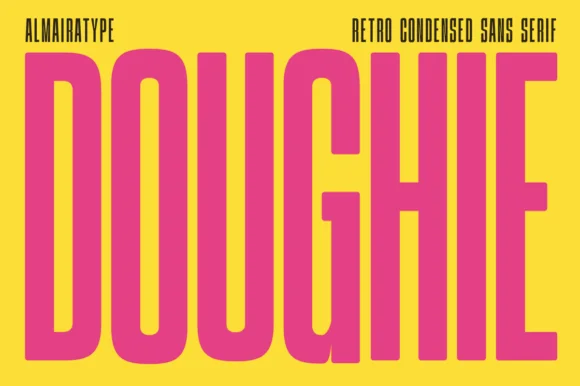
Doughie
Doughie is an ultra-tall, compressed retro condensed sans stretching rounded-corner vertical pillars edge-to-edge across posters and packaging!
Doughie is an ultra-tall pillar-condensed retro poster sans at about five to one: narrow vertical stems, a very small counter, flat shoulders and a uniform weight that turns a word into a column of bars. The proportions fit a long title in a narrow measure, and the counter is the first thing to close at any reduction or in embroidery. It needs roughly 30 mm for the counter and the shoulder to read, and it is best in one dark ink on white and cream, or white on a dark ground where the narrow stems read as light pillars.
Recommended project & layout
Artisanal donut/cookie box, tall soda can & tote bag — Stretch 1 5-to-9-letter uppercase word full-height (140–240 pt) with tight +2 tracking in hot pink on yellow or cobalt on cream.
Before you cut or print
100% smooth straight pillars cut and weed in 4 seconds on Cricut HTV and Oracal 651 down to 0.75 inches tall!
Best paired with
Get fontPaid link
 #11
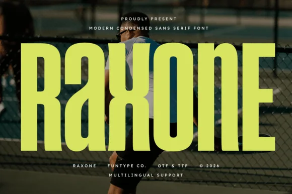
Raxone
Raxone is a heavy, muscular condensed sans featuring subtle architectural waist notches on 'R', 'a', 'x', and 'n' for modern sports & streetwear (OTF/TTF).
Raxone is a heavy condensed athletic sans with subtle architectural notches at the waist of the R, a, x and n, flat-sided stems and a tall x-height, so a word reads as court-side kit lettering rather than a modern grotesk. The notches are small and repeat, which means the face needs size to show them, and the condensation fits a long name across a shirt back. It needs roughly 26 mm for the notches to read, and it is best in electric lime or white on a dark jersey or one ink on a pale ground.
Recommended project & layout
Pickleball / tennis club shirt, energy-drink can & gym bag — Set 1 5-to-8-letter brand name huge (96–180 pt) in electric lime, white, or orange across athletic photography.
Before you cut or print
Clean, crisp geometric polygons cut and weed fast on stretch athletic HTV and Oracal 651 down to 0.65 inches!
Best paired with
Get fontPaid link
 #12
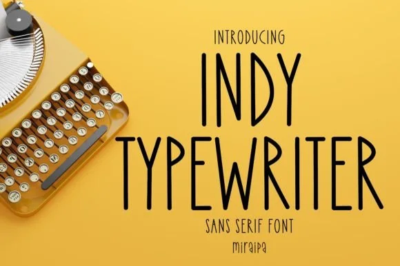
Indy Typewriter
Indy Typewriter is actually a tall, friendly monoline handwritten sans serif—zero serifs or mechanical slabs despite the 'Typewriter' name!
Indy Typewriter is a tall condensed monoline handwritten sans with rounded stroke ends, airy spacing and no serifs at all despite the name, so a heading reads as neat hand printing rather than typing. The even monoline keeps it legible at 9 pt in a narrow column, and the condensed stance fits a long label in a small space. It needs roughly 14 pt for the rounded ends to read, and it is best in ink black on cream or in one pale ink on dark card.
Recommended project & layout
Pantry canister decal, planner tab & minimalist mug — Stack 1 or 2 uppercase words at 42–84 pt with +6 tracking in matte black vinyl on clear glass.
Before you cut or print
Uniform monoline rounded strokes cut and weed in seconds on Cricut Oracal 651, HTV, and Joy Smart Vinyl—and draw great with pens!
Best paired with
Get fontPaid link
 #13
Weekend Parade
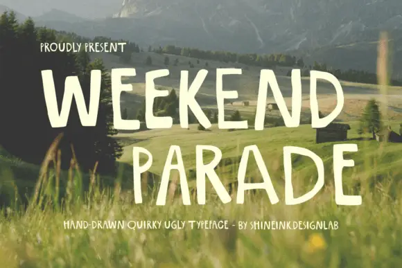
Weekend Parade is a set of tall narrow hand-drawn capitals with uneven stems, open counters and a baseline that drifts across the length of the line.
The letters are drawn rather than constructed: stems vary in width, the A opens wide at the apex, and the paired words lean slightly toward each other instead of sitting square. Spacing is deliberately loose, so the line reads as a hand-painted sign rather than a tracked display face, and the counters stay generous even at the narrowest widths. The cut of the E and the short middle arm of the W are the two places where the hand shows most clearly. The photograph of a field and fence behind the sample supplies mood only; the typeface is flat and untextured, which is why it also works stripped back to a single colour on paper.
Recommended project & layout
A walking-club notice — Keep route details level beneath the heading.
Before you cut or print
Verify punctuation for the route name.
Best paired with
Get fontPaid link
Serifs & Slab Serifs
5 fonts #14
Varsity Spirit
Varsity Spirit is a layered varsity capital alphabet in which each letter carries an inline stroke, a keyline and a set of matching numerals, so a team name reads as the appliqué on a college jacket.
The V cuts two thick diagonals with an inline running between them, the S holds a stepped spine, the A pinches a flat apex, the R turns a notched leg and the numerals carry the same inline and keyline, all at a heavy slab weight with square serifs. The inline is the character: it divides each stroke into two bands, which is why the sample sets a stacked word above a full numeral line. Because the inline is narrow, the face needs 40 pt before it stays open, and each layer has to be a clean vector for a vinyl or embroidery cut. The white timber ground, the format strip and the small badge are presentation; the black and white layered words are the face.
Recommended project & layout
A school-spirit event poster — Put a broad title over a separate plain schedule and keep the inner lines away from background patterns.
Before you cut or print
Check every required numeral and letter rather than assuming the sample alphabet is complete.
Best paired with
Get fontPaid link
 #15
Romane
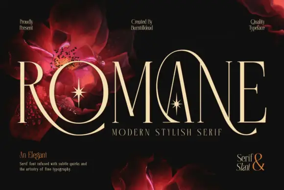
Romane is a very tall modern serif in which the capitals stretch, the hairlines stay slender, the R leg sweeps below the line and a large loop rises around the central A, so a name reads as a couture title with movement at both ends.
The R curves its leg far under the baseline, the A carries a rising loop around its apex, the O closes a tall narrow bowl and every stem holds a fine contrast that thins at the joins, with ligatures available for awkward pairs. The sweeping extensions are the character: ornament arrives from the letters themselves, which is why the sample sets one name on black with floral artwork behind. Because the hairlines are fine, the face wants coated stock from 18 pt and the loop needs 18 mm of clear space above the cap line. The red flowers and stars behind the title are artwork; the cream capitals are the face.
Recommended project & layout
A botanical feature-cover title — Use a clear title panel with authorised botanical imagery elsewhere.
Before you cut or print
Proof swashes and hairlines at intended size.
Best paired with
Get fontPaid link
 #16
Vintage Varsity
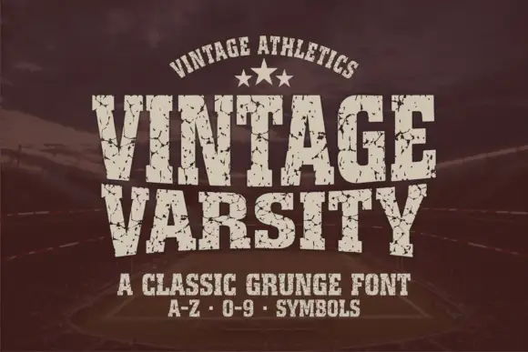
Vintage Varsity is a condensed athletic capital alphabet with heavy flat slabs and a cracked wear texture, so a short word reads as a printed team jersey from decades ago.
The letters are narrow and tall: the V closes to a sharp point, the A keeps a low bar, the R carries a straight leg and the S reverses through flat terminals, with slabs at every stem and no bracketing. The wear is drawn into the letterforms rather than applied as an effect: cracks run through the slabs and a few counters show chipped edges, which is what gives the face its printed-jersey look. Weight is heavy and uniform, the fit is tight enough that a long team name holds a single line, and because the texture is coarse the face needs a decent size to stay legible. The dark ground, the cream ink, the star rule and the two small caption lines are presentation; the typeface is the two words.
Recommended project & layout
A reunion match poster — Keep dates and scores in a clean companion face.
Before you cut or print
Inspect cracks in the narrowest strokes.
Best paired with
Get fontPaid link
 #17
Orvelia
Orvelia is a high-contrast display serif in which the stems alternate thick and hairline weights, the R, V and A end in curved swash legs and the bowls stay sculpted, so a name reads as a crest for a perfume box or a masthead.
The R tucks its leg into a curve, the V splits into two swashed strokes, the A carries a curling leg and the bowls close against fine joins that thin to a hairline at every junction. The swash leg is the character: three capitals carry the ornament while the rest of the alphabet stays quiet, which is why the sample frames one word for formal stationery. Because the hairlines are fine, the face wants coated stock from 16 pt and gains from hot foil on signage; the display cut ships with swashes as separate glyphs. The pale ground and the small frame rules are presentation; the dark display word is the face.
Recommended project & layout
Formal wedding suite monogram & header — Track supporting lines (FOREVER BEGINS HERE) wide in a simple roman serif beneath the main display name.
Before you cut or print
Delivered as OTF; best suited to print, foil stamping and digital branding due to fine serif hairlines.
Best paired with
Get fontPaid link
 #18
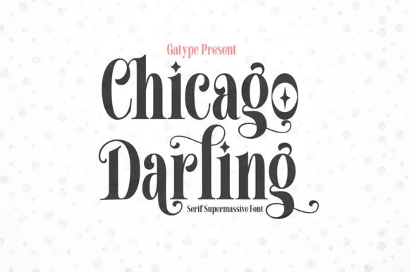
Chicago Darling
Chicago Darling is a bold, condensed modern-vintage serif distinguished by curled spiral terminals, sparkling counters, and deep descender loops.
Chicago Darling is a high-contrast vintage display serif with curled ball terminals: hairline thins against swollen stems, a small x-height, a high waist and terminals that roll into small balls on the a, c and r. It is the lettering of a nineteen-twenties poster and a department-store sign, so it wants size and air. The hairline thins are the finest element and they break first in print and in vinyl. It needs roughly 34 mm for the contrast and the ball terminal to read, and it is best one dark ink on a cream ground.
Recommended project & layout
Soy candle vessel label & apothecary box front — Stack a two-word scent or brand name tightly at 32–42 pt with tighter line-height, anchored by minimalist uppercase sans notes below.
Before you cut or print
Hairline crossbars and spiral tips shine in 300 DPI print and hot foil; avoid weeding small adhesive vinyl below 2 inches cap height.
Best paired with
Get fontPaid link
Matched Font Duos & Packs
4 fonts #19
Brown Carolina Duo
Brown Carolina Duo contrasts broad high-contrast capitals with a much finer narrow slanted script, set dark on a plain cream field, where the capital R legs sweep below the neighbouring letters and the script carries long tails that run past the ends of both words.
The caps keep thin cross strokes and heavy uprights, the script keeps one fine weight, and the two voices sit in a strict stack: script, two cap rows, script. That alternating order is the character, because the fine lines frame the heavy block like a rule above and below. Both treatments appear on a plain light field, so the cover gives no clue about texture or shadow. Keep 34 pt for the caps before the thin strokes break up, keep 20 pt as the floor for the script and check the R leg before setting a line of capitals.
Recommended project & layout
A boutique stationery front — Use the capital name centrally and a small script descriptor below, leaving the R sweep clear of contact information in a plain footer.
Before you cut or print
Confirm both styles and the actual capital alternates.
Best paired with
Get fontPaid link
 #20
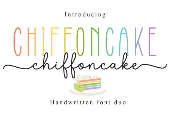
Chiffoncake Duo
Chiffoncake Duo pairs very tall narrow capitals, each in a different pastel tone, with a low connected script whose deep f loops drop below the baseline, and long tails extend from both sides of the lower word above a small cake illustration.
The caps stay tall and thin, the script stays fine and continuous, the loops drop deep and the entry and exit tails run wide. That height contrast is the character: the pair is built on the gap between a condensed cap row and a light handwritten line, which is why the sample keeps both centred. The rainbow colours and the cake drawing are presentation. Keep 28 pt for the script, leave 20 mm beneath for the f loops and check whether both styles install from one file before planning a two-line lockup.
Recommended project & layout
A cake-menu category heading — Keep the two lines separate rather than overlapping and put flavours and prices in a plain list below the f loops.
Before you cut or print
Confirm the exact included pair and any alternate-access claim.
Best paired with
Get fontPaid link
 #21
Country Kitchen
Country Kitchen is a two-cut duo in which narrow upright capitals set the plain line and a darker connected script carries the warm one, so a kitchen sign can separate a heading from a phrase without a third family.
The capital cut stands narrow and unjoined with even strokes and tight counters, while the script cut connects through tall k and h loops and long low entry and exit strokes at a heavier weight. The contrast in join is the character: one member is printed, one is written, which is why the sample pairs a thin cap line with a dark script beneath it. Set the caps at 16 pt and the script at 22 pt for a balanced pair, and weld the script before cutting from 1.1 inches of x-height. The photographed interior, the boards and the props are presentation; the lettered sign is the duo.
Recommended project & layout
A farm-kitchen menu header — Place the capitals above the script with a clear gap, then start dishes and prices in plain type below both tails.
Before you cut or print
Check the actual pair and leave menu details undecorated.
Best paired with
Get fontPaid link
 #22
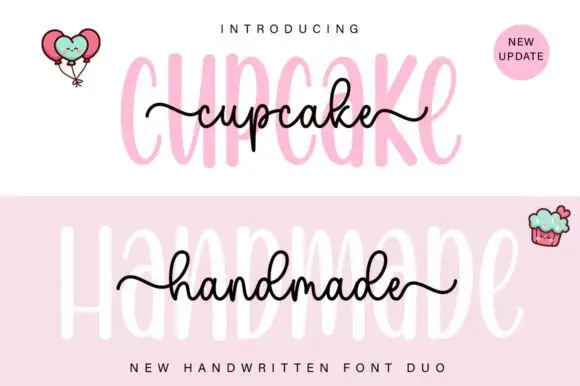
Cupcake Handmade Duo
Cupcake Handmade Duo places tall narrow rounded letters in pale pink behind a smaller connected script line in black, twice on one cover, where the script carries long outer tails and looped k and h forms while a balloon pair, a cupcake drawing and an update badge sit in the corners.
The caps stay tall and narrow, the script stays compact and continuous, the loops open large and the tails run wide past the caps on both sides. That size gap is the character, because the script sits inside the cap row rather than under it. The balloons, the cupcake and the badge are separate sample elements, so do not count them as part of the type. Keep 34 pt for the caps and 16 pt for the script, and check the k and h loops against your margins before locking the lockup.
Recommended project & layout
A cupcake-table heading — Place the capital title above, not behind, the script; put flavours and dietary information in a plain panel below.
Before you cut or print
Check both supplied styles and essential food information separately.
Best paired with
Get fontPaid link
Display & Decorative Headlines
3 fonts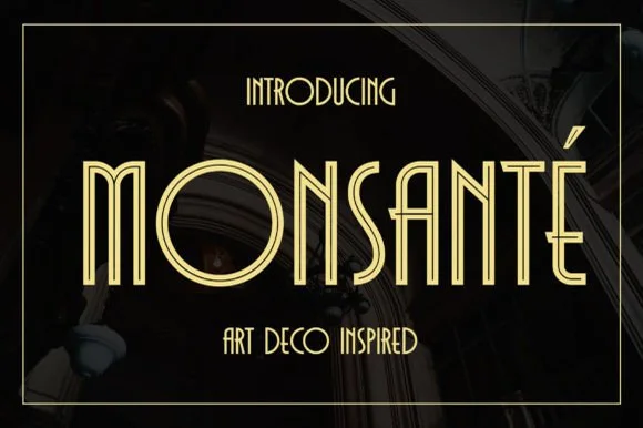 #23
Monsante
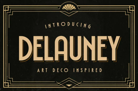
Monsante is a tall, geometric 1920s Art Deco display typeface built from crisp parallel double-line inline strokes and low-waisted crossbars.
Monsante is a nineteen-twenties Art Deco double-line inline geometric display: wide squared letters built from two parallel strokes with a hairline gap, sharp mitred corners and a strict symmetry that reads as a hotel facade sign. The gap between the lines is the design and it closes into one stroke when the face is reduced. It needs roughly 32 mm for the double line to read, and it is best in one fine metallic on a dark ground, or one ink on a pale ground where the gap stays open.
Recommended project & layout
Roaring-Twenties gala invite, champagne menu & seating chart — Track uppercase headlines out to +40 in metallic gold on black, emerald, or midnight-navy cardstock.
Before you cut or print
Parallel twin-rail lines are delicate—ideal for gold foil stamping, laser engraving, and 300 DPI print rather than small vinyl decals.
Best paired with
Get fontPaid link
 #24
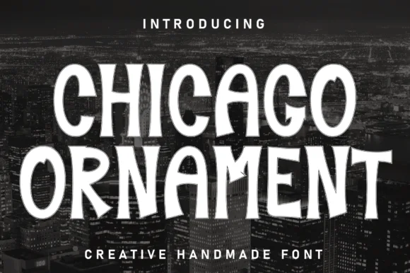
Chicago Ornament
Chicago Ornament is a tall, hand-inked condensed display typeface with softly flared terminals, high-waisted bars, and subtle sign-painter grit.
Chicago Ornament is a handcrafted ornamental condensed display serif in which the stems are dense with carved detail: small diamonds, hatching and scroll fins run up the vertical, the serifs split into curls and the caps carry a drawing rather than a letter shape. The ornament fills the stem, so the counters stay narrow and the smallest fin is what closes first. It needs roughly 36 mm for the hatching and the scroll fin to read, and it is best in one dense ink on cream and sand tones, or a single deep colour on a pale poster stock.
Recommended project & layout
City travel poster, jazz-night bill & documentary title — Stack 2 all-caps lines wide across dark black-and-white photography with tight 0.95 leading.
Before you cut or print
Solid upright stems with soft flares cut cleanly on matte wall vinyl, wood stencils, and tote HTV down to 0.8 in.
Best paired with
Get fontPaid link
 #25
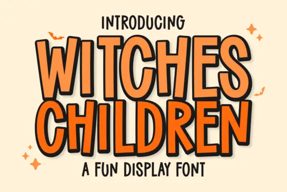
Witches Children
Witches Children shows tall narrow capitals with rounded curves and slightly leaning stems, where the W opens a deep narrow middle, the C and D use long oval bowls and the R stays compact beside them.
The letters stay narrow and tall, the widths vary, the stems lean a few degrees and the bowls stretch into ovals. That uneven set is the character: the word reads as hand-lettered comic titling rather than a drawn display face, which is why the sample keeps a short title with a seasonal flavour. Because the heights vary, leave room for the tallest letter and the widest W, and keep 34 pt before the narrow bowls pinch shut. The narrow bowls pinch shut first: at 24 pt the o and the e close into slits and the word reads as a picket fence. Keep the title at 34 pt and above, allow room for the tallest letter, and set long words in two rows rather than tracking them tight.
Recommended project & layout
A children’s spooky-story poster — Use two roomy title lines above a plain age-and-time panel with no bats over the lettering.
Before you cut or print
Check the W interior and narrow D counter in print.
Best paired with
Get fontPaid link
Practical buyer checklist
Frequently asked questions.
Key cutting, printing and pairing answers before choosing a tall condensed & narrow poster typeface.
How narrow can a font get before it stops working?
Around 1:6 width-to-height is the practical limit for text. Beyond that, adjacent vertical stems merge into a single block and the reader has to infer letters from context rather than from shape.
Are condensed fonts good for signage at a distance?
Yes, because they fit more height into the same panel, and height is what carries over distance. Keep the counters open and avoid stacking more than four letters in a narrow column.
Why do ultra-condensed fonts look wrong in body copy?
Narrow counters reduce the internal white space that helps word recognition, and letter shapes start to repeat. Use them for headlines, numbers and short labels, then switch to a normal-width text face.
Can a very narrow font be cut from vinyl?
Yes when the stems stay thick, since each stem is a solid strip. The risk is the counters: narrow islands break during weeding, so keep the design above 1.5 inches and test the densest letter first.
Keep exploring
Related collections & guides.
Explore adjacent maker roundups or check our practical pre-production checklists.


01 / Branding & Print
Editorial & posters
37 curated fonts · Previews & pairings

02 / Type Styles
1920s Art Deco & Gatsby
19 curated fonts · Previews & pairings
03 / Cricut & Craft
Modern farmhouse & wood signs
27 curated fonts · Previews & pairings
04 / Branding & Print
Minimalist & geometric sans
31 curated fonts · Previews & pairings
Guides: Invitation font checklist · Vinyl & cutting checklist · How to pair script & sans fonts