 #1 · Best Overall
Disclosure: MakerFileHub may earn a commission from qualifying purchases via paid links on this page. How our links work.
Couture serifs, apothecary detail & 5 ml labels
25 Best Beauty, Skincare & Cosmetics Fonts
Cosmetics typography has the smallest canvas in packaging: a 30 ml bottle gives a few square inches for a brand name, a product line and an ingredient list. Alerigue and Auretha carry the couture serif weight, Askinо and The Bilstein Editorial keep the neoclassical register, and Resquel and Amor Hadena add the Art Nouveau and celestial detail that suits a premium range.
Quick verdict
Auretha is the most complete luxury serif family for a full range, Alerigue is the strongest single display for a hero product, and Svara gives a usable regular and italic pair for body copy. Askinо covers the fashion register.
Quick answer
Top 3 beauty, skincare & cosmetics branding picks right now.
Short on time? Start with our three highest-rated beauty, skincare & cosmetics branding standouts before scrolling the full breakdown.
#1 · Best Overall #2 · Runner-Up Pick
 #3 · Editor's Choice
How we tested & selected these 25 fonts
We kept 25 of 601 candidates after rendering each on a simulated 30 ml bottle at 300 dpi. Weighted whether hairlines survive at 5 pt, how the swash behaves on a curved label, and whether a matching light or regular weight exists for ingredients.
Side-by-side summary
Top 5 beauty, skincare & cosmetics branding picks at a glance.
Compare specimens, OpenType/PUA traits and primary project roles side by side.
| Rank & Font | Style & File Specs | Best Project Fit | Store Listing |
|---|---|---|---|
| SerifVersatile-family | Complete skincare/hospitality brand identity & web system | Get fontPaid link | |
| SerifAlternates & swashes | Haute-couture fashion masthead, perfume bottle & lookbook | Get fontPaid link | |
| SerifNeoclassical | Fashion magazine masthead, architecture monograph & portfolio | Get fontPaid link | |
| SerifEditorial | Magazine cover headline, podcast art & fashion campaign | Get fontPaid link | |
| SerifFashion-forward | Luxury cosmetics carton, jewelry pouch & tarot deck box | Get fontPaid link |
Serifs & Slab Serifs
19 fonts#1 · Best OverallAuretha
Auretha is a complete 8-weight + Variable luxury serif typeface (Thin to Extrabold, 374 glyphs, 6 alternates) built for full brand systems.
Auretha is a modern luxury serif family in eight weights plus a variable axis, with a 374-glyph set: high-contrast display cuts that thin to hairlines at the top weights, sturdier text cuts underneath, fine bracketed serifs and a tall cap height. The family lets a fashion house set a cover and a caption in one voice, and the hairlines require coated stock or large sizes. The display needs roughly 30 mm and the text cuts hold at 9 pt, all in one fine ink.
Recommended project & layout
Complete skincare/hospitality brand identity & web system — Use Bold/Semibold at -15 tracking for packaging wordmarks and Light/Regular at 11 pt for ingredient and story panels.
Before you cut or print
Variable font file allows fine-tuning exact optical stroke weight for dark-mode web headers; Bold cuts also work on 1 in+ sign vinyl.
Best paired with
Get fontPaid link
#2 · Runner-Up PickAlerigue
Alerigue is a high-contrast luxury editorial serif distinguished by dramatic coiled spiral terminals and sweeping calligraphic ascender loops.
Alerigue is a flamboyant couture serif in which the swashes coil back over the word: thin hairlines loop above and below the caps, the stress is high and the serifs finish in fine curled points. The coils overlap neighbouring letters, so a word is one drawing rather than a sequence, and the hairlines are the first thing to fail in print. It needs roughly 40 mm for the coil and the fine point to read, and it is best in one dense ink on matte white, or foil above 60 pt where the coil edge can carry.
Recommended project & layout
Haute-couture fashion masthead, perfume bottle & lookbook — Set 1 focal title-case word at 64–110 pt, activating spiral alternates selectively on outer letters and 1 interior stem.
Before you cut or print
Razor-thin hairlines and fine spiral tips are built for print, foil, and digital editorial layouts—not vinyl cutting.
Best paired with
Get fontPaid link
#3 · Editor's ChoiceAskinо
Askino is a clean, restrained high-contrast editorial serif with razor-flat hairlines, tall ascenders, and un-cluttered Parisian magazine elegance.
Askinо is a neoclassical high-contrast fashion serif with fine hairline joins, sharp bracketed serifs, small counters and wide caps that sit on a tight baseline grid. The contrast is the design, so it needs size and a smooth stock, and the small counters make a long word read as a dense mark rather than as a line of text. It needs roughly 30 mm for the hairlines to hold, and it is best in one ink on smooth coated stock or as a foil on a matte cover.
Recommended project & layout
Fashion magazine masthead, architecture monograph & portfolio — Set title-case hero words large (72–140 pt) with -10 tracking across monochrome fashion photography.
Before you cut or print
Crisp hairline serifs shine on coated magazine stock, web hero banners, and foil book cloth rather than small vinyl.
Best paired with
Get fontPaid link
 #4 · Top Maker Utility
The Bilstein Editorial
The Bilstein Editorial is a high-fashion serif duo (Regular & Italic) combining crisp upright Roman ligatures with lush, calligraphic Italic swashes.
The Bilstein Editorial is a swashed editorial serif family in a regular and an italic: a moderated high-contrast stroke, fine bracketed serifs, a tall cap height and swash capitals that curl off the first letter, with the italic carrying a faster rhythm for captions. It sets long text honestly and gives a feature its own voice, and the swashes only survive above a certain size. The regular needs roughly 20 mm and the swash capitals 30 mm for their detail to read, and one dense ink on uncoated stock covers both cuts.
Recommended project & layout
Magazine cover headline, podcast art & fashion campaign — Set row one in Italic title-case ('The Bilstein') and row two in upright all-caps ('EDITORIAL') with tight 0.92 leading.
Before you cut or print
Fine hairline serifs and diagonal ligatures are crafted for print, web editorial, and digital campaigns—not small cut vinyl.
Best paired with
Get fontPaid link
 #5 · Standout Silhouette
Resquel
Resquel is an expressive high-contrast editorial serif featuring sweeping ribbon under-tails, interlocked ligatures, and star-sparkle counters.
Resquel is a high-contrast editorial serif in caps with sweeping ribbon under-tails beneath the R and Q, interlocked ligatures and star-sparkle detail cut into the Q counter. The tails extend far past the word, so a layout needs base and side room, and the hairlines need roughly 28 mm before they hold. It is a cover and label face with a celestial register, best in one bone or metallic ink on a deep slate ground, and it is deliberately impractical for long copy.
Recommended project & layout
Luxury cosmetics carton, jewelry pouch & tarot deck box — Center 1 uppercase brand word at 54–88 pt with tight 0 tracking so the 'R' and 'Q' under-ribbons cradle adjacent letters.
Before you cut or print
Needle-thin crosshairs inside counters call for foil stamping, offset/digital print, or web headers—not blade-cut vinyl.
Best paired with
Get fontPaid link
 #6
Amor Hadena
Amor Hadena is a dramatic swash-serif weaving lyrical spiral curls and towering looped ascenders across high-contrast Roman letters!
Amor Hadena is a high-contrast Roman serif in which the terminals are not simply flared but drawn as full spiral swashes that coil inward, so the A, r, H and d each end in a curl that looks drawn with a pointed nib rather than generated. Ascenders are set unusually tall against a small x-height, which produces a fashion-magazine line rhythm: airy, slightly precarious, and dependent on generous leading. Hairlines are genuinely thin, so the face needs about 20 pt before the contrast holds, and it is a display and titling choice; setting paragraphs in it collapses the counters.
Recommended project & layout
Perfume bottle label, couture lookbook & beauty serum — Stack 2 mixed-case words tight (72–145 pt) so descending 'r/g/y' curls kiss ascending 'H/d/l' loops.
Before you cut or print
Delicate hairline spirals are crafted for luxury print, hot-foil packaging, and digital editorial headers—not small vinyl cutting.
Best paired with
Get fontPaid link
 #7
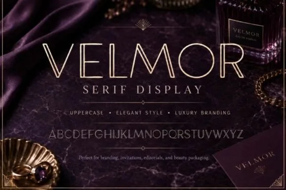
Velmor
Velmor is an ultra-refined uppercase luxury display serif carved down every primary vertical stem with a delicate open inline channel.
Velmor is a slender open-inline serif drawn for luxury editorial and perfumery: thin outer strokes flank a fine open channel, the serifs are hairlines and the contrast is extreme, so the letter reads as a drawn line rather than a mass. The open channel is the whole design, and it closes when the face is small or printed on absorbent stock. It needs roughly 36 mm for the channel to stay open, and it is best in one dense ink on smooth matte stock, or a fine foil above 48 pt where the channel edge can carry.
Recommended project & layout
Eau-de-parfum bottle label, velvet jewelry box & candle — Set 1 uppercase brand word at 44–80 pt with +25 tracking above clean wide-spaced Roman subtitles ('SERIF DISPLAY').
Before you cut or print
Engineered for hot-foil stamping, embossing, print packaging, and web headers—far too fine for blade-cut vinyl.
Best paired with
Get fontPaid link
 #8
Orvelia
Orvelia is a high-contrast display serif in which the stems alternate thick and hairline weights, the R, V and A end in curved swash legs and the bowls stay sculpted, so a name reads as a crest for a perfume box or a masthead.
The R tucks its leg into a curve, the V splits into two swashed strokes, the A carries a curling leg and the bowls close against fine joins that thin to a hairline at every junction. The swash leg is the character: three capitals carry the ornament while the rest of the alphabet stays quiet, which is why the sample frames one word for formal stationery. Because the hairlines are fine, the face wants coated stock from 16 pt and gains from hot foil on signage; the display cut ships with swashes as separate glyphs. The pale ground and the small frame rules are presentation; the dark display word is the face.
Recommended project & layout
Formal wedding suite monogram & header — Track supporting lines (FOREVER BEGINS HERE) wide in a simple roman serif beneath the main display name.
Before you cut or print
Delivered as OTF; best suited to print, foil stamping and digital branding due to fine serif hairlines.
Best paired with
Get fontPaid link
 #9
Svara
Svara is a sharp modern editorial serif family pairing an upright Regular with a lively true Italic across OTF, TTF & WOFF formats!
Svara is a contemporary editorial serif duo: a text regular with moderate contrast, sharp wedge serifs and open apertures, plus a matching italic with a true cursive slant and a slightly narrower advance. The pair is built for long reading, so the italic can carry emphasis inline without changing colour, and the regular holds at caption sizes. It needs roughly 16 mm for the wedge serif to read in display use, and it is best in one black on soft white, and in the italic as a second voice rather than a second colour, shipped as OTF, TTF and WOFF for screen.
Recommended project & layout
Substack / magazine masthead, lookbook & Shopify webfont — Mix upright Regular with angled Italic inside the same 64–120 pt headline ('Svara *Serif*') over warm off-white.
Before you cut or print
Razor-sharp vectors shine in editorial print, web headers (WOFF included!), and 1.3 in+ sign vinyl.
Best paired with
Get fontPaid link
 #10
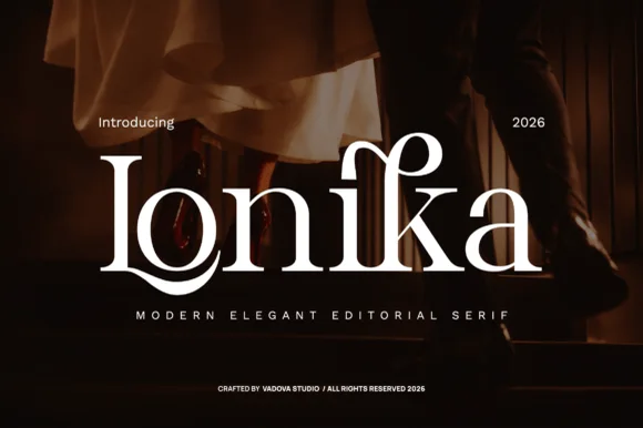
Lonika
Lonika is a refined, high-contrast modern editorial serif distinguished by cradle-looped capitals and curved calligraphy-style ascenders.
Lonika is a high-contrast romantic editorial serif with floral dots and swashes: fine hairline hairlines against heavy stems, ball terminals that finish in a small flower, swept swash capitals that curl off the first letter and a tall cap height that fills a heading. The hairlines and the floral dots are the finest elements and both silt on textured stock. It needs roughly 30 mm for the flower dot and the swash to read, and it is best in one fine ink on coated or smooth card, or a foil impression above 40 pt.
Recommended project & layout
Evening wedding invitation suite, vow book & menu title — Spotlight a single surname or venue word at 48–68 pt centered over dark photography or thick cotton stock.
Before you cut or print
Delicate hairline serifs and horizontal bars belong in high-DPI print, letterpress, or foil stamping rather than tiny cut vinyl.
Best paired with
Get fontPaid link
 #11
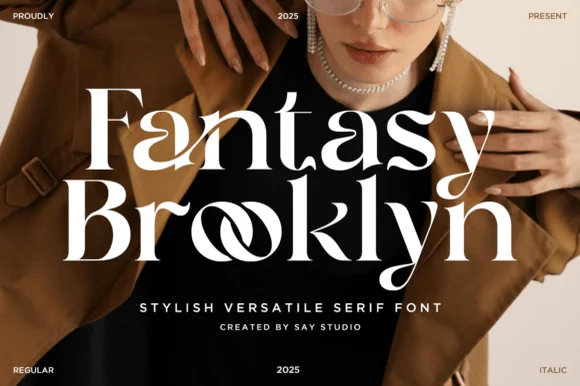
Fantasy Brooklyn
Fantasy Brooklyn is a chic modern editorial serif (Regular & Italic) featuring interlocking 'oo' infinity ligatures and sculpted runway contrast!
Fantasy Brooklyn is a high-contrast editorial serif supplied in regular and italic, built around interlocking double-o ligatures that turn a repeated vowel into a pair of joined bowls. The construction is fashion-editorial: tall ascenders, sculpted stress and tight spacing that relies on the ligature to relieve it. It needs roughly 24 mm at the size where the interlock reads as a pair of loops rather than a smudge, and it is a cover and masthead face. Italic carries emphasis without a second family, which is useful on a poster or a lookbook.
Recommended project & layout
Fashion lookbook, salon rebrand, magazine masthead & blog — Stack 2 mixed-case words tight (80–160 pt) with -2 tracking and mix Regular + Italic weights for editorial hierarchy.
Before you cut or print
Best for print magazines, packaging, social graphics, and 1.5 in+ Oracal 651 boutique window decals (protect thin hairlines!).
Best paired with
Get fontPaid link
 #12
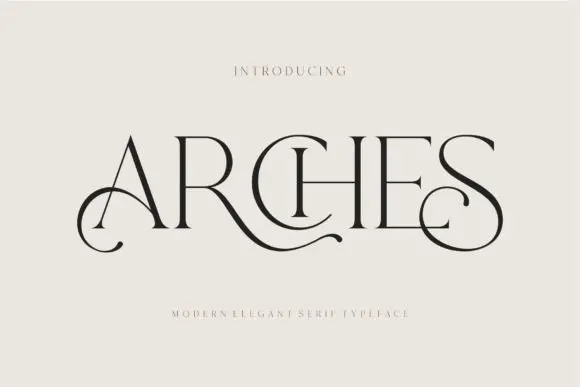
Arches
Arches sets one word in dark ink on a warm neutral field, where wide flat serifs sit on hairline cross strokes, the A climbs to a sharp apex, the R leg sweeps into a long horizontal tail that runs beneath the following letters and the S closes with an extended curl.
The uprights stay thin, the serifs stay flat and wide, the contrast is extreme and two letters throw strokes sideways instead of down. Those sideways strokes are the character: the word reads as a piece of engraved editorial typography rather than a headline, which is why the sample leaves a wide cream margin around it. The small introduction line above and the caption below are separate cover text. Keep 44 pt before the hairlines vanish, allow 30 mm at each end for the sweep and check the R tail against any text you put underneath.
Recommended project & layout
A beauty studio identity — Use a short studio name with a broad clear margin around its lower curls. Put the service descriptor and booking details beneath in plain type rather than threading them through the swashes.
Before you cut or print
Test the actual studio name; the preview’s “Arches” composition may not transfer to other letters.
Best paired with
Get fontPaid link
 #13
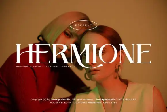
Hermione Modern Serif
Hermione is a modern elegant serif in caps with very fine hairlines, tall proportions and a set of display ligatures, shown over an editorial portrait and set with a slight arch.
HERMIONE spans the card in white over a close portrait in warm light, and the letters are tall and narrow with hairlines at the joins and sharp wedge serifs; the I and the O are drawn to touch, and the custom ligatures give the word a rhythm that a standard setting would not have. The baseline lifts slightly across the centre, which is a display treatment rather than a feature of the font, and a caption at the foot names the family and credits the foundry. The sample is a fashion layout: type over a photograph, wide spacing in small caps, one ornament. What it tells a buyer is that the face is for titles and mastheads at a large size, and that the hairlines need a good press or a screen, never a cheap photocopy.
Recommended project & layout
A portrait-series opener — Place the capitals across a pale full-width panel with the subject's name and byline in plain small text below the left edge.
Before you cut or print
Verify the actual phrase, ligatures and rights; the specimen does not prove automatic decorative joins.
Best paired with
Get fontPaid link
 #14
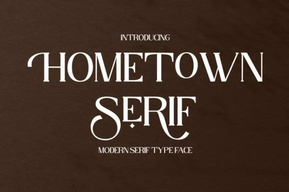
Hometown Serif
Hometown Serif is an elegant, high-contrast uppercase display serif accented by sweeping descender cradles and spiraled stem hooks.
Hometown Serif is a high-contrast modern display serif with curled swash stems: hairline hairlines against heavy stems, stems that curl out at the base into a small spur and swash capitals that finish in a drawn curl. The hairlines and the curls are the finest elements and both silt on textured stock. It needs roughly 30 mm for the curl and the hairline to read, and it is best in one fine ink on coated or smooth card, or a foil impression above 40 pt.
Recommended project & layout
Formal invitation monogram, menu header & welcome mirror — Track uppercase titles slightly open (+30) at 32–48 pt, reserving decorative tail alternates for the first or center letters.
Before you cut or print
Hairline horizontal crossbars and thin serif feet are best suited to print, foil stamping, or 2 in+ mirror decals.
Best paired with
Get fontPaid link
 #15
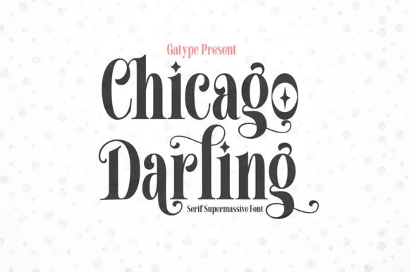
Chicago Darling
Chicago Darling is a bold, condensed modern-vintage serif distinguished by curled spiral terminals, sparkling counters, and deep descender loops.
Chicago Darling is a high-contrast vintage display serif with curled ball terminals: hairline thins against swollen stems, a small x-height, a high waist and terminals that roll into small balls on the a, c and r. It is the lettering of a nineteen-twenties poster and a department-store sign, so it wants size and air. The hairline thins are the finest element and they break first in print and in vinyl. It needs roughly 34 mm for the contrast and the ball terminal to read, and it is best one dark ink on a cream ground.
Recommended project & layout
Soy candle vessel label & apothecary box front — Stack a two-word scent or brand name tightly at 32–42 pt with tighter line-height, anchored by minimalist uppercase sans notes below.
Before you cut or print
Hairline crossbars and spiral tips shine in 300 DPI print and hot foil; avoid weeding small adhesive vinyl below 2 inches cap height.
Best paired with
Get fontPaid link
 #16
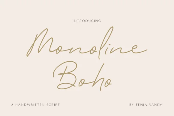
Monoline Boho
Monoline Boho is a fine, forward-slanted handwritten script featuring sweeping multi-peak capitals and airy looped ascenders.
Monoline Boho is a fine slanted monoline signature script with knotted loops: an even hairline stroke on a strong slant, letters joined low, and ascenders that tie themselves into small open knots before they release. It reads as a hand-signed name rather than a set line, which is why it belongs on a card, a tag or a decal. The knots are the finest element and they close into a smudge once the face is reduced or cut small. It needs roughly 30 mm for the knot and the hairline to read, and it is best one dark ink on a smooth stock.
Recommended project & layout
Botanical skincare bottle & ceramic studio logo — Give a two-word studio name generous whitespace at 24–30 pt, paired with widely tracked 7.5 pt uppercase sans ingredient lines.
Before you cut or print
Fine monoline strokes belong in print, foil stamping, or Foil Quill drawing rather than small cut-and-weed adhesive decals.
Best paired with
Get fontPaid link
 #17
Vanielst Elegant Serif Display Stylistic
Vanielst is a substantial, medium-high-contrast display serif highlighted by graceful overhead swash loops and crisp bracketed feet.
Vanielst Elegant Serif Display Stylistic is a bold transitional display serif with an overhead canopy swash: sturdy bracketed stems, a moderate contrast, crisp horizontal serifs and a capital set that carries a wide arc of swash above the word like an awning. The canopy is the design and it needs vertical room, so the face cannot be tucked under a fold. The canopy and the hairlines are the finest elements and they break first. It needs roughly 36 mm for the canopy and the serif to read, and it is best one dark ink on a bright stock.
Recommended project & layout
Perfume carton, candle vessel & boutique wordmark — Set a single 5-to-8-letter brand name at 36–54 pt, activating only one canopy swash alternate so the silhouette stays clean and memorable.
Before you cut or print
Substantial main stems cut cleanly on sign vinyl down to 1 inch, though tapering overhead swash tips perform best in print, foil, or larger 2 in+ decals.
Best paired with
Get fontPaid link
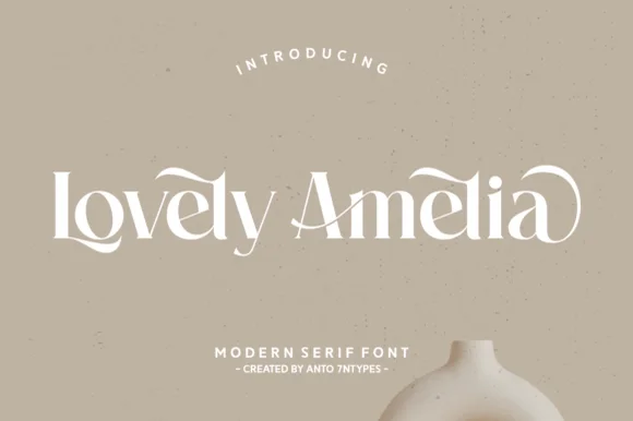 #18
Lovely Amelia
Lovely Amelia is a soft, high-contrast modern display serif featuring sweeping canopy arches over vowels and sculpted ligatures.
Lovely Amelia is a high-contrast display serif with Art-Nouveau canopy arches that spring from the vowels and a sculpted cradle tail that runs beneath a word. The arches sit above the x-height, so the layout needs headroom, and the tail occupies its own band below the baseline. Contrast is strong, so the face wants 22 mm and up before the hairlines hold, and it is a title and invitation face rather than a text face. Its natural home is an asymmetric composition where the canopy can echo a drawn frame.
Recommended project & layout
Ceramic-studio mark, botanical skincare & boutique sign — Set 1 or 2 title-case words at 48–84 pt in warm cream or charcoal over earthy clay/sand tones.
Before you cut or print
High-contrast hairline transitions shine in print, foil, and web logos; scale vinyl above 1.75 in if cutting.
Best paired with
Get fontPaid link
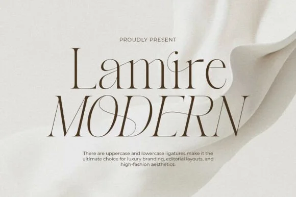 #19
Lamire Modern
Lamire Modern is an ultra-light, tall-statured editorial serif featuring sweeping diagonal ligatures across both uppercase and lowercase.
Lamire Modern is an ultra-light editorial serif with tall stature, whisper hairlines and sweeping diagonal ligatures that cross from one letter to the next. The contrast is extreme, so the face needs roughly 30 mm before it survives in print, and the ligatures require the letters to be set as designed rather than adjusted with kerning. It reads as fashion typography rather than a book face, and it is at its best in one colour on a smooth coated stock where the hairlines stay continuous.
Recommended project & layout
Bridal gown label, luxury skincare serum & candle carton — Stack mixed-case over all-caps at 48–84 pt with +10 tracking and wide ivory negative space.
Before you cut or print
Hairline strokes are strictly engineered for print, hot foil, and high-res web headers—never blade-cut vinyl.
Best paired with
Get fontPaid link
Matched Font Duos & Packs
3 fonts #20
Brown Carolina Duo
Brown Carolina Duo contrasts broad high-contrast capitals with a much finer narrow slanted script, set dark on a plain cream field, where the capital R legs sweep below the neighbouring letters and the script carries long tails that run past the ends of both words.
The caps keep thin cross strokes and heavy uprights, the script keeps one fine weight, and the two voices sit in a strict stack: script, two cap rows, script. That alternating order is the character, because the fine lines frame the heavy block like a rule above and below. Both treatments appear on a plain light field, so the cover gives no clue about texture or shadow. Keep 34 pt for the caps before the thin strokes break up, keep 20 pt as the floor for the script and check the R leg before setting a line of capitals.
Recommended project & layout
A boutique stationery front — Use the capital name centrally and a small script descriptor below, leaving the R sweep clear of contact information in a plain footer.
Before you cut or print
Confirm both styles and the actual capital alternates.
Best paired with
Get fontPaid link
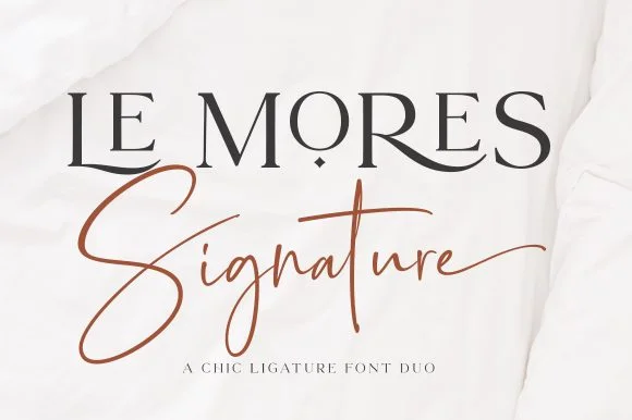 #21
Le Mores Signature
Le Mores Signature pairs an editorial ligature serif—highlighted by cradled base loops—with a brisk copper-toned signature cursive.
Le Mores Signature pairs a ligature-rich editorial serif with a slanted signature script: the serif is a moderate-contrast face with true ligatures and oldstyle figures for running text, while the script is a fast slanted signature with a looping capital and a heavy exit stroke. The pair is how a printed magazine signs a page, so the serif carries the body and the signature carries the name. The signature's thin connectors are the finest element and they break first. The serif needs roughly 20 mm and the signature 30 mm for their detail to read.
Recommended project & layout
Boutique fashion hangtag, perfume box & atelier logo — Set the primary brand name in tracked-open serif capitals at 36 pt and overlap a single script subword across the lower-left stem.
Before you cut or print
Keep the slender signature script in print, hot foil, or larger 2.5 in+ decals rather than tiny blade-cut vinyl.
Best paired with
Get fontPaid link
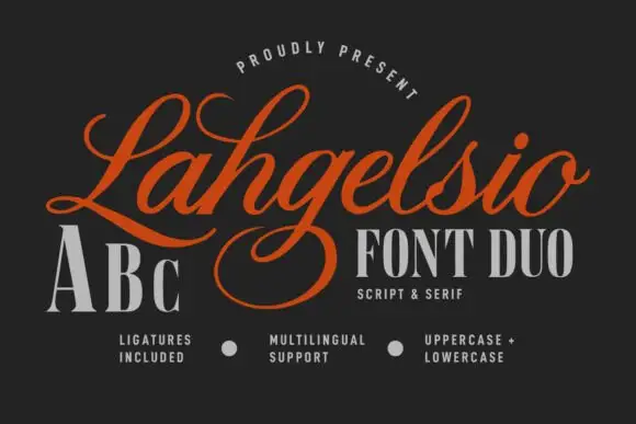 #22
Lahgelsio
Lahgelsio is a duo: an ornate script with tall loops and a mirrored flourish, and a tall high-contrast serif with fine hairlines, made to be stacked on the same card.
The script half opens with a large looped capital that rises above the cap line and closes into shaded stems, and the word runs through fine joins into an exit that curls up and back over itself, which is the flourish that defines the face. The lowercase is small and tightly packed beneath that flourish. The serif half is a tall narrow roman with strong vertical contrast, fine unbracketed serifs and wide capitals, and in the sample it carries the alphabet and a small caption so the two halves can be compared side by side. Together they cover the classic pairing a stationery set needs: a script for the names and a serif for the details. The dark ground, the orange and cream inks and the three small feature captions are presentation; the duo is the lettering.
Recommended project & layout
A cosmetics range hierarchy — Use script on the front top panel and a short serif category below with plain ingredients on the side.
Before you cut or print
Proof the serif hairlines and script g loop on packaging.
Best paired with
Get fontPaid link
Clean Sans & Handwritten Print
3 fonts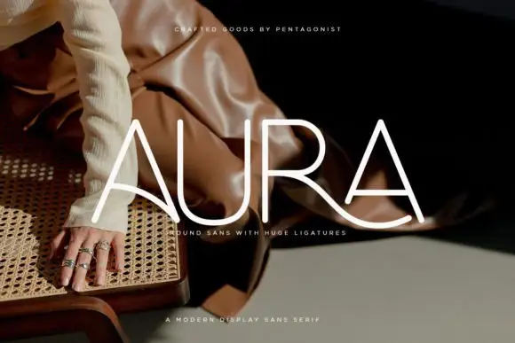 #23
Aura
Aura shows pale thin capitals over a dark fashion photograph, where near-even rounded strokes build an open U and a broad R bowl, the first A carries a long curved cross-stroke that sweeps toward the centre and the R leg continues below the final A as a broad flowing curve.
The strokes stay uniform and thin, the curves stay circular and one cross stroke drops into a wide ligature that links two letters and runs under the word. That ligature is the character: the row reads as a drawn wordmark rather than a set line, which is why the sample keeps four letters on a photograph. The source notes PUA extras plus entry and terminal swashes, so check how the link is reached. Keep 36 pt for the thin strokes, test the ligature with your own letters and reserve 20 mm beneath.
Recommended project & layout
A rounded-line skincare-name study — Test the actual name on a flat panel and keep its descriptor beneath the entire sweep.
Before you cut or print
Verify connection access and inspect fine strokes at label size.
Best paired with
Get fontPaid link
 #24
Helina
Helina is a clean, heavy-weight condensed sans serif with flat-cut terminals, tight vertical rhythm, and bold magazine-masthead authority.
Helina is a heavy geometric condensed grotesk: very narrow stems with a uniform weight, squared shoulders, tight apertures and a level baseline that makes a column of type look like a printed rule. The condensation fits long words on a fascia, and the tight aperture is what closes first when the face is small. It needs roughly 24 mm for the aperture and the squared shoulder to read, and it is best in one dark ink on white and cream, or white on a dark ground where the narrow stems read as vertical lights.
Recommended project & layout
Fashion lookbook masthead, fitness poster & reel cover — Set all-caps headlines at 72–140 pt with tight -15 tracking above wide-spaced (+250) micro subcaptions.
Before you cut or print
Straight, sharp-cornered vertical bars are super fast to weed on vinyl decals, gym wall graphics, and HTV.
Best paired with
Get fontPaid link
 #25
Bielchon
Bielchon is a crisp, light-to-regular modern sans-serif featuring tall x-height, circular bowls, and subtle stencil-like notched joins.
Bielchon is a slim contemporary geometric sans with architectural cuts: narrow even stems, perfectly circular bowls, sharp mitred cuts where two strokes meet instead of a curve and a level baseline that reads as gallery signage. The mitres are the design and they round off once the face is reduced or printed with a coarse screen. It needs roughly 22 mm for the mitre and the counter to read, and it is best in one fine ink on a pale ground, or a single white on a dark ground where the cuts print as sharp joints.
Recommended project & layout
Architectural studio, skincare box & minimalist identity — Set brand wordmarks in mixed-case at 36–60 pt with +15 tracking, leaving generous negative space across matte white or stone stock.
Before you cut or print
At small label sizes below 12 pt, print at 300+ DPI so the delicate notch gaps at 'h' and 'n' shoulders remain crisp rather than filling in.
Best paired with
Get fontPaid link
Practical buyer checklist
Frequently asked questions.
Key cutting, printing and pairing answers before choosing a beauty, skincare & cosmetics branding typeface.
What size should a 30 ml skincare label use?
The brand name at 9 to 12 pt, the product name at 7 to 9 pt, and the ingredient list at 5 to 6 pt. Anything below 5 pt fails most market regulations and prints as a smudge on a curved bottle.
Can luxury serifs be used for ingredient text?
No. Hairlines close up at that size and the text becomes unreadable, which is a compliance problem before it is a design one. Use a light sans with open counters and adequate contrast.
Which fonts work with gold foil on skincare packaging?
Mid-contrast serifs with solid stems. Very fine hairlines fill in under foil pressure, and very bold fonts lose the delicacy foil is meant to signal. Test one label before the whole run.
How do I keep a minimalist skincare brand from looking generic?
Use one distinctive detail, such as a single swash or a custom character, and keep everything else neutral. Minimal branding reads as considered when the restraint is visible in the spacing, not only in the font choice.
Keep exploring
Related collections & guides.
Explore adjacent maker roundups or check our practical pre-production checklists.



01 / Type Styles
Luxury & modern serif
34 curated fonts · Previews & pairings
02 / Branding & Print
Soy candles, apothecary & skincare
29 curated fonts · Previews & pairings
03 / Branding & Print
Minimalist & geometric sans
31 curated fonts · Previews & pairings
04 / Type Styles
Signature & logo script
28 curated fonts · Previews & pairings
Guides: Invitation font checklist · Vinyl & cutting checklist · How to pair script & sans fonts