Neutral Sans Workhorse

Stay on the Ground + Swaraga
Lets Stay on the Ground own the focal silhouette while handling secondary copy, sizing and subheads cleanly.
Inspect Swaraga specimenDisclosure: MakerFileHub may earn a commission from qualifying purchases via paid links on this page. How our links work.
Grunge stamped display with clean cut
Stay On The Ground is a grunge display in red and white over a dark texture: heavy squared caps with a coarse stamp-like wear, a second line boxed inside a rough rectangle, and beneath it a full alphabet shown twice — once worn and once clean — with a small note marking the clean version.
Paid link
Get this fontProject & layout blueprintsAt-a-glance maker compatibility
Open counter bridges hold interior islands intact on laser-cut wood, acrylic, and mylar stencils.
Visual anatomy & craft review
The plate leads with the display and then lists the alphabet in both states, which is the honest way to present a worn face: a buyer can see what the letters look like before and after the texture, so the decision is informed. The drawing is a squared condensed display with flat tops and heavy strokes, and the wear is applied as a coarse stipple that chips the edges and leaves the counters partly filled. The boxed second line is a composition device, not part of the face. Because the wear is heavy, the face works at display sizes and in one colour, and the clean cut exists for fabric and small print. The palette is red and white over a dark ground.
Grunge, stamped, bold, athletic
Two-font hierarchy recipes
Tested contrast partners — pairing Stay on the Ground with grounded secondary typography.
Stay on the Ground + Swaraga
Lets Stay on the Ground own the focal silhouette while handling secondary copy, sizing and subheads cleanly.
Inspect Swaraga specimen
Stay on the Ground + Cronelo
Grounds bold display lettering with classic typographic authority on posters, badges and apparel.
Inspect Cronelo specimenPractical applications
Concrete hierarchy, scale and production guidance tailored to Stay on the Ground’s stroke geometry.
A worn athletic face reads as a team print, and the clean cut lets the same artwork go onto fabric without the texture clogging the screen.
Hierarchy & layout recipe
Print a 260 mm chest graphic: the phrase at 55 mm cap height, two inks on a dark shirt, and the clean cut below 8 mm. Keep the thinnest stroke at 4 mm and place the graphic 80 mm below the collar.
Pre-production check
Check the screen at actual mesh, where the wear clogs the mesh; use the clean cut for fabric. Wash-test one shirt and confirm the phrase stays legible after five cycles.
A stamped display reads as a flyer pasted on a wall, and the heavy letters survive a single-colour print where a fine display would disappear.
Hierarchy & layout recipe
A2 portrait: the event at 130 mm cap height, the line-up in a 14 mm sans, and the date at 26 mm. Keep 30 mm margins and print two colours on a dark ground.
Pre-production check
Check the poster at five metres, where the wear can read as print failure; keep it coarse and even. Confirm the 14 mm line-up reads at two metres and that the boxed line clears the details.
A bold athletic face reads from across a corridor, and the clean version reproduces on a copier where the worn one would fill in.
Hierarchy & layout recipe
A4 print: the headline at 46 mm cap height in the clean cut, the times in a 10 mm sans, and the venue in 9 mm. Keep 20 mm margins and print one colour on a light stock.
Pre-production check
Check the A4 after a copier pass, where the wear fills the counters; use the clean cut. Confirm the 9 mm venue reads at arm's length and that the headline fits the sheet.
Technical & licence verification
Confirm included OTF/TTF/WOFF formats, full glyph tables and licence coverage on the live store page before batch production.
Closest visual alternatives
Matched across letterform anatomy, stroke behaviour and craft applications.
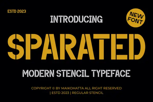
Angular stencil display
Sparated is an angular stencil display in mustard on black: heavy condensed caps with narrow vertical breaks through the bowls and the upright joins, squared corners and flat terminals, with a grey secondary line beneath and tracked credits at the foot.
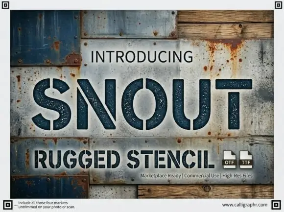
Wide rugged stencil capitals with narrow vertical gaps and speckled fill
Snout is a wide industrial stencil in which heavy capitals are interrupted by narrow vertical gaps, the S and O stay round against straight-sided N, U and T shapes and a speckled fill roughens the surface, so a word reads as a sprayed crate marking.
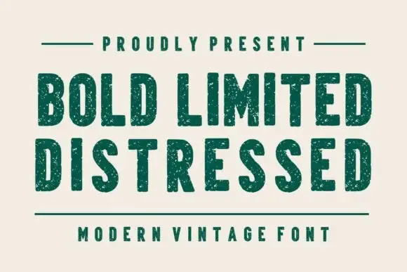
Condensed plain blocks with fine worn texture
Bold Limited Distressed shows tall heavy capitals with softly squared corners and tight inner spaces, where small pale speckles interrupt the green stems without greatly changing the outer silhouettes.
Ideas for this font
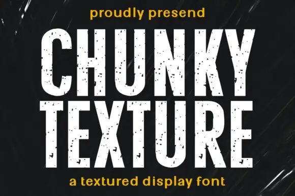
Condensed heavy capitals with sparse chips across pale faces
Chunky Texture is a condensed heavy display in which the stems run straight, the bowls stay compact and fine specks plus occasional larger chips interrupt the faces, so a heading reads as painted stencil with light wear.
Ideas for this font
Allow optional Google Analytics to measure visits and catalogue actions. Your search words and notes are not included. Privacy & storage