 #1 · Best Overall
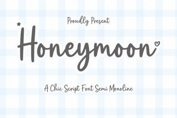
Honeymoon
Casual semi-monoline marker script with heart terminal accents
Get fontPaid link
Read review ↓Disclosure: MakerFileHub may earn a commission from qualifying purchases via paid links on this page. How our links work.
Heart connectors, monoline scripts & party signage
Bachelorette design is a small format with a lot of playful lettering: drink signs, games cards, sashes and photo props. Honeymoon and Within Romance keep a rounded monoline marker script, The Babe and Hello Betty use heart connectors and long tails, and Bunglon and Lovely add the formal script option for a shower invitation. Wedding Nayla brings sweeping lead-in tails.
Quick verdict
Honeymoon is the most playful script for bachelorette signage, The Babe covers the heart-connector role, and Bunglon keeps a shower invitation formal. Lovely handles wide wordmarks on banners.
Quick answer
Short on time? Start with our three highest-rated bridal shower & bachelorette party standouts before scrolling the full breakdown.
#1 · Best OverallCasual semi-monoline marker script with heart terminal accents
 #2 · Runner-Up Pick
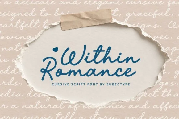
Rounded monoline marker signature script with heart accent
 #3 · Editor's Choice
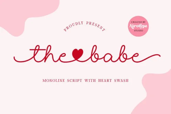
Smooth monoline cursive script with solid heart connector swashes
We kept 20 of 330 candidates after testing each on a 5 by 7 inch invitation and a 16 by 20 inch photo backdrop. Weighted heart connector thickness, how the tails behave at large scale, and whether the script stays legible at 14 pt for games cards.
Side-by-side summary
Compare specimens, OpenType/PUA traits and primary project roles side by side.
| Rank & Font | Style & File Specs | Best Project Fit | Store Listing |
|---|---|---|---|
| ScriptSweet | 'Just Married' luggage tag, honeymoon tote & passport holder | Get fontPaid link | |
| ScriptHeartfelt | Love-letter mug wrap, scrapbook title & anniversary card | Get fontPaid link | |
| ScriptAlternates & swashes | Bride-squad satin robe HTV, slipper decal & hanger name | Get fontPaid link | |
| ScriptPUA encoded · Alternates & swashes | Bridal shower champagne flute or glass can wrap | Get fontPaid link | |
| ScriptPUA encoded · Ligatures · Alternates & swashes | Save-the-date or thank-you card headline | Get fontPaid link |
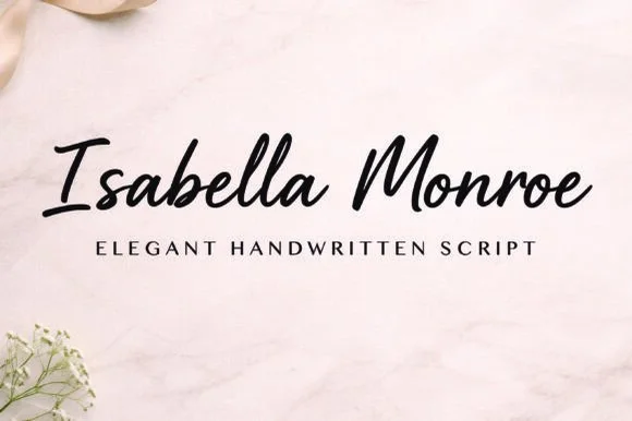
#1 · Best OverallHoneymoon is a warm, semi-monoline handwritten script featuring upright marker capitals, bouncy lowercase loops, and tiny heart accents.
Honeymoon is a casual semi-monoline marker script with heart terminal accents: a wet stroke with a slight thick-thin, joined letters, blunt marker ends and a few terminals that finish in a small heart. The hearts are the design and close first, and the semi-monoline keeps the face legible at small sizes. It needs roughly 24 mm for the heart terminal and the marker edge to read, and it is best in one warm ink on smooth card, or a pastel plus paper where the hearts read as knockouts.
'Just Married' luggage tag, honeymoon tote & passport holder — Center 1-to-2-word destination or couple phrases at 4–7 inches wide on canvas totes or gingham-themed cards.
Medium-thick marker strokes cut smoothly on HTV and permanent vinyl—weld connected letters and watch the tiny floating hearts when weeding.
#2 · Runner-Up PickWithin Romance is a smooth, uniform monoline cursive script featuring wide rounded capitals and optional solid-heart accents.
Within Romance is a uniform monoline cursive with wide rounded capitals, even gel-pen strokes and an optional solid-heart accent that can be placed as a separate glyph. Because the stroke never varies, the face plots cleanly, transfers predictably and prints at 12 mm without thinning, while the wide capitals give a short name a generous opening. It reads as handwriting done with a good pen rather than calligraphy, and it is at its best on cards, tags and small signage where the words are few.
Love-letter mug wrap, scrapbook title & anniversary card — Stack 2 title-case words centered at 4–6 inches wide in cobalt blue, berry red, or espresso above tracked sans.
Weld all touching cursive connectors before sending to your vinyl cutter; weeds cleanly down to 0.85 inches.
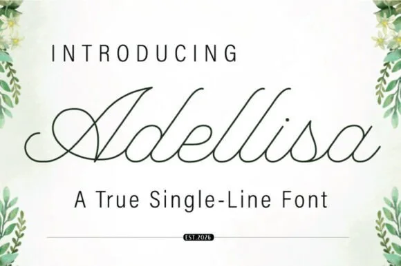
#3 · Editor's ChoiceThe Babe is a clean, steady monoline handwritten script featuring solid heart-shaped word connectors and smooth horizontal end tails.
The Babe is a smooth monoline cursive script in which the connectors swell into solid heart shapes: an even thin stroke, a gentle rightward slant and a heart that sits on the baseline between certain letter pairs. The hearts are drawn into the joins rather than added as an ornament, so a word reads as a chain of hearts, and the monoline keeps the face honest at small sizes. It needs roughly 22 mm for the heart connector to read, and it is best in one warm ink on ivory, or a foil impression above 34 pt where the monoline stays thin.
Bride-squad satin robe HTV, slipper decal & hanger name — Link two short lowercase words ('the♥bride', 'maid♥honor') across a 7-inch robe back or 3.5-inch tumbler.
Always Weld the entire connected line in Cricut Design Space so the heart connector and cursive loops cut as one continuous ribbon.
 #4 · Top Maker Utility
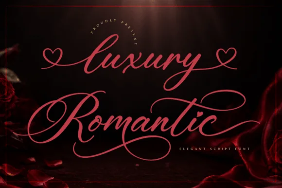
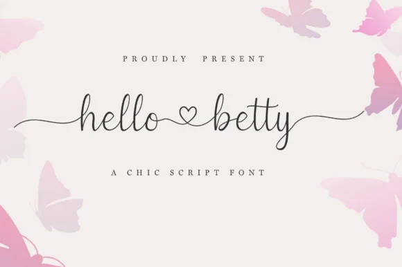
Hello Betty is a fine-line bouncy script featuring symmetric beginning/ending tails and a centered heart connector swash.
Displayed on blush cream with soft butterfly corners, lowercase 'hello ♡ betty' starts with a long wave lead-in stroke on 'h', links the two words through a standalone open heart loop, and exits 'y' with an undulating tail alongside tall narrow 'l' and 'b' ascenders. PUA encoding unlocks the heart swashes and terminal tails in craft apps. The heart connector is the weakest point on a cutting mat: it is drawn as an open loop rather than a filled shape, so it weeding-fails before the tails do and it disappears entirely once the x-height drops under about 12 mm. Keep the phrase at three inches wide or above, and proof one cut before the batch.
Bridal shower champagne flute or glass can wrap — Keep the full two-word phrase within 3.25 inches wide so the left and right tails wrap gently without disappearing around the glass sides.
Because the stroke is slender, cut on premium permanent cast vinyl at slow blade speed and burnish firmly onto transfer tape before lifting.
 #5 · Standout Silhouette
Bunglon is a modern copperplate script in which the downstrokes carry weight, the hairlines stay fine and generous swashes arch above the x-height and below the baseline, so a single name reads as formal calligraphy.
The B opens a wide upper loop, the bowls swell on the downstroke and thin on the join, the ascenders carry tall loops and the swash set adds long arcs that clear the word above and below. The overhead swashes are the character: they frame a name without a border, which is why the sample sets one couple's name on a plain card. Because the swashes are long, a line needs 20 mm of clearance at both ends, and the joins must be welded before cutting from 1.1 inches of x-height. The pale ground, the fine rules and the small caps line are presentation; the dark calligraphic name is the face.
Save-the-date or thank-you card headline — Use swashed forms sparingly on first and last letters and keep event logistics in a clean serif.
Fine hairlines suit print and foil; thicken with a small offset path if adapting for large vinyl signs.
 #6
Lovely sets a fine signature script in a single dark weight over a pale city photograph, where a wide entry curve opens low at the left, the letters rise into tall slender loops through the middle and a large descending y plus an extended closing sweep make the lower right part of the footprint.
The stroke stays thin and even, the loops stay tall, the entry runs wide and the exit sweeps out. That asymmetry is the character: the word is wider at the right than the left, which is why the sample sits on a generous square field rather than a strip. The building behind it is scenery, not part of the type. Keep 26 pt as the floor, allow 25 mm of clear space at the right for the exit sweep and check the y loop against any line placed beneath.
A quiet wedding invitation heading — Use a single script heading above the names. Keep a clear band beneath its lowest strokes, then set the venue and time in plain text.
Print at invitation size and check contrast on the chosen paper. Do not use the fine script for the address or RSVP instructions.
 #7
I Heart You runs a fine connected phrase along one long baseline, where a heart replaces the dot on the opening i and two more hearts rise above the joins between words, with long entrance and exit strokes widening the phrase on both sides.
The stroke stays one even monoline weight, the letters stay connected, the hearts sit on the joins rather than beside them and the ends run long. Those heart joins are the character, because the phrase is drawn as a single ribbon with three interruptions. The small typeface label beneath is cover text. Check how the heart is reached in your file, keep 26 pt so the monoline stays unbroken and remember that a cutting machine will need the hearts joined to the letters.
A single-line Valentine front — Centre the phrase on a wide card with generous end margins. Put the recipient name on the reverse rather than squeezing it between the heart loops.
Confirm the required heart alternates; single-line machine behaviour is not tested.
 #8
Autography sets a narrow handwritten word framed by a large heart at the right and a smaller heart above the opening letters, where the capital A carries a long thin diagonal and a looping lower stroke, a broad cross stroke runs across the upper middle and the final y descends deeply beside the large heart.
The strokes stay hairline and monoline, the letters stay narrow, the crossbar stretches wide and the y drops deep. That framing is the character: the two hearts bracket the word rather than sit around it, which is why the composition runs much taller than a signature line. The hearts may be drawn graphics rather than glyphs. Keep 30 pt for the hairlines, plan 25 mm to the right for the large heart and check the file before promising the hearts inside a name.
A guest-book cover with a name pair — Centre the names with generous space above for a single heart. Place “Our guest book” in plain type beneath the lowest descending stroke.
Verify the heart alternates and actual name arrangement; this single-word preview does not show an automatic name-pair feature.
 #9
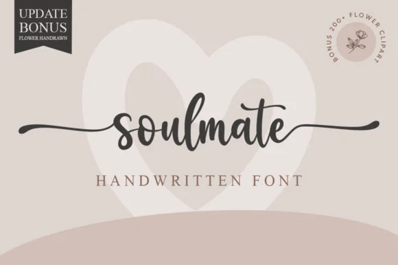
Soulmate sets a balanced modern cursive in a single dark weight on a warm neutral field, where moderate stroke contrast and tidy x-height proportions keep the word clear while horizontal s and e extensions run far out to both sides and frame the name symmetrically.
The strokes stay even and moderate, the letters stay upright and connected, the tails run horizontal and long, and the word stays centred inside them. Those side tails are the character, because they turn a single word into a rule that can hold a whole layout. A pale heart sits behind the word and a corner note advertises flower clipart, both as cover treatment. Keep 26 pt so the joins stay open, allow 25 mm at each side for the tails and check the middle letters against a long name before committing.
Engraved keepsake box or vow book cover — Set in lowercase with side swashes on a single line above a small ceremony date.
PUA encoded; weld script joins and check thin outer tail tips before cutting small adhesive vinyl.
 #10
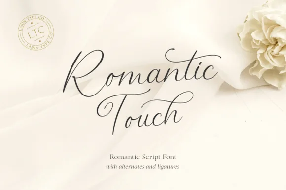
Romantic Touch is a feather-light, fluid handwritten script featuring wide looped capitals, flying t-crossbars, and delicate nib movement.
Romantic Touch is an ultra-fine fountain-pen script with wide looped capitals, flying t crossbars and delicate nib movement, so a name reads as written with a light hand on good paper rather than as engraved calligraphy. The hairlines are the design, which means the face needs size and a smooth stock, and the flying crossbar extends past the letter. It needs roughly 24 mm for the hairlines to hold and 10 mm in a card, and it is best in one fine dark ink on ivory or as a light foil on matte board.
Vellum invitation wrap, silk-ribbon print & vow booklet — Center 2 stacked words at 42–64 pt with 1.15 line spacing and wide 1.25-inch margins.
Hairline fountain-pen strokes belong in flat print, letterpress, Foil Quill, or Cricut Pen addressing—not cut vinyl.
 #11
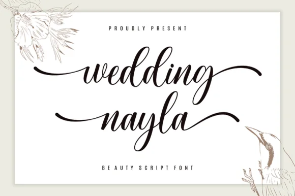
Wedding Nayla is a romantic modern bridal script featuring long, graceful horizontal entry and exit tails built for signs, hangers, and invitations.
Wedding Nayla is a modern wedding calligraphy script with sweeping lead-in and end tails: a light-to-medium contrast, a wide oval axis, a modest slant and tails that extend well past the word on both sides. The tails mean a centred layout needs side clearance, and the hairlines are the first thing to break on textured stock. It needs roughly 24 mm for the lead-in and the tail to read, and it is best in one warm ink on smooth ivory, or a foil impression above 38 pt where the tail can still carry.
Acrylic wedding welcome sign, bridesmaid box & table name — Set lowercase names at 60–115 pt with sweeping left/right end tails above ultra-wide-tracked (+450) serif micro-caps.
Weld overlapping cursive joins in Cricut Design Space before cutting permanent Oracal 651 or HTV, and size above 1.2 in!
 #12
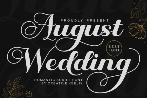
August Wedding is a PUA-encoded modern bridal calligraphy script pairing thick, vinyl-sturdy downstrokes with sweeping 'A/W/g' swash loops!
August Wedding is a lush bridal calligraphy script with thick vinyl-sturdy downstrokes, tall swash loops on the A, W and g and a PUA alternate set, so a name reads as engraved stationery rather than a casual hand. The heavy downstroke survives a cutting machine and a foil, while the swashes extend the word at both ends and need clearance. It needs roughly 24 mm for the swashes to read, and it is best in white on matte black or a fine gold foil on ivory.
Frosted-acrylic wedding welcome sign, mirror decal & invite — Stack 2 title-case words at 68–135 pt in white or champagne-gold vinyl on dark smoked or frosted acrylic.
Copy PUA swash alternates via Character Map/Font Book, then Weld overlapping cursive joins before cutting Oracal 651!
 #13
Welcome features relaxed lowercase cursive with long level beginning and ending swash tails, tailored for round wood signs and entryways, where the smooth monoline-leaning strokes and open letter spacing keep words calm while the extended w and e tails span a circular blank.
The stroke stays one width, the spacing opens, the tails run level and the word sits calm. That level tail is the character: the greeting stretches to the width of a round board without a bigger point size, which is why the sample targets door signs. Plan the tails against the blank's curve, keep the stroke at 3 mm for cutting, and check the exits in your own word before committing the sign. The wide tail is also the weak point on a shaped blank: it has to end inside the panel, so a 12 mm tail on a 300 mm round board is safe and anything longer gets trimmed at the edge.
Round wood welcome sign or nursery plaque — Centre the tailed lowercase word across the middle third and tuck family names below in small caps.
PUA-encoded tails weld cleanly in Cricut/Silhouette; verify thin tail tips before weeding small decals.
 #14
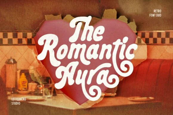
Romantic Aura Duo pairs a thick, velvety 1970s swash script with a clean companion voice for nostalgic love notes and merch.
Romantic Aura Duo pairs a nineteen-seventies swashed retro script with a rounded sans: the script runs a high-contrast stroke with wide swelling swashes that lift above and below the line, while the sans is a soft rounded block for details and lists. The pair is a period look, so it works best in two warm flat inks on a light ground rather than in photographic tints. The swash thins are the finest element and they break first. The script needs roughly 32 mm and the sans 20 mm for their detail to read.
Retro Valentine sweatshirt, mug wrap & galentine card — Stack 2 to 3 centered words tightly inside a heart or arch silhouette so rising ascenders nest into the gaps of the line above.
Weld all overlapping script letters before cutting HTV, and keep total lockup width at 3.5 in+ so tight inner 'e' and 'a' counters weed cleanly.
 #15
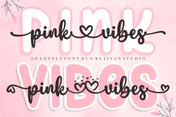
Pink Vibes Duo pairs two fat rounded capital rows, drawn in white with a soft pink glow, with a small dark connected script that runs across them, and in the lower sample the script joins the words with heart shapes instead of a plain connector stroke.
The caps stay broad and inflated, the script stays thin and dark, the contrast between the two weights carries the pair and the hearts sit where a ligature would normally go. The upper sample sets the script over the caps without hearts, the lower inserts one heart between the words and a second heart cluster on the final s, so the decorative join is an option rather than the default. Branches in the corners are cover artwork. Check which connector glyphs your file carries before planning the heart link, keep 30 pt for the script strokes and set the caps in one colour so the pink glow does not come from the type.
A two-level greeting — Keep capitals above script rather than overlapping; leave heart tails in open space.
Check connector variants and actual duo contents.
 #16
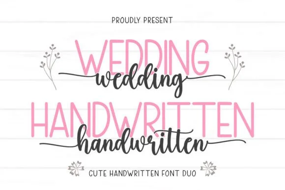
Wedding Handwritten pairs a tall, narrow rounded sans-serif with a lively thick-thin calligraphy script sporting symmetrical side tails.
Wedding Handwritten pairs a tall slender sans with a tailed calligraphy script: the sans is a narrow even-width capital set for details and directions, while the script runs a high-contrast stroke with long ascenders and a tail that lifts off the last letter. The pair is a stationery set, so both cuts have to survive one ink and a matte stock. The script tail is the finest element and it breaks first. The sans needs roughly 20 mm and the script 30 mm for their detail to read.
Save-the-date card, acrylic table sign & seating chart — Set table numbers or 'SAVE THE DATE' in 1.8 in blush or gold sans and center couple names across the lower half in charcoal script.
Weld the script letters before cutting vinyl for acrylic wedding signs, and handle the fine horizontal outer tails gently on transfer tape.
 #17
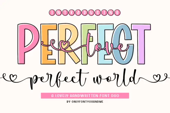
Perfect Love Perfect World places fine script across tall outlined capitals, where small hearts extend the script ends and the lower world line carries deep p and d strokes.
The caps stay tall and open, the outline runs thin, the script threads across them and the ends finish in small hearts. That layering is the character: one line sits over another instead of beside it, which is why the sample reads as a single romantic composition. Small hearts may be artwork rather than glyphs, and overlapping two members invites collisions, so test your own phrase and keep 18 mm of clear ground below from 26 pt. The overlap is the only real risk: the script has to cross the outline without touching it, so keep 20 mm of clear ground between the layers and test one phrase before a run of cards.
A welcome-sign direction — Place a short script line in the gap, then keep names on a separate baseline.
Check overlap at the capital counters.
 #18
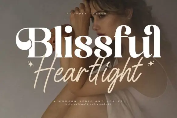
Blissful Heartlight shows a pale heavy Blissful line with round bowls and curled upper entries over a portrait, where the serifs swell into bulges at the joins and a thinner right-leaning Heartlight script sits beneath with long loose strokes and extended ascenders and descenders plus two small stars at the outer edges.
The serif stays heavy and soft, the script stays thin and leaning, the ascenders rise high and the descenders drop low while the two rows overlap slightly at the centre. That swelling serif is the character: the caps look inflated at the joins rather than cut, which is why the sample relies on a photographic ground for contrast. The stars are styling, and the cover notes alternates and ligatures without showing them. Keep 44 pt for the serif and 26 pt for the script, and check the overlap for contrast before printing.
A serif-and-handwritten invitation pairing — Keep the handwritten line clear of the practical invitation text.
Verify both members and exact joins.
 #19
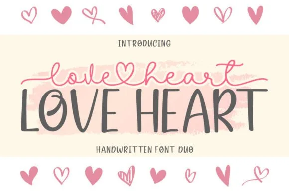
Love Heart Duo matches a tall, slightly textured uppercase brush-sans with a fine monoline cursive featuring a built-in center heart swash.
Love Heart Duo pairs a hand-brushed tall sans with a heart-connected monoline script: the sans is narrow with a dry brush edge and open counters for headlines and lists, while the script runs an even thin stroke where the joins between two words swell into a small drawn heart. The pair gives one card a hand-linked line and a legible second voice from a single family and a single palette, so an invitation, a tag and a seal can be built together. The hearts are the finest element and they close into dots as soon as the face shrinks, and the dry brush edge fills when the sans is reversed or printed small. The sans needs roughly 24 mm and the script 26 mm for their detail to read.
Couple anniversary mug, pillow sham & Valentine card — Match the outer tip-to-tip width of the tailed script to the full width of the uppercase sans row underneath.
The fine monoline script cuts best above 1.75 in tall on vinyl; for smaller mugs, use sublimation or Print-Then-Cut.
 #20
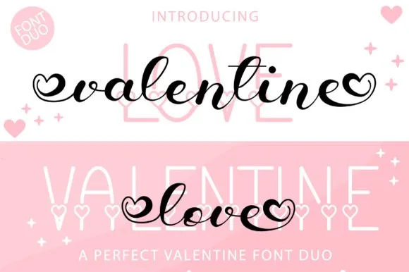
Valentine Love Duo teams a bold bouncy brush script—with open heart terminal loops—with a tall slim sans accented by tiny baseline hearts.
Valentine Love Duo pairs a heart-tipped calligraphy script with a heart-accented tall sans: the script runs a moderate contrast stroke on a shallow slant with swashes that finish in a drawn heart tip, while the sans is a narrow block whose i dots are small hearts. The pair gives one card two voices and two heart placements from a single palette, so an invitation, a seal and a sleeve can be printed as one set. The hearts are the finest elements and both close into dots as soon as the face shrinks, and the script's hairlines are the first thing to lose on textured stock. The script needs roughly 26 mm and the sans 22 mm for their detail to read.
Galentine tumbler decal, wine tote & pajama set — Use the heart-ended black or red script at 4.5 inches wide across the center of tall pale-pink sans background capitals.
Weld all script letters before cutting vinyl, and use fine tweezers to weed the small interior heart loops at both ends.
Practical buyer checklist
Key cutting, printing and pairing answers before choosing a bridal shower & bachelorette party typeface.
Lettering at 6 to 10 inches on a 16 by 20 inch backdrop, or larger for a full wall banner. Below 6 inches the script is invisible in photographs, which is the entire purpose of the piece.
Yes, at 1.5 inches or more with a monoline stroke. Fine calligraphy with hairline connectors tears on satin during weeding, so choose a rounded marker script for anything that has to be cut.
The formal and semi-formal scripts, with a restrained palette. Heart connectors and bouncy lettering read as bachelorette, while a copperplate or swash script reads as a shower or a wedding-adjacent event.
Most do, though script numerals are often weak. If a date appears in the design, test those glyphs, and consider setting the date in the block face instead of forcing the script.
Keep exploring
Explore adjacent maker roundups or check our practical pre-production checklists.
36 curated fonts · Previews & pairings
26 curated fonts · Previews & pairings
19 curated fonts · Previews & pairings
31 curated fonts · Previews & pairings
Guides: Invitation font checklist · Vinyl & cutting checklist · How to pair script & sans fonts
Allow optional Google Analytics to measure visits and catalogue actions. Your search words and notes are not included. Privacy & storage