MakerFileHub · Fonts4,091 curated & craft fonts · 93 curated collections · Original previews
MakerFileHubSaved 0

Headline-first letterforms

Display Fonts (694 Profiles)

Five hundred and sixty-four display faces built for a single line at large size: heavy contrast serifs, condensed sans, novelty cuts and poster lettering that would fall apart in a paragraph but holds a title beautifully.

Letterform anatomy

How to read display letterforms.

Three checks worth running on any specimen before you compare prices.

Display type is designed for the top of the hierarchy, so judge it at that scale. Check the width of the counters against the stroke weight, because a heavy face with closed counters loses legibility faster than its lighter sibling. Look at spacing: display fonts often ship tight sidebearings to look impactful in a preview, which needs manual tracking once you set a real word.

93 CollectionsA–Z Index

694 fonts (sorted by maker demand)Page 1 of 29

Font profiles

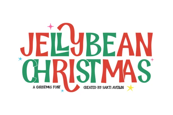
Original Jellybean Christmas preview by Sakti Avellin

Chunky hand-drawn Christmas capitals with one letter dropping below the line

Jellybean Christmas

Jellybean Christmas is a heavy hand-drawn capital alphabet in which the strokes stay fat and slightly uneven, the corners soften and one letter in each line is allowed to fall out of the baseline, so a greeting reads as cut paper.

Explore
Original Classroom Memories preview by Keithzo (7NTypes)

Duo pairing heart-substituted bold caps with a looping script

Classroom Memories

Classroom Memories is a two-cut family in which bold rounded capitals carry hearts in place of some counters and a thin looping script writes a second line, so a short phrase reads as a decorated classroom poster.

Explore

Production reality

Where these faces fail.

A heavy display face costs material. Wide letters need a wider cut area, more transfer tape and more vinyl, and closed counters trap air bubbles on curved surfaces. On tumblers and jars, choose slightly narrower display cuts or split the artwork into separate decals.

Can a display font be used for a logo?

Yes, and it is one of the better uses. Display faces carry a strong voice at small word counts, which suits a brand name or a short tagline. Keep supporting text in a separate neutral face so the logo line stays the loudest element.

Why does my display text look cramped after purchase?

Display fonts are usually spaced for artwork rather than for reading, so the preview spacing is tighter than text needs. Add tracking between letters once you set live wording, and reduce it again if the word is a single three-letter mark.

Help improve the font catalogue?

Allow optional Google Analytics to measure visits and catalogue actions. Your search words and notes are not included. Privacy & storage

Original preview

Clear review data?