 #1 · Best Overall
Disclosure: MakerFileHub may earn a commission from qualifying purchases via paid links on this page. How our links work.
Organic brush scripts & botanical line work
24 Best Boho, Earthy & Botanical Fonts
Boho type is defined less by style than by a specific kind of irregularity: brush strokes that swell unevenly, loops that lean, and spacing that breathes. Boho and Sweet Boho carry that warmth in a thick script, Wisteria Tale and Simplicity keep it ink-fine, and Evan and Olive bring botanical and organic shapes into display lettering. Rustic Melody and Alexander add the naturalist, engraved side of the look.
Quick verdict
Boho is the most versatile script for a craft brand, Sweet Boho softens it, and Wisteria Tale handles airy signage. Olive covers the block display slot, and Alexander is the pick for botanical packaging.
Quick answer
Top 3 boho, earthy & botanical picks right now.
Short on time? Start with our three highest-rated boho, earthy & botanical standouts before scrolling the full breakdown.
#1 · Best Overall #2 · Runner-Up Pick
Sweet Boho
Thick rounded brush script with plump loops and wide transitions
Get fontPaid link
Read review ↓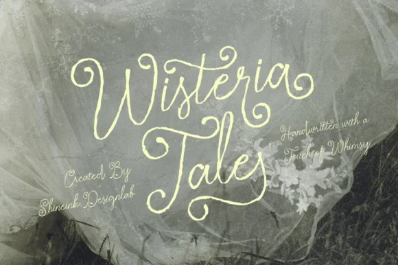 #3 · Editor's Choice
Wisteria Tale
Whimsical handwritten script with cork-screw curls and tall capitals
Get fontPaid link
Read review ↓How we tested & selected these 24 fonts
We kept 24 of 391 candidates that show genuine brush irregularity rather than a smooth script with a texture applied. Judged on stroke swell consistency, loop clarity at 1 inch, and whether the botanical elements are separate glyphs that can be positioned rather than baked into every letter.
Side-by-side summary
Top 5 boho, earthy & botanical picks at a glance.
Compare specimens, OpenType/PUA traits and primary project roles side by side.
| Rank & Font | Style & File Specs | Best Project Fit | Store Listing |
|---|---|---|---|
| ScriptWarm | Macramé shop tag, boho mug decal or nursery wall sign | Get fontPaid link | |
| ScriptCozy | Tea mug decal, bridesmaid gift box or cozy home sign | Get fontPaid link | |
| ScriptAlternates & swashes | Garden wedding invitation, fantasy novel cover or botanical tea tin | Get fontPaid link | |
| ScriptPUA encoded · Alternates & swashes | A botanical maker’s round seal | Get fontPaid link | |
| ScriptPUA encoded · Alternates & swashes | Botanical skincare bottle & ceramic studio logo | Get fontPaid link |
Scripts & Calligraphy
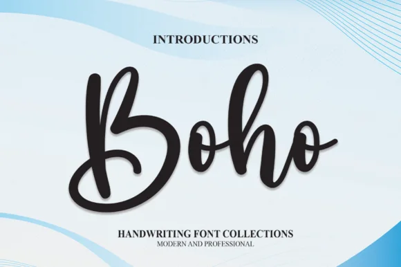
7 fonts#1 · Best OverallBoho
Boho by andikastudio is a thick bouncy modern brush script in which the downstrokes stay generous, the counters open wide and the letters stand nearly upright, so a short phrase reads as warm handwriting that still cuts cleanly.
The downstrokes carry most of the weight, the counters stay open enough to keep small sizes legible, the baseline bounces slightly and the upright stance keeps the line steady. The chunky stroke is the character: the word reads as a brush mark rather than a fine pen line, which is why the sample suits vinyl applications. Because the joins stay thick, keep 26 pt as the floor and cut from 1.1 inches of x-height so the connectors weld without tearing; ligature access is a separate step.
Recommended project & layout
Macramé shop tag, boho mug decal or nursery wall sign — Weld connected lowercase letters before cutting in Cricut or Silhouette.
Before you cut or print
Easy cut on HTV, permanent vinyl and wood stencils.
Best paired with
Get fontPaid link
#2 · Runner-Up PickSweet Boho
Sweet Boho is a thick rounded brush script in which the strokes stay plump, the joins widen into soft transitions and the loops of S, B and h open wide, so a short phrase holds a large amount of ink on a craft blank.
The S swells through two wide curves, the B closes a broad upper loop, the h lifts a rounded arch and the connectors keep almost the same weight as the stems, which leaves very little thin passage anywhere in a word. The plumpness is the character: wide strokes give adhesive surface on a mug or a wooden sign, which is why the sample sets a warm phrase on a plain ground. Because the letters are fat, a title needs generous leading from 28 pt and the joins weld into a single path before cutting from 1.1 inches of x-height. The cream ground, the small daisies and the caption are presentation; the dark brush phrase is the face.
Recommended project & layout
Tea mug decal, bridesmaid gift box or cozy home sign — Stack two short words tightly and Weld overlapping connections before cutting.
Before you cut or print
Top-tier vinyl & HTV friendliness thanks to thick, smooth strokes.
Best paired with
Get fontPaid link
#3 · Editor's ChoiceWisteria Tale
Wisteria Tale is a whimsical handwritten script in which the capitals climb into corkscrew curls, the joins stay monoline and the terminals spiral, so a two-word title reads as something written with a fine pen on a card.
The W opens into two tall curls, the i carries a light dot, the s wobbles a shallow spine, the t crosses a high bar, the e turns a round eye and the final a finishes a spiral, all at a monoline weight with tall ascenders and generous loops. The curls are the character: they add height rather than weight, which is why the sample sets two stacked words with wide leading and lets the spirals fill the space. Because the stroke is even, the face holds at 22 pt and prints in one colour, but the spirals need a smooth stock to survive. The tulle photograph, the small italic credit lines and the studio note are presentation; the cream script words are the face.
Recommended project & layout
Garden wedding invitation, fantasy novel cover or botanical tea tin — Set at generous display scale over muted sage, charcoal or parchment.
Before you cut or print
Fine organic pen strokes excel in print, foil and digital art.
Best paired with
Get fontPaid link
 #4 · Top Maker Utility
Simplicity
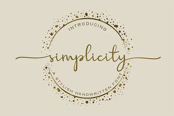
Simplicity sets a fine lowercase word across an ornamental ring, with long swashes extending beyond the circle on either side. The l rises above a low lowercase body, the p drops below it, the final y carries a narrow descending loop and the long end strokes supply much of the width.
The body stays low and fine, the ascender rises, the descender loops and the end strokes travel far out. Those long exits are the character: the word reaches past its own bounding box, which is why the sample lets it cross a decorative ring. The ring is separate artwork rather than an included ornament, so plan the exits in your layout, keep 26 pt for the fine joins and give at least 24 mm of clear space at each end.
Recommended project & layout
A botanical maker’s round seal — Keep the words across the circle’s centre. Break the ring where the letters or swashes cross it instead of running a line through the text.
Before you cut or print
Check the real phrase and ring clearance at seal size; the gold border is artwork, not a promised glyph.
Best paired with
Get fontPaid link
 #5 · Standout Silhouette
Monoline Boho
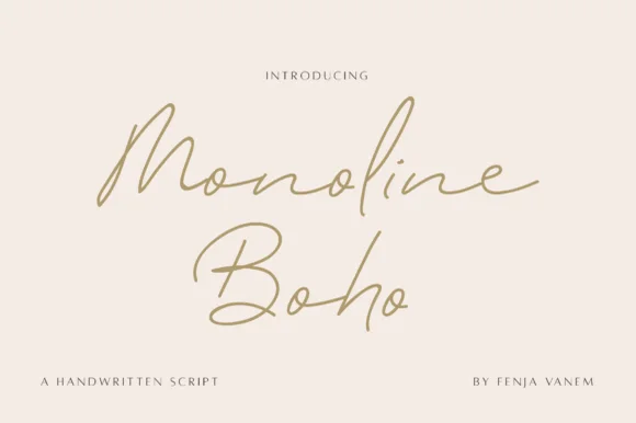
Monoline Boho is a fine, forward-slanted handwritten script featuring sweeping multi-peak capitals and airy looped ascenders.
Monoline Boho is a fine slanted monoline signature script with knotted loops: an even hairline stroke on a strong slant, letters joined low, and ascenders that tie themselves into small open knots before they release. It reads as a hand-signed name rather than a set line, which is why it belongs on a card, a tag or a decal. The knots are the finest element and they close into a smudge once the face is reduced or cut small. It needs roughly 30 mm for the knot and the hairline to read, and it is best one dark ink on a smooth stock.
Recommended project & layout
Botanical skincare bottle & ceramic studio logo — Give a two-word studio name generous whitespace at 24–30 pt, paired with widely tracked 7.5 pt uppercase sans ingredient lines.
Before you cut or print
Fine monoline strokes belong in print, foil stamping, or Foil Quill drawing rather than small cut-and-weed adhesive decals.
Best paired with
Get fontPaid link
 #6
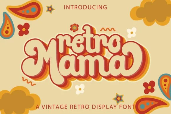
Retro Mama
Retro Mama is a plump, connected 1970s marshmallow script featuring bulbous heart-cleft M arches and sweeping wrap-around swash loops.
Retro Mama is a groovy connected marshmallow script: fat rounded letters that join in one thick ribbon, a lazy baseline that rises and dips, and swash loops that rise off the caps into a wide arc. The weight is the character, so it closes the counters early, and the swash loops grow the word vertically. It needs roughly 28 mm for the swash arc and the marshmallow join to read, and it is best in two warm inks on cream, or one saturated colour on white where the thick stroke stays solid.
Recommended project & layout
Mother's Day 'Cool Mama' sweatshirt, glass can & car decal — Nestle smaller lowercase 'retro' or 'cool' right into the top valley of the big swashed 'Mama' line below.
Before you cut or print
Fat, smooth single-piece strokes weed like a dream on puff HTV, matte vinyl, and embroidery appliqué—weld all cursive joins first!
Best paired with
Get fontPaid link
 #7
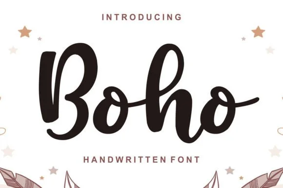
Boho
Boho (by Lisna.Craft) is a thick, welcoming brush-marker script (not a rigid block display) featuring rounded loops and joyful baseline bounce.
Boho by Lisna.Craft is a chunky bouncy brush-marker script with a plump double-bellied B, tall loops and sturdy connected bowls, so a name reads as a hand-painted sign rather than a fine script. The heavy connected strokes are safe to cut and to plot, and the baseline bounce keeps a short word lively while the even weight keeps a long one readable at 14 mm. It needs roughly 22 mm for the brush edge to read, and it is best in espresso brown on white or in white on a terracotta ground.
Recommended project & layout
Macramé shop tag, boho nursery decal & ceramic mug — Center 1 short word at 64–120 pt in espresso brown, terracotta, or cream above wide-spaced sans ('HANDWRITTEN FONT').
Before you cut or print
Weld all touching cursive connectors before cutting permanent vinyl or HTV; weeds cleanly down to 0.75 inches!
Best paired with
Get fontPaid link
Display & Decorative Headlines
6 fonts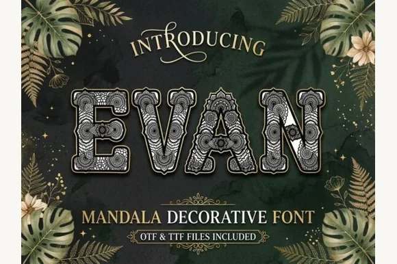 #8
Evan
Evan is a decorative capital set in which each letter keeps a sturdy outer rim and the interior fills with botanical mandala lace, so a short word reads as a drawn ornament rather than as plain lettering.
The A carries a rim around a triangular counter filled with petals, the O holds a circular mandala, the E sets three arms with lace inside and every letter keeps its outline thick enough to survive a cut. The lace fill is the character: it makes three to six letters enough for a design, which is why the sample sets a short word on a plain field. Because the fill is fine, the face wants 60 pt before the pattern reads and it holds best as a single decorative word rather than a line of text; long phrases turn the lace into noise. The frame and background in the sample are artwork; the filled letters are the face.
Recommended project & layout
Yoga studio poster, boho tote screen-print or journal cover — Use at large display sizes (60pt+) on solid dark or earthy backgrounds.
Before you cut or print
Dense internal lace is strictly for print, sublimation, DTF and laser engraving — never vinyl weeding.
Best paired with
Get fontPaid link
 #9
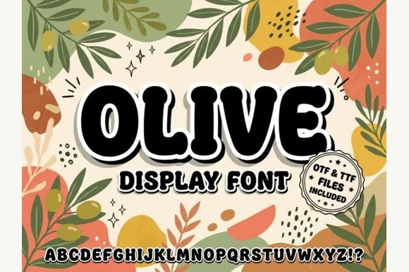
Olive
Olive is a stout, softly rounded organic display sans with gently tapered stems and warm 1970s Mediterranean market charm (OTF & TTF).
Olive is a chunky organic display sans with softly rounded corners, gently tapered stems and slightly irregular blocks, wrapped in a white sticker keyline on the specimen, so a word reads as a Mediterranean market label rather than a geometric poster. The irregularity is small and repeatable, which keeps it legible at 20 mm, and the sticker keyline lets it sit over a busy background. It needs roughly 24 mm for the taper to read, and it is best in jet black on cream or in one dark ink on terrazzo pink.
Recommended project & layout
Olive-oil bottle label, focaccia bakery bag & deli sign — Set 1 uppercase product word at 60–110 pt wrapped in a crisp white offset border over botanical illustrations.
Before you cut or print
100% solid, thick single-layer shapes cut and weed in seconds on Cricut Oracal 651, HTV, and stencils down to 0.55 inches!
Best paired with
Get fontPaid link
 #10
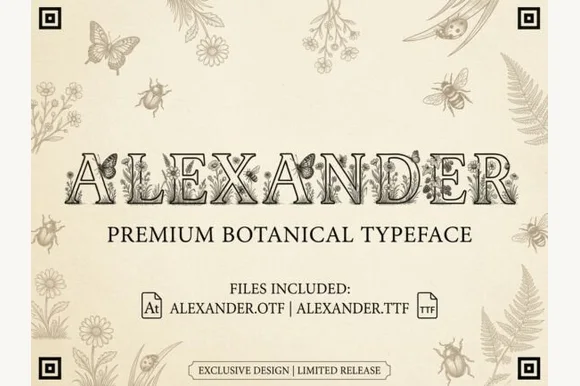
Alexander
Alexander is an intricate vintage naturalist's display serif filling hollowed Roman capitals with fine-line butterflies, honeybees, and wildflowers (OTF & TTF)!
Alexander is a naturalist's display serif whose hollowed Roman capitals are filled with fine botanical and entomological line work — butterflies, honeybees, wildflowers — so each letter reads as a specimen plate rather than a letter with an ornament. The interior detail is delicate, so the face needs roughly 40 mm before the insects read as drawn rather than as dirt, and the outline is what holds the shape at distance. It is a title and plate face, best in one ink on laid or cream stock, and it should never be used below about 18 mm.
Recommended project & layout
Botanical garden wedding monogram, honey favor & menu — Set 1 full name at 64–130 pt or 1 giant 4-inch monogram initial on warm cotton rag cardstock.
Before you cut or print
Microscopic interior botanical line-art is strictly for high-res flat print (300 DPI+), stationery, DTF, and large CO2 laser wood engraving—never vinyl cutting!
Best paired with
Get fontPaid link
 #11
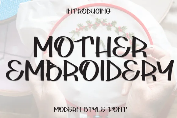
Mother Embroidery
Mother Embroidery is a curvy, bohemian uppercase display font (neither a script nor a classic serif) accented with swooping R/M/Y split legs.
Mother Embroidery is a curvy bohemian display in caps with rounded wedge strokes and swooping split legs on the R, M and Y, so a word reads as hand-drawn lettering with a botanical softness rather than a geometric sans. The strokes are even and heavy, the counters are round, and the split legs extend below the baseline, which means the layout needs foot room. It needs roughly 20 mm for the split to read as intentional, and it is at its best in one matte colour on a natural ground such as linen, clay or kraft.
Recommended project & layout
Mother's Day tote bag, plant-mom mug & floral hoop sign — Stack 2 centered uppercase words at 52–92 pt with +4 tracking inside a floral wreath.
Before you cut or print
100% solid, disconnected curvy shapes cut and weed fast on Cricut HTV and permanent vinyl down to 0.75 inches!
Best paired with
Get fontPaid link
 #12
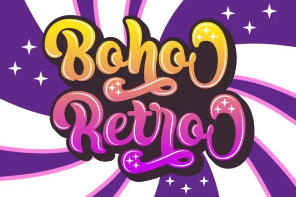
Boho Retro
Boho Retro is a plump, heavy-looped 1970s groovy display script with curled swash caps and pillowy connected lowercase bowls.
Boho Retro is a swirled nineteen-seventies psychedelic bubble script-display: fat rounded letters that swell at the waist, joins drawn as spirals and terminals that curl back into the letter like smoke. It is a poster face, so it wants size, two flat inks and a pale ground rather than a busy photograph. The spirals are the finest element and they fill into solid blobs as soon as the face is reduced. It needs roughly 44 mm for the spiral and the swell to read, and it is best two warm flat inks on a light stock.
Recommended project & layout
Retro festival ringer tee & iced-coffee glass wrap — Stack a two-word phrase at a slight upward 6-degree angle and add a contoured offset shadow layer in Cricut or Illustrator if you want the sticker look.
Before you cut or print
Weld connected lowercase letters before cutting vinyl, and check the tight interior spiral holes inside 'B', 'o', and 'e' when weeding.
Best paired with
Get fontPaid link
 #13
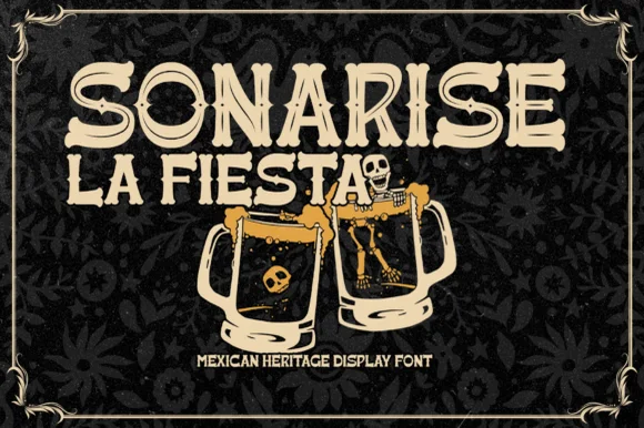
Sonarisa La Fiesta
Sonarisa La Fiesta is a lively Mexican-heritage display typeface with flared Tuscan-style spurs, dancing baselines, and hand-carved warmth.
Sonarisa La Fiesta is a hand-carved Mexican fiesta and cantina serif display: chunky bracketed letters with visible chisel facets, small star or diamond cuts set into the counters and edges that read as carved and painted timber. The facets are the design and they flatten into a solid block once the face is reduced, and the star cuts close first. It needs roughly 32 mm for the facet and the star to read, and it is best in three flat inks on cream, or one ink plus paper where the stars print as knockouts.
Recommended project & layout
Día de los Muertos banner, taco-bar menu & cantina sign — Stack 2 or 3 centered uppercase lines in warm cream, marigold gold, or fiesta coral over dark papel-picado backgrounds.
Before you cut or print
Chunky solid stems with flared ends cut cleanly on cardstock banners, HTV aprons, and painted wood stencils down to 0.75 in.
Best paired with
Get fontPaid link
Matched Font Duos & Packs
6 fonts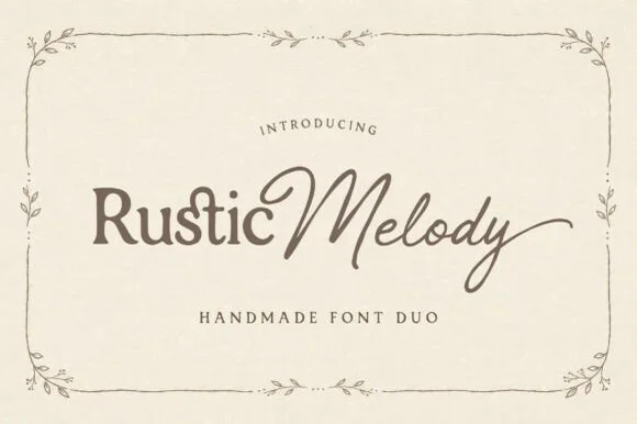 #14
Rustic Melody
Rustic Melody is a graceful handmade font duo pairing a gently organic mixed-case serif ('Rustic') with a flowing fine-pen signature script ('Melody')!
Rustic Melody is a duo of a handcrafted organic serif and an airy signature calligraphy: the serif carries uneven edges that read as cut paper, short bracketed serifs and a warm irregular rhythm, while the calligraphy runs a light stroke with joined letters and long tapered exits for names. The pair lets one card carry a printed headline and a signed line, and the light calligraphy is the weaker element in print. The serif needs roughly 22 mm and the calligraphy 26 mm for their detail to read.
Recommended project & layout
Barn-or-garden wedding invitation, vow booklet & place card — Place mixed-case Serif (60 pt) + title-case Script (76 pt) side-by-side above wide-tracked Serif small-caps ('HANDMADE FONT DUO').
Before you cut or print
Serif cuts cleanly at 0.85 in+; delicate Signature Script shines in flat print, foil stamping, Cricut Pens, or 1.4 in+ welded vinyl.
Best paired with
Get fontPaid link
 #15
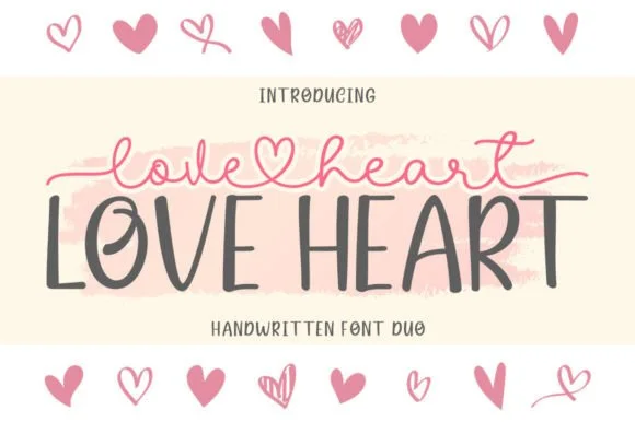
Love Heart Duo
Love Heart Duo matches a tall, slightly textured uppercase brush-sans with a fine monoline cursive featuring a built-in center heart swash.
Love Heart Duo pairs a hand-brushed tall sans with a heart-connected monoline script: the sans is narrow with a dry brush edge and open counters for headlines and lists, while the script runs an even thin stroke where the joins between two words swell into a small drawn heart. The pair gives one card a hand-linked line and a legible second voice from a single family and a single palette, so an invitation, a tag and a seal can be built together. The hearts are the finest element and they close into dots as soon as the face shrinks, and the dry brush edge fills when the sans is reversed or printed small. The sans needs roughly 24 mm and the script 26 mm for their detail to read.
Recommended project & layout
Couple anniversary mug, pillow sham & Valentine card — Match the outer tip-to-tip width of the tailed script to the full width of the uppercase sans row underneath.
Before you cut or print
The fine monoline script cuts best above 1.75 in tall on vinyl; for smaller mugs, use sublimation or Print-Then-Cut.
Best paired with
Get fontPaid link
 #16
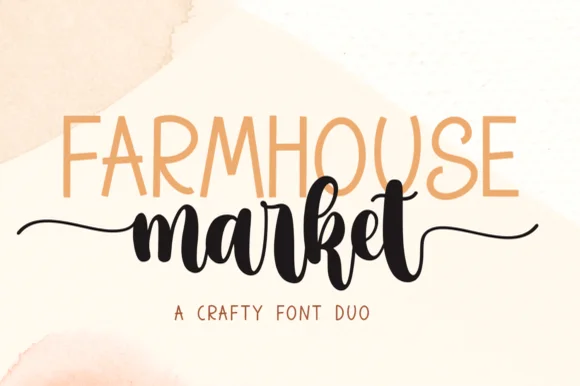
Farmhouse Market
Farmhouse Market teams a tall, organic uppercase sans with a bold, bouncy brush script finished by sweeping side tails.
Farmhouse Market pairs a condensed hand-drawn sans with a thick brush-pen script: the sans is a narrow uneven block with a wobbling stem for signs and price cards, while the script is a heavy brush stroke with dry ends and a visible pen turn at each join. The pair is built for a market stall, so it wants kraft paper and one dark ink rather than a coated ground. The dry brush ends are the finest element and they silt first. The sans needs roughly 22 mm and the script 30 mm for their detail to read.
Recommended project & layout
Farmers-market canvas tote & produce crate stencil — Span the uppercase sans across the top width of the script's core letters, letting the script's left and right tails extend 1 inch wider on each side.
Before you cut or print
Weld all brush script letters into a single compound path before cutting HTV, and double-check the small upper loop inside 'e' and 'k'.
Best paired with
Get fontPaid link
 #17
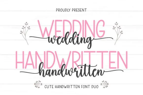
Wedding Handwritten
Wedding Handwritten pairs a tall, narrow rounded sans-serif with a lively thick-thin calligraphy script sporting symmetrical side tails.
Wedding Handwritten pairs a tall slender sans with a tailed calligraphy script: the sans is a narrow even-width capital set for details and directions, while the script runs a high-contrast stroke with long ascenders and a tail that lifts off the last letter. The pair is a stationery set, so both cuts have to survive one ink and a matte stock. The script tail is the finest element and it breaks first. The sans needs roughly 20 mm and the script 30 mm for their detail to read.
Recommended project & layout
Save-the-date card, acrylic table sign & seating chart — Set table numbers or 'SAVE THE DATE' in 1.8 in blush or gold sans and center couple names across the lower half in charcoal script.
Before you cut or print
Weld the script letters before cutting vinyl for acrylic wedding signs, and handle the fine horizontal outer tails gently on transfer tape.
Best paired with
Get fontPaid link
 #18
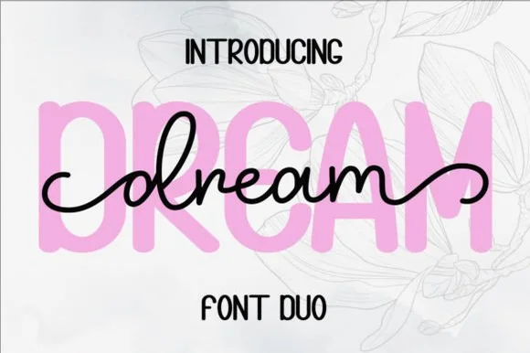
Dream Duo
Dream Duo combines a plump, soft-cornered uppercase sans-serif with a fluid monoline script that threads cleanly across wide titles.
Dream Duo pairs a chunky pastel rounded sans with a smooth monoline cursive: the sans is a fat even-width block with fully rounded corners and tight spacing for headlines, while the cursive is a soft even stroke with open loops and a gentle slant. The pair is built for a soft palette, so it loses its character when printed in a single harsh black. The monoline hairline is the finest element and it breaks first. The sans needs roughly 26 mm and the cursive 28 mm for their detail to read.
Recommended project & layout
Nursery wall name sign & sweet-sixteen acrylic backdrop — Scale the background sans to 3.5 inches tall in soft pastel and center the dark monoline script across the middle 60% height.
Before you cut or print
Weld all cursive joins before cutting vinyl, and use Cricut's Slice or a 0.07 in offset knockout if avoiding two-layer vinyl overlap.
Best paired with
Get fontPaid link
 #19
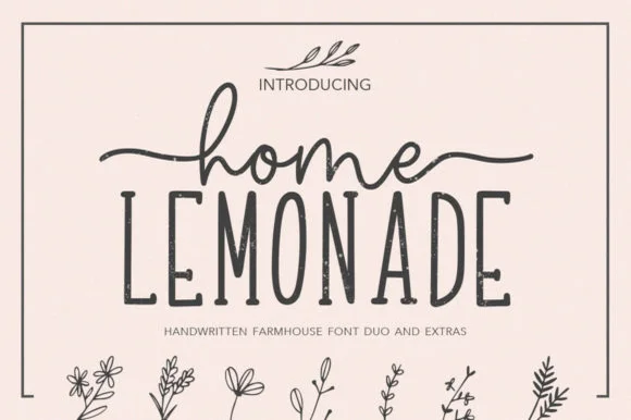
Home Lemonade
Home Lemonade is a coordinated farmhouse font duo pairing a wide-tailed monoline cursive script, a tall skinny uppercase sans, and floral doodles.
Home Lemonade is a farmhouse family of a monoline script, a tall narrow sans and a set of botanical extras: the script runs an even light stroke with wide loops for names, the sans is narrow with blunt ends for lists and prices, and the extras supply drawn lemons, leaves and jars at the same weight. All three share one palette so a stand can be built from one purchase. The script needs roughly 24 mm and the extras 20 mm for their detail to read.
Recommended project & layout
Lemonade-stand wood sign, beverage dispenser & pitcher tag — Center 1 lowercase script word with side tails directly above a wider uppercase sans word, accented by 1 botanical sprig.
Before you cut or print
Both the monoline script and skinny sans cut cleanly on Oracal 651 glass/wood vinyl at 1 inch+ scale—weld script joins first.
Best paired with
Get fontPaid link
Serifs & Slab Serifs
3 fonts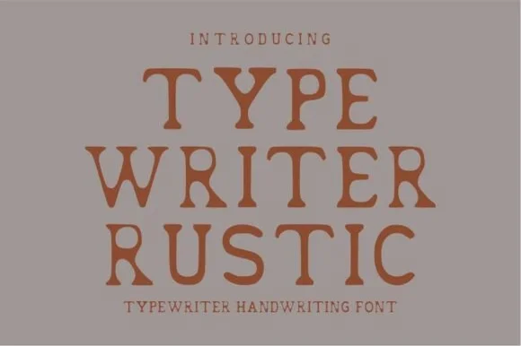 #20
Typewriter Rustic
Typewriter Rustic is a chunky, hand-stamped organic typewriter slab serif with soft ink-bleed curves built for cozy cottage and apothecary labels.
Typewriter Rustic is a chunky hand-stamped typewriter slab with wide soft-inked serifs and gently swollen stems, so a word reads as stamped onto a paper label rather than typeset. The ink bleed is baked into the contour, which means the face looks right at 14 pt and softens past a headline, and the even weight prints in one colour. It needs roughly 14 pt for the bleed edge to read, and it is best in burnt sienna on greige or in one dark ink on kraft.
Recommended project & layout
Soy-candle apothecary label, pottery stamp & linen tag — Stack 3 short centered uppercase words at 52–96 pt with generous +12 tracking over warm greige or kraft.
Before you cut or print
100% solid, smooth organic contours (zero tiny grunge specks!) cut and weed fast on Cricut vinyl, HTV, and clay stamps down to 0.55 in!
Best paired with
Get fontPaid link
 #21
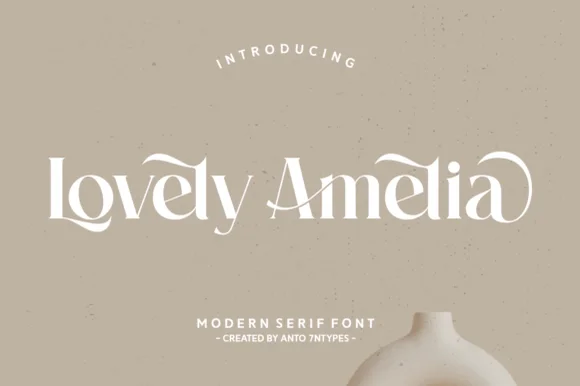
Lovely Amelia
Lovely Amelia is a soft, high-contrast modern display serif featuring sweeping canopy arches over vowels and sculpted ligatures.
Lovely Amelia is a high-contrast display serif with Art-Nouveau canopy arches that spring from the vowels and a sculpted cradle tail that runs beneath a word. The arches sit above the x-height, so the layout needs headroom, and the tail occupies its own band below the baseline. Contrast is strong, so the face wants 22 mm and up before the hairlines hold, and it is a title and invitation face rather than a text face. Its natural home is an asymmetric composition where the canopy can echo a drawn frame.
Recommended project & layout
Ceramic-studio mark, botanical skincare & boutique sign — Set 1 or 2 title-case words at 48–84 pt in warm cream or charcoal over earthy clay/sand tones.
Before you cut or print
High-contrast hairline transitions shine in print, foil, and web logos; scale vinyl above 1.75 in if cutting.
Best paired with
Get fontPaid link
 #22
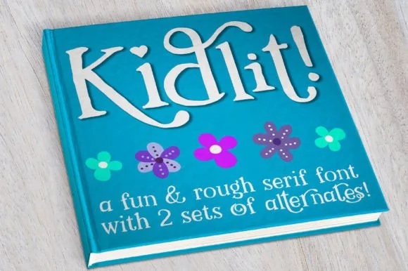
Kidlit
Kidlit is a lively hand-drawn serif with organic, slightly wiggly stems, curled ascender tops, and multi-set alternates.
Kidlit is a hand-drawn bouncy storybook serif with curled ascenders: soft bracketed stems, a small x-height, letters that hop along the baseline and ascenders that curl over like a fern. It is a children's-book face, so it wants air and one warm ink rather than a busy illustration behind it. The curls are the finest element and they close into a hook once the face is reduced. It needs roughly 26 mm for the curl and the serif to read, and it is best one dark ink on a cream ground.
Recommended project & layout
Classroom library bin labels & reading-corner banner — Set genre titles in 1.5 in mixed-case Kidlit above a smaller secondary line at 40% height, cycling alternate glyphs on repeated letters.
Before you cut or print
Sturdy stems cut cleanly on cardstock and adhesive vinyl down to 0.75 in; watch only the small detached dots on 'i' and '!' during transfer.
Best paired with
Get fontPaid link
Clean Sans & Handwritten Print
2 fonts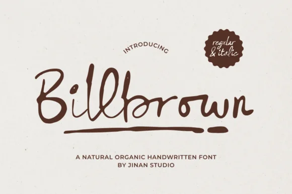 #23
Billbrown
Billbrown is a relaxed, slightly dry-edged felt-marker script family (Regular & Italic) with tall looped ascenders and hand-drawn warmth.
Billbrown is a warm textured felt-pen handwritten script in a regular and an italic: a soft broad-tip stroke with visible fibre texture along the edges, connected letters, a light slant in the regular and a steeper one in the italic. The fibre edge is the texture and it fills when the face is reversed or printed small. It needs roughly 22 mm for the fibre edge and the join to read, and it is best in one warm ink on a smooth card, or a single dark colour on kraft where the texture reads as bleed.
Recommended project & layout
Artisan coffee bag, sourdough bakery box & soap belly-band — Set brand names at 36–54 pt in espresso or olive ink on unbleached kraft paper above tracked uppercase sans notes.
Before you cut or print
Medium marker thickness cuts well on 1.25 in+ adhesive vinyl and HTV once overlapping joins ('l-l-b') are welded.
Best paired with
Get fontPaid link
 #24
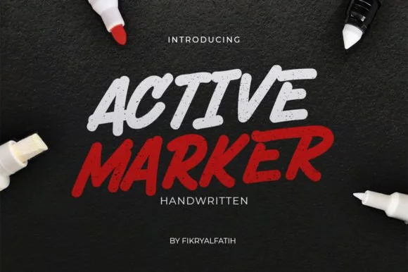
Active Marker
Active Marker captures brisk, slanted broad-tip marker lettering with organic stroke tapers and natural double-letter ligatures.
Active Marker is a slanted chisel-tip whiteboard and chalkboard marker sans: even strokes with a visible chisel angle, blunt ends that read as a marker turned in the hand, a firm slant and open counters that stay clean on a board. The chisel angle is the design and it flattens when the face is reduced. It needs roughly 20 mm for the chisel angle and the blunt end to read, and it is best in one dry-erase or chalk ink on a board, or a single dense ink on uncoated stock where the chisel edge prints as a step.
Recommended project & layout
Coffee-shop daily specials board & deli menu header — Highlight section headers ('ESPRESSO', 'FRESH BAKED') in bold white or red at 36–54 pt above clean tabular price columns.
Before you cut or print
Sturdy solid strokes cut smoothly on chalk-style matte vinyl at 0.8 in and taller with minimal weeding fuss.
Best paired with
Get fontPaid link
Practical buyer checklist
Frequently asked questions.
Key cutting, printing and pairing answers before choosing a boho, earthy & botanical typeface.
How do I keep a boho script from looking like a template?
Use the alternates. Most of these fonts ship two or three versions of common letters and ligatures for pairs such as th and ing, and swapping them breaks the repetition that makes a design look stock.
Can fine boho scripts be cut from vinyl?
At 3 inches or larger, yes. Below that, connectors narrower than 0.5 mm tear during weeding, so either enlarge the lettering or switch to print and cut for small labels.
What background colours suit an earthy palette?
Warm neutrals such as oat, clay and soft charcoal hold a brush script better than bright white, which makes organic strokes look thin. Keep contrast at accessible levels: light text on clay needs a darker shade than intuition suggests.
Do these fonts include botanical ornaments?
Some ship them as separate glyphs on private-use keys, others only as preview artwork. Check the glyph count: a font with 100 to 200 glyphs usually lacks ornaments, while 400 or more suggests they are included.
Keep exploring
Related collections & guides.
Explore adjacent maker roundups or check our practical pre-production checklists.
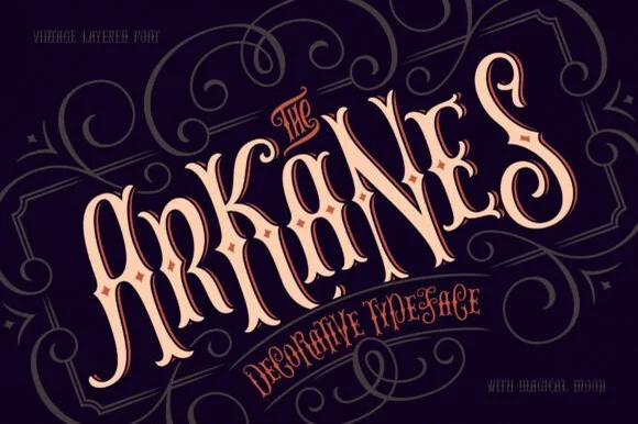
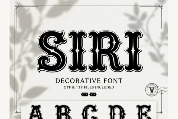
01 / Branding & Print
Soy candles, apothecary & skincare
29 curated fonts · Previews & pairings
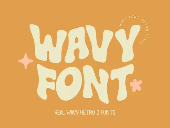
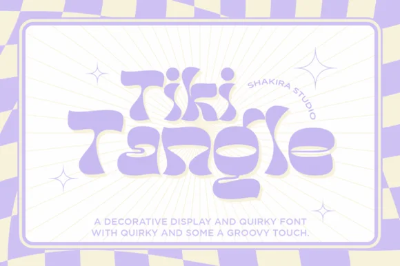
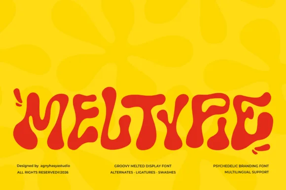
02 / Type Styles
Retro 70s & groovy
31 curated fonts · Previews & pairings

03 / Cricut & Craft
Modern farmhouse & wood signs
27 curated fonts · Previews & pairings
04 / Holidays & Seasons
Spring
25 curated fonts · Previews & pairings
Guides: Invitation font checklist · Vinyl & cutting checklist · How to pair script & sans fonts