 #1 · Best Overall
Disclosure: MakerFileHub may earn a commission from qualifying purchases via paid links on this page. How our links work.
Melting forms, Fillmore curves & flower-power bubbles
24 Best 60s & 70s Psychedelic Fonts
Psychedelic lettering is about distorted legibility: shapes that melt, swell or buckle while the word stays readable. Nesslow and Meltypie work the liquid end, Sixties Hippie and Slightly Surreal reference the Fillmore poster tradition, and Hippie in Love and Momo carry the bell-bottom and flower-power bubbles. Groovy Deluxe and Hells Bells add the swash-flame variants.
Quick verdict
Nesslow is the most usable psychedelic display for a poster, Slightly Surreal is the closest to the Fillmore tradition, and Meltypie handles the liquid look. Groovy Deluxe covers a softer seventies register.
Quick answer
Top 3 60s & 70s psychedelic & hippie picks right now.
Short on time? Start with our three highest-rated 60s & 70s psychedelic & hippie standouts before scrolling the full breakdown.
#1 · Best Overall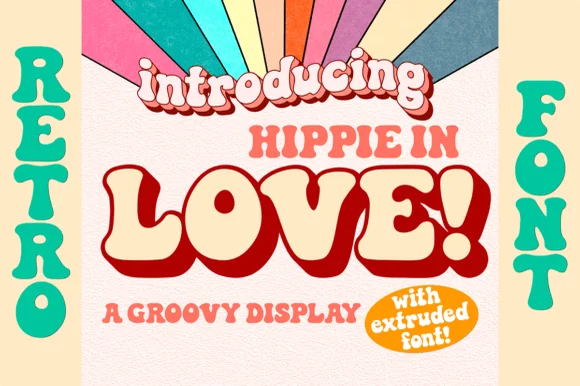 #2 · Runner-Up Pick
Hippie in Love
1970s groovy bell-bottom display with matched Extruded font
Get fontPaid link
Read review ↓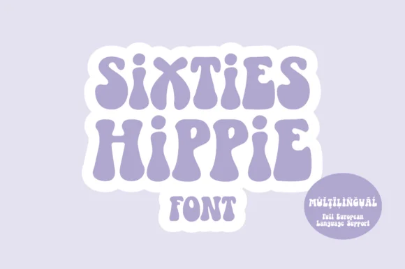 #3 · Editor's Choice
How we tested & selected these 24 fonts
We kept 24 of 140 candidates that keep the word readable while distorting it. Judged on how far the shapes can warp before the letters collapse, whether the distortion repeats obviously, and how the face holds in one colour.
Side-by-side summary
Top 5 60s & 70s psychedelic & hippie picks at a glance.
Compare specimens, OpenType/PUA traits and primary project roles side by side.
| Rank & Font | Style & File Specs | Best Project Fit | Store Listing |
|---|---|---|---|
| DisplayTrippy | Psych-rock gig poster, festival flyer & skate-deck art | Get fontPaid link | |
| DisplayGroovy | Retro Valentine sweatshirt, Galentine mug & groovy card | Get fontPaid link | |
| DisplaySixties | Die-cut laptop sticker, flower-market tote & camp tee | Get fontPaid link | |
| DisplayWavy | Retro oval bumper sticker, soda-can wrap & skate-shop badge | Get fontPaid link | |
| DisplayFunky | Sour-ale beer can, gummy-candy pouch & hot-sauce label | Get fontPaid link |
Display & Decorative Headlines
15 fonts#1 · Best OverallNesslow
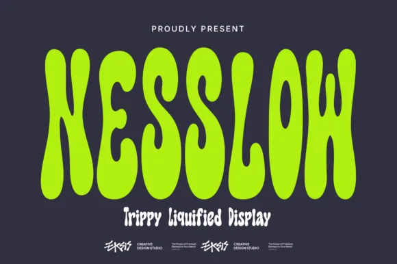
Nesslow is a tall, condensed psychedelic display typeface whose undulating vertical stems swell and pool like melting neon wax.
Nesslow is a tall condensed melting liquid-lava display: narrow stems that sag and pool at the baseline, droplets hanging off the bottoms of some letters and a smooth molten edge that reads as poured wax. The pools grow the word downward and need extra leading, and the droplets are the finest element. It needs roughly 32 mm for the droplet and the sag to read, and it is best in two flat inks on a matte ground, or one vinyl colour where the droplets become cut paths.
Recommended project & layout
Psych-rock gig poster, festival flyer & skate-deck art — Set 1 uppercase word tall across the center in acid lime, electric orange, or hot pink over matte charcoal.
Before you cut or print
Smooth, rounded blob contours with zero tiny grunge specks cut surprisingly cleanly on HTV, sticker vinyl, and skate decals!
Best paired with
Get fontPaid link
#2 · Runner-Up PickHippie in Love
Hippie in Love is a chunky 1970s retro display family bundled with a dedicated Extruded shadow font for instant 3D poster lettering.
Hippie in Love is a nineteen-seventies bell-bottom display with a matched extruded cut: soft flared stems, a rounded shoulder, a small kick at the foot and a second shape that sits behind the letter as a solid extruded depth. The extrude is fixed to the skeleton, so the two cuts must keep the same spacing. It needs roughly 28 mm for the flare and the extrude edge to read, and it is best in two warm inks on cream, or one ink with the extrude left as bare paper on coloured card.
Recommended project & layout
Retro Valentine sweatshirt, Galentine mug & groovy card — Type your phrase in the Extruded font in deep maroon or chocolate brown, then layer the Regular font on top in warm cream.
Before you cut or print
Use the solid Regular font alone for super-clean single-layer HTV weeding, or Print-Then-Cut/DTF for two-tone 3D shirts.
Best paired with
Get fontPaid link
#3 · Editor's ChoiceSixties Hippie
Sixties Hippie is a warm, bottom-heavy 1960s flower-power display font with pinched waists, plump teardrop feet, and full European multilingual support.
Sixties Hippie is a heavy nineteen-sixties flower-power poster face drawn in the Fillmore manner: bulbous stems that swell and narrow, letters interlocked so one overhangs the next, and small flower cuts set into the counters. The interlock grows a word wide and the flower cuts close first when the face shrinks. It needs roughly 34 mm for the flower and the swell to read, and it is best in two warm inks on cream, or one ink plus paper where the flowers read as knockouts on a tinted ground.
Recommended project & layout
Die-cut laptop sticker, flower-market tote & camp tee — Stack 2 or 3 centered uppercase words in lavender, mustard, or terracotta inside a 0.15 in white sticker contour.
Before you cut or print
Broad solid fills with zero sharp spurs make weeding HTV, puff vinyl, and glossy Oracal 651 quick and snag-free.
Best paired with
Get fontPaid link
 #4 · Top Maker Utility
Cosmed Retro
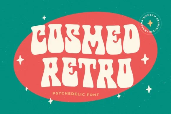
Cosmed Retro is a thick, wavy psychedelic display typeface with liquid bottom swells and tiny keyhole counters built for bold 60s/70s badges.
Cosmed Retro is a wavy psychedelic display built from blob letters: each stem swells and narrows in a wave, the counters are reduced to slits and the whole word rides an undulating baseline. The wave grows the word vertically and the slits close first when the face shrinks. It needs roughly 30 mm for the wave and the slit counter to read, and it is best in two warm inks on cream, or one ink plus paper where the slits read as knockouts.
Recommended project & layout
Retro oval bumper sticker, soda-can wrap & skate-shop badge — Set 2 uppercase words centered inside an angled oval badge, accented with tiny four-point retro sparkles.
Before you cut or print
Outer silhouettes cut fast on vinyl and HTV; scale above 1.1 in so the tiny droplet counters inside 'O' and 'R' stay open.
Best paired with
Get fontPaid link
 #5 · Standout Silhouette
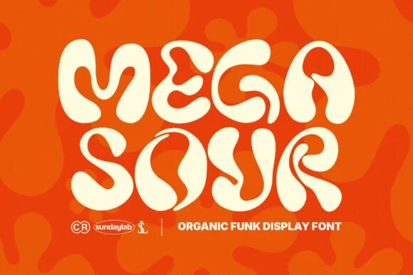
Megasour
Megasour is an exuberant organic funk display typeface with swirling teardrop terminals, liquid S-curves, and energetic 70s album-cover rhythm.
Megasour is a swirling organic display built from liquid-groove shapes: the stems curve into soft loops, the bowls melt into one another and the counters open as long liquid slits rather than closed holes. The swirl grows the word vertically and horizontally, so a tight box clips it, and the slits close first when the face is small. It needs roughly 34 mm for the swirl and the slit to read, and it is best in one saturated ink on cream, or a two-colour build where a lighter tone runs inside the grooves.
Recommended project & layout
Sour-ale beer can, gummy-candy pouch & hot-sauce label — Stack short 4-letter syllables ('MEGA / SOUR', 'WILD / TART') edge-to-edge across bright citrus packaging.
Before you cut or print
Smooth, rounded single-layer vector curves cut cleanly on glossy label vinyl, tote HTV, and window decals down to 0.9 in.
Best paired with
Get fontPaid link
 #6
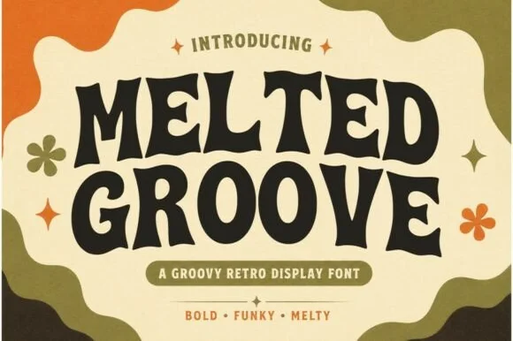
Melted Groove
Melted Groove is a bold, readable 1970s retro display font blending soft flared serifs with gentle wavy stem movement.
Melted Groove is a nineteen-seventies bell-bottom serif display in which the stems flare at the foot and the baseline undulates like a wave: soft bracketed serifs that sweep outward, a heavy even weight and a rise and dip that carries across the whole word. The wave grows the word vertically and the flare widens the base, so a centred line needs clearance on all sides. It needs roughly 30 mm for the flare and the undulation to read, and it is best in two warm inks on cream, or one saturated colour on white where the sweeping base stays graphic.
Recommended project & layout
Farmers-market banner, coffee-shop tote & candle label — Stack 2 centered words at 54–88 pt in espresso brown over cream, flanked by small retro flower icons.
Before you cut or print
Generous open counters and smooth rounded corners make Melted Groove super easy to weed on HTV, wood stencils, and cup vinyl.
Best paired with
Get fontPaid link
 #7
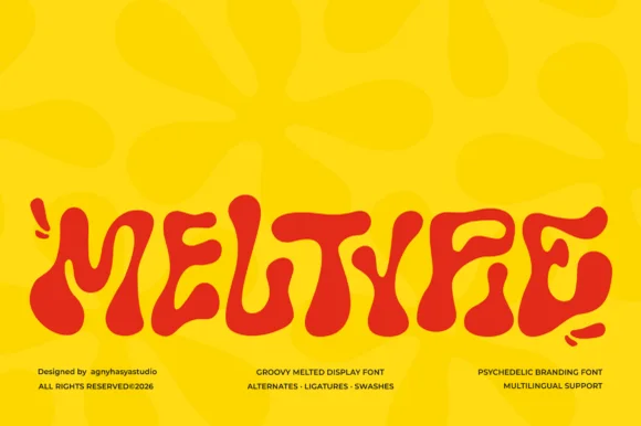
Meltypie
Meltypie is a bold, bottom-heavy psychedelic display typeface with liquid, syrup-like curves that swell and drip along the baseline.
Meltypie is a liquid melted psychedelic groovy display: letters drawn as soft blobs with stretched joins, drips hanging from the baseline and round terminals that sag under their own weight. It is the lettering of a seventies poster, and the drips are what make the word look poured rather than written. The drips are the finest element and they merge into neighbours as soon as the face is reduced. It needs roughly 40 mm for the drip and the blob to read, and it is best in two flat inks on coated stock where the edge stays crisp.
Recommended project & layout
Artisan pizza box, ice-cream pint & cookie-shop logo — Set a single 5-to-9-letter brand or treat name large across the center panel in high-contrast red, chocolate, or butter yellow, paired with a crisp grotesk subline.
Before you cut or print
Rounded, bulbous contours have no fragile sharp spurs, making Meltypie surprisingly easy to cut on bold sign vinyl and DTF shirt transfers.
Best paired with
Get fontPaid link
 #8
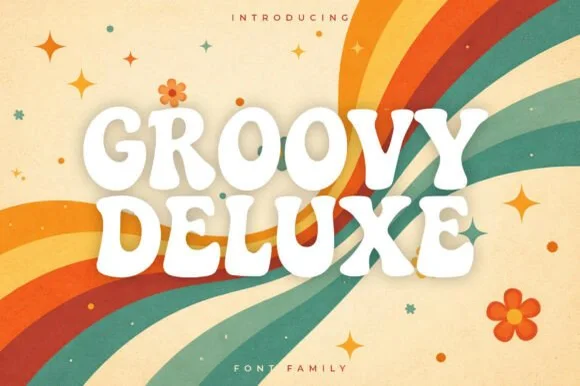
Groovy Deluxe
Groovy Deluxe is a clean, upbeat 1970s retro display font family with softly pinched waists, plump rounded feet, and clear open counters.
Groovy Deluxe is a soft nineteen-seventies poster family with several weights and a swash set: rounded balloon stems, a gentle italic lean, wide bowls and swashes that curl off the caps. The rounded weight keeps the face friendly rather than aggressive, and the swashes extend the word at both ends. It needs roughly 26 mm for the rounded bowl and the swash to read, and it is best in two warm inks on cream, or one saturated colour on white where the balloon stems stay solid.
Recommended project & layout
Retro rainbow beach towel, roller-skate tee & tumbler wrap — Set 2 centered uppercase lines in crisp white or cream with a subtle tan offset shadow over diagonal retro stripes.
Before you cut or print
Clean, solid vector contours weed quickly on HTV, puff vinyl, and glossy glass-can decals at 0.7 in+.
Best paired with
Get fontPaid link
 #9
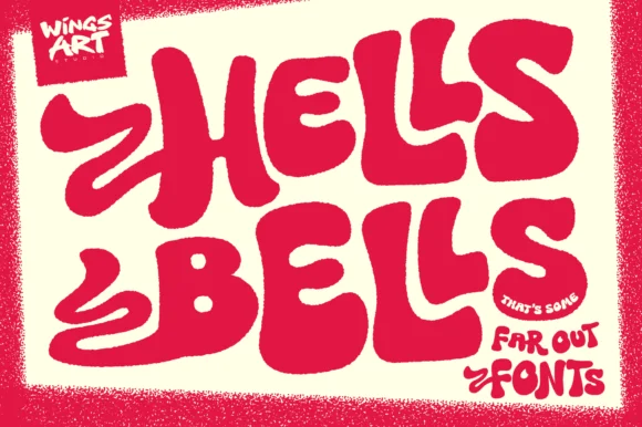
Hells Bells
Hells Bells is a flamboyant 1970s poster display typeface with sweeping bell-bottom curves, flame-like left swashes, and heavy disco swagger.
Hells Bells is an exuberant nineteen-seventies bell-bottom display with swash flames: heavy rounded strokes that flare into wide trouser legs at the baseline, flame-shaped swashes curling off the caps and a warm irregular rhythm that reads as a concert poster. The flares widen a word considerably and the flame tips are the finest element. It needs roughly 34 mm for the flame tip and the flare to read, and it is best in two warm inks on cream, or one ink plus paper where the flames read as knockouts on a tinted ground.
Recommended project & layout
70s rock tribute poster, roller-disco flyer & vinyl jacket — Tilt two stacked words upward 5 degrees in hot red, magenta, or burnt orange on cream paper.
Before you cut or print
Broad solid fills cut cleanly on large tee HTV and window vinyl—peel gently along the narrower tips of the side swash ribbons.
Best paired with
Get fontPaid link
 #10
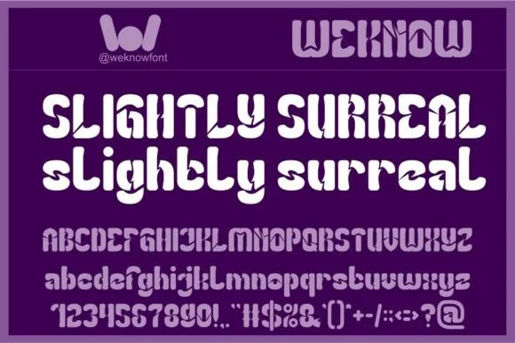
Slightly Surreal
Slightly Surreal is a complete geometric-psychedelic display font (uppercase, lowercase, 0–9 & full symbols) blending 1960s mod curves with crisp modern spacing.
Slightly Surreal is a geometric psychedelic display in full case with numerals and symbols, whose bowls are deliberately top-heavy or bottom-heavy and whose stems carry bifurcated notches, so a word reads as a 1968 Fillmore poster rather than a modern geometric. The modulation is the design, which means the face needs size for the imbalance to read as intentional, and the numbers let it set a date. It needs roughly 28 mm for the notches to hold, and it is best in one bright ink on a deep ground or two colours on a pale one.
Recommended project & layout
Indie-psych gig poster, vinyl record sleeve & zine — Pair all-caps headers (68 pt) with groovy lowercase subheaders (48 pt) in high-contrast lilac, orange, or cream over deep purple.
Before you cut or print
100% clean, crisp solid vector shapes cut and weed smoothly on Cricut HTV and vinyl down to 0.7 inches!
Best paired with
Get fontPaid link
 #11
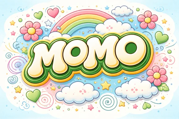
Momo
Momo is a plush, groovy retro bubble display font built for multi-ringed 1970s rainbow outlines, daisy illustrations, and puff-print apparel.
Momo is a plump retro bubble display with inflated round bowls, near-circular counters and a heavy, even weight that was drawn to carry concentric rainbow contours. The letters sit wide and low, so a word becomes a stack of soft pebbles rather than a linear string, and the tight default spacing lets a designer nest outlines without gaps collapsing. Because the shapes are so simple, the face tolerates multi-colour puff printing and thick keylines that would destroy a more detailed alphabet.
Recommended project & layout
'ONE GROOVY BABY' / daisy birthday banner, shirt & mug — Wave or arch 1 uppercase name (+12%), add green + mustard + white concentric offsets, and surround with daisies.
Before you cut or print
100% smooth solid bubble letters cut and layer cleanly in Cricut HTV, cardstock, and Print-Then-Cut stickers!
Best paired with
Get fontPaid link
 #12
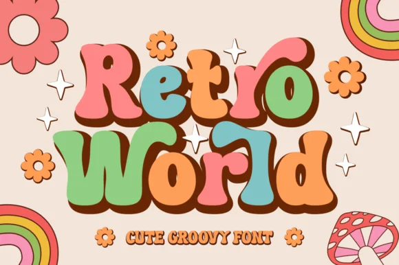
Retro World
Retro World is a curvy, bottom-heavy 1970s groovy display typeface with curled swash ears, teardrop lobes, and sunny flower-child bounce.
Retro World is a plump nineteen-seventies psychedelic bubble display: fat rounded letters built from overlapping flower petals, a wobbling baseline and a soft outline that separates the bubbles from the ground. The petals close the counters early and the outline is the finest element. It needs roughly 32 mm for the petal edge and the outline to read, and it is best in two warm inks on cream, or one burnt orange on white where the petal edges stay open.
Recommended project & layout
Groovy summer-camp tee, iced-coffee glass wrap & tote — Color individual letters in alternating muted retro tones (terracotta, sage, mustard, dusty pink) backed by a unified dark brown shadow.
Before you cut or print
Smooth, generous vector curves weed fast and cleanly on permanent cup vinyl and HTV down to 0.75 inches.
Best paired with
Get fontPaid link
 #13
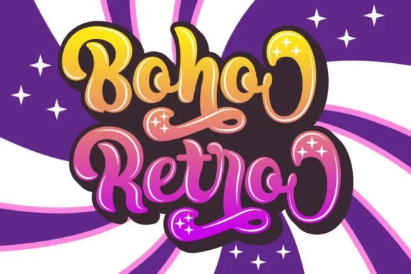
Boho Retro
Boho Retro is a plump, heavy-looped 1970s groovy display script with curled swash caps and pillowy connected lowercase bowls.
Boho Retro is a swirled nineteen-seventies psychedelic bubble script-display: fat rounded letters that swell at the waist, joins drawn as spirals and terminals that curl back into the letter like smoke. It is a poster face, so it wants size, two flat inks and a pale ground rather than a busy photograph. The spirals are the finest element and they fill into solid blobs as soon as the face is reduced. It needs roughly 44 mm for the spiral and the swell to read, and it is best two warm flat inks on a light stock.
Recommended project & layout
Retro festival ringer tee & iced-coffee glass wrap — Stack a two-word phrase at a slight upward 6-degree angle and add a contoured offset shadow layer in Cricut or Illustrator if you want the sticker look.
Before you cut or print
Weld connected lowercase letters before cutting vinyl, and check the tight interior spiral holes inside 'B', 'o', and 'e' when weeding.
Best paired with
Get fontPaid link
 #14
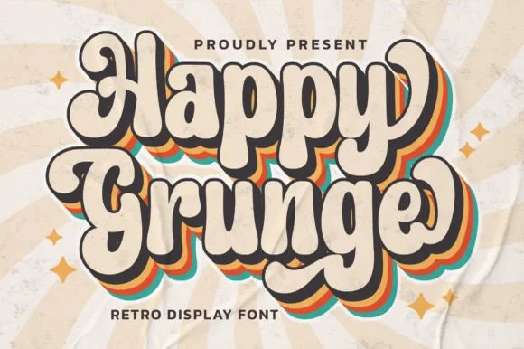
Happy Grunge
Happy Grunge is a clean, upbeat 1970s groovy bubble display font—smooth and rounded rather than distressed—with teardrop bowls and dancing stems.
Happy Grunge is a bouncy nineteen-seventies groovy soft-bubble display: fat rounded letters with a warm wobble across the baseline, a soft outline that separates the bubbles from a busy ground and a small heart or star tucked into one counter. The wobble grows the word vertically and the tucked shape closes first. It needs roughly 30 mm for the tucked shape and the outline to read, and it is best in two warm inks on cream, or one ink plus paper where the outline reads as a soft edge.
Recommended project & layout
Retro sunshine tote, festival sticker & kids' graphic tee — Duplicate 3 offset background layers in mustard, burnt orange, and teal behind cream foreground type for the classic 70s stack.
Before you cut or print
Solid vector edges weed smoothly down to 0.75 in; just pop out the small enclosed counters inside 'a', 'p', 'g', and 'e'.
Best paired with
Get fontPaid link
 #15
Wavy Retro
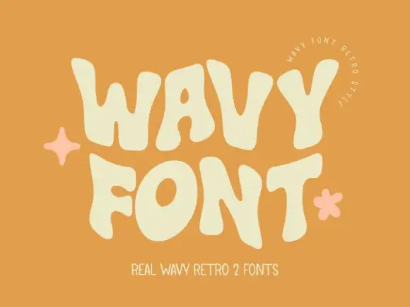
Wavy Retro shows thick letters with curved outer edges and uneven tops, where the W spreads broadly, the O tilts and the T carries an exaggerated rightward arm, and the cream title sits on orange with almost no additional decoration.
The strokes stay thick, the sides bulge, the tops rise unevenly and the arms stretch sideways. That wave is the character: the word reads as a seventies sign rather than a straight cap row, which is why the sample keeps the type alone on orange. The cover advertises two fonts while only one direction is shown, so check the styles you hold, keep 44 pt so the bulges stay distinct and test the W against a long word. The bulges are the detail: below about 30 pt the swollen sides merge with the neighbouring letter and the row prints as a chain of bars. Keep the face at 44 pt, test the W against the longest word in the title, and check the second advertised style before you build a layout around it.
Recommended project & layout
A summer workshop poster — Use two roomy rows on a flat contrasting field with a plain date block.
Before you cut or print
Check row spacing around the tallest bulges and verify the chosen member.
Best paired with
Get fontPaid link
Serifs & Slab Serifs
7 fonts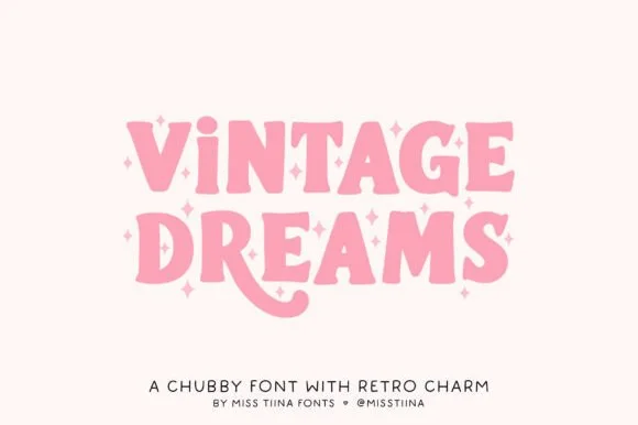 #16
Vintage Dreams
Vintage Dreams is a lovable, chubby 1970s display serif combining soft Cooper-Black curves, sparkle-star 'i' dots, and a swooping 'R' tail!
Vintage Dreams is a chubby nineteen-seventies Cooper-inspired serif with groovy swashes: fat rounded serifs, a soft bulbous weight and curled swashes that roll off the caps and the descenders, with a warm irregular baseline. The swashes widen the word considerably and the bulbs close the counters early. It needs roughly 30 mm for the bulb and the swash to read, and it is best in two warm inks on cream, or one burnt orange on white where the swash reads as a drawn line.
Recommended project & layout
Groovy iced-coffee glass wrap, retro sweatshirt & sticker — Stack 2 words at 60–110 pt, swapping uppercase 'I' for lowercase 'i' to trigger the cute star dot!
Before you cut or print
100% smooth, plump solid shapes cut and weed in seconds on Cricut Oracal 651, puff HTV, and cardstock down to 0.7 inches!
Best paired with
Get fontPaid link
 #17
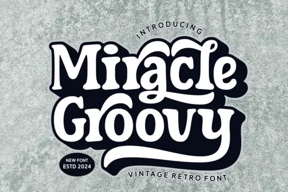
Miracle Groovy
Miracle Groovy shows weighty rounded forms with small sharp serif tips, where the a and the lower y extend into long sweeping tails that visually bind two rows together, and a heavy dark offset surrounds the white title on a textured pale field.
The bodies stay weighty and round, the serif tips stay small, two letters grow tails and the offset repeats the silhouette behind. That binding tail is the character: the second row hangs off the first rather than sitting beneath it, which is why the sample shows one dense lockup. Only one phrase is shown, so test your own wording for joins, keep 36 pt and allow 26 mm beneath the sweeps for whatever comes next. The binding tail is drawn for one phrase only: a different word loses the join, so test your wording first and allow 26 mm beneath the sweeps for whatever sits under them.
Recommended project & layout
A retro record-shop name study — Try flat lettering before a restrained offset, leaving a clear lower margin.
Before you cut or print
Verify long-tail alternates and name rights.
Best paired with
Get fontPaid link
 #18
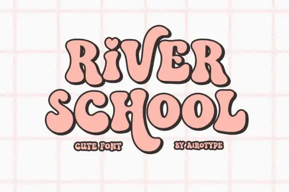
River School
River School shows soft heavy serif-like forms with curved endings, where a heart-shaped dot and a long descending stroke interrupt an otherwise compact two-line shape.
The strokes stay heavy and round, the serifs soften into curves, the dot opens as a small heart and one stroke drops far below the baseline. That heart dot is the character: a retro face gains a single romantic mark without extra artwork, which is why the sample keeps two short rows close together. The long tail crosses the space between the lines, so keep 20 mm of clear ground beneath the descender and verify that the heart is a character rather than a cover addition.
Recommended project & layout
A class welcome card — Leave space under the title for long tails.
Before you cut or print
Confirm the heart-dot option if needed.
Best paired with
Get fontPaid link
 #19
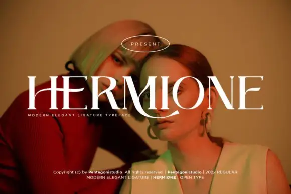
Hermione Modern Serif
Hermione is a modern elegant serif in caps with very fine hairlines, tall proportions and a set of display ligatures, shown over an editorial portrait and set with a slight arch.
HERMIONE spans the card in white over a close portrait in warm light, and the letters are tall and narrow with hairlines at the joins and sharp wedge serifs; the I and the O are drawn to touch, and the custom ligatures give the word a rhythm that a standard setting would not have. The baseline lifts slightly across the centre, which is a display treatment rather than a feature of the font, and a caption at the foot names the family and credits the foundry. The sample is a fashion layout: type over a photograph, wide spacing in small caps, one ornament. What it tells a buyer is that the face is for titles and mastheads at a large size, and that the hairlines need a good press or a screen, never a cheap photocopy.
Recommended project & layout
A portrait-series opener — Place the capitals across a pale full-width panel with the subject's name and byline in plain small text below the left edge.
Before you cut or print
Verify the actual phrase, ligatures and rights; the specimen does not prove automatic decorative joins.
Best paired with
Get fontPaid link
 #20
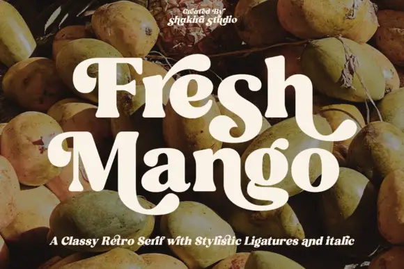
Fresh Mango
Fresh Mango shows cream mixed-case letters with thick soft strokes and narrow internal counters over a fruit photograph, where the initial F curls at its upper left, the h ends in an outward hook and the M sweeps into a large low curve that runs under the following letters.
The strokes stay thick, the counters squeeze narrow, the terminals curl soft and one letter drops a wide low curve. That narrow counter is the character: the face reads as a seventies food label rather than a book serif, which is why the sample sets two short rows over photography. The cover notes stylistic ligatures and an italic, so check that your file carries them before planning a joined pair. Keep 40 pt so the counters stay open, allow 20 mm beneath the M curve and print on a light stock where the cream letters hold.
Recommended project & layout
A fruit-shop label study — Test flat lettering with plain ingredient and quantity information.
Before you cut or print
Check name rights and exact alternate availability.
Best paired with
Get fontPaid link
 #21
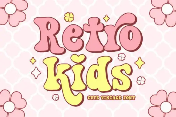
Retro Kids
Retro Kids uses rounded heavy serif-like forms with uneven widths, where the i takes a heart for its dot, the k drops a long curved leg under the row, the two words sit in pink and yellow with a thick outline and the cover fills the field with outlined daisies.
The strokes stay heavy and soft, the feet round, the widths shift and one letter borrows a heart for a dot while another leg curves far below. That heart dot is the character, because it turns a plain vintage face into a children's mark with a single gesture. The daisies and stars are cover artwork. The source notes PUA-encoded extras and stylistic alternates, so check how the heart is reached and test the long k leg against your bottom margin before setting a two-row block.
Recommended project & layout
A playful birthday front — Leave space below the long letter leg.
Before you cut or print
Verify available alternates for the actual words.
Best paired with
Get fontPaid link
 #22
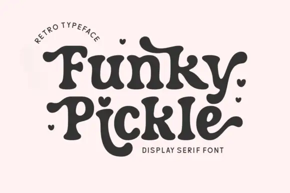
Funky Pickle
Funky Pickle is a retro display serif in which the stems swell, the terminals turn into bulbs and the arms curl, so a two-word title reads as a 1970s record sleeve rather than as a modern serif.
The F curls its arm into a bulb, the u drops a round tail, the n keeps a soft shoulder, the k turns two fat diagonals, the y swells into a hooked descender and the e closes a heavy eye, all at a moderate weight with bulbous serifs and a warm, irregular rhythm. The bulb terminals are the character: they carry the period feel without any gradient or shadow, which is why the sample sets two words in one flat colour on a pale ground. Because the strokes are round, the face holds at 26 pt and cuts cleanly, and it prints happily on a screen. The pale ground, the small arc of caps above, the tiny hearts and the caption below are presentation; the dark display words are the face.
Recommended project & layout
A friendship card heading — Leave space above and below the rows for curled extensions.
Before you cut or print
Verify heart dots and actual joins before printing.
Best paired with
Get fontPaid link
Matched Font Duos & Packs
2 fonts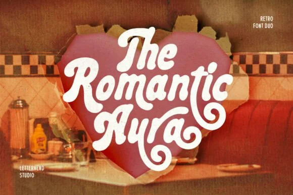 #23
Romantic Aura Duo
Romantic Aura Duo pairs a thick, velvety 1970s swash script with a clean companion voice for nostalgic love notes and merch.
Romantic Aura Duo pairs a nineteen-seventies swashed retro script with a rounded sans: the script runs a high-contrast stroke with wide swelling swashes that lift above and below the line, while the sans is a soft rounded block for details and lists. The pair is a period look, so it works best in two warm flat inks on a light ground rather than in photographic tints. The swash thins are the finest element and they break first. The script needs roughly 32 mm and the sans 20 mm for their detail to read.
Recommended project & layout
Retro Valentine sweatshirt, mug wrap & galentine card — Stack 2 to 3 centered words tightly inside a heart or arch silhouette so rising ascenders nest into the gaps of the line above.
Before you cut or print
Weld all overlapping script letters before cutting HTV, and keep total lockup width at 3.5 in+ so tight inner 'e' and 'a' counters weed cleanly.
Best paired with
Get fontPaid link
 #24
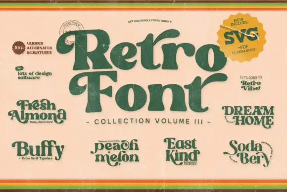
Retro Groovy Bundle
Retro Groovy Bundle presents several named retro samples around a large curved serif title, with heavy green lettering on a warm cream cover, small name plates reading Fresh Almond, Buffy, Peach Melon, East Kind, Dream Home and Soda Berry, and a corner badge that advertises SVG, PDF and EPS files.
The main title stays heavy with rounded serifs and a deep curve on its first letter, while the six smaller names share the same seventies weight but differ in width and swash. That range is the character: the bundle is sold on variety, so a buyer picks family members rather than one face. The badge and the format marks are cover information, not proof of what installs on your machine. Check the actual file list before planning a mixed headline, keep 34 pt for the narrow members and test two members side by side before pairing them.
Recommended project & layout
A small label moodboard — Compare individual member previews before selecting one label face.
Before you cut or print
Confirm which member and licence the listing actually includes.
Best paired with
Get fontPaid link
Practical buyer checklist
Frequently asked questions.
Key cutting, printing and pairing answers before choosing a 60s & 70s psychedelic & hippie typeface.
How do I keep a 60s poster readable?
Limit the psychedelic treatment to the band name or the main word, keep everything else in a plain sans, and leave generous margins. The era's posters were readable at a glance from across a street.
Can psychedelic fonts be cut from vinyl?
Only the heavier bubble and bell-bottom faces, at 2 inches or more. Melting and swirling designs create thin waists that tear during weeding, so print those designs instead.
What is the difference between 60s psychedelic and 70s groovy?
Sixties psychedelia distorts geometry and often warps the baseline, while seventies groovy swells the shapes and flattens the baseline. The two reference different decades and different music scenes.
Do these fonts work for a modern brand?
As an accent, yes. Pair a psychedelic display with a neutral sans and a restrained palette, and keep it on one surface so it reads as a deliberate reference rather than as the whole identity.
Keep exploring
Related collections & guides.
Explore adjacent maker roundups or check our practical pre-production checklists.
01 / Type Styles
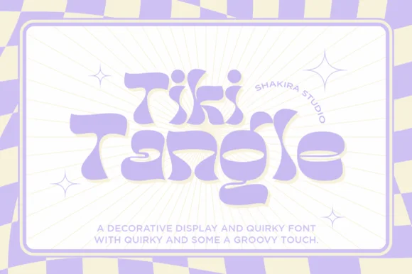
Retro 70s & groovy
31 curated fonts · Previews & pairings
02 / Type Styles
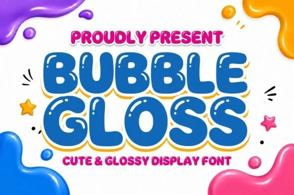
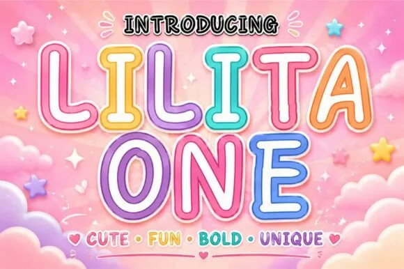
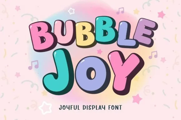
Bubble & puffy 3D lettering
30 curated fonts · Previews & pairings

03 / Type Styles
Boho, earthy & botanical
24 curated fonts · Previews & pairings



04 / Cricut & Craft
T-shirts, hoodies & HTV apparel
33 curated fonts · Previews & pairings
Guides: Invitation font checklist · Vinyl & cutting checklist · How to pair script & sans fonts