Neutral Sans Workhorse

Aura Bella + Modern Limited
Lets Aura Bella own the focal silhouette while handling secondary copy, sizing and subheads cleanly.
Inspect Modern Limited specimenDisclosure: MakerFileHub may earn a commission from qualifying purchases via paid links on this page. How our links work.
Fine contrast capitals and rounded lowercase with an extended sweeping R leg
Aura Bella draws an extremely light display sans, its strokes reduced to hairlines with a few heavy flares, its capitals tall, wide-spaced and set over a dark photograph.
Paid link
Get this fontProject & layout blueprintsAt-a-glance maker compatibility
Sturdy stroke walls and open counters weed cleanly on adhesive vinyl, HTV apparel film, and cut cardstock.
Visual anatomy & craft review
AURA over BELLO fills the frame in cream, the letters so light that they read as pencil lines against the portrait behind them, with small diamond sparkles between the rows. The bowls are almost rectangular, the A a narrow triangle and the B built from two tall lobes, and the spacing is wide enough that each letter stands alone. Corner notes name the foundry, the year and the classification in small tracked capitals. Hairlines are the whole design and also its fragility: printed small, on rough stock or in low resolution, the strokes break up and the word stops reading.
Fine contrast capitals and rounded lowercase with an extended sweeping R leg
Two-font hierarchy recipes
Tested contrast partners — pairing Aura Bella with grounded secondary typography.
Aura Bella + Modern Limited
Lets Aura Bella own the focal silhouette while handling secondary copy, sizing and subheads cleanly.
Inspect Modern Limited specimen
Aura Bella + Medvilea Editorial
Grounds bold display lettering with classic typographic authority on posters, badges and apparel.
Inspect Medvilea Editorial specimenPractical applications
Concrete hierarchy, scale and production guidance tailored to Aura Bella’s stroke geometry.
The hairline capitals give a cover its couture tone, and the wide spacing lets a photograph stay visible between the letters.
Hierarchy & layout recipe
Print a 230 by 300 mm cover: set the title at 100 pt with 8 mm of tracking, keep 26 mm of clear ground beneath before the issue line at 10 pt, and keep 20 mm of margin from the trim.
Pre-production check
Hairlines vanish over light areas; check the proof against your own photograph first. Have the printer send a physical sample first.
The light wide capitals read as luxury on a woven clothing tag, and the plain forms let the fabric carry the collection itself.
Hierarchy & layout recipe
Print a 45 by 85 mm tag: set the label at 11 pt with 2 mm of tracking, keep 6 mm of clear ground beneath before the season at 5 pt, and keep 5 mm from the lettering to the punch hole.
Pre-production check
The hairlines break under 12 pt; check the printed tag before a full run. Request a proof on the actual stock before signing off.
The extreme lightness gives a formal invitation its restraint, and the wide spacing keeps a long pair of names calm on the card.
Hierarchy & layout recipe
Print a 130 by 180 mm invitation: set the names at 22 pt with 3 mm of tracking, keep 18 mm of clear ground beneath before the venue at 9 pt, and keep 16 mm of margin on each side of the card.
Pre-production check
Fine strokes need letterpress or foil; check a printed sample before the suite. Order one sample before committing to the run.
Technical & licence verification
Confirm included OTF/TTF/WOFF formats, full glyph tables and licence coverage on the live store page before batch production.
Closest visual alternatives
Matched across letterform anatomy, stroke behaviour and craft applications.
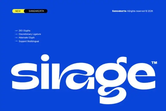
Wide display lowercase with flowing joints
Sirage is a wide display in white on a saturated blue: lowercase with a flowing a construction that sweeps through the bowl, an extended double-bowl g, thick even strokes and round terminals, set as one large word with a small badge at the top left and a list of features beside it.
Ideas for this font
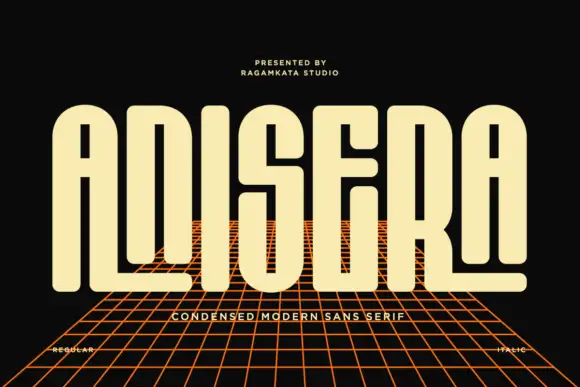
Tall rounded capitals with long slots and extended baseline arms
Anisera draws a very tall condensed sans, its shoulders squared, its tops flat and its counters reduced to narrow slots, and sets it over a perspective grid on black.

Bold sans with ligature alternates
Think Loved is a bold sans in orange on a pale ground: wide geometric caps with flat terminals, a very high waist and tight spacing, with a ligature that fuses two letters into a single drawn shape, set in two lines with a small tracked note beneath naming the alternate.
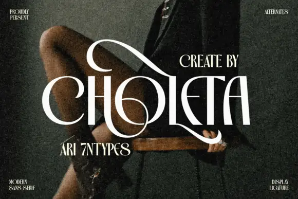
Contrasting capitals woven through a large upper loop and low circular sweep
Choleta builds tall white capitals and then lets thin strokes cross through them, so the counters open into slashes and the whole line reads as one sculpted ligature rather than six separate letters.
Ideas for this font
Same independent foundry
Allow optional Google Analytics to measure visits and catalogue actions. Your search words and notes are not included. Privacy & storage