 #1 · Best Overall
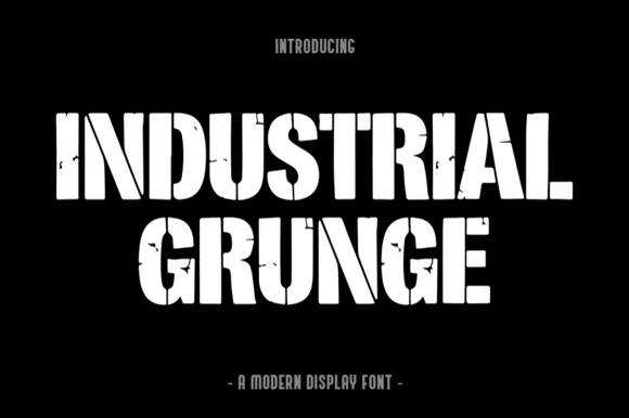
Industrial Grunge
Heavy stencil-slashed & weathered steel industrial block
Get fontPaid link
Read review ↓Disclosure: MakerFileHub may earn a commission from qualifying purchases via paid links on this page. How our links work.
Asphalt texture, dry stamp & photocopied edges
Grunge type is a print artefact: the texture came from bad photocopies, worn plates and scanned paper, and the good digital versions reproduce that wear inside the glyph. Industrial Grunge and Distressed Black carry asphalt and steel textures, Nafa Grunge and Heavy Grunge keep a scuffed sign-painter edge, and Boom Grunge and Great Grit work the stamped, heavy end. Letterpress and Varsity Grunge bridge into woodblock and athletic.
Quick verdict
Industrial Grunge is the strongest for band merch, Nafa Grunge suits a worn sign-painter look, and Letterpress covers the woodblock poster case. Great Grit is the pick for a wide stamped slab.
Quick answer
Short on time? Start with our three highest-rated 90s grunge, distressed & rock standouts before scrolling the full breakdown.
#1 · Best OverallHeavy stencil-slashed & weathered steel industrial block
 #2 · Runner-Up Pick
 #3 · Editor's Choice
We kept 27 of 275 candidates whose texture follows the stroke rather than sitting over it. Judged on how the wear reads at 300 dpi print, whether the distress repeats obviously, and how much survives on a shirt after ten washes.
Side-by-side summary
Compare specimens, OpenType/PUA traits and primary project roles side by side.
| Rank & Font | Style & File Specs | Best Project Fit | Store Listing |
|---|---|---|---|
| DisplayForged-steel | Garage gym banner, welding/fabrication shirt & tool crate | Get fontPaid link | |
| DisplayRugged | Workwear hoodie HTV, brewery coaster & hardware sign | Get fontPaid link | |
| DisplaySpeckled | Streetwear graphic tee, skate-shop hoodie & energy pouch | Get fontPaid link | |
| DisplayFile formats | Skatewear chest graphic, punk sticker & zine header | Get fontPaid link | |
| DisplayPUA encoded | Retro sunshine tote, festival sticker & kids' graphic tee | Get fontPaid link |
#1 · Best OverallIndustrial Grunge is a heavy, blocky industrial display font combining vertical stencil cuts with chipped concrete/steel edge wear.
Industrial Grunge is a heavy stencil-slashed block with a weathered steel surface: fat square stems, cut-through stencil bridges across the closed letters, chipped edges and patches where the plate appears to have rusted through. The bridges are structural for cutting and the chips are the finest element, so both disappear when the face is reversed. It needs roughly 28 mm for the bridge and the chip to read, and it is best in one dense ink on uncoated stock, or a single white on a dark ground where the bridges print as cut-throughs.
Garage gym banner, welding/fabrication shirt & tool crate — Stack 2 centered all-caps lines at 60–110 pt in stark white, hazard yellow, or rust orange over matte black.
Because wear is mostly along outer edges and stencil slits (not hundreds of tiny pinholes), it even cuts on 1.5 in+ stencil/HTV vinyl!
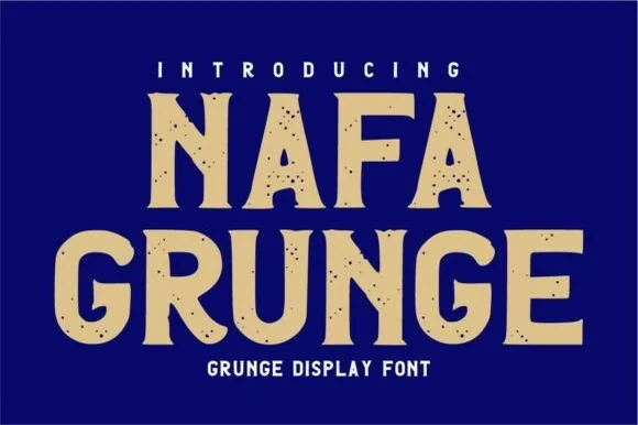
#2 · Runner-Up PickNafa Grunge is a bold vintage sans-display font pairing subtly notched outer contours with clean, solid interiors.
Nafa Grunge is a bold vintage sans display with subtly notched outer contours, hand-chipped edges and clean solid interiors, so a word reads as sign-painter lettering with a chipped edge rather than as a distressed texture. The notches sit only on the contour, which keeps the counters clean at 20 mm, and the heavy weight holds in one ink. It needs roughly 26 mm for the chipping to read, and it is best in sand tan on cobalt or in one dark ink on board.
Workwear hoodie HTV, brewery coaster & hardware sign — Stack 2 centered uppercase words at 56–100 pt in warm tan or cream over cobalt navy or barn red.
Solid interiors make this one of the most cutter-friendly vintage grunge fonts—weeds cleanly down to 1 inch!
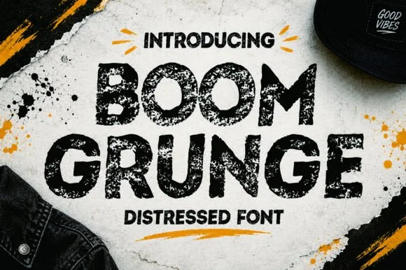
#3 · Editor's ChoiceBoom Grunge is a wide, chunky urban sans-display font heavily textured inside and out with coarse asphalt and sponge-stamp grit.
Boom Grunge is a wide urban sans whose surface is stamped with coarse sponge grit and spray speckle inside the strokes and along the outer edges, so the face looks sprayed onto asphalt rather than distressed in software. The capitals are geometric and heavy with short, blunt terminals, and the speckle is fine enough that a large word keeps a solid silhouette. Wear this coarse needs about 30 mm to read as texture rather than dirt, and the face is best in one flat colour on a mid-tone ground, where the speckle shows without a second ink.
Streetwear graphic tee, skate-shop hoodie & energy pouch — Stack 2 wide uppercase words centered beneath hand-drawn accent ticks ('INTRODUCING').
Heavy internal speckle voids mean you MUST use DTF, screen print, sublimation, or paper print—never blade-cut vinyl!
 #4 · Top Maker Utility
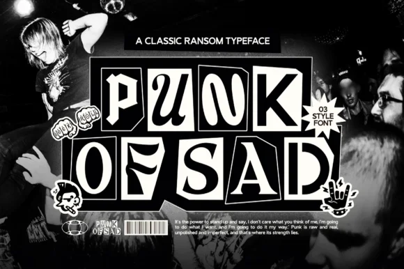
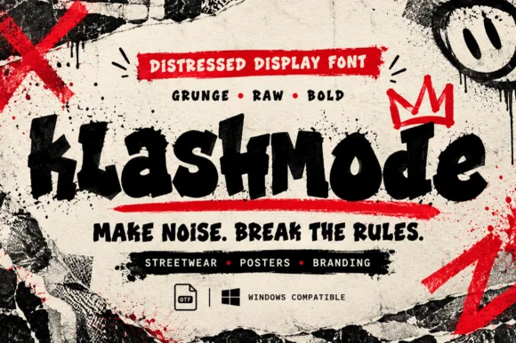
Klashmode is a raw, rebellious street-grunge display font mixing chunky tilted uppercase and lowercase blocks with rough ink-stamp edges.
Klashmode is a chaotic punk display that mixes chunky tilted uppercase and lowercase blocks with rough ink-stamp edges, so a word looks assembled from cut-outs rather than set on a baseline. Tilt is baked into each glyph, which means the face already carries the ransom-note instability and only needs a short phrase to work. Ink-stamp roughness sits on the edges, so it survives a low-resolution print, and it needs roughly 18 mm for the tilt to read as intentional rather than as a mistake. It is a sticker, flyer and zine face.
Skatewear chest graphic, punk sticker & zine header — Set 1 mixed-case word across a 10-inch chest underscored by a bold red brush bar and graffiti crown.
Solid heavy cores cut on 1.25 in+ hoodie HTV and slap stickers—and print razor-sharp via DTF and screen print.
 #5 · Standout Silhouette
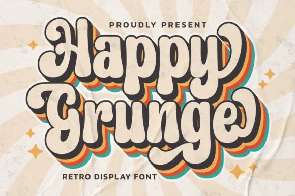
Happy Grunge is a clean, upbeat 1970s groovy bubble display font—smooth and rounded rather than distressed—with teardrop bowls and dancing stems.
Happy Grunge is a bouncy nineteen-seventies groovy soft-bubble display: fat rounded letters with a warm wobble across the baseline, a soft outline that separates the bubbles from a busy ground and a small heart or star tucked into one counter. The wobble grows the word vertically and the tucked shape closes first. It needs roughly 30 mm for the tucked shape and the outline to read, and it is best in two warm inks on cream, or one ink plus paper where the outline reads as a soft edge.
Retro sunshine tote, festival sticker & kids' graphic tee — Duplicate 3 offset background layers in mustard, burnt orange, and teal behind cream foreground type for the classic 70s stack.
Solid vector edges weed smoothly down to 0.75 in; just pop out the small enclosed counters inside 'a', 'p', 'g', and 'e'.
 #6
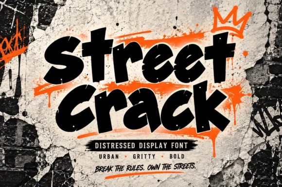
Street Crack is a muscular, forward-driving urban display font with chunky graffiti-marker strokes and rugged concrete-textured edges.
Street Crack is a gritty urban brush-tag and distressed street display: a ragged loaded stroke with spatter along the edges, broken joins where the brush skipped and a hard outline that reads as a sprayed tag on a rough wall. The spatter and the skips are the design and they silt into a solid mass when the face is reversed or printed small. It needs roughly 30 mm for the skip and the spatter to read, and it is best in one spray colour on a wall, or a flat two-colour print on uncoated stock.
Skatewear hoodie, streetwear drop poster & gaming banner — Stack 2 short punchy words at a 6-degree upward slant over bright neon-orange or acid-yellow brush accents.
Because outer contours carry micro-distressed grit, prefer DTF, screen printing, sublimation, or 2 in+ sign vinyl over tiny weeding.
 #7
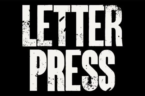
Letterpress is a tall, heavy condensed sans-display font stamped with authentic wood-type ink voids, chipped edges, and poster-press grit.
Letterpress is a heavy woodblock-grunge condensed grotesk: very narrow letters, an extremely heavy stem, small counters and a printed texture of chipped edges, ink squash and lighter patches inside the stroke. The condensation plus the weight means the counters are the first thing to close, and the texture is drawn so it survives one-colour printing. It needs roughly 32 mm for the counters and the chipped edge to read, and it is best in one dense black on newsprint and uncoated board.
Indie concert gig poster, documentary title & zine cover — Stack 2 all-caps words tight at 80–140 pt in off-white or newsprint yellow over matte black.
Hundreds of internal ink-grunge specks mean you should produce this via print, screen print, or DTF—never blade-cut vinyl.
 #8
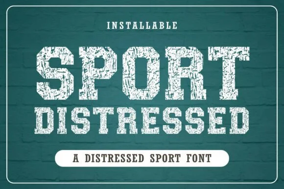
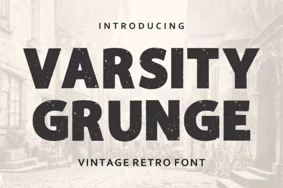
Varsity Grunge is a bold, stamp-weathered athletic block sans built for vintage gym tees, tailgate coolers, and throwback sweatshirts.
Varsity Grunge is a wide athletic block sans with chamfered corners, a cracked-ink surface and a faded print register that reads as a decades-old team jersey. The capitals are heavy and wide, spacing is tight, and the distress sits inside the strokes rather than over the edges, so a two-colour print keeps its silhouette while the fill looks worn. It is a headline face for apparel, signage and merchandise, comfortable from 20 mm upward, and it pairs with a plain condensed sans for numbers and detail where the grunge would reduce legibility.
Throwback alumni tee, gym hoodie & stadium cup — Stack 2 centered uppercase lines huge (72–145 pt) above clean wide-tracked sans caps ('VINTAGE RETRO FONT').
Interior stamp speckles are built for DTF transfers, sublimation, and screen print—avoid weeding tiny vinyl!
 #9
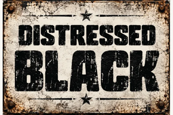
Distressed Black is an ultra-heavy industrial block sans (NOT delicate handwriting!) blasted with authentic scratched-paint & rusted-sign distressing!
Distressed Black is an ultra-heavy industrial block sans whose surfaces are blasted with diagonal scratch streaks, rust pits and chipped edges, so a word reads as paint sprayed on a rusted steel plate rather than as a clean grotesk. The distress is baked into the glyphs at high density, which means the face holds at large sizes and turns to noise below about 30 mm. It needs roughly 40 mm for scratches and pits to read as wear, and it is best in pitch black on rusted steel or in one dark ink on raw board.
Sublimated metal garage plaque, auto-shop hoodie & mug — Set row 1 medium-large (60 pt) above a massive full-width 5-letter hero word (135 pt) inside a bolted frame.
Hundreds of fine interior scratch streaks and grunge specks require sublimation, DTF, or flat print—NEVER cut on vinyl!
 #10
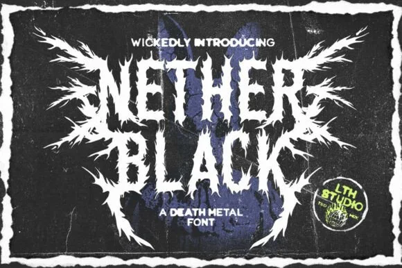
Nether Black is a ferocious death-metal display typeface erupting with symmetrical thorn spikes and splintered outer wings.
Nether Black is a jagged symmetrical death-metal thorn display: dense blackletter-derived stems with spikes thrown from every arm, mirrored ornaments along the vertical axis and a solid inner field that makes each word read as a barbed plate. It is a scene face, so it belongs on a record sleeve and a club flyer rather than on a product label. The spikes are the finest element and they fill into a solid edge when the face is reduced or screened. It needs roughly 40 mm for the spikes and the stems to read, and it is best one white ink on a black ground or the reverse.
Haunted-attraction merch hoodie & horror gig poster — Stack two short 4-to-6-letter words centered on a black garment back, using the winged outer alternates only on the first and last letters.
Skip cut-and-weed vinyl on the razor-fine thorn tips—use DTF transfers, screen printing, or high-resolution poster print instead.
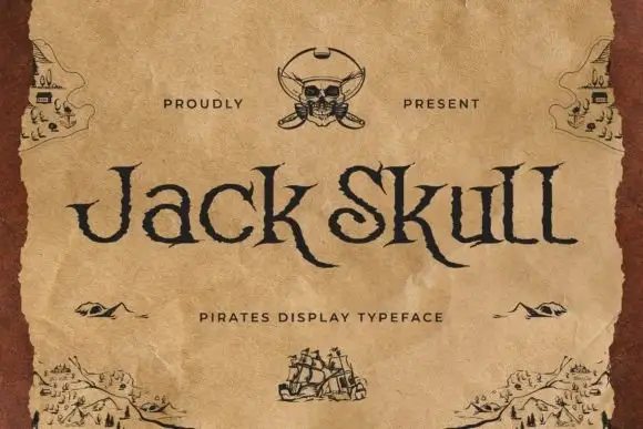 #11
Jack Skull is a pirate display face: irregular letterforms with jagged edges, spiked serifs and uneven stroke weights, drawn to look cut into a parchment map.
Jack Skull sits across the middle of an aged parchment card in a dark brown, and the letters look hand-cut: the strokes thicken and thin without a pattern, the serifs break into spikes, and the K and the S carry small notches that read as knife marks. A skull and crossed swords sit at the top centre, small drawn islands and ships decorate the corners, and a spaced caption under the word names the style. The captions and the ornaments are drawn at the same brown as the type, so the card reads as one printed sheet rather than a word on a background. The face is a display cut for pirate parties, rum labels and treasure-hunt invitations, and it holds at a large size where the rough edges are visible; set small, the notches close and the word turns into a plain condensed serif.
A pirate-party invitation heading — Place Jack Skull in the upper half of a plain sand-coloured card with a separate small location block near the bottom.
Check the descender clearance and source pirate illustrations separately.
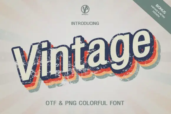 #12
Vintage Npnaay sets a fat rounded display face, wears the fill down with a printed grain and stacks two offset copies behind it in warm colours so the word reads as a seventies print.
The word leans a few degrees off the horizontal, the navy face speckled with wear, and behind it a red and a cream offset repeat step down and to the left, giving the lettering the depth of a misregistered screen print. Bowls are wide, the serifs rounded and the joins soft, so the shape stays cheerful even though the texture is rough. Corner labels name the file types and a bonus version, and a tracked caption sits under the sample. The layers are the design, so the face is sold as artwork as much as a font, and a plain single-colour setting loses most of what the cover shows.
A record fair announcement — Run the title diagonally across an off-white poster, then anchor time and venue in a level navy block along the lower edge.
Check the shadow clearance on descenders and whether the desired export preserves the worn marks.
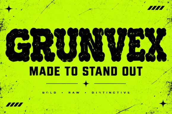 #13
Grunvex is an ultra-heavy, puffy street-block display font combining rounded graffiti-slab silhouettes with subtle worn-ink texture.
Grunvex is an ultra-heavy puffy street-block display with rounded graffiti-slab silhouettes, tightly touching capitals, tiny slit counters and a subtle worn-ink bite on the edges, so a word reads as a painted block panel rather than a tag. The slit counters are very small, which means the face needs size to stay legible, and the touching letters make the word behave as one mass. It needs roughly 34 mm for the slits to read, and it is best in jet black on acid yellow or in one flat ink on a dark ground.
Rave/punk flyer, streetwear chest bar & YouTube thumbnail — Set 1 uppercase hero word at 72–130 pt with tight -5 tracking above solid condensed subheaders ('MADE TO STAND OUT').
Best for screen print, DTF hoodies, and posters; if cutting large 2 in+ vinyl, Contour out the sparse internal specks.
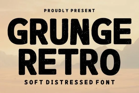 #14
Grunge Retro is a wide, bold geometric sans display font carrying rounded corners and light, tasteful vintage speckle wear.
Grunge Retro is a wide geometric display sans in caps with softly radiused corners and a light, evenly distributed speckle wear that sits across the face rather than in patches. The geometry is clean underneath, so the distress reads as age on a painted sign rather than as a broken file, and the wide stance fills a panel with one short word. It needs roughly 30 mm for the speckle to read as wear instead of dirt, and it is best in a warm black on sandstone, or as one ink on kraft.
Vintage surf/skate hoodie, craft-soda can & diner menu — Stack 2 wide uppercase lines centered beneath a tracked sans eyebrow ('PROUDLY PRESENT').
Ideal for screen print, DTF hoodies, sublimation mugs, and kraft labels; Contour out the tiny pinholes if cutting HTV.
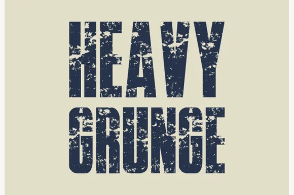 #15
Heavy Grunge is a tall, condensed distressed sans-serif font stamped with authentic scratched-asphalt and worn-paint texture.
Heavy Grunge is a tall condensed grotesk with scratched-asphalt texture and worn-paint edges, so a word looks stamped onto a rough surface rather than printed on paper. The caps are flat-sided and narrow, which fits a long title in a column, and the distress is fine enough to survive a small print while the silhouette stays solid at distance. It needs roughly 20 mm for the scratch detail to read, and it is at its best in one flat colour on a mid-tone ground where the wear shows without a second ink.
Rock/metal documentary poster, skate magazine & album art — Stack 2 condensed words tight (0.90 leading) in faded navy, charcoal, or crimson on off-white newsprint.
Fine internal scratch speckles require print, DTF transfers, or screen printing—never attempt to blade-weed vinyl!
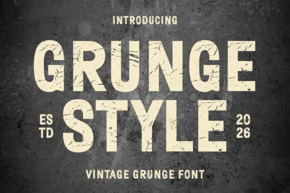 #16
Grunge Style stacks pale capital words against a rough dark wall. Broad upright stems and rounded G and U bowls remain visible beneath thin scratches and uneven dark breaks, while the R leg and the Y fork provide sharper diagonals and the small split numerals suggest a limited date example.
The stems stay heavy, the bowls round, the scratches cut across the strokes and the breaks vary from letter to letter. That wear is the character: the face reads as a sprayed sign that has weathered rather than a clean face with a filter, which is why the sample sets two rows on a wall. The composite image cannot separate every mark from the artwork texture, so check the actual file texture, keep 36 pt before the scratches eat the forms and test the numerals before you promise a distressed date.
A print-culture exhibition poster — Set PRESS MARKS in pale letters on a flat dark poster top with one process photograph and a clean information strip below.
Check the actual texture at print size and avoid piling background scratches behind worn letters.
 #17
Modern Vintage is a tall capital alphabet with a distressed print texture, tight letterfit and vertical proportions, so a word reads as letterpress that has been used a hundred times.
The M holds two thin diagonals and a raised vertex, the O closes a narrow counter, the D keeps a square bowl and the R carries a short leg, all at a heavy even weight with edges broken by a fine speckle. That texture is what makes the face read as worn metal type rather than as a clean geometric sans. The fit is tight, so a two-word line builds a solid block at 60 pt, and the narrow counters close up below 16 pt where the speckle starts to look like dirt. Because the letters are tall, the face stacks well in two lines with minimal leading. The cream ground, the black ink and the small caption are presentation; the typeface is the two words.
An industrial photo-essay cover — Put the heading in a plain top panel above the photograph and use a clean caption face.
Check the distress does not erase key strokes at cover size.
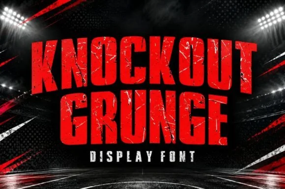 #18
Knockout Grunge is a towering, heavy-impact athletic slab-display font textured with gritty stadium-concrete and fight-poster wear.
Knockout Grunge is a towering athletic slab with octagonal counters, heavy pillars and a stadium-concrete texture that reads as a fight poster printed cheap and pasted up. The caps are massive and tightly spaced, so a word fills a vertical panel, and the wear is internal enough that the silhouette stays solid at distance. It needs roughly 30 mm for the texture to read, and it is at its best in one colour on a dark ground where the octagonal counters give the letters their structure.
MMA/boxing fight-night poster, gym banner & sports thumbnail — Stack 2 centered uppercase lines tight (0.88 leading) in crimson or gold over dark arena spotlights.
Internal scratch textures are tailored for DTF gym shirts, posters, and YouTube thumbnails rather than blade-cut vinyl.
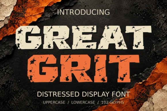 #19
Great Grit is a wide, muscular distressed slab-display font (102 glyphs, uppercase & lowercase) with notched outer edges and sparse surface grit.
Great Grit is a wide, muscular slab display with notched outer edges and sparse surface grit, supplied with uppercase and lowercase across 102 glyphs. The slabs are heavy and the stance is wide, so a word fills a broad panel and reads at a distance, while the notches keep the outline from looking like a plain rectangle. Grit is sparse, so the face survives a small print, and it needs roughly 20 mm before the notches read as stamped rather than damaged. It is a sign, packaging and apparel face.
Off-road 4x4 decal, mud-run shirt & smokehouse menu — Color row one bone-cream and row two safety orange at 64–110 pt over dark charcoal.
Best in DTF, screen print, and outdoor printed vinyl; Contour out the sparse interior specks if blade-cutting 1.5 in+ HTV.
 #20
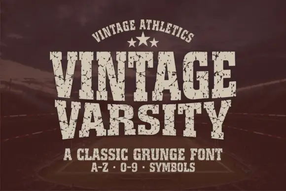
Vintage Varsity is a condensed athletic capital alphabet with heavy flat slabs and a cracked wear texture, so a short word reads as a printed team jersey from decades ago.
The letters are narrow and tall: the V closes to a sharp point, the A keeps a low bar, the R carries a straight leg and the S reverses through flat terminals, with slabs at every stem and no bracketing. The wear is drawn into the letterforms rather than applied as an effect: cracks run through the slabs and a few counters show chipped edges, which is what gives the face its printed-jersey look. Weight is heavy and uniform, the fit is tight enough that a long team name holds a single line, and because the texture is coarse the face needs a decent size to stay legible. The dark ground, the cream ink, the star rule and the two small caption lines are presentation; the typeface is the two words.
A reunion match poster — Keep dates and scores in a clean companion face.
Inspect cracks in the narrowest strokes.
 #21
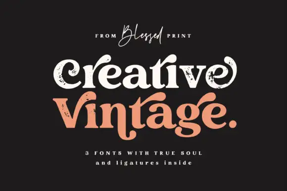
Creative Vintage is a high-contrast serif in which the terminals curl into swash shapes, the C turns inward, the t finishes in a broad low hook and scattered distressed marks break the fill, so a title reads as a worn printed label.
The C curls its terminal inward, the t ends in a broad low hook, the V and g stretch long curved extensions and the fill carries scattered marks that thin the strokes. The distressed curl is the character: the wear sits in the outline rather than over it, which is why the sample suits a printed label. Because the marks are small, the face wants 30 pt before they read as texture rather than dirt, and the thin curls need coated stock. The extra characters are PUA-encoded, so decorative access is a separate step.
A vintage-print collection band — Give the title two spacious lines and put item details in a clean separate strip.
Inspect the selected style and ligature access rather than assuming all three fonts match.
 #22
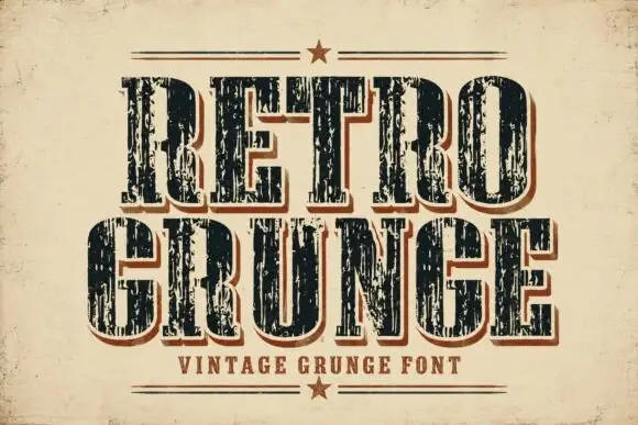
Retro Grunge shows tall closely spaced slab capitals with rounded bowls and deep vertical scratches, where the E and R keep heavy stems even as the surface breaks and a red-brown offset edge sits behind the black letters on aged paper.
The stems stay tall, the fit runs close, the scratches cut vertically and the offset edge repeats the whole row behind it. That scrape is the character: the word looks printed on a worn press rather than deliberately shredded, which is why the cover keeps the letters pale on aged stock. The letter texture already supplies most of the visual activity, so skip extra distressed art in the layout, keep 34 pt and check the offset edge against the trim.
A local music-poster heading — Use two large rows above a clean information band; keep the background relatively quiet.
Inspect the scratches and counters at the intended print size.
 #23
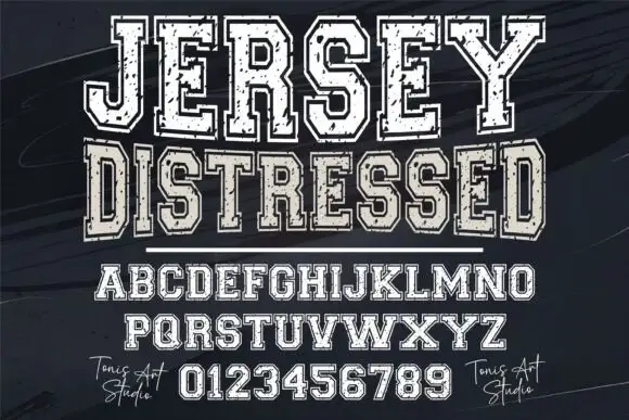
Jersey Distressed is a varsity slab capital alphabet with a heavy fill, a separate outline and a speckled wear texture, so one word reads as a shirt print that has been washed a hundred times.
The J carries a full hook, the E holds three even arms and the Y forks high, all at a heavy even weight with square unbracketed slabs. Both the fill and the outline are supplied separately in the sample, which is how a two-colour athletic print is built: the outline traps the fill and the texture sits inside the fill so the edge stays clean. That construction is what makes the face usable at 60 mm on a garment without the letterforms collapsing into noise. Numbers and a full alphabet are shown on the sheet, which is the practical part for team work. Counters are wide enough to survive a screen print. The dark ground, the white fill, the black outline and the small credits are presentation; the typeface is the word.
A local running-club banner — Use one broad title band, with the route and meeting time below in solid plain lettering rather than distressed small text.
Proof the border and speckle detail at banner viewing distance.
 #24
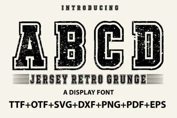
Jersey Retro Grunge shows large collegiate A, B, C and D forms with broad slabs and clipped corners, where a pale inset outline separates the dark letter bodies from an outer black edge and small scratches and holes roughen both the fill and the contour.
The slabs stay broad, the corners clip, the chain of edge, pale line and body repeats on every letter and the damage sits in both areas. That three-part construction is the character: the letters read as a layered jersey print rather than a single-colour outline, which is why the sample shows only four capitals. The footer lists many file formats, which tells you nothing about the quality of each. Keep 44 pt so the inset stays open, check the smallest size you need and test the grunge on a garment transfer before ordering.
A club-year poster — Use one large title over a plain year and event line, without adding extra distressed borders.
Check the required year numerals and fine outline separation in a proof.
 #25
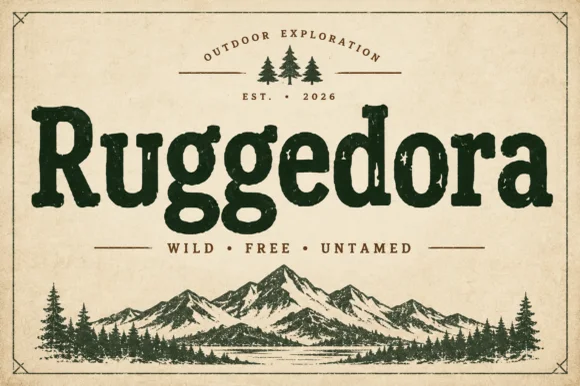
Ruggedora is a heavy, softly distressed vintage slab serif with plump rounded bowls, bracketed feet, and weathered trail-sign warmth.
Ruggedora is a worn Cooper-style vintage slab serif: heavy bracketed slabs, a rounded stem, and a surface that is chipped along the contour with small voids inside the stroke so the letter reads as letterpress kept in a drawer. The wear is drawn, so a one-colour print keeps it, and the bracket is what closes first at small sizes. It needs roughly 30 mm for the bracket and the chips to read, and it is best in one dense ink on kraft and newsprint, or white on a dark board where the chips print as lights.
Campfire enamel mug, national-park patch & overland decal — Center the main title in forest green, rust, or charcoal above wide-tracked sans mottoes ('WILD · FREE · UNTAMED') and pine icons.
Solid interior letter bodies allow clean HTV and outdoor car-decal weeding down to 0.85 inches.
 #26
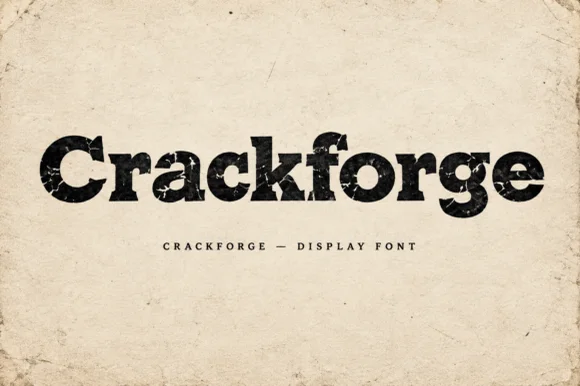
Crackforge is a heavy slab display alphabet in which the stems stay thick, the serifs turn square and the surface breaks into fine cracks, so a word reads as a cast metal plate that has been outdoors for years.
The C cuts a square crescent, the r turns a blunt arm, the a closes a small bowl on a heavy stem, the c repeats the square cut, the k splays two thick diagonals and the f carries a wide bar, all at a bold slab weight with square serifs and a cracked texture drawn into the fill. The crack pattern is the character: it sits inside the strokes rather than on the outline, which is why the sample sets mixed case on a plain ground and lets the surface do the work. Because the strokes are solid, the face reads from 30 pt and prints in one ink; the cracks disappear below that size. The aged paper ground, the torn edges and the small caps line beneath are presentation; the black display word is the face.
Hot-sauce bottle label, distressed band tee or pub poster — Print large in dark ink on kraft/cream paper or off-white ink on black shirts.
Internal crack fissures are built for DTF, screen printing and print — not blade vinyl cutting.
 #27
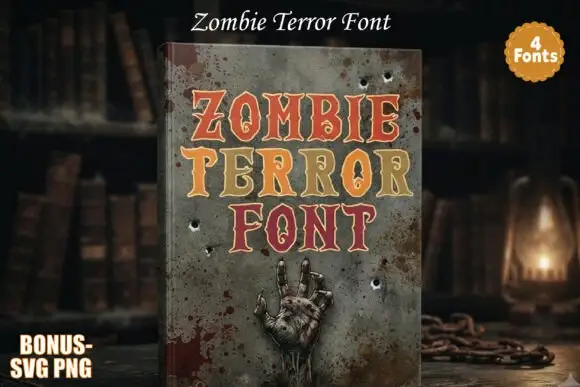
Zombie Terror presents three rows of compact serif capitals with red, orange and ochre faces traced by pale edges: narrow pointed notches cut into some stems and serifs, and the O counters take irregular flame-like inner shapes instead of smooth circles.
The skeleton stays serif-led and firm, the notches cut inward at a point, the pale edge separates each face from the row behind and the counters distort without breaking. The pointed notch is the character: the horror arrives as small incisions rather than dripping shapes, which is why the sample stacks three coloured rows. Because the notches are narrow, keep 32 pt before they disappear, and keep the title short so the detail is not buried; the hand and stains on the cover belong to the scene.
A fictional haunted archive title — Place the title in three centred rows on muted grey with a plain cream catalogue-number line at the foot.
Check small notches at final size and confirm whether any background texture is separately supplied.
Practical buyer checklist
Key cutting, printing and pairing answers before choosing a 90s grunge, distressed & rock typeface.
Print them rather than cutting them. DTF and screen print both reproduce the texture and hold it through washing, while cut vinyl cannot represent the wear at all because the specks lift during weeding.
The distress eats into the strokes, so at 12 pt the wear merges with the background and the letter loses its edge. Keep grunge faces above 18 pt in print and much larger on apparel.
Not usefully. Digitising smooths the texture away and adds thread texture instead, so the finished piece looks like a plain block. Choose a solid face and let the stitch supply the surface interest.
Use it on one element, keep the palette restrained, and let the layout stay modern. Full grunge treatment across type, borders and imagery is what pins a design to a specific decade.
Keep exploring
Explore adjacent maker roundups or check our practical pre-production checklists.
20 curated fonts · Previews & pairings
19 curated fonts · Previews & pairings
27 curated fonts · Previews & pairings
33 curated fonts · Previews & pairings
Guides: Invitation font checklist · Vinyl & cutting checklist · How to pair script & sans fonts
Allow optional Google Analytics to measure visits and catalogue actions. Your search words and notes are not included. Privacy & storage