Editorial Serif Anchor

Spooky + Aureline
Anchors Spooky's fluid strokes with crisp Roman proportions on wedding suites, headers and packaging.
Inspect Aureline specimenDisclosure: MakerFileHub may earn a commission from qualifying purchases via paid links on this page. How our links work.
Chunky brush display with dry edges
Spooky 6 is a chunky brush display in teal with a white outline: thick uneven strokes, dry brush edges that break the contour, and letters that lean and bounce against each other, printed over a moonlit forest scene.
Paid link
Get this fontProject & layout blueprintsAt-a-glance maker compatibility
Sturdy stroke walls and open counters weed cleanly on adhesive vinyl, HTV apparel film, and cut cardstock.
Visual anatomy & craft review
The word is set at the centre of the page in fat caps, and the drawing is a brush letter rather than a constructed one: the S swells at the top, the P and the double O have slightly different weights, and the y drops a thick tail that curls under the line, so the word reads as painted on a board. The fill is a flat teal with a white contour and a soft outer edge, and the contour itself is broken in places where the brush lifted, which is what gives the lettering its hand-painted credibility. Contrast between the letters and the ground is managed with the white outline rather than with a plate, so the word stays legible over the dark trees and the bright moon behind it. Above and below, small tracked capitals in a clean sans provide the introduction and the style name, which is the right division of labour: the display face does the character and the sans does the reading.
Spooky, brushed, chunky, playful
Two-font hierarchy recipes
Tested contrast partners — pairing Spooky with grounded secondary typography.
Spooky + Aureline
Anchors Spooky's fluid strokes with crisp Roman proportions on wedding suites, headers and packaging.
Inspect Aureline specimen
Spooky + Miniplate
Keeps small-scale dates, URLs, nutrition facts and care instructions crisp and legible below script titles.
Inspect Miniplate specimenPractical applications
Concrete hierarchy, scale and production guidance tailored to Spooky’s stroke geometry.
A chunky brush word is readable from the pavement and carries a hand-painted mood, which is what a front-garden sign needs more than a detailed illustration.
Hierarchy & layout recipe
A3 print on foamex: the word at 150 mm cap height, the times in an 18 mm sans below, and a 5 mm white keyline around the word to lift it off the dark ground. Keep the black ground to 70 percent so the teal still reads in the evening.
Pre-production check
Check the dry edges at full size, where the broken contour can look like a print fault rather than a brush mark; keep the breaks larger than 2 mm. Read the sign from the pavement at 8 metres and confirm the 18 mm times are legible in low light.
A brush display sets a playful fright in one word without a full illustration, and the white contour means the banner works on any ground colour.
Hierarchy & layout recipe
Print 900 by 400 mm: the word at 180 mm cap height, one line of names in a 25 mm sans beneath, and a 6 mm contour. Keep 40 mm of clear border on each side and choose a dark ground so the teal has something to sit against.
Pre-production check
Check the contour at 6 mm on the printed banner, where it stays white only if the ink is opaque; specify a white base layer. Confirm the 25 mm names read from six metres and that the brush edges do not merge with the ground at that distance.
A brush display appeals to a school audience without being frightening, and because the strokes are thick and even the word reads on a poster pinned in a corridor.
Hierarchy & layout recipe
A3 portrait: the word at 140 mm, the date and time in a 20 mm sans, and the ticket price in 12 mm. Keep the layout to three bands with 25 mm gaps so the brush edges have air, and print the black background only in the lower two thirds.
Pre-production check
Check the poster at three metres in corridor light, where the teal on a dark ground can lose contrast; brighten the fill or widen the contour. Confirm the 12 mm price reads at arm's length and that no brush edge crosses the school's logo area.
Technical & licence verification
Confirm included OTF/TTF/WOFF formats, full glyph tables and licence coverage on the live store page before batch production.
Closest visual alternatives
Matched across letterform anatomy, stroke behaviour and craft applications.
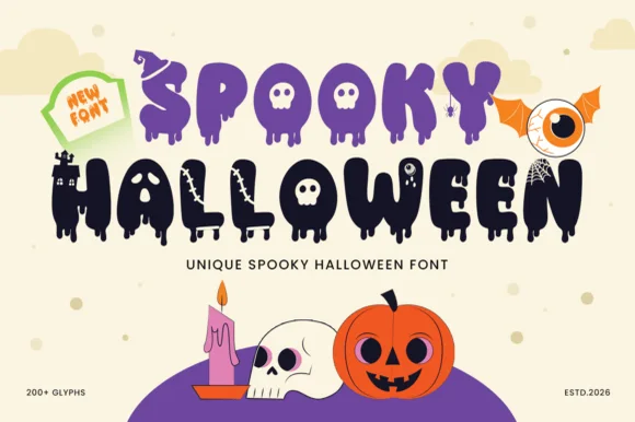
200+ glyph melting-ooze, witch-hat & haunted-castle horror alphabet
Spooky Halloween (by Umitype) is a loaded 200+ glyph Halloween display font crowning melting slime letters with witch hats, haunted castles, skulls & eyeballs!
Ideas for this font
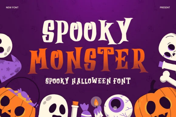
Layered Halloween display with two cuts
Spooky Monster is a two-cut Halloween display in cream and orange on purple: a sharp gothic-flavoured capital cut for the first word and an ornate swashed serif for the second, both stacked over flat illustrations of ghosts, pumpkins and skulls.
Ideas for this font
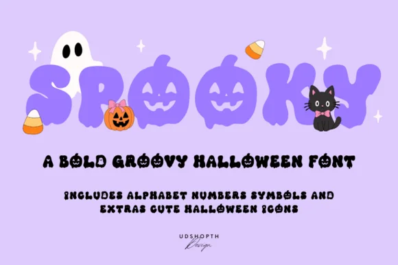
Bold groovy bubble display with faces
Spooky is a bold groovy display in lilac-purple on a pale lavender ground: fat rounded letters that swell and narrow, jack-o-lantern faces cut into three of them, and a bounce that lifts alternate characters, so the word reads as a seventies novelty rather than as a horror face.
Ideas for this font
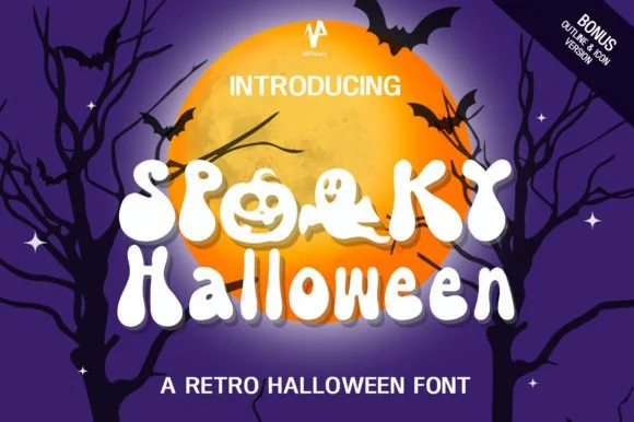
70s groovy ghost & jack-o'-lantern counter font (+ Bonus Outline & Icons!)
Spooky Halloween (by NPNaay) is a 1970s groovy display pack hiding cute ghosts & jack-o'-lanterns inside letter bowls—PLUS a Bonus Outline & Icon version!
Ideas for this font
Allow optional Google Analytics to measure visits and catalogue actions. Your search words and notes are not included. Privacy & storage