Neutral Sans Workhorse

Alberta + Bielchon
Lets Alberta own the focal silhouette while handling secondary copy, sizing and subheads cleanly.
Inspect Bielchon specimenDisclosure: MakerFileHub may earn a commission from qualifying purchases via paid links on this page. How our links work.
Celtic knot capitals drawn as interlaced strands with black outlines
Alberta is a Celtic knot capital alphabet in which every stroke is drawn as a braided strand, the openings close into loops and one thin outline holds the whole letter, so a word reads as knotwork rather than as type.
Paid link
Get this fontProject & layout blueprintsAt-a-glance maker compatibility
Sturdy stroke walls and open counters weed cleanly on adhesive vinyl, HTV apparel film, and cut cardstock.
Visual anatomy & craft review
The A builds its apex from two interlaced strands, the L curls into a terminal spiral, the B closes two braided bowls, the E splits into three woven arms and the R turns a knotted leg, all at a display weight with a single contour and a regular over-and-under pattern. The interlacing is the character: each letter is drawn as a continuous path, which is why the sample sets one word and lets the pattern carry the image. Because the strands are thin, the face needs 50 pt before the weave reads and it prints best in one colour with the counters open. The green and purple ground, the corner knots and the line beneath are presentation; the outlined knot word is the face.
Celtic · Knotwork · Interlaced
Two-font hierarchy recipes
Tested contrast partners — pairing Alberta with grounded secondary typography.
Alberta + Bielchon
Lets Alberta own the focal silhouette while handling secondary copy, sizing and subheads cleanly.
Inspect Bielchon specimen
Alberta + Vanielst Elegant Serif Display Stylistic
Grounds bold display lettering with classic typographic authority on posters, badges and apparel.
Inspect Vanielst Elegant Serif Display Stylistic specimenPractical applications
Concrete hierarchy, scale and production guidance tailored to Alberta’s stroke geometry.
The knotwork gives a pub a mark with a regional story, and the single contour cuts cleanly in vinyl at 60 mm per letter.
Hierarchy & layout recipe
Cut a 900 by 250 mm vinyl sign: set the word at 60 mm per letter, keep every strand at 2.5 mm of vinyl, and leave 30 mm of clear glass above and below so the outline reads against the wall behind.
Pre-production check
Weeded strands under 2.5 mm tear away from the backing; check the cut file and thicken the outline rather than the letter spacing.
The interlaced shapes suit a Celtic handfasting ceremony, and the outlined capitals hold a two-word sign at 45 mm on a painted wooden board.
Hierarchy & layout recipe
Paint a 600 by 300 mm board: set the words at 45 mm, keep the outline at 2 mm, and paint the strands in two tones following the over-and-under pattern rather than filling flat.
Pre-production check
Filling the weave flat loses the pattern; check the board at arm's length and keep the alternation visible before adding a second tone.
The knot register suits a heritage event, and the outline stays open on a printed page at 40 pt where a filled letter would clot.
Hierarchy & layout recipe
Print a 148 by 210 mm programme: set the header at 40 pt in one ink, keep 3 mm of white inside every loop, and set the schedule in a 9 pt serif beneath with 12 mm of clearance.
Pre-production check
Loops smaller than 3 mm fill in on uncoated stock; check the printed page and keep the header at 40 pt or above.
Technical & licence verification
Confirm included OTF/TTF/WOFF formats, full glyph tables and licence coverage on the live store page before batch production.
Closest visual alternatives
Matched across letterform anatomy, stroke behaviour and craft applications.
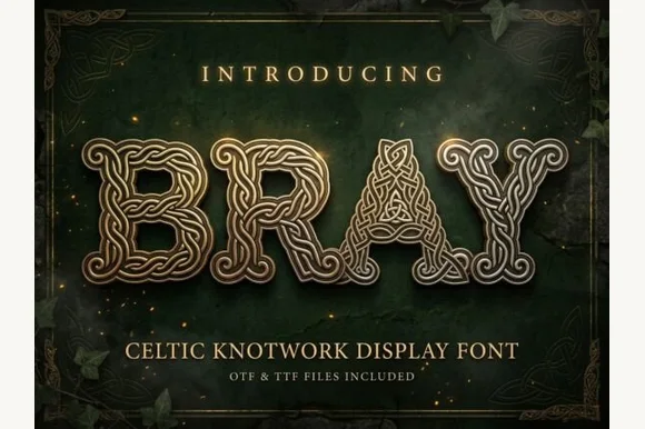
Celtic knotwork display with bevelled strands and interlaced bowls
Bray is a Celtic knotwork display alphabet in which every stroke is a braided band with a bevelled edge, the bowls close into interlaced rings and the letters share one outline, so a word reads as cast metal rather than as type.
Ideas for this font
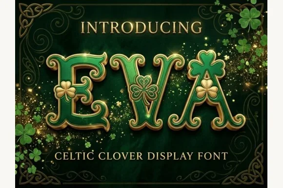
Shamrock-embellished St. Patrick's Celtic display serif
Eva Celtic is a festive St. Patrick's display serif decorating flared Celtic-style capitals with built-in three-leaf shamrock cutouts and sprigs.
Ideas for this font
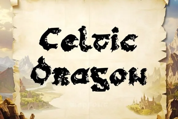
Jagged dragon-scale & weathered Gaelic uncial display
Celtic Dragon is a rugged medieval uncial display font combining rounded Gaelic manuscript skeletons with jagged dragon-wing / torn-parchment edges.
Ideas for this font
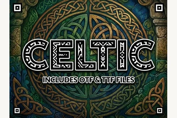
Intricate interwoven Celtic-knotwork block display
Celtic is an ornamental uppercase display font filling wide geometric block letters with authentic interlaced Celtic ribbon knotwork.
Ideas for this font
Same independent foundry
Allow optional Google Analytics to measure visits and catalogue actions. Your search words and notes are not included. Privacy & storage