#1 · Best Overall
Stanza
Swashed modern couture serif with hairline stress and curling terminals
Get fontPaid link
Read review ↓Disclosure: MakerFileHub may earn a commission from qualifying purchases via paid links on this page. How our links work.
High-contrast display serifs & couture swashes
Luxury in type comes from contrast and restraint: hairlines that thin almost to nothing against sturdy stems, generous capitals, and serifs that end in a point rather than a slab. Stanza and History of Miracles carry exaggerated swash capitals, Orvelia and Aureline keep the contrast with cleaner shapes, and Amilea and Arches show what happens when the ligature becomes the whole idea. De Rozzo supplies the retro-editorial middle ground.
Quick verdict
Stanza is the most striking statement serif for a fashion or beauty brand, Orvelia is the cleaner choice for packaging, and De Rozzo covers the retro-editorial case. Amilea is the pick when one large ligature has to carry the design.
Quick answer
Short on time? Start with our three highest-rated luxury & modern serif standouts before scrolling the full breakdown.
#1 · Best OverallSwashed modern couture serif with hairline stress and curling terminals
 #2 · Runner-Up Pick
Elegant display serif with large ornamental swashes
 #3 · Editor's Choice
We reviewed 542 serifs and kept 34 with real hairline contrast rather than a thin weight. Emphasis on stem-to-hairline ratio, terminal shape, how the face behaves at 8 pt body size, and whether the swashes are separate glyphs or baked into the default letters.
Side-by-side summary
Compare specimens, OpenType/PUA traits and primary project roles side by side.
| Rank & Font | Style & File Specs | Best Project Fit | Store Listing |
|---|---|---|---|
| SerifLigatures · Alternates & swashes | Fashion boutique logo, perfume box or magazine title | Get fontPaid link | |
| SerifLigatures · Alternates & swashes · Language support | Romantic novel cover, wedding menu or candle label | Get fontPaid link | |
| SerifPoised | Wine label, resort identity, fashion lookbook or masthead | Get fontPaid link | |
| DisplayChic | Black-tie city wedding invitation or boutique masthead | Get fontPaid link | |
| SerifFile formats | Jewelry box wordmark or skincare bottle label | Get fontPaid link |
#1 · Best OverallStanza is a modern serif in which the strokes carry extreme contrast, the terminals curl and the crossbars of the A and the T extend into swashes, so a short word reads as a fashion masthead rather than a title.
The S closes both ends in curls, the T throws its bar wide and finishes in a fine swash, the A carries a halved crossbar that runs beyond the letter and the N keeps two hairlines with a heavy diagonal, all with high contrast and unbracketed joins. The swashes are the character: they extend beyond the letter body at the top and the base, which is what lets four letters fill a wide plate and what makes the face a poor choice for anything below 30 pt. Hairlines are genuinely thin, so the face wants coated stock and a printer who can hold the line. The green ground, the white ink, the tracked label and the small caption are presentation; the serif is the word shown.
Fashion boutique logo, perfume box or magazine title — Limit dramatic swash alternates to 1–2 letters per wordmark.
Fine serif hairlines are built for print, foil and digital branding.
#2 · Runner-Up PickHistory of Miracles is an elegant display serif in which the stems carry fine serifs and large drawn swashes swing out from several letters, so a two-word title reads as an engraved certificate head.
The H sets two tall stems with a fine bar, the i carries a light dot, the s holds a swash spine, the t spreads a curled arm, the o stays a wide ring and the y drops a long tail, all at a moderate contrast with fine serifs and swashes drawn from the first and last letters, plus a set of italic alternates. The swashes are the character: they take up as much space as the letters, which is why the sample sets two stacked words with a large gap above and below. Because the swashes are thin, the face needs 36 pt upward and a smooth ground, and it prints best in one flat colour. The dark teal sky, the planet, the small badge and the caption beneath are presentation; the yellow display words are the face.
Romantic novel cover, wedding menu or candle label — Set Title Case headlines at 30pt+ and use the plain italic for subtitles.
Includes Regular and Italic; best for print, foil and digital layouts.
#3 · Editor's ChoiceDe Rozzo balances wide classical roman bowls with crisp modern wedge serifs and alternates, built for luxury fashion, magazines and wine labels, where the expansive round O and C counters contrast with slender horizontal hairlines for a confident Mediterranean feel.
The bowls stay wide and round, the serifs cut as wedges, the hairlines thin out and the alternates sit outside the default set. That wedge is the character: a classical roman gains a modern edge, which is why the sample suits fashion and wine. Alternates need checking in your own file, so test the letters you need, keep 32 pt for the hairlines and print on coated stock where the thin strokes survive. The hairline thins are the risk: they silt below about 32 pt and they fill on an uncoated sheet, and the alternates sit outside the default set so they have to be switched on per letter.
Wine label, resort identity, fashion lookbook or masthead — Track all-caps wordmarks +15 and pair with minimalist grotesk body copy.
Best for print packaging, foil and web headers.
 #4 · Top Maker Utility
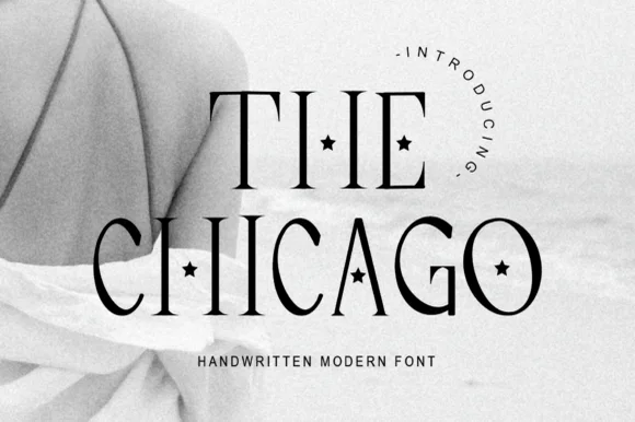
The Chicago is a tall display serif in which the stems stretch upward, the hairlines stay fine and a small star is punched into several counters, so a two-word title reads as a decorated magazine masthead.
The T spreads a hairline arm on a thin stem, the H sets two tall stems with a light bar, the C curls a narrow crescent, the A pinches a fine apex and the G closes a small bowl, all at a high contrast with fine serifs, while the counters of the i, the o and the a are replaced by a four-point star. The stars are the character: they replace counters rather than adding ornament around the word, which is why the sample sets two lines with a wide gap between them. Because the strokes are thin, the face needs 44 pt upward and a coated stock, and the stars need open space. The pale photograph, the arched lettering above and the caption beneath are presentation; the black display words are the face.
Black-tie city wedding invitation or boutique masthead — Set all-caps headers at 28pt+ with generous line spacing over clean white or cream.
Fine hairlines and tiny stars suit print, foil and digital branding.
 #5 · Standout Silhouette
Aureline is a fine serif in which the stems narrow to hairlines, the serifs spread thin and the bowls stay wide open, so a single name reads as a jewellery hallmark rather than as a headline.
The A spreads a wide apex on two hairline stems, the u holds two thin strokes, the r finishes a fine arm, the e turns a light eye, the l rises on a narrow stem and the n turns a wide shoulder, all at a high contrast with unbracketed hairlines and an open fit. The fineness is the character: the face depends on proportion rather than weight, which is why the sample sets one name above a small ring and a letterspaced line. Because the hairlines are so thin, the face needs 30 pt upward and a coated stock, and it should not be set in a paragraph. The warm cream ground, the gold ring, the soft leaf shadow and the small caps line are presentation; the black serif name is the face.
Jewelry box wordmark or skincare bottle label — Set the brand name in Title Case with widely tracked uppercase descriptors beneath.
Delivered in OTF format; best suited for print packaging, foil stamping and digital brand systems.
 #6
Orvelia is a high-contrast display serif in which the stems alternate thick and hairline weights, the R, V and A end in curved swash legs and the bowls stay sculpted, so a name reads as a crest for a perfume box or a masthead.
The R tucks its leg into a curve, the V splits into two swashed strokes, the A carries a curling leg and the bowls close against fine joins that thin to a hairline at every junction. The swash leg is the character: three capitals carry the ornament while the rest of the alphabet stays quiet, which is why the sample frames one word for formal stationery. Because the hairlines are fine, the face wants coated stock from 16 pt and gains from hot foil on signage; the display cut ships with swashes as separate glyphs. The pale ground and the small frame rules are presentation; the dark display word is the face.
Formal wedding suite monogram & header — Track supporting lines (FOREVER BEGINS HERE) wide in a simple roman serif beneath the main display name.
Delivered as OTF; best suited to print, foil stamping and digital branding due to fine serif hairlines.
 #7
Amilea shows pale yellow high-contrast letters with fine tapered serifs and broad rounded lowercase over a dark portrait, where a thin loop curves below the capital A and a tall upper flourish crosses the central ascender before sweeping right.
The uprights stay heavy, the joins thin to hairlines, the serifs taper to points and two drawn flourishes cross the word above and below. Those crossing flourishes are the character: the sample is a lockup rather than a plain setting, which is why the names sit on a photograph with a raised hand. The source notes PUA extras, ligatures and alternates, so check how the flourishes are reached. Keep 40 pt for the hairlines, reserve 25 mm above and below and do not set a paragraph.
A names-led invitation accent — Leave clear space above and below the title with plain details beneath.
Verify exact letters and alternate access.
 #8
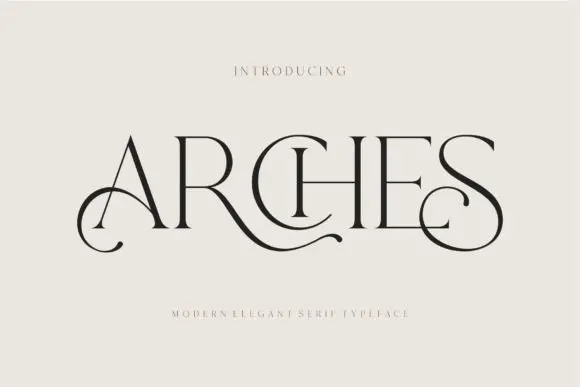
Arches sets one word in dark ink on a warm neutral field, where wide flat serifs sit on hairline cross strokes, the A climbs to a sharp apex, the R leg sweeps into a long horizontal tail that runs beneath the following letters and the S closes with an extended curl.
The uprights stay thin, the serifs stay flat and wide, the contrast is extreme and two letters throw strokes sideways instead of down. Those sideways strokes are the character: the word reads as a piece of engraved editorial typography rather than a headline, which is why the sample leaves a wide cream margin around it. The small introduction line above and the caption below are separate cover text. Keep 44 pt before the hairlines vanish, allow 30 mm at each end for the sweep and check the R tail against any text you put underneath.
A beauty studio identity — Use a short studio name with a broad clear margin around its lower curls. Put the service descriptor and booking details beneath in plain type rather than threading them through the swashes.
Test the actual studio name; the preview’s “Arches” composition may not transfer to other letters.
 #9
Resquel is an expressive high-contrast editorial serif featuring sweeping ribbon under-tails, interlocked ligatures, and star-sparkle counters.
Resquel is a high-contrast editorial serif in caps with sweeping ribbon under-tails beneath the R and Q, interlocked ligatures and star-sparkle detail cut into the Q counter. The tails extend far past the word, so a layout needs base and side room, and the hairlines need roughly 28 mm before they hold. It is a cover and label face with a celestial register, best in one bone or metallic ink on a deep slate ground, and it is deliberately impractical for long copy.
Luxury cosmetics carton, jewelry pouch & tarot deck box — Center 1 uppercase brand word at 54–88 pt with tight 0 tracking so the 'R' and 'Q' under-ribbons cradle adjacent letters.
Needle-thin crosshairs inside counters call for foil stamping, offset/digital print, or web headers—not blade-cut vinyl.
 #10
Askino is a clean, restrained high-contrast editorial serif with razor-flat hairlines, tall ascenders, and un-cluttered Parisian magazine elegance.
Askinо is a neoclassical high-contrast fashion serif with fine hairline joins, sharp bracketed serifs, small counters and wide caps that sit on a tight baseline grid. The contrast is the design, so it needs size and a smooth stock, and the small counters make a long word read as a dense mark rather than as a line of text. It needs roughly 30 mm for the hairlines to hold, and it is best in one ink on smooth coated stock or as a foil on a matte cover.
Fashion magazine masthead, architecture monograph & portfolio — Set title-case hero words large (72–140 pt) with -10 tracking across monochrome fashion photography.
Crisp hairline serifs shine on coated magazine stock, web hero banners, and foil book cloth rather than small vinyl.
 #11
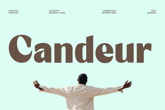
Candeur is an ultra-bold modern editorial serif pairing massive teardrop bowls and thick stems with razor-thin horizontal connectors.
Candeur is an ultra-bold modern display serif with reverse stress and high contrast: the horizontal strokes carry the weight while the verticals thin, stems are almost solid and the axis runs the opposite way to a classic serif, with small sharp serifs at the top and bottom. The inverted stress is the design and it reads as a solid block at a distance. It needs roughly 30 mm for the reverse stress to read, and it is best in one dense ink on coated stock, or a single white on a dark ground.
Artisanal chocolate bar, specialty coffee box & record sleeve — Set 1 title-case brand word huge (64–120 pt) at tight -15 tracking across pastel mint, butter, or terracotta cartons.
Outer bowls cut cleanly on large 1.5 in+ window vinyl and tote HTV; watch the hairline joins inside 'a' and 'e' at small sizes.
 #12
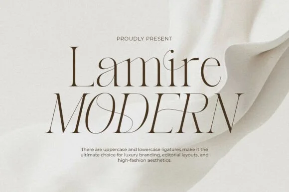
Lamire Modern is an ultra-light, tall-statured editorial serif featuring sweeping diagonal ligatures across both uppercase and lowercase.
Lamire Modern is an ultra-light editorial serif with tall stature, whisper hairlines and sweeping diagonal ligatures that cross from one letter to the next. The contrast is extreme, so the face needs roughly 30 mm before it survives in print, and the ligatures require the letters to be set as designed rather than adjusted with kerning. It reads as fashion typography rather than a book face, and it is at its best in one colour on a smooth coated stock where the hairlines stay continuous.
Bridal gown label, luxury skincare serum & candle carton — Stack mixed-case over all-caps at 48–84 pt with +10 tracking and wide ivory negative space.
Hairline strokes are strictly engineered for print, hot foil, and high-res web headers—never blade-cut vinyl.
 #13
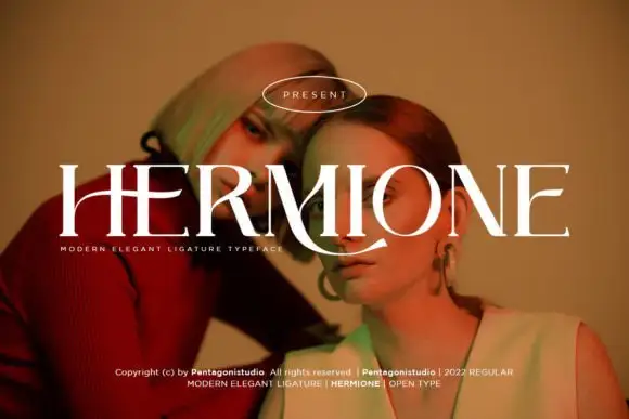
Hermione is a modern elegant serif in caps with very fine hairlines, tall proportions and a set of display ligatures, shown over an editorial portrait and set with a slight arch.
HERMIONE spans the card in white over a close portrait in warm light, and the letters are tall and narrow with hairlines at the joins and sharp wedge serifs; the I and the O are drawn to touch, and the custom ligatures give the word a rhythm that a standard setting would not have. The baseline lifts slightly across the centre, which is a display treatment rather than a feature of the font, and a caption at the foot names the family and credits the foundry. The sample is a fashion layout: type over a photograph, wide spacing in small caps, one ornament. What it tells a buyer is that the face is for titles and mastheads at a large size, and that the hairlines need a good press or a screen, never a cheap photocopy.
A portrait-series opener — Place the capitals across a pale full-width panel with the subject's name and byline in plain small text below the left edge.
Verify the actual phrase, ligatures and rights; the specimen does not prove automatic decorative joins.
 #14
Brown Carolina Duo contrasts broad high-contrast capitals with a much finer narrow slanted script, set dark on a plain cream field, where the capital R legs sweep below the neighbouring letters and the script carries long tails that run past the ends of both words.
The caps keep thin cross strokes and heavy uprights, the script keeps one fine weight, and the two voices sit in a strict stack: script, two cap rows, script. That alternating order is the character, because the fine lines frame the heavy block like a rule above and below. Both treatments appear on a plain light field, so the cover gives no clue about texture or shadow. Keep 34 pt for the caps before the thin strokes break up, keep 20 pt as the floor for the script and check the R leg before setting a line of capitals.
A boutique stationery front — Use the capital name centrally and a small script descriptor below, leaving the R sweep clear of contact information in a plain footer.
Confirm both styles and the actual capital alternates.
 #15
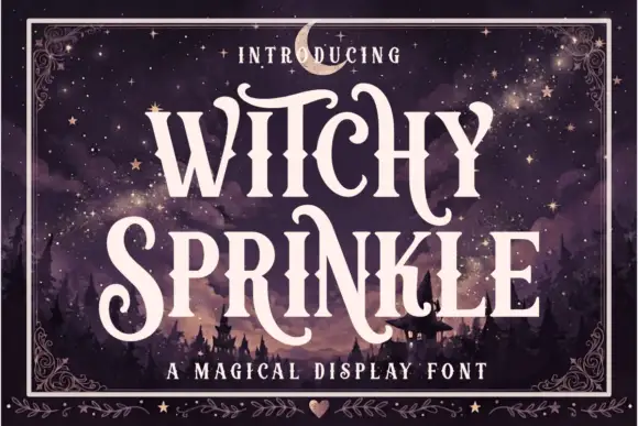
Witchy Sprinkle is a magical display serif in which the stems rise into elongated spurs, the terminals curl into points and the contrast stays high, so a two-word title reads as a hand-drawn storybook sign.
The W splays four pointed strokes, the I rises into a tall spur, the T spreads a thin arm with a curl, the C turns a hooked crescent and the S holds a curving spine, all at a high contrast with drawn terminal curls and stretched finials. The pointed finials are the character: they sit above the cap line and hang below the baseline, which is why the sample sets two stacked words with a wide gap and stars around them. Because the spurs are thin, the face needs 40 pt before they read, and it prints best in one light colour on a dark ground. The night sky, the moon, the cottage, the ornamented corner frame and the heart at the foot are presentation; the cream display words are the face.
A magical-tales anthology — Put the title in two spacious lines above a small plain author line, clearing the longest tail.
Confirm the shown S and N alternates are available.
 #16
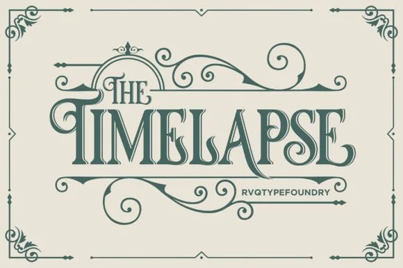
Timelapse is an ornate Victorian display serif crowned with spiraling vine swashes, teardrop terminals, and vintage apothecary charm.
Timelapse is a Victorian storybook and apothecary display serif with swashes: fine bracketed serifs against heavy stems, a small ball terminal on the diagonals, swash capitals that curl off the first letter and a slightly condensed width that keeps a long label on one line. The hairlines are the design and the swashes need side clearance. It needs roughly 30 mm for the swash and the hairline to read, and it is best in one fine ink on smooth or coated stock, or a foil impression above 40 pt where the curls still turn.
Steampunk or historical novel cover, tea tin & poster — Center 1-to-2-word uppercase titles at 48–72 pt, activating upper flourishes on left initials and lower curls on middle/right stems.
Fine spiral tendrils and thin serif crossbars belong in print, foil, or laser wood engraving rather than small cut vinyl.
 #17
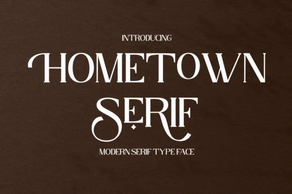
Hometown Serif is an elegant, high-contrast uppercase display serif accented by sweeping descender cradles and spiraled stem hooks.
Hometown Serif is a high-contrast modern display serif with curled swash stems: hairline hairlines against heavy stems, stems that curl out at the base into a small spur and swash capitals that finish in a drawn curl. The hairlines and the curls are the finest elements and both silt on textured stock. It needs roughly 30 mm for the curl and the hairline to read, and it is best in one fine ink on coated or smooth card, or a foil impression above 40 pt.
Formal invitation monogram, menu header & welcome mirror — Track uppercase titles slightly open (+30) at 32–48 pt, reserving decorative tail alternates for the first or center letters.
Hairline horizontal crossbars and thin serif feet are best suited to print, foil stamping, or 2 in+ mirror decals.
 #18
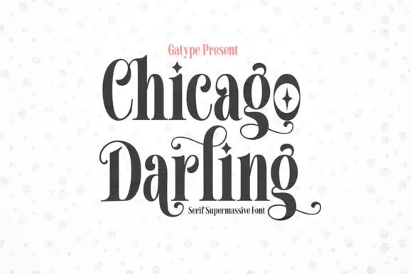
Chicago Darling is a bold, condensed modern-vintage serif distinguished by curled spiral terminals, sparkling counters, and deep descender loops.
Chicago Darling is a high-contrast vintage display serif with curled ball terminals: hairline thins against swollen stems, a small x-height, a high waist and terminals that roll into small balls on the a, c and r. It is the lettering of a nineteen-twenties poster and a department-store sign, so it wants size and air. The hairline thins are the finest element and they break first in print and in vinyl. It needs roughly 34 mm for the contrast and the ball terminal to read, and it is best one dark ink on a cream ground.
Soy candle vessel label & apothecary box front — Stack a two-word scent or brand name tightly at 32–42 pt with tighter line-height, anchored by minimalist uppercase sans notes below.
Hairline crossbars and spiral tips shine in 300 DPI print and hot foil; avoid weeding small adhesive vinyl below 2 inches cap height.
 #19
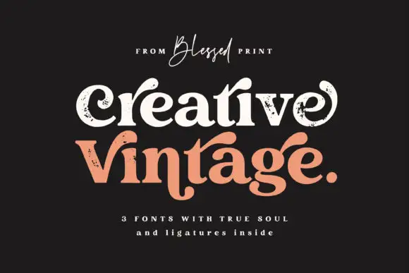
Creative Vintage is a high-contrast serif in which the terminals curl into swash shapes, the C turns inward, the t finishes in a broad low hook and scattered distressed marks break the fill, so a title reads as a worn printed label.
The C curls its terminal inward, the t ends in a broad low hook, the V and g stretch long curved extensions and the fill carries scattered marks that thin the strokes. The distressed curl is the character: the wear sits in the outline rather than over it, which is why the sample suits a printed label. Because the marks are small, the face wants 30 pt before they read as texture rather than dirt, and the thin curls need coated stock. The extra characters are PUA-encoded, so decorative access is a separate step.
A vintage-print collection band — Give the title two spacious lines and put item details in a clean separate strip.
Inspect the selected style and ligature access rather than assuming all three fonts match.
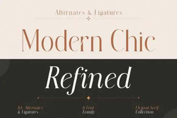 #20
Modern Chic Refined pairs a pale brown upright cap line with a white slanted word: both keep long fine stems and contrasting rounded bowls, and the italic f drops below the baseline as the one descending letter.
The upright cut holds fine stems with narrow joins, the italic leans with an open rhythm and the f extends below the line while the bowls stay round. The upright-and-italic pairing is the character: one line states and the other moves, which is why the sample sets two rows in two colours on a split cover. Because the hairlines are fine, keep 22 pt as the floor on coated stock, and treat the cover claim of six fonts and 83 alternates as advertising rather than a verified inventory.
A style-essay title pairing — Keep the italic descender clear of rules and credits.
Confirm the selected members and exact forms.
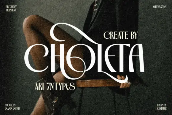 #21
Choleta builds tall white capitals and then lets thin strokes cross through them, so the counters open into slashes and the whole line reads as one sculpted ligature rather than six separate letters.
The name runs across a dark fashion photograph with the model seated, the white letters wide and the interior shapes cut away in dramatic curves, the shoulders of the C and the H reaching up past the cap line. Corner notes label it a modern display sans with alternates and ligatures, and two smaller lines of serif type frame it above and below. The effect depends on the cross-strokes, so the face needs a dark ground and a big size, and a plain setting without the alternates will not look like the sample. On a poster the open cuts print as light, which means a low-ink choice for large formats.
A decorative capital-name study — Test a single-color name with the descriptor outside both the upper and lower sweep zones.
Confirm each alternate and resolve the actual supplied alphabet rather than relying on conflicting category wording.
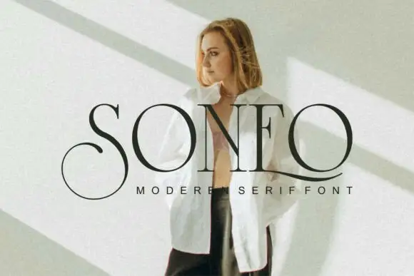 #22
Soneo is a fine high-contrast serif in which the letters run tall and narrow, the hairlines are true hairlines and the capital S curls far beyond its letter body, so a name reads as a fashion masthead.
The S is the defining letter: a tall narrow spine with a curl that opens above and sweeps out below, extending past the width of every other capital in the word. The O closes an oval counter, the N keeps two fine stems, the E carries three thin arms and the O repeats the oval, all with heavy vertical strokes and hairlines that nearly disappear at the joins. That contrast is what gives the face its editorial register, and it is also what limits reproduction: the face needs a coated stock and a size of 24 pt or more, or the hairlines will break up. The fit is tight so the curling S overlaps its neighbour deliberately. The model photograph, the shadow on the wall, the black ink and the tracked caption are presentation; the typeface is the word.
A modern studio-name study — Keep a plain descriptor clear of the lower extension.
Check name rights and exact alternate mapping.
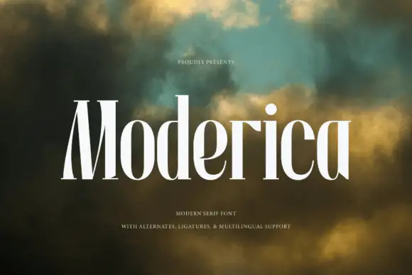 #23
Moderica is a tall condensed serif in which the stems hold substantial weight, the bowls compress into narrow curves and the ratio between them runs steep, so a stacked title reads as an architectural editorial head.
The M compresses its apexes into a tight block, the d rises on a heavy vertical, the i keeps a small square dot and the bowls of o and e narrow until they read as vertical ovals against the stems. The vertical rhythm is the character: a long word fits a narrow column without losing its contrast, which is why the sample stacks white letters over a blurred green field. Because the bowls are narrow, the face wants 20 pt before they stay open, and ligatures plus alternates allow awkward pairs to be swapped so the rhythm holds. The blurred field and the small caption are presentation; the white serif letters are the face.
A contemporary design-feature title — Set the narrow title on two generous lines, leaving its tall stems clear of a sturdy credit line.
Proof narrow counters and the exact title.
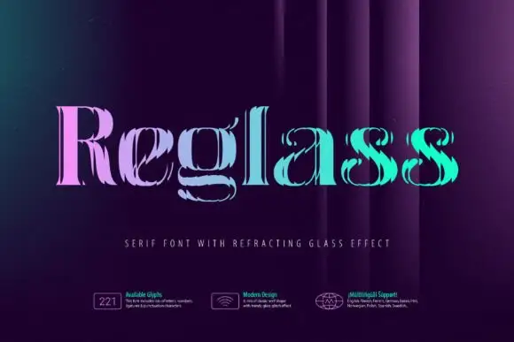 #24
Reglass shows thin high-contrast serif letters broken into closely spaced vertical-looking ridges with displaced edges, so the bowls and stems appear refracted rather than uniformly solid.
The stroke is sliced into fine vertical strips, the edges shift between them and the gradient moves from pink to teal across the face. The refraction is the character: the letter looks seen through glass rather than printed on paper, which is why the sample fills a dark ground. Because the ridges are narrow, keep 40 pt before the fragments merge into noise, and keep the tile to a short word since longer lines lose the effect. Fine fragments also degrade quickly in low-resolution output.
An experimental design-zine title — Keep the title large against a flat dark field with a plain issue line below.
Verify whether the effect is in glyph outlines or needs separate artwork steps.
 #25
Vanielst is a substantial, medium-high-contrast display serif highlighted by graceful overhead swash loops and crisp bracketed feet.
Vanielst Elegant Serif Display Stylistic is a bold transitional display serif with an overhead canopy swash: sturdy bracketed stems, a moderate contrast, crisp horizontal serifs and a capital set that carries a wide arc of swash above the word like an awning. The canopy is the design and it needs vertical room, so the face cannot be tucked under a fold. The canopy and the hairlines are the finest elements and they break first. It needs roughly 36 mm for the canopy and the serif to read, and it is best one dark ink on a bright stock.
Perfume carton, candle vessel & boutique wordmark — Set a single 5-to-8-letter brand name at 36–54 pt, activating only one canopy swash alternate so the silhouette stays clean and memorable.
Substantial main stems cut cleanly on sign vinyl down to 1 inch, though tapering overhead swash tips perform best in print, foil, or larger 2 in+ decals.
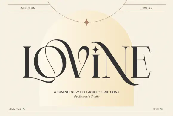 #26
Lovine is a high-contrast capital face in which a thin loop winds through the L and O, the N diagonal drops below the final E and a diamond-like mark rises over the middle, so a name reads as linked monogram lettering.
The L extends a hairline loop into the O, the N sends its diagonal below the baseline, the stems stay slender with a sharp thick-thin break and the small diamond mark sits above the centre. The linking loop is the character: it joins letters without making them a script, which is why the sample sets one word inside a pale arch. Because the loop travels, the layout needs 18 mm at each end from 26 pt, and the hairlines want coated stock. The arch and rules in the sample are layout; the dark capitals are the face.
A formal name-line study — Use one verified endpoint treatment above plain names and dates.
Proof the full phrase and actual case mapping.
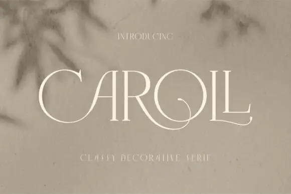 #27
Caroll is a fine high-contrast capital face in which slender stems carry wide round bowls and low circular swashes run from the C and A region toward the middle and loop again through the O and final L, so a name reads as engraved lettering.
The C opens wide, the A keeps a fine apex, one low curve crosses the middle of the word and another loops through the O into the final L, all on hairline strokes with sharp thick-thin breaks. The circular swash is the character: it links capitals without closing the word, which is why the sample sets one name over soft plant shadows. Because the curves run low, the layout needs 20 mm beneath and 18 mm at each end from 26 pt; the source lists alternates and accented support, so shapes are a choice rather than a default.
A light invitation-heading study — Reserve one clear lower band for the circular extensions.
Verify actual names, ampersand and plain forms.
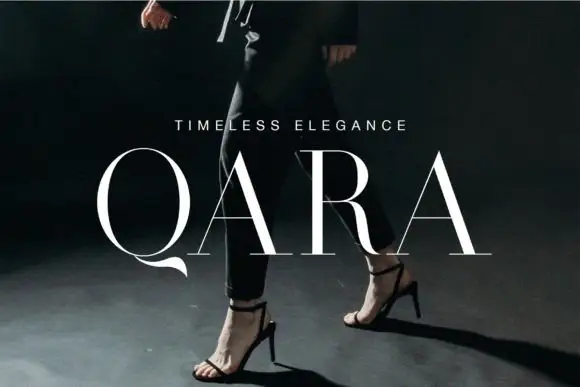 #28
Qara is a fine high-contrast capital face in which the bowls run broad and light, the A crossbars stay thin and the Q finishes in a short thick tail, so a wide-tracked name reads as a fashion house signature.
The O closes a wide thin ring, the Q adds a short heavy curve below the baseline, the A carries an especially light crossbar and the stems hold a fine vertical contrast that thins at every join. The short tail is the character: one heavy mark against an otherwise pale line, which is why the sample sets a spaced name across a dark photograph. Accented Latin is included, so a name keeps its diacritics without substitution. Because the stems are fine, the face wants coated stock from 18 pt with wide tracking, and the tail needs 8 mm of clearance below the baseline. The dark fashion photograph and the small caption are presentation; the pale spaced capitals are the face.
A restrained apparel-label name — Use flat dark letters on a clear light tag.
Check name rights and crossbars in print.
 #29
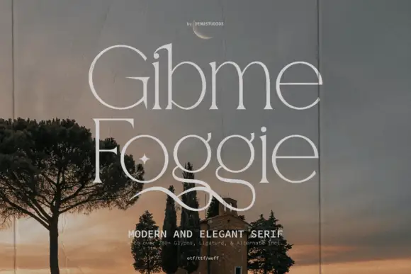
Gibme Foggie shows pale fine lettering in two rows over a distant building and trees, where wide circular bowls meet slender upright stems and the repeated lower g forms descend into long crossing loops below the line.
The bowls open wide and round, the stems stay fine, the descenders cross into long loops and the whole line keeps a light even colour. That crossing loop is the character: a fine serif gains a drawn flourish at the end of the word, which is why the sample repeats it across two rows. Source notes list ligatures and stylistic alternates, so check which forms your file actually carries, keep the hairlines on coated stock and allow 20 mm beneath the loops from 28 pt.
A fine two-word identity study — Reserve a full lower loop band before a plain descriptor on a flat card.
Check name rights and alternate access.
 #30
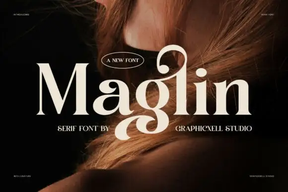
Maglin shows pale substantial serif mixed case over a close portrait: the M holds firm thick diagonals, the a curls inward, the tall l bends into a rounded upper hook and the g drops a broad descending loop toward the subtitle.
The stems stay thick, the bowls round out, the joins keep a moderate contrast and two letters travel beyond the line, one above as a hook and one below as a wide loop. The paired extensions are the character: the row is framed above and below by the same weight, which is why the sample sets one name over a portrait. Because the loop reaches into the subtitle area, keep 24 mm beneath and 18 mm above from 30 pt, and treat the ligature and alternate lists as deliberate access.
A curled personal-studio identity — Reserve separate top and bottom clearances before placing a service descriptor.
Check name rights and access to plain forms.
 #31
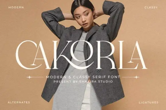
Cakorla shows pale high-contrast capitals over a fashion portrait, where the broad O overlaps the central region, a long K leg sweeps below it and the C extends into a shallow curved lower terminal.
The stems stay thick, the joins thin to hairlines, the O widens well past its neighbours and two strokes travel across letters to suggest a link. That interlacing is the character: a plain cap row reads as a fitted mark, which is why the sample sets one short name on a portrait. Small captions mention alternates and ligatures but prove nothing about coverage, so confirm whether the crossing strokes exist as characters and keep 30 pt before the hairlines break.
An interlaced boutique-name study — Compare a plain lockup with one verified interlaced version on a flat card.
Check name rights and alternate mapping.
 #32
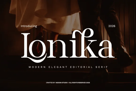
Lonika is a refined, high-contrast modern editorial serif distinguished by cradle-looped capitals and curved calligraphy-style ascenders.
Lonika is a high-contrast romantic editorial serif with floral dots and swashes: fine hairline hairlines against heavy stems, ball terminals that finish in a small flower, swept swash capitals that curl off the first letter and a tall cap height that fills a heading. The hairlines and the floral dots are the finest elements and both silt on textured stock. It needs roughly 30 mm for the flower dot and the swash to read, and it is best in one fine ink on coated or smooth card, or a foil impression above 40 pt.
Evening wedding invitation suite, vow book & menu title — Spotlight a single surname or venue word at 48–68 pt centered over dark photography or thick cotton stock.
Delicate hairline serifs and horizontal bars belong in high-DPI print, letterpress, or foil stamping rather than tiny cut vinyl.
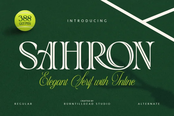 #33
Sahron is an aristocratic high-contrast serif accented by fine interior inline grooves down its primary vertical and diagonal stems.
Sahron is an engraved inline luxury display serif in a regular and an alternate cut: high-contrast stems with a fine white inline running down the middle of every thick stroke, sharp bracketed serifs and an alternate set that shifts the inlay to a double line. It is a banknote and a perfume-box face, so it wants size and precise registration rather than a soft ground. The inline is the finest element and it fills or breaks first in print and in foil. It needs roughly 40 mm for the inline to read, and it is best one dark ink on a bright coated stock.
Emerald spirits label, bespoke tailoring seal & candle box — Set a single uppercase brand name at 42–64 pt with +35 tracking over rich hunter green, navy, or matte black stock.
Fine interior inline slots shine in 300+ DPI offset/digital print and hot foil; avoid small blade-cut vinyl where narrow inline strips could lift.
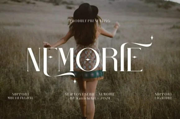 #34
Nemorie is a refined high-contrast display serif featuring sweeping scythe-like swash bars, sculpted ligatures, and four-point star accents.
Nemorie is a high-contrast art-nouveau serif with celestial ligatures: a thin-thick stroke with hairline hairlines, tall whipped ascenders that rise into a small star or comet tail and ligature pairs that knit two letters into one drawn shape. The hairlines are the design and the first thing to break on textured stock, and the ligatures change the word's width as they engage. It needs roughly 28 mm for the hairline and the comet tail to read, and it is best in one fine ink on smooth or coated stock, or a foil impression above 40 pt where the hairlines still carry.
Fantasy novel cover, tarot guidebook & poetry anthology — Center 1-word titles at 56–90 pt with +15 tracking over moody photography, keeping author names clean below.
Ultra-fine hairlines require book printing, foil stamping, or high-res digital covers rather than small cut vinyl.
Practical buyer checklist
Key cutting, printing and pairing answers before choosing a luxury & modern serif typeface.
Around 12 pt in print on coated stock, and 18 pt on screen. Below that the hairline joins the background, especially in reversed-out white on a dark panel, so use a regular-weight companion for small text.
Yes, and it is a strong alternative to script. Keep the names in the serif, put the logistics in a quiet sans, and leave the swashes on one line only so the composition keeps a single focal point.
Foil spreads slightly under heat and pressure. Compensate by reducing the hairline weight or choosing a lighter cut, and test on the exact stock, since coated and textured papers absorb the stamp very differently.
Some ship italics as separate files, others only slant the roman. A true italic has different letter shapes, not just an angle, so check the specimen for a single-storey a or an italic e before relying on it for editorial captions.
Keep exploring
Explore adjacent maker roundups or check our practical pre-production checklists.
39 curated fonts · Previews & pairings
23 curated fonts · Previews & pairings
19 curated fonts · Previews & pairings
28 curated fonts · Previews & pairings
Guides: Invitation font checklist · Vinyl & cutting checklist · How to pair script & sans fonts
Allow optional Google Analytics to measure visits and catalogue actions. Your search words and notes are not included. Privacy & storage