 #1 · Best Overall
Disclosure: MakerFileHub may earn a commission from qualifying purchases via paid links on this page. How our links work.
Thumbnail impact, episode titles & stream overlays
24 Best YouTube, Podcast & Gaming Fonts
A thumbnail is read at 120 px wide on a phone, which removes everything except silhouette and weight. Isaac and Headline deliver the condensed impact, Gc Grind and Season add inktrap and chamfered detail, and Pixel Wonder and Chakord Pixel cover the gaming and retro-arcade channels. Posterplush and Pogat handle the playful packaging-style thumbnails.
Quick verdict
Headline is the most reliable screenshot font for thumbnails, Isaac is the strongest for esports and gaming, and Gc Grind adds an inktrap edge for sports and commentary channels. Chakord Pixel covers the retro gaming niche.
Quick answer
Top 3 YouTube thumbnails, podcasts & gaming picks right now.
Short on time? Start with our three highest-rated YouTube thumbnails, podcasts & gaming standouts before scrolling the full breakdown.
#1 · Best Overall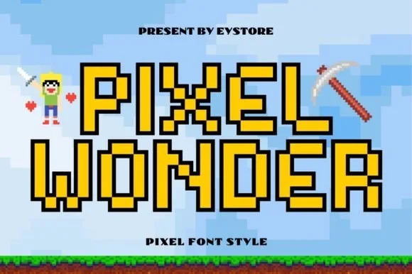 #2 · Runner-Up Pick
 #3 · Editor's Choice
How we tested & selected these 24 fonts
We kept 24 of 419 candidates after testing each at 120 px and 320 px wide, the sizes a thumbnail is actually viewed at. Weighted silhouette clarity, how the face survives YouTube's compression, and whether a solid and outlined weight exist.
Side-by-side summary
Top 5 YouTube thumbnails, podcasts & gaming picks at a glance.
Compare specimens, OpenType/PUA traits and primary project roles side by side.
| Rank & Font | Style & File Specs | Best Project Fit | Store Listing |
|---|---|---|---|
| DisplayHigh-octane | Racing number graphic, gaming stream overlay & jersey logo | Get fontPaid link | |
| Decorative8-bit | Minecraft/sandbox gamer birthday banner, cake topper & tee | Get fontPaid link | |
| DecorativePUA encoded · Alternates & swashes | 'Level Up' gamer birthday topper & party shirt | Get fontPaid link | |
| DisplayPlush-chunky | Classroom rule poster, hallway directional sign & shirt | Get fontPaid link | |
| DisplayCereal-box-fat | Cookie/granola pouch, ice-cream pint, burger wrap & merch | Get fontPaid link |
Display & Decorative Headlines
9 fonts#1 · Best OverallIsaac
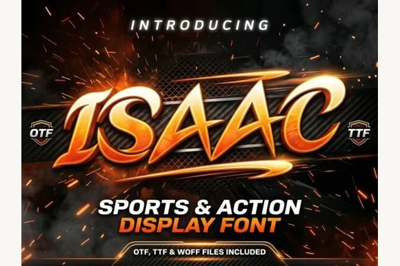
Isaac is an aggressive, forward-slanted sports display font featuring speed-sliced horizontal wings and razor-angled athletic geometry.
Isaac is a slanted winged esports and motorsport action display: heavy squared letters on a firm forward slant, small wing plates cut through the stems and a hard keyline that reads as a team livery. The wings and the slant give the word speed, and the wings close first when the face is reduced. It needs roughly 28 mm for the wing and the keyline to read, and it is best in two flat inks on a dark ground, or one ink plus paper where the wings print as knockouts.
Recommended project & layout
Racing number graphic, gaming stream overlay & jersey logo — Set all-caps names at tight -10 tracking, adding a crisp two-color offset stroke in Illustrator or Canva.
Before you cut or print
Solid broad athletic stems cut cleanly on racing car vinyl, helmet decals, and jersey HTV down to 0.85 inches.
Best paired with
Get fontPaid link
#2 · Runner-Up PickPixel Wonder
Pixel Wonder is an authentic, grid-locked 8-bit pixel block font framed by crisp stepped black pixel outlines for instant sandbox-game nostalgia.
Pixel Wonder is an outlined eight-bit pixel block font: every letter is built from square pixels on a fixed lattice with a hollow interior and a black contour around the outside, so a word reads as a stamped screen rather than a filled bitmap. The lattice means the face only works at whole multiples of its pixel size, and the outline closes first. It needs roughly 26 mm for the contour and the pixel step to read, and it is best in two inks on white, or one ink plus a knocked-out interior on black for a screen look.
Recommended project & layout
Minecraft/sandbox gamer birthday banner, cake topper & tee — Fill interiors with bright gold, emerald green, or diamond cyan inside Canva/Illustrator for Print-Then-Cut party toppers.
Before you cut or print
Straight 90-degree pixel corners cut cleanly on cardstock, HTV, and vinyl when scaled above 1.25 inches.
Best paired with
Get fontPaid link
#3 · Editor's ChoiceChakord Pixel
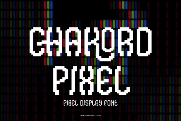
Chakord Pixel builds chunky 8-bit arcade capitals from crisp square pixel blocks with playful notched corners and ligature-like joins.
Chakord Pixel is a stair-stepped eight-bit arcade pixel display: every stroke is built from square cells on a fixed grid, with hard diagonal steps, chunky caps and no anti-aliased curves at all. The grid is the design, so the face must be set on an even multiple of the cell size or the steps break into uneven runs. The corners are the finest element and they crumble when the face is scaled off-grid. It needs roughly 32 mm for the cell to read as a pixel, and it is best one bright ink on a dark ground.
Recommended project & layout
'Level Up' gamer birthday topper & party shirt — Stack 'LEVEL 10' or the birthday kid's gamer tag in two centered lines, backing white letters with a black offset pixel shadow.
Before you cut or print
Because stepped corners create many tiny 90-degree turns, use a fresh 45-degree blade at medium speed so vinyl corners lift sharply.
Best paired with
Get fontPaid link
 #4 · Top Maker Utility
Posterplush
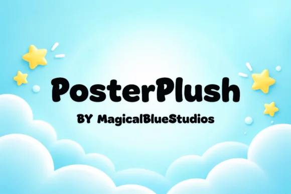
Posterplush is a bold, velvety-thick rounded display font combining heavy black poster mass with warm hand-drawn softness.
Posterplush is a velvety-thick rounded display that mixes heavy black poster mass with hand-drawn softness, in mixed case with plump bowls and a warm, slightly irregular contour. The weight is enormous, so the letters read as a silhouette and the counters are small, which means the face needs size to stay legible. It needs roughly 32 mm for the rounded contour to read as drawn rather than as a fill fault, and it is best in jet black on a bright ground or in cream on deep blue.
Recommended project & layout
Classroom rule poster, hallway directional sign & shirt — Set 1 or 2 mixed-case words at 60–115 pt in solid black, cobalt, or white across balanced outer margins.
Before you cut or print
Ultra-sturdy 100% solid shapes cut and weed in seconds on Cricut cardstock, HTV, and permanent vinyl down to 0.55 inches!
Best paired with
Get fontPaid link
 #5 · Standout Silhouette
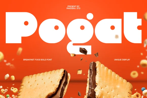
Pogat
Pogat is an ultra-heavy, slab-thick retro packaging font with massive ink mass and tiny circular pinhole counters built for snack and food branding!
Pogat is an ultra-fat geometric display built for packaging and cereal boxes: near-solid slabs, tight counters reduced to small slots, a level baseline and a chunky regularity that reads as a printed carton front. The slots are the only negative space and they close first, and the weight makes a word very wide. It needs roughly 34 mm for the slot and the slab edge to read, and it is best in two flat inks on board, or one ink plus a knocked-out slot on coloured stock.
Recommended project & layout
Cookie/granola pouch, ice-cream pint, burger wrap & merch — Set 1 short 4-to-7-letter brand name edge-to-edge (90–180 pt) in stark white or cocoa brown over saturated orange, yellow, or red.
Before you cut or print
Outer silhouettes weed in 3 seconds on HTV and vinyl—watch tiny pinhole counters inside 'P', 'o', 'g', and 'a' below 1 inch!
Best paired with
Get fontPaid link
 #6
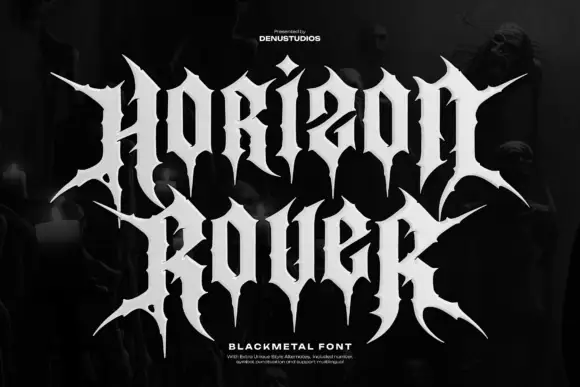
Horizon Rover
Horizon Rover draws black metal lettering: tall letterforms built from sharp spikes, hairline joins and diamond finials, so a two-word title reads as a logo stamped on a record sleeve.
HORIZON over ROVER fills the frame in white on a dark backdrop of figures and fog, the H built from thin diagonal strokes that end in points and the R carrying a spike above the bowl. The joins thin almost to nothing, which is what gives the style its menace, and the counters stay narrow. Two tracked captions sit below, one naming the face and one naming the foundry, plus a short note about alternates. It is a display style with real fragility: the hairline joins vanish at small sizes and in low-resolution output, so it belongs on posters, sleeves and merchandise, not on labels.
Recommended project & layout
A heavy-music showcase poster — Stack the two words on black with deep side margins, and place the lineup in a plain white footer.
Before you cut or print
Check alternate access and whether both rows remain readable without their cover arrangement.
Best paired with
Get fontPaid link
 #7
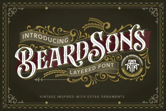
Beardsons
Beardsons rises diagonally across an ornate olive cover, where white capitals carry thin internal lines, narrow waists and extended curled terminals around the opening B and the central S, a dark red offset behind the letters adds depth and fine gold foliage frames the name.
The stems stay narrow at the waist and wide at the terminals, the internal hairlines cut through the bodies and the offset duplicates the contour behind. That layered offset is the character: the word reads as a carved Victorian sign rather than a flat lettering job, which is why the sample runs on a diagonal across a bordered field. The gold foliage, the border and the banners are artwork. Keep 44 pt so the thin inner lines survive, allow 12 mm for the offset and check the diagonal at the trim.
Recommended project & layout
A barbershop appointment-card front — Angle BEARDSONS slightly across a dark olive card front; place BARBER in small plain capitals beneath, and booking details on the reverse.
Before you cut or print
Verify available letter variants and any layer registration in the intended application.
Best paired with
Get fontPaid link
 #8
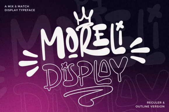
Moreli
Moreli is a playful mix-and-match street-bubble display typeface shipped in both solid Regular and matching hollow Outline versions.
Moreli is a street-art bubble and outline graffiti display duo: the fill cut is a fat rounded bubble with a wide flare and a slight lean, while the outline cut traces the same shapes as a hollow keyline for a second colour behind or in front. The pair is designed to be layered, so the outline only makes sense when it is registered against the fill. The keyline is the finest element and it closes first when the face is reduced. The fill needs roughly 36 mm and the outline 44 mm for their detail to read.
Recommended project & layout
Streetwear drop tee, skate sticker & podcast cover — Stack the solid Regular style on line one at 110% scale above the Outline style on line two, tilting the whole lockup 5 degrees.
Before you cut or print
Use the solid Regular cut for vinyl decals; reserve the fine double-wall Outline version for screen printing, DTF, or large posters.
Best paired with
Get fontPaid link
 #9
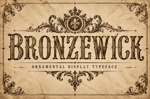
Bronzewick
Bronzewick pairs tall narrow Old West capitals with fine engraved linework inside every stem, so a single-colour print gains the depth of copperplate or woodblock engraving without a second ink.
The letters stay narrow and tall with heavy bracketed serifs, and the interior of each stem carries thin parallel hatch lines that read as shading. The internal hatching is the character: the depth lives inside the letter rather than in an outline, which is why the sample suits a whiskey label. Because the hatch lines are fine, keep 34 pt before they resolve, and check that the chosen surface does not fill them at press. The face suits short heritage headings and loses the engraving effect on longer lines.
Recommended project & layout
Craft whiskey label, beard-oil bottle or book cover — Use at 36pt+ on light kraft or cream stock so internal hatching lines stay crisp.
Before you cut or print
Fine internal engraving lines are made for print, laser engraving and sublimation — not blade vinyl cutting.
Best paired with
Get fontPaid link
Clean Sans & Handwritten Print
13 fonts #10
Headline
Headline is a crisp, heavy condensed sans serif engineered with flat horizontal terminals, narrow counters, and clean newspaper-poster punch.
Headline is a heavy condensed poster sans with flat horizontal terminals, narrow flat-sided counters and uniform vertical pillars, so a word reads as a newspaper poster rather than a modern display. The condensation packs a long line into a narrow measure, and the flat terminals survive a cheap single-colour print. It needs roughly 30 mm for the narrow counters to stay open, and it is best in cobalt or black on off-white gallery stock, or white on a saturated ground.
Recommended project & layout
Magazine feature opener, sports poster & social carousel — Set primary titles in all-caps at 72–140 pt with -10 tracking, paired with tracked lighter condensed captions above and below.
Before you cut or print
Razor-straight edges weed in seconds on large window decals, gym wall vinyl, and apparel HTV.
Best paired with
Get fontPaid link
 #11
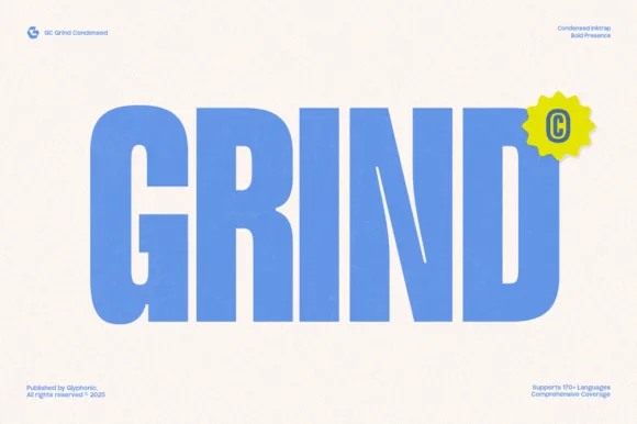
Gc Grind
Gc Grind is a bold condensed sans-serif engineered with subtle corner inktraps and flat industrial curves across 170+ languages.
Gc Grind is a heavy condensed inktrap display sans: very narrow squared stems, small triangular traps cut into the joins where two strokes meet, a tall cap height and tight counters that read as a stencil-cut industrial headline. The traps are the design and they fill into solid corners as soon as the face is printed small. It needs roughly 24 mm for the trap and the condensed stem to read, and it is best in one dense ink on uncoated stock, or a single white on a dark ground where the traps print as cut notches.
Recommended project & layout
Coffee roastery bag, energy-drink can & streetwear tag — Run bold uppercase product names vertically or across narrow 2.5-inch can panels, pairing specs in a tiny technical grotesk.
Before you cut or print
Solid vertical bars cut cleanly on matte vinyl and stencil mylar; keep height above 0.8 in so the intentional inktrap notches stay visible.
Best paired with
Get fontPaid link
 #12
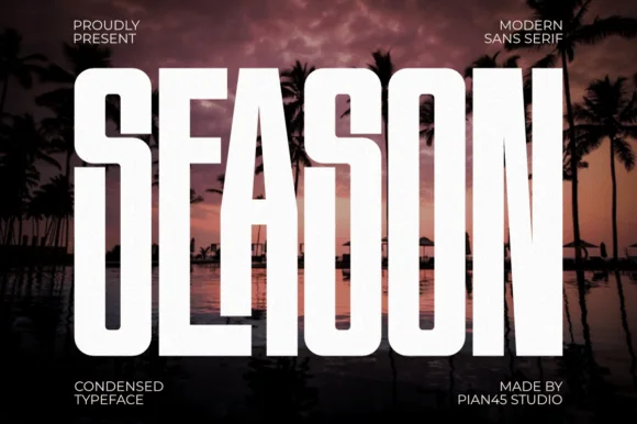
Season
Season is a massive, ultra-bold condensed sans with crisp chamfered outer bowls ('S', 'O') built for billboard-scale headlines and thumbnails.
Season is a massive chamfered-shoulder condensed impact sans in caps, with flat sides cut at an angle where the stem meets the bar and very tight sidebearings, so a word reads as a stamped panel rather than as a headline. The chamfer is the design, which means the face needs size for the angled shoulders to read as machined, and the tight fit demands tracking when set long. It needs roughly 40 mm for the chamfers to hold, and it is best in white on a dark ground or a single flat colour on a pale one.
Recommended project & layout
YouTube travel thumbnail, festival stage banner & podcast — Span 1 uppercase word edge-to-edge (110–200 pt) in stark white across dark moody photography.
Before you cut or print
100% solid, straight-sided shapes cut and weed in seconds on Cricut HTV, car-window Oracal 651, and stencils down to 0.65 in!
Best paired with
Get fontPaid link
 #13
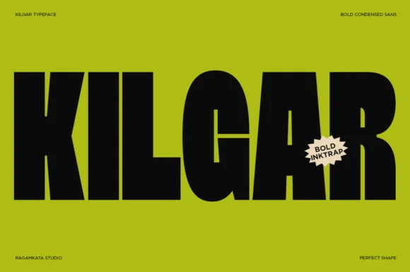
Kilgar
Kilgar is a bold modern condensed sans carving dramatic, sculptural inktrap wedges into the intersections of 'K', 'L', 'G', 'A', and 'R'!
Kilgar is a bold condensed sans with sculptural inktrap wedges cut into the intersections of letters like K, L, G, A and R, so the joins read as carved V-cuts rather than printed corners. The stems are massive and the compression is strong, which fits a long title into a narrow panel, and the traps are the only fine detail, so they close below about 25 mm. It is a poster, signage and apparel face, at its best in one flat colour on a bright ground with a hard silhouette.
Recommended project & layout
Tech/design conference identity, electronic label & streetwear — Set 1 uppercase title huge (100–200 pt) in jet black over high-voltage chartreuse, safety orange, or silver.
Before you cut or print
Clean, sharp vector polygons cut crisply on 0.9 in+ Cricut HTV and vinyl—peel gently around the V-shaped inktrap notches!
Best paired with
Get fontPaid link
 #14
Taught
Taught is a heavy, flat-sided condensed sans-serif with tight interior counters and commanding vertical headline presence.
Taught is a bold flat-sided condensed poster grotesk: narrow stems with completely flat sides, tight square counters, a bold weight that holds across a large format and a set of slightly odd terminals that give it a printed poster feel. The flat sides keep a word from looking hand-made, and the counters close when the face is scaled down. It needs roughly 22 mm for the counter and the flat side to read, and it is best in one dense ink on uncoated stock, or a single white on a dark ground.
Recommended project & layout
YouTube thumbnail headline, fitness poster & magazine cover — Set 1-to-4-word uppercase punchlines at 72+ pt with +15 tracking and tight 0.92 line-height over high-contrast backgrounds.
Before you cut or print
Broad flat stems weed fast on sign vinyl and HTV down to 0.6 inches—zero fragile serifs or hairlines to tear.
Best paired with
Get fontPaid link
 #15
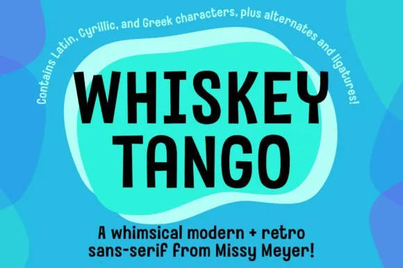
Whiskey Tango
Whiskey Tango is a lively, tall-and-narrow rounded sans-serif packed with Latin, Cyrillic, and Greek support plus over 110 PUA alternates.
Whiskey Tango is a tall condensed rounded retro sans with more than a hundred and ten private-use extras: squeezed caps with soft corners and a high waist, plus swash letters, ligatures, tails and ornaments reached through alternate keystrokes. It is a packaging face, so it wants a tall panel and a single flat ink rather than a soft ground. The soft corners are the finest element and they plug first at small sizes. It needs roughly 26 mm for the corner and the condensed stem to read, and it is best one flat ink on kraft or white board.
Recommended project & layout
Retro travel poster, podcast cover & cocktail menu — Stack two-word drink or episode titles in 48 pt uppercase at tight 0.95 line-height, using mixed-case Whiskey Tango or a light sans for descriptions.
Before you cut or print
Rounded stroke ends and generous counters make this one of the cleanest tall sans faces to cut on Oracal 651 or HTV even at 0.65 in.
Best paired with
Get fontPaid link
 #16
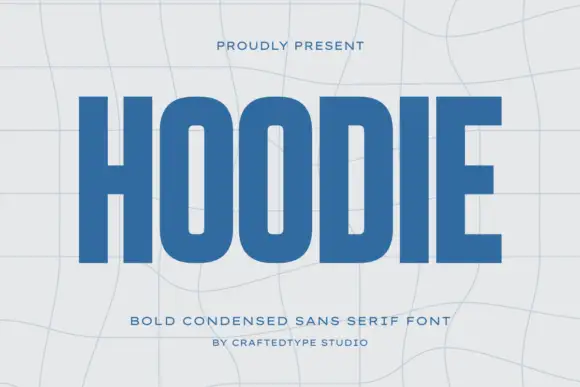
Hoodie
Hoodie shows a large blue uppercase word on a pale warped-grid field, where heavy straight uprights and flat horizontal endings form a dense block, the O and D hold rounded rectangular counters, the H crossbar sits near the middle and the E keeps three squared arms.
The stems stay straight and heavy, the counters turn into rounded rectangles, the endings flatten and the row compresses. That compression is the character: a short word becomes a dense block, which is why the sample fills the width on a warped grid. The grid bends independently of the type, so check the counters at your final size, keep 40 pt before they close and confirm the condensed caps are what your file actually holds. The rounded rectangular counters are the failure point: they close at about 30 pt and the word reads as a dense ribbon, so keep 40 pt and do not let a curved grid carry the type.
Recommended project & layout
A compact athletic-club name study — Set one flat name line above a plain independent-club descriptor.
Before you cut or print
Check counter openness at badge size and test any garment process separately.
Best paired with
Get fontPaid link
 #17
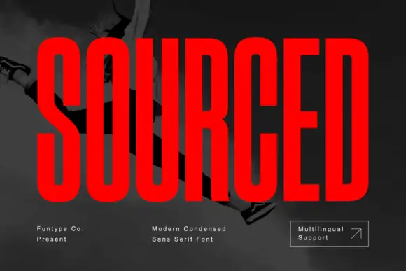
Sourced
Sourced shows vivid red capitals across a dark monochrome photograph, where tall heavy uprights and flat-ended arms leave thin rounded rectangular counters inside the O and D, the R carries a straight angled leg and the C opens only a small gap on its right side.
The stems stay tall and thick, the counters squeeze into vertical rectangles, the arms end flat and the side openings close. That compression is the character: a long word fits a narrow field without losing height, which is why the sample sets a single name alone on a photograph. Language support is mentioned on the cover but only the name and small captions appear, so check the accented characters you need, keep 40 pt before the counters close and give the rows extra leading.
Recommended project & layout
A bold documentary-feature heading — Use a clear flat panel for the main words and keep credits outside the block.
Before you cut or print
Check small apertures and title contrast in a print-size proof.
Best paired with
Get fontPaid link
 #18
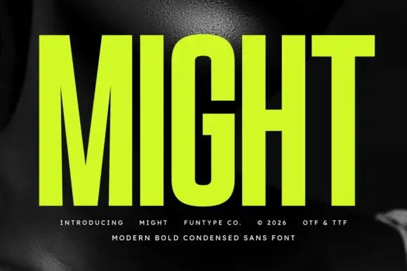
Might
Might shows lime uppercase lettering over a dark monochrome photograph, where very tall heavy stems and tight vertical counters create a compressed block, the M drops a deep centre and the G keeps rounded rectangular outer corners with a narrow internal opening.
The stems stretch tall, the counters close narrow, the M bottoms out and the G rounds its corners. That compression is the character: a short word becomes a vertical block, which is why the sample sets one word across the frame. The G opening matters at small sizes, so keep 44 pt, test the counters on plain colour and check the deep M against your own line breaks before the cover art is signed off. The narrow counters are the failure point: they silt at about 30 pt and the whole word greys into a bar, so keep 44 pt and never set the face over a photograph.
Recommended project & layout
A compact training-event poster title — Stack two short capital lines beside a plain horizontal time and venue panel.
Before you cut or print
Check interior openings at final viewing distance; the cover is not a performance claim.
Best paired with
Get fontPaid link
 #19
Six Sound Font
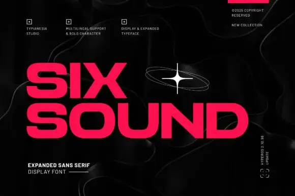
Six Sound Font shows hot-pink capitals in two rows against black, where the S has broad flat-ended curves, the O is wide and rounded, the X spans a strong diagonal cross and the title leaves a noticeably large horizontal footprint even in short words, with a white orbital star and faint contour lines around it.
The letters stretch wide, the bowls open round, the ends cut flat and the rows take a lot of width. That expansion is the character: a short word fills a wide field, which is why the sample needs two rows on a square cover. The star and contour lines are decoration, so plan your line breaks for the footprint, keep 40 pt before the flat cuts lose definition and check that a narrow label is not the right home for this face.
Recommended project & layout
An independent radio poster — Run LATE SIGNAL across a black poster above a narrow white schedule column, leaving the title free of orbital graphics.
Before you cut or print
Fit the actual words without compression and check small counters under the chosen pink ink.
Best paired with
Get fontPaid link
 #20
Guns & Smoke
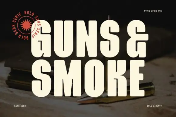
Guns and Smoke is an ultra-bold condensed sans: stems nearly rectangular, counters cut to tall slots, and flat terminals that give a word the weight of a stencil on a crate.
GUNS and SMOKE are stacked in cream on a dark photograph of cartridges and a compass, the letters so condensed that the two rows form one tall block across the frame. The stems are straight bars with no taper, the S is almost a set of right angles, and the G has a flat crossbar that closes the aperture to a slot. There is no contrast at all, so the face depends entirely on mass and spacing, and the spacing is tight enough that the rows nearly touch. Small credits sit in the corners at a fraction of the size: a studio banner on the left, the style at the foot, and a note about language support at the right. The face is built for headlines at the top of a poster, a crate stencil or a record sleeve, and it should never be set in a paragraph, where the slots merge and the words become a grey block.
Recommended project & layout
A dark-still-life photo title — Place DUST & LIGHT in a pale upper block above a dark object photograph with a plain credit strip below.
Before you cut or print
Verify the ampersand and narrow counters at the final size.
Best paired with
Get fontPaid link
 #21
Banana Cupcake
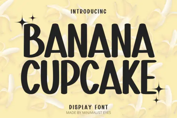
Banana Cupcake stacks two large words in dark letters on a pale banana photograph, where tall narrow capitals fill the width, the counters squeeze into thin slots, the corners soften slightly and the letter widths shift row by row so the second word runs wider than the first.
The stems stay tall, the counters stay narrow, the widths vary and the corners soften just enough to feel hand-set. That condensed density is the character: two long words fit one square panel without shrinking, which is why the sample sets them at full width. The banana imagery and the sparkles belong to the artwork. Keep 44 pt so the slot counters stay open, test the narrow letters on a small label and avoid setting a long phrase in this face.
Recommended project & layout
A small-batch granola pouch — Set the range name above a smaller flavour line. Put weight and ingredients in a separate, plainly set area near the base, leaving a clear gap below the headline.
Before you cut or print
Proof the narrow counters on the actual pouch material.
Best paired with
Get fontPaid link
 #22
Nugget
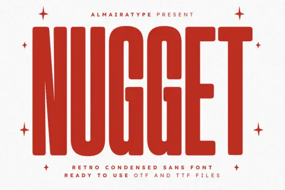
Nugget shows red capitals filling most of a white cover, where thick near-even strokes leave thin vertical openings in the U and G, the N draws a sharply narrowing diagonal and every outer corner softens.
The weight stays almost solid, the channels run thin and vertical, the corners round off and the T spreads a wide flat top. That narrow channel is the character: the letters read as cut slots in a slab rather than counters in a drawn face, which is why the sample sets one large word with small captions around it. The listed formats are cover claims rather than inspected files, so keep 44 pt, proof the channels at final size and test any cutting claim yourself.
Recommended project & layout
A condensed food-feature title — Stack two brief words above plain credits with wide outer margins.
Before you cut or print
Inspect narrow channels at final print size before reducing the heading.
Best paired with
Get fontPaid link
Serifs & Slab Serifs
2 fonts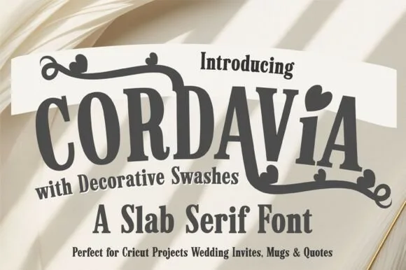 #23
Cordavia Bold Swash
Cordavia Bold Swash is a warm, slightly condensed slab serif crowned with decorative canopy swashes, baseline curls, and solid heart i-dots.
Cordavia Bold Swash is a playful slab serif with heart details: heavy unbracketed slabs, open counters, a small heart replacing the dot on the i and swashes that finish in a heart tip at the entry and exit of a word. The hearts are the design and they close into dots as soon as the face is reduced. It needs roughly 28 mm for the heart and the slab to read, and it is best in two soft inks on white, or one ink plus paper where the hearts print as knockouts.
Recommended project & layout
Cricut wedding mug, welcome wood sign & save-the-date — Set a couple surname or single word ('MR & MRS', 'ALWAYS') in uppercase, dropping in one lowercase heart-dotted 'i' for charm.
Before you cut or print
Thick slab bodies and solid swash ribbons cut reliably on Oracal 651 and HTV down to 1 inch cap height.
Best paired with
Get fontPaid link
 #24
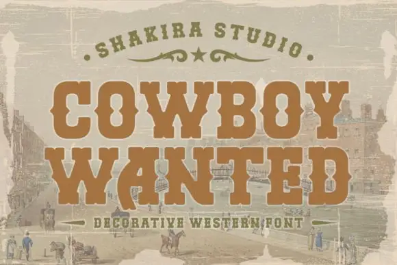
Cowboy Wanted
Cowboy Wanted sets a heavy western slab in warm brown on a sepia landscape, its serifs bracketed, its corners spurred and its strokes slightly worn at the edges.
COWBOY over WANTED fills the frame, the O and the C keeping wide bowls and the W carrying a central spur that splits the letter into two V shapes. Serifs are thick and squared, and the whole line sits on a faded frontier scene, with an arc of small caps above and a tracked caption below. The wear is even rather than dramatic, so the letters keep their edges at poster size and soften at small size. It is a period display face, and its use is narrow on purpose: wanted posters, event bills and packaging that has to look printed in the previous century.
Recommended project & layout
A western-party invitation title — Stack COWBOY above WANTED on a plain cream invitation with the venue on a separate white reverse.
Before you cut or print
Confirm counters and source any town scene independently.
Best paired with
Get fontPaid link
Practical buyer checklist
Frequently asked questions.
Key cutting, printing and pairing answers before choosing a YouTube thumbnails, podcasts & gaming typeface.
What font size should thumbnail text be?
Around 90 to 120 px cap height on a 1280 by 720 canvas, which leaves the word readable when the image is shown at 120 px wide. Smaller text is invisible in a feed and wastes the frame.
Which fonts read best in a podcast cover at small size?
Heavy condensed sans faces with wide counters. Podcast covers appear at 60 to 100 px in most apps, so the show name needs a stroke that survives that reduction, and any subtitle is usually wasted.
Do gaming fonts work for stream overlays?
The pixel and angular faces work well for overlays because they read at small sizes on a video. Keep the overlay text in one face and reserve the more decorative gaming fonts for the offline screen and social posts.
Can I use the same font for a thumbnail and a printed poster?
Yes, but expect to increase weight for print and reduce it for screen. Screens compress and lose fine detail, while print gains it, so the same face often needs different settings in each medium.
Keep exploring
Related collections & guides.
Explore adjacent maker roundups or check our practical pre-production checklists.
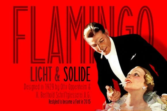
01 / Type Styles
Tall condensed & narrow poster
25 curated fonts · Previews & pairings
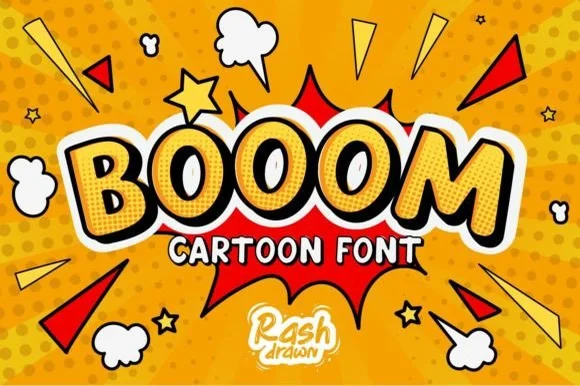
02 / Type Styles
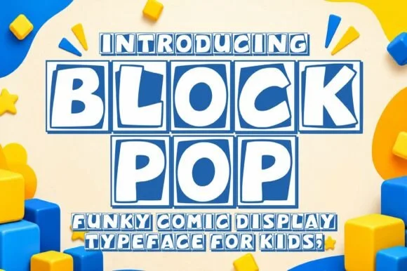
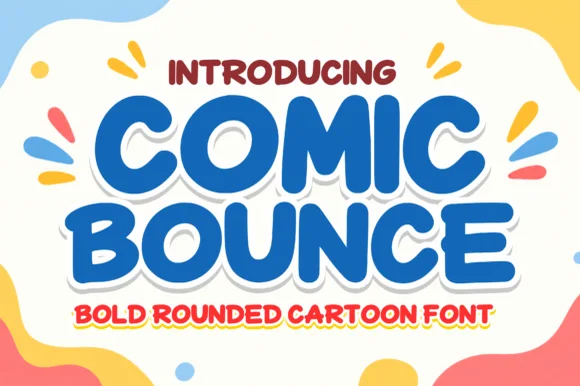
Comic book, cartoon & manga
24 curated fonts · Previews & pairings
03 / Type Styles
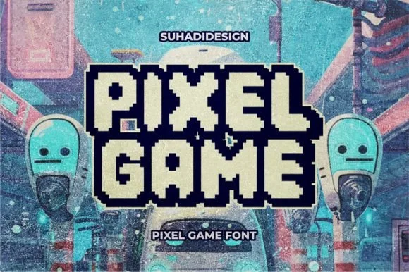
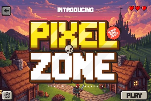
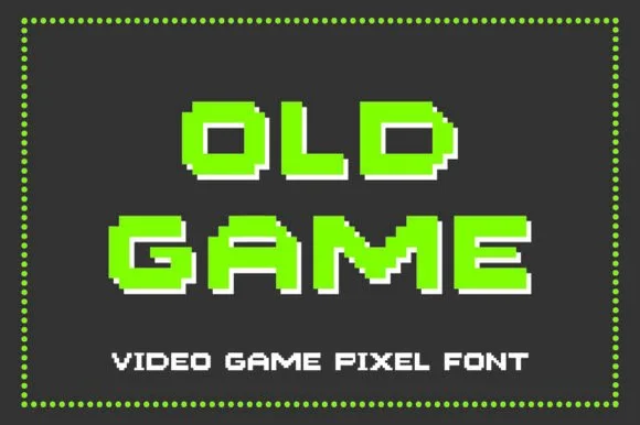
8-bit pixel, VHS & gaming
14 curated fonts · Previews & pairings
04 / Type Styles
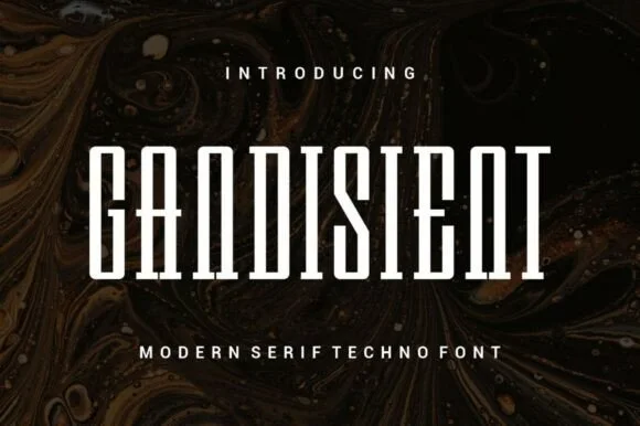
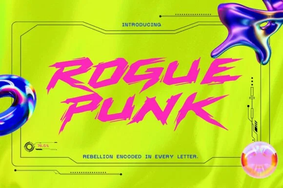
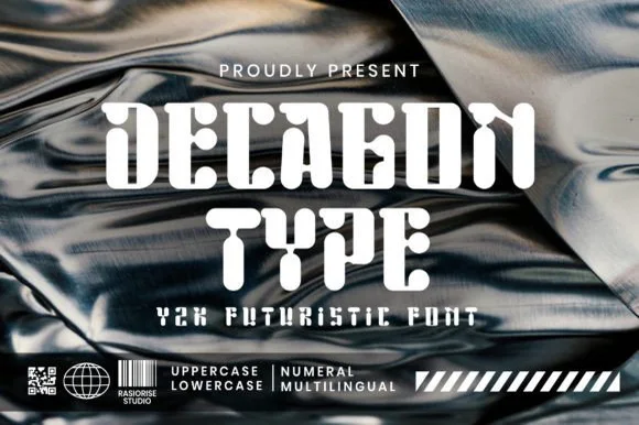
Cyberpunk, sci-fi & mecha tech
16 curated fonts · Previews & pairings
Guides: Invitation font checklist · Vinyl & cutting checklist · How to pair script & sans fonts