 #1 · Best Overall
Disclosure: MakerFileHub may earn a commission from qualifying purchases via paid links on this page. How our links work.
Glitch, chrome-era & early-2000s interface type
16 Best Y2K & Futuristic Tech Fonts
Y2K type is a specific set of artefacts: bevelled chrome edges, sliced horizontal bands, and a slanted, over-sharpened geometry that came from early web interfaces. Punk Cyber keeps a six-style family for consistent use, Trash Maker references the chunky UI block, and Iyas and Thea build glitch and waveform gestures into the letters. Aden and Hellebore push the look toward faceted crystal and cybernetic width.
Quick verdict
Punk Cyber is the most usable Y2K family across a campaign, Hellebore handles the wide cybernetic sans role, and Aden is the statement display for a single wordmark. Thea is the pick for motion and album art.
Quick answer
Top 3 Y2K & futuristic tech picks right now.
Short on time? Start with our three highest-rated Y2K & futuristic tech standouts before scrolling the full breakdown.
#1 · Best Overall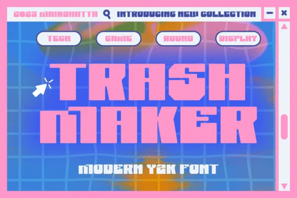 #2 · Runner-Up Pick
Trash Maker
Heavy squared Y2K digital blocks with tiny pixel-notch cutouts
Get fontPaid link
Read review ↓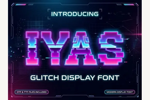 #3 · Editor's Choice
How we tested & selected these 16 fonts
We kept 15 of 191 candidates that show real interface-era construction rather than a slanted sans with a gradient. Judged on whether the glitch or slice is drawn into the glyph outline, how the forms hold at 400 px, and whether a solid companion weight exists.
Side-by-side summary
Top 5 Y2K & futuristic tech picks at a glance.
Compare specimens, OpenType/PUA traits and primary project roles side by side.
| Rank & Font | Style & File Specs | Best Project Fit | Store Listing |
|---|---|---|---|
| DisplayFuturistic | Y2K merch drop, pop single cover or holographic sticker | Get fontPaid link | |
| DisplayBlocky | Y2K streetwear graphic, game jam cover or club flyer | Get fontPaid link | |
| DisplayGlitch | EDM club poster, gaming channel banner or cyber tee | Get fontPaid link | |
| DisplayWaveform | Electronic album cover, DJ visualiser header or synth zine | Get fontPaid link | |
| DisplayScanline | 80s arcade night poster, synthwave album or retro tee | Get fontPaid link |
Display & Decorative Headlines
12 fonts#1 · Best OverallPunk Cyber
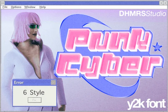
Punk Cyber is a Y2K display capital alphabet in which the letters carry a rounded tech skeleton, two offset copies sit behind the fill and a highlight runs along the top edge, so a word reads as a chrome badge from a 2001 interface.
The P builds a fat bowl on a thick stem, the u keeps two rounded stems, the n repeats the shoulder, the k splays two cut diagonals and the y drops a hooked tail, all at a display weight with clipped corners, two offset layers and a drawn highlight. The layers are the character: the sample builds each word from fill, first offset and second offset in three tones, which is why the face reads as chrome without a gradient mesh. Because the offsets are wide, the face needs 40 pt before they separate, and each layer must be a clean vector. The lilac ground, the cursor arrow, the window frame, the star and the small studio marks are presentation; the pink and blue display words are the face.
Recommended project & layout
Y2K merch drop, pop single cover or holographic sticker — Combine the Slant and Outline files in contrasting neon/pastel hues.
Before you cut or print
Smooth outer contours cut cleanly on holographic sticker vinyl.
Best paired with
Get fontPaid link
#2 · Runner-Up PickTrash Maker
Trash Maker is a heavy squared display in which the letters form thick digital blocks, the counters shrink to slots and tiny pixel notches cut the corners, so a two-word headline reads as early-web graphics.
The T spreads a wide flat bar, the r keeps a short shoulder, the a closes a slot-like counter and the k splays two squared arms, with pixel notches taken out of selected corners and an almost solid fill. The digital block is the character: it turns a short phrase into a graphic object, which is why the sample sets two words tight on a dark ground. Because the counters are small, the face wants 36 pt before they stay open and it cuts cleanly from three quarters of an inch of cap height; longer sentences lose the effect. The grid background and the small caption are presentation; the blocky lettering is the face.
Recommended project & layout
Y2K streetwear graphic, game jam cover or club flyer — Pair hot-pink or acid-green headers with pixel cursor icons and grid rules.
Before you cut or print
Solid straight edges make large vinyl decals fast and easy to weed.
Best paired with
Get fontPaid link
#3 · Editor's ChoiceIyas
Iyas is a pixel capital alphabet in which each letter is sliced into horizontal bands and some bands are displaced sideways, so a word reads as a signal breaking up on a screen.
The I stands as a stack of bars, the Y forks into a staircase and the A carries a stepped bar, all built on a pixel grid with a heavy even weight. The glitch is systematic: one or two bands per letter shift a few pixels left or right, which keeps the word legible while making it read as interference. That displacement is also the failure point at small sizes, where a shifted band reads as a printing fault rather than an effect. Because the letters occupy fixed pixel cells, the fit is wide and a short word spans a panel at 50 pt. The dark ground, the neon gradient, the interface frame, the badges are presentation; the display face is the word shown in the sample and its supporting line.
Recommended project & layout
EDM club poster, gaming channel banner or cyber tee — Apply neon gradient fills or dual-colour chromatic aberration shadows.
Before you cut or print
Stepped horizontal segments suit digital, print and DTF transfers best.
Best paired with
Get fontPaid link
 #4 · Top Maker Utility
Thea
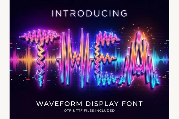
Thea is a display alphabet in which every stroke is drawn as an oscillating audio waveform, so a word reads as a signal trace rather than as lettering, with the shape still legible from the amplitude envelope.
Each letter is built from a vertical waveform: the T holds a stiff peak and a wide crossbar, the h rises into a rounded amplitude, the e closes a looped oscillation and the a keeps a small bowl, all traced as thin lines that spike above and below the letter body at a regular frequency. Legibility comes from the envelope rather than the outline, which is why the face needs a generous size — at 40 pt the waveform reads, at 14 pt it turns into noise. The glow in the sample is applied colour, not part of the letterforms, and the underlying alphabet is a single-line trace. Use is narrow by design: titles, panels and event artwork rather than body copy. The dark ground, the spectrum gradient, the bokeh and the two caption lines are presentation; the typeface is the word.
Recommended project & layout
Electronic album cover, DJ visualiser header or synth zine — Keep to 3–6 uppercase letters at large display scale on dark backgrounds.
Before you cut or print
Fine oscillating wave paths are strictly for digital and print art — not vinyl cutting.
Best paired with
Get fontPaid link
 #5 · Standout Silhouette
Glory
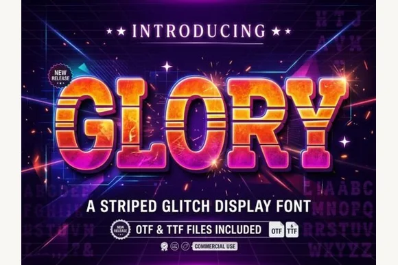
Glory is a chunky arcade block in which every letter carries horizontal scanline gaps, so a word reads as a stretched slice of a 1980s title screen rather than as flat lettering.
The G closes with a square bar, the L keeps one heavy arm, the O holds a rectangular counter and the Y forks with flat cuts, all at a very heavy weight with squared corners and a bevel across the top and left edges. The scanlines are the defining feature: three or four horizontal gaps cut through each stroke at regular intervals and stay aligned across the word, which is what makes the face read as a screen artifact. That alignment is also the risk — set at different sizes, the stripes drift out of register between letters. Because the shapes are simple, the face holds at 60 pt on a poster and fails below 20 pt where the gaps read as damage. The dark ground, the gradient fills, the sparks and the two caption lines are presentation; the typeface is the word.
Recommended project & layout
80s arcade night poster, synthwave album or retro tee — Fill with vertical warm-sunset gradients over dark navy/violet backdrops.
Before you cut or print
Multiple horizontal stripes per letter suit DTF, screen printing and digital graphics.
Best paired with
Get fontPaid link
 #6
Nevera
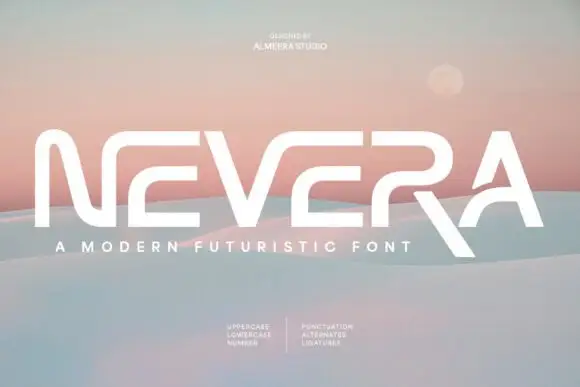
Nevera is a wide futuristic sans in caps and lowercase: monoline strokes, rounded joins, a single-storey a and a very open skeleton that makes a word look engineered rather than written.
NEVERA spans the card in white over a soft gradient of sand and sky, and the letters are built from wide arcs: the N is drawn with a rounded junction instead of a sharp corner, the E has three equal bars, the V and the A share a rounded vertex, and the whole word sits on a wide even spacing that gives it the look of a logotype. The stroke weight never changes, which keeps the face neutral, and the rounded joins do the work that a chamfer would do in a technical sans. Two small blocks of type below list the character set in a light grotesque, and a caption under the word names the style. It is a futuristic display cut for technology, packaging and titles, and it needs a wide measure: at a narrow column the rounded joins collide and the word loses its openness.
Recommended project & layout
A future-mobility name proof — Set NEVERA in black through a clear white landscape panel with a separate pastel product-code tab below the right edge.
Before you cut or print
Check character recognition and reserve space under the R leg.
Best paired with
Get fontPaid link
 #7
Aden
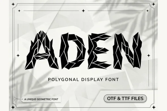
Aden is a sharp, polygonal display font built from faceted geometric crystal shards separated by crisp white origami crease lines (OTF & TTF).
Aden is a faceted low-poly display in caps, where each letter is assembled from crystal shards separated by crisp white crease lines, so a word reads as a shattered surface rather than a solid block. The crease lines are the only detail and they are structural, which means they have to stay separated or the letter becomes a polygon blob. It needs roughly 30 mm before the faceting reads as crystal, and it is at its best in one dark ink on a pale ground or reversed out of a deep colour.
Recommended project & layout
Tech conference banner, architectural journal & gaming cover — Set short 4-to-7-letter titles huge (72–140 pt) in jet black on stark white or neon cyan on obsidian.
Before you cut or print
Hair-thin polygon seam lines require digital graphics, posters, DTF, or laser engraving—avoid weeding tiny vinyl shards!
Best paired with
Get fontPaid link
 #8
Decagon Type
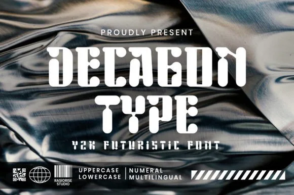
Decagon Type is a chunky Y2K futuristic display font blending ten-sided faceted block outer walls with curvy, liquid-like interior cutouts.
Decagon Type is a Y2K display that pairs ten-sided faceted outer walls with soft liquid cutouts inside the counters, so each letter reads as a machined shell with something poured into it. The contrast between hard outer edges and curvy interiors gives the face its period signature, and the weight is heavy enough to hold a silhouette at poster size. The inner curves are the detail that disappears first, so it needs roughly 30 mm, and it is at its best in white or chrome-like flat colour on a dark ground.
Recommended project & layout
Y2K club flyer, hyperpop album cover & streetwear graphic — Set centered uppercase stacks over metallic chrome textures alongside barcode and diagonal-stripe Y2K graphic bars.
Before you cut or print
Chunky solid fills cut cleanly on streetwear HTV, puff vinyl, and holographic sticker vinyl down to 0.9 inches!
Best paired with
Get fontPaid link
 #9
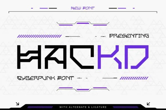
Hackd
Hackd is a sharp-angled cyberpunk sans featuring connected horizontal crossbar ligatures, stencil breaks, and aggressive 45-degree chamfers.
Hackd is a sharp geometric sans in caps whose crossbars link into neighbouring letters, with 45-degree chamfers and crisp stencil breaks slicing the C, K and D, so a word reads as a circuit routed across a panel. The stencil gaps are functional: they let the face paint on awkward surfaces, but they also mean the letters must be large enough for the gaps to stay open. It needs roughly 30 mm before the chamfers read as machined, and it is best in electric violet or white on a dark ground.
Recommended project & layout
Hackathon logo, gaming peripheral box & tech podcast — Set 1 uppercase brand word large (56–100 pt) in two-tone black and electric violet over clean light or dark HUD grids.
Before you cut or print
Straight, sharp-cornered flat bars cut cleanly on laptop vinyl decals and apparel HTV at 0.85 in+.
Best paired with
Get fontPaid link
 #10
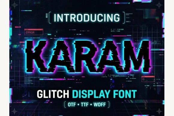
Karam
Karam is a cybernetic glitch display font that slices bold serif/slab capitals with horizontal scan-tear offsets and pixel blocks.
Karam is a horizontal pixel-sliced digital glitch slab display: a squared slab skeleton cut into thin horizontal bands that shift sideways by a few pixels, with small chromatic offsets at the slice boundaries that read as a broken video frame. The slice offset is the design, and any scaling that is not a whole-pixel multiple turns the slices into uneven bars. It needs roughly 32 mm at whole-pixel multiples for the slice to read, and it is best as a flat three-colour print on coated stock, or one ink where the offsets print as knockouts.
Recommended project & layout
Cybersecurity conference slide, tech podcast & gaming intro — Duplicate the text layer 2 px left in cyan and 2 px right in magenta behind white foreground text for instant RGB chromatic glitch.
Before you cut or print
Fine horizontal pixel steps belong in digital video, web banners, print, or DTF rather than blade-cut vinyl.
Best paired with
Get fontPaid link
 #11
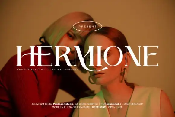
Hermione Modern Serif
Hermione is a modern elegant serif in caps with very fine hairlines, tall proportions and a set of display ligatures, shown over an editorial portrait and set with a slight arch.
HERMIONE spans the card in white over a close portrait in warm light, and the letters are tall and narrow with hairlines at the joins and sharp wedge serifs; the I and the O are drawn to touch, and the custom ligatures give the word a rhythm that a standard setting would not have. The baseline lifts slightly across the centre, which is a display treatment rather than a feature of the font, and a caption at the foot names the family and credits the foundry. The sample is a fashion layout: type over a photograph, wide spacing in small caps, one ornament. What it tells a buyer is that the face is for titles and mastheads at a large size, and that the hairlines need a good press or a screen, never a cheap photocopy.
Recommended project & layout
A portrait-series opener — Place the capitals across a pale full-width panel with the subject's name and byline in plain small text below the left edge.
Before you cut or print
Verify the actual phrase, ligatures and rights; the specimen does not prove automatic decorative joins.
Best paired with
Get fontPaid link
 #12
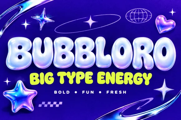
Bubbloro
Bubbloro delivers thick inflated balloon-style display letters with compact counters, and the smaller subline on the cover confirms the same solid puffy silhouette without any chrome bevel.
The strokes swell outward, the corners round fully, the counters shrink to small openings and the letters sit tight against one another. The inflated body is the character: the word reads as a blown-up object rather than a drawn line, which is why the sample pairs a hero word with a smaller subline in the same construction. Because the counters are small, keep 32 pt before they close, and note the advertised 3D finish is a treatment applied later rather than a built-in effect.
Recommended project & layout
Soda/snack label, kids' YouTube banner or party sign — Use solid neon or pastel fills on dark backgrounds or apply layer styles in Photoshop/Canva.
Before you cut or print
Base OTF/TTF provides solid vector shapes (3D chrome gloss on cover is a raster layer effect).
Best paired with
Get fontPaid link
Clean Sans & Handwritten Print
4 fonts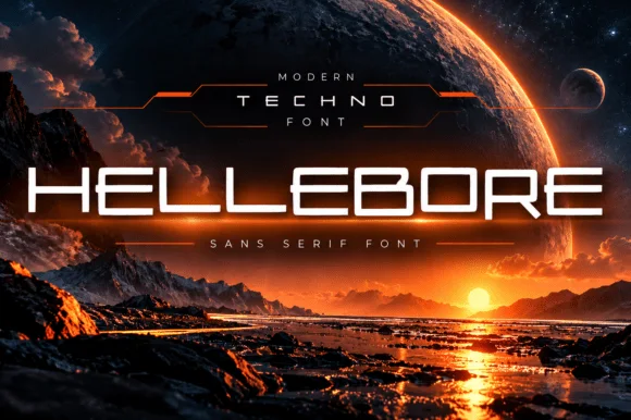 #13
Hellebore
Hellebore is a wide techno sans in which the counters are squared, the junctions are chamfered and every letter sits on a broad horizontal footprint, so a word reads as a title sequence rather than as signage.
The capital H holds two thick stems and a wide bar, the E carries three flat arms, the L keeps one arm and a broad foot, and the O closes a rectangular counter with chamfered corners, all at a heavy even weight with no contrast. The width is the character: a six-letter word stretches across a wide format at a modest point size, which is how the face suits film titles and equipment panels. Chamfers at the junctions keep the shapes from looking like plain blocks, and they are the detail that fails first at small sizes, where the corners fill in. Counters stay open at 30 pt. The planet backdrop, the horizon, the orange rim light, the thin rules and the two caption lines are presentation; the typeface is the word.
Recommended project & layout
Sci-fi book/film title, Twitch overlay or tech hardware mark — Track uppercase +30 to +60 across dark landscape compositions.
Before you cut or print
Clean uniform strokes cut effortlessly on automotive/PC case vinyl decals.
Best paired with
Get fontPaid link
 #14
Vectra
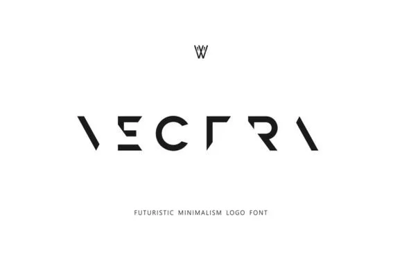
Vectra is an experimental futuristic logo font that strips each capital down to minimalist geometric strokes and negative-space angles.
Vectra is a deconstructed minimalist stencil and puzzle logo font: letters are broken into separated segments with deliberate gaps, sharp modular angles and a geometry that reads as a sliced mark rather than a drawn letter. The gaps are the design and they close under vinyl weeding if they are too narrow, and the modular build means a letter can look like two pieces. It needs roughly 26 mm for the gaps and the angles to read, and it is best as a one-colour vinyl or cut job, or a flat two-colour print on coated stock.
Recommended project & layout
Tech startup wordmark, architecture studio & synth label — Track capitals wide (+250 to +400) across stark white or matte-black surfaces, paired with a conventional sans descriptor below.
Before you cut or print
Because missing stems rely on Gestalt word recognition, use Vectra strictly for short 1-word logos—never body copy or long phrases.
Best paired with
Get fontPaid link
 #15
Six Sound Font
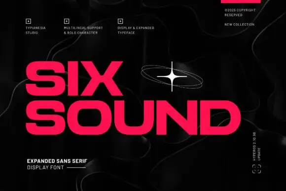
Six Sound Font shows hot-pink capitals in two rows against black, where the S has broad flat-ended curves, the O is wide and rounded, the X spans a strong diagonal cross and the title leaves a noticeably large horizontal footprint even in short words, with a white orbital star and faint contour lines around it.
The letters stretch wide, the bowls open round, the ends cut flat and the rows take a lot of width. That expansion is the character: a short word fills a wide field, which is why the sample needs two rows on a square cover. The star and contour lines are decoration, so plan your line breaks for the footprint, keep 40 pt before the flat cuts lose definition and check that a narrow label is not the right home for this face.
Recommended project & layout
An independent radio poster — Run LATE SIGNAL across a black poster above a narrow white schedule column, leaving the title free of orbital graphics.
Before you cut or print
Fit the actual words without compression and check small counters under the chosen pink ink.
Best paired with
Get fontPaid link
 #16
Oscorp
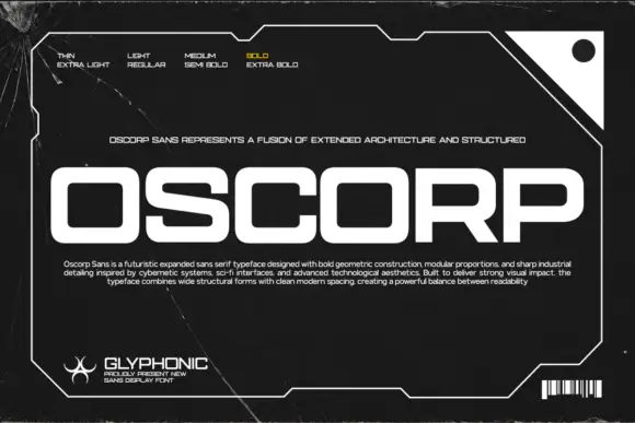
Oscorp places large white capitals inside an angular frame on black, where broad rectangular bowls with rounded corners form the O, C and P, the S carries long nearly horizontal strokes and the low expanded proportions give a short word a wide footprint.
The bowls turn into rounded rectangles, the arms lie flat, the S stretches sideways and the whole row spreads wide. That footprint is the character: a four-letter word fills a square frame without growing tall, which is why the sample sets it alone inside a border. The frame, scratches and barcode are artwork rather than part of the letters, and the weight legend shows only one treatment, so check the styles in your file and keep 40 pt before the narrow openings close.
Recommended project & layout
A modular-device label heading — Set CORE UNIT across a black equipment-card header with serial and version in a separate white grid below.
Before you cut or print
Verify required numerals and counter openings at the planned label size.
Best paired with
Get fontPaid link
Practical buyer checklist
Frequently asked questions.
Key cutting, printing and pairing answers before choosing a Y2K & futuristic tech typeface.
Can Y2K fonts be used in a long-term brand identity?
As an accent, yes. As the primary face, the style is tied to a revival cycle and will read as dated within a few years. Pair a restrained primary typeface with a Y2K display cut for campaign moments.
Why do sliced fonts look muddy in print?
The gaps between slices are often under 0.3 mm at body size, which fills in with ink. Print them large, at least 36 pt, and check a proof on the actual stock before committing to a full run.
Do futuristic fonts include lowercase letters?
Many ship capitals only or map lowercase to a smaller capital set. Check the glyph count before setting mixed-case copy, and plan layouts around all-caps if that is what the file provides.
What is the difference between Y2K and cyberpunk typography?
Y2K references early-2000s consumer tech: chrome, bevels, glossy plastic and interface blocks. Cyberpunk leans darker and more industrial, with stencil cuts, circuitry lines and distressed metal edges.
Keep exploring
Related collections & guides.
Explore adjacent maker roundups or check our practical pre-production checklists.
01 / Type Styles
8-bit pixel, VHS & gaming
14 curated fonts · Previews & pairings

02 / Type Styles
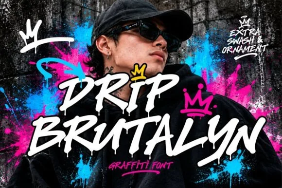
Graffiti, throw-up & street tag
18 curated fonts · Previews & pairings



03 / Branding & Print
Editorial & posters
37 curated fonts · Previews & pairings



04 / Cricut & Craft
T-shirts, hoodies & HTV apparel
33 curated fonts · Previews & pairings
Guides: Invitation font checklist · Vinyl & cutting checklist · How to pair script & sans fonts