Neutral Sans Workhorse

Après Ski + Base Edge
Lets Après Ski own the focal silhouette while handling secondary copy, sizing and subheads cleanly.
Inspect Base Edge specimenDisclosure: MakerFileHub may earn a commission from qualifying purchases via paid links on this page. How our links work.
Heavy angular capitals with small round counters and a detached acute accent
Apres Ski sets a retro grotesque at a steep angle across a snowy slope, its capitals wide, its corners notched and its counters cut with shapes that look borrowed from ski graphics of the seventies.
Paid link
Get this fontProject & layout blueprintsAt-a-glance maker compatibility
Sturdy stroke walls and open counters weed cleanly on adhesive vinyl, HTV apparel film, and cut cardstock.
Visual anatomy & craft review
APRÈS SKI runs diagonally from the top of the frame to the bottom right, each word in a different tone of teal and cream so the slope reads through the letters, and the accents sit high above the E. The A carries a diagonal notch, the R an angled leg and the S a squared-off spine, which gives the face its period feel without any shadow or outline. A bold three-line block in the lower left names it as a retro display font. The diagonal placement is a layout decision, not part of the face, but it shows the intended use: large, angled and short, where the cut corners read as deliberate rather than as damage.
Heavy angular capitals with small round counters and a detached acute accent
Two-font hierarchy recipes
Tested contrast partners — pairing Après Ski with grounded secondary typography.
Après Ski + Base Edge
Lets Après Ski own the focal silhouette while handling secondary copy, sizing and subheads cleanly.
Inspect Base Edge specimen
Après Ski + Vanielst Elegant Serif Display Stylistic
Grounds bold display lettering with classic typographic authority on posters, badges and apparel.
Inspect Vanielst Elegant Serif Display Stylistic specimenPractical applications
Concrete hierarchy, scale and production guidance tailored to Après Ski’s stroke geometry.
The retro cut corners suit a winter resort that wants to look established, and the heavy caps carry across a snow-covered noticeboard.
Hierarchy & layout recipe
Print an A2 poster: set the title at 110 pt on one row, keep 28 mm of clear ground beneath before the dates at 18 pt, and keep 26 mm of border so the cut corners stay inside the sheet.
Pre-production check
Angled settings need extra bleed; check the layout with your printer before the proof is ordered.
The notched capitals give a winter issue a graphic hook, and the wide forms fill a masthead without a photograph behind them.
Hierarchy & layout recipe
Print a 210 by 280 mm cover: set the masthead at 88 pt across two rows, keep 22 mm of clear ground beneath before the standfirst at 11 pt, and keep 18 mm of margin from the trim.
Pre-production check
Thin notches fill in at small sizes; check the printed cover before shrinking the cover title.
The retro weight reads as a house style on a can, and a short beer name fits the wide capitals on a slim and narrow can label.
Hierarchy & layout recipe
Print a 60 by 120 mm can label: set the beer name at 20 pt on one row, keep 10 mm of clear ground beneath before the strength at 6 pt, and keep 6 mm of clear area where the label wraps the curve.
Pre-production check
Curved cans distort wide letters; check a wrapped mock-up before the can label print run starts.
Technical & licence verification
Confirm included OTF/TTF/WOFF formats, full glyph tables and licence coverage on the live store page before batch production.
Closest visual alternatives
Matched across letterform anatomy, stroke behaviour and craft applications.
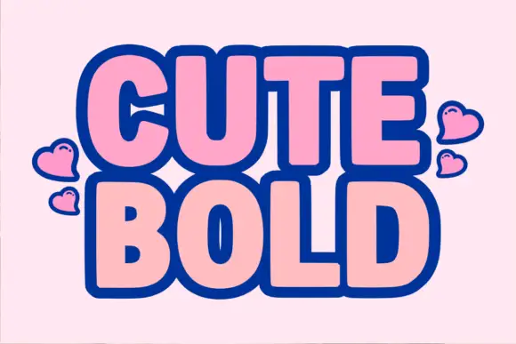
Heavy rounded bold sans with a thick dark outline
Cute Bold is a heavy rounded sans in which the letters swell, the counters close to slots and a thick dark outline wraps each word, so a two-word title reads as a cut sticker made for a scrapbook.
Ideas for this font
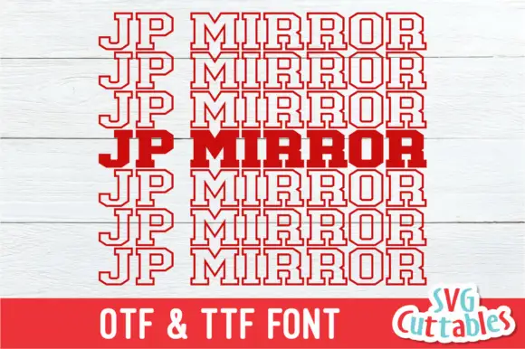
Clipped varsity slab capitals repeated in outline around one solid middle row
JP Mirror repeats a red uppercase name in seven tightly stacked rows on a pale wood ground, where six rows are hollow outlines and one central row is solid red, clipped corners and squared slab feet define the letters and the P and R carry large rectangular counters.
Ideas for this font
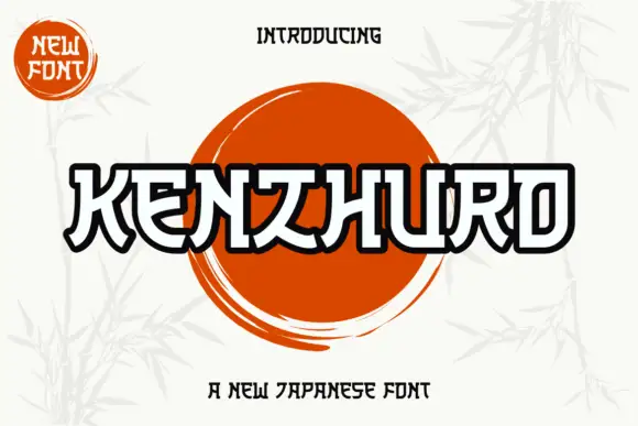
Outlined angular display with bridge cuts and heavy contours
Kenzhuro is an angular display alphabet in which every stroke is a heavy outline with bridge cuts at the joints, so a word reads as a brushed sign where the interior of each stroke stays open.
Ideas for this font
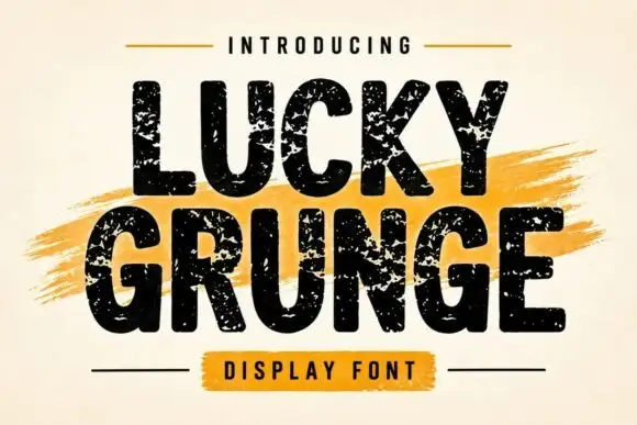
Grunge heavy sans display
Lucky Grunge is a heavy grunge display in black on cream: wide condensed caps with chipped edges, speckled interiors and a slightly rough baseline, set over a dry orange brush swipe with a banner caption, so the pair reads as a stencilled crate label.
Ideas for this font
Same independent foundry
Allow optional Google Analytics to measure visits and catalogue actions. Your search words and notes are not included. Privacy & storage